screensdesign

Explore mobile app design examples.

Noxogy Sleep Tracker: Top navigation bar, followed by a status message, a segmented control, a list of recordings, and a bottom navigation bar.Noxogy Sleep Tracker: Header with date and navigation, followed by a status message, a tab switcher, a list of audio recordings, and a bottom navigation bar.Noxogy Sleep Tracker: Top navigation bar followed by a segmented control, a warning message, and a vertical list of data rows.

Analyzing reports

Expedia: Hotels, Flights, Cars: Top navigation bar with search input, followed by a vertical list of search results, and a system keyboard at the bottom.Expedia: Hotels, Flights, Cars: Top navigation tabs, date range display, scrollable calendar grid, flexibility options, and a bottom confirmation button.Expedia: Hotels, Flights, Cars: Top navigation bar followed by three stacked input cards and a bottom-aligned primary action button.

Booking accommodation

Expedia: Hotels, Flights, Cars: Top navigation bar followed by a segmented control, a vertical list of input fields, and a bottom-aligned primary action button.Expedia: Hotels, Flights, Cars: A modal overlay containing a header with a title and cancel button, followed by a scrollable list of destination options.Expedia: Hotels, Flights, Cars: Top navigation bar with title, followed by a list of four traveler categories with counters, and a bottom primary action button.

Booking travel

Equalizer - Volume Booster EQ: Top header with search and connect, followed by three distinct sections: Artists (horizontal), Playlists (grid/horizontal), and Songs (vertical list).Equalizer - Volume Booster EQ: Top navigation bar followed by section headers for Albums and Songs with corresponding list items.Equalizer - Volume Booster EQ: Top navigation bar with Cancel/Done, followed by a search input field, and a scrollable list of music tracks with thumbnails and action buttons.

Browsing music and audio

Rork: Header text at the top, followed by a vertical list of selection buttons, and a primary action button at the bottom.Rork: Header text followed by a vertical list of selection buttons, with a primary CTA button at the bottom.Rork: Header text at the top, followed by a vertical list of selection buttons, and a primary action button at the bottom.

Building apps

Everlook- Face & Body Editor: Top header with app name and VIP status, central carousel of images, 'My Draft' section, and a bottom navigation bar with four circular icons.Everlook- Face & Body Editor: A central system permission modal sits over a camera viewfinder interface with a bottom toolbar and a right-side brightness slider.Everlook- Face & Body Editor: Top navigation bar, large central workspace, vertical right-side tool column, and a two-row bottom editing menu with a central shutter button.

Capturing with the camera

Useless - Screen Time Control: Top header with back button, followed by a hero card, a troubleshooting row, two list sections for limits and schedules, and a bottom navigation bar.Useless - Screen Time Control: A modal window centered over a background settings page, containing a time picker, day selection toggles, and a primary action button.Useless - Screen Time Control: A modal sheet containing a scrollable list of app categories and individual apps, followed by a search bar, and ending with two primary action buttons at the bottom.

Configuring app limits

Equalizer - Volume Booster EQ: Album art at top, song info below, four circular control buttons in a row, progress bar, and playback controls at the bottom.Equalizer - Volume Booster EQ: Top section contains a large vertical slider, middle section displays track info and feature toggles, bottom section contains playback controls.Equalizer - Volume Booster EQ: Top equalizer sliders, middle preset buttons and track info, lower feature icons, bottom playback controls.

Configuring audio

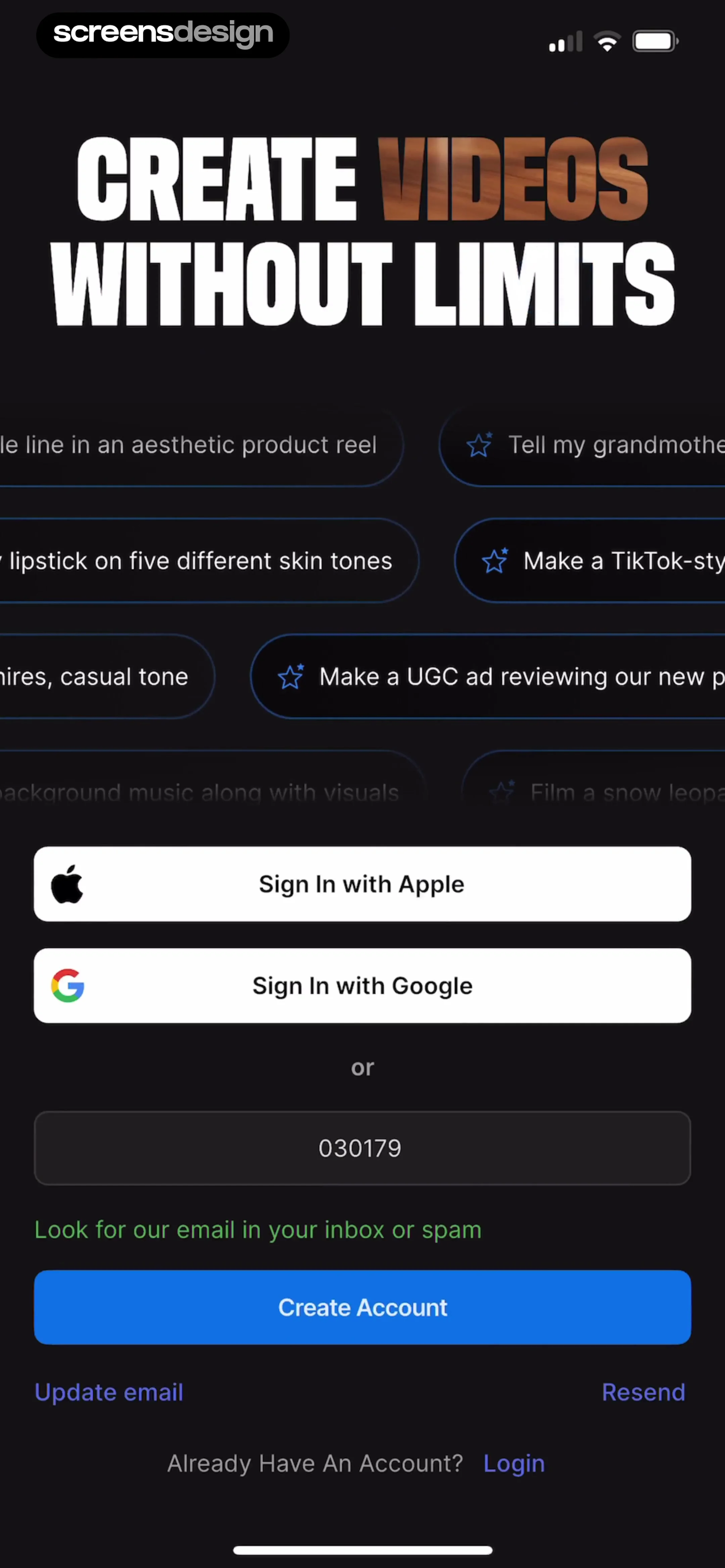
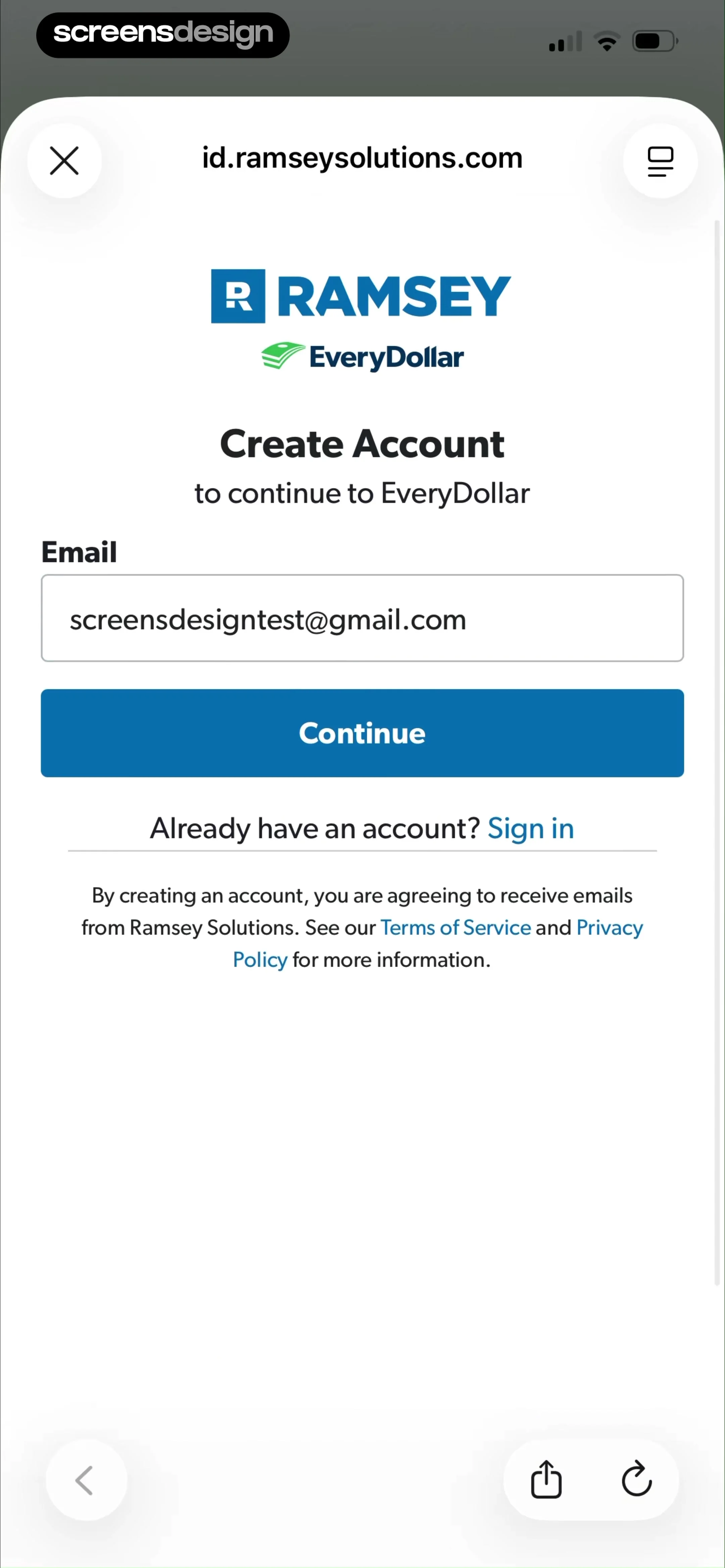
Hotels.com: Book hotels & more: Top close button, header text, Google sign-in button, email input field, continue button, social sign-in options, legal text, and brand logos at the bottom.Hotels.com: Book hotels & more: Header text followed by instructions, input field, primary button, secondary text links, and a numeric keypad at the bottom.Hotels.com: Book hotels & more: Centered card with brand logos at the top, followed by text, a link, and a bottom-aligned primary button.

Creating an account

EveryDollar: Budget Management: Green header at top, white content card in middle, feedback section below, and bottom navigation bar.EveryDollar: Budget Management: The screen is vertically centered with a top navigation icon, a central illustration, a two-line text block, and a primary call-to-action button below.EveryDollar: Budget Management: Top progress bar, header summary, main content card with income list, and bottom primary action button.

Creating budgets

invideo AI: AI Video Generator: A modal overlay with a header at the top and a vertical list of plugin options below.invideo AI: AI Video Generator: Top navigation bar followed by a primary action button, then a centered empty state illustration and instructional text.invideo AI: AI Video Generator: Top navigation bar followed by a photo upload card, a character description input, a script input area, and a bottom primary action button.

Creating characters and avatars

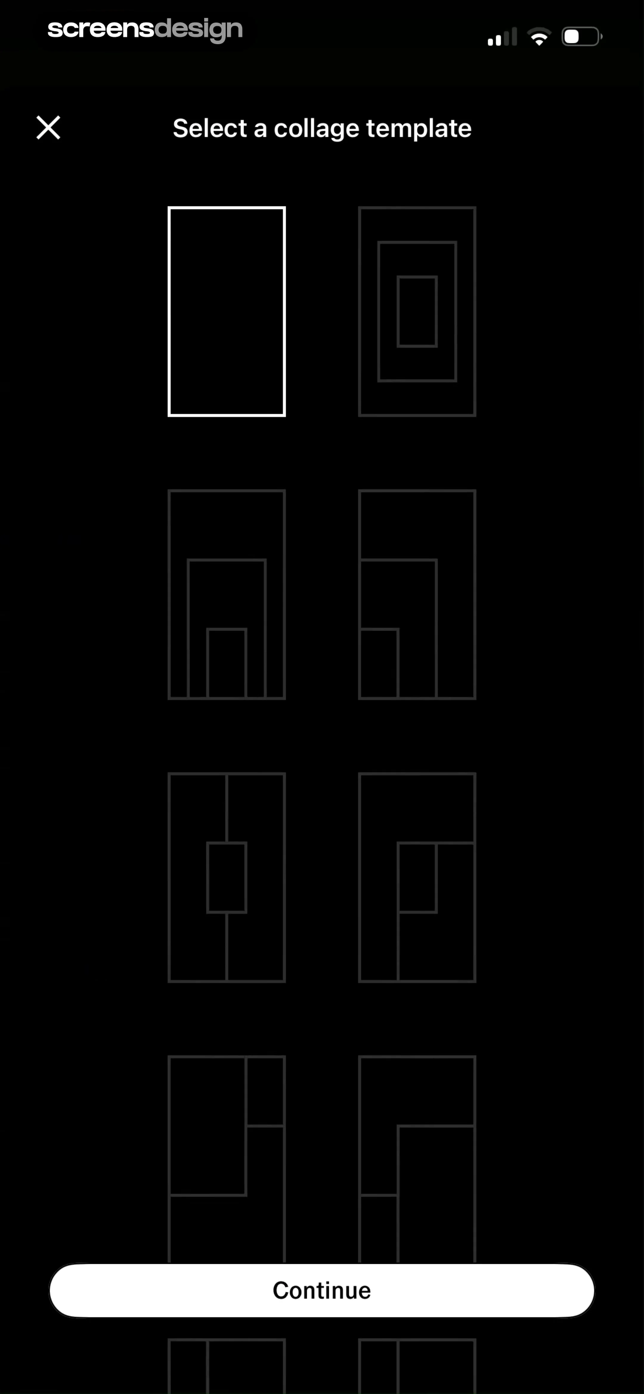
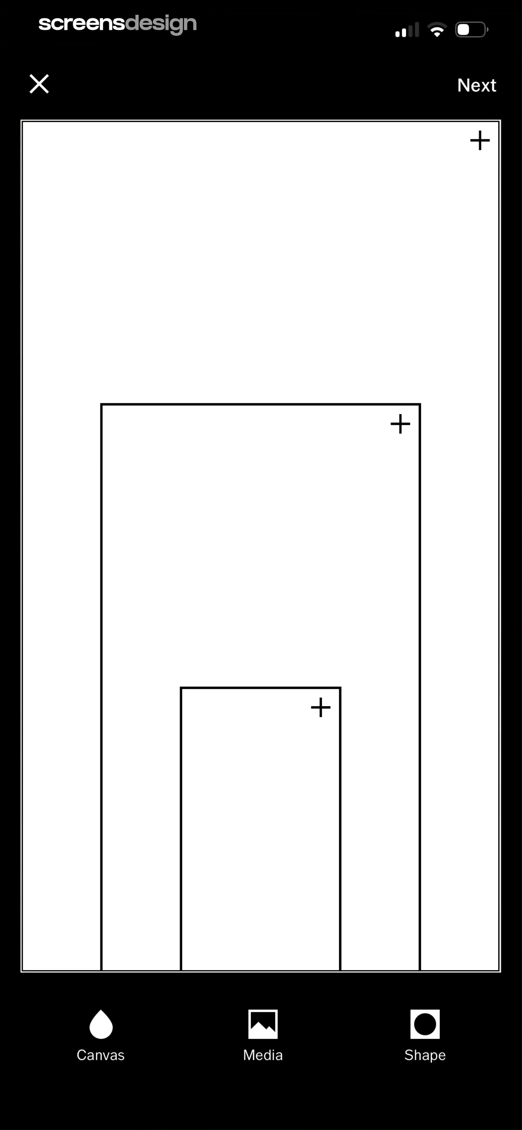
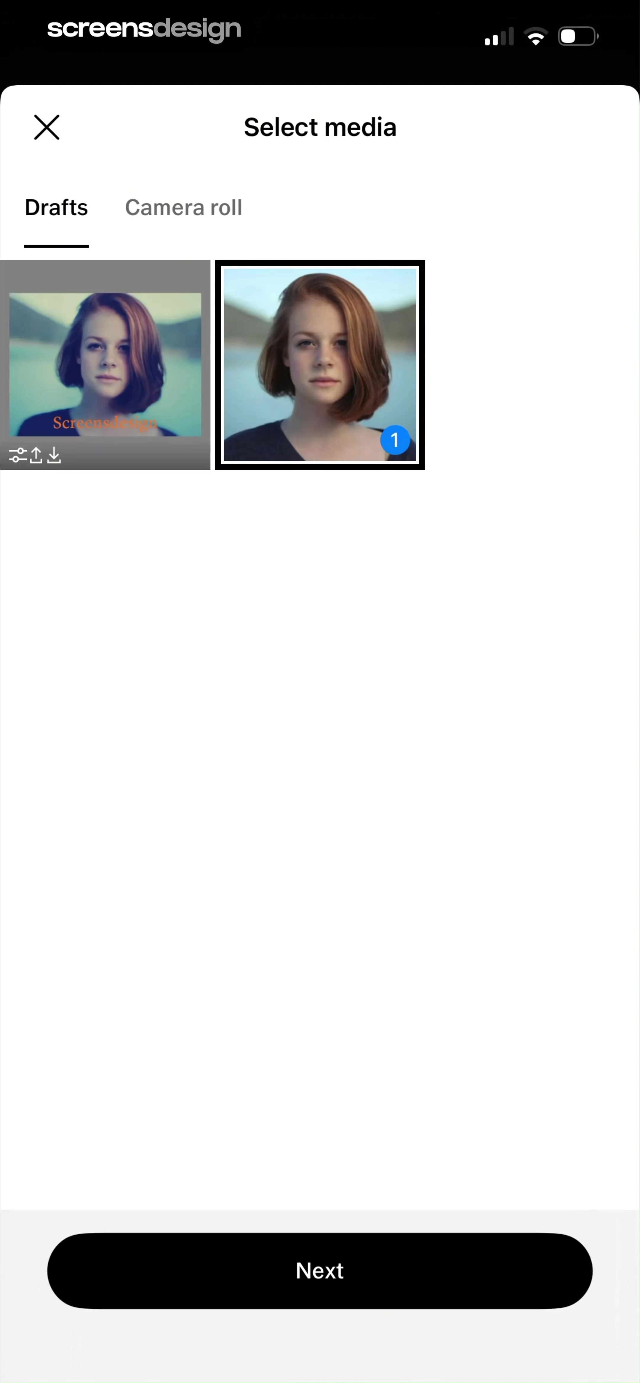
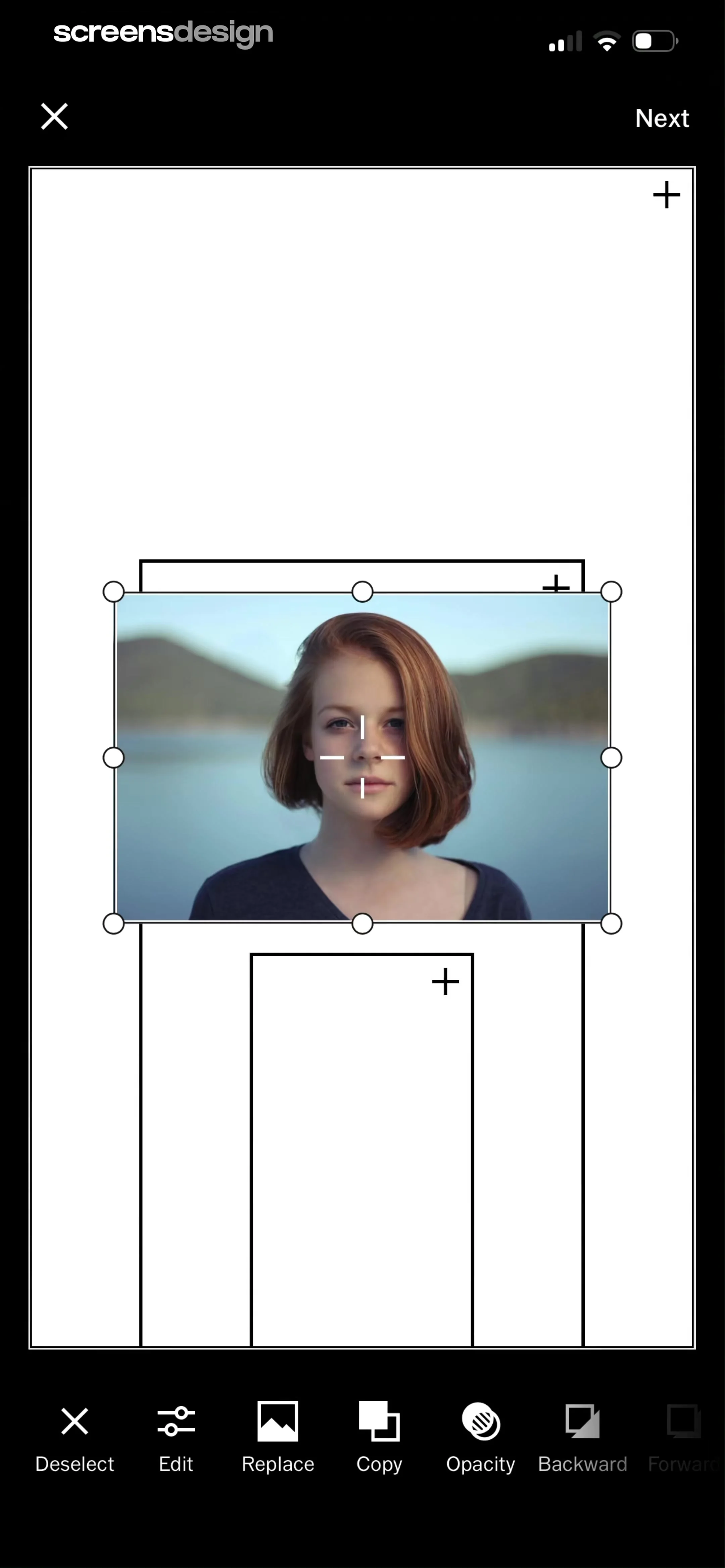
VSCO: Photo & Video Editor: Top header with close button, followed by a 2-column grid of collage template icons, and a bottom-aligned primary action button.VSCO: Photo & Video Editor: Top navigation bar, large central canvas area with nested placeholders, and a bottom navigation bar with three icons.VSCO: Photo & Video Editor: Header with close button and title, followed by tab navigation, a grid of media thumbnails, and a bottom-anchored primary action button.

Creating collages

WeMoms - Pregnancy & Baby App: Top navigation bar, poll question input, poll options container, audience selector, toolbar, and keyboard.WeMoms - Pregnancy & Baby App: Top back button, central illustration, header text, two selection cards, and two circular buttons at the bottom.WeMoms - Pregnancy & Baby App: Header with back button and post action, followed by a title, search input, and a dense grid of selectable tag chips.

Creating posts, notes, and videos

Redfin: Buy, Sell & Rent Homes: Top search bar and filter controls, followed by a large map view, and a single property card at the bottom.Redfin: Buy, Sell & Rent Homes: Top search and filter bar, large map occupying the top two-thirds, property card at the bottom with a toast notification overlay.Redfin: Buy, Sell & Rent Homes: The screen consists of a background map view with search filters and a foreground modal overlay for list management.

Creating lists

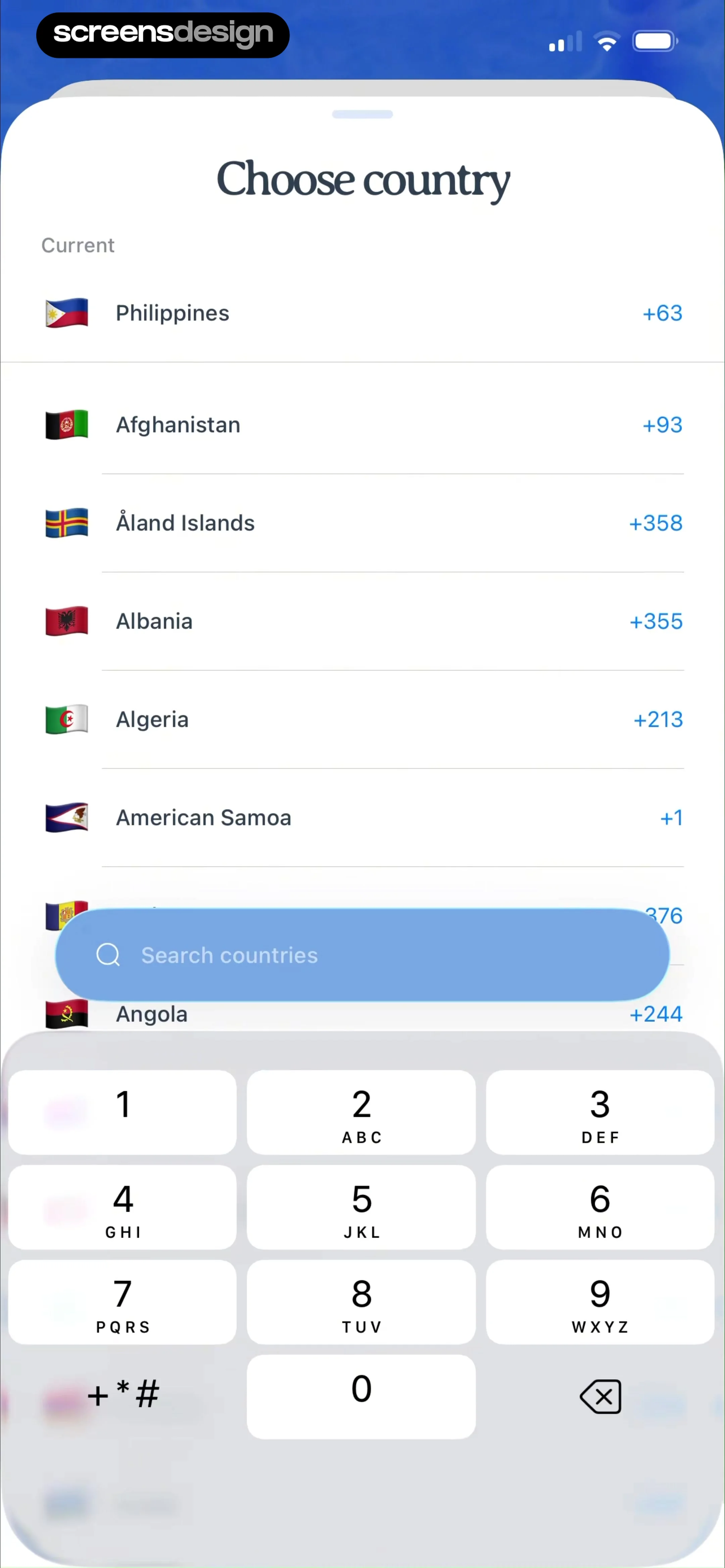
AI Song Generator: Mozart: Header with tabs, large text input area, advanced settings grid, primary CTA button, and bottom navigation bar.AI Song Generator: Mozart: The screen features a top navigation bar, a prompt input area, and a large modal overlay covering the bottom two-thirds of the screen, containing vocal selection options and a bottom action button.AI Song Generator: Mozart: Top navigation bar, text prompt input, and a bottom-anchored modal overlay containing a genre selection grid and a primary action button.

Creating songs

Filmit AI: AI Cinematic Video: Top navigation bar, large photo upload area, script text input area with controls, prompt ideas section, and a bottom primary action button.Filmit AI: AI Cinematic Video: A centered system permission modal overlaying a dark-themed editor screen with a top navigation bar and a bottom action button.Filmit AI: AI Cinematic Video: Top navigation bar followed by a dense grid of square image thumbnails.

Creating videos

WebNovel - Read Novels & Manga: Top navigation bar followed by two distinct sections containing cards and a carousel, ending with a large bottom action button.WebNovel - Read Novels & Manga: Top header with back button and title, a theme preview area, a central modal containing a mobile app UI mockup, and a bottom action button.WebNovel - Read Novels & Manga: A modal dialog centered over a settings page with a top navigation bar and a bottom action button.

Customizing appearance

Widgetable: Besties & Couples: A centered modal window on a dark background, containing a header illustration, two input fields, a checkbox, and a primary call-to-action button.Widgetable: Besties & Couples: Top background with promotional content, followed by a centered modal containing a header, two phone mockups, and two bottom buttons.Widgetable: Besties & Couples: The screen consists of a blurred background showing home screen icons, with a white modal sheet occupying the bottom half of the screen containing selection options and a primary CTA.

Customizing widgets

Rooms: Header with title and icon, followed by a horizontal row of three template cards, a divider, and a grid of four larger remixable project cards.Rooms: Top notification banner, followed by a header with search and category tabs, and a large scrollable grid of 3D assets.Rooms: Top 3D editor viewport with transform handles, bottom half-screen drawer for asset selection.

Designing spaces

Tattoo AI - Tattoo Design: Top navigation bar, followed by a large text input area with a floating suggestion bubble, and a system keyboard at the bottom.Tattoo AI - Tattoo Design: Top navigation bar with segmented control, followed by a large text input area, a primary action button, and the system keyboard at the bottom.Tattoo AI - Tattoo Design: Top navigation bar, central chat conversation area with alternating bubbles, bottom text input field.

Designing tattoos

Meetup: Social Events & Groups: Search bar at top, followed by horizontal filter chips and category tabs, then a vertical scrollable list of event cards, and a bottom navigation bar.Meetup: Social Events & Groups: Top navigation bar, promotional banner, hero image with speaker details, event title and metadata, attendee list, 'About' section, and a bottom sticky bar with RSVP button.Meetup: Social Events & Groups: Top navigation bar, promotional event header, event details, attendee list, and a fixed bottom action bar.

Discovering events

bergfex: Hiking & Tracking: A modal overlay centered on a map background, containing three grouped lists of settings.bergfex: Hiking & Tracking: Top navigation bar with close and add buttons, followed by an informational card, and a centered empty state illustration with instructional text.bergfex: Hiking & Tracking: The screen consists of a header title, a large central map area with a resizable selection overlay, and a bottom footer containing two side-by-side action buttons.

Downloading content

Tiny Scanner - PDF Scanner App: Top navigation bar, central document preview area, and a bottom sheet overlay for tools.Tiny Scanner - PDF Scanner App: Top navigation bar, central document preview area, bottom processing overlay with status text, and a bottom toolbar.Tiny Scanner - PDF Scanner App: Top navigation bar, document preview card, language selector, scrollable text area, and bottom action bar.

Editing documents

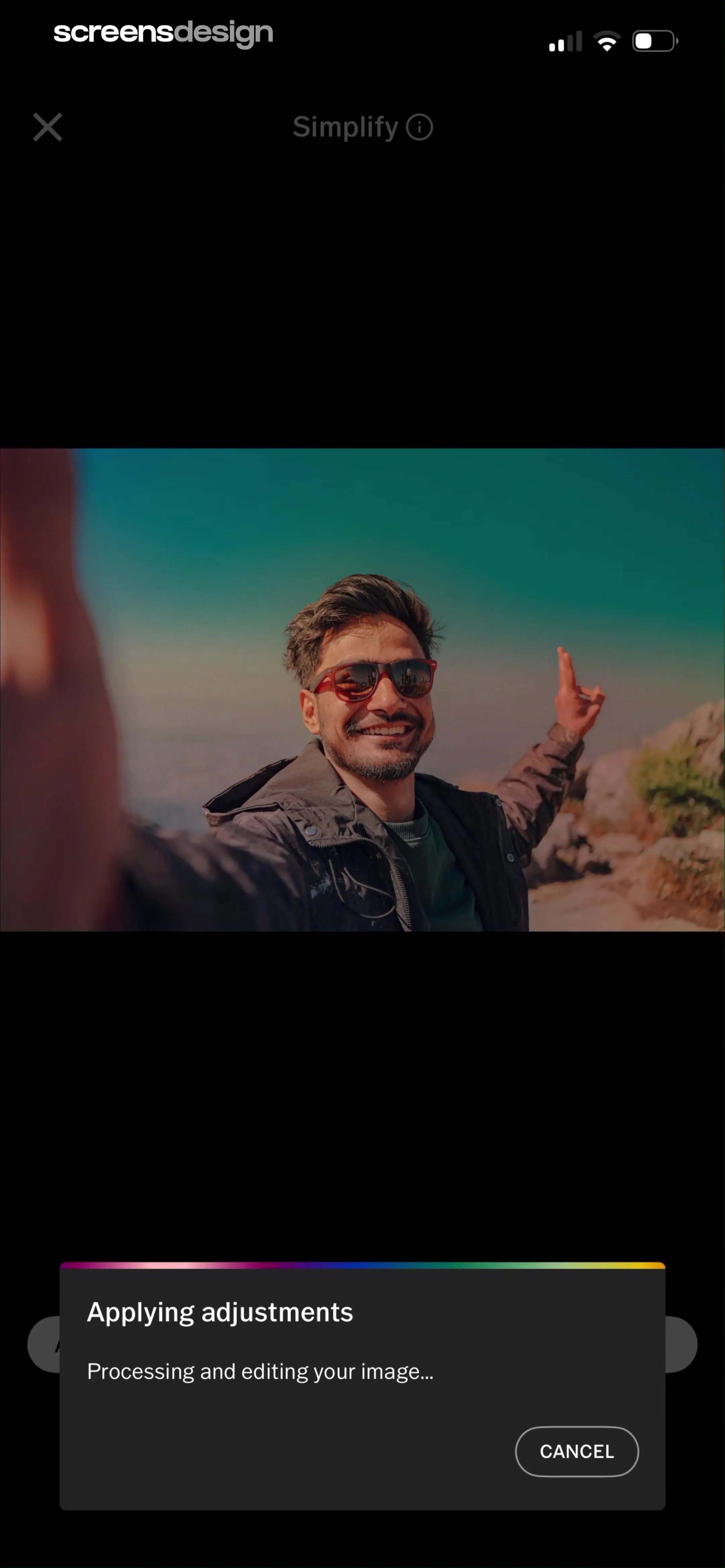
Everlook- Face & Body Editor: Top bar with close and camera icons, followed by a 'Sample Photos' horizontal carousel, and a large grid of user photos filling the rest of the screen, with a floating 'Recents' button at the bottom.Everlook- Face & Body Editor: The screen is divided into three main parts: the photo preview area at the top, the adjustment slider in the middle, and the tool selection/navigation bar at the bottom.Everlook- Face & Body Editor: Top image area with color swatches, middle text card, bottom close button overlay.

Editing photos

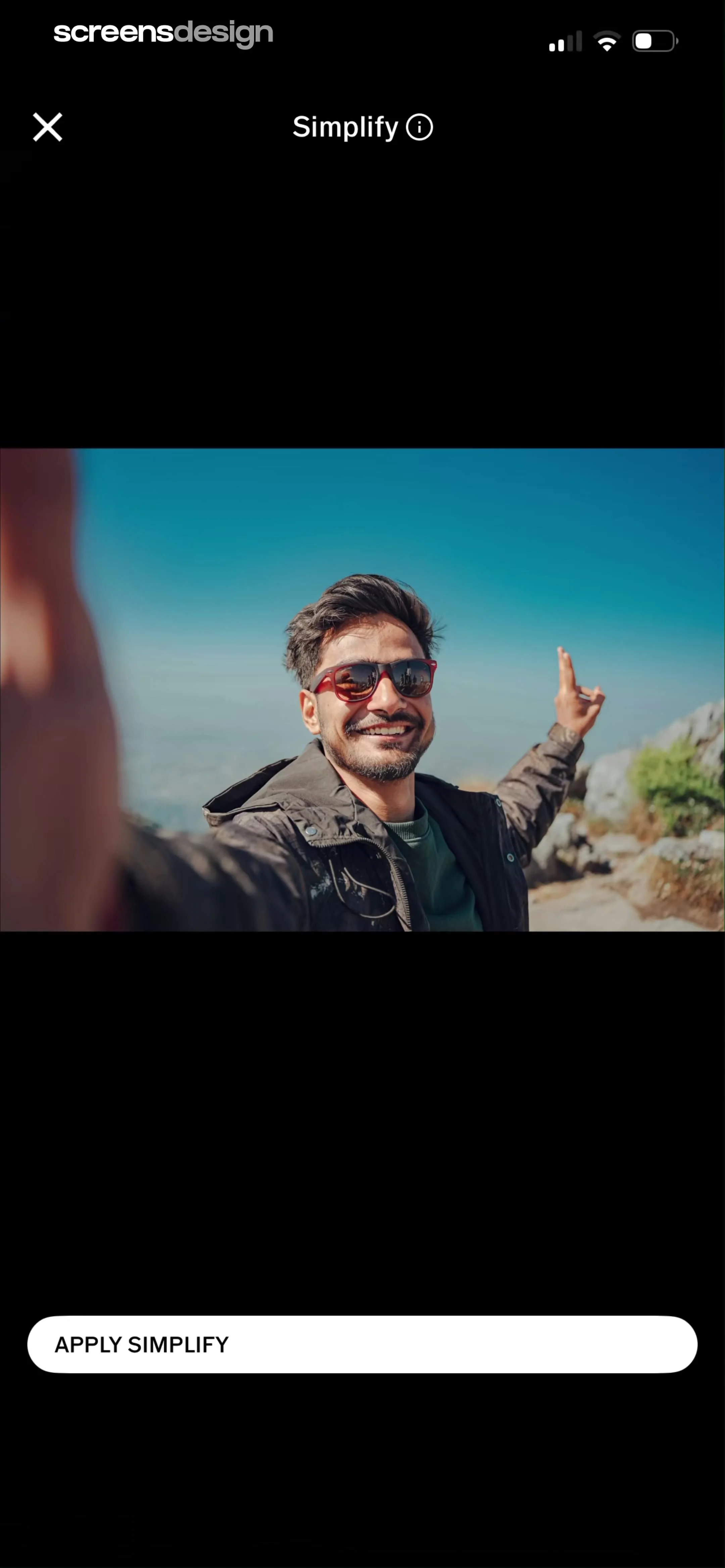
VSCO: Photo & Video Editor: Header at top, 2x3 grid of feature cards in the center, bottom navigation bar at the base.VSCO: Photo & Video Editor: Top navigation bar with tab switcher, followed by a multi-column image grid, and a bottom navigation bar with search and menu icons.VSCO: Photo & Video Editor: Top navigation bar, central image preview area, and a bottom action button.

Editing photos with AI

HBX | Globally Curated Fashion: Header text at top, feature list in middle, primary action buttons below, 'Not now' button and pagination dots at bottom, with a system modal overlaying the center.HBX | Globally Curated Fashion: Top browser navigation bar, followed by the HBX logo, a sign-up form with three inputs, a primary CTA, an 'OR' divider, and a social login button.HBX | Globally Curated Fashion: Top browser bar, notification banner, header text, multi-field form, bottom browser navigation bar.

Entering personal details

Flight Tracker +: Full-screen map with floating UI elements in the top right, right edge, and bottom center.Flight Tracker +: Top map area, middle flight details card with modal overlay, bottom navigation bar.Flight Tracker +: Header with title and flight codes, followed by a countdown card, and a vertical list of itinerary steps.

Exploring flight information

SHEIN - Shopping Online: Top search bar, category tabs, horizontal product scroll, promotional banners, gamified tiles, secondary tabs, sign-in banner, and bottom navigation.SHEIN - Shopping Online: Top navigation bar, category icon carousel, filter/sort bar, and a two-column product grid.SHEIN - Shopping Online: Top navigation bar, large hero product image, product title and pricing, color and size selection, bottom persistent action bar.

Exploring product details

Tiny Scanner - PDF Scanner App: Top navigation bar, instructional text, centered document preview card, page number indicator.Tiny Scanner - PDF Scanner App: Top navigation bar, instructional text, central document preview card, bottom delete action.Tiny Scanner - PDF Scanner App: Top navigation bar, document preview area, centered modal overlay with format selection, and a bottom action bar.

Exporting files and media

Flight Tracker +: Header, search tabs, input fields, search button, explore list, bottom navigation.Flight Tracker +: Modal header with title and close button, followed by a search bar, a 'Recents' list item, a 'Nearby' section with two cards, and a system keyboard at the bottom.Flight Tracker +: Modal window with a header, search bar, section title, and a list of search results.

Finding flights

Vrbo Vacation Rentals: Top header with title and dates, followed by a horizontal property carousel, then a 'Travel guides' section with a large banner and smaller category cards, and a bottom navigation bar.Vrbo Vacation Rentals: Top navigation bar, search summary header, filter bar, loyalty banner, vertical list of property cards, and a floating map button at the bottom.Vrbo Vacation Rentals: Top navigation, followed by a 2x3 grid of interest cards, a horizontal region filter bar, and a vertical list of destination cards.

Finding places

Zalando – Online fashion: Top navigation bar, followed by a video hero section, a horizontal category filter bar, a text section with a title and description, and a product image carousel, with a persistent bottom navigation bar.Zalando – Online fashion: Top navigation bar, sub-category horizontal list, filter chips, product grid, and bottom navigation bar with a promotional banner above it.Zalando – Online fashion: Top navigation bar, central product image, product title and brand info, bottom confirmation banner, and bottom navigation bar.

Finding products

Good Food: Recipe Finder: Search bar at top, followed by tabbed navigation, sort options, and a vertical list of recipe cards, with a bottom navigation bar.Good Food: Recipe Finder: A search results list in the background with a modal bottom sheet overlaying the bottom half of the screen.Good Food: Recipe Finder: Top navigation bar, hero video area, recipe title and metadata, description, comments link, info section, and bottom navigation bar.

Finding recipes

DAZN: Stream Live Sports: Top navigation bar, promotional carousel, secondary tab bar, vertical list of team cards grouped by division, and bottom navigation bar.DAZN: Stream Live Sports: Top navigation bar, promotional banner, tabbed navigation, content section with horizontal carousel, bottom notification toast, and bottom navigation bar.DAZN: Stream Live Sports: Top navigation bar, promotional carousel, horizontal tab navigation, main content section with a large poster, and a fixed bottom navigation bar.

Following content

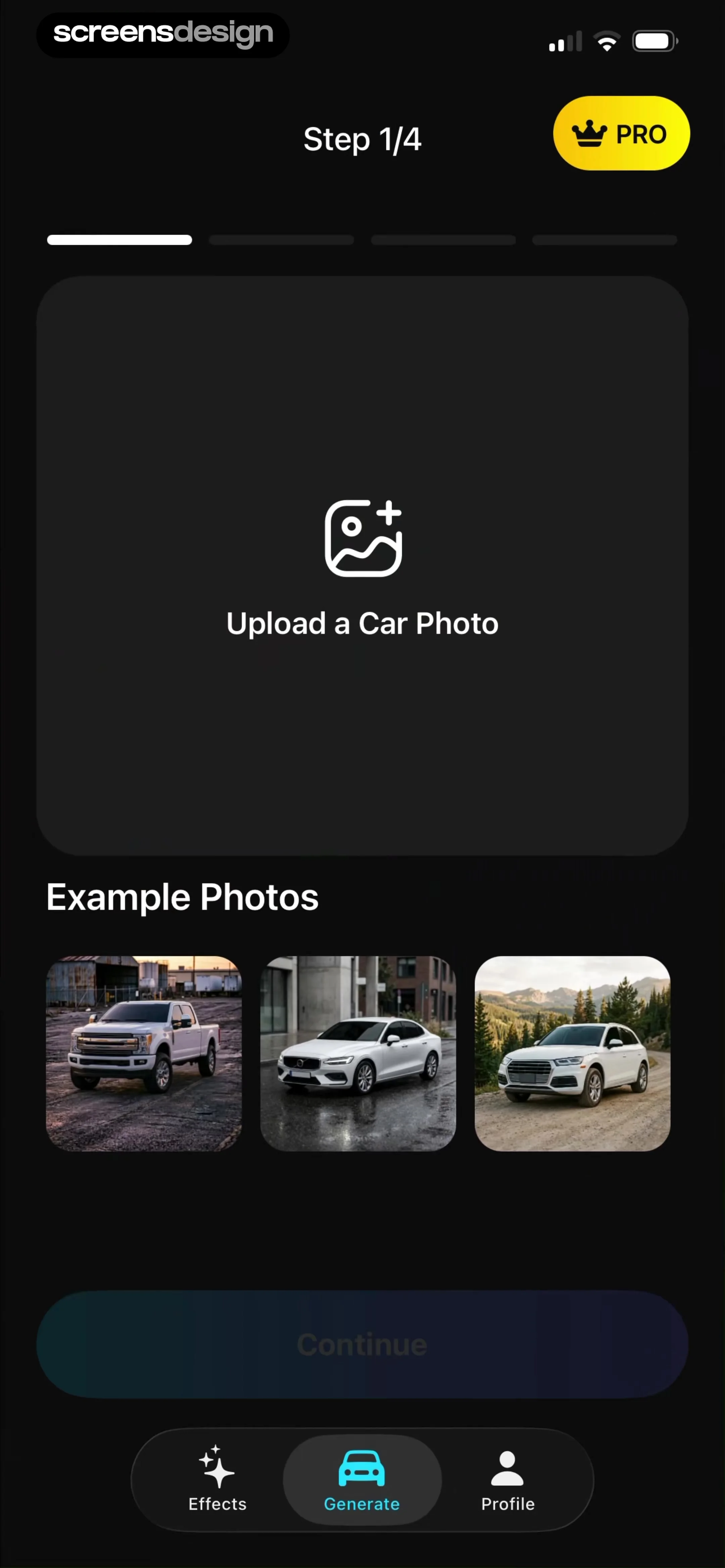
GoPhoto:AI Photo & Video Maker: Top header with upgrade/search, followed by a row of tool icons, a horizontal category filter, and a multi-column grid of image templates, ending with a bottom navigation bar.GoPhoto:AI Photo & Video Maker: Top navigation bar followed by a 2x3 grid of portrait images.GoPhoto:AI Photo & Video Maker: Top navigation bar, central image display with overlay, bottom action bar.

Generating images

Vivino: Drink The Right Wine: Header with title, system message text, empty chat area, and bottom input field with keyboard.Vivino: Drink The Right Wine: Header, system message, chat history, topic selection card, bottom input bar.Vivino: Drink The Right Wine: Top navigation bar followed by a search bar and a vertical list of action buttons.

Getting help

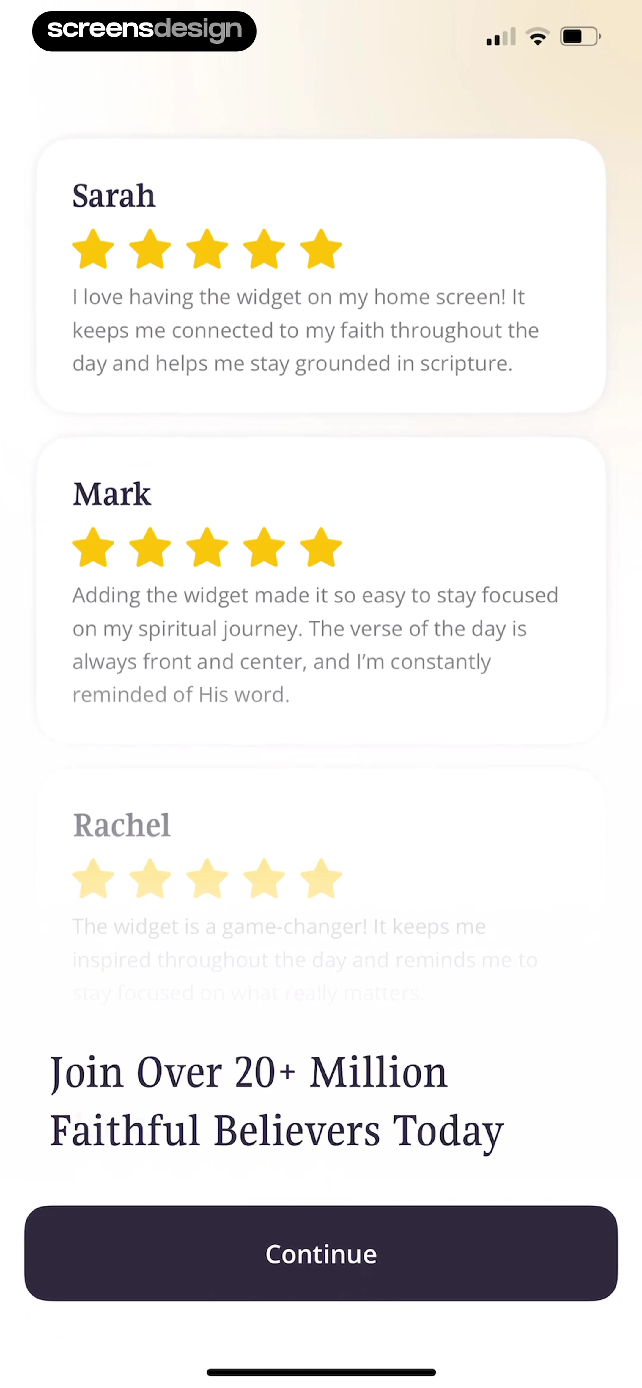
BuyBye - Budget Planner: Top back button, header text, large star rating graphic, list of testimonial cards, and a bottom 'Next' button, with a centered modal overlay.BuyBye - Budget Planner: A modal overlay centered on a page containing a header, a list of user reviews, and a bottom navigation button.Eppika: Read & Learn Languages: A list-based settings page with a centered modal dialog overlaying the content.

Giving feedback

CamScanning: AI Measure & Scan: Top header with mode selector, central camera viewfinder with overlay instructions, and a bottom control bar with primary scan button and secondary tools.CamScanning: AI Measure & Scan: Top navigation bar, central square viewfinder, side capture button, bottom mode toggle.CamScanning: AI Measure & Scan: Top navigation bar, central image preview with label, text description below, and bottom action bar.

Identifying objects

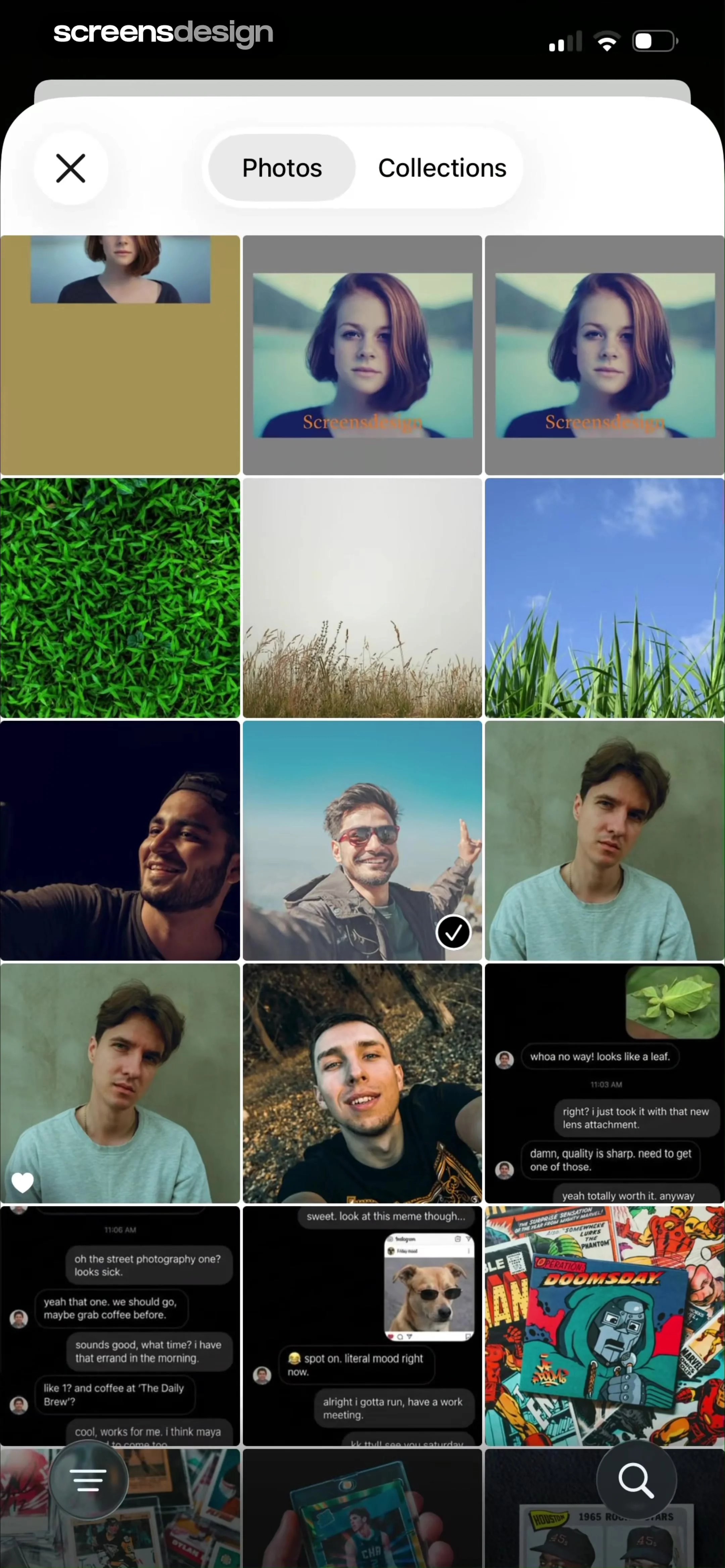
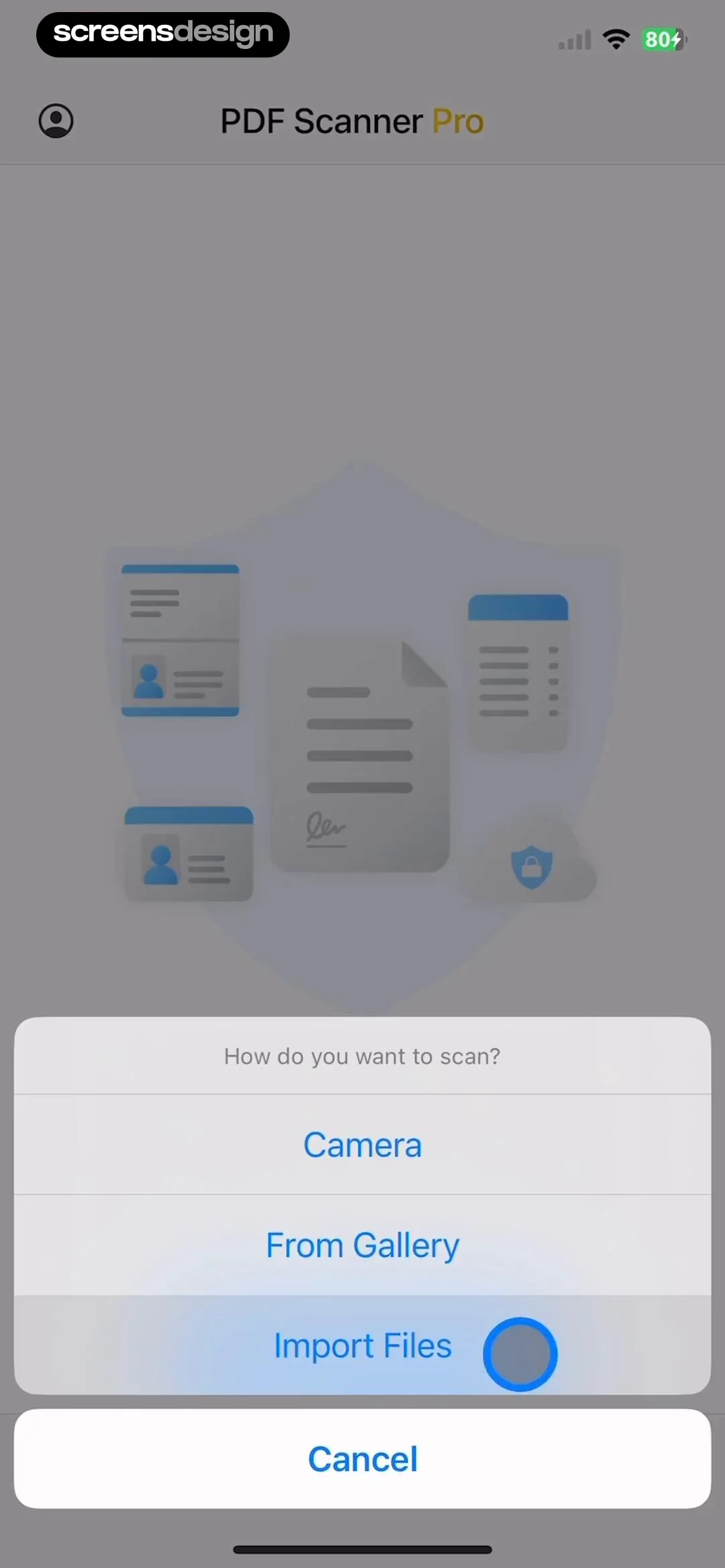
AI Summary - Meeting Notes: A modal overlay centered on a dashboard screen containing a header, navigation tabs, and a list of notes.AI Summary - Meeting Notes: Top navigation with cancel button, followed by a title, a text input field, and a language selection card.AI Summary - Meeting Notes: Top navigation bar with Cancel, header title, input field, language selection card, and a centered system permission modal.

Importing files and media

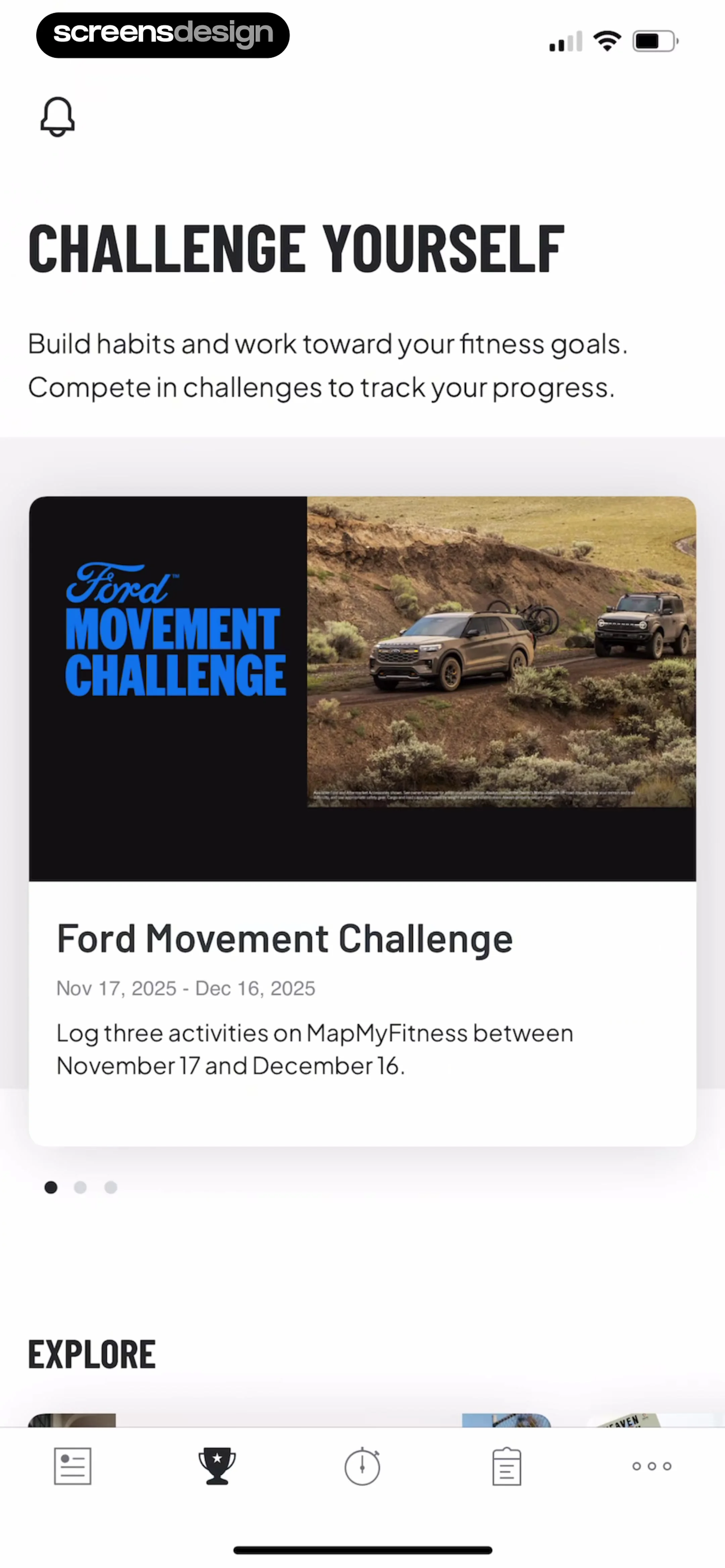
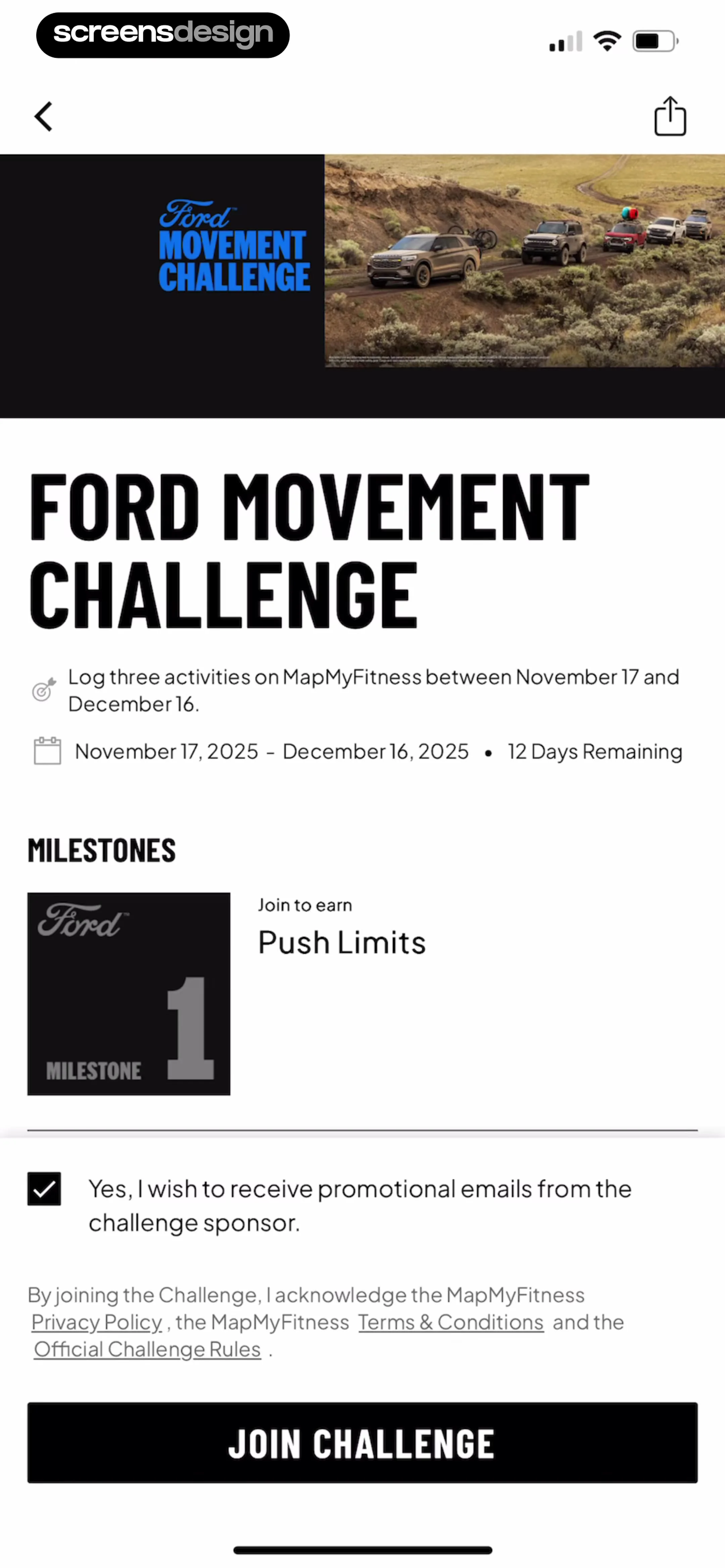
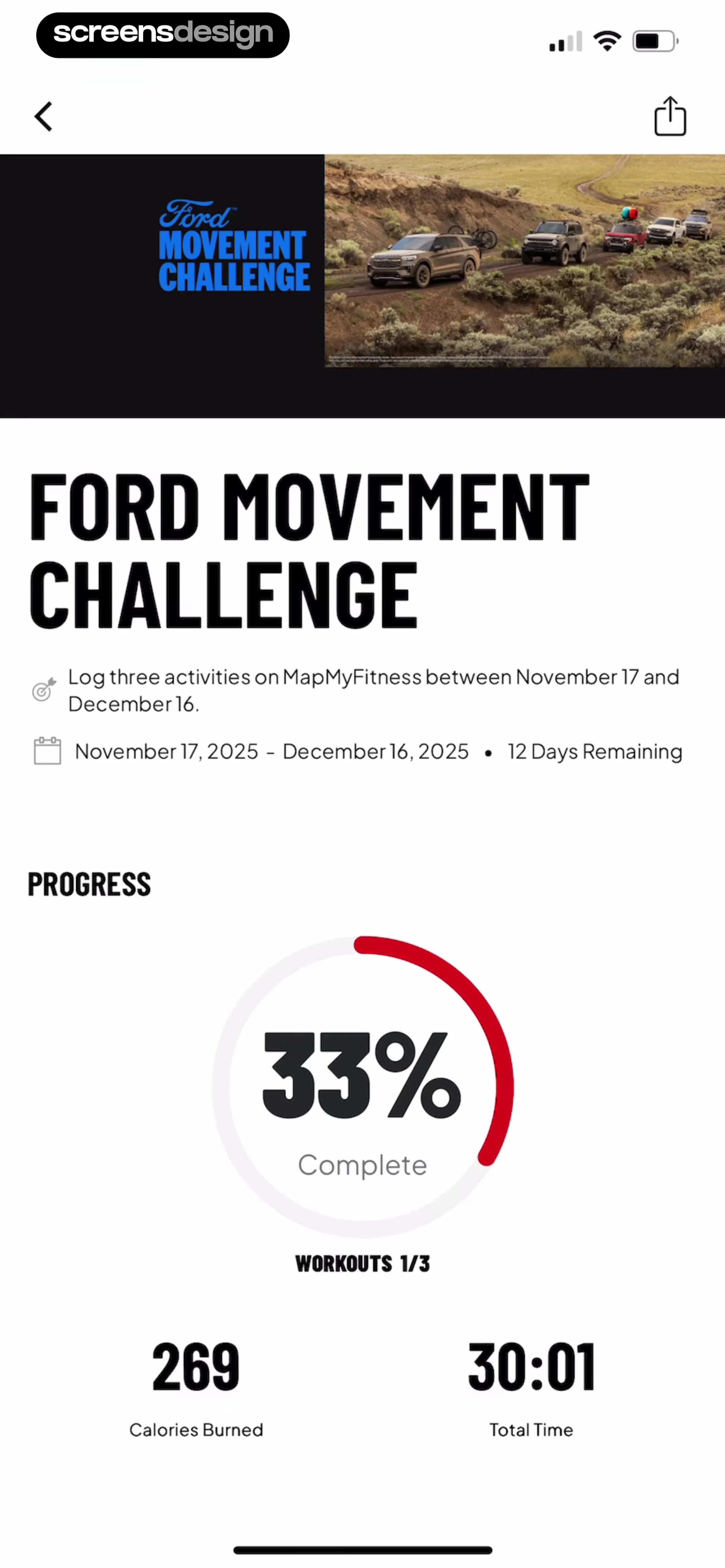
Map My Run GPS Running Tracker: Header with title and description, followed by a featured challenge card, pagination dots, and an explore section header.Map My Run GPS Running Tracker: Header image and branding at the top, followed by challenge description, milestones section, legal text with checkbox, and a full-width bottom CTA button.Map My Run GPS Running Tracker: Top header image, followed by challenge title, requirements, progress circular chart, and bottom metrics.

Joining communities and challenges

Particle: Personalized News: Top header with greeting and audio prompt, followed by a large hero news card, a section header, and a horizontal carousel of news cards.Particle: Personalized News: Top section for current track, middle section for queue list, bottom section for playback controls and utility bar.Particle: Personalized News: Top 'Now Playing' section, followed by a scrollable 'Playing Next' list, and a fixed bottom playback control bar.

Listening to audio

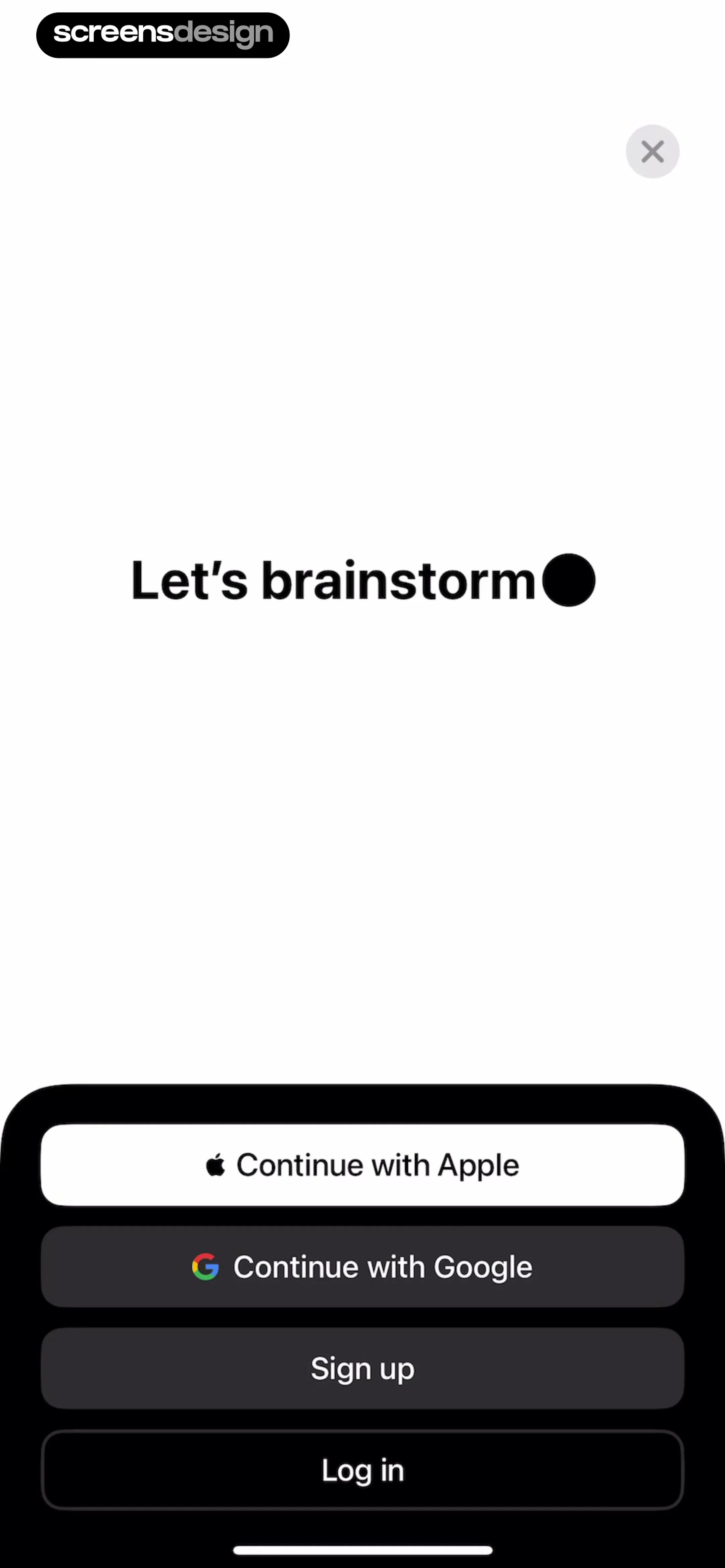
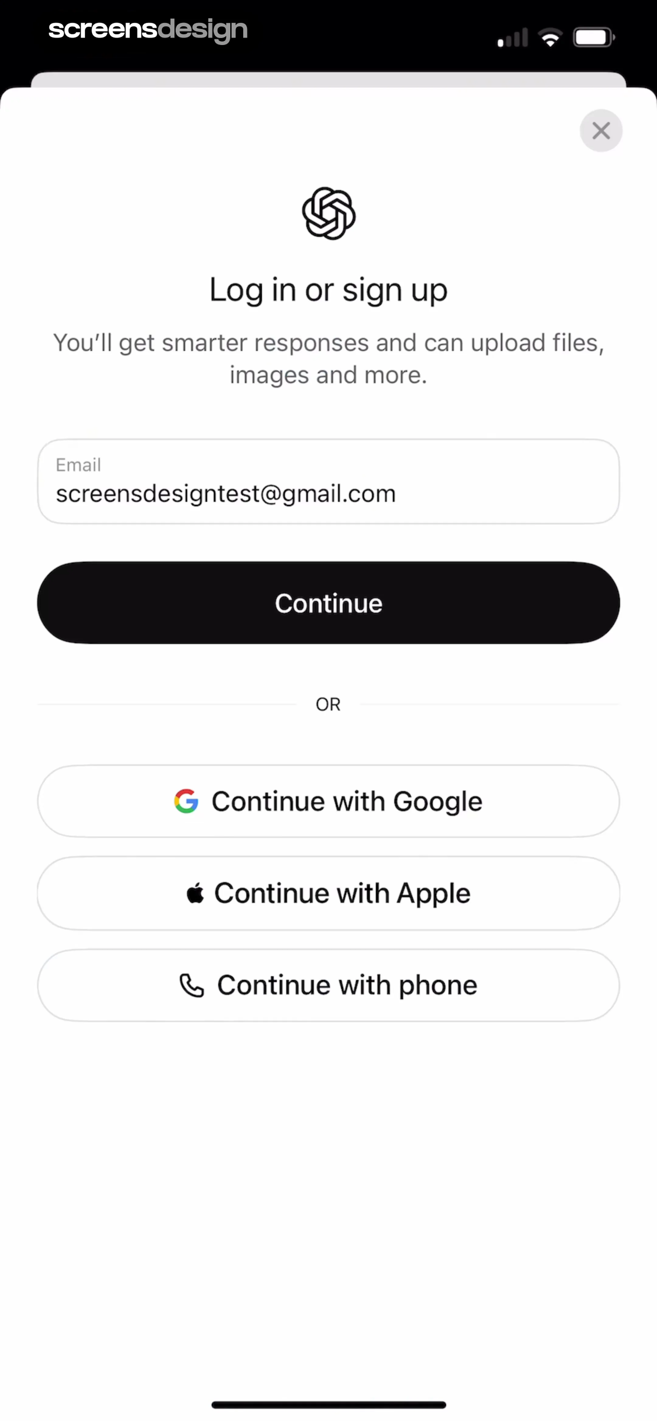
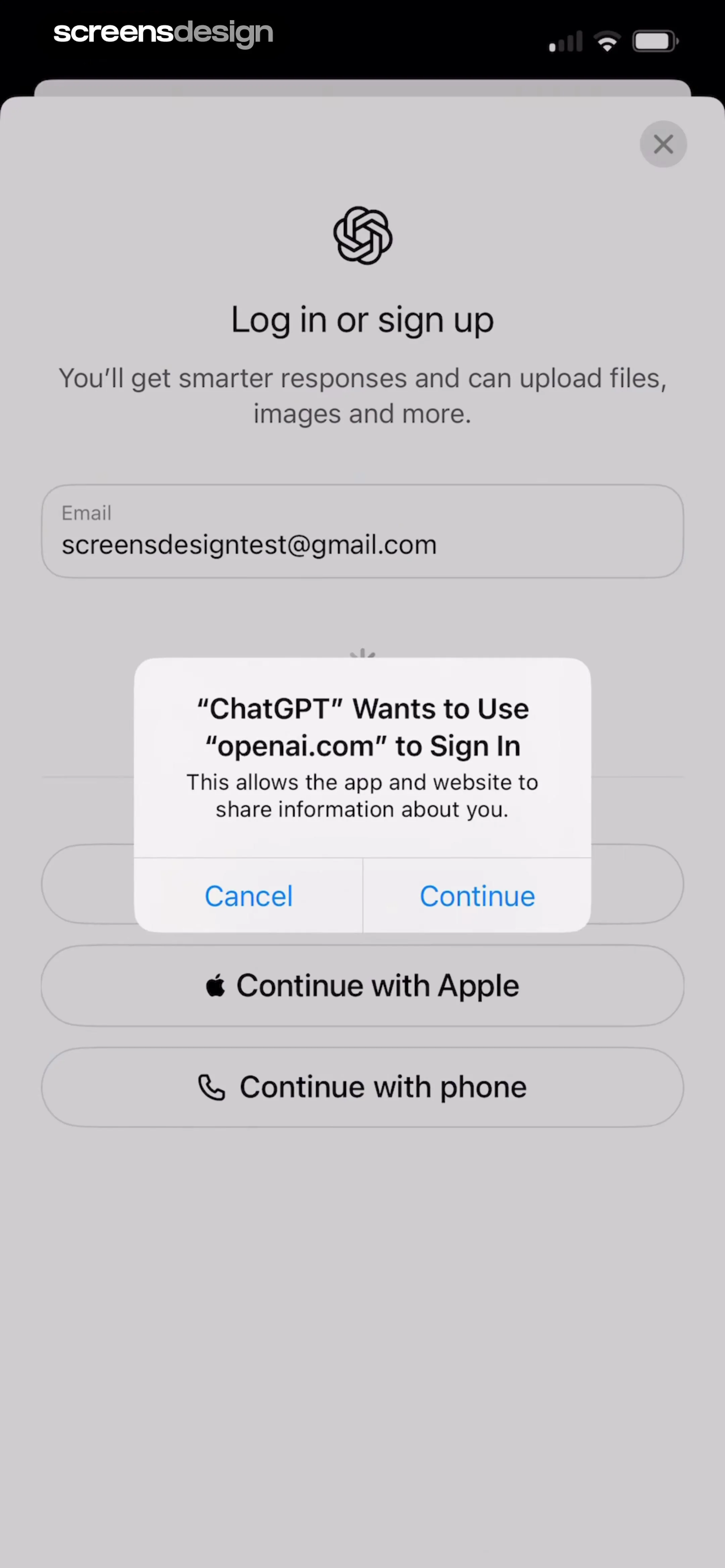
ChatGPT: The screen is divided into a large empty white space at the top containing the main heading, and a dark, rounded bottom panel containing the authentication options.ChatGPT: A centered modal window containing a logo, header text, email input field, primary action button, an 'OR' divider, and three secondary social login buttons.ChatGPT: A centered system modal overlaying a background login screen containing a logo, text, and multiple sign-in options.

Logging in

Klook: Travel & Activities: Header with title, main cart item list, 'Often booked together' horizontal product list, and a sticky bottom checkout bar.Klook: Travel & Activities: Top navigation bar, followed by a cart item list, a cross-sell section with product cards, and a bottom checkout bar.Zalando – Online fashion: Header with title, followed by a scrollable list of parcel groups containing product cards, ending with a fixed summary and checkout button area.

Managing a shopping cart

Blinq: Digital Business Card: Top navigation bar, followed by a color selection row, a card preview area, action buttons for image customization, and a bottom primary action button.Blinq: Digital Business Card: Top navigation bar followed by a vertical list of text input fields for personal details, a reorder instruction, and a list of contact fields with a bottom action button.Blinq: Digital Business Card: Top navigation bar, followed by a reorder instruction, a list of editable contact fields, a section for adding new fields, and a fixed bottom preview button.

Managing contact cards

Fishbrain - Fishing App: Top navigation tabs, followed by a create button, a section header, a horizontal list of group cards, and a bottom navigation bar.Fishbrain - Fishing App: Top navigation tabs, followed by a create button, a section header, a horizontal carousel of group cards, and a bottom navigation bar.Fishbrain - Fishing App: Top navigation bar followed by a photo upload area, text fields, list-style navigation rows, a privacy section with radio buttons, and a bottom action button.

Managing groups

CamScanning: AI Measure & Scan: Header with app name, followed by a 2x2 grid of feature cards, a 'Fun features' list, and a 'Recently Used' section with a tab filter and list items.CamScanning: AI Measure & Scan: Header with logo and icons, followed by a horizontal tab bar, a vertical list of recent items, and a large floating-style action button at the bottom.CamScanning: AI Measure & Scan: Top navigation bar, followed by a horizontal category selector, a central empty state illustration with text, and a primary call-to-action button.

Managing history

Weather Pro · Radar Alerts: Top navigation bar followed by a search input, a location permission request card, and a list of saved locations.Weather Pro · Radar Alerts: Top search bar and location list, with a centered modal error message and a loading spinner below it.Weather Pro · Radar Alerts: Top location and temperature header, followed by an hourly forecast card, a 10-day forecast list card, and a bottom loading indicator.

Managing locations

Equalizer - Volume Booster EQ: The screen features a background album view with a centered album cover and a bottom-anchored modal sheet containing song management options.Equalizer - Volume Booster EQ: A modal sheet with a header containing a cancel button and title, followed by a vertical list of two selectable playlist options.Equalizer - Volume Booster EQ: Top navigation bar, central icon and text input field, bottom system keyboard.

Managing playlists

Klook: Travel & Activities: Header with user info, rewards card, horizontal stats row, vertical list of navigation links, promotional banner, secondary list of links, and bottom navigation bar.Klook: Travel & Activities: A background profile settings list with a centered modal overlay containing form inputs and a primary action button.Klook: Travel & Activities: A list-based settings page with a modal overlay covering the bottom half of the screen.

Managing a profile

v0: Top header with project info, segmented control for tabs, central content area with privacy options, and bottom action buttons.v0: A centered modal window containing a header with project info, a segmented control, a central icon with descriptive text, and a primary action button at the bottom.v0: Top section lists stocks, middle section lists news, bottom section contains navigation bar and a floating modal.

Managing projects

v0: Search bar at top, list of recent items below, modal overlay at bottom, settings and credits at bottom corners.v0: Top search bar, content list in the middle, modal overlay in the center, and bottom account/credit bar.v0: A modal window with a header containing an avatar and username, followed by grouped list sections for Account, Usage, Billing, Notification Settings, and Preview Screen.

Managing settings

SubPilot: Cancel Subscriptions: Top blue header with summary, middle dark section with tabbed lists, bottom navigation bar.SubPilot: Cancel Subscriptions: Top header with subscription info, followed by an alert banner, a details card, a transaction history link, and a bottom action bar.SubPilot: Cancel Subscriptions: Top back button, central card with logo, title, description, and primary button, followed by an 'Or' divider and a secondary manual instruction card.

Managing subscriptions

Expedia: Hotels, Flights, Cars: Header with greeting, followed by three service icons, a flight tracking card, a horizontal trip carousel, and a section for recently viewed items, with a bottom navigation bar.Expedia: Hotels, Flights, Cars: Top navigation bar followed by a grid of interest cards, a horizontal region filter bar, and a vertical list of destination cards.Expedia: Hotels, Flights, Cars: Top image carousel followed by a dark-themed text content block and a bottom information card.

Managing trips

Heyyyy: Stories that text back: Top navigation bar, progress indicator, large empty chat history area, bottom message input bar.Heyyyy: Stories that text back: Top navigation bar, followed by a progress indicator, a central chat history area, and a bottom input bar with an integrated keyboard.Heyyyy: Stories that text back: Top navigation bar, progress bar, chat history area, bottom modal overlay, and bottom text input bar.

Messaging

ScanAny-PDF Scanner App: The screen is a simple splash screen with a centered logo and text label.ScanAny-PDF Scanner App: Top navigation link, central illustration, descriptive text block, primary CTA button, and bottom pagination dots.ScanAny-PDF Scanner App: Top right login link, central illustration, text block in the middle, bottom primary button, and pagination dots at the very bottom.

Onboarding

Good Food: Recipe Finder: Top navigation header, filter tabs, sorting controls, two-column recipe card grid, and bottom navigation bar.Good Food: Recipe Finder: Top navigation tabs, sorting controls, two-column grid of recipe cards, bottom navigation bar.Good Food: Recipe Finder: A modal overlay centered on a background page containing a header, tab navigation, and a grid of recipe cards.

Organizing collections

ScanAny-PDF Scanner App: Top navigation bar, followed by a promotional banner, a 'My Documents' header with utility icons, a vertical list of document cards, and a floating action button at the bottom.ScanAny-PDF Scanner App: Top navigation bar, promotional banner, document list, and a centered modal overlay with a grid of action icons.ScanAny-PDF Scanner App: Header with app name and selection, promotional banner, document list, and a floating action button at the bottom, with a centered modal overlay.

Organizing documents

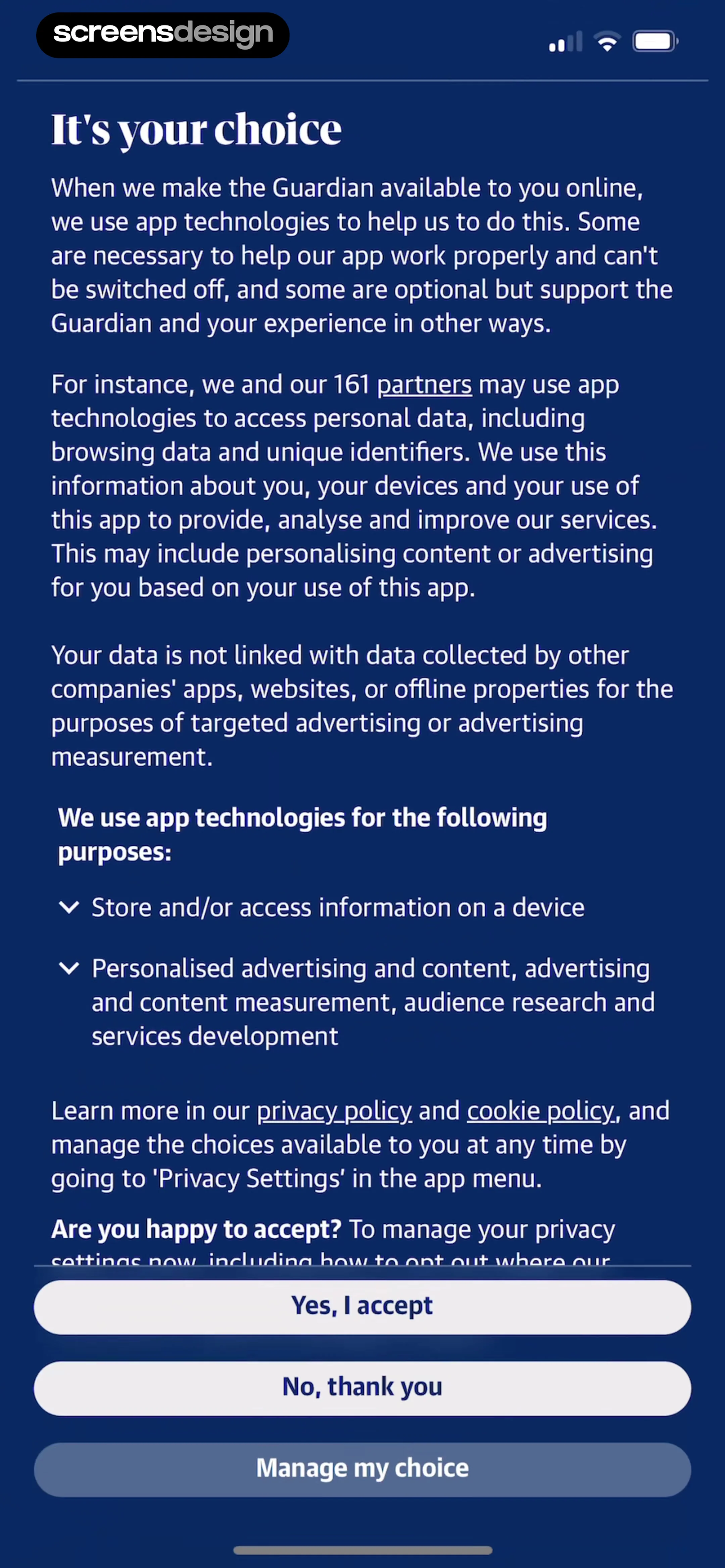
The Guardian - US & World News: Top navigation bar, hero image, article title and body text, author follow section, bottom navigation bar.The Guardian - US & World News: Top navigation bar, hero image, article title and body text, author follow section, bottom navigation bar.The Guardian - US & World News: Header with author name and follow controls, followed by a vertical list of article cards with images and text.

Personalizing content

Windy.app — Wind, Tides, Radar: A modal window centered on the screen containing a header with a close button and a vertical list of three action items.Windy.app — Wind, Tides, Radar: Top map area, followed by transport mode tabs, route input fields, and a bottom primary action button.Windy.app — Wind, Tides, Radar: Top search bar followed by a vertical list of two location selection options.

Planning routes

Debatium - Couple Game Convo: Top navigation bar followed by a vertical list of category cards, with a large horizontal button near the bottom.Debatium - Couple Game Convo: A centered modal card on a dark background with a close button at the top right.Debatium - Couple Game Convo: A centered white modal card on a dark background with a close button at the top right.

Playing games

Vivino: Drink The Right Wine: Top bar with close and done buttons, followed by wine product info, a large circular rating slider in the center, and a text input field at the bottom.Vivino: Drink The Right Wine: Top navigation bar with close and done buttons, followed by a rating display, a large text input area, secondary action buttons, and a system keyboard at the bottom.Vivino: Drink The Right Wine: Top navigation bar, followed by a rating and text input area, then a section for tagging and flavor selection, and finally a scrollable list of flavor tags.

Rating and reviewing content

Particle: Personalized News: Header with greeting and profile, followed by a large hero news card, a section header, and a horizontal carousel of smaller news cards, with a fixed bottom navigation bar.Particle: Personalized News: Top hero image with headline, followed by a bulleted summary list, and a bottom section for article count and interaction.Particle: Personalized News: Top hero image with headline, followed by a publisher spectrum info card, then a bulleted list of summary points, and a floating action button at the bottom.

Reading articles and stories

Voice Recorder-Audio Memos Арр: Header at the top, search bar below, central illustration, and two primary action buttons at the bottom.Voice Recorder-Audio Memos Арр: The screen is vertically organized with a title at the top, a large waveform visualization in the middle, a digital timer below that, and a control bar at the bottom.Voice Recorder-Audio Memos Арр: Top bar with file name and Done button, central waveform visualization, and a bottom-anchored modal for sharing options.

Recording audio

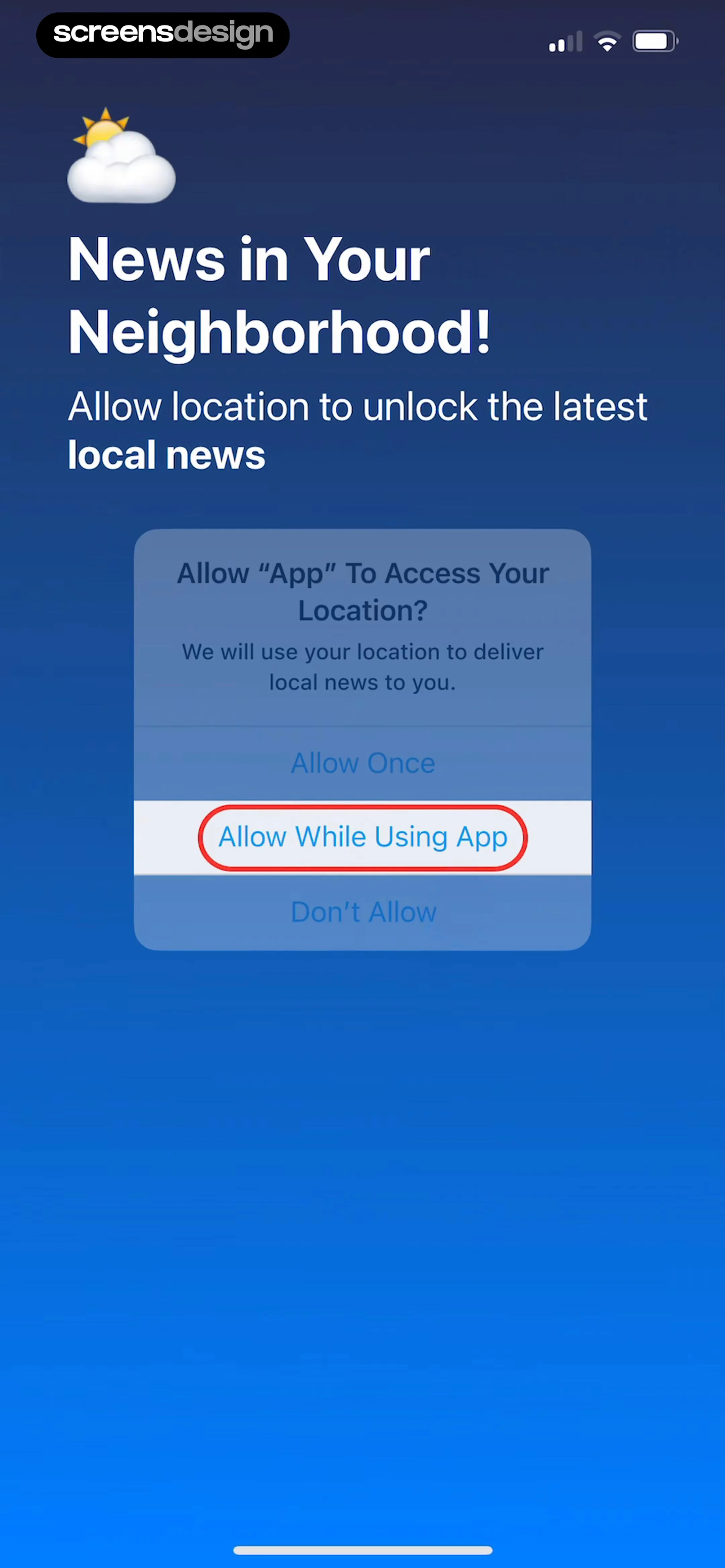
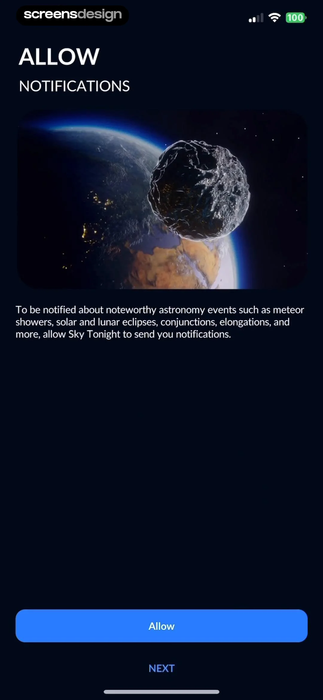
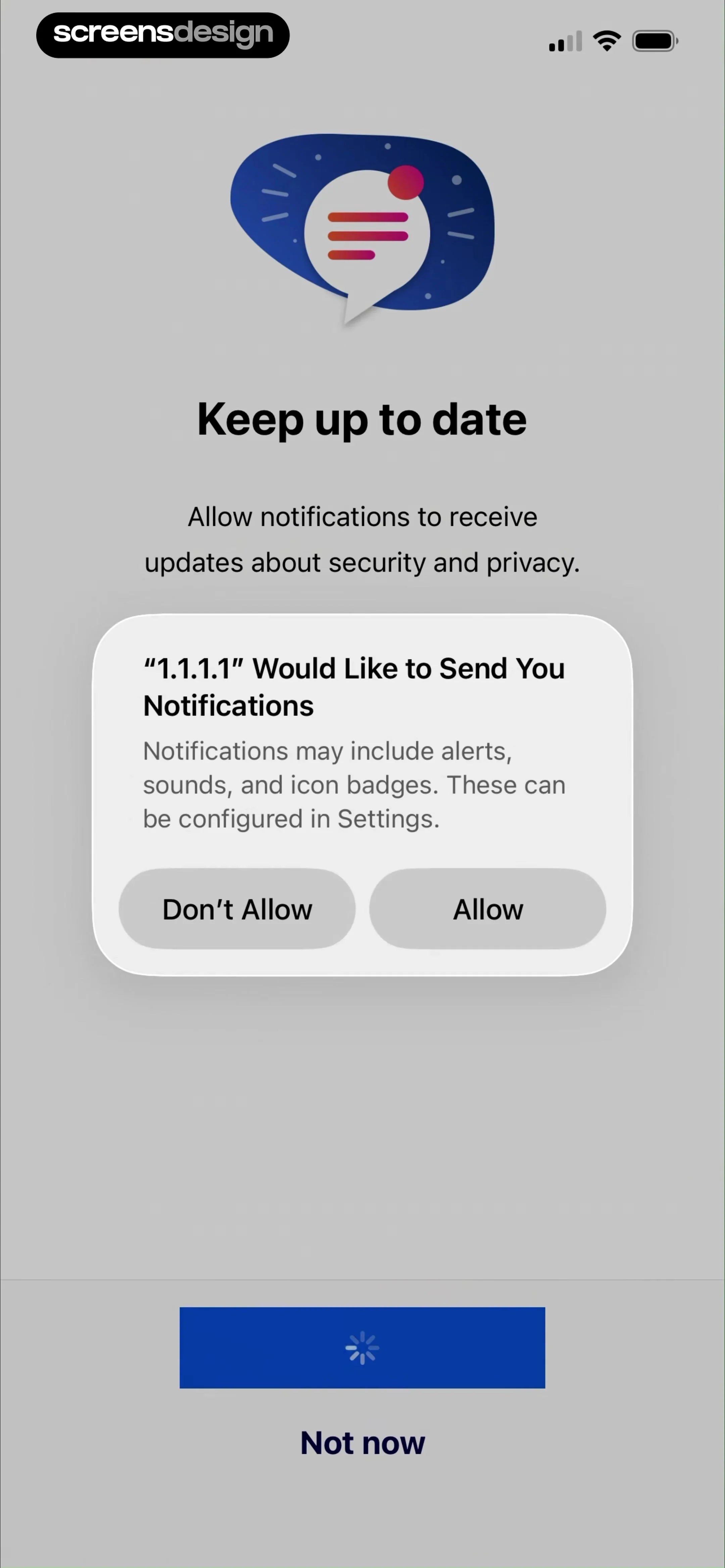
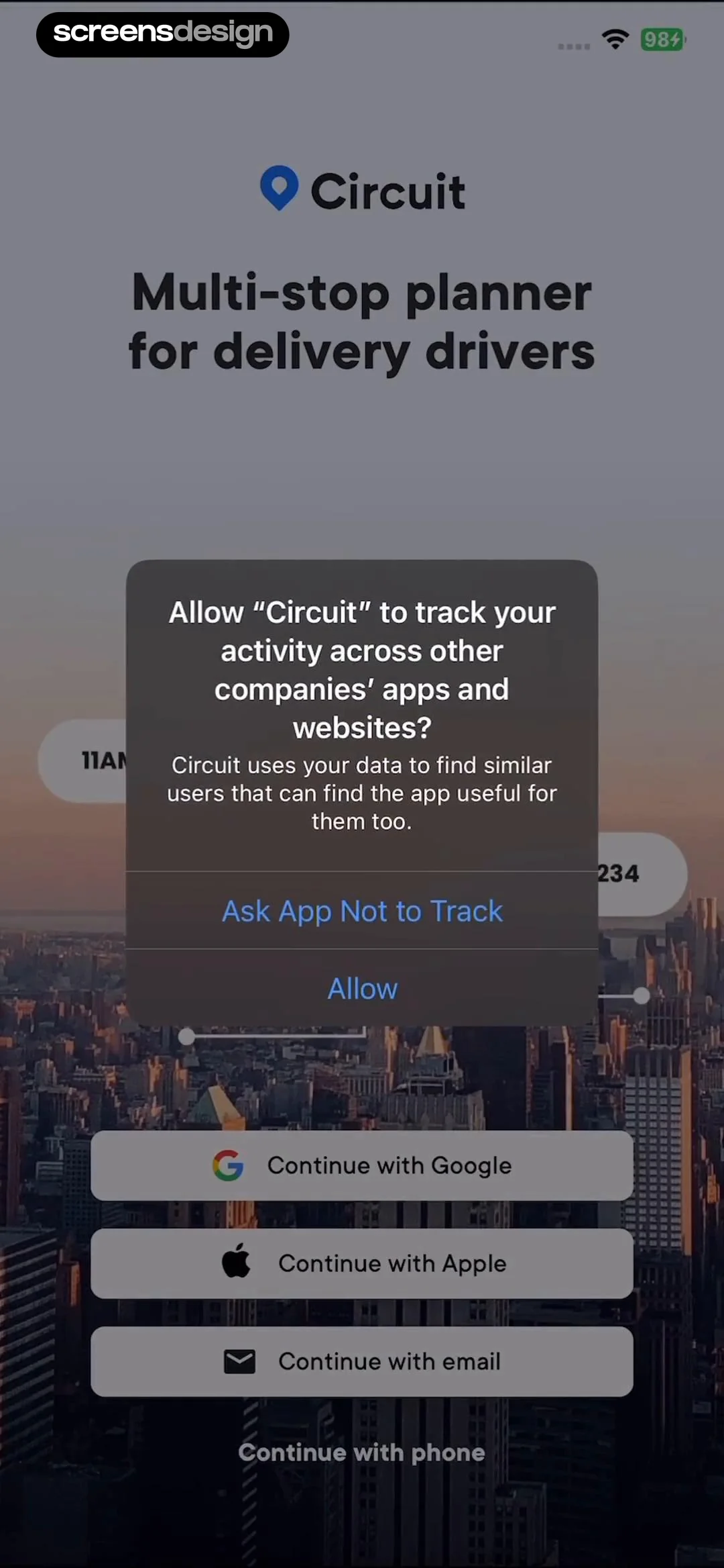
Hypelist: Create & Share Lists: Top navigation bar with progress indicator, centered title and subtitle, vertical list of three permission cards, and a large bottom action button.Hypelist: Create & Share Lists: Header text at top, list of permission toggles in the middle, system modal overlay in the center, and a large button at the bottom.Hypelist: Create & Share Lists: Top section with contact avatars and count, middle section with explanatory text, bottom section with two primary action buttons.

Requesting permissions

Vrbo Vacation Rentals: Top image carousel, middle property title and rating, highlights card, and bottom persistent booking bar.Vrbo Vacation Rentals: Top navigation bar followed by a promotional card, detailed property information list, and a sticky bottom booking footer.Vrbo Vacation Rentals: Top navigation bar followed by booking summary cards, pricing section, host contact button, AI search module, and a sticky bottom booking footer.

Reviewing properties

Scroll The Bible: Top header with title and action button, followed by two categorized list sections containing cards.Scroll The Bible: Top navigation bar followed by a vertical list of study cards.Scroll The Bible: Top close button, title, verse container, followed by a vertical stack of meaning, trivia, and application cards.

Saving items

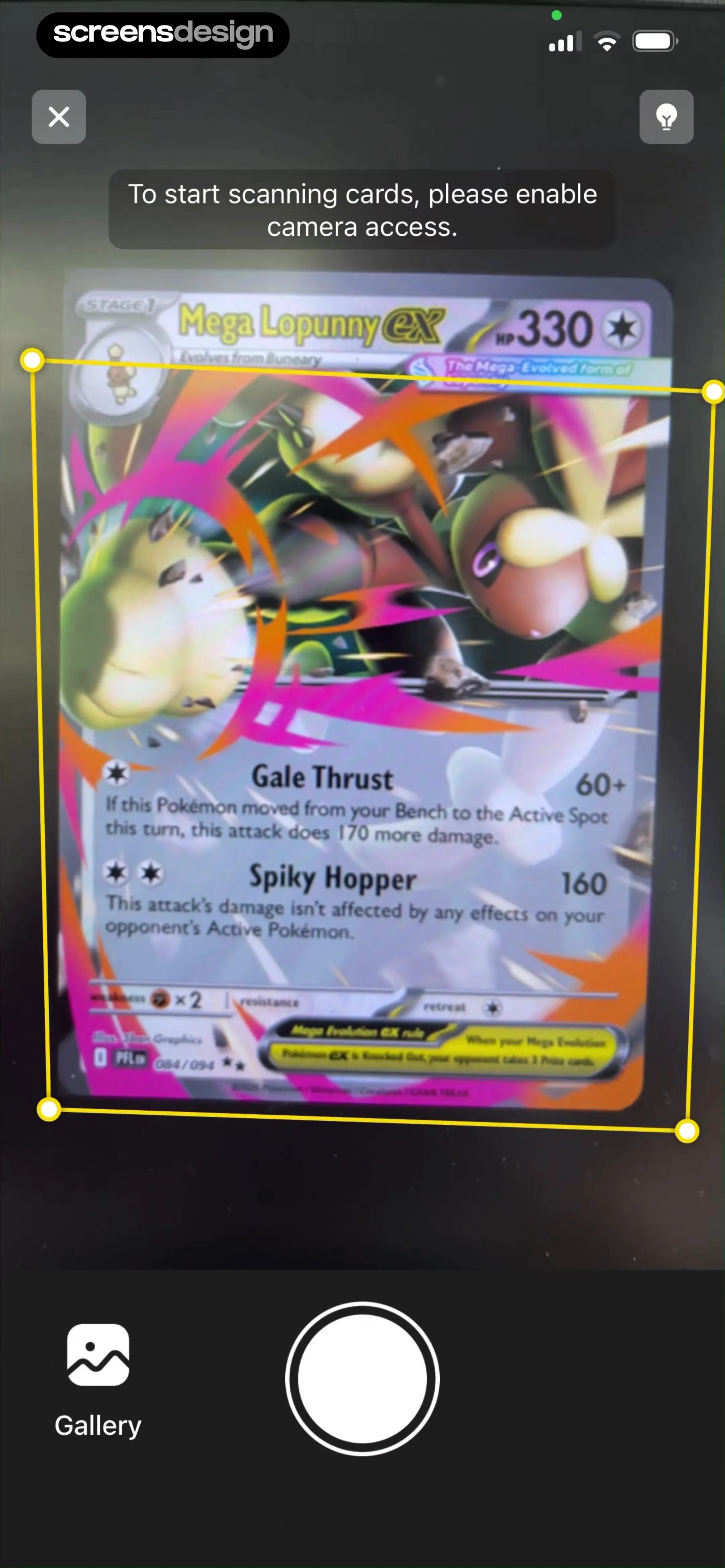
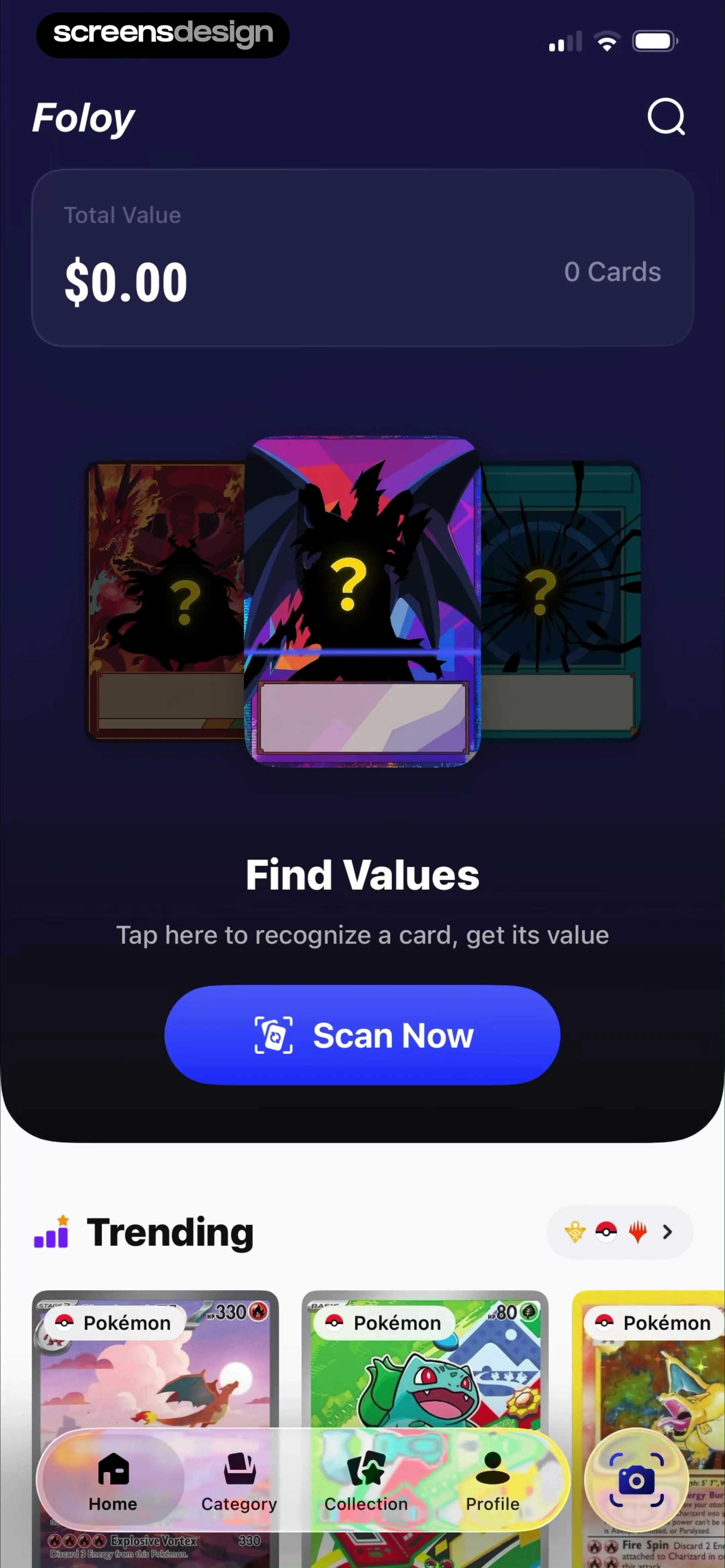
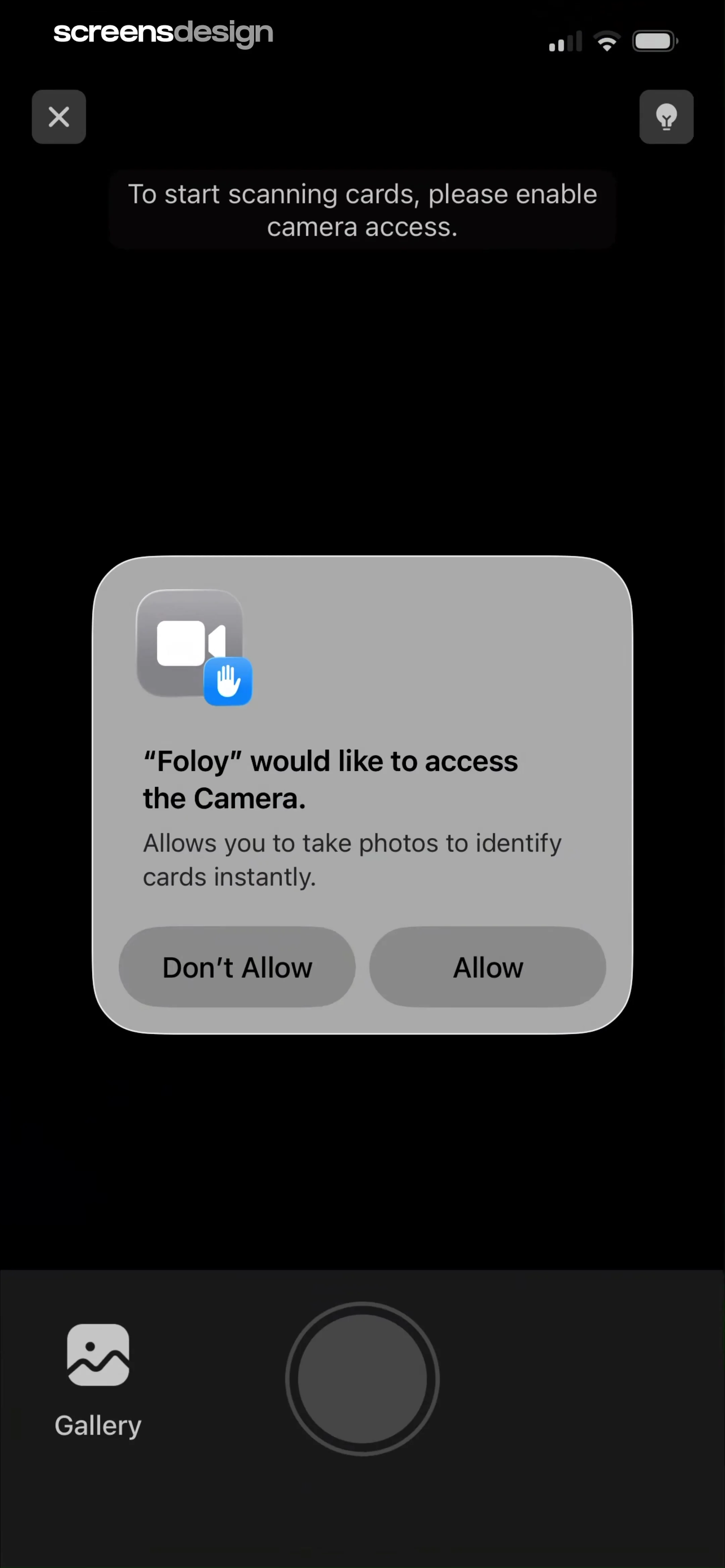
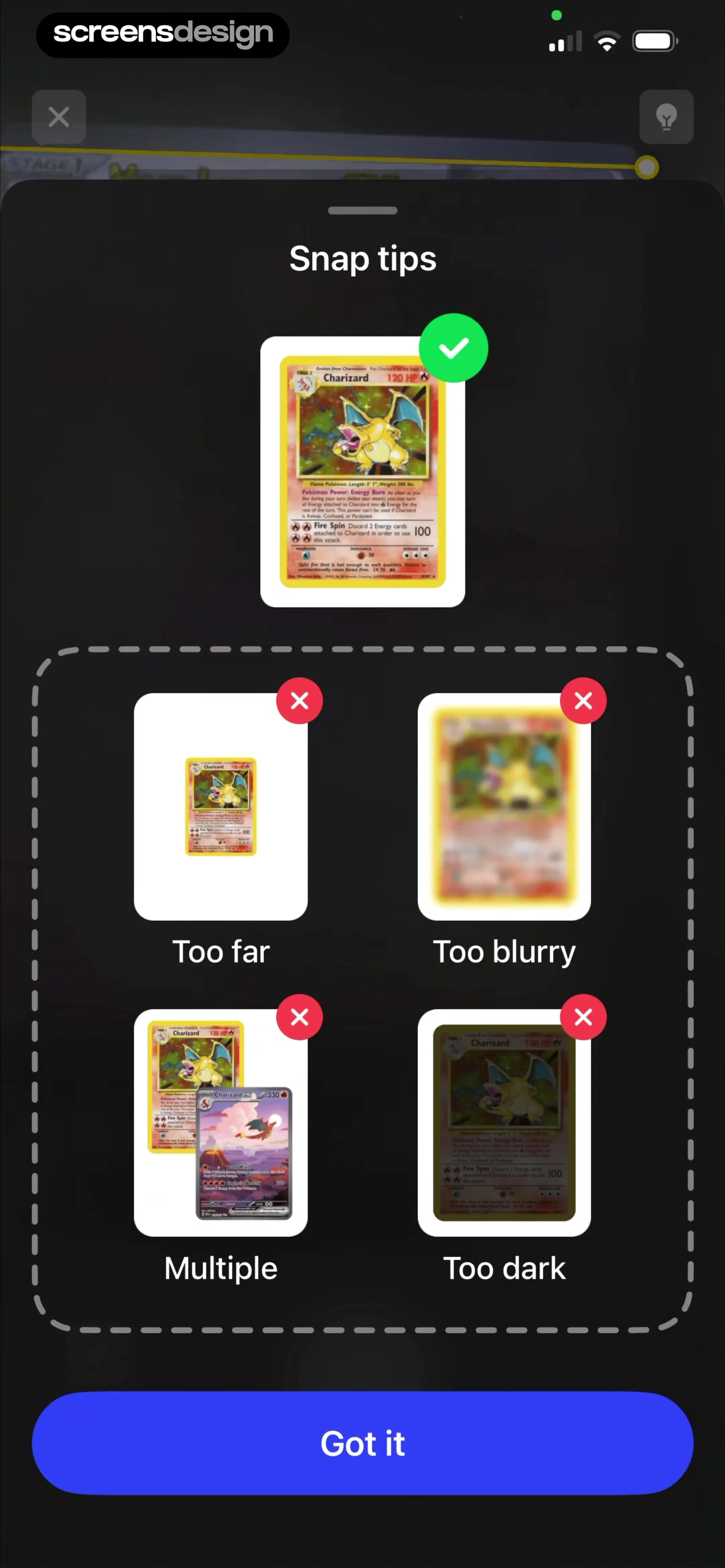
TCG Card Scanner & Value-Foloy: Top header with search, total value summary card, central scan call-to-action, trending cards section, and a persistent bottom navigation bar.TCG Card Scanner & Value-Foloy: A dark camera viewfinder background with a centered system permission modal and a bottom control bar.TCG Card Scanner & Value-Foloy: A centered modal overlay containing a header, a 'good' example, a grid of 'bad' examples, and a bottom action button.

Scanning cards

Tiny Scanner - PDF Scanner App: A central modal box containing instructional text and a primary action button, sitting above a secondary navigation area for scanning modes.Tiny Scanner - PDF Scanner App: Top navigation bar, central educational modal overlaying a document preview, and a bottom toolbar with editing functions.Tiny Scanner - PDF Scanner App: Top navigation bar, central document preview area with crop handles, and a bottom sheet modal containing a list of paper sizes.

Scanning documents

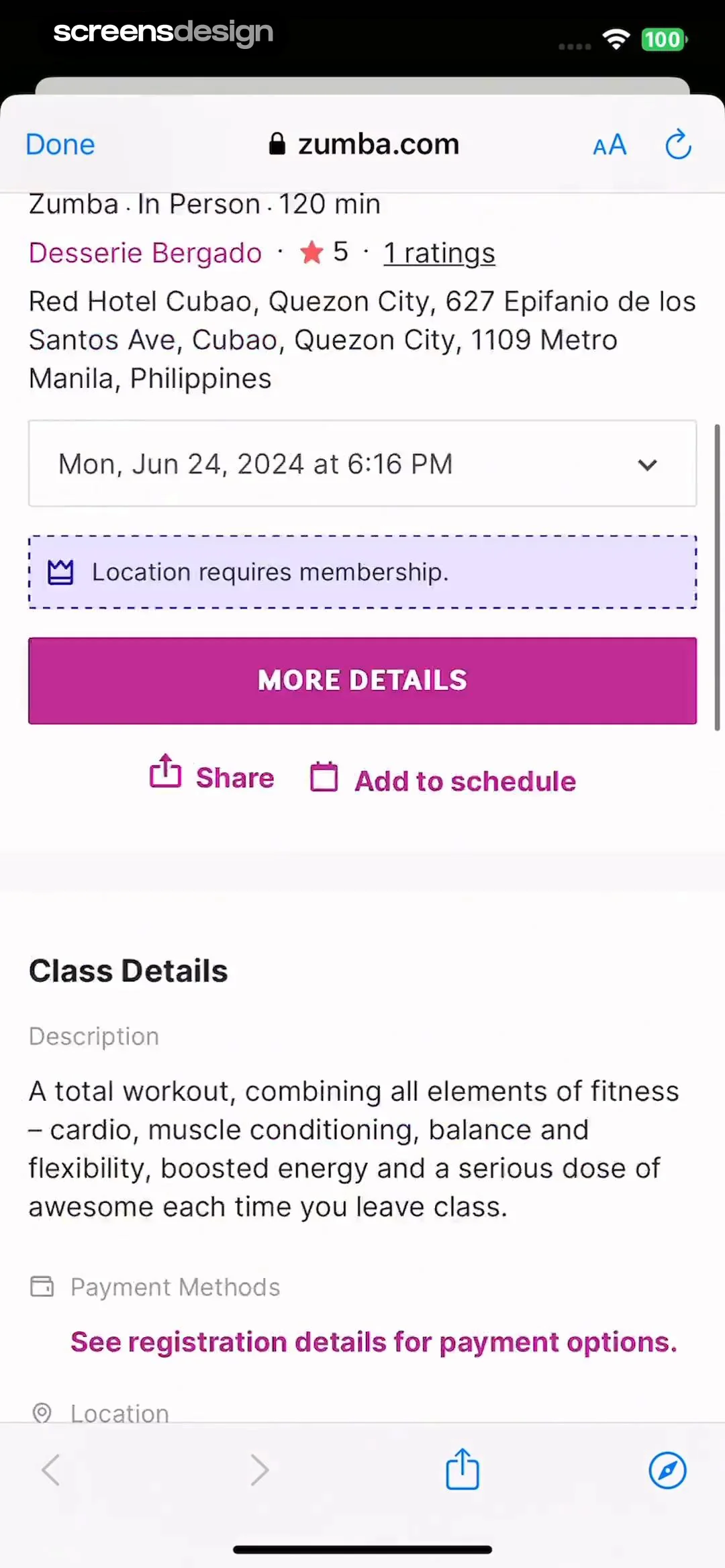
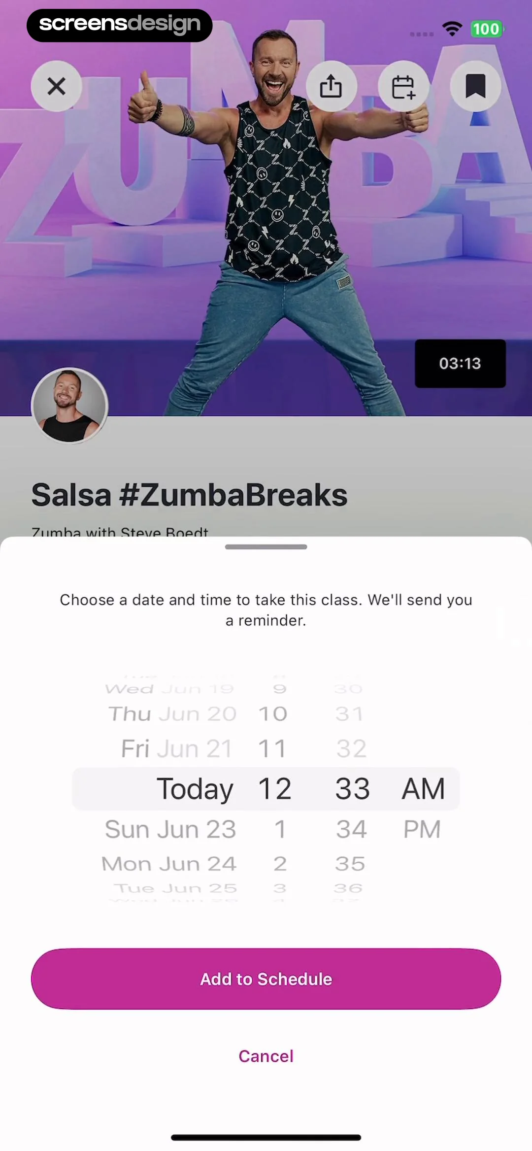
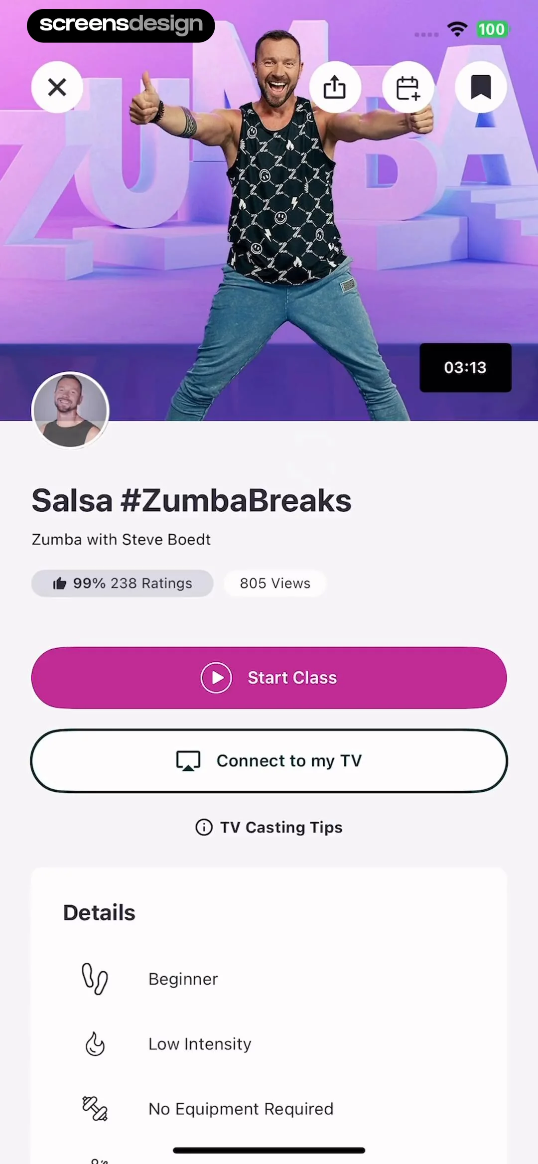
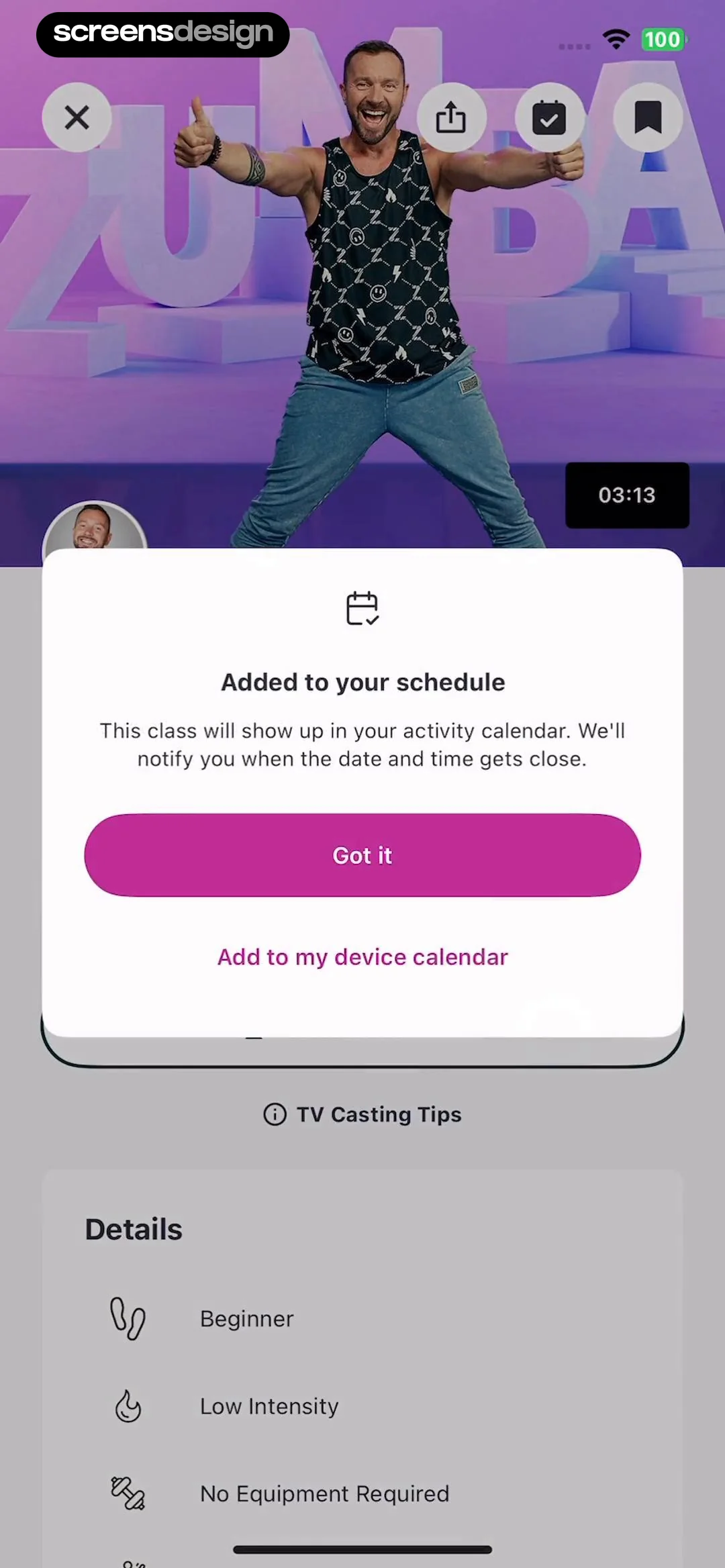
Zumba - Dance Fitness Workout: Top hero image, followed by title and metadata, primary action buttons, and a details list at the bottom.Zumba - Dance Fitness Workout: Video player background with a bottom-anchored modal overlay for scheduling.Zumba - Dance Fitness Workout: A modal overlay centered over a video player and a details list section.

Scheduling reminders

Scanner App: Genius Scan: Top navigation bar, followed by a search input field, and a list of search results below.Scanner App: Genius Scan: Top navigation bar, followed by a search input field, a section header, and a list of tag pills.Scanner App: Genius Scan: Top navigation bar, search input field, central empty state illustration and text, bottom system keyboard.

Searching and filtering

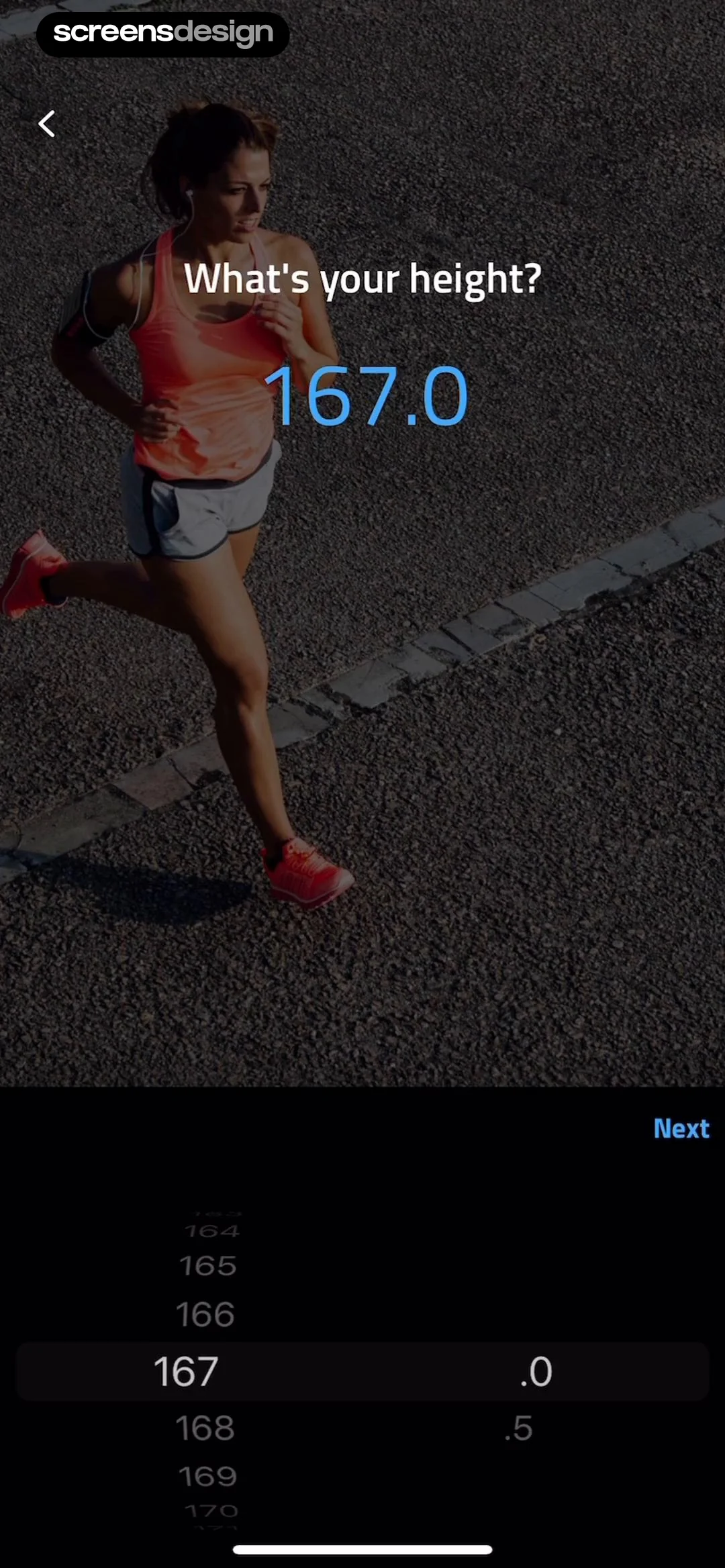
Calorie Counter by Numify: Top progress bar, central icon and data display, explanatory text block, and bottom navigation bar with back and next buttons.Calorie Counter by Numify: Top image, middle text block, bottom navigation row.Calorie Counter by Numify: Progress bar at top, question text, numeric input field, unit toggle, goal suggestion card, navigation buttons, and numeric keypad at the bottom.

Setting goals

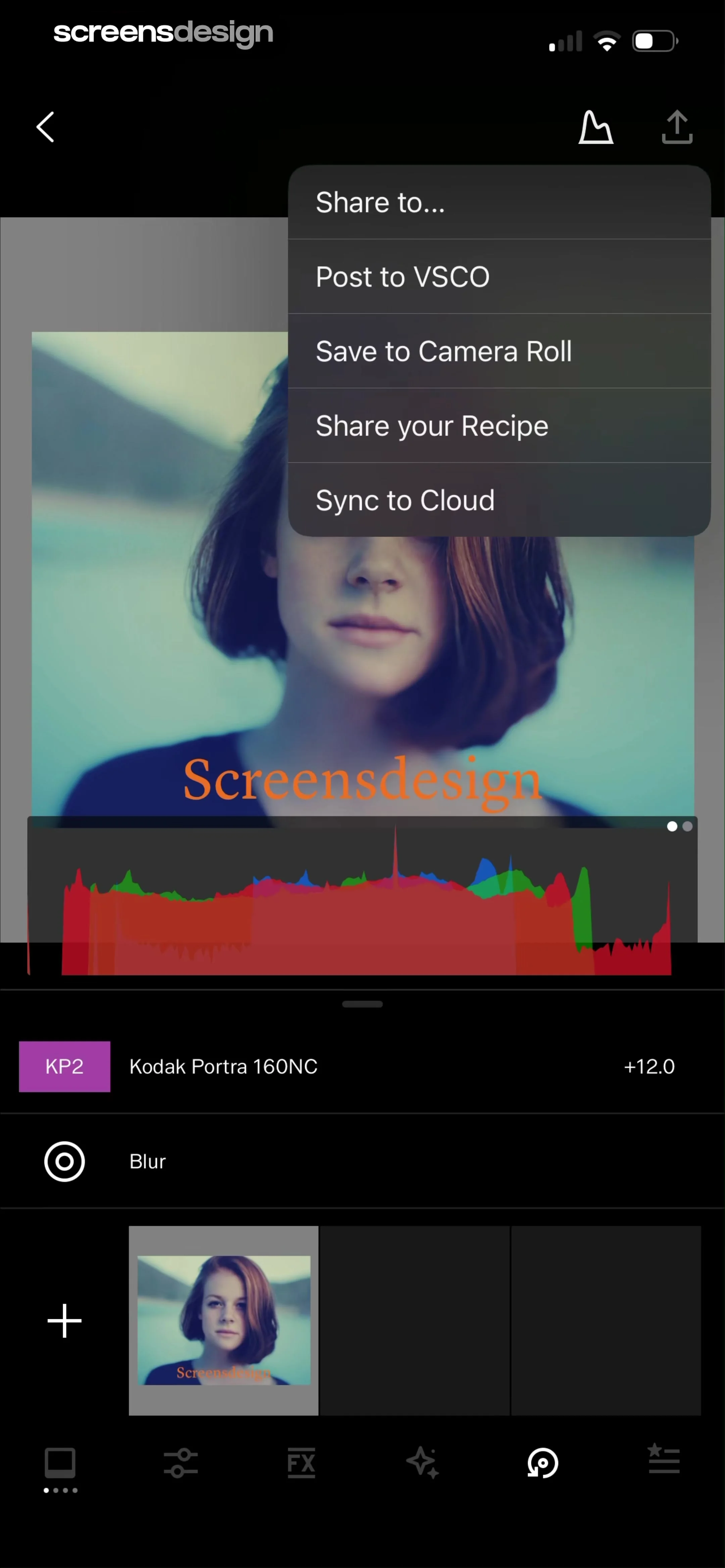
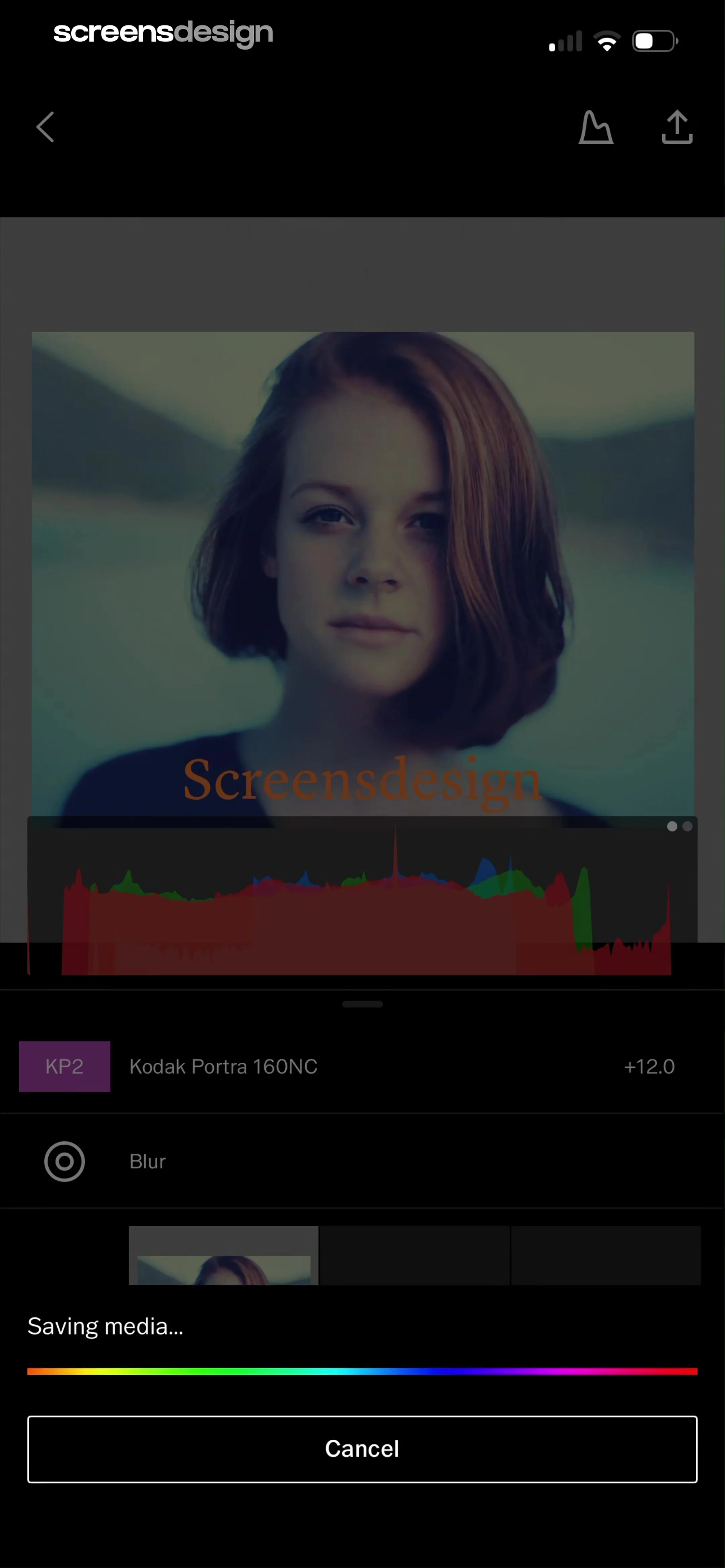
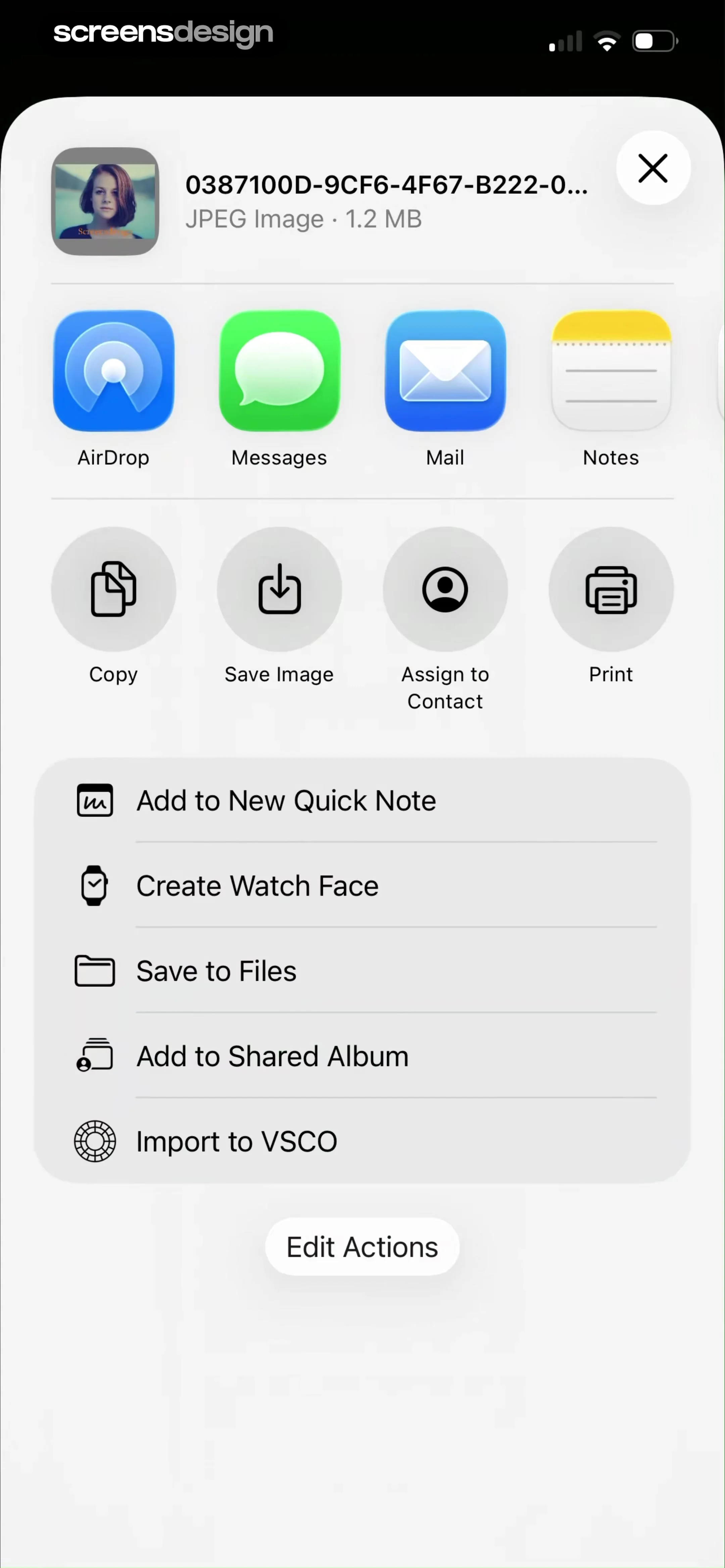
VSCO: Photo & Video Editor: Top navigation bar with share menu, central photo preview with histogram, middle list of applied edits, and bottom navigation bar.VSCO: Photo & Video Editor: Top navigation bar, central image preview with histogram, list of applied filters/adjustments, bottom progress indicator, and a final cancel button.VSCO: Photo & Video Editor: Top header with file info, horizontal app sharing row, grid of action icons, vertical list of secondary actions, and a bottom edit button.

Sharing content

Too Good To Go: Save Good Food: A modal overlay centered on the screen, covering the lower portion of the underlying product detail page.Too Good To Go: Save Good Food: Header with back button and bakery info, payment section, price summary card, legal disclaimer, and bottom action bar with quantity selector and reserve button.Too Good To Go: Save Good Food: Top navigation, store header, payment method selection area, order summary, and bottom action bar with a modal overlay.

Shopping and checkout

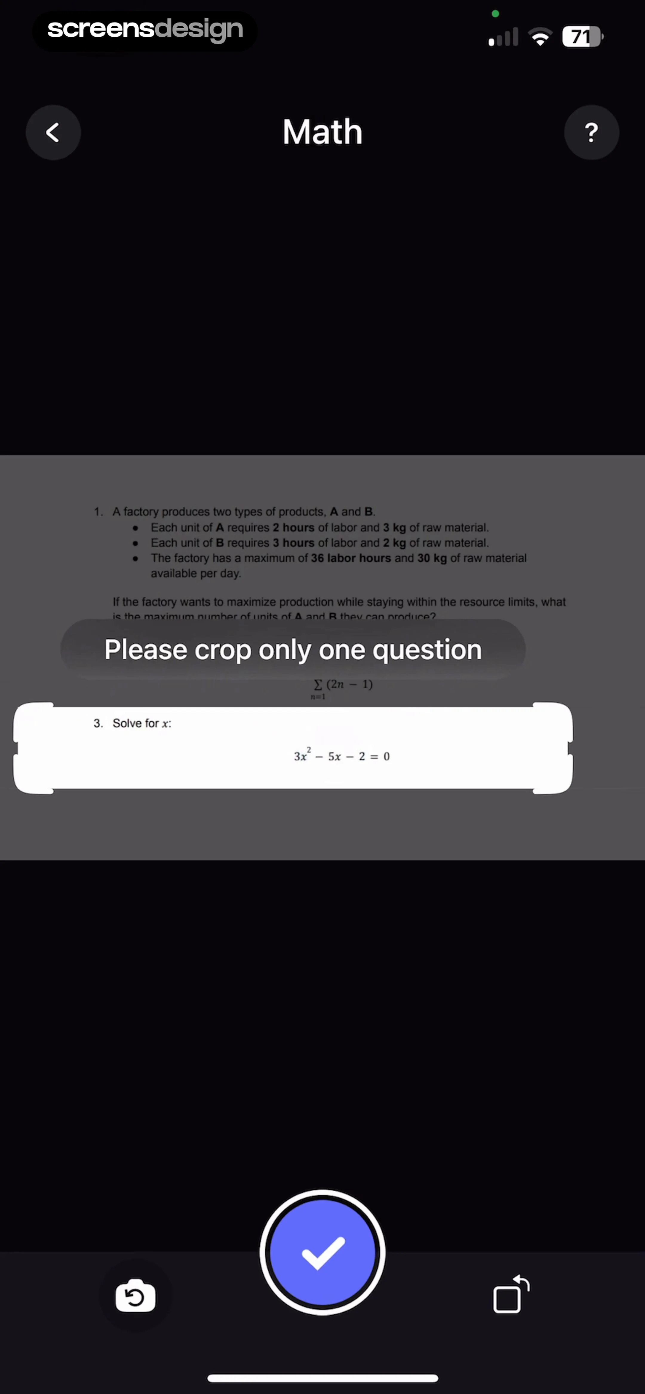
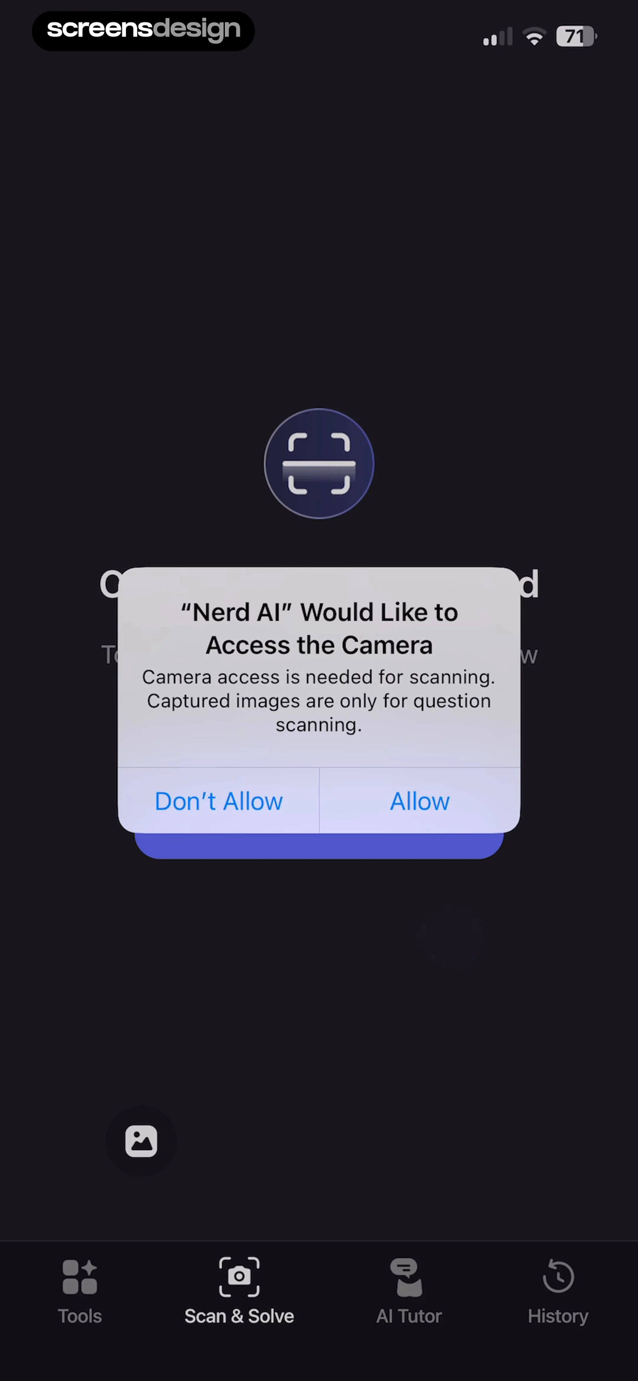
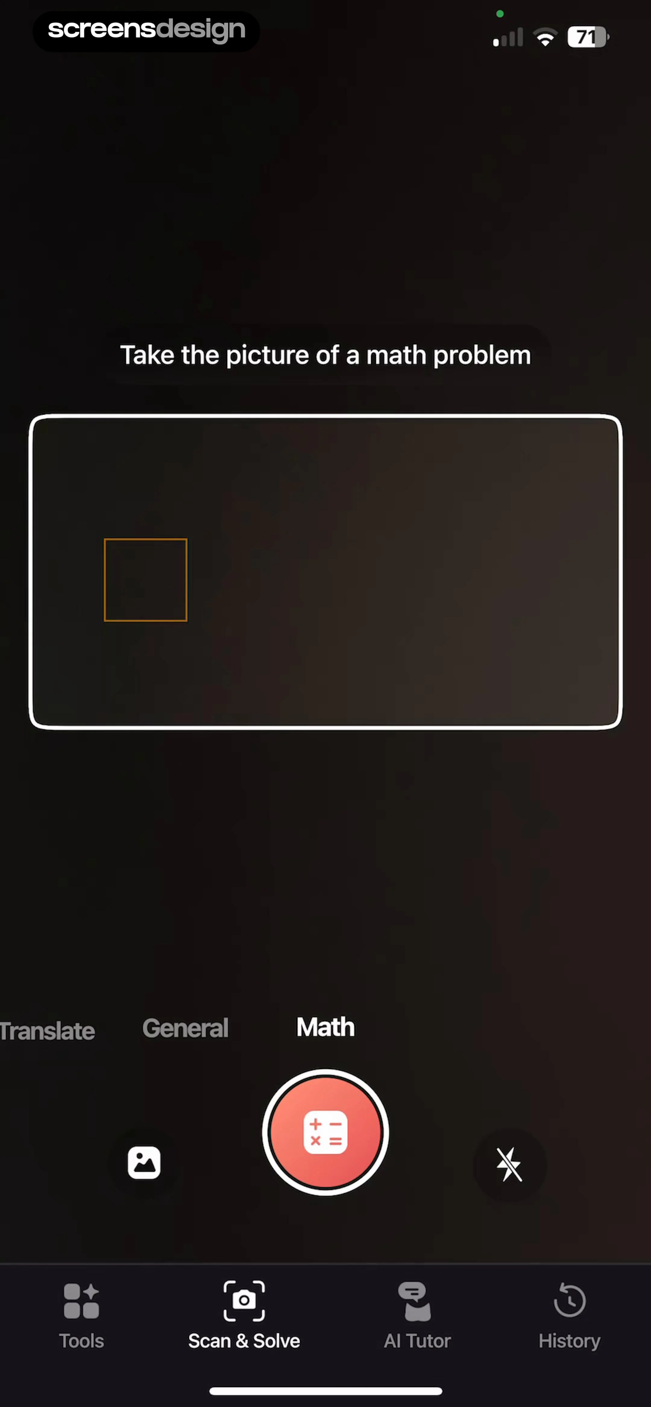
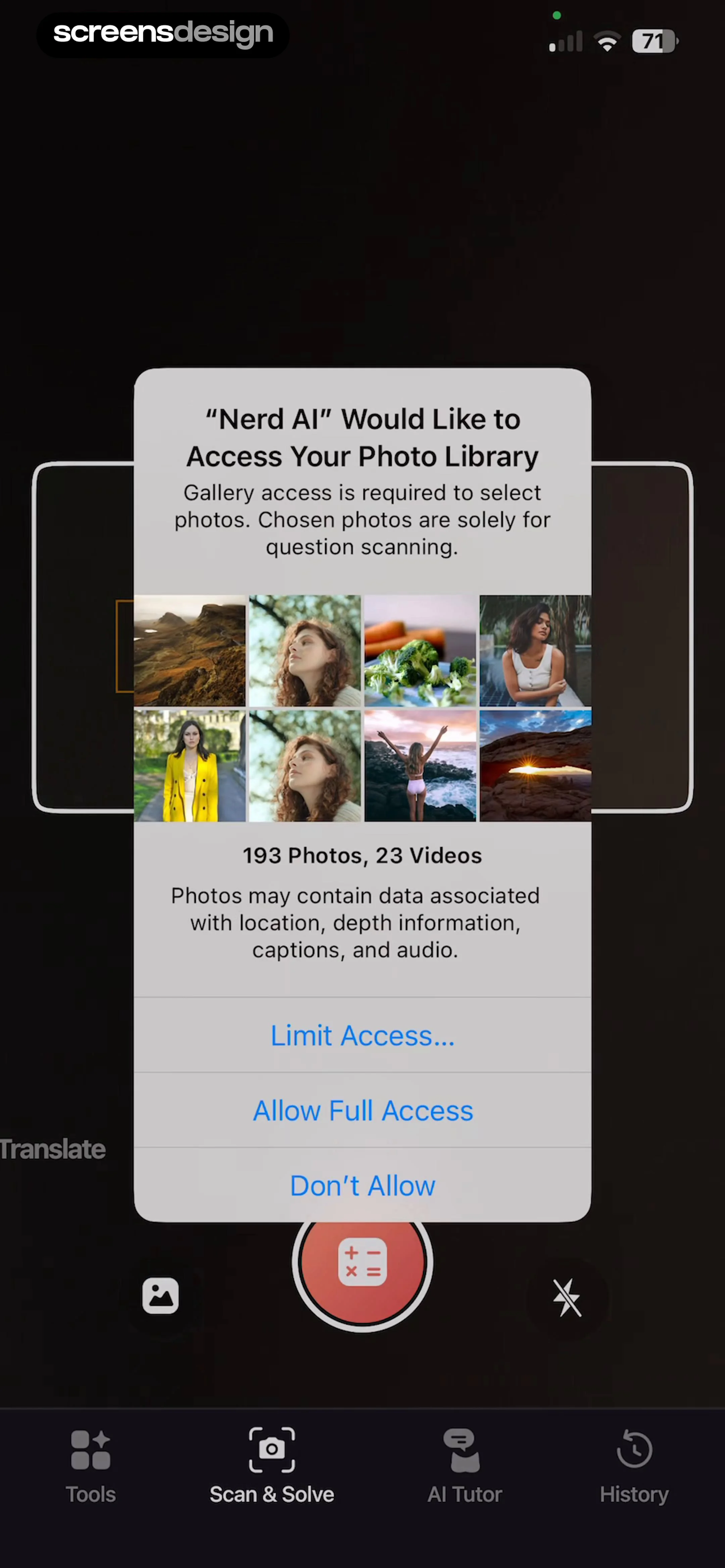
Nerd AI - Math Problem Solver: A centered system permission modal sits over a dark background with a bottom navigation bar.Nerd AI - Math Problem Solver: Top instruction text, central camera viewfinder, mode selector, shutter controls, and bottom navigation bar.Nerd AI - Math Problem Solver: A centered system permission modal sits on top of a camera-based scanning interface with a bottom navigation bar.

Solving math problems

Layout for Instagram・Inpreview: Top bar with restore/close, background image with text overlay, central white modal with subscription timeline, bottom CTA button, and footer disclaimer.Layout for Instagram・Inpreview: The screen consists of a dark, blurred background with a centered white modal card containing subscription details, pricing, and system-level payment instructions.Layout for Instagram・Inpreview: A centered modal sits on top of a subscription offer card, with a primary CTA button at the bottom.

Starting free trials

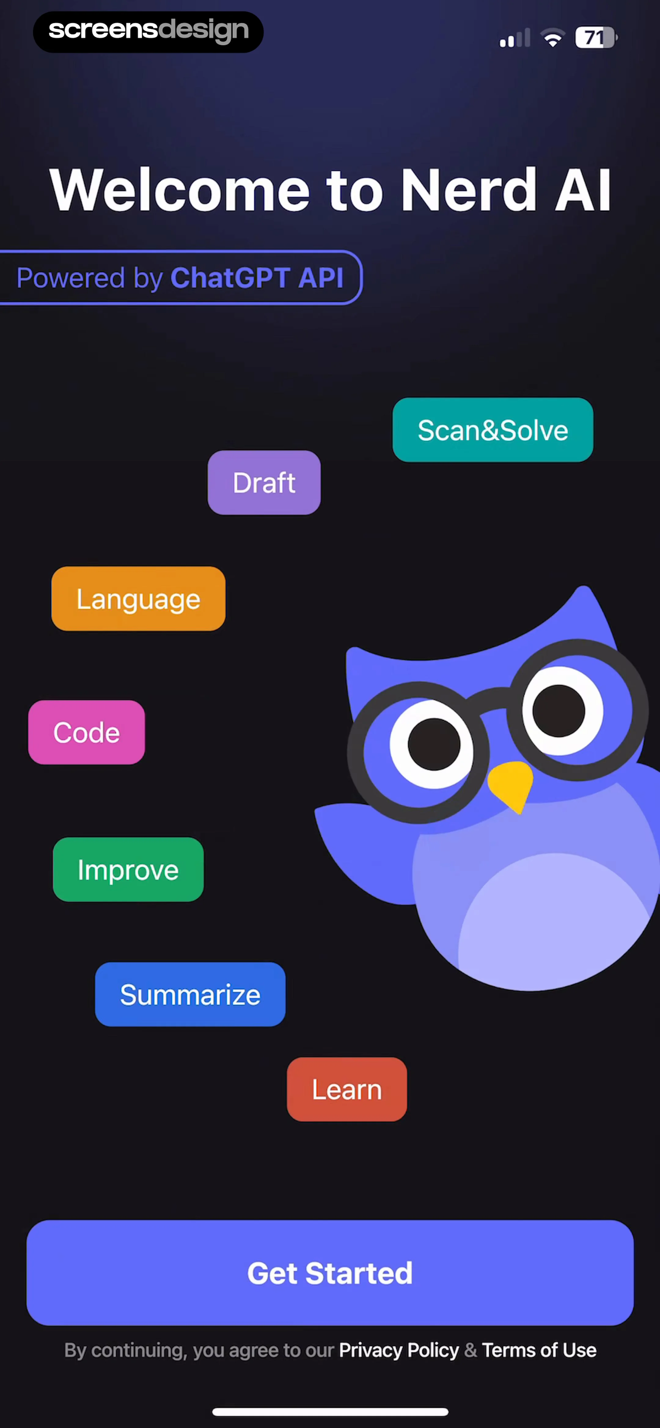
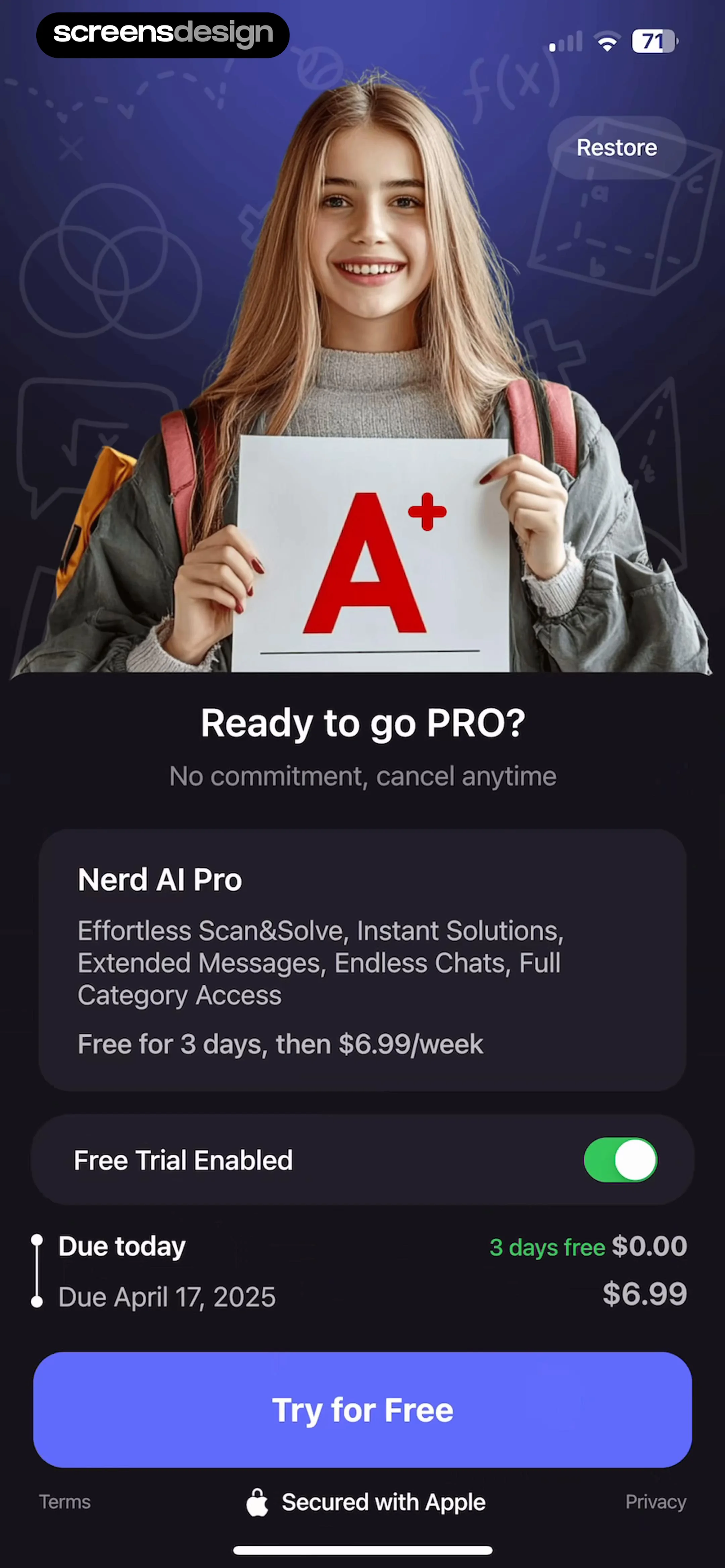
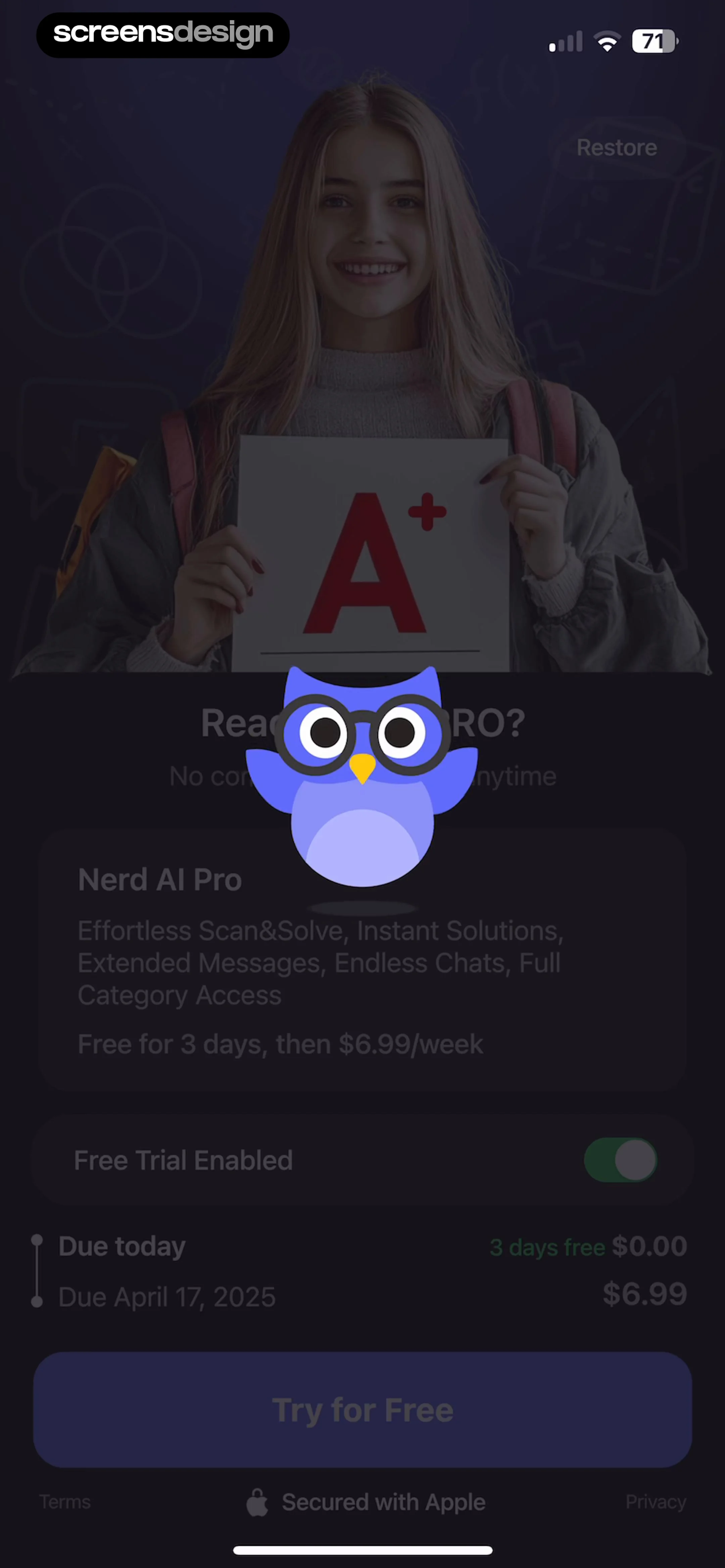
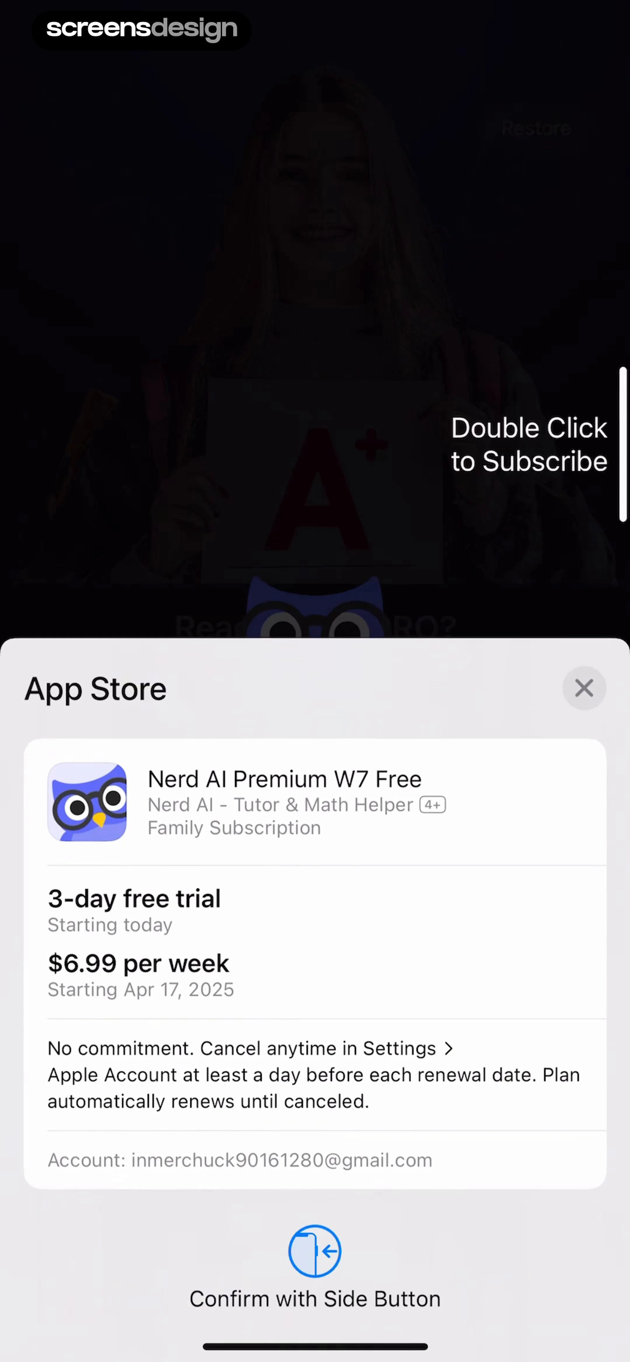
Nerd AI - Math Problem Solver: Hero image at the top, followed by header text, a subscription details card, a trial toggle, a billing breakdown, and a large primary CTA button at the bottom.Nerd AI - Math Problem Solver: Top image, central mascot, subscription details card, trial toggle, billing timeline, primary CTA button, and footer links.Nerd AI - Math Problem Solver: The screen features a dark background with a centered white iOS system modal containing subscription details, followed by a bottom instruction area.

Subscribing

Zutobi: Permit & Driving Prep: Header with title and feedback button, followed by tabbed navigation, a hero course card, and a vertical list of lesson units.Zutobi: Permit & Driving Prep: Top navigation bar with progress indicator, followed by a video player, informational text, and a bottom call-to-action button.Zutobi: Permit & Driving Prep: A video player occupies the majority of the screen, with a vertical action bar on the left and a full-screen toggle in the bottom right.

Taking lessons

Deezer: Music Player, Podcast: Top header with close button and title, central graphic, and bottom section with two stacked selection cards.Deezer: Music Player, Podcast: Top header with close button, central graphic card, and bottom section with two selectable game mode cards.Deezer: Music Player, Podcast: Top progress bar, central instructional modal, and a list of selectable song options below.

Taking quizzes

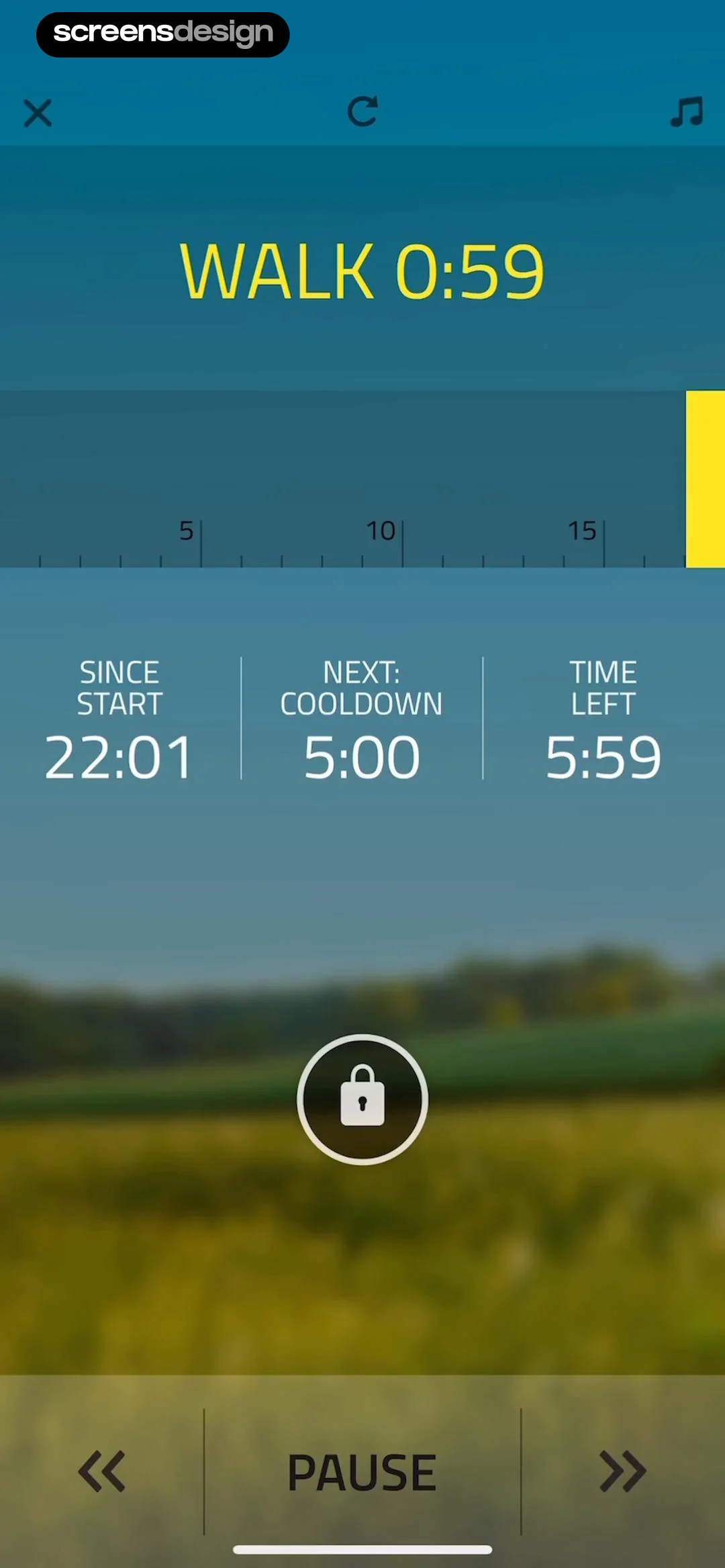
Contraction Timer & Counter 9m: Top navigation bar, empty central area with instructional text, and a large circular button at the bottom.Contraction Timer & Counter 9m: Top navigation bar, summary stats card, list of contraction entries, large central action button, and a bottom ad banner.Contraction Timer & Counter 9m: Top navigation bar, summary stats card, vertical list of contraction logs, large central action button, and a bottom promotional banner.

Tracking activity

EveryDollar: Budget Management: Top green header with date and controls, followed by a summary bar, two summary cards, and a vertical list of budget categories.EveryDollar: Budget Management: Header with navigation, search bar, followed by grouped cards containing lists of selectable items.EveryDollar: Budget Management: Top navigation bar followed by a search bar, then a grouped list of budget items categorized by headers.

Tracking expenses

Noxogy Sleep Tracker: Top navigation bar, central time display, central activation button, and three bottom cards for history and settings.Noxogy Sleep Tracker: Top header with app name and time, central active monitoring indicator, and three bottom cards for settings and history.Noxogy Sleep Tracker: Top header with time and status, central circular interactive button with waveform, and three bottom cards for secondary navigation.

Tracking sleep

AI Summary - Meeting Notes: Top navigation bar, followed by tabbed content switcher, a central action card for transcription, and a bottom audio playback control bar.AI Summary - Meeting Notes: Header at top, followed by an Auto Detect card, an 'All Languages' section with a list of options, and a bottom fixed action button.AI Summary - Meeting Notes: Top navigation bar, followed by title/metadata, a segmented control, a central AI summary prompt card, and a bottom playback control bar.

Transcribing recordings

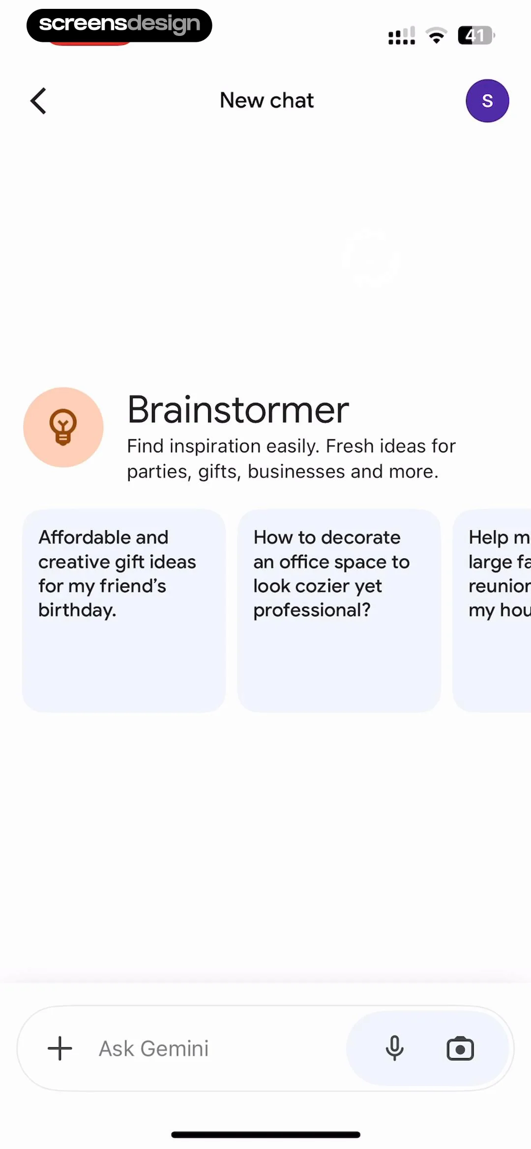
Claude by Anthropic: Top navigation bar, centered greeting with icon, bottom text input field, and system keyboard.Claude by Anthropic: A modal overlay centered on the screen, containing a header, a content preview card, an access control list, and a primary action button.Claude by Anthropic: Top close button, centered illustration, title, list of benefits, language selection card, and a bottom primary action button.

Using AI assistants

Weather Pro · Radar Alerts: Full-screen map background with a floating control card at the bottom.Weather Pro · Radar Alerts: Full-screen map background with a floating control panel at the bottom and navigation buttons at the top corners.Weather Pro · Radar Alerts: Map background with a floating layer selection menu in the top right and a time-scrubber card at the bottom.

Using maps

Weather Pro ��· Radar Alerts: Top header with location and temperature, followed by an hourly forecast card, a 10-day forecast list card, and a map preview at the bottom.Weather Pro · Radar Alerts: Full-screen map background with a floating control card at the bottom.Weather Pro · Radar Alerts: Full-screen map background with a floating control panel at the bottom and navigation buttons at the top corners.

Viewing weather forecasts

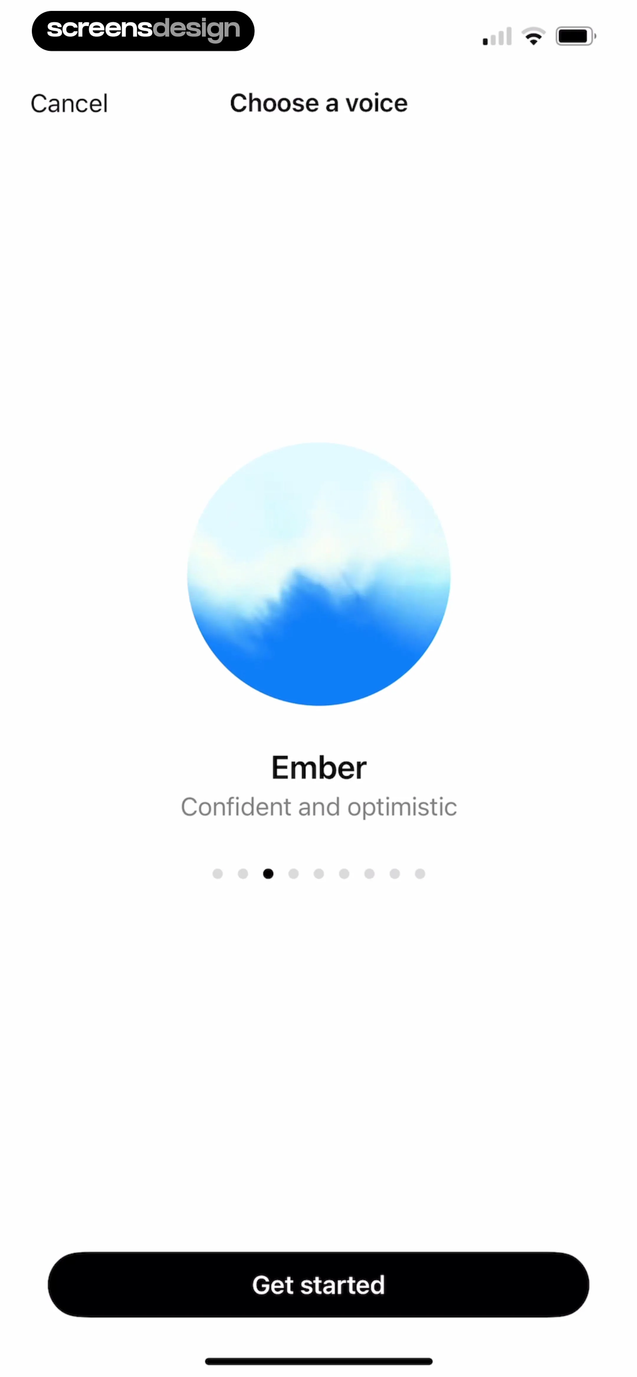
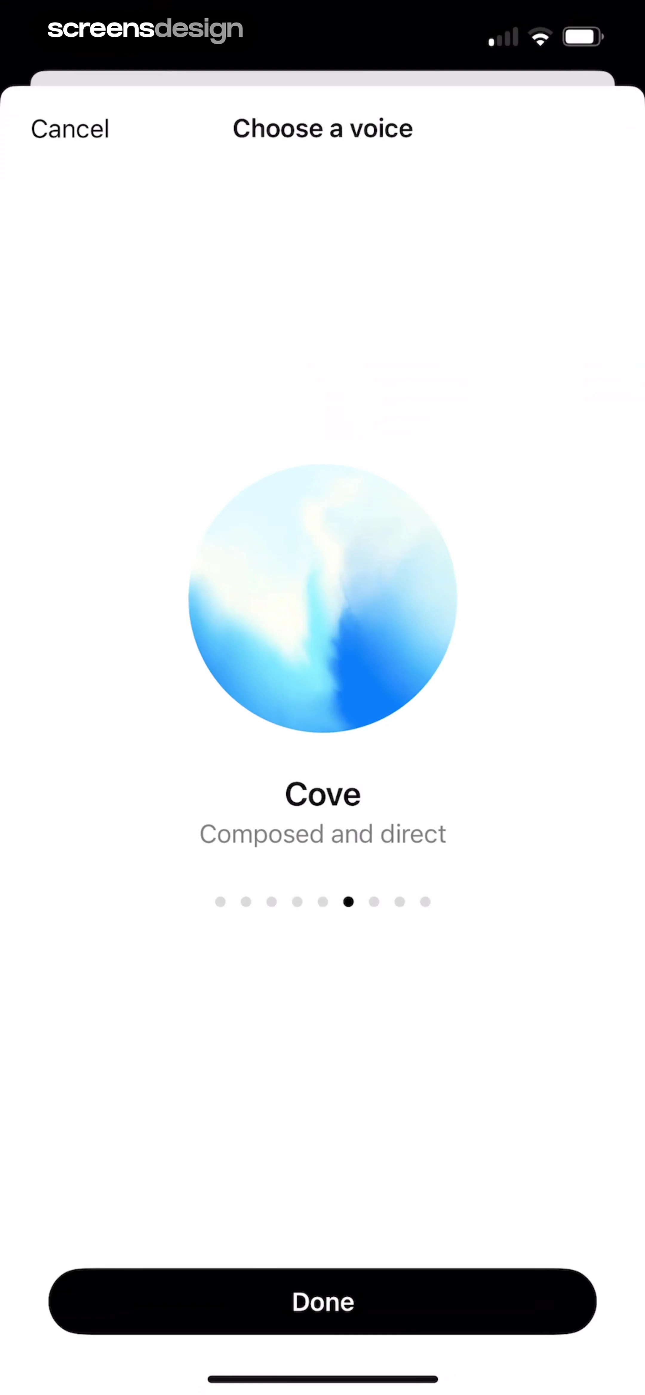
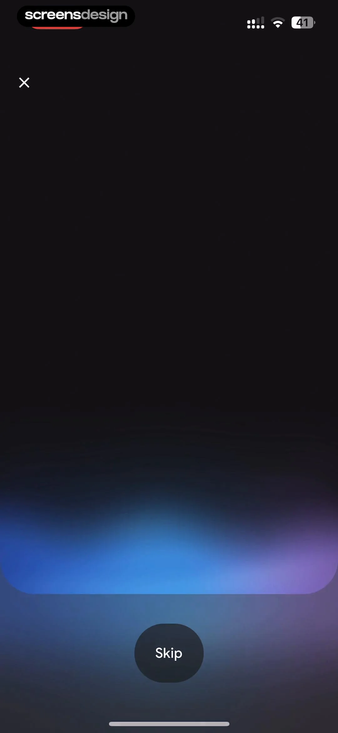
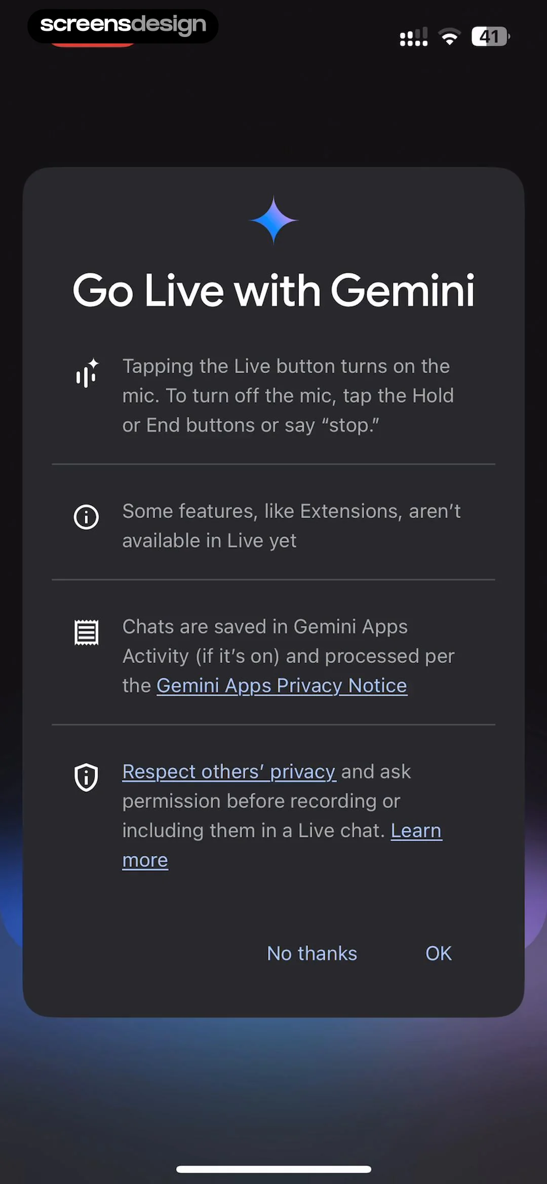
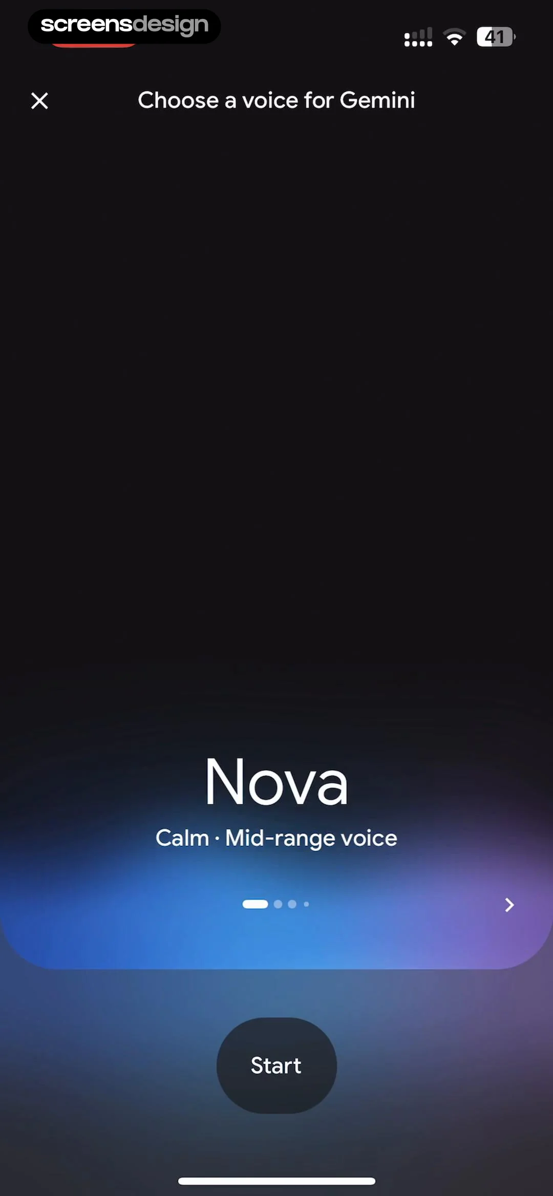
Google Gemini: A dark, gradient-filled background with a top-left close button and a bottom-center skip button.Google Gemini: A centered modal card containing a header icon, title, four bulleted text blocks, and two bottom-aligned action buttons.Google Gemini: Top navigation bar, central voice profile display with pagination, and a bottom primary action button.

Voice conversations

Zumba - Dance Fitness Workout: Top hero image, followed by title and metadata, primary action buttons, and a details list at the bottom.Zumba - Dance Fitness Workout: Video player background with a bottom-anchored modal overlay for scheduling.Zumba - Dance Fitness Workout: A modal overlay centered over a video player and a details list section.

Watching videos

A good reference is just the start.Explore the full library.