

 See the flow
  WebNovel - Read Novels & Manga
A disabled 'Use 0' button is visible, followed by a 'How To Obtain' button and a small notification badge indicating '5 stories updated'.
 See the flow
  Yelp: Food, Services & Reviews
At the bottom of the screen, there is a large, centered 'Continue' button, which is currently disabled or inactive, indicating that the user must confirm their selection to proceed.
 See the flow
  ChatGPT
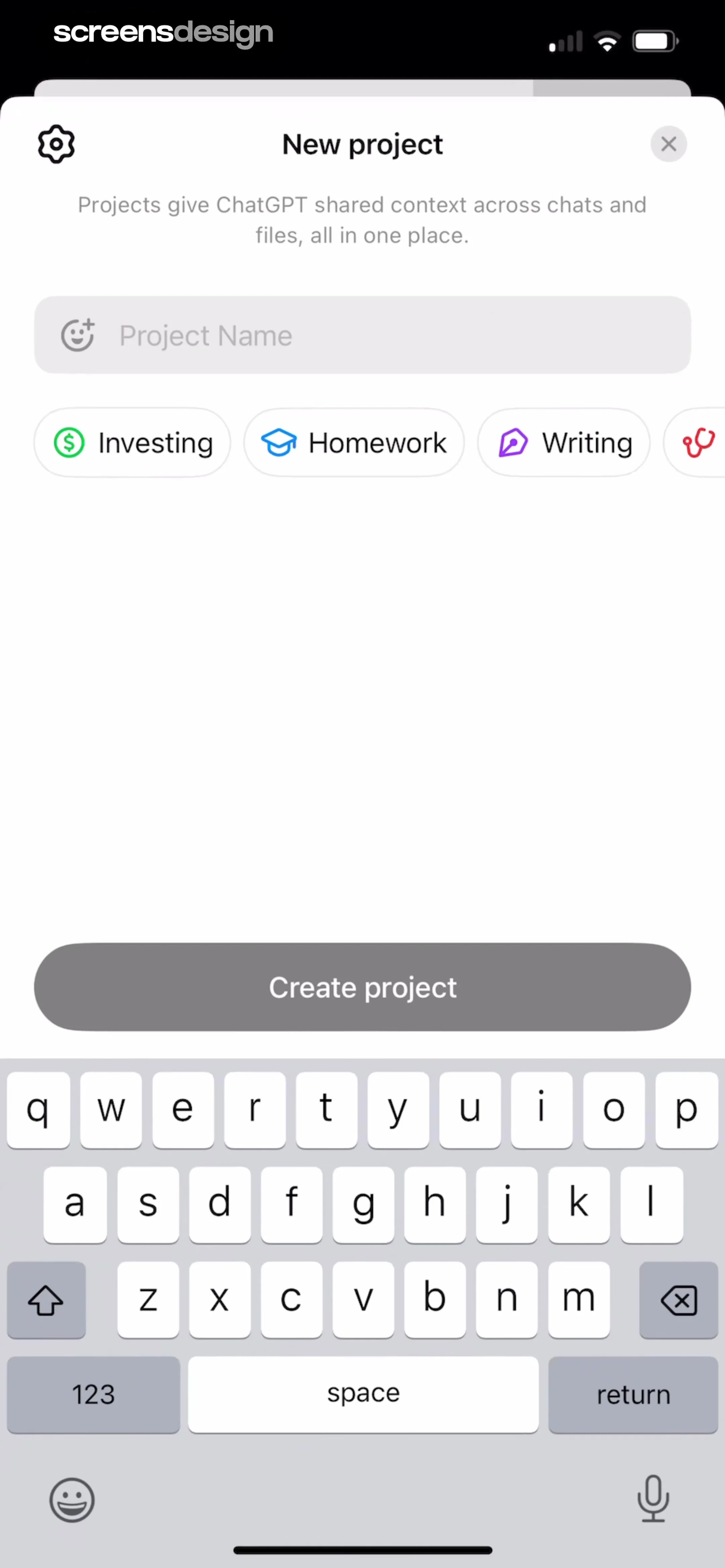
A large, prominent 'Create project' button is positioned in the middle of the screen, currently in a disabled or inactive state.
 See the flow
  Hotels.com: Book hotels & more
Top navigation bar with close button, followed by a chat history area, quick-reply buttons, a disabled input field, and a bottom navigation tab.
 See the flow
  SunSafe: UV Index & Tanning
Below the face, the text 'Analyzing...' is displayed, followed by a large, pill-shaped 'Get Started' button that appears to be in a disabled or inactive state.
 See the flow
  EveryDollar: Budget Management
Below the illustration, the text 'No deleted transactions' is displayed in bold, followed by the explanatory subtext 'Transactions you delete will appear here.' At the bottom of the screen, there is a large, disabled 'Restore' button.
 See the flow
  Deezer: Music Player, Podcast
Below these options is a disabled 'Submit' button and a 'Cancel' text button.
 See the flow
  Gaia GPS: Mobile Trail Maps
At the bottom, there are two primary buttons: a white 'Never Mind, Keep My Account' button and a disabled, greyed-out 'Delete My Account' button, indicating that the user must check all boxes before proceeding with the deletion.
 See the flow
  Meetup: Social Events & Groups
A disabled 'Next' button is centered in the lower half of the screen, positioned above the system keyboard.
 See the flow
  Scroll The Bible
At the bottom of the screen, there is a large, disabled 'Continue' button.
 See the flow
  HelloBot - Astrology & Tarot
At the bottom, there is a large, greyed-out 'Save' button, indicating that the user must make a selection before proceeding.
 See the flow
  Rork
RorkAt the bottom of the screen, there is a large, disabled-looking button labeled 'Creating...' which indicates that the app generation process is currently in progress.
 See the flow
  Scanner App: Genius Scan
At the bottom of the screen, a toolbar provides four action buttons: 'Merge' (disabled), 'Move' (active), a trash icon for deletion, and a share icon.
 See the flow
  Tattoo AI - Tattoo Design
At the bottom, a large, inactive 'Create' button spans the width of the screen.
 See the flow
  SubPilot: Cancel Subscriptions
A 'Delete' button is present at the bottom, currently in a disabled state.
 See the flow
  SnoreLab : Record Your Snoring
A large, prominent 'Apply' button is centered at the bottom, though it appears disabled or inactive.
 See the flow
  Blinq: Digital Business Card
The top navigation bar contains 'Cancel', a title 'Blinq' with an edit icon, and a disabled 'Save' button.
 See the flow
  Planner 5D: AI Home Design
At the bottom of the screen, there is a large, pill-shaped 'Continue' button, which is currently disabled or inactive, indicating that the user must select at least one style before proceeding.
 See the flow
  Refina: AI Plastic Surgery
At the bottom of the main screen, there is a disabled 'Use these photos' button.
 See the flow WebNovel - Read Novels & Manga
Below the list, there are two large buttons: 'Cancel' on the left and a disabled 'Submit' button on the right.


