screensdesign

Mobile onboarding flow examples

ScanAny-PDF Scanner App: Complete Onboarding

Open recorded flow
  1. Step 1 · 0:00

    ScanAny-PDF Scanner App: The screen is a simple splash screen with a centered logo and text label.See the flow
    ScanAny-PDF Scanner App

    The screen is a simple splash screen with a centered logo and text label.

  2. Step 2 · 0:04

    ScanAny-PDF Scanner App: Top navigation link, central illustration, descriptive text block, primary CTA button, and bottom pagination dots.See the flow
    ScanAny-PDF Scanner App

    Top navigation link, central illustration, descriptive text block, primary CTA button, and bottom pagination dots.

  3. Step 3 · 0:06

    ScanAny-PDF Scanner App: Top right login link, central illustration, text block in the middle, bottom primary button, and pagination dots at the very bottom.See the flow
    ScanAny-PDF Scanner App

    Top right login link, central illustration, text block in the middle, bottom primary button, and pagination dots at the very bottom.

  4. Step 4 · 0:09

    ScanAny-PDF Scanner App: Top right login link, central document illustration, descriptive text in the middle, and a large primary button at the bottom with a pagination indicator.See the flow
    ScanAny-PDF Scanner App

    Top right login link, central document illustration, descriptive text in the middle, and a large primary button at the bottom with a pagination indicator.

  5. Step 5 · 0:12

    ScanAny-PDF Scanner App: Top navigation, trust badge, headline, central illustration, feature list, pricing, primary CTA, and footer links.See the flow
    ScanAny-PDF Scanner App

    Top navigation, trust badge, headline, central illustration, feature list, pricing, primary CTA, and footer links.


SHEIN - Shopping Online: Onboarding

Open recorded flow
  1. Step 1 · 0:01

    SHEIN - Shopping Online: Top navigation bar, large empty central area with loading spinner, bottom sign-in banner, and bottom navigation bar.See the flow
    SHEIN - Shopping Online

    Top navigation bar, large empty central area with loading spinner, bottom sign-in banner, and bottom navigation bar.

  2. Step 2 · 0:03

    SHEIN - Shopping Online: Top graphic, followed by a list of three settings rows, with a centered system modal overlaying the middle section.See the flow
    SHEIN - Shopping Online

    Top graphic, followed by a list of three settings rows, with a centered system modal overlaying the middle section.

  3. Step 3 · 0:06

    SHEIN - Shopping Online: Top graphic, header text, three preference rows, primary CTA button, and footer instructional text.See the flow
    SHEIN - Shopping Online

    Top graphic, header text, three preference rows, primary CTA button, and footer instructional text.

  4. Step 4 · 0:09

    SHEIN - Shopping Online: Top header with map graphic, followed by a search bar, a 'Current' location section, a 'Common Location' section, and an alphabetical list of countries.See the flow
    SHEIN - Shopping Online

    Top header with map graphic, followed by a search bar, a 'Current' location section, a 'Common Location' section, and an alphabetical list of countries.

  5. Step 5 · 0:12

    SHEIN - Shopping Online: Top graphic, modal header, search bar, scrollable list of countries, system keyboard at the bottom.See the flow
    SHEIN - Shopping Online

    Top graphic, modal header, search bar, scrollable list of countries, system keyboard at the bottom.

Google Gemini: Onboarding

Open recorded flow
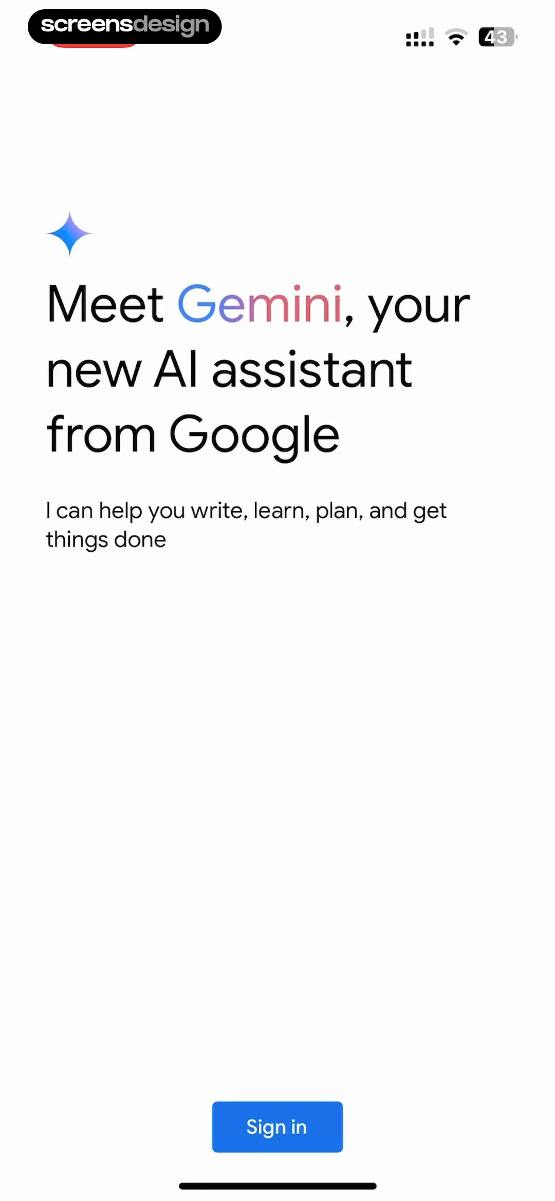
  1. Step 1 · 0:01

    Google Gemini: Top-aligned header with icon and text, followed by a bottom-aligned primary action button.See the flow
    Google Gemini

    Top-aligned header with icon and text, followed by a bottom-aligned primary action button.

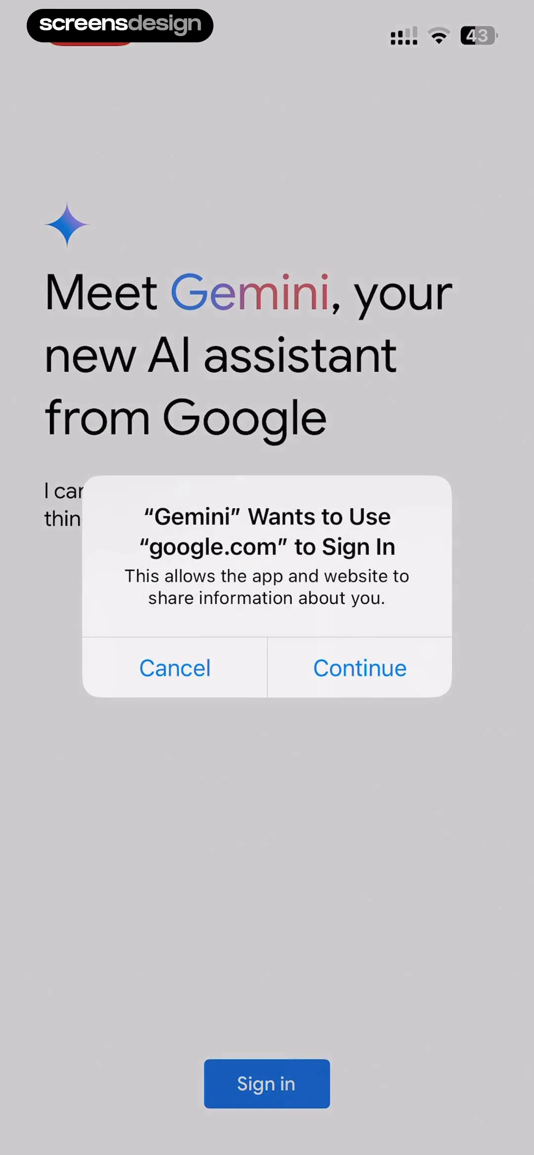
  2. Step 2 · 0:04

    Google Gemini: Top-aligned branding text with a centered system modal and a bottom-aligned primary action button.See the flow
    Google Gemini

    Top-aligned branding text with a centered system modal and a bottom-aligned primary action button.

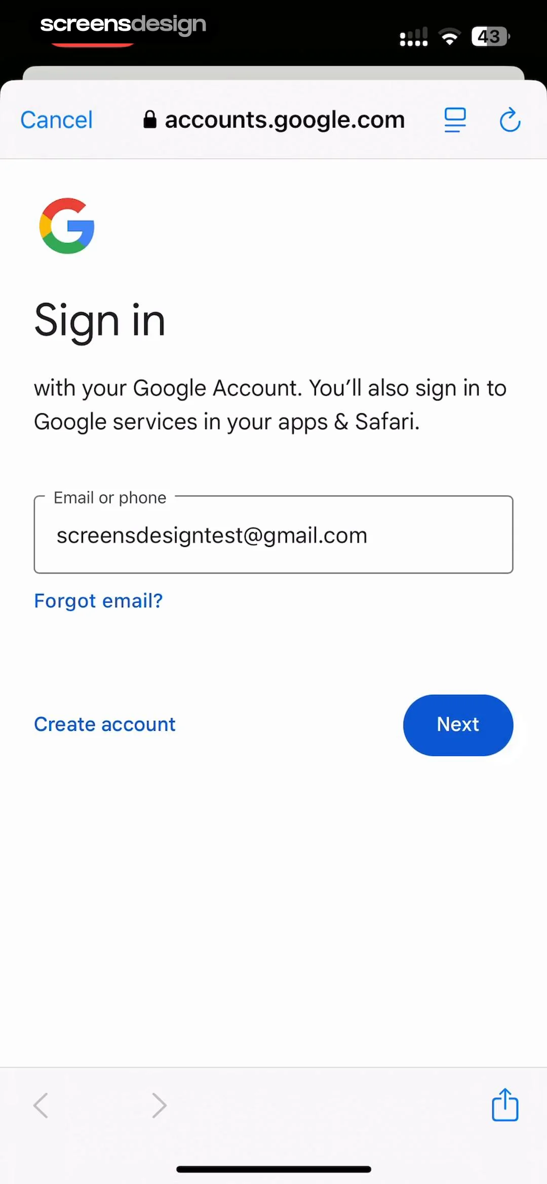
  3. Step 3 · 0:17

    Google Gemini: Top browser navigation bar followed by a centered Google logo, heading, sub-text, input field, and bottom action buttons.See the flow
    Google Gemini

    Top browser navigation bar followed by a centered Google logo, heading, sub-text, input field, and bottom action buttons.

  4. Step 4 · 0:29

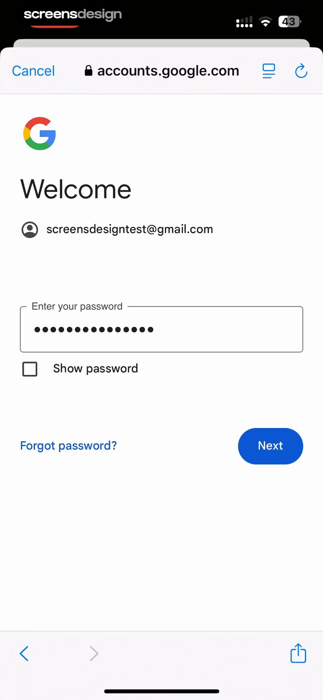
    Google Gemini: Top browser bar, centered Google logo, heading, email, password input, checkbox, bottom action buttons, bottom browser navigation.See the flow
    Google Gemini

    Top browser bar, centered Google logo, heading, email, password input, checkbox, bottom action buttons, bottom browser navigation.

  5. Step 5 · 0:42

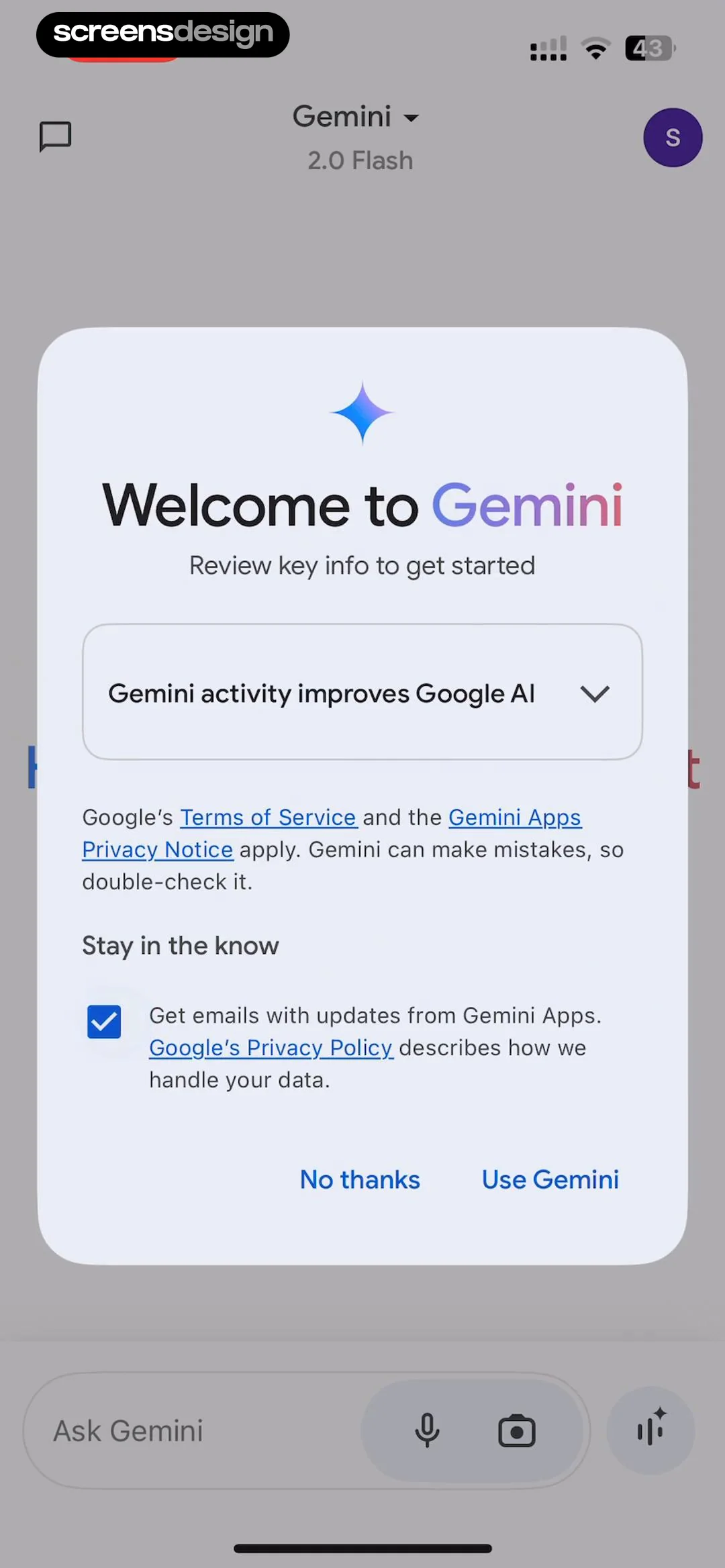
    Google Gemini: A centered modal overlaying the main app interface. The modal contains a header, a collapsible card, legal text, an opt-in checkbox, and two primary buttons at the bottom.See the flow
    Google Gemini

    A centered modal overlaying the main app interface. The modal contains a header, a collapsible card, legal text, an opt-in checkbox, and two primary buttons at the bottom.

Wallcraft – Wallpapers, live: Complete Onboarding

Open recorded flow
  1. Step 1 · 0:03

    Wallcraft – Wallpapers, live: Centered brand logo and text on a solid dark background.See the flow
    Wallcraft – Wallpapers, live

    Centered brand logo and text on a solid dark background.

  2. Step 2 · 0:08

    Wallcraft – Wallpapers, live: Centered logo and text, followed by a large action button, and a footer link at the bottom.See the flow
    Wallcraft – Wallpapers, live

    Centered logo and text, followed by a large action button, and a footer link at the bottom.

  3. Step 3 · 0:17

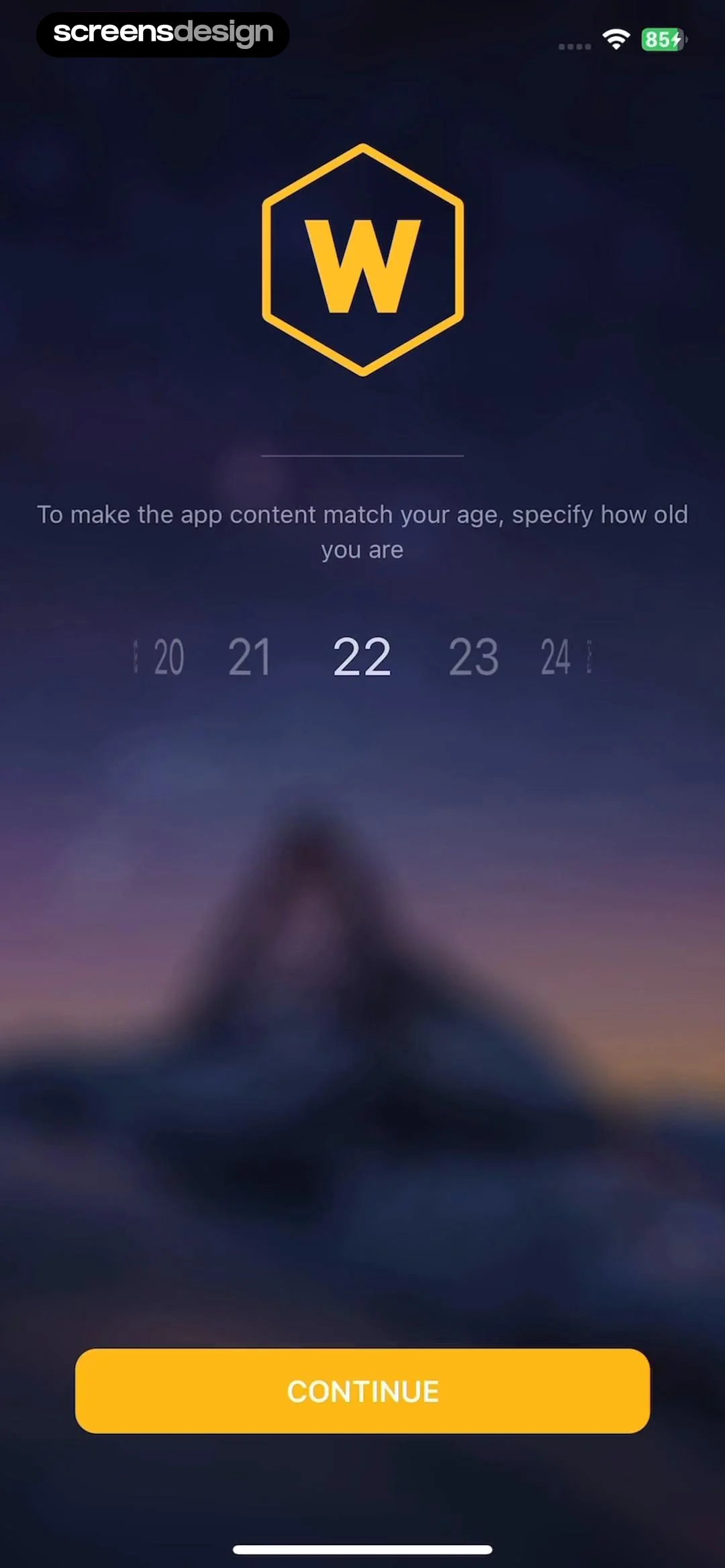
    Wallcraft – Wallpapers, live: Logo at top, instructional text in middle, age picker below text, large button at bottom.See the flow
    Wallcraft – Wallpapers, live

    Logo at top, instructional text in middle, age picker below text, large button at bottom.

  4. Step 4 · 0:20

    Wallcraft – Wallpapers, live: The screen consists of a centered text block explaining the privacy policy, followed by a large call-to-action button at the bottom.See the flow
    Wallcraft – Wallpapers, live

    The screen consists of a centered text block explaining the privacy policy, followed by a large call-to-action button at the bottom.

  5. Step 5 · 0:22

    Wallcraft – Wallpapers, live: A dark background with informational text, overlaid by a centered system permission modal, with a large yellow button at the bottom.See the flow
    Wallcraft – Wallpapers, live

    A dark background with informational text, overlaid by a centered system permission modal, with a large yellow button at the bottom.

Contraction Timer & Counter 9m: Onboarding

Open recorded flow
  1. Step 1 · 0:04

    Contraction Timer & Counter 9m: Top illustration, middle text block, bottom primary button, and footer legal text.See the flow
    Contraction Timer & Counter 9m

    Top illustration, middle text block, bottom primary button, and footer legal text.

  2. Step 2 · 0:07

    Contraction Timer & Counter 9m: Top illustration, followed by a star rating, a title, a list of bulleted features, and a primary CTA button at the bottom.See the flow
    Contraction Timer & Counter 9m

    Top illustration, followed by a star rating, a title, a list of bulleted features, and a primary CTA button at the bottom.

  3. Step 3 · 0:21

    Contraction Timer & Counter 9m: Top navigation bar with restore and close buttons, central illustration, descriptive text block, and a large primary CTA button at the bottom with pricing details.See the flow
    Contraction Timer & Counter 9m

    Top navigation bar with restore and close buttons, central illustration, descriptive text block, and a large primary CTA button at the bottom with pricing details.

  4. Step 4 · 0:26

    Contraction Timer & Counter 9m: Top navigation bar, main content area with a centered modal, and a large circular button at the bottom.See the flow
    Contraction Timer & Counter 9m

    Top navigation bar, main content area with a centered modal, and a large circular button at the bottom.

  5. Step 5 · 0:29

    Contraction Timer & Counter 9m: Top navigation bar, main content area with centered modal, and a large circular button at the bottom.See the flow
    Contraction Timer & Counter 9m

    Top navigation bar, main content area with centered modal, and a large circular button at the bottom.

Found an example you like?See the whole story.