

 See the flow
  Hypelist: Create & Share Lists
The top section features a gold-toned gradient background with a back button, a user-add icon, a share icon, and a three-dot menu icon.
 See the flow
  ZEDGE™ Ringtones & Wallpapers
Navigation controls are located at the top, including a back button, an 'add' icon, and a three-dot menu icon for additional options.
 See the flow
  Klook: Travel & Activities
The bottom right corner features a floating action button (FAB) with a plus icon and a map view icon.
 See the flow
  ChatGPT
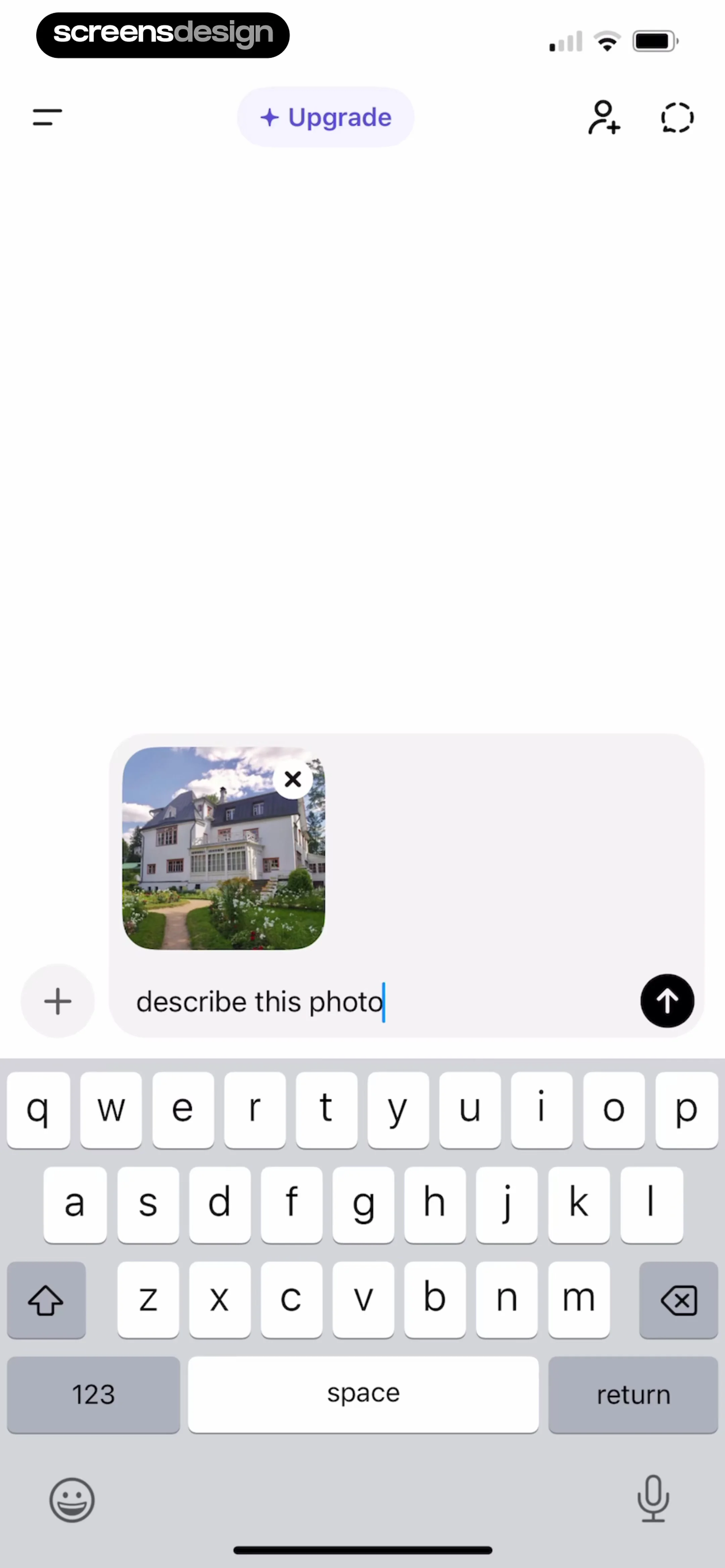
To the left of the input is a plus icon for adding more content, and to the right is an upward-pointing arrow button for sending the message.
 See the flow
  Layout for Instagram・Inpreview
Below this, there are two circular buttons: one for media and one labeled 'New' with a plus icon.
 See the flow
  Fishbrain - Fishing App
The bottom navigation bar provides access to 'Community', 'Map', a central '+' button for adding content, 'Forecast', and 'You'.
 See the flow
  AI Song Generator: Mozart
Below this, a 'My Voices' section features a large blue circular button with a plus icon for adding a custom voice, alongside a 'Surprise Me!' button.
 See the flow
  Yard AI: Backyard Design
A prominent button allows users to 'Add a photo to ask about a real issue'.
 See the flow
  Plant Identifier, Care: Planty
The bottom navigation bar contains five icons: 'My Garden' (active), 'Caring', a central large '+' button for adding new plants, 'Diagnose', and 'Account'.
 See the flow
  SnoreLab : Record Your Snoring
The bottom area includes 'Sleep Notes' with icons for specific sleep conditions, a large '+' button for adding new notes, and a persistent bottom navigation bar with icons for Record, Results, Trends, Discover, and Profile.
 See the flow
  FLYP - Fashion Design Studio
list), and a bottom navigation bar with icons for home, studio, a central plus button for creating new designs, notifications, and a profile/account avatar.
 See the flow
  Widgetable: Besties & Couples
At the bottom of the screen, there is a floating action bar containing a circular avatar/profile icon, a plus icon, and a larger green creature icon, suggesting options to add or interact with the mood tracking system.
 See the flow
  Calculator₊
At the bottom of the modal, there is a color palette consisting of a large black square swatch followed by smaller circular swatches in black, blue, green, yellow, and red, ending with a plus icon button for adding custom colors.
 See the flow
  ZARA
ZARAThe bottom of the screen features a text input field labeled 'Message' with a plus icon on the left and an upward-pointing arrow on the right for sending messages.
 See the flow
  WebNovel - Read Novels & Manga
Each entry includes a '+' button to add the novel to a library or a checkmark icon for already added items, plus a '...' menu for more options.
 See the flow
  Redfin: Buy, Sell & Rent Homes
At the top, there is a header titled 'Favorites' with an icon for managing lists and a plus button for creating a new list.
 See the flow
  Litres: Audio
This screen is a modal interface for adding an audiobook to a user-created list.
 See the flow
  Tiny Scanner - PDF Scanner App
Below the document area, there is a floating toolbar containing a plus (+) button for adding more elements and a preview of the signature being applied.
 See the flow
  Planner 5D: AI Home Design
An 'Add new' card with a plus icon is positioned at the top left.
 See the flow
  Bible Chat: Daily Devotional
At the top, there is a navigation bar with a back button, a centered 'History' title, and a plus icon for starting a new chat.


