

 See the flow
  Sky Tonight - Stargazing Guide
The central area contains a large, dark-themed line chart visualizing the 'Altitude' of the constellation over a 24-hour period, with specific markers for rise, transit, and set times (8:47 PM, 2:38 AM, 8:30 AM).
 See the flow
  SubPilot: Cancel Subscriptions
A dropdown menu labeled 'Expenses' sits above a donut chart visualization that indicates 'No transaction' and '$0'.
 See the flow
  Windy.app — Wind, Tides, Radar
The bottom section presents a 'Forecast History (2012 - 2023)' area, featuring a monthly selector (Jan-Dec) and a line chart visualizing historical weather data trends.
 See the flow
  Noxogy Sleep Tracker
This screen displays a bar chart titled 'Factor Effect on Snoring Ratio' within a dark-themed mobile application.
 See the flow
  Wikiloc - Trails of the World
An elevation area chart remains below the 3D trail map.
 See the flow
  Fishbox - Smart Fishing App
A line chart visualizes wave height over time from 4:00 AM to 8:00 PM.
 See the flow
  bergfex: Hiking & Tracking
At the top, an elevation profile chart shows the terrain over a 175 km distance.
 See the flow
  Plane Finder ⁃ Flight Tracker
The main content area features a summary of arrival statistics (60% Early, 22% On Time, 17% Late, 1% Cancelled) followed by a stacked bar chart visualizing these trends over the last week.
 See the flow
  Budget app - spending tracker
A line chart visualizes the selected metric over time, with a sharp upward spike in June 2024.
 See the flow
  Fishbrain - Fishing App
Header with title, followed by a bar chart, then a list of detailed statistics, and a bottom navigation bar.
 See the flow
  Useless - Screen Time Control
A 'Weekly Trend' section displays a simple line chart showing activity over the days of the week (M-Su), currently showing zero activity.
 See the flow
  Widgetable: Besties & Couples
Below this, a 'Mood Fluctuation Chart' card presents a line graph tracking mood changes over the days of the month, with a single data point plotted for the 8th or 9th day.
 See the flow
  Redfin: Buy, Sell & Rent Homes
Header title, followed by a property valuation card with a chart, then a section for new address input, and a bottom navigation bar.
 See the flow
  Map My Run GPS Running Tracker
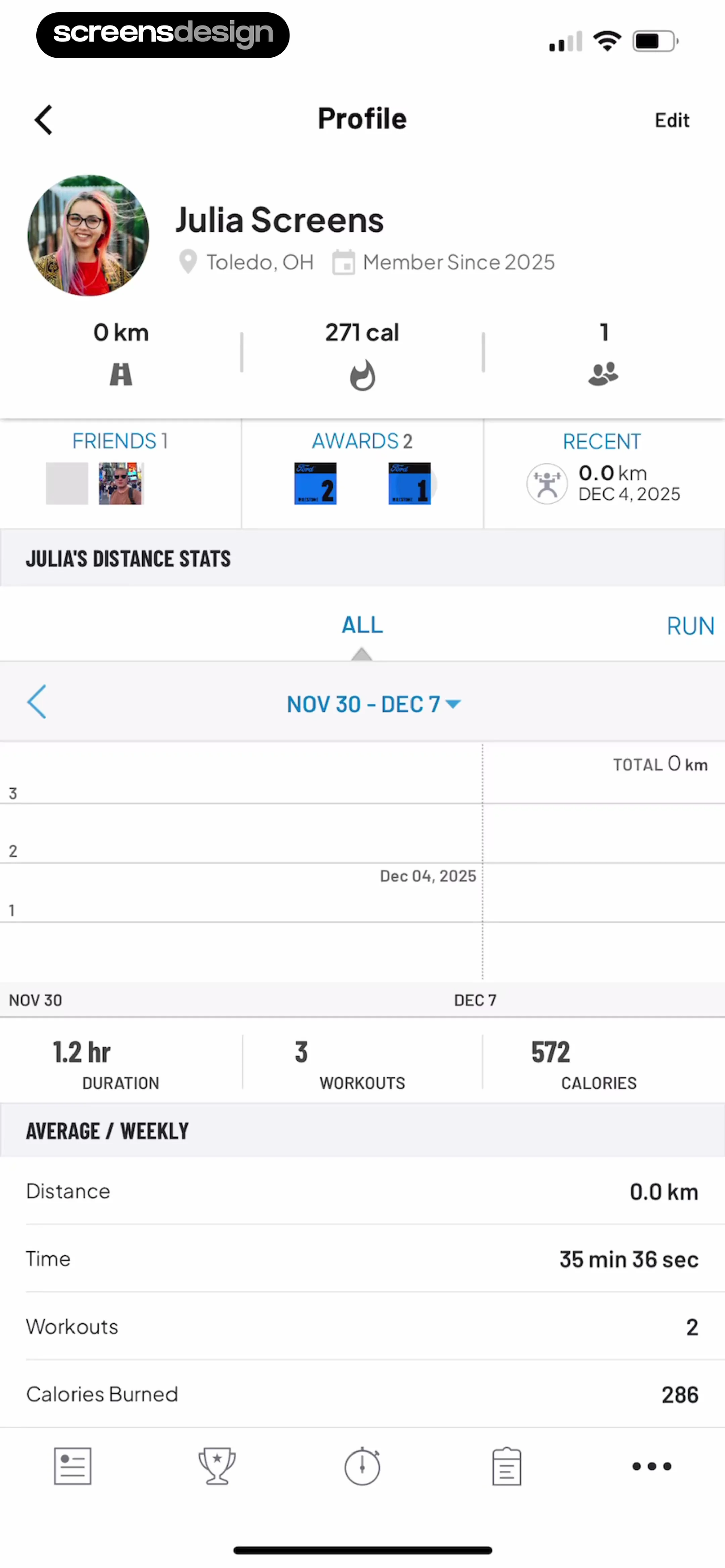
The main body features a 'JULIA'S DISTANCE STATS' section with a line chart showing activity between 'NOV 30 - DEC 7', followed by a summary of '1.2 hr' duration, '3' workouts, and '572' calories.
 See the flow
  Gaia GPS: Mobile Trail Maps
A green elevation profile runs below the route map and above the distance summary.
 See the flow
  Precip - Rain Totals & Gauge
At the top, a bar chart visualizes 'Total precipitation' over time, with a toggle to switch between 'Days' and 'Months' views.
 See the flow
  Pick Up Limes
At the top, a large circular donut chart visualizes the macronutrient breakdown (Carbs, Fats, Protein) with a central prompt to 'hold to reveal calories'.
 See the flow Windy.app — Wind, Tides, Radar
A stacked area chart shows forecast history above a table of monthly values.
 See the flow Sky Tonight - Stargazing Guide
The central area contains a line chart visualizing the 'Altitude' of the meteor shower over a 24-hour period, with a vertical line indicating the current time.
 See the flow Budget app - spending tracker
Below, a donut chart visualizes spending categories (Shopping, Housing, Food & Drink, Transportation) with percentage labels.


