

 See the flow
  invideo AI: AI Video Generator
At the bottom of the modal, there are two primary action buttons: 'Back' and 'Save'.
 See the flow
  Everlook- Face & Body Editor
Above the photo, there is a top navigation bar with a back arrow on the left and a download/save icon on the right.
 See the flow
  Widgetable: Besties & Couples
The top navigation bar includes a back button, a copyright symbol icon, a 'Preview' button, and a 'Save' button.
 See the flow
  Rooms
RoomsAbove the model, the title 'Red Bed' is displayed, flanked by a red 'X' cancel button on the left and a green checkmark save button on the right, with a three-dot menu icon in between.
 See the flow Everlook- Face & Body Editor
The top of the screen features a back arrow on the left and a download/save icon on the right.
 See the flow
  calimoto Motorcycle Navigation
Below the map, there is an input field with the placeholder 'What makes this ride special?', followed by two large buttons: a blue 'Save' button and a dark grey 'Cancel' button.
 See the flow
  VSCO: Photo & Video Editor
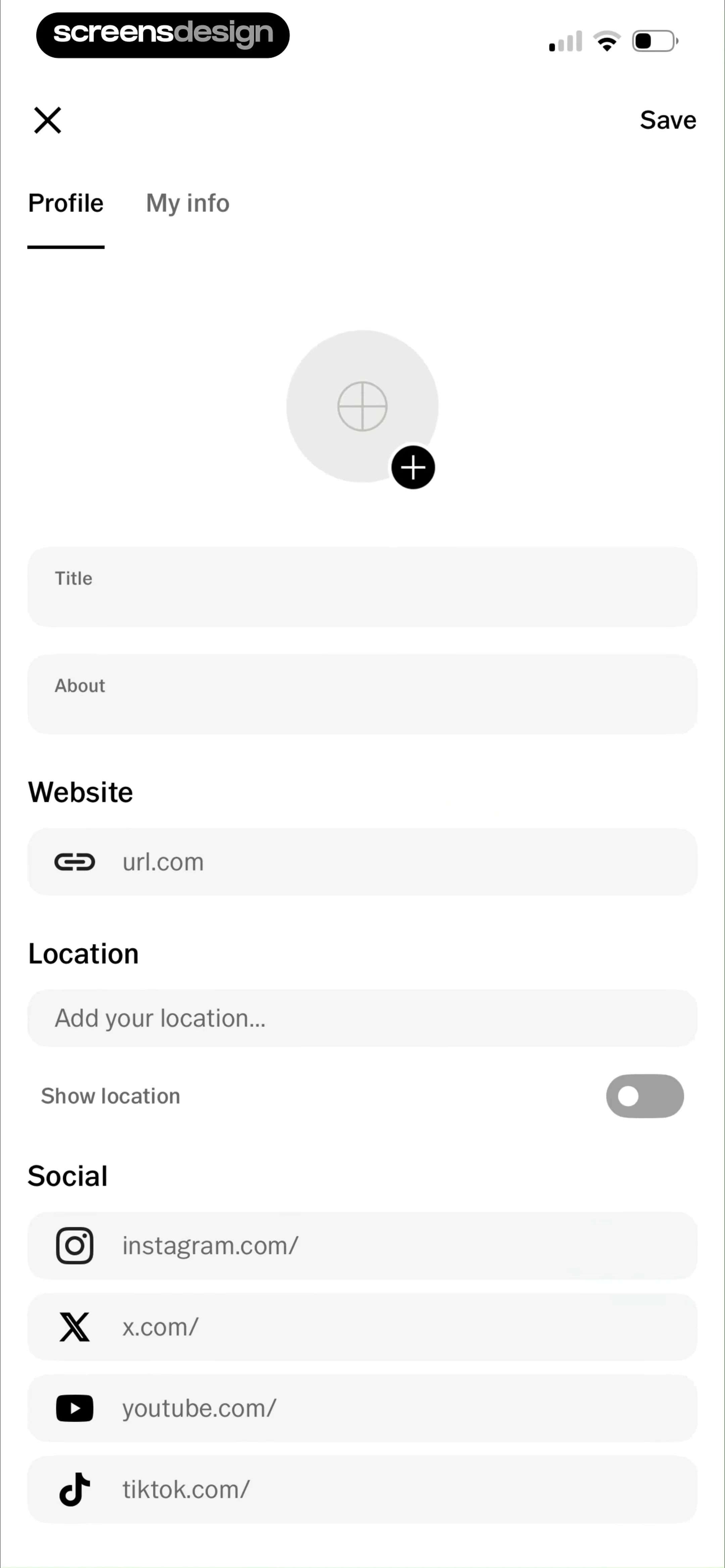
At the top, there is a navigation bar with a close 'X' button and a 'Save' action.
 See the flow
  Precious - Baby Photo Art
It offers three distinct action buttons: 'SAVE TO CAMERA ROLL' (primary), 'DON'T SAVE' (secondary), and 'GO BACK' (tertiary).
 See the flow invideo AI: AI Video Generator
At the bottom of the screen, there are two primary action buttons: a 'Back' button and a 'Save' button, both spanning the width of the bottom area.
 See the flow
  Meetup: Social Events & Groups
Below the text, there are three distinct action buttons: a primary teal button labeled 'Save draft for later', a secondary outlined button with red text labeled 'Exit without saving', and a tertiary text-only button labeled 'Cancel'.
 See the flow
  HBX | Globally Curated Fashion
The top navigation bar includes a back button and a 'Save' action.
 See the flow
  bergfex: Hiking & Tracking
Action buttons include 'Save', 'Navigate', and a share icon, alongside a menu button and a close button.
 See the flow
  Blinq: Digital Business Card
There is an 'Add tag' button, followed by two primary action buttons: 'Skip' and 'Save'.
 See the flow
  Litres: Audio
A semi-transparent modal is centered at the bottom, featuring the 'Daily Easy English Expression Podcast' cover art, title, and author, followed by a vertical list of action buttons: 'Save', 'Add to a list', and 'Mark as listened'.
 See the flow
  Ascend: Bible Game
A modal centered over a list-based settings page.
 See the flow
  Gaia GPS: Mobile Trail Maps
Top navigation bar, followed by an informational card, a profile photo section, two input fields, and a bottom navigation bar.
 See the flow VSCO: Photo & Video Editor
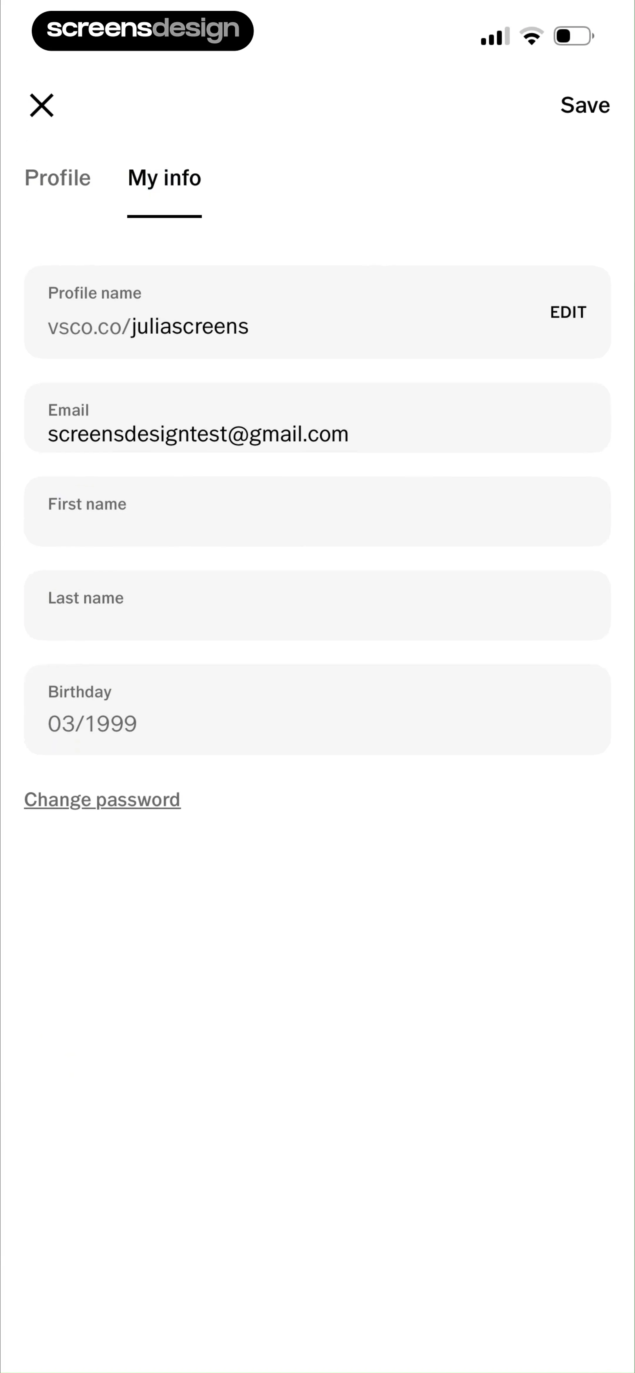
Top navigation bar followed by a tabbed sub-header, then a vertical list of input fields, and a bottom link.
 See the flow
  Fishbrain - Fishing App
Top navigation bar, followed by a large header area for a cover photo, then a vertical list of form fields, and a final action button at the bottom.
 See the flow
  Zalando – Online fashion
Top navigation bar, followed by a vertical list of input fields, a radio button selection group, and a large bottom action button, with a persistent bottom navigation bar.
 See the flow Blinq: Digital Business Card
Top navigation bar, followed by a vertical list of text input fields, a section header, and a grid of selectable contact field icons, ending with a fixed bottom action button.


