

 See the flow
  Precip - Rain Totals & Gauge
The top section, titled 'Recent totals', presents a table with columns for 'Period', 'Rain', 'Snow', and 'Total (liquid)'.
 See the flow
  Yik Yak
Below this, a red header section contains a back button, the title 'Leaderboard', a subtitle 'Worst of Canvas', and two selectable tabs: 'All Time' and 'Winter '24'.
 See the flow
  Fishbox - Smart Fishing App
Top navigation bar with location name, horizontal date selector, hourly weather data table, solunar moon phase section, and bottom navigation bar.
 See the flow
  Fishbrain - Fishing App
Below the description, a structured data table provides key metrics: 'Max weight' (4.9 lb), 'Max length' (17 in), 'Water composition' (Saltwater, Brackish), and 'Common depth' (0-16 ft).
 See the flow
  Flight Tracker +
Below this, a table-like structure organizes flight information into three columns: 'Time', 'Origin' (with destination city below it), and 'Flight #' (with status below it).
 See the flow
  Premier League - Scores, News
This screen displays the Premier League 2 (PL2) football league table.
 See the flow
  CraftBook: Crochet Made Easy
Below this is a comparison table showing the benefits of the premium tier versus the free tier.
 See the flow
  AI Summary - Meeting Notes
Top navigation bar followed by a dropdown menu, then a long-form text document with a table and paragraphs.
 See the flow
  Redfin: Buy, Sell & Rent Homes
The bottom section features a 'Unit Details' table that lists specific units with their respective pricing, square footage, availability status, and unit numbers.
 See the flow
  ZARA
ZARAA comprehensive table follows, mapping the zones (Chest, Front length, Sleeve length, Back width, Arm circumference) to specific numerical values across sizes XS, S, M, and L.
 See the flow Precip - Rain Totals & Gauge
Below the chart, a 'Recent totals' table provides a breakdown of precipitation data across different time periods (12 hours, 24 hours, 48 hours, 7 days, 30 days, and Month-to-date).
 See the flow
  Useless - Screen Time Control
Below the comparison table, there are three subscription plan cards: Monthly ($6.99/mo), Yearly ($2.08/mo, marked with a '70% OFF' badge), and Lifetime ($69.99).
 See the flow
  Blinq: Digital Business Card
A comparison table follows, contrasting 'Free' and 'Premium' features, including card limits, custom color themes, AI notetaker capabilities, and dynamically updated contacts.
 See the flow
  HBX | Globally Curated Fashion
The top section, titled 'Product Measurements', provides a table with columns for Size, Shoulder Width, Chest Circumference, and Sleeve length, showing specific measurements in inches and centimeters for sizes S, M, L, and XL.
 See the flow
  Map My Run GPS Running Tracker
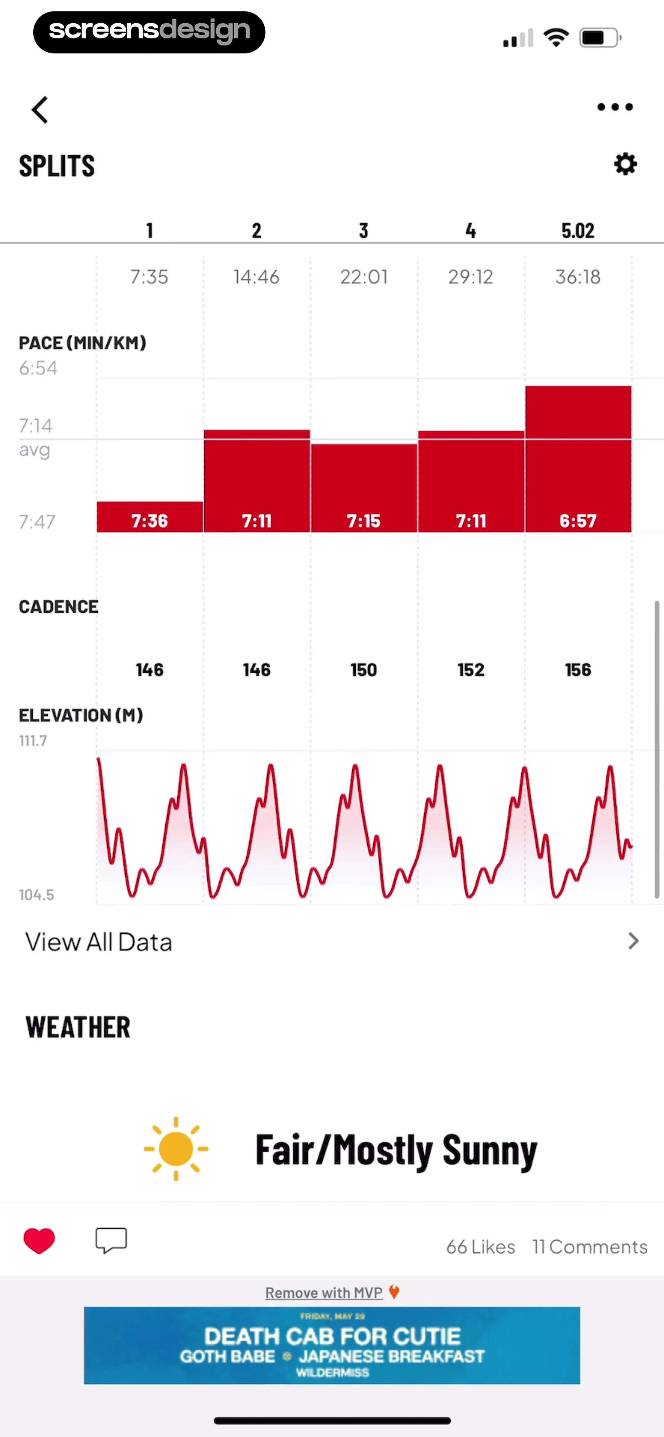
Below the chart, a table lists cadence metrics (146, 150, 152, 156) corresponding to each split.
 See the flow
  Sky Tonight - Stargazing Guide
Beneath the image, a data table provides technical specifications including the constellation (Ophiuchus), absolute magnitude, catalogue designations, spectral class, and distance from the Sun.
 See the flow
  FLYP - Fashion Design Studio
Below this, a 'Size Chart' section presents two detailed tables: one in inches and one in centimeters.
 See the flow
  Budget app - spending tracker
This screen displays a financial budgeting table and a numeric keypad for data entry.
 See the flow
  Planner 5D: AI Home Design
Each feature has a corresponding icon on the left and status indicators for both 'Premium' and 'Pro' columns, using checkmarks, red 'X' symbols, or text like 'Unlimited' and '60/year'.
 See the flow
  South China Morning Post: News
This screen is a modal comparison table for the South China Morning Post (SCMP) subscription plans, specifically comparing 'Standard' and 'Plus' tiers.


