

 See the flow
  Litres: Audio
A separator line with the word 'or' divides the primary email login from alternative authentication methods.
 See the flow
  Yelp: Food, Services & Reviews
A divider with the word 'or' separates these from an email input field labeled 'Enter email to login or sign up'.
 See the flow
  Zalando – Online fashion
Each option is separated by a thin horizontal divider.
 See the flow
  SHEIN - Shopping Online
Below this, there is an 'Or join with' separator, followed by three social login options: Google, Facebook, and Apple.
 See the flow
  ZARA
ZARAThe design is clean, minimalist, and utility-focused, using a light theme with high-contrast black text and thin horizontal dividers.
 See the flow
  Claude by Anthropic
The main body consists of a list of settings options organized into two groups separated by a thin divider.
 See the flow
  Vivino: Drink The Right Wine
The design is clean, minimalist, and utility-focused, using a light theme with grey dividers and standard iOS-style input fields.
 See the flow
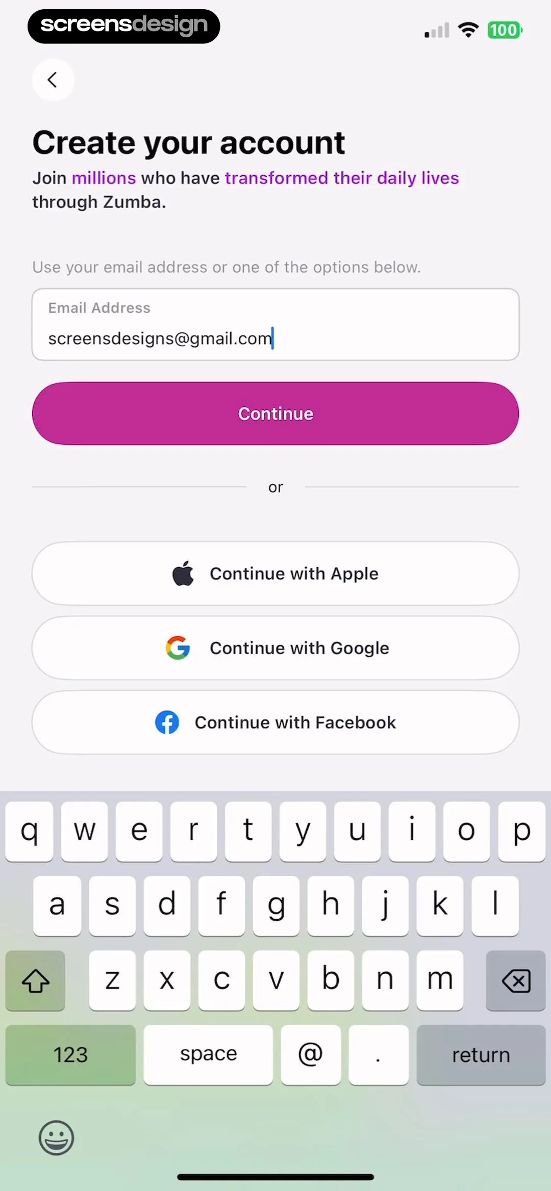
  Zumba - Dance Fitness Workout
A divider with the word 'or' separates the email input from three social sign-in options: 'Continue with Apple', 'Continue with Google', and 'Continue with Facebook', each represented by its respective brand icon.
 See the flow
  Precious - Baby Photo Art
The design is light, airy, and utility-focused, using a simple white background with subtle grey dividers between list items.
 See the flow
  Bible Chat: Daily Devotional
Below a horizontal divider, the header 'Prayer for Eleyna' introduces a written prayer text addressed to the Lord, asking for divine intervention, softened hearts, and spiritual guidance.
 See the flow
  Meetup: Social Events & Groups
Below these, there is an 'OR' separator and a standard email/password input field.
 See the flow
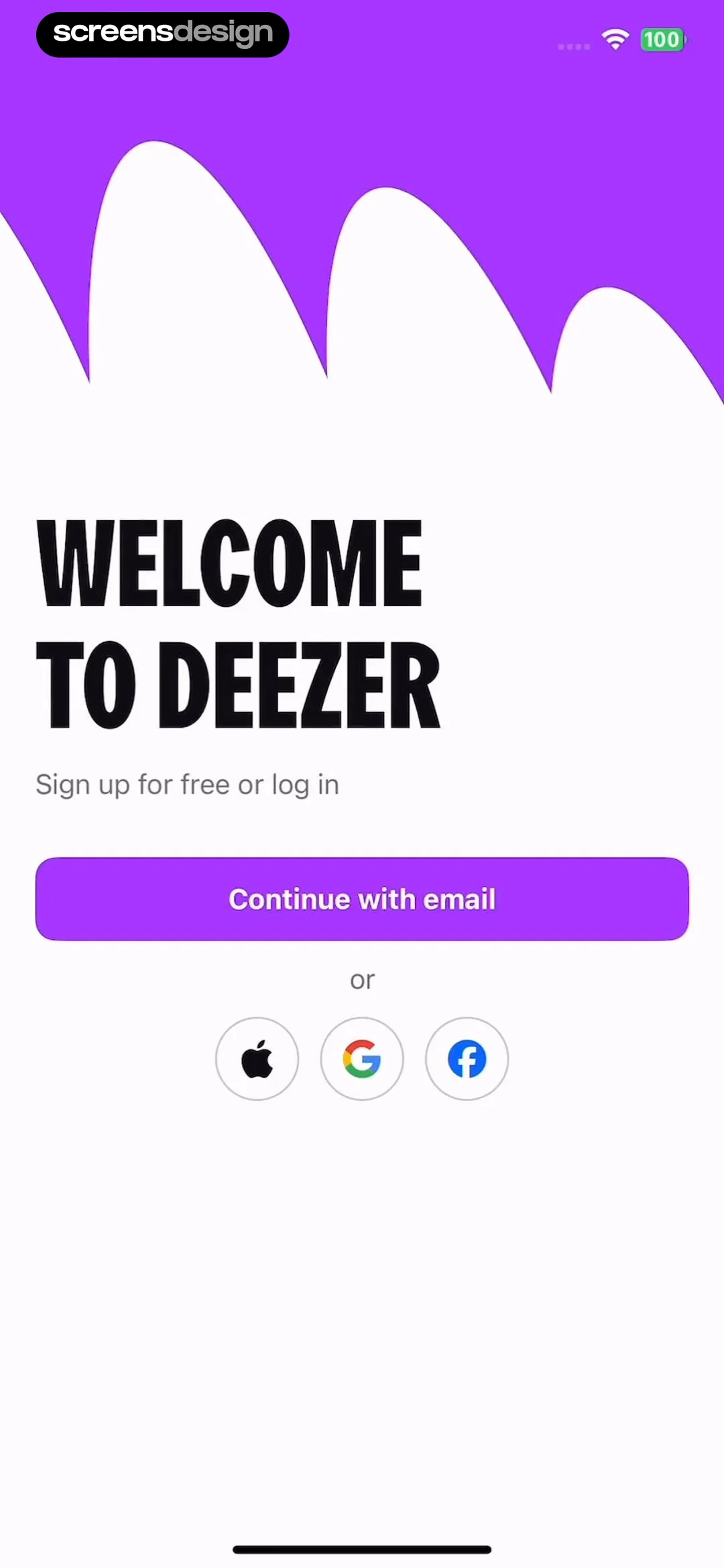
  Deezer: Music Player, Podcast
Below this button, there is a small 'or' separator, followed by three circular social login buttons featuring the Apple, Google, and Facebook logos respectively.
 See the flow
  South China Morning Post: News
Below this, there are four distinct, rectangular buttons for authentication: 'Sign in with Facebook', 'Sign in with Google', 'Sign in with Apple', and 'Sign in with Email', separated by an 'OR' divider.
 See the flow
  Klook: Travel & Activities
The overall aesthetic is minimal and utility-focused, using a light theme with clear typography and subtle dividers between list items.
 See the flow
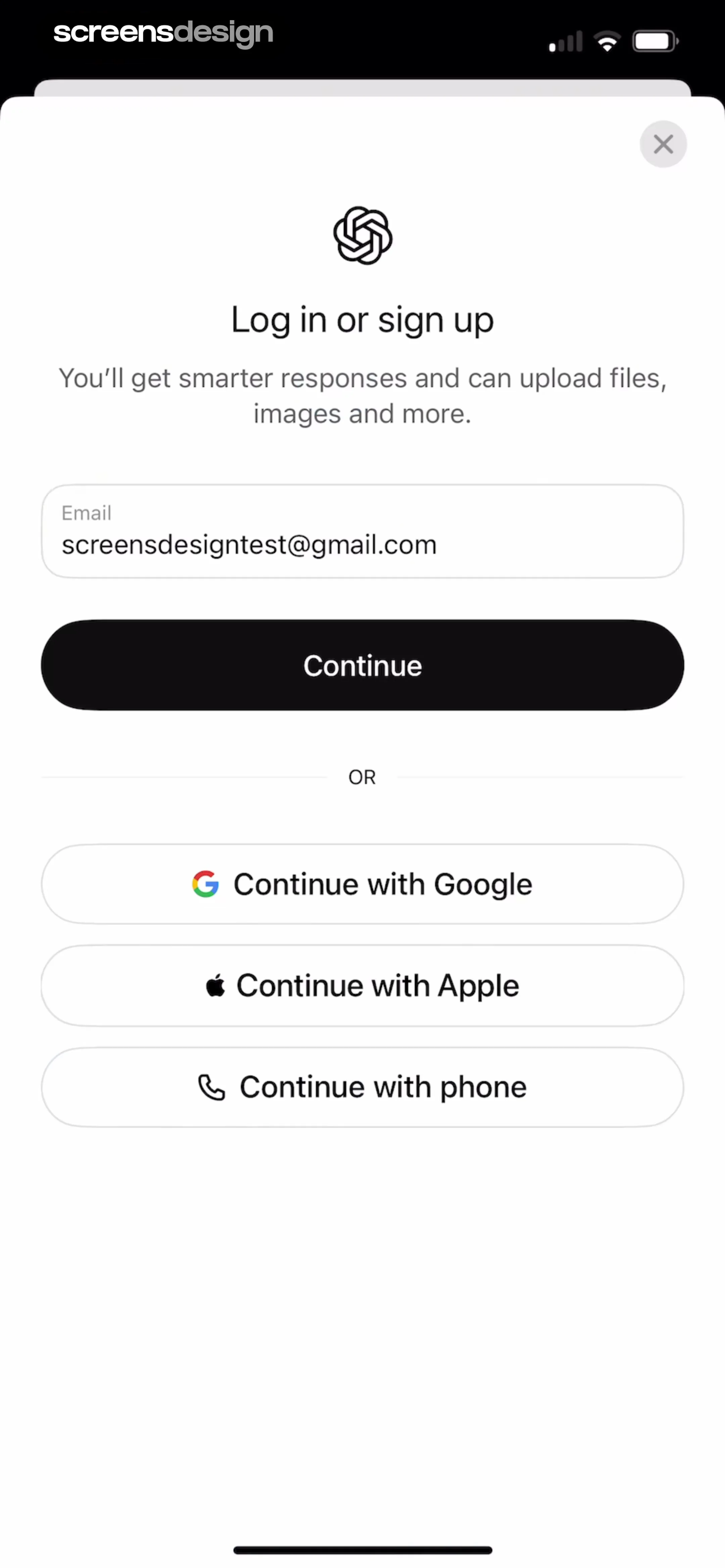
  ChatGPT
A divider labeled 'OR' separates the email login from three alternative social login options: 'Continue with Google', 'Continue with Apple', and 'Continue with phone'.
 See the flow
  SubPilot: Cancel Subscriptions
Top back button, central card with Netflix logo and prompt, 'Or' separator, bottom privacy disclosure card with final CTA.
 See the flow
  Blinq: Digital Business Card
Below the modal, the main screen features a 'Search my contacts' button, a divider labeled 'Or', and a row of sharing options including 'Copy link', 'LinkedIn', 'Telegram', and 'More'.
 See the flow
  Gaia GPS: Mobile Trail Maps
The design is clean and minimalist, using a white background with thin horizontal dividers between list items and green text for the primary actions and selected state.
 See the flow
  The Wall Street Journal. News
The overall design is clean, minimalist, and utility-focused, using a white background with thin grey dividers between list items.
 See the flow
  Too Good To Go: Save Good Food
The UI uses a minimalist aesthetic with a white background, thin grey dividers between list items, and chevron icons indicating navigation to sub-menus.


