screensdesign

Mobile image generation flow examples

GoPhoto:AI Photo & Video Maker: Generating an AI Portrait

Open recorded flow
  1. Step 1 · 1:01

    GoPhoto:AI Photo & Video Maker: Top header with upgrade/search, followed by a row of tool icons, a horizontal category filter, and a multi-column grid of image templates, ending with a bottom navigation bar.See the flow
    GoPhoto:AI Photo & Video Maker

    Top header with upgrade/search, followed by a row of tool icons, a horizontal category filter, and a multi-column grid of image templates, ending with a bottom navigation bar.

  2. Step 2 · 1:06

    GoPhoto:AI Photo & Video Maker: Top navigation bar followed by a 2x3 grid of portrait images.See the flow
    GoPhoto:AI Photo & Video Maker

    Top navigation bar followed by a 2x3 grid of portrait images.

  3. Step 3 · 1:22

    GoPhoto:AI Photo & Video Maker: Top navigation bar, central image display with overlay, bottom action bar.See the flow
    GoPhoto:AI Photo & Video Maker

    Top navigation bar, central image display with overlay, bottom action bar.

  4. Step 4 · 1:26

    GoPhoto:AI Photo & Video Maker: Top navigation bar with back button and app branding, followed by a background image, and a bottom-anchored modal containing input slots and a primary action button.See the flow
    GoPhoto:AI Photo & Video Maker

    Top navigation bar with back button and app branding, followed by a background image, and a bottom-anchored modal containing input slots and a primary action button.

  5. Step 5 · 1:28

    GoPhoto:AI Photo & Video Maker: A centered system permission modal overlaying a dark background with a primary 'Generate' button at the bottom.See the flow
    GoPhoto:AI Photo & Video Maker

    A centered system permission modal overlaying a dark background with a primary 'Generate' button at the bottom.

  6. Step 6 · 1:30

    GoPhoto:AI Photo & Video Maker: Top header with close and title, followed by a dropdown menu, a large scrollable grid of image thumbnails, and a bottom bar with a preview label and a large action button.See the flow
    GoPhoto:AI Photo & Video Maker

    Top header with close and title, followed by a dropdown menu, a large scrollable grid of image thumbnails, and a bottom bar with a preview label and a large action button.

  7. Step 7 · 1:38

    GoPhoto:AI Photo & Video Maker: Top navigation bar, central image area with cropping overlay, bottom aspect ratio selector, and bottom action buttons.See the flow
    GoPhoto:AI Photo & Video Maker

    Top navigation bar, central image area with cropping overlay, bottom aspect ratio selector, and bottom action buttons.

  8. Step 8 · 1:51

    GoPhoto:AI Photo & Video Maker: Top navigation bar, central hero image, bottom modal with two photo slots and a primary action button.See the flow
    GoPhoto:AI Photo & Video Maker

    Top navigation bar, central hero image, bottom modal with two photo slots and a primary action button.


ZEDGE™ Ringtones & Wallpapers: Using AI Wallpaper Generator

Open recorded flow
  1. Step 1 · 5:08

    ZEDGE™ Ringtones & Wallpapers: Top navigation bar followed by a title header and a 2x2 grid of image cards.See the flow
    ZEDGE™ Ringtones & Wallpapers

    Top navigation bar followed by a title header and a 2x2 grid of image cards.

  2. Step 2 · 5:10

    ZEDGE™ Ringtones & Wallpapers: Top navigation bar, central large image preview, title text, and bottom action bar.See the flow
    ZEDGE™ Ringtones & Wallpapers

    Top navigation bar, central large image preview, title text, and bottom action bar.

  3. Step 3 · 5:13

    ZEDGE™ Ringtones & Wallpapers: Full-screen image with a floating control bar at the bottom and navigation icons at the top.See the flow
    ZEDGE™ Ringtones & Wallpapers

    Full-screen image with a floating control bar at the bottom and navigation icons at the top.

  4. Step 4 · 5:26

    ZEDGE™ Ringtones & Wallpapers: Top header with back button and AI icon, followed by a text input box, a horizontal style carousel, two sections of selectable tags (Suggestions and Cool tricks), and a large bottom CTA button.See the flow
    ZEDGE™ Ringtones & Wallpapers

    Top header with back button and AI icon, followed by a text input box, a horizontal style carousel, two sections of selectable tags (Suggestions and Cool tricks), and a large bottom CTA button.

  5. Step 5 · 5:34

    ZEDGE™ Ringtones & Wallpapers: Top navigation bar, prompt input field, style selection carousel, suggested prompts section, cool tricks tag cloud, and a bottom primary action button, with a centered error modal overlay.See the flow
    ZEDGE™ Ringtones & Wallpapers

    Top navigation bar, prompt input field, style selection carousel, suggested prompts section, cool tricks tag cloud, and a bottom primary action button, with a centered error modal overlay.

ThemeKit: Widget & Icon Themes: Generating AI Wallpaper

Open recorded flow
  1. Step 1 · 4:14

    ThemeKit: Widget & Icon Themes: A collage of various art images at the top, followed by a title, descriptive text, and a large call-to-action button at the bottom.See the flow
    ThemeKit: Widget & Icon Themes

    A collage of various art images at the top, followed by a title, descriptive text, and a large call-to-action button at the bottom.

  2. Step 2 · 4:31

    ThemeKit: Widget & Icon Themes: Header with title and balance, text input area, category tabs, style selection carousel, primary CTA button, and bottom ad banner.See the flow
    ThemeKit: Widget & Icon Themes

    Header with title and balance, text input area, category tabs, style selection carousel, primary CTA button, and bottom ad banner.

  3. Step 3 · 4:44

    ThemeKit: Widget & Icon Themes: Top navigation bar, text input area, horizontal filter tabs, and a grid of style selection cards.See the flow
    ThemeKit: Widget & Icon Themes

    Top navigation bar, text input area, horizontal filter tabs, and a grid of style selection cards.

  4. Step 4 · 4:46

    ThemeKit: Widget & Icon Themes: Header with balance, text input area, category tabs with chips, horizontal style carousel, large primary button, and bottom ad banner.See the flow
    ThemeKit: Widget & Icon Themes

    Header with balance, text input area, category tabs with chips, horizontal style carousel, large primary button, and bottom ad banner.

  5. Step 5 · 4:49

    ThemeKit: Widget & Icon Themes: Top navigation bar, central progress card, secondary prompt card, bottom advertisement banner.See the flow
    ThemeKit: Widget & Icon Themes

    Top navigation bar, central progress card, secondary prompt card, bottom advertisement banner.

  6. Step 6 · 5:13

    ThemeKit: Widget & Icon Themes: Top navigation bar, large central image, descriptive text card, primary save button, and bottom advertisement banner.See the flow
    ThemeKit: Widget & Icon Themes

    Top navigation bar, large central image, descriptive text card, primary save button, and bottom advertisement banner.

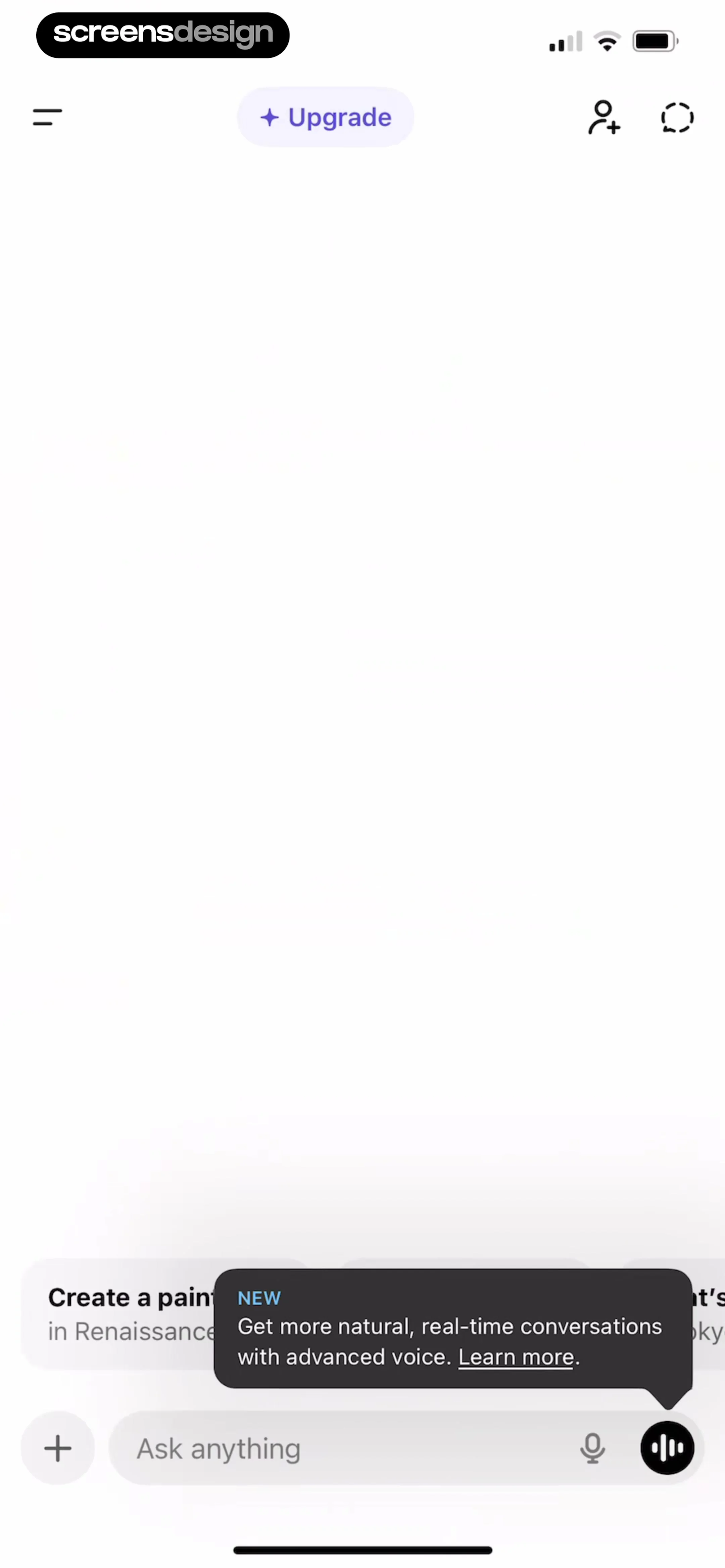
ChatGPT: Image Generation

Open recorded flow
  1. Step 1 · 1:10

    ChatGPT: Top navigation bar, large empty central content area, bottom prompt suggestions, and a bottom fixed input bar with a floating tooltip.See the flow
    ChatGPT

    Top navigation bar, large empty central content area, bottom prompt suggestions, and a bottom fixed input bar with a floating tooltip.

  2. Step 2 · 1:23

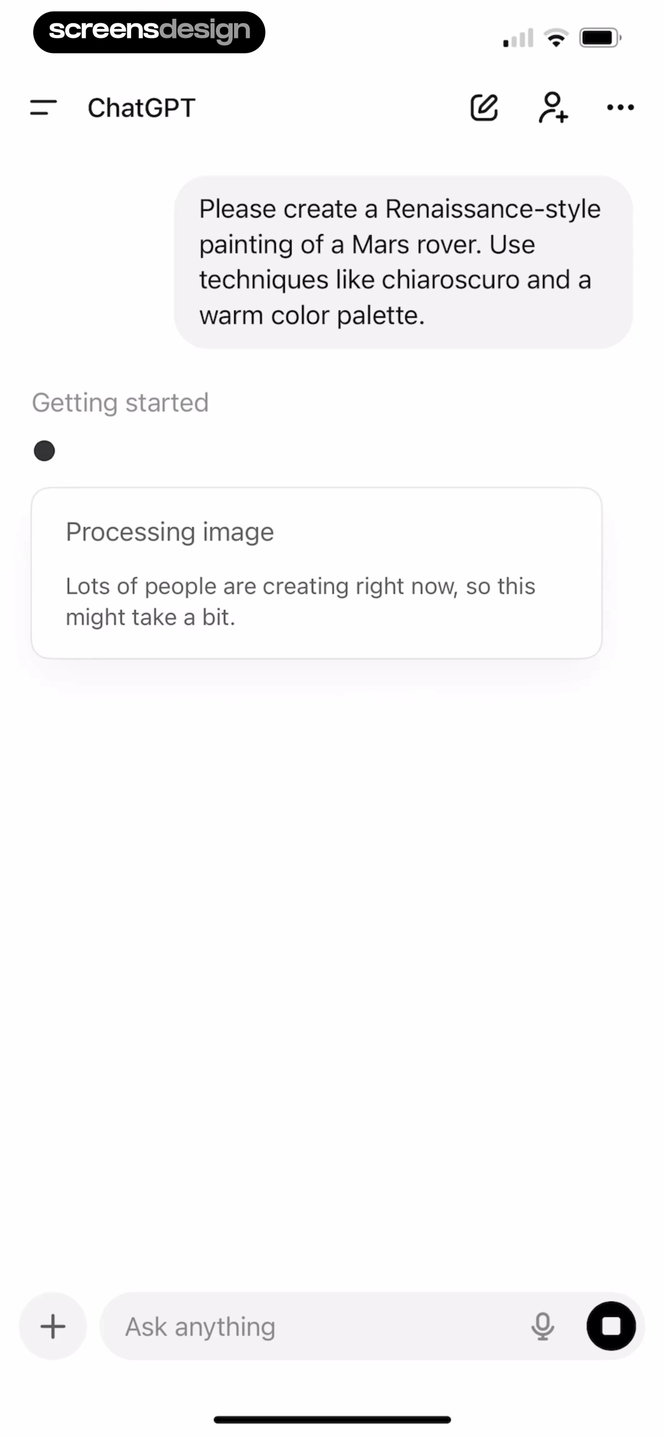
    ChatGPT: Top navigation bar, central chat history area with user prompt and status card, bottom input bar.See the flow
    ChatGPT

    Top navigation bar, central chat history area with user prompt and status card, bottom input bar.

Found an example you like?See the whole story.