

 See the flow
  Calorie Counter by Numify
At the bottom of the screen, there is a back arrow button and a large, prominent black 'Next' button.
 See the flow
  SunSafe: UV Index & Tanning
At the bottom of the screen, there is a large, prominent black 'Next' button for proceeding to the next step of the onboarding process.
 See the flow
  Useless - Screen Time Control
A large red 'Continue' button is at the bottom, with a 'Skip' text link above it.
 See the flow
  VSCO: Photo & Video Editor
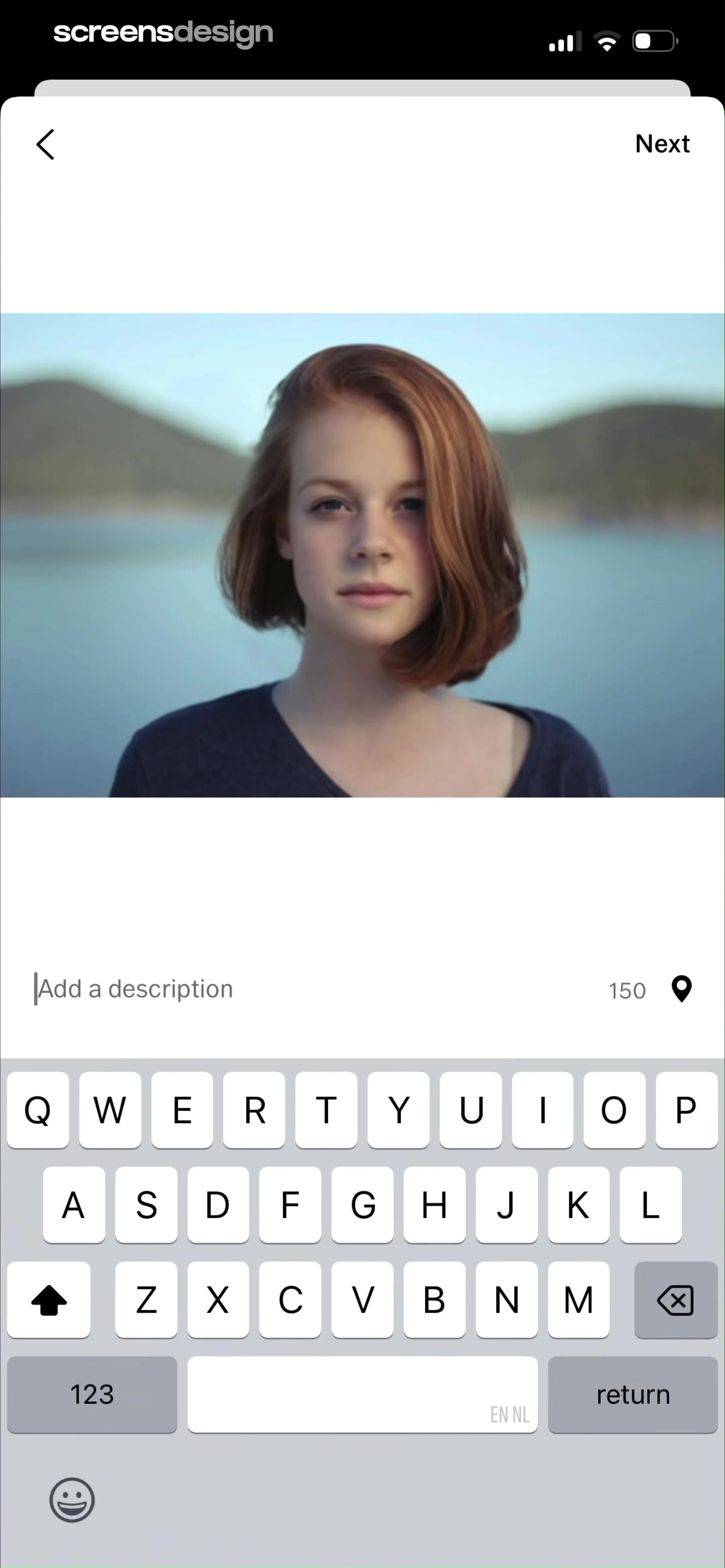
At the top, a navigation bar contains a back arrow on the left and a 'Next' button on the right.
 See the flow
  Ascend: Bible Game
At the bottom of the screen, there are two large buttons: a 'Back' button with a light blue outline and a prominent, gradient-filled 'Next' button with a right-pointing arrow icon.
 See the flow
  Deezer: Music Player, Podcast
Below the input field is a prominent, solid purple 'Continue' button.
 See the flow
  EveryDollar: Budget Management
At the bottom of the screen, a large, dark blue primary button labeled 'Continue to Savings' allows the user to proceed to the next step of the budget setup.
 See the flow
  v0
v0Centered logo in the middle, two stacked buttons at the bottom.
 See the flow
  Bible Chat: Daily Devotional
At the bottom, a large, dark, rounded button labeled 'Continue with selection' serves as the primary call to action.
 See the flow
  Modyfy: AI Car Designer
At the bottom of the screen, there is a large, prominent, rounded-rectangular blue gradient button labeled 'Continue' that serves as the primary call to action for the user to proceed with the onboarding flow.
 See the flow
  Widgetable: Besties & Couples
The primary interactive area contains two large, pill-shaped buttons: 'Continue with Apple' and 'Continue with Google', with the latter highlighted by a green 'Current' badge.
 See the flow
  Planner 5D: AI Home Design
At the bottom, there is a back arrow button on the left and a prominent green 'Next' button on the right, indicating the user is in the process of preparing an image for a design project.
 See the flow
  Plant Identifier, Care: Planty
Top right skip button, central diagnostic card with image, bottom white sheet with text and primary continue button.
 See the flow
  Too Good To Go: Save Good Food
At the bottom, there are 'Back' and 'Next' navigation buttons, and a 'Skip' button is positioned in the top right corner.
 See the flow
  Layout for Instagram・Inpreview
At the bottom, a large, vibrant gradient button labeled 'Continue' serves as the primary call to action.
 See the flow
  Eppika: Read & Learn Languages
At the bottom of the screen, a large, full-width red button labeled 'Continue' serves as the primary call to action.
 See the flow
  SnoreLab : Record Your Snoring
Below the warning text are two primary action buttons: 'Continue' and 'Exit'.
 See the flow
  Yelp: Food, Services & Reviews
The top navigation bar contains 'Cancel', a 'Recents' dropdown menu, and a 'Next' button.
 See the flow
  GoPhoto:AI Photo & Video Maker
At the bottom, there is a prominent, horizontally-oriented, gradient-colored button labeled 'Continue' with white text.
 See the flow
  Redfin: Buy, Sell & Rent Homes
At the bottom, there is a prominent red 'Next' button.

