

 See the flow
  Flight Tracker +
At the top, there is a navigation header with a history icon, a notification bell, and a segmented control to toggle between 'My Flights' and 'Trips', with 'Trips' currently selected.
 See the flow
  Scanner App: Genius Scan
The top of the screen features a 'Crop' button on the right and a segmented control to toggle between 'All images' and 'Documents'.
 See the flow
  EveryDollar: Budget Management
The top section features a green header with a title 'Insights' and a segmented control bar with four tabs: 'Spending Totals' (selected), 'Spending Details', 'Monthly Income', and 'Income vs.
 See the flow
  AI Summary - Meeting Notes
Under the video, there is a segmented control with 'Transcription' (selected) and 'Summary' (unselected) tabs.
 See the flow
  ThemeKit: Widget & Icon Themes
The top section displays a preview of the icon, which is a blue squiggle on a white background, with a segmented control below it to select the icon shape (circle, rounded square, square).
 See the flow
  Premier League - Scores, News
Below this, a segmented control allows users to filter by 'First Team', 'PL2', or 'U18' (currently selected).
 See the flow
  Hypelist: Create & Share Lists
The top of the screen features a 'Cancel' button, a segmented control for switching between 'Photos' and 'Collections', and a search bar with a microphone icon.
 See the flow
  Plant Identifier, Care: Planty
The layout features a top navigation bar with a 'Cancel' button on the left and a segmented control for 'Photos' and 'Albums' in the center.
 See the flow
  Zalando – Online fashion
Below the 'Your Account' title, there is a 'Homepage' section with a segmented control for 'Women', 'Men', and 'Kids', with 'Kids' currently selected.
 See the flow
  Heyyyy: Stories that text back
The top section features a clear 'X' close button and a segmented control toggle between 'Photos' and 'Collections'.
 See the flow
  Rooms
RoomsAt the top, a segmented control allows toggling between 'Edit' and 'Preview' modes, alongside a help icon and a 'Save as' button.
 See the flow
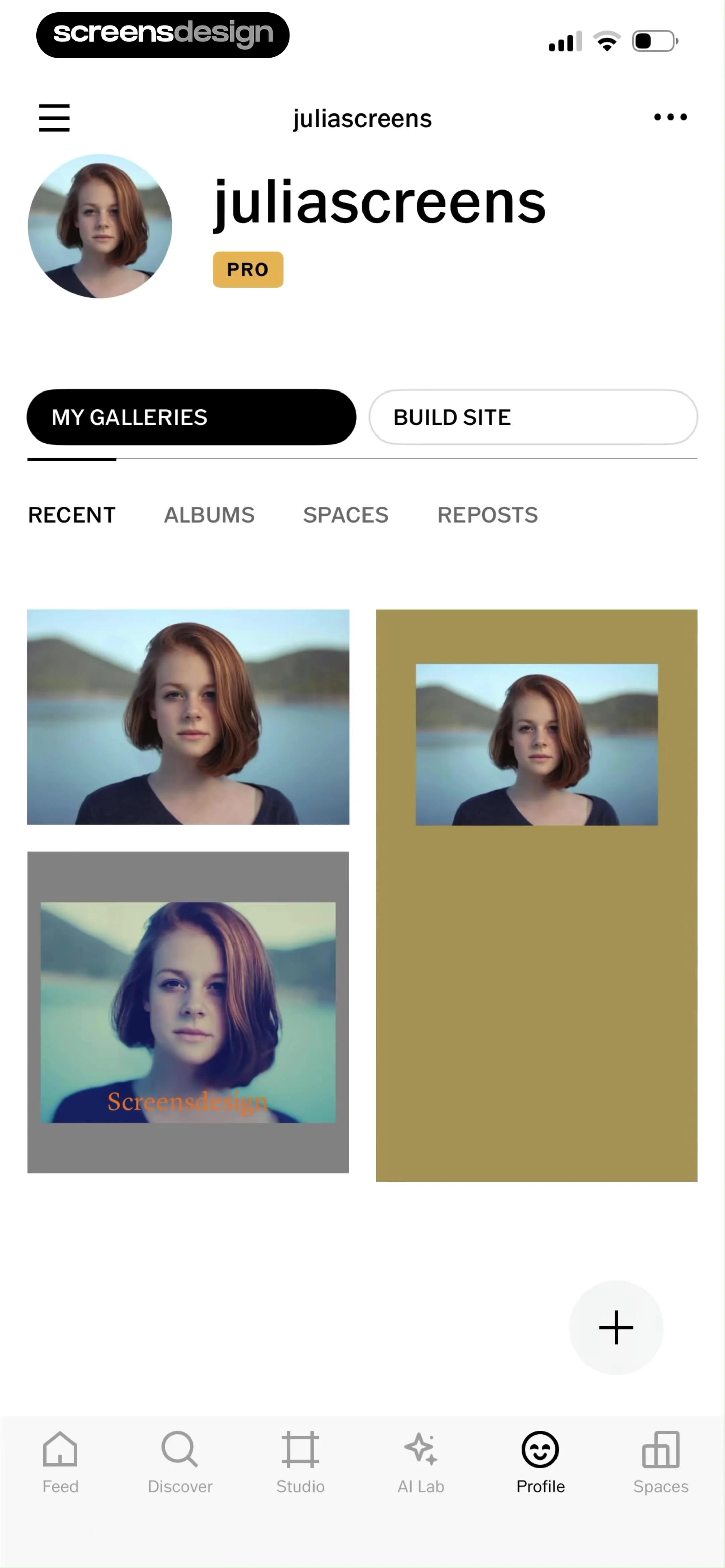
  VSCO: Photo & Video Editor
Below this, a segmented control allows switching between 'MY GALLERIES' and 'BUILD SITE'.
 See the flow
  Widgetable: Besties & Couples
Below the preview, a color picker panel is active, featuring a segmented control to switch between 'Grid', 'Spectrum', and 'Sliders' modes, with 'Sliders' currently selected.
 See the flow
  Blinq: Digital Business Card
The main content area features a title 'Design Principle: Consistency is Key' followed by a segmented control toggle for 'Summary' and 'Transcript', with 'Transcript' currently selected.
 See the flow
  v0
v0Below this, there is a segmented control with 'Share' and 'Publish' tabs, with 'Publish' currently active.
 See the flow
  Noxogy Sleep Tracker
A segmented control allows switching between 'Statistics' and 'Recordings', with 'Recordings' currently selected.
 See the flow
  CraftBook: Crochet Made Easy
The top section features a segmented control with 'Photos' (selected) and 'Collections' tabs, alongside a close button.
 See the flow
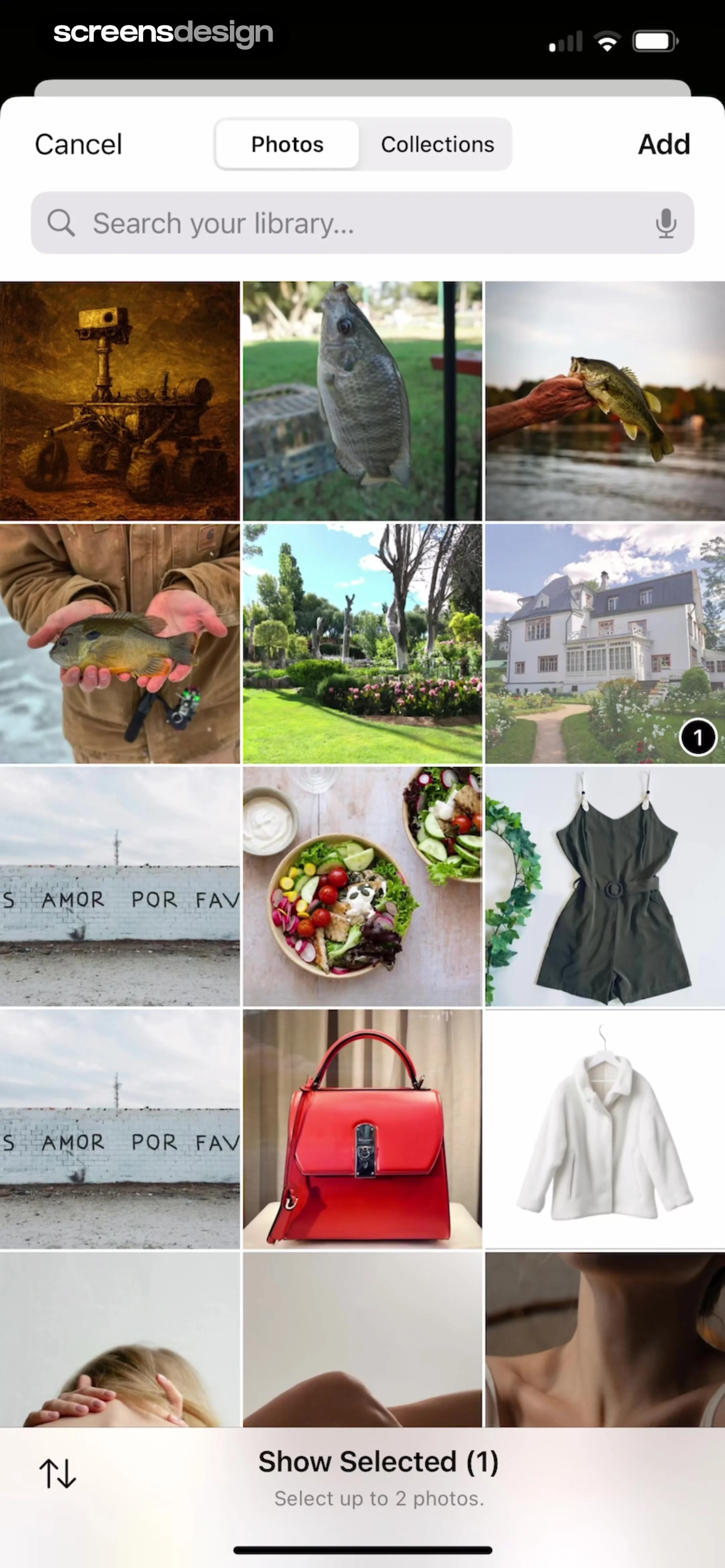
  ChatGPT
The top navigation bar contains 'Cancel', a segmented control for 'Photos' and 'Collections', and an 'Add' button.
 See the flow
  Planner 5D: AI Home Design
Below this, a segmented control allows switching between 'Current' and 'Completed' tabs, with 'Current' selected.
 See the flow
  Windy.app — Wind, Tides, Radar
A vertical stack of cards containing sliders, segmented controls, and a circular interactive compass.


