Start with behavior, not polish
Mobile app UI design that makes the next action clear.
Mobile app UI design is the layer people see, read, tap, enter, compare, and respond to. It includes screen hierarchy, navigation, controls, content presentation, feedback, and every state those elements can enter.
A polished default screen is not enough. A useful interface also explains what is interactive, what changed, what is still possible, and how the user can recover. The examples below are recorded product screens, so you can inspect the exact screen and its surrounding journey rather than judging a detached mockup.
This guide stays at the interface layer: components, interaction patterns, state behavior, and visual systems. For the wider UX and product process, use the mobile app design guide. For screen types, roles, and reference galleries, use the app screens guide.
Research method: 14 recorded ScreensDesign screens reviewed across navigation, inputs, filtering, data, overlays, and system states. Published August 2026.
Hierarchy
Make importance visible before the user begins reading.
Navigation
Keep location, available destinations, and escape routes clear.
Controls
Match each decision to a familiar, usable interaction.
States
Design what happens before, during, after, and when things fail.
Components and visual systems
Build component families, not isolated polished rectangles.
A component is a behavioral contract. It needs a clear purpose, content rules, interaction rules, accessibility semantics, and a complete set of states. Reusing only the shape or color does not create a coherent mobile app UI design system.
Buttons
Primary, secondary, destructive, icon-only, and loading actions.
Fields
Labels, values, guidance, validation, focus, and secure entry.
Selectors
Checks, radios, switches, chips, pickers, and segmented controls.
Cards and lists
Repeated content, clear tap areas, metadata, and disclosure.
Navigation
Tabs, bars, menus, back paths, destinations, and current location.
Feedback
Progress, loading, success, empty, warning, and error states.
Design every state before calling a component done.
Review default, pressed, focused, selected, disabled, loading, success, and error behavior. The relevant set changes by component, but the team should never discover a missing state during implementation.
Let tokens carry consistency across the product.
Typography roles, color roles, spacing, corner treatment, elevation, and icon rules should express the same hierarchy wherever a component appears. Test contrast, dynamic text, touch targets, focus, and motion as part of that system.
Start from platform behavior, then earn each deviation.
Native components bring familiar behavior, accessibility, and operating-system updates. A custom component is useful when the product needs a distinct interaction, but it must preserve the conventions people rely on.
Structure and navigation
Navigation should explain the product before the user taps.
A mobile interface has little room for ambiguous destinations. Persistent navigation should represent durable places. Local controls should change the current task. Creation actions should reveal choices only when those choices are needed.
Motion keeps creation compact until intent is known.
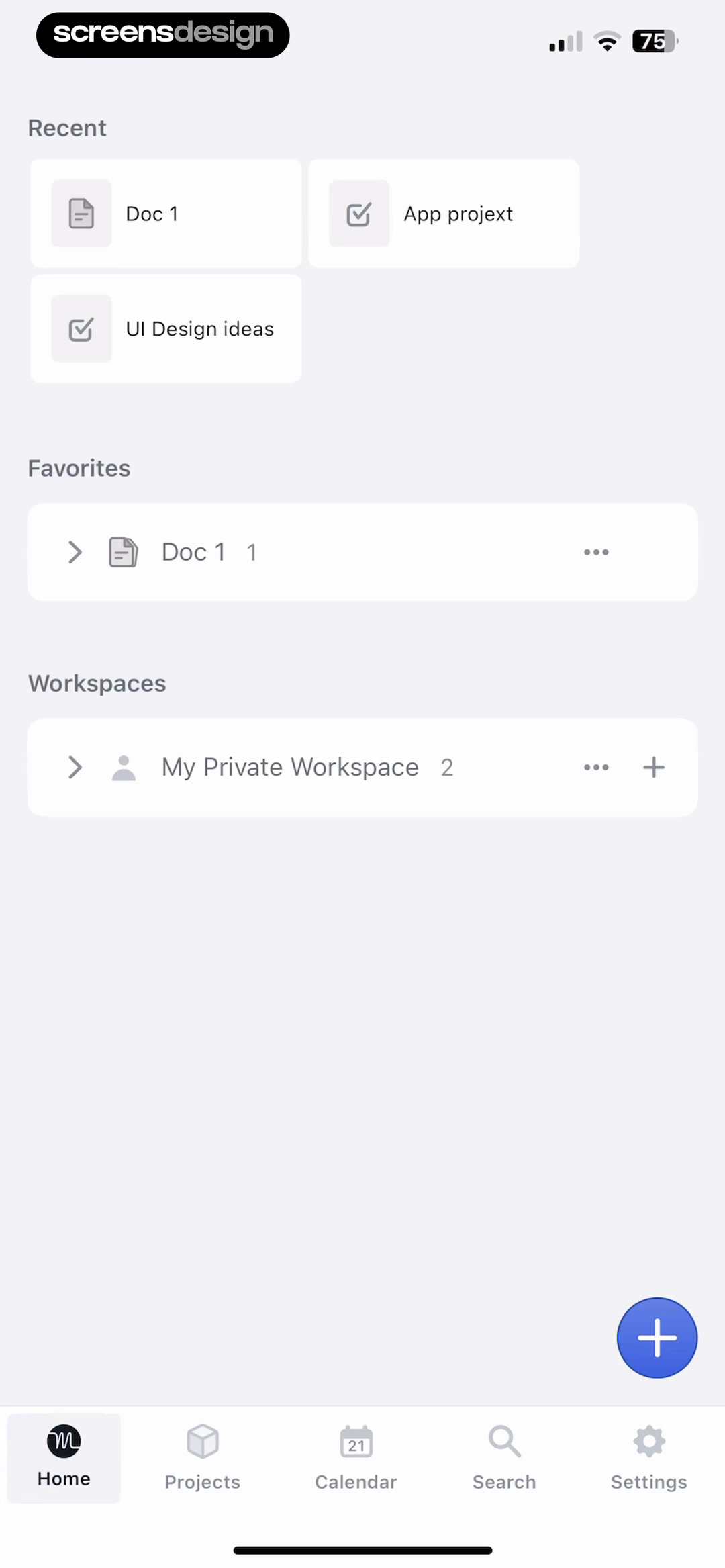
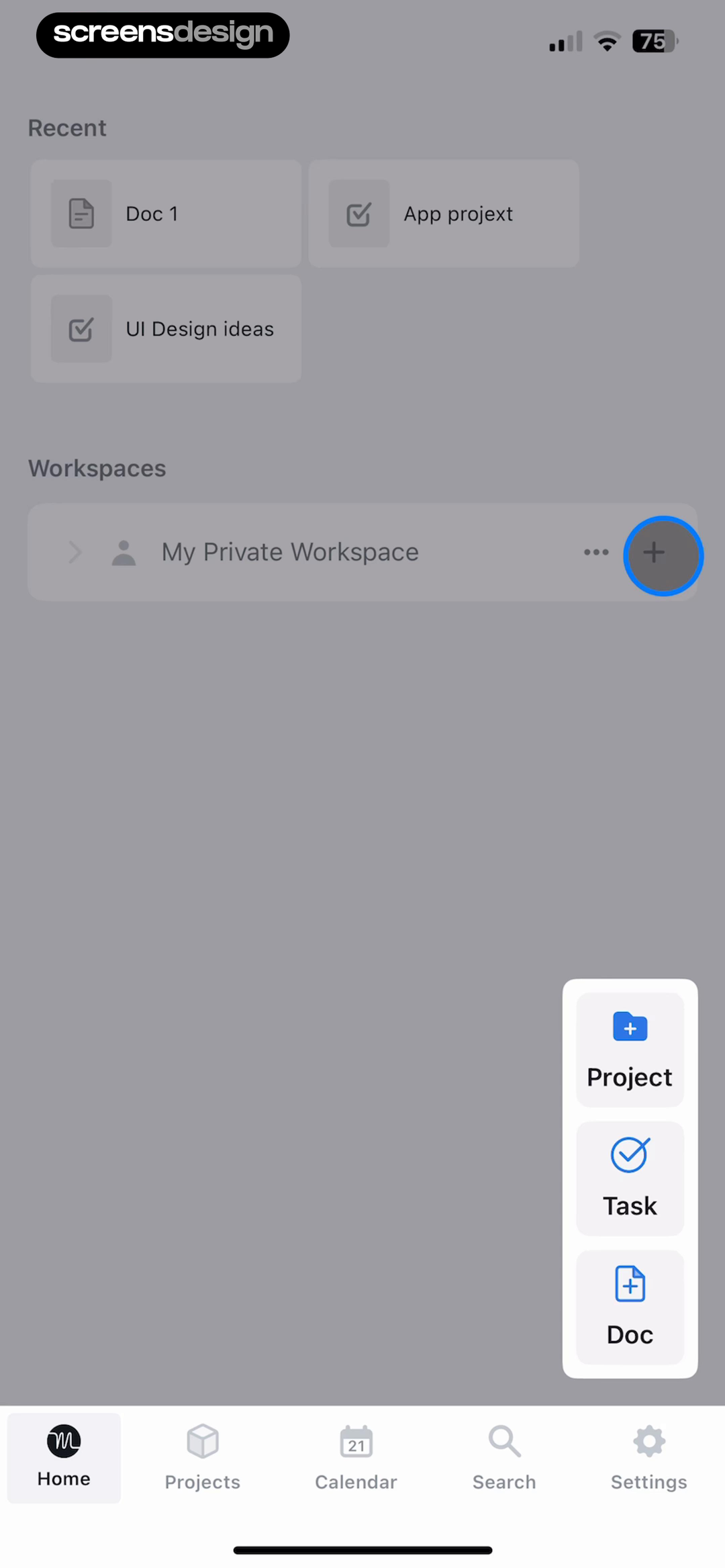
The resting home screen uses bottom navigation for durable destinations and one floating plus control for creation. After it is tapped, the interface reveals Project, Task, and Doc without permanently adding three competing buttons.
The useful principle is not the floating button itself. It is the timing: the interface asks which object the user wants only after the user expresses intent to create.
Open the recorded task flow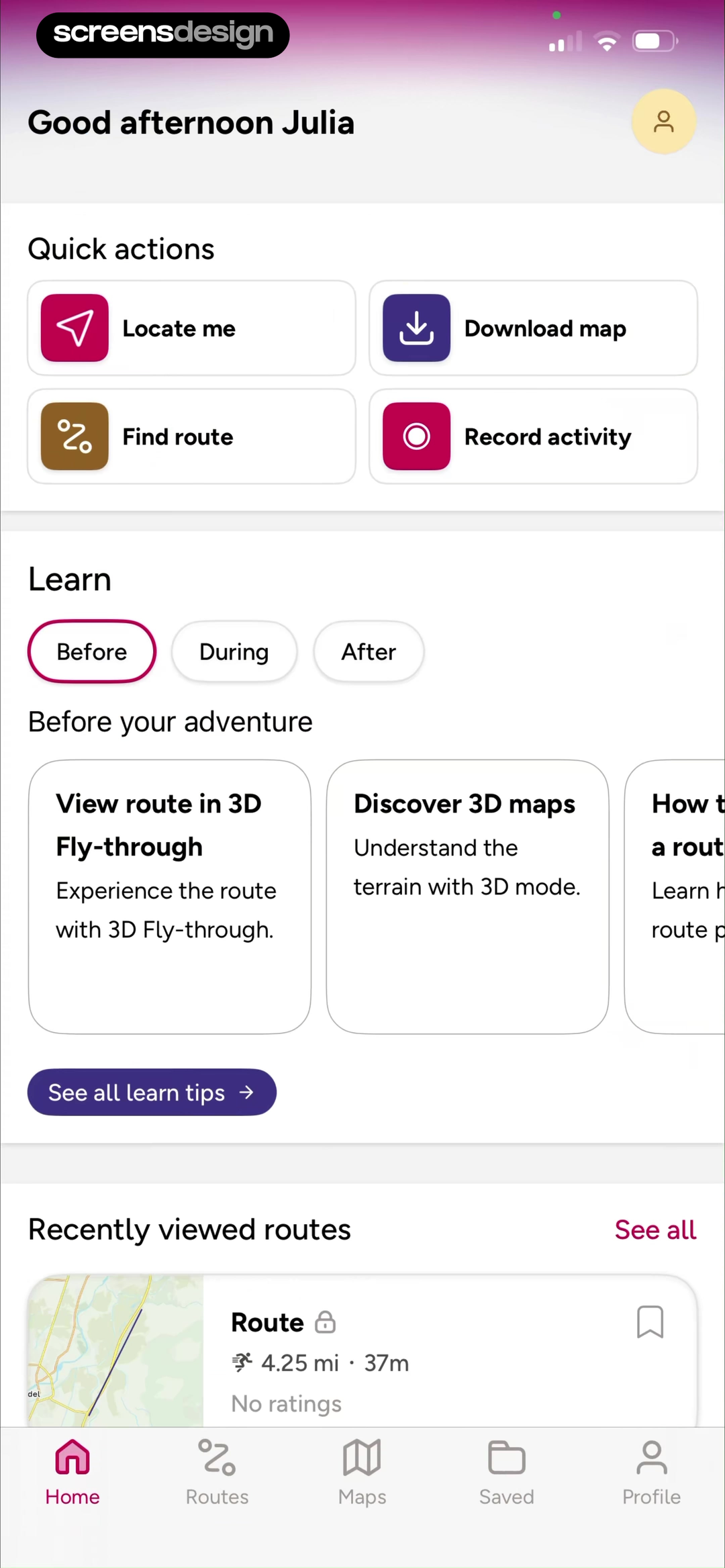
OS Maps separates quick actions from destinations.
Locate me, Download map, Find route, and Record activity are task shortcuts. Home, Routes, Maps, Saved, and Profile are stable destinations. Learning content and recent routes sit lower because they support the main job rather than define the product's global structure.
When a home screen contains many possibilities, use grouping and labels to explain the difference between an action, a destination, and content that can be resumed.
OS MapsForms and input design
A form is a sequence of decisions, not a stack of fields.
The interface should explain what information is needed, why it matters, which values are valid, and what happens after completion. Grouping, defaults, suggested answers, and the primary action all reduce interpretation work.
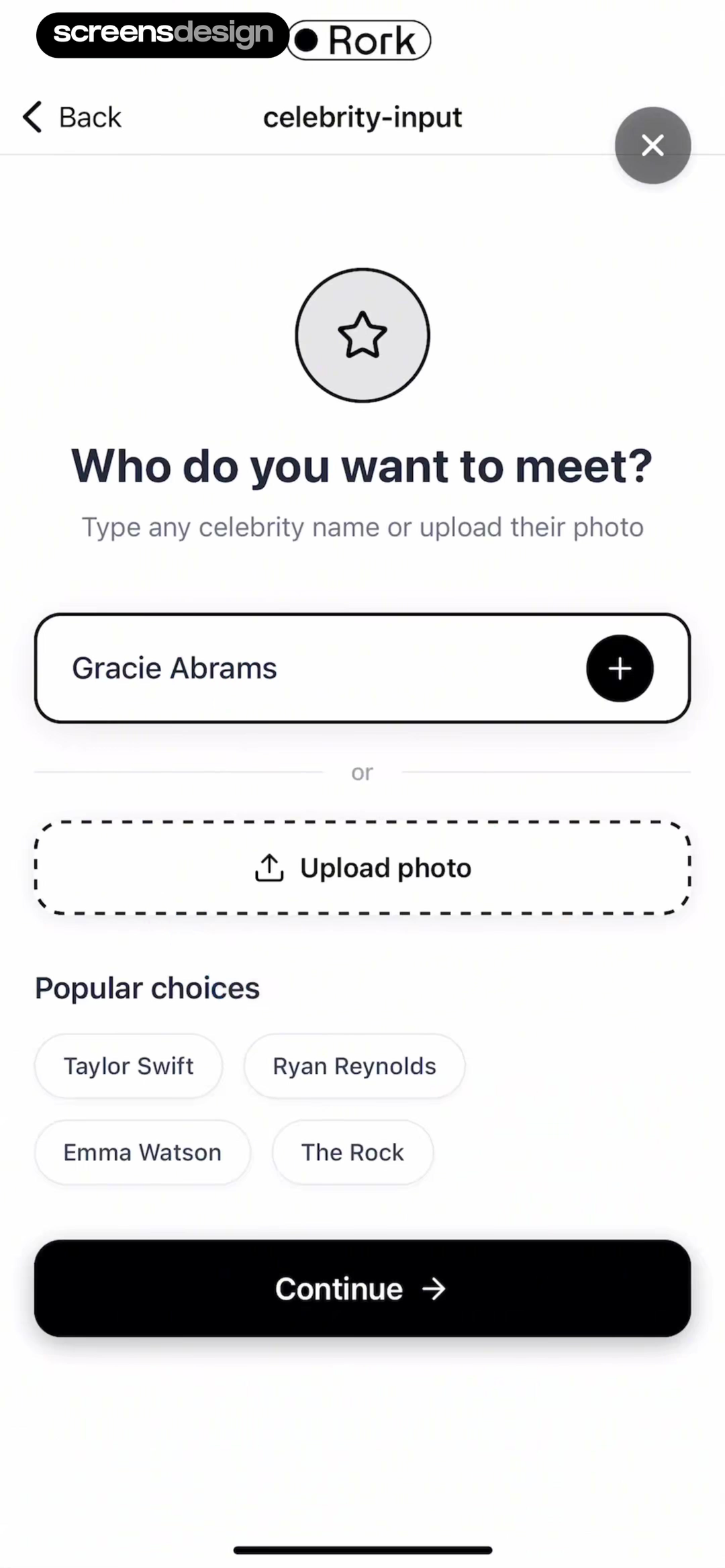
Rork combines typing, uploading, and suggestions.
The screen asks one question and provides three ways to answer it: enter a name, upload a photo, or use a popular choice. The Continue action remains visually separate from those input methods.
Rork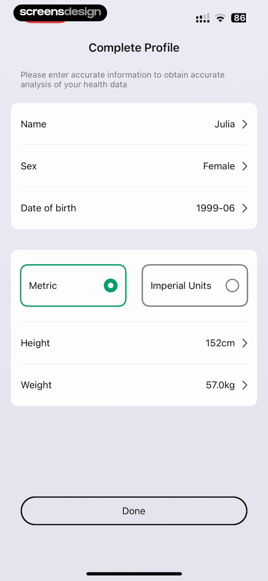
Zepp groups related values and exposes units.
Identity fields are separated from measurement settings. Metric and Imperial Units are treated as an explicit choice because that selection changes the meaning of the height and weight values below it.
Open the recorded profile flowCompare forms with the same job.
Search real input screens, then inspect how validation, defaults, permissions, and completion work across the full flow.
Search and filtering
Keep the query, scope, filters, and result state connected.
Search UI becomes difficult when the user cannot tell where the system searched or why the result set changed. Keep the query visible, expose the active scope, show applied filters, and preserve those choices when the result becomes empty.
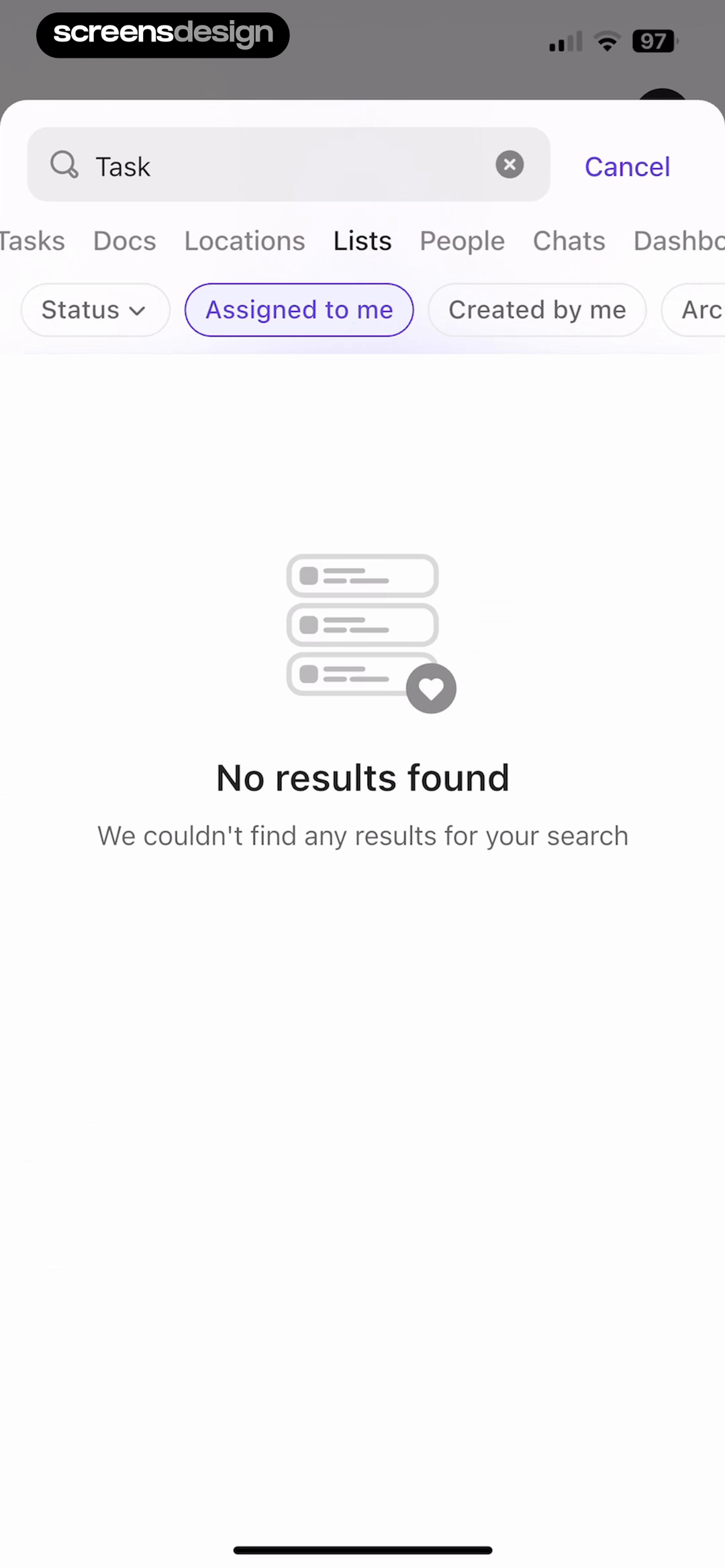
ClickUp lets the empty result explain itself.
The first screen shows tasks under a visible Tasks scope with secondary filter chips. After Assigned to me is applied, the result becomes empty, but the search term, content scope, and active filter remain visible. The user can diagnose the result without restarting the search.
- Keep the query editable.
- Make active filters visually distinct.
- Explain whether nothing exists or nothing matches.
- Provide a direct path to broaden the result.
Dashboards and data
Match visual weight to the decision behind the number.
A dashboard should not make every metric equally loud. Start with the question a person is trying to answer, then choose summary values, comparisons, charts, and drill-down controls that support that question.
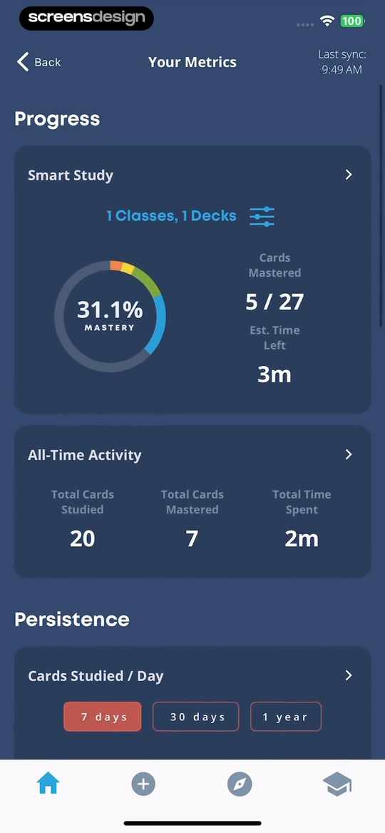
Apple Health scans. Brainscape synthesizes.
Apple Health uses a vertical list of metric cards because the immediate job is to browse values across categories. Brainscape combines mastery, totals, time estimates, and a time-range chart because the job is to understand learning progress as a system.
Both screens group related information and attach units to values. The difference is the level of interpretation the product performs before presenting the data.
Show the number with its unit and current context.
State the baseline, period, or target being compared.
Explain status when a number alone is difficult to interpret.
Offer drill-down only when more detail can change a decision.
Sheets, menus, and dialogs
Interrupt the interface only when the decision deserves it.
Overlays are useful when an action belongs to the current context or when proceeding could create a meaningful consequence. They become harmful when they hide information the user needs to make the decision.

Must keeps a contextual bulk choice lightweight.
The action sheet offers one bulk operation and a clearly separated Cancel control. The surrounding collection remains visible through the dimmed background, preserving context.
Must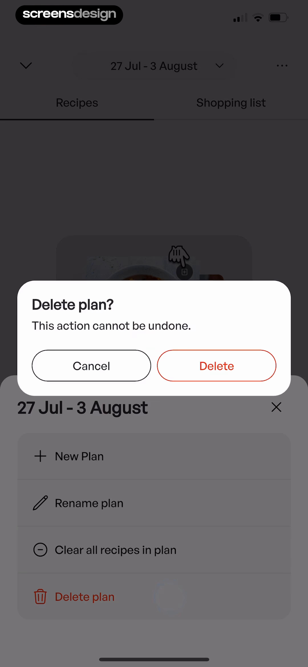
Mob names the object and the consequence.
Delete plan? is more specific than a generic warning. The dialog states that the action cannot be undone and keeps Cancel next to the destructive choice.
MobEmpty, success, and error states
The interface is not finished until recovery is designed.
System states should answer four questions: what happened, what it means, whether the user's work is safe, and what can be done next. Tone and illustration can support that message, but they cannot replace it.

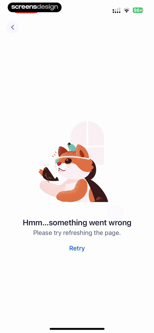
Unsplash names the failure and offers Retry.
The Stats destination remains visible, the message says the server is down, and the next action is immediate.
UnsplashProduct Hunt adds warmth without hiding the task.
The illustration makes the failure feel less severe, but the screen still explains the issue and presents Retry.
Product HuntCraft separates recent feedback from persistent state.
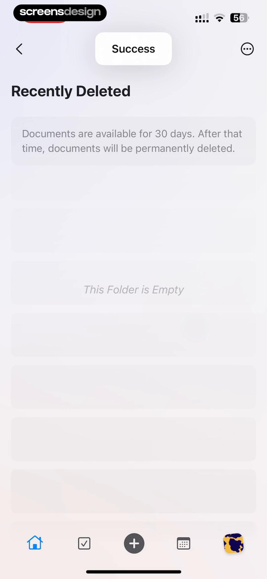
A temporary Success toast confirms the preceding action. The page then explains the 30-day retention rule and that the folder is empty.
CraftStudy the state after the polished screen.
Inspect complete journeys to see loading, permissions, empty content, validation, success, and recovery in context.
Search by interface problem
Browse the component in the state you are designing.
A generic gallery can show visual variety. A useful UI search should narrow by task, content, component, and state so the examples are comparable.
Forms and inputs
Fields, choices, validation, upload controls, and completion actions.
Search these screens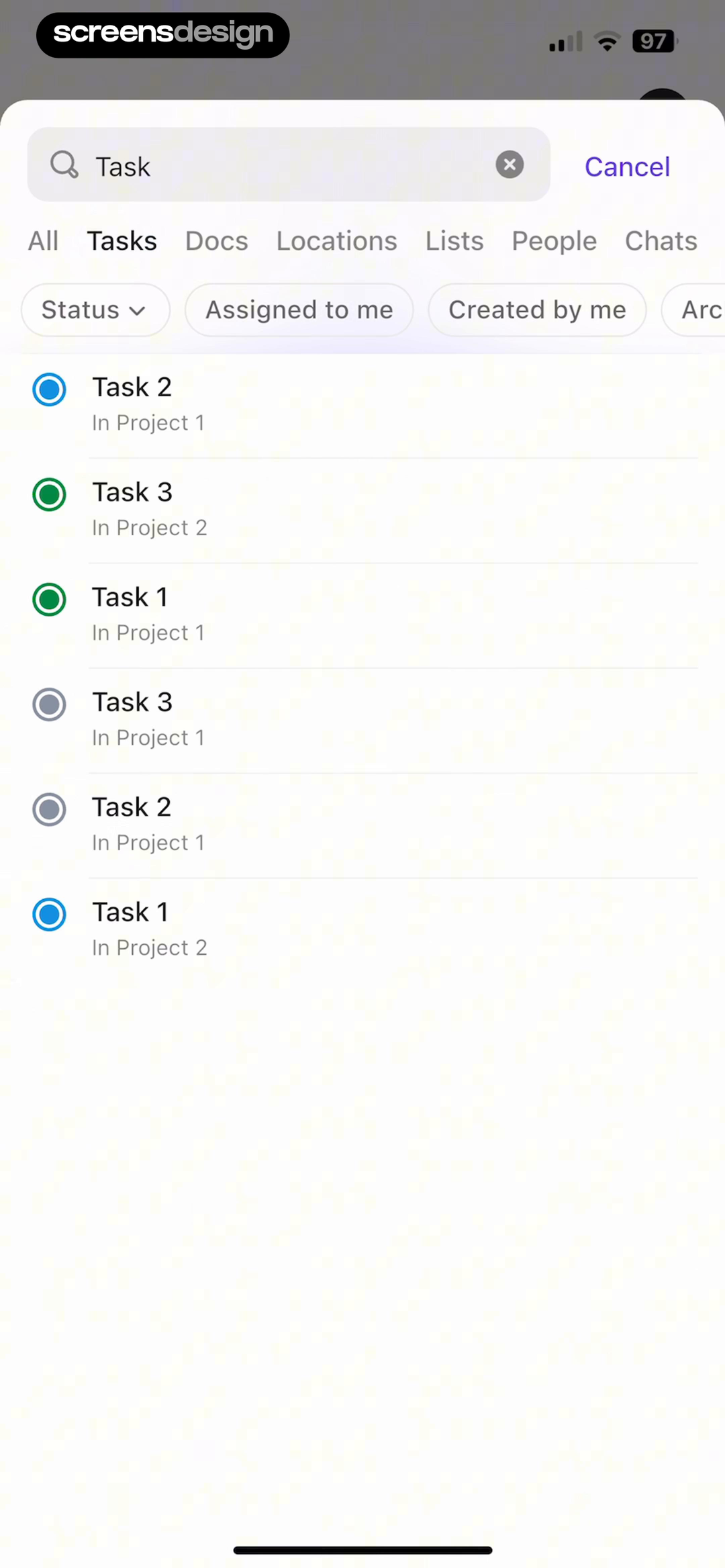
Search and filters
Query fields, scopes, chips, results, and useful no-result states.
Search these screensSheets and dialogs
Contextual actions, confirmation, cancellation, and destructive choices.
Search these screensA repeatable screen-review process
Move from screen purpose to reviewed interface states.
Component selection should follow the product decision. This five-step sequence keeps visual design connected to behavior, content, and the surrounding journey.
- 01
Write the screen's job.
Name the decision or action the screen must make easier. Do this before choosing cards, tabs, or visual treatments.
Question: what should the user be able to do next? 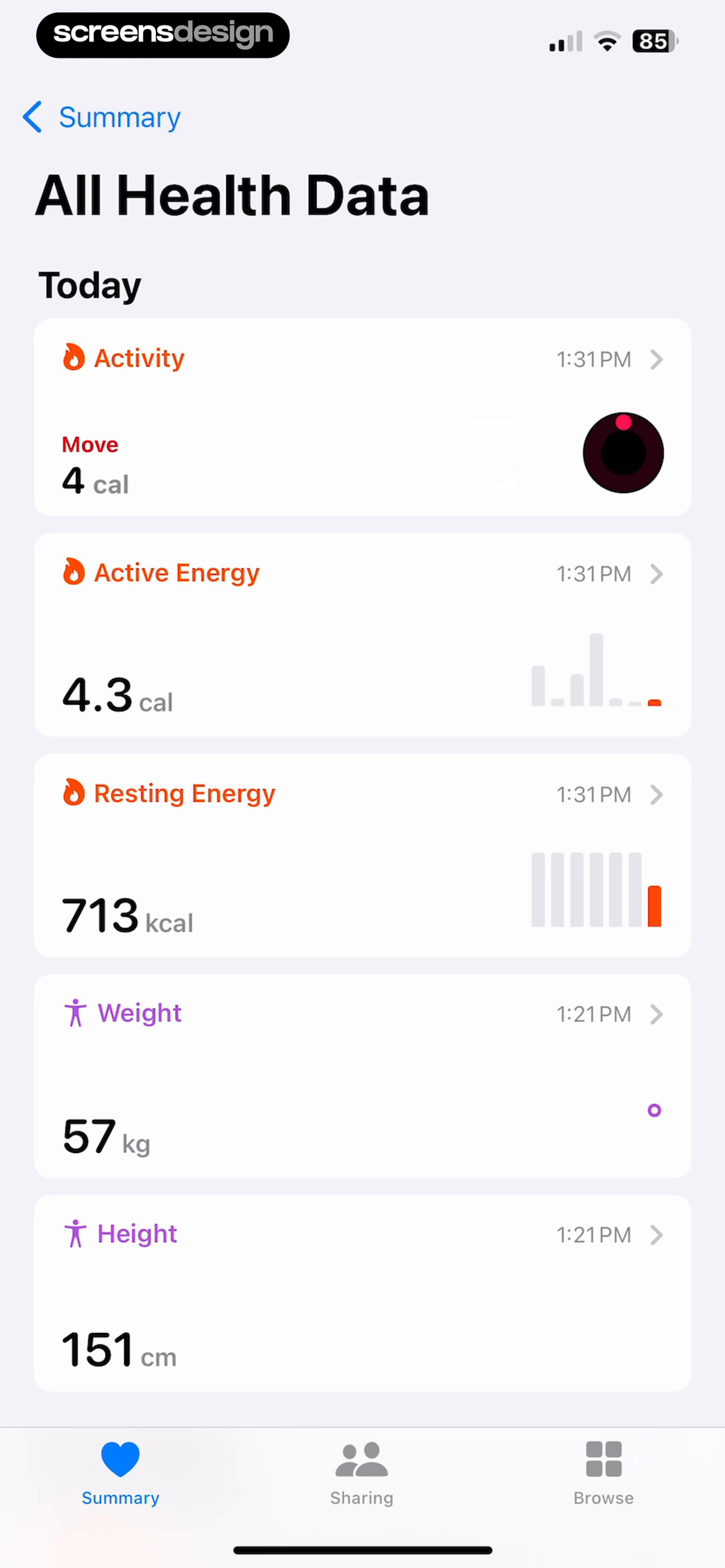 02
02Rank the information.
Separate what must be understood now from what can wait. Size, position, grouping, and contrast should follow that order.
Question: what deserves the first three seconds of attention?- 03
Map every meaningful state.
List initial, active, completed, empty, loading, error, disabled, and permission states before treating the default screen as finished.
Question: what changes after the user acts? - 04
Test realistic content.
Use long labels, missing data, repeated items, small numbers, large numbers, and content the product will genuinely produce.
Question: does the layout still explain itself under stress? - 05
Compare the surrounding flow.
Inspect what precedes the screen and what follows it. A locally elegant component can still create a confusing journey.
Question: did this interaction preserve context and momentum?
Before implementation
Review the interface as a connected system.
Use this checklist on the default screen, then repeat it for loading, empty, error, disabled, and completed states.
The screen has one clearly stated primary job.
The first visual emphasis matches the first user decision.
Navigation labels describe destinations rather than features.
Controls look interactive and have a predictable result.
Field labels, units, requirements, and validation remain visible.
Search scopes and applied filters can be understood and changed.
Numbers include enough context to support interpretation.
Destructive actions name the object and consequence.
Empty and error states explain what can happen next.
Text, contrast, focus, motion, and tap targets remain accessible.
Realistic content does not break hierarchy or component sizing.
The next screen preserves the context created on this one.
Continue with the broader mobile app design guide, browse the visual app screens guide, or learn how to research references in the app design inspiration guide. For a practical method focused on one interface at a time, use the app screen design guide.
See the system applied in reviews of mobile color and typography, home screens, empty states, and calorie tracker interfaces.
Frequently asked questions
Questions about mobile app UI design.
What is mobile app UI design?
Mobile app UI design is the design of the screens, controls, navigation, visual hierarchy, content presentation, and interactive states people use inside a mobile product. It turns product behavior and information into an interface that can be understood and operated.
What is the difference between mobile app UI and UX design?
UX design covers the wider experience, including user needs, task flows, product structure, research, and usability. UI design focuses on how that experience is expressed through screens, components, content hierarchy, interaction feedback, and visual treatment. The two should be designed together.
Which screens should a mobile UI designer create first?
Start with the smallest path that proves the product's core value: the entry point, the primary task, the result, and the main recovery state. Add onboarding, account, settings, edge cases, and secondary journeys after the central interaction is coherent.
How do you choose components for a mobile app?
Choose components according to the user's decision, the amount and type of content, platform conventions, accessibility needs, and the states the component must support. A familiar control is usually stronger than a novel one when both solve the same job.
How should mobile app UI examples be used?
Study examples by task and state. Record what the screen is helping the user decide, why each component is present, what happens after interaction, and which product constraints shaped the result. Translate the mechanism rather than copying the surface.
What should a mobile UI design checklist include?
Check hierarchy, readable text, tap targets, navigation clarity, component consistency, realistic content, loading and error handling, empty states, destructive-action safeguards, accessibility, and continuity with the surrounding flow.
2,622 apps in the top charts.Ask them anything.
Search the interface problem you are solving, compare exact screens and complete flows, and use stronger evidence to improve your own app.