Observed across 12 recorded mobile apps
14 Mobile App Color and Typography Examples: Systems to Audit
Fourteen recorded screens show color and typography working as interface systems, not isolated decoration.
A mobile visual system succeeds when people can tell what is important, what is interactive, what changed, and what needs attention. Typography creates that reading order through size, weight, face, spacing, and line length. Color reinforces roles such as action, selection, progress, warning, category, and brand. Neither should carry essential meaning alone.
Start with roles before choosing tokens. Define display, section, body, label, data, action, and supporting text. Then define surface, text, border, accent, positive, caution, negative, and informational color roles. Test those roles with long copy, large text, low brightness, dark appearance, real data, errors, disabled controls, and selected states. A polished static frame cannot reveal whether the system survives those conditions.
Use the mobile app UI design guide to place these visual decisions inside navigation, feedback, components, and complete task states. For Apple platform conventions and system behavior, continue with the iOS app design guide.
See those roles applied to return-state hierarchy in the mobile app home screen design review.
01. Hierarchy
Build reading order from stable roles.
A useful hierarchy makes the next level of detail predictable before a person reads every word.
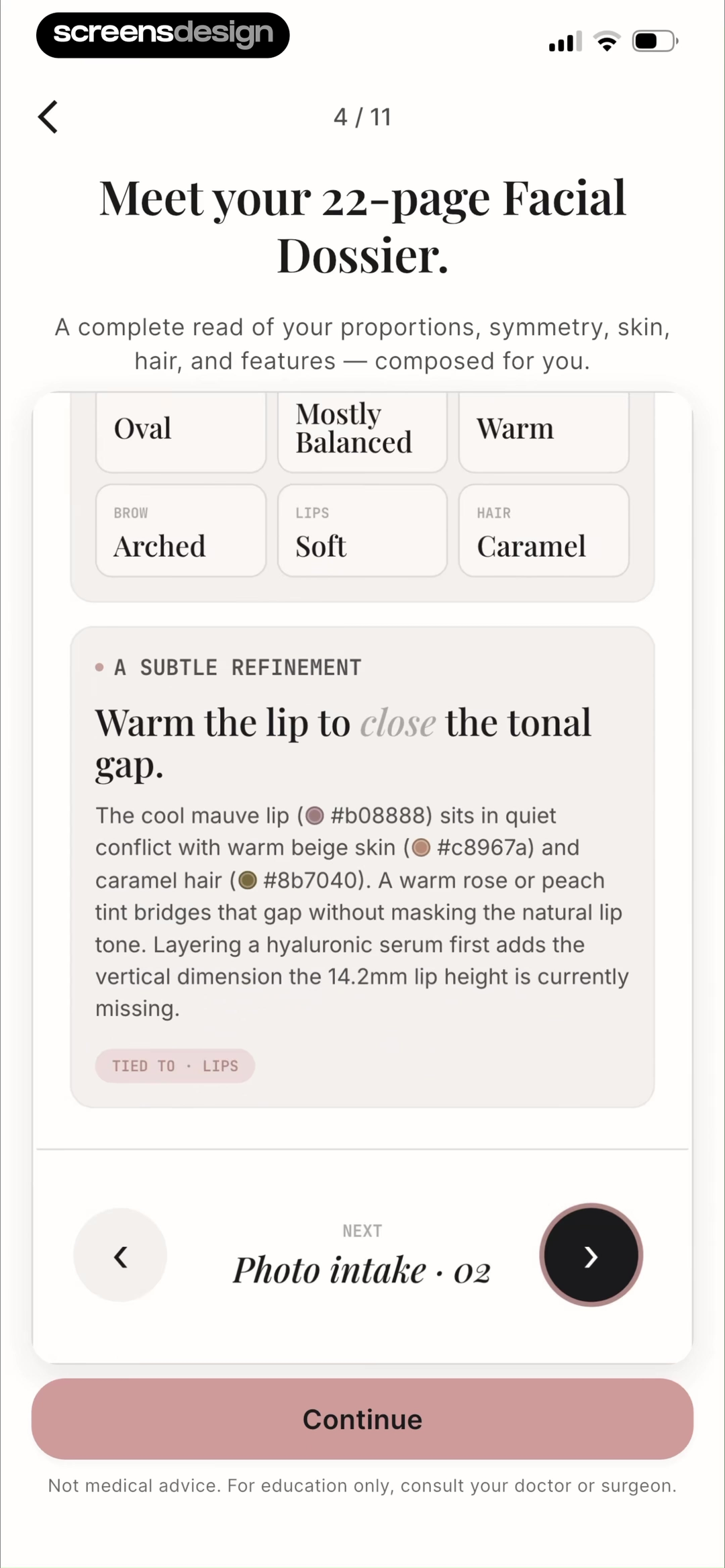
Refina presents a 22-page facial dossier with several information levels in one view. A serif display heading introduces the report, compact uppercase labels name attributes, a larger recommendation sentence carries the main finding, and smaller sans-serif copy explains it. Pale neutral surfaces and a muted pink action keep the page restrained while the hierarchy does most of the organizational work. The small medical disclaimer remains visible as a separate final level.
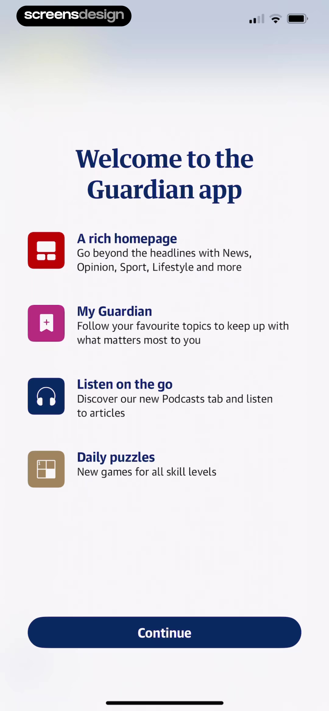
The Guardian welcome screen uses a different structure. One large heading leads into four repeated feature rows. Each row combines a colored square icon, a short bold label, and one supporting sentence. The colors distinguish feature families, but the repeated type and spacing pattern still works as the primary scaffold. A dark blue Continue button remains visually separate from the explanatory list.
Audit hierarchy by hiding images and imagining the screen in grayscale. The title, current section, principal value, supporting explanation, and next action should still be distinguishable. If weight and size cannot establish order without color, the system is asking the palette to do too much.
02. Type range
Design the scale as an operating range.
Readable typography must survive user preferences and content variation, not only a default specimen.
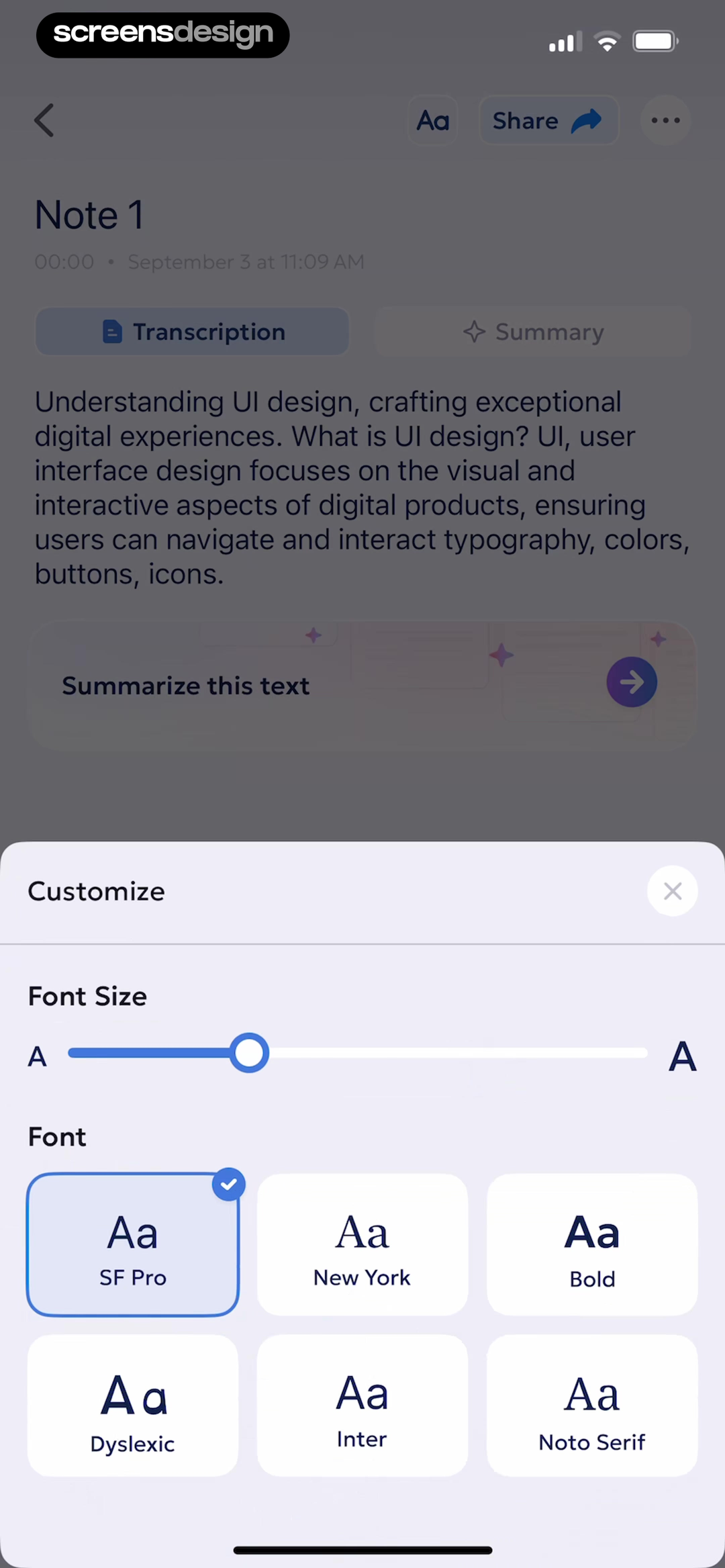
AI Summary opens a Customize sheet over a note. It offers a font-size slider and six labeled face choices: SF Pro, New York, Bold, Dyslexic, Inter, and Noto Serif. The screen makes type a user-controlled setting, although the presence of a Dyslexic label does not prove that the option improves reading for every person. That requires user research and testing.
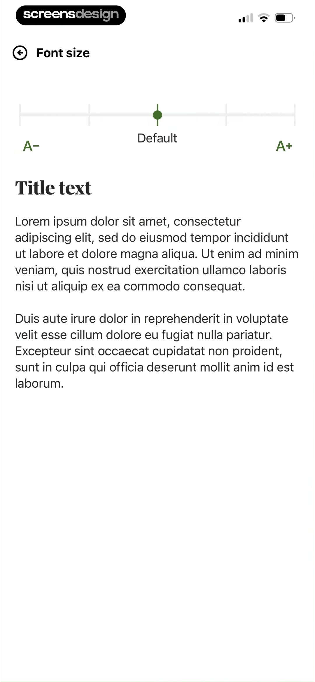
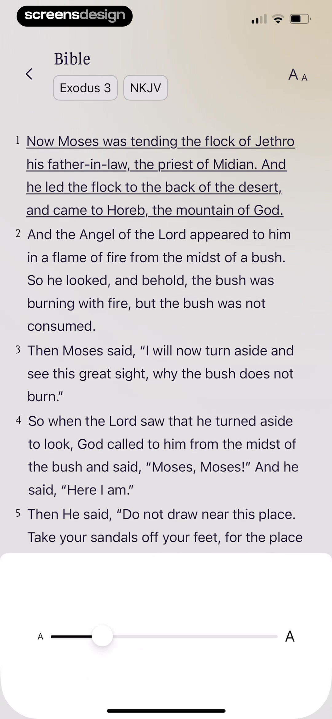
Good Food gives font size its own settings page with a slider between A- and A+. A title and two paragraphs update in the same view, so users can judge wrapping and density before returning to a recipe. Bible Chat places a size slider directly over an actual chapter. The surrounding book, chapter, translation, verse numbers, and long reading text expose more realistic line breaks than a short sample alone.
For each role, specify a minimum and maximum rather than one fixed pixel value. Test long titles, narrow devices, bold text settings, larger content sizes, translation, and mixed numerals. Controls should remain visible when text wraps, and the primary action should not be pushed beyond reach without a clear scroll path.
03. Semantic color
Make color confirm meaning, not replace it.
Status and data colors need a written or structural counterpart whenever the distinction affects a decision.
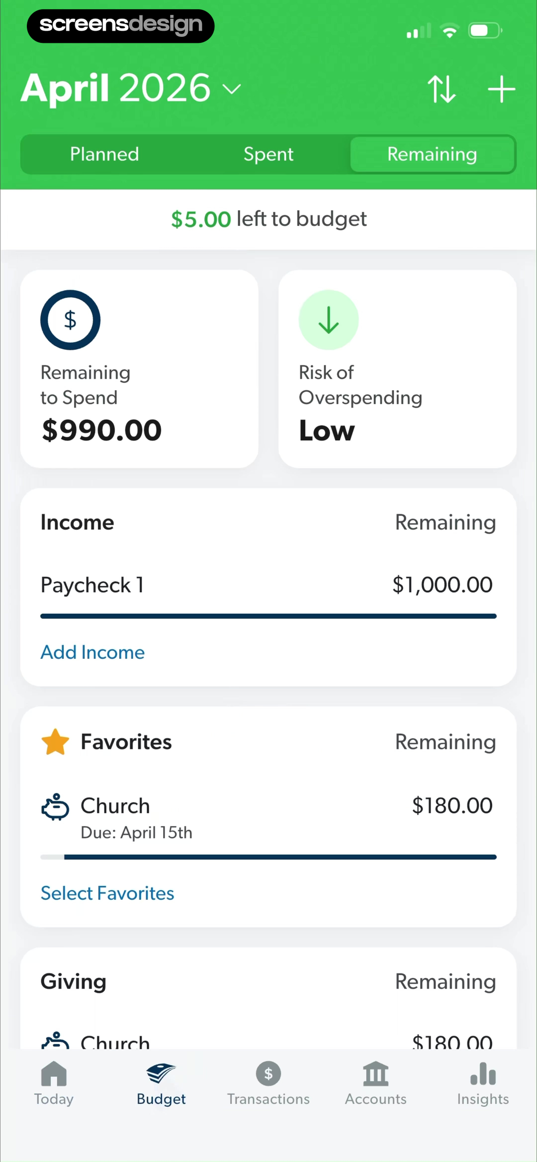
EveryDollar uses green across the April budget header, selected view, and a small amount left to budget. Its summary cards also name Remaining to Spend and Risk of Overspending, with the risk written as Low. The labels preserve the meaning if green is difficult to distinguish or reproduced without color.
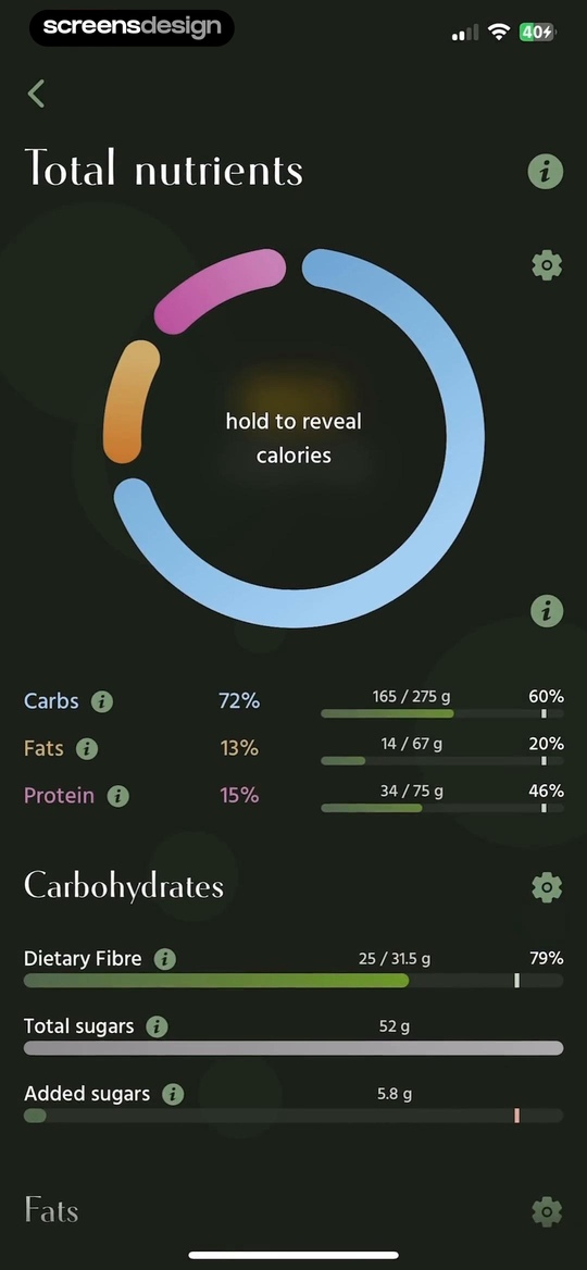
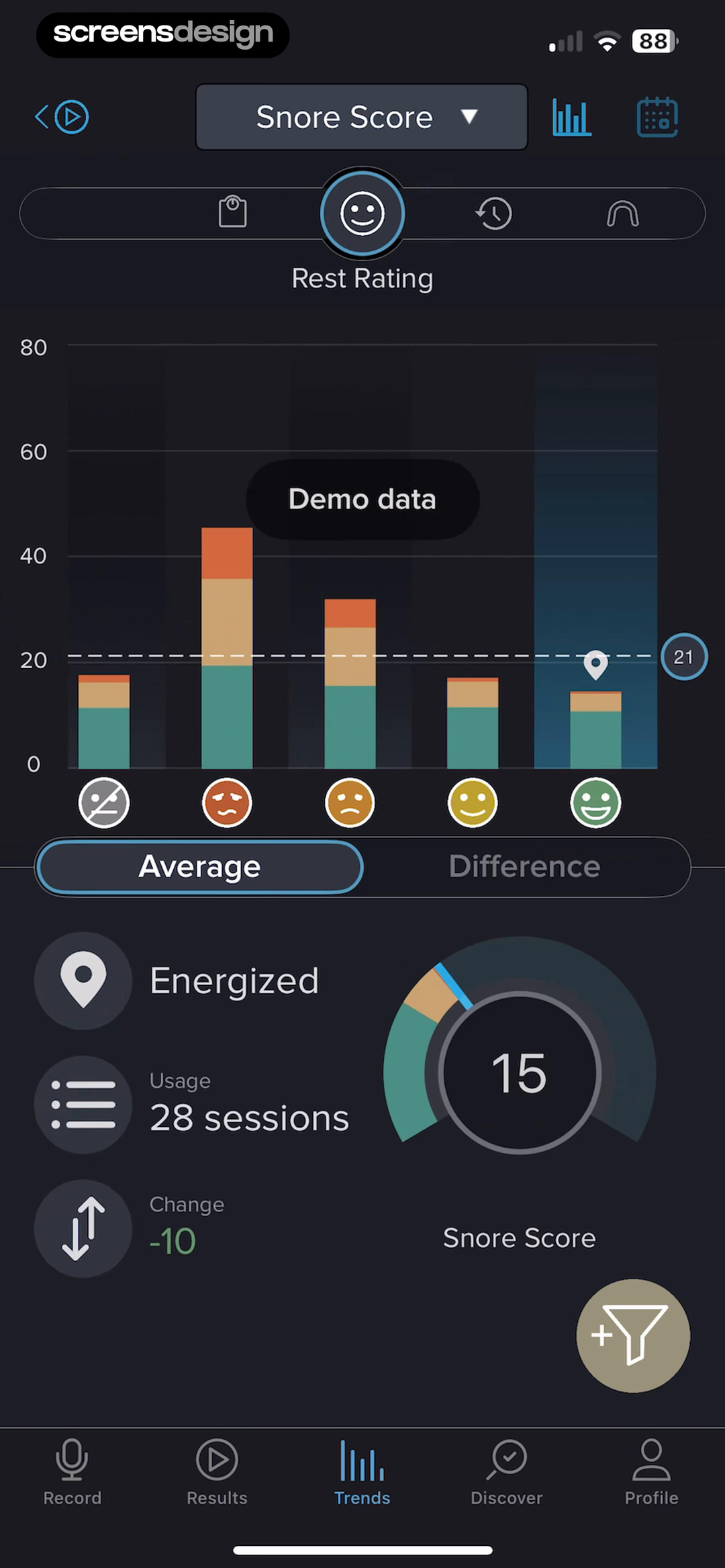
Pick Up Limes repeats its macronutrient colors in a large segmented ring, a labeled legend, percentages, gram totals, and progress bars. Carbs, Fats, and Protein remain identifiable through text and position. SnoreLab uses teal, orange, red, emoji faces, axes, values, and a Demo data label on a dark trend chart. The chart therefore exposes several cues beyond hue, but its exact contrast and color differentiation still need measurement.
Document semantic colors as relationships: positive text on a surface, warning icon beside a label, selected border around a control, and series color paired with a legend. Review color-vision simulations, increased contrast, grayscale, and low brightness. Never reuse a status hue as a decorative accent in the same context if the overlap could change interpretation.
04. Light and dark
Rebuild hierarchy for each appearance.
Dark mode is a separate set of role relationships, not a global inversion.
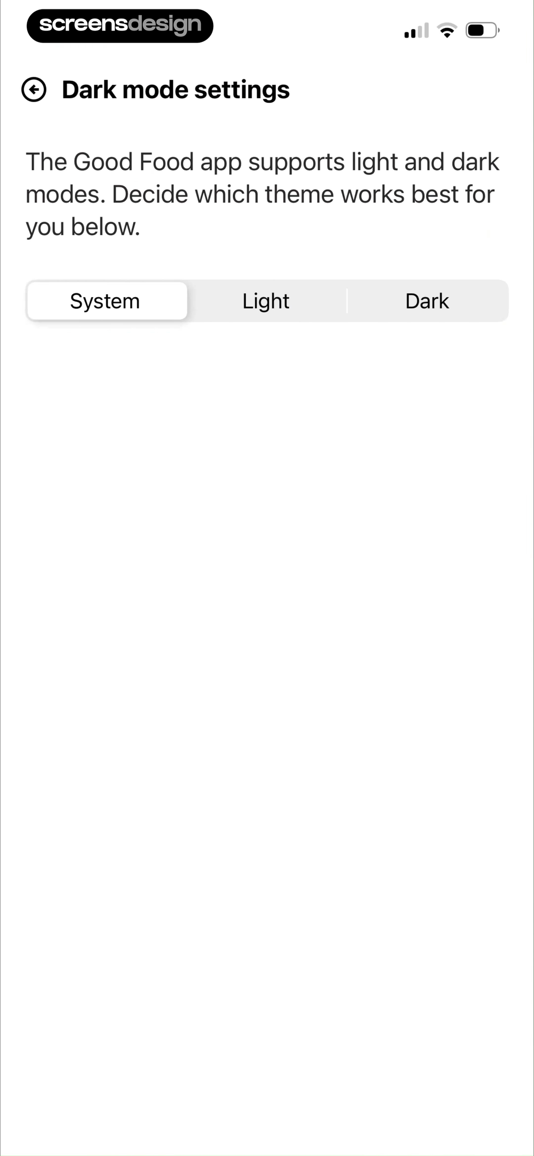
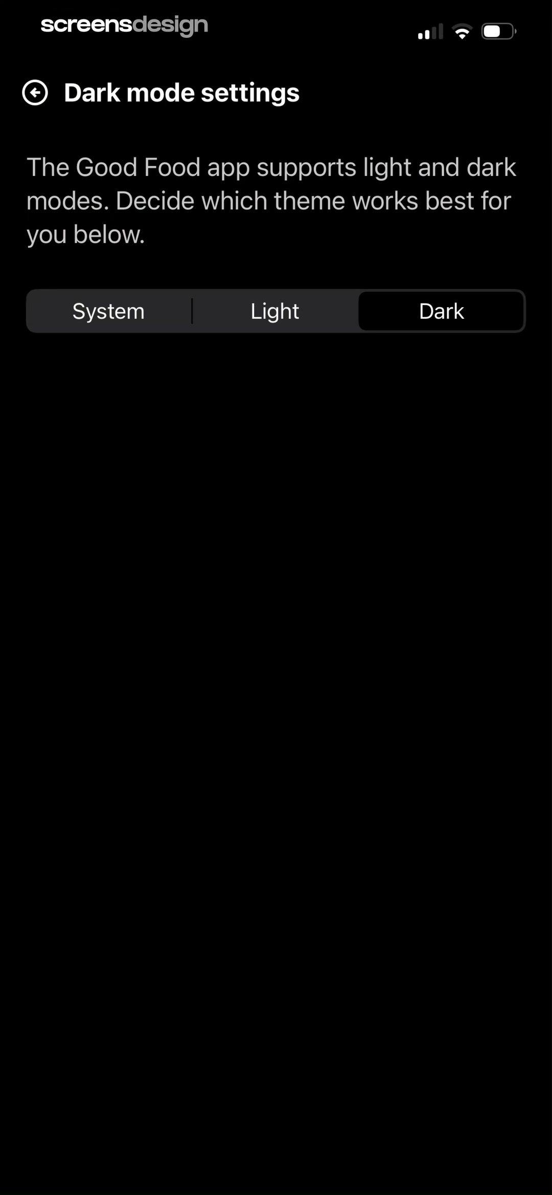
Good Food records the same Dark mode settings screen in two adjacent moments. At 110.5 seconds, the surface is white, text is dark, the segmented track is light gray, and System is selected. At 113.4 seconds, the surface is black, text is white, and Dark is selected inside a darker track. The wording, control order, and navigation remain stable while the role colors change.
That parity is the baseline, not proof of accessible contrast. Measure primary and secondary text, icons, borders, selected controls, disabled states, imagery overlays, and system bars in both appearances. Very dark surfaces can still lose hierarchy when every layer uses nearly the same value. Light surfaces can fail when secondary gray text becomes too faint.
Define theme tokens by purpose, then inspect screenshots side by side. Check that selection is visible without relying on brightness alone and that status colors retain their meaning on each surface.
Separate white layers
Use borders, spacing, and measured neutral contrast to distinguish controls without turning every surface gray.
Separate dark layers
Tune surface steps, text emphasis, selected controls, and saturated accents rather than reversing every value.
05. Dense data
Let labels and precision organize the chart.
Dense screens need a hierarchy that survives similar numbers, repeated units, and compact controls.
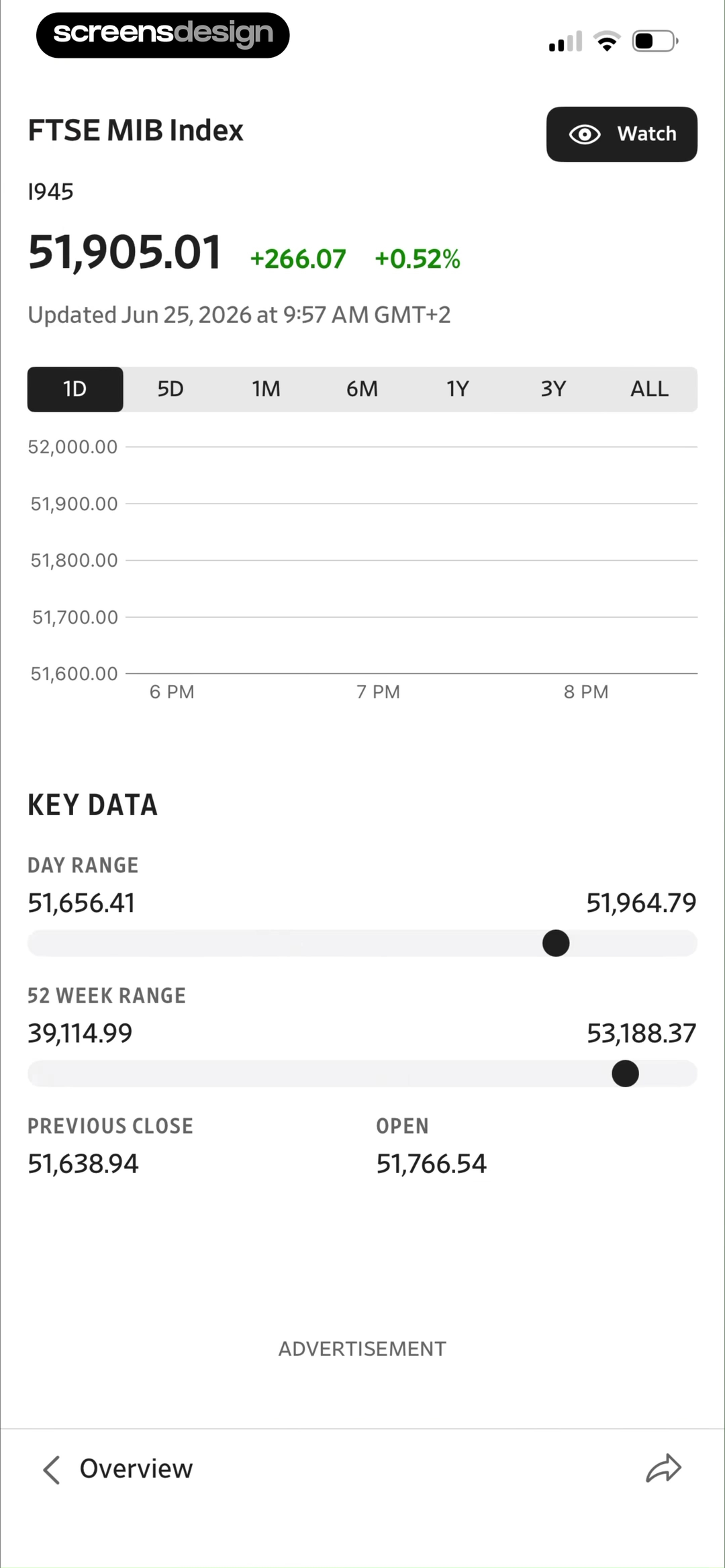
The Wall Street Journal places the FTSE MIB index name, current value, positive point and percentage change, update time, and Watch action above a range selector and chart. Key Data then repeats each metric as a labeled row with exact values. Green is used for the positive change, but the plus signs and numbers also state direction.
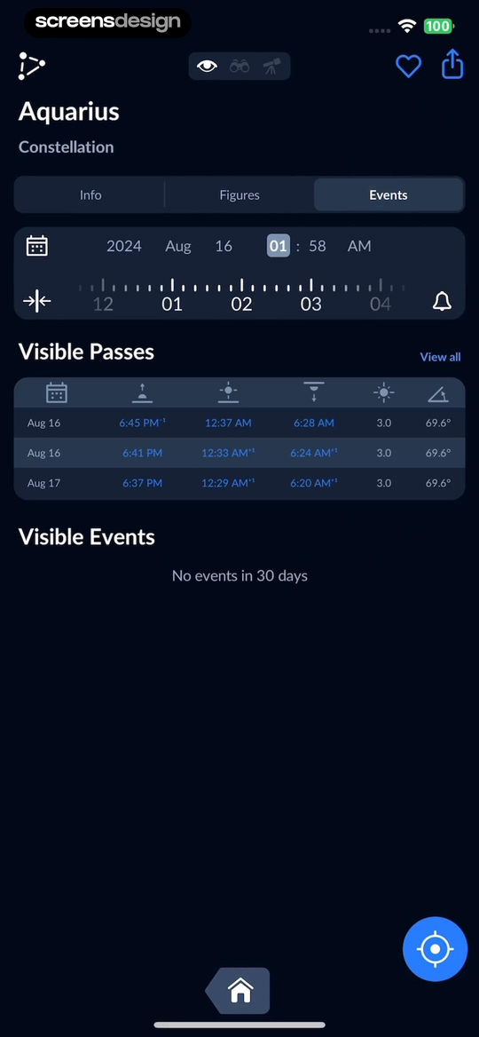
Sky Tonight uses a dark astronomy interface for Aquarius events. The object name and type lead into Info, Figures, and Events tabs, a date and time control, a Visible Passes table, and a written empty result for Visible Events. White text, blue-gray controls, columns, and section labels separate several data levels without introducing many accent hues.
For dense data, write the question each view answers. Put the decisive value first, keep units attached, show update time when freshness matters, and use tabular numerals where alignment helps comparison. Test the chart without its colors and the table without its chart. Each should retain enough context to support the task.
06. Brand expression
Choose one signature move, then preserve utility.
A memorable face or accent works best when it has a narrow, repeatable role.
Heyyyy opens with one word in a bold black serif, a small expressive emoji, and a pale lavender-to-white textured gradient. With no competing interface content, the display face can carry the introduction. The next screen in the replay begins sign-in, where utility roles need to take priority again.
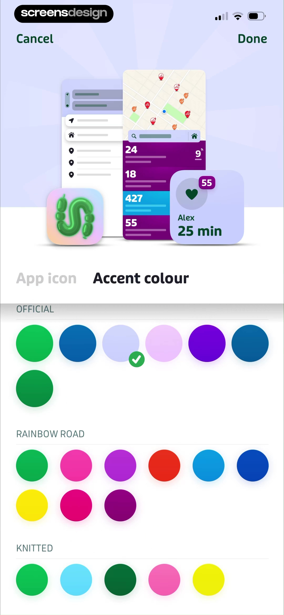
Transit exposes accent colour as a user preference. The screen groups swatches under Official, Rainbow Road, and Knitted, marks the chosen lavender with a check, and previews it inside a miniature transit interface. This records how one accent can personalize an established component system. It does not show whether every available color remains legible in every state.
Constrain expressive tokens. A display serif might be reserved for short titles, while body and control text use a tested reading face. A brand accent might identify primary actions or selection, while warnings and errors keep dedicated semantic roles. Preview customization against real screens and block choices that compromise text, focus, or state contrast.

07. Review method
Audit one task across content, states, and themes.
A token list becomes useful only when it is tested through the screens people actually use.
Choose one important task and capture its entry, decision, validation, loading, success, empty, and error states. Record every type role and color role that appears. Then compare the same task with larger text, dark appearance, increased contrast, long content, translation, and realistic data. Note where a label truncates, a selected state disappears, or two meanings share the same color.
Measure contrast for the actual foreground and background pair in each state. Check text, icons, borders, charts, disabled controls, focus indicators, and content over imagery. Contrast is necessary, but it is not the complete readability test. Line length, spacing, weight, size, glare, motion, and wording also affect whether content can be used.
Search recorded mobile color and typography screens to compare the same role across products, then open the surrounding replay before adopting a pattern.
- Name every type role and verify that each role has a distinct purpose.
- Test the minimum and maximum supported text sizes with real copy.
- Map surface, text, accent, selection, status, and data colors by role.
- Pair every essential color distinction with text, icon, shape, position, or pattern.
- Measure actual foreground and background contrast in light and dark appearances.
- Review selected, disabled, loading, success, warning, error, and empty states.
- Check charts in grayscale and confirm that legends, units, and labels remain usable.
- Reserve expressive faces and accent colors for narrow, documented roles.
- Verify long titles, translation, large text, and narrow screens without clipped actions.
- Inspect the screen before and after each example so hierarchy matches the complete task.
Questions and answers
Questions about mobile color and typography systems
How many colors should a mobile app use?
Count roles rather than swatches. Most interfaces need surfaces, primary and secondary text, borders, an accent, selection, and semantic status colors. Each role may require light and dark variants. Add a new hue only when it communicates a durable distinction that existing roles cannot express clearly.
How many fonts should a mobile app use?
One reading family can support most interfaces through size, weight, width, and spacing. A second display family can add brand expression to short headings when it does not reduce clarity. More families increase loading, fallback, localization, and consistency work, so every addition needs a defined role.
Does dark mode mean reversing black and white?
No. Dark appearance needs purpose-built surfaces, text levels, borders, selected states, imagery treatments, and tuned accents. Direct inversion can create glare, flatten elevation, or oversaturate status colors. Keep the information architecture stable, then test each role on its actual dark surface.
How can color-coded data remain accessible?
Use labels, legends, values, units, direct annotations, line styles, shapes, or patterns in addition to hue. Measure contrast against the real surface and test color-vision simulations and grayscale. For important decisions, provide a table or written summary that does not depend on interpreting a chart alone.
What should a color and typography audit deliver?
Produce a role inventory, token mapping, annotated state set, contrast results, large-text and localization findings, chart redundancy checks, and a short list of failures with owners. Attach each issue to a real task and screen so the fix can be verified in context.
Apps referenced in this page
Open the products behind the examples.
 Refina: AI Plastic SurgeryCosmetic Procedure Preview
 The GuardianNews, sport, podcasts, puzzles
 AI Summary - Meeting NotesRecord-Transcribe-Summarize
 Good Food: Recipe FinderEasy Recipes & Meal Planner
 Bible Chat: Daily DevotionalAudio Prayer, Verse, and Study
 EveryDollar: Budget ManagementTrack Income, Bills & Spending
 Pick Up LimesVegan recipes & meal plans
 SnoreLab : Record Your SnoringSnore Recorder & Sleep Tracker
 The Wall Street Journal. NewsWorld Business & Market News
 Sky Tonight - Stargazing GuideStar Constellation Finder App
 Heyyyy: Stories that text backSo real, you'll catch feelings
 Transit • Subway & Bus TimesTrack NYC MTA, CTA, LA Metro
2,622 apps in the top charts.Ask them anything.
Search exact mobile screens by visual role, compare complete recorded flows, and inspect how type and color behave around each decision.