The useful definition
Mobile app design that earns the next tap.
It is the combined practice of deciding what a person sees, understands, can do, and feels at every point in a mobile product. The interface is the visible result; the real design work begins with priorities, flows, states, and trade-offs.
A polished screen cannot rescue a confused product model. Before choosing a type scale or corner radius, decide who the experience is for, what they are trying to accomplish, and what the product needs to communicate at that exact moment.
Product intent
The user problem, desired outcome, and reason this screen exists.
Information structure
The content, navigation, hierarchy, and relationship between states.
Interaction behavior
What happens after a tap, swipe, error, delay, permission, or return visit.
Visual system
Typography, color, spacing, imagery, motion, and components working as one language.
UX defines the journey and whether it solves the right problem; UI makes that journey perceivable, operable, and expressive. Treating them as separate phases usually creates seams the user can feel.
Seven durable principles
Clarity first. Character second. Both matter.
Trends change quickly; human attention, motor limits, and the need for feedback do not. These principles stay useful across product categories and visual styles.
Give every screen one primary job.
A screen may support several actions, but one should dominate. If everything asks for equal attention, the interface has delegated prioritization to the user.
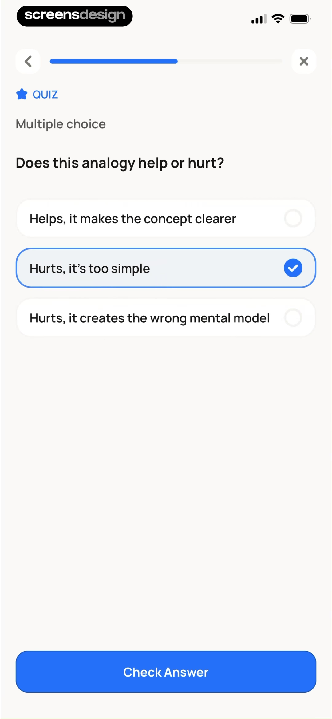
One question, three answer choices, one selected state, and one Check Answer action.
Make hierarchy work before decoration.
Scale, spacing, grouping, contrast, and position should reveal what matters before color or illustration adds personality. Test the layout in grayscale when the hierarchy feels uncertain.

Explore All Courses leads the screen, followed by Daily Read, Jump Back In, and Downloads.
Design for hands, interruptions, and small displays.
Keep frequent actions reachable, targets generous, forms forgiving, and progress recoverable. Mobile use happens while walking, commuting, multitasking, and returning after a delay.

A large photo, visible progress, and explicit DELETE and KEEP choices support a quick decision.
Make state changes unmistakable.
Every meaningful action needs feedback. Show selected, loading, saved, empty, offline, success, and error states as intentionally as the ideal state shown in a design review.
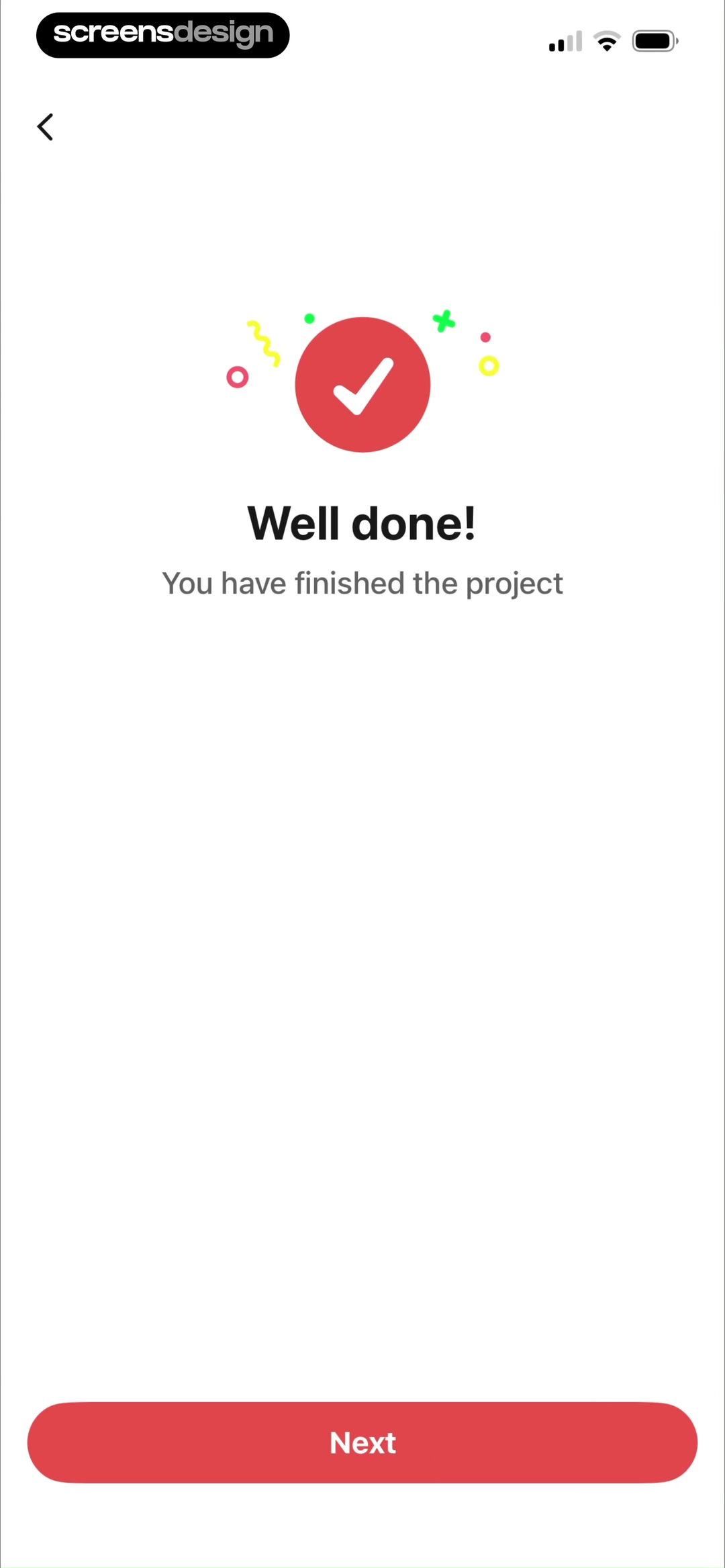
A checkmark, “Well done!”, completion copy, and one Next button confirm the finished project.
Reveal complexity when it becomes useful.
Progressive disclosure keeps first contact simple without making the product shallow. Introduce advanced controls in context instead of front-loading every capability.

Selecting one task reveals its subtasks and Delete, Edit, Focus Time, and Done controls.
Build a system, not a gallery.
Define reusable decisions for type, color, spacing, elevation, controls, and motion. Consistency lowers cognitive load and lets teams spend their time on product problems.

Five destinations reuse the same card structure while color and imagery distinguish each task.
Accessibility is a quality standard.
Support dynamic text, sufficient contrast, meaningful labels, reduced motion, screen readers, and alternatives to gestures. Do not rely on color alone to communicate status.

Text size, haptics, sound, reduced motion, and appearance controls sit together in Settings.
Screen anatomy and navigation
Build the path before polishing the pixels.
Most mobile screens are a negotiation between orientation, content, action, and feedback. A useful composition gives each role enough space and makes the hierarchy survive real content, smaller devices, and larger text settings.
Orientation
Title, back behavior, tabs, or progress answer where the user is and how this moment relates to the wider journey.
Primary content
The information or object needed to make the current decision should appear before supporting detail and promotion.
Primary action
The most useful next step needs a clear label, a reachable target, and enough contrast to remain obvious at a glance.
System feedback
Selection, validation, loading, success, and errors show that the interface understood the action and what happens next.
Secondary routes
Cancel, skip, edit, help, and alternative paths stay available without competing visually with the primary task.
Safe areas and input
Account for notches, home indicators, keyboards, system bars, scrolling, and controls that need to remain reachable.
A large course entry leads into Daily Read and Jump Back In.
A repeated card pattern turns five user intentions into obvious routes.
Progress, selection, and one submit action share the same screen.
Patterns in real products
Eight mobile app design examples worth dissecting.
These examples come from complete recorded experiences in the ScreensDesign library. The useful question is not “Should we copy this screen?” It is “What problem is this decision solving, and would the same logic fit our product?”
For a faster visual index, explore our guide to app screen examples by screen type, including onboarding, home, search, forms, empty states, success, and paywalls.
Revenue, downloads, and ratings provide commercial context; they do not prove that a particular screen caused performance. The observations below describe visible design decisions, not conversion claims.

Explain one benefit, then offer one obvious next step.
Its notification feature screen pairs the focused message “Stay Notified in Real-Time” with a single “Dive in” action. The illustration supports the promise instead of competing with it.
Inspect this recorded screenUse hierarchy to make a content-rich home screen feel calm.
A prominent course invitation leads the page, while Daily Read, Jump Back In, progress, and navigation form a clear sequence. The layout answers “What should I do now?” before showing everything available.
Inspect this recorded screenOrganize the product around recognizable user intentions.
Five large cards for Identify, Diagnose, Flower Care, Garden Planning, and Lawn Problems turn the home screen into a task map. Color helps scanning, but the labels still carry the meaning.
Inspect this recorded screenMake the core interaction legible without a manual.
A large photo, visible progress, and the opposing DELETE and KEEP choices keep attention on a single decision. Secondary actions stay available without becoming the visual headline.
Inspect this recorded screen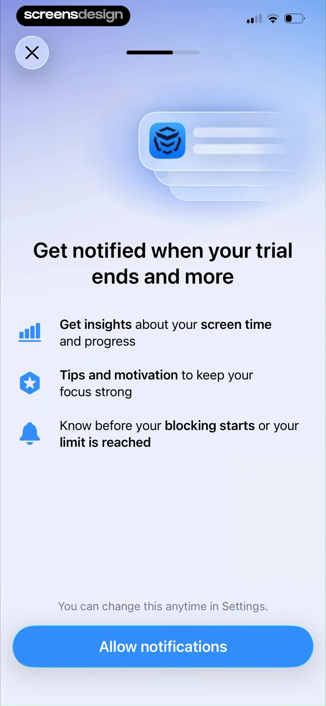
Explain why a permission is useful before asking for it.
Before the native notification prompt, AppBlock names three concrete outcomes: screen-time insights, focus tips, and alerts before a blocking session starts. It also says the choice can be changed later, giving the request context without pretending it is mandatory.
Inspect this recorded screenKeep a complex decision focused on one answer at a time.
The quiz combines a visible progress bar, a short prompt, three full-width answer cards, an unmistakable selected state, and one Check Answer button. The interaction separates choosing from submitting, which reduces accidental progress and makes feedback easier to understand.
Inspect this recorded screen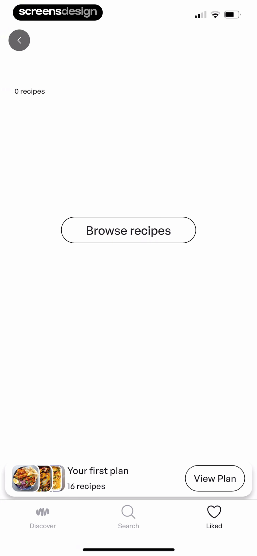
Turn an empty state into a useful bridge, not a dead end.
A zero-recipe collection could feel like failure. Mob instead provides a direct Browse recipes action, retains access to the user’s first plan, and leaves the main navigation visible. The empty state explains what is missing by showing the next way to create value.
Inspect this recorded screen
Make subscription timing and cost readable before commitment.
ToonMe lays out what happens now, when the reminder arrives, and when billing begins. The recurring weekly price sits immediately above the trial action, while cancel, privacy, terms, and restore options remain visible. Clarity is part of the interface, not fine print added afterward.
Inspect this recorded screenRecorded onboarding length varies dramatically. More steps are not automatically more persuasive, and fewer are not automatically clearer. Judge each step by the uncertainty it removes or the value it creates.
For a focused breakdown of buttons, fields, navigation, feedback, and component states, continue with the mobile app UI design guide.
States, permissions, and platforms
The real product lives between the ideal screens.
A mobile UI is not a collection of static pages. It is a system that changes as data arrives, permissions change, the keyboard appears, a network fails, or the user returns days later. Design those transitions as first-class product moments.
Loading
Preserve layout where possible, show what is happening, and avoid a spinner when useful content can progressively appear.
Empty
Explain why there is no content and provide the action that creates, imports, discovers, or restores it.
Error
State what failed in plain language, protect entered work, and offer a relevant retry or alternate route.
Offline
Clarify what remains available, what will sync later, and which actions genuinely require a connection.
Permission denied
Keep the product usable, explain the affected feature, and link to Settings only when the user chooses to reconsider.
Success
Confirm the result, reflect the new state, and make the next sensible action obvious without blocking progress.
The empty collection explains what is missing and offers Browse recipes.
The permission warm-up explains three uses before the system prompt appears.
The completion state confirms the result and leaves one clear next step.
Intent, content, brand, and tokens
The information architecture, terminology, color roles, type hierarchy, and core interaction logic should feel like one product across iOS and Android.
Navigation, controls, permissions, and system behavior
Respect native back behavior, sheets, pickers, keyboards, system prompts, gestures, and accessibility conventions. Aim for equivalent clarity, not identical pixels.
Platform and accessibility references: Apple Human Interface Guidelines, Material Design, and WCAG 2.2.
Designing specifically for Apple platforms? Continue with the iOS app design guide for native navigation, controls, system surfaces, accessibility, and platform adaptation.
For category and screen-level applications of this framework, compare the Bible app design review and the mobile home screen review.
A practical process
Move from uncertainty to a testable product.
Good mobile design rarely appears in a straight line. This sequence keeps the team aligned while leaving room to revisit earlier decisions when evidence changes.
The screens below are examples to inspect at each stage. They illustrate useful questions, but they do not reveal or prove the private design process used by the teams that made them.
- 01
Define the outcome.
State who the flow serves, the job they need to complete, and the observable outcome. Replace “improve onboarding” with a specific behavior the team can design and measure.
 365 Gratitude
The opening question names six possible user outcomes instead of asking for vague preferences.
- 02
Research journeys, not screenshots.
Study how comparable products introduce value, request data, handle permissions, teach interactions, recover from failure, and return users to the core loop. Capture principles and risks, not a mood board of disconnected surfaces.
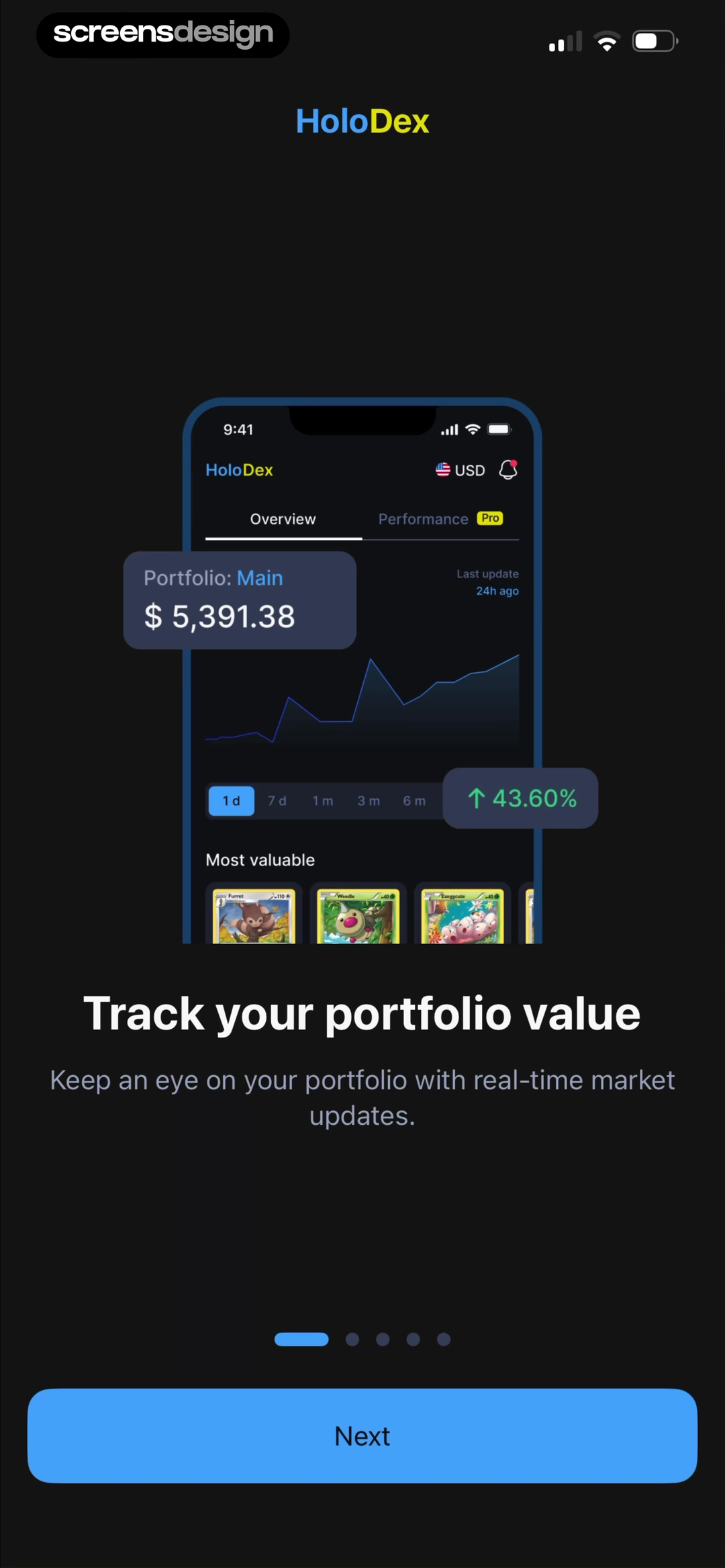
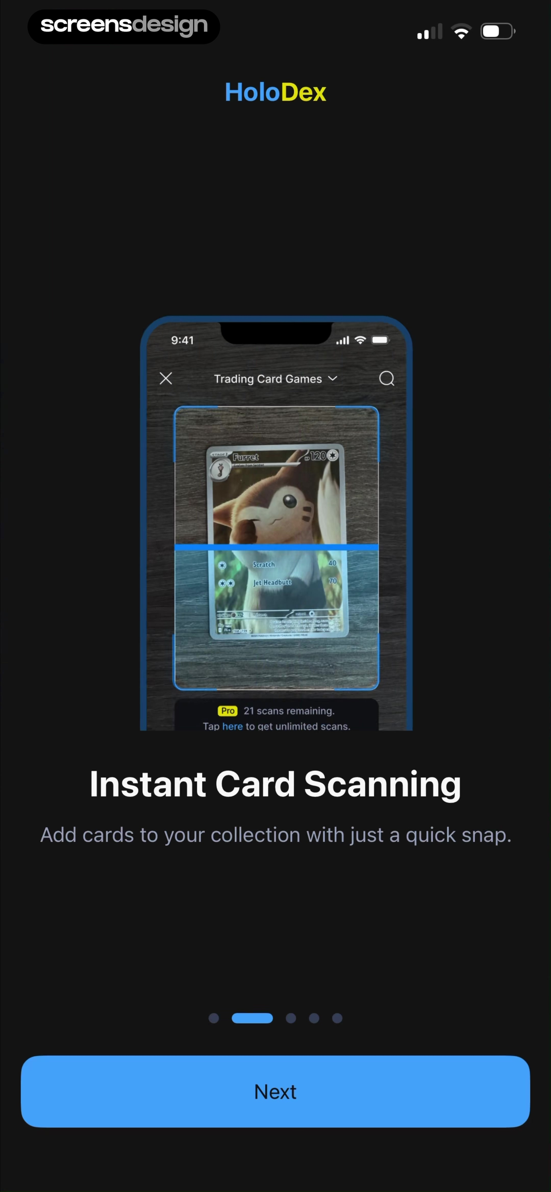
 HoloDex
Three consecutive carousel frames explain portfolio tracking, card scanning, and price insights. Their order is part of the evidence.
- 03
Map the critical path and its branches.
Draw the shortest successful journey, then add alternate entry points, back navigation, cancellation, permissions denied, empty data, slow networks, and returning-user states.
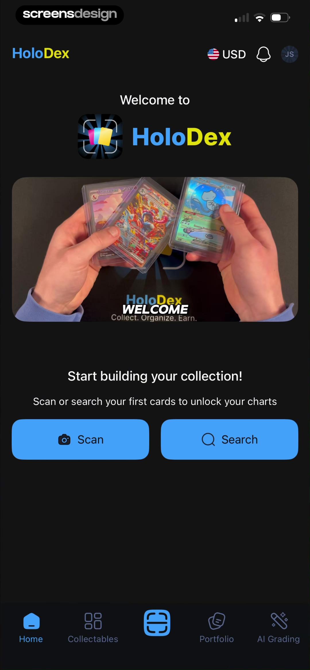 HoloDex
The activated home screen branches into Scan or Search while keeping the collection goal visible.
- 04
Design the content model.
Decide what information each screen needs, its priority, and how real content can vary. Design with long names, missing images, localization, and dynamic values before polishing components.
ImprintCourses, a daily read, resume state, downloads, and navigation expose several real content types at once.
- 05
Prototype the interaction at low fidelity.
Test order, comprehension, navigation, and feedback while changes are cheap. A grayscale prototype should make the primary action and current state obvious.
WellspokenOne question, answer selection, progress, and submission create a focused interaction that can be tested end to end.
- 06
Apply the visual system.
Use tokens and reusable components to add typography, color, imagery, elevation, and motion. Let the brand amplify meaning rather than mask unresolved structure.
PlantAIOne repeated card anatomy handles five destinations while color and imagery distinguish each task.
- 07
Validate on devices and with people.
Test reach, keyboard behavior, dynamic type, safe areas, orientation, reduced motion, and assistive technology. Observe where real users hesitate, not only what they say they prefer.
JunoText size, haptics, sound, reduced motion, and appearance turn accessibility checks into explicit product states.
- 08
Ship with measurement and ownership.
Define events, quality indicators, rollout constraints, and who will revisit the experience. Iteration works only when the team can connect behavior to the exact product state that produced it.
 Open
OpenThe summary exposes streak, classes, best streak, and minutes practiced as concrete outcome measures.
Testing and measurement
Measure comprehension before chasing polish.
Good research separates what people prefer from what they can actually understand and complete. Test the riskiest decisions with realistic tasks, content, devices, and system conditions.
Prototype the uncertain moments
- Can a new user describe the screen’s purpose?
- Do they find the primary action without instruction?
- Can they recover from a mistake or denied permission?
- Does the flow survive long copy and real data?
Validate the implemented behavior
- Test on small and large devices with larger text enabled.
- Use screen readers, switch navigation, and reduced motion.
- Throttle the network and interrupt the app mid-task.
- Compare the shipped states with the design specification.
Connect behavior to outcomes
- Task completion and time to first useful outcome.
- Error, retry, abandonment, and successful recovery rates.
- Permission acceptance only after the benefit is understood.
- Support themes and qualitative feedback by product state.
Instrument outcomes, not vanity taps. A Continue event says a button fired; a completed setup with valid data, no repeated errors, and a successful return visit says the journey worked.
Before handoff
A mobile app design quality checklist.
Use this at flow reviews and before implementation. A screen can look finished while the experience around it is still incomplete.
Purpose & hierarchy
- The screen has one evident primary job.
- The next action is understandable without instruction.
- Secondary content does not compete with the main task.
- Real and extreme content lengths have been tested.
Interaction & states
- Tap targets are comfortable and reachable.
- Loading, empty, error, offline, and success states exist.
- Back, cancel, retry, and destructive actions behave clearly.
- Keyboard, permissions, and interruptions are accounted for.
System & accessibility
- Components use shared tokens and predictable behavior.
- Text can scale without hiding actions or content.
- Contrast and labels work without relying on color alone.
- Motion has purpose and respects reduced-motion settings.
Handoff & measurement
- Responsive rules and edge cases are documented.
- The prototype communicates transitions and feedback.
- Analytics describe outcomes, not only button taps.
- A named owner will review the shipped experience.
Avoidable failure modes
Six mistakes that make polished apps feel difficult.
Starting with visual trends
Glass, gradients, and large type are treatments, not a product strategy.
Copying a screen without its context
The same pattern can help one journey and create friction in another.
Designing only the happy path
Real trust is built in errors, recovery, permissions, and empty states.
Using onboarding to explain a confusing product
Teach unfamiliar behavior, but simplify the core interface first.
Forcing identical iOS and Android behavior
Share intent and brand; respect each platform’s learned conventions.
Treating handoff as the finish line
The shipped product, not the design file, is the final interface.
Frequently asked questions
Mobile app design FAQ.
What is mobile app design?
Mobile app design is the practice of shaping a mobile product’s structure, interface, interactions, content, states, and visual system so people can complete useful tasks with confidence.
What is the difference between mobile UI and mobile UX design?
UI design focuses on the interface people see and touch. UX design covers the wider journey: what users need, how information is organized, how flows behave, and whether the experience solves the right problem. Strong mobile products need both.
What makes a mobile app design good?
A good mobile app makes the next useful action easy to understand, gives clear feedback, works across content and device states, remains accessible, and expresses a consistent product personality without sacrificing usability.
Should an app be designed for iOS or Android first?
Start with the platform that best represents the initial audience, but define shared product principles and reusable design tokens from day one. Adapt navigation, permissions, controls, and system behavior to each platform instead of forcing pixel-for-pixel parity.
What should be included in a mobile app design system?
At minimum, define typography, color roles, spacing, layout rules, iconography, elevation, motion, form controls, navigation, and the loading, empty, error, disabled, selected, and success states of reusable components. Document behavior and accessibility, not only appearance.
How do you design mobile app onboarding?
Onboarding should remove the uncertainty that blocks first value. Ask only for information that changes the experience, request permissions when their benefit is clear, allow safe skipping where possible, show progress for longer flows, and return users to the product quickly.
How do you test a mobile app design before development?
Test a realistic prototype with representative users and real content. Give people tasks rather than instructions, watch where they hesitate or recover, and record completion, errors, time, confidence, and comprehension. Then validate technical and accessibility constraints with engineering before handoff.
How long does it take to design a mobile app?
The timeline depends on product scope, research access, platform count, and how many unknowns must be resolved. A focused feature can take days; a new multi-flow product can take months. Estimate by journeys, states, and validation cycles rather than by screen count alone.
2,622 apps in the top charts.Ask them anything.
Ask how successful apps onboard users, structure paywalls, recover from errors, and keep a product moving. Use the cited answers and complete replays to improve an app you already have or move from research into Create.