Start with a design decision
App design inspiration you can actually use.
Useful app design inspiration is not a folder of attractive screenshots. It is a set of real product decisions you can compare, explain, and translate into a better interface for your own users.
The examples in this guide come from recorded mobile products, not polished device mockups. Open any screen to inspect it in ScreensDesign, then study the surrounding flow before deciding which idea belongs in your product.
Look for the decision you need to make, not only an adjective such as clean or modern.
Keep references that solve the same problem in visibly different ways.
Explain the hierarchy, interaction, state, or content rule creating the effect.
Check whether the visual idea survives the screen before it and the state after it.
Six visual directions
Study the reason each screen looks the way it does.
A visual direction is useful when it serves the product’s content, pace, and recurring actions. These twelve screens show six distinct approaches, each grounded in a different interface job.
Let the product feel like a place.
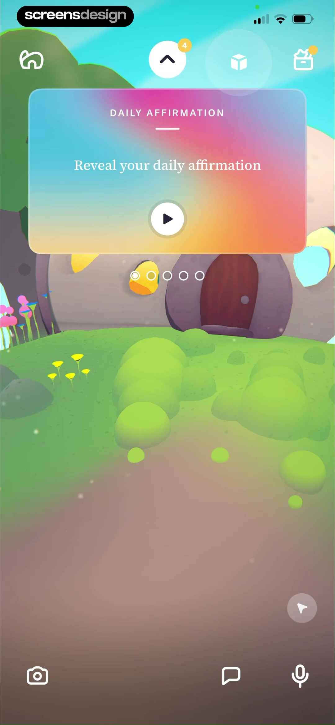
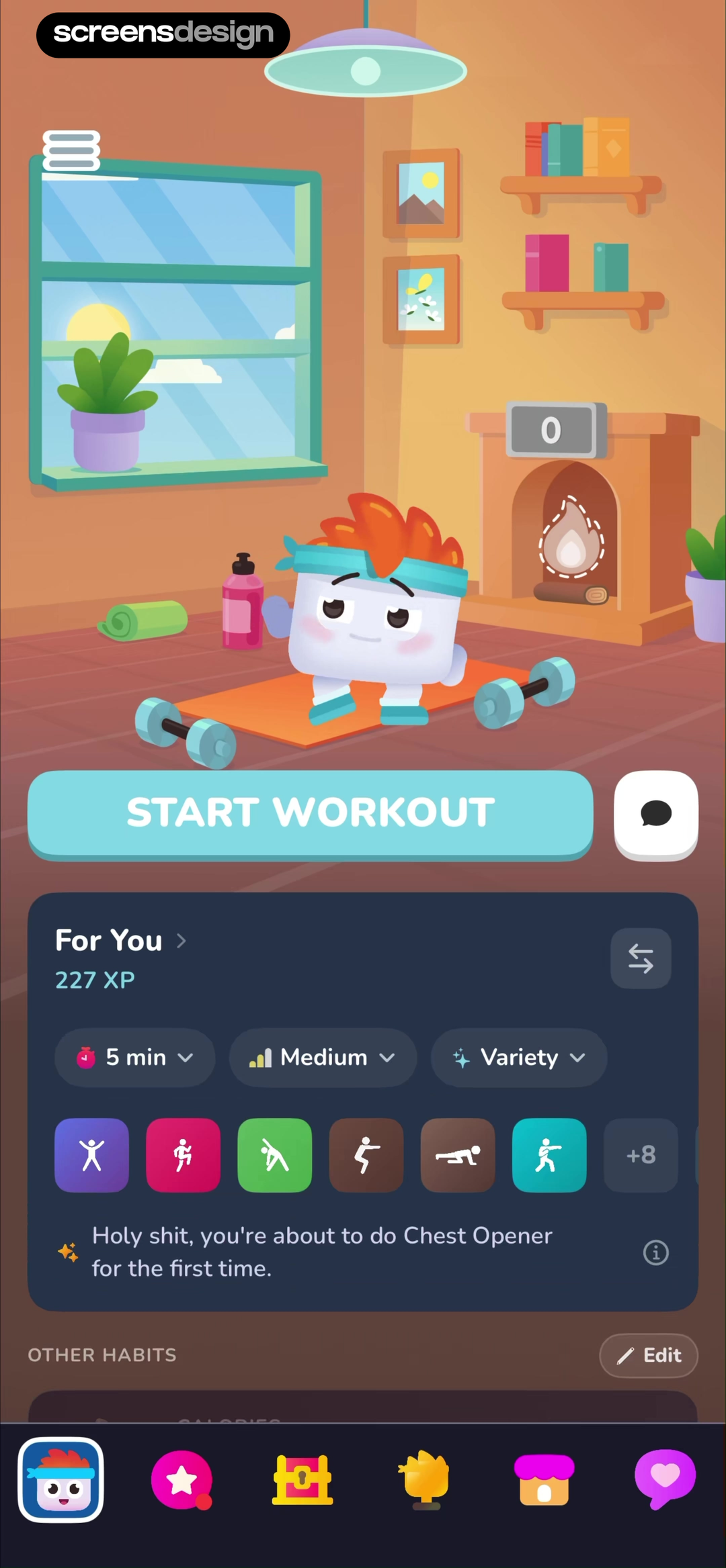
Tolan and Luvu treat the home screen as an environment rather than a stack of neutral cards.The illustration is not a background added after the interface. It establishes location, personality, and a reason to return. Both products still protect a clear action: reveal the affirmation or start the workout.
Useful when companionship, progression, or daily return is central to the product. The world should clarify the next action, not compete with it.
Find more examplesRemove interface until the moment feels right.
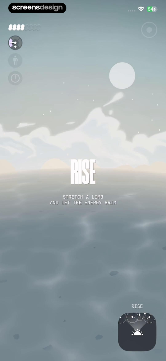
Calm and (Not Boring) Vibes use almost the entire screen to establish pace and attention.Calm presents one instruction on a gradient. Vibes keeps controls at the edge while the landscape, a single verb, and a short instruction carry the experience. Restraint works because the user goal is narrow at that moment.
Useful for breathing, focus, audio, reflection, or transition states. It is less suitable when the user must compare several options or inspect detailed status.
Find more examplesMake browsing feel intentionally curated.
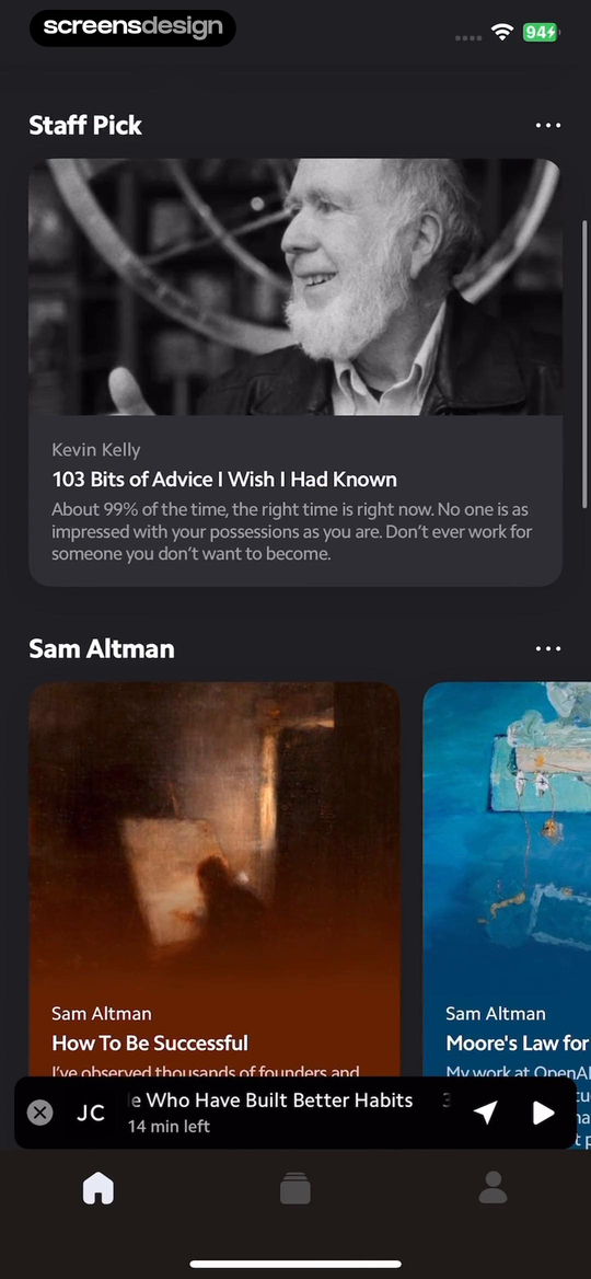
Matter and Imprint use content hierarchy to turn a large library into a manageable next choice.Matter creates a lead story, secondary cards, and a persistent listening state. Imprint separates discovery, a daily read, continuation, and downloads. Neither screen gives every item equal weight.
Useful for learning, reading, media, recipes, travel, or any product where users choose from a substantial catalog.
Find more examplesUse contrast to direct attention, not signal luxury.
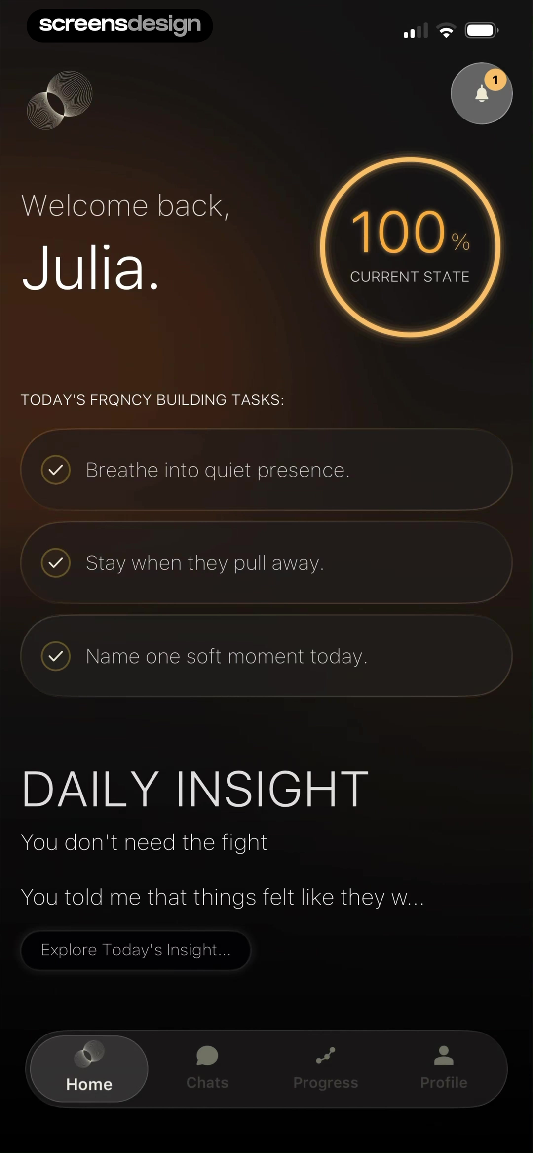
FRQNCY and Nansen AI show two very different reasons to use a dark interface.FRQNCY uses warm gold, soft gradients, and generous spacing for reflection. Nansen uses compact panels and controlled contrast for portfolio data. The shared dark canvas serves different content jobs.
Useful when the content benefits from focus, low-light use, visual depth, or high-contrast data. Start with hierarchy and accessibility before choosing black surfaces.
Find more examplesOrganize complexity around the question being asked.
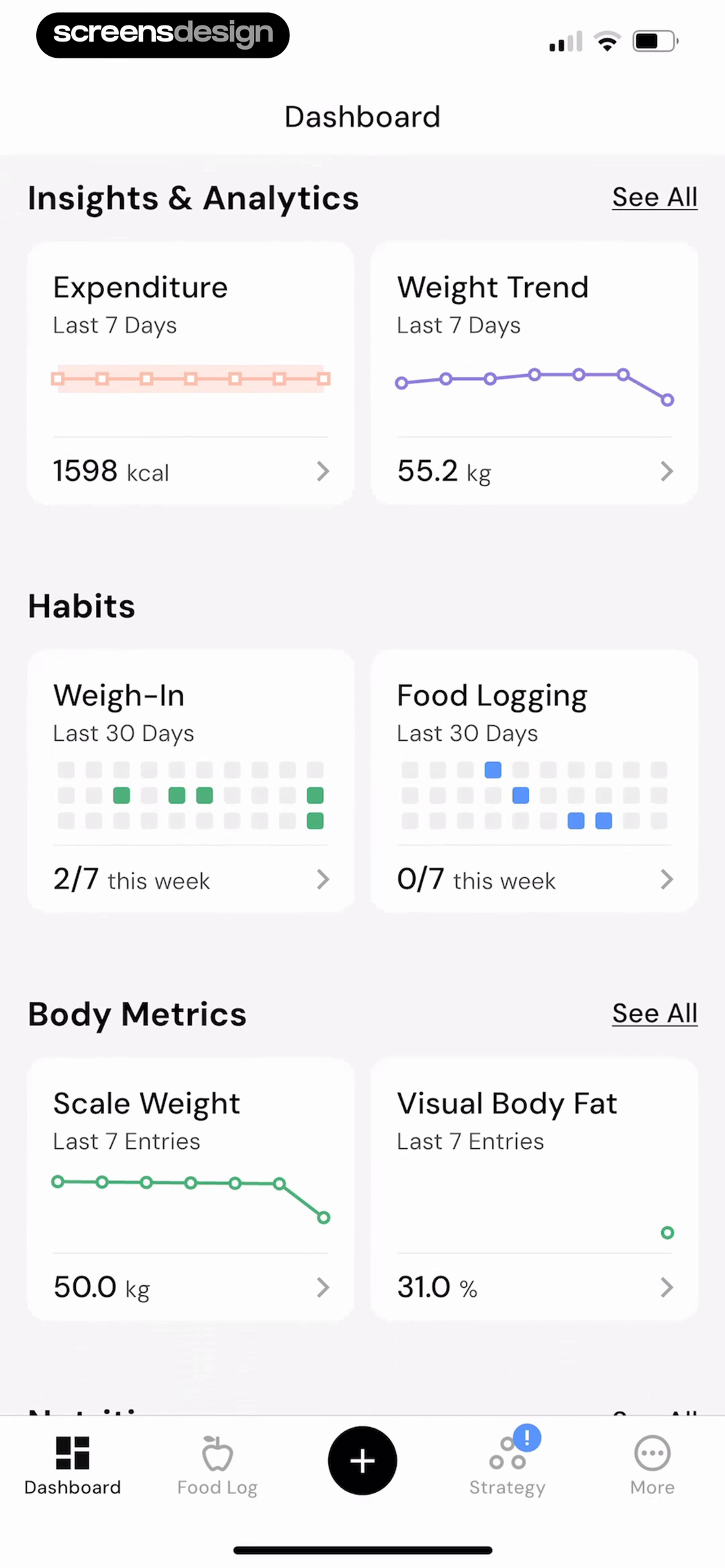
MacroFactor and Structured make dense information readable by giving each visual form one job.MacroFactor groups trends, habits, and body metrics into predictable modules. Structured turns time into a vertical path, then places tasks and gaps directly on it. The data model determines the composition.
Useful for health, finance, planning, analytics, and tracking. Borrow the information grammar before borrowing chart colors or card styles.
Find more examplesGive ordinary work a recognizable voice.
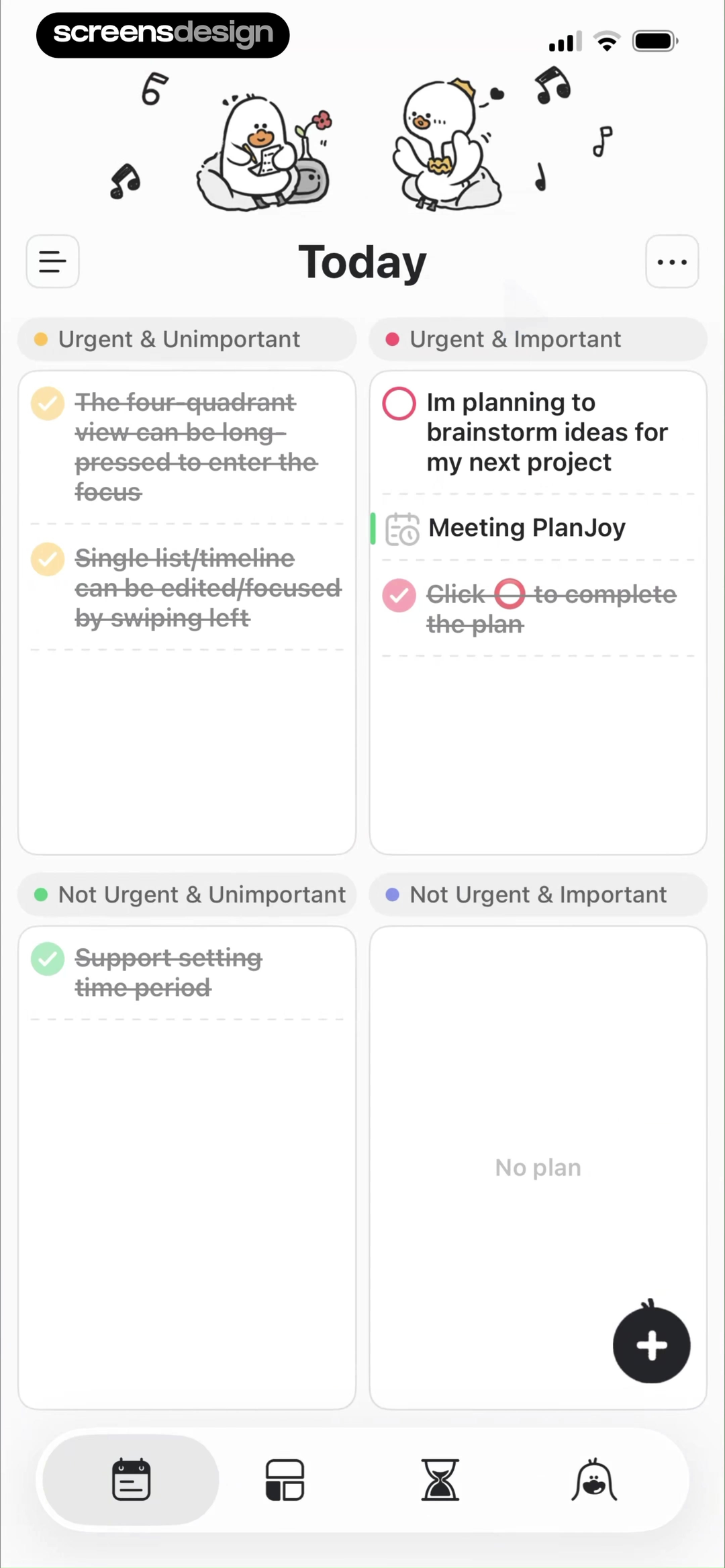
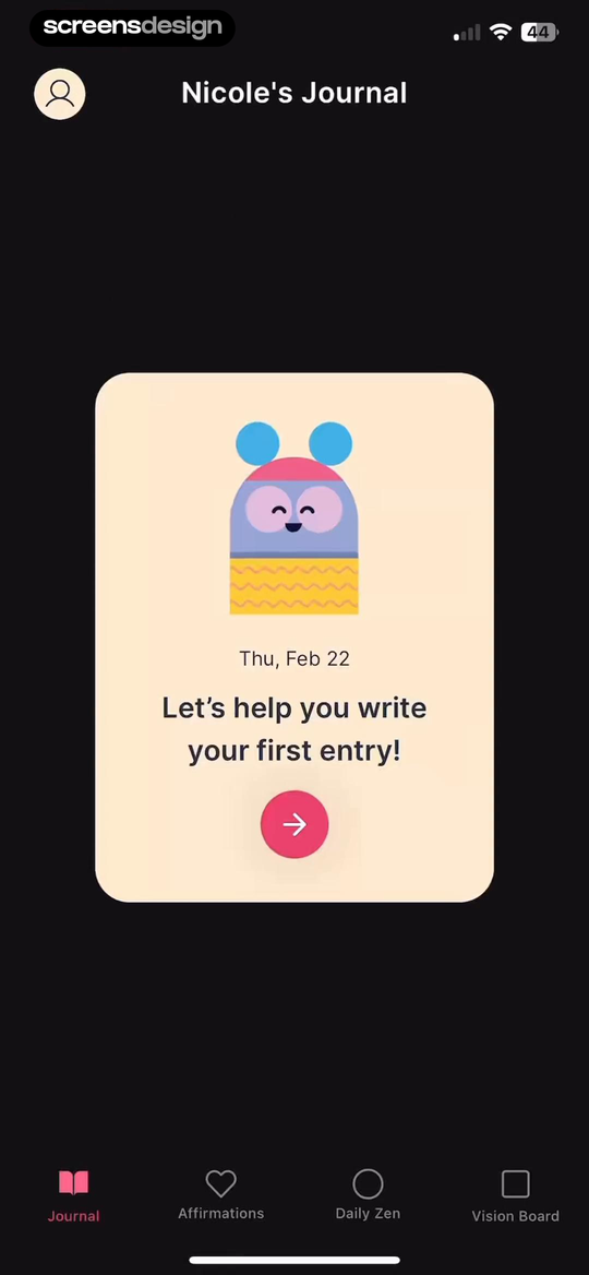
Plan Joy and Gratitude add character without hiding the task a person came to complete.Plan Joy uses color and small characters to soften a structured priority matrix. Gratitude places a warm first-entry prompt on a quiet dark shell. Personality appears at the point of action, not on every component.
Useful for habits, journals, personal organization, and education. Keep controls familiar so the expressive layer does not create extra learning work.
Find more examplesBuild a stronger reference set
Search comparable screens, then open the complete journey behind the one that catches your attention.
Search by product context
Find inspiration inside the category you are building.
Style is only one filter. Category changes the data, user expectations, frequency of use, platform constraints, and level of trust a screen must support.
Health and fitness
Progress, coaching, metrics, and motivation without flattening every product into the same ring chart.
Search these screens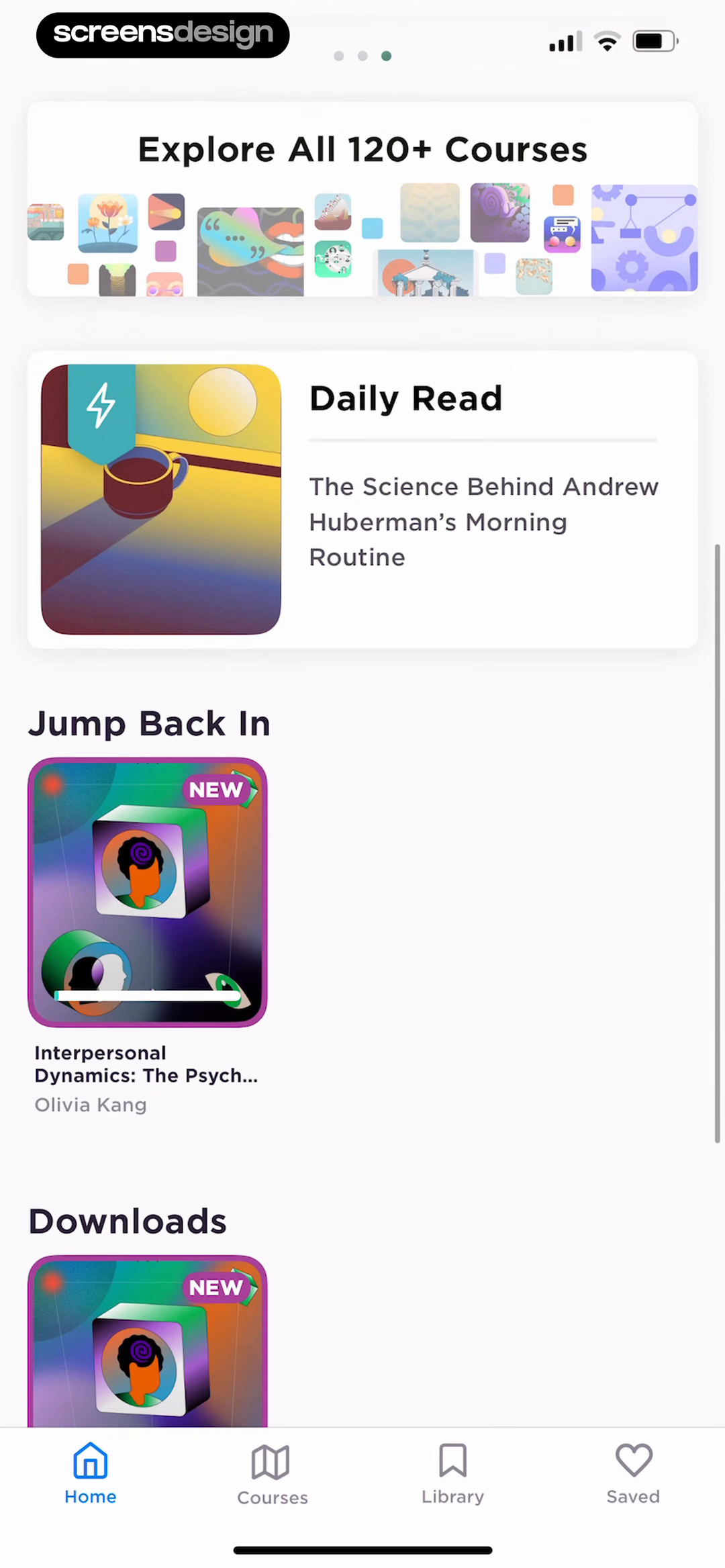
Learning and reading
Editorial hierarchy, resumption states, saved content, and useful ways into a large catalog.
Search these screens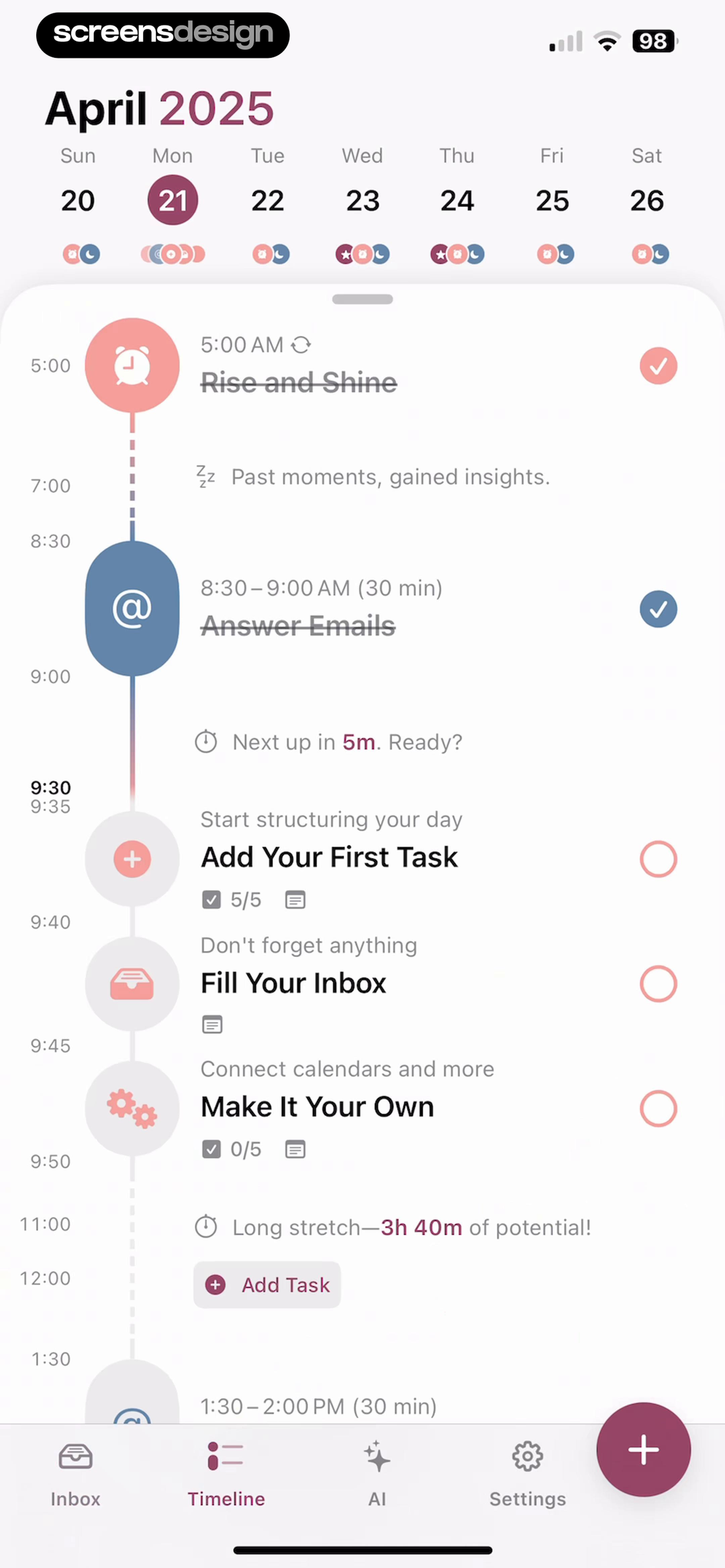
Productivity
Timelines, lists, matrices, focus states, and calm ways to make the next task obvious.
Search these screens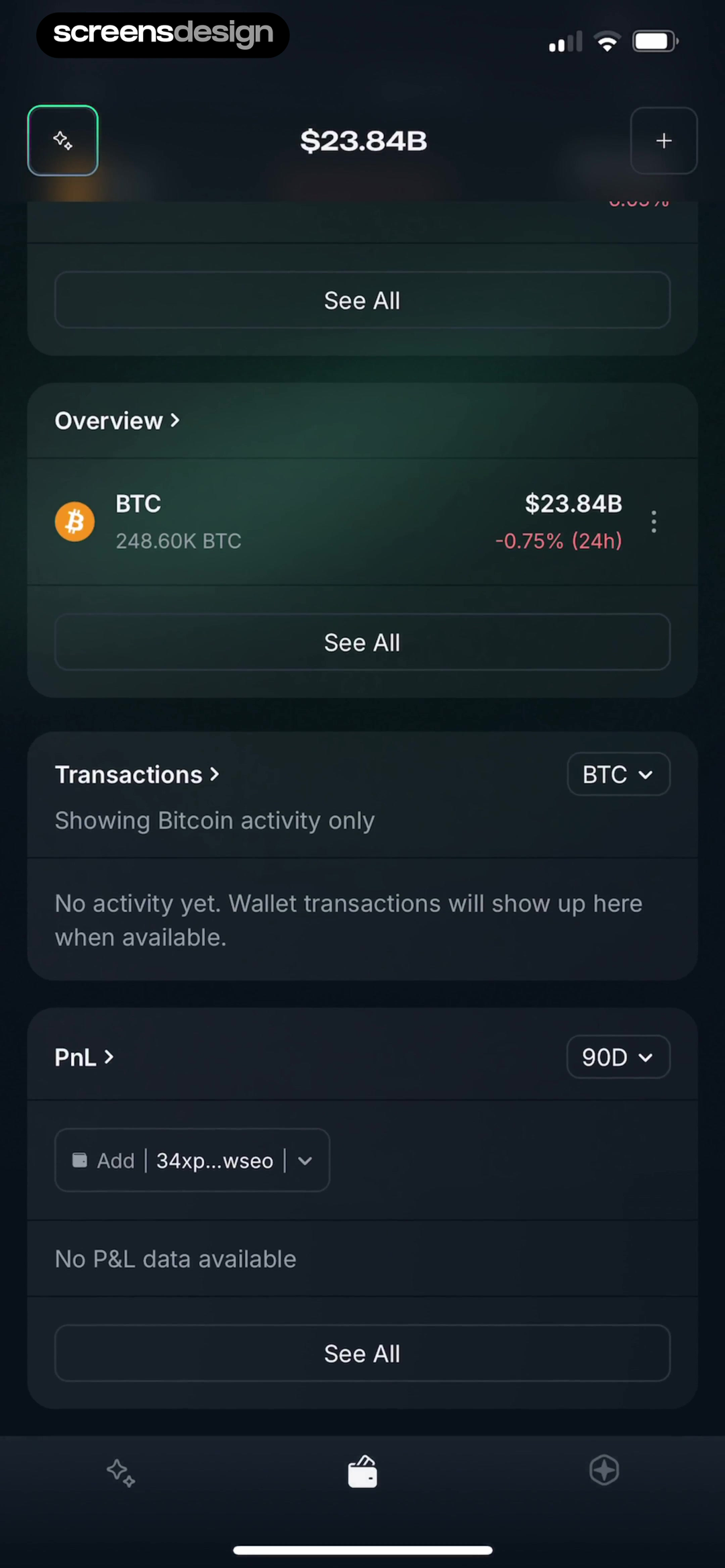
Finance
Balances, trends, transactions, empty states, and progressive disclosure for consequential data.
Search these screens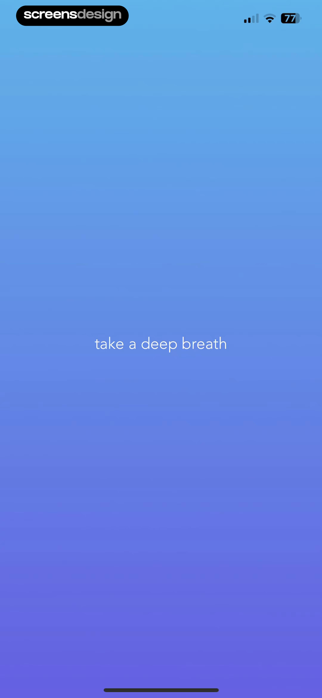
Wellbeing
Breathing room, supportive language, sensory pacing, and prompts that do not feel clinical.
Search these screensCompanions and habits
Characters, daily return loops, progress, and environments that can grow with the relationship.
Search these screensThe screen after the beautiful screen
A visual system has to survive the next state.
One screenshot can hide navigation problems, weak empty states, or a layout that only works with perfect content. Compare states from the same product before borrowing the surface treatment.
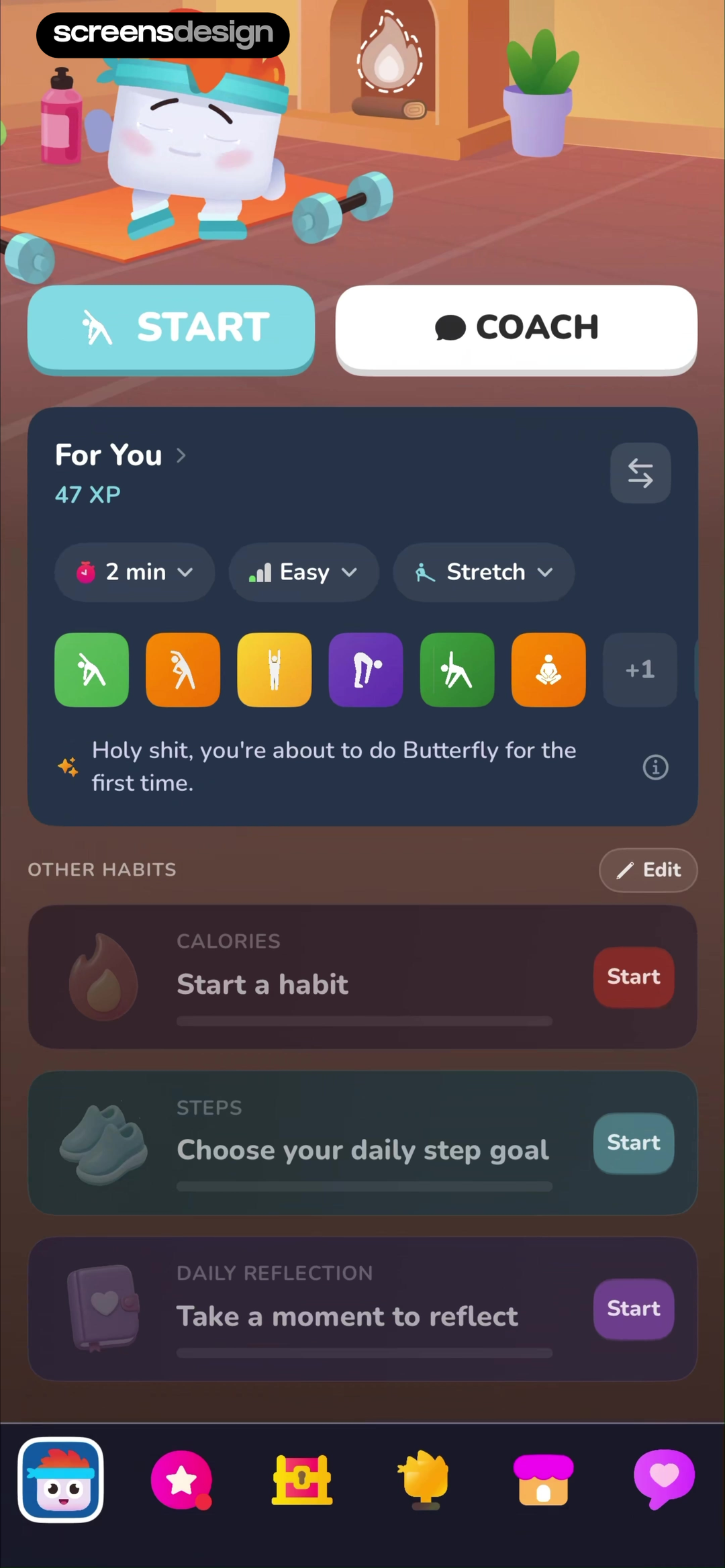
Luvu keeps its character while the dashboard expands.
Both recorded home states preserve the illustrated room, direct workout action, progress panel, and persistent navigation. The later state adds coaching and other habits without turning into a different product.
Open the recorded feature flow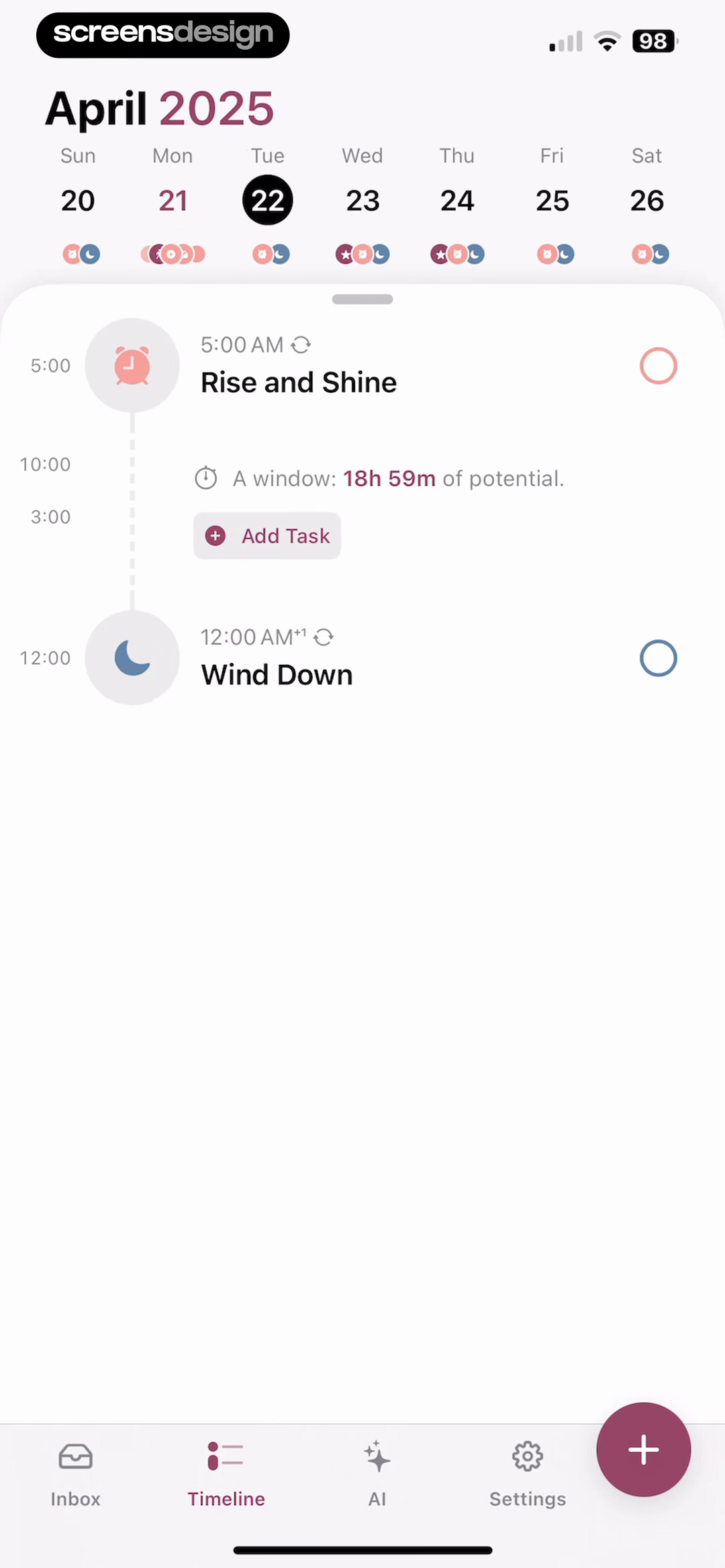
Structured makes empty time part of the design.
A sparse day and a populated day use the same calendar, vertical line, task markers, and creation action. Open space is described as usable time, so the layout remains informative even when content is limited.
Open the recorded task flowA repeatable research process
Turn a reference into your own design system.
The goal is not to combine the nicest pieces from several apps. It is to make a traceable design decision that fits your product better than the first idea did.
- 01
Name the product decision.
Start with the problem in your product: choosing a lesson, reading a trend, beginning a workout, or returning to a habit. Searching for a vague mood produces vague references.
Question: what must become easier on this screen? - 02
Collect a small, varied set.
Save three to six references that solve the same job in visibly different ways. Variation reveals the underlying decision more clearly than twenty near-identical cards.
Question: which approaches genuinely disagree? - 03
Describe the mechanism.
Write down what creates the effect: one dominant action, an anchored timeline, a lead story, progressive disclosure, or a stable dark contrast system.
Question: what would still work with our brand removed? - 04
Translate it into your constraints.
Apply the mechanism to your content, states, platform behavior, accessibility requirements, and design system. Change the expression while preserving the useful reasoning.
Question: what must be different for our users? - 05
Test the next state.
A promising reference must survive loading, empty, error, partial, and completed states. Review the complete flow before committing to the surface treatment.
Question: does the idea work after the first beautiful frame?
Research with your own problem
Ask ScreensDesign how real apps solve the screen or flow you are designing now.
Borrow the reasoning
Separate transferable ideas from product-specific expression.
A reference becomes safer and more original when the team can explain which part transfers and which part belongs to the source product.
- Information priority and the dominant next action
- How content is grouped, compared, or progressively shown
- How empty, partial, loading, and completed states behave
- How navigation remains predictable as density changes
- Where illustration, motion, or color supports comprehension
- Distinctive characters, illustrations, and brand assets
- Signature layouts copied without your own content model
- Color combinations chosen only because they look current
- Interactions that conflict with platform expectations
- Claims about performance that the screen cannot prove
Before you design
Use this checklist on every inspiration board.
Each reference solves the same clearly named product problem.
The set includes meaningfully different approaches, not duplicates.
Every screenshot links to its real screen or complete flow.
The note explains a mechanism, not only an aesthetic reaction.
You identified which source constraints may not apply to you.
You reviewed at least one neighboring state for each strong idea.
Your translation uses your content, components, and platform rules.
The idea remains usable with realistic, empty, and error content.
For screen-specific design decisions, continue with the practical app screens guide. For the broader product process, use the mobile app design guide. To turn a reference into a consistent component and state system, use the mobile app UI design guide. For a reference process focused specifically on hierarchy, typography, color, components, and interface states, use the UI design inspiration guide.
Frequently asked questions
Questions about app design inspiration.
Where can I find good app design inspiration?
Start with recorded product screens and complete flows rather than promotional mockups alone. Search by the interface job you need to solve, such as onboarding, planning, progress, or empty states, then compare several real implementations.
How do I use app inspiration without copying?
Describe the mechanism behind the reference, then rebuild that mechanism with your own content model, brand, components, platform conventions, states, and user constraints. Do not reproduce the same composition, illustration, or visual identity.
How many references should I collect?
Three to six strong references are usually enough for one design decision. A smaller set is easier to compare and forces the team to explain why each example matters.
Should I organize inspiration by style or screen type?
Use both, but start with the product task. Screen type and flow position keep the research relevant; visual style helps you explore distinct expressions once the functional problem is clear.
What should an app inspiration board include?
Include the exact screen, its surrounding flow, the problem it solves, the mechanism worth studying, constraints that may not transfer, and a short note about how the idea could change for your product.
Why study complete app flows instead of screenshots only?
A complete flow shows how hierarchy, navigation, content, and visual language behave as the user moves between states. It reveals whether a strong-looking idea remains understandable during real use.
2,622 apps in the top charts.Ask them anything.
Find references for the exact screen you are designing, inspect what happens before and after it, and turn stronger research into a more original product.