Mobile app home screen design examples
14 Mobile App Home Screen Design Examples: Six Jobs to Prioritize
Fourteen recorded home and dashboard screens show how mobile apps help people resume, discover, track, create, decide, or respond without giving every module equal weight.
A mobile app home screen is a routing decision, not a complete inventory of the product. It must recognize the user's current state, elevate the most useful action, and keep alternate destinations available without making them compete. The right hierarchy depends on the job that brings someone back. A learner may need to continue a lesson, a creator may need recent projects, and a host may need to resolve one listing issue.
This review groups examples by that primary job. The categories make action priority inspectable: the first meaningful card should answer the most likely return question, while progress, recommendations, navigation, and account utilities support that answer. The examples also show why the same layout cannot serve every state. An empty creator home should explain how to start; a returning creator home should protect access to existing work.
Use the app screen design guide to review a home screen inside its full task and navigation model, then use the mobile app UI design guide to check the wider component, feedback, accessibility, and visual hierarchy system.
For first-use, no-results, and recovery modules inside those homes, continue with the mobile app empty state examples.
01. Resume
Restore the exact work that was interrupted.
A returning home screen should reduce the effort of reconstructing what happened last time.
Brilliant gives its central area to "Pick up where you left off." The card identifies Foundational Math, level 1, the Solving Equations lesson, and progress before the Continue button. Streak and completed-lesson summaries stay above without displacing the lesson. Recommendations follow below. Home, Courses, Leagues, and More keep exploration available after the return task is clear.
Gizmo treats recent work as a set. Its "Jump back in" module lists a quiz, a chat, and two step-by-step lessons with progress rings. Popular and owned decks follow beneath, while Home, Progress, Add, Decks, and Profile remain persistent.
Use one resume card when an object has an obvious next step. Use labeled recents when people switch among formats or projects. In both models, show title, object type, progress, and a continuation verb so users do not need to open items to find where they stopped.
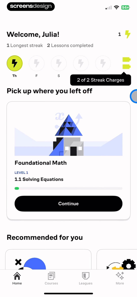
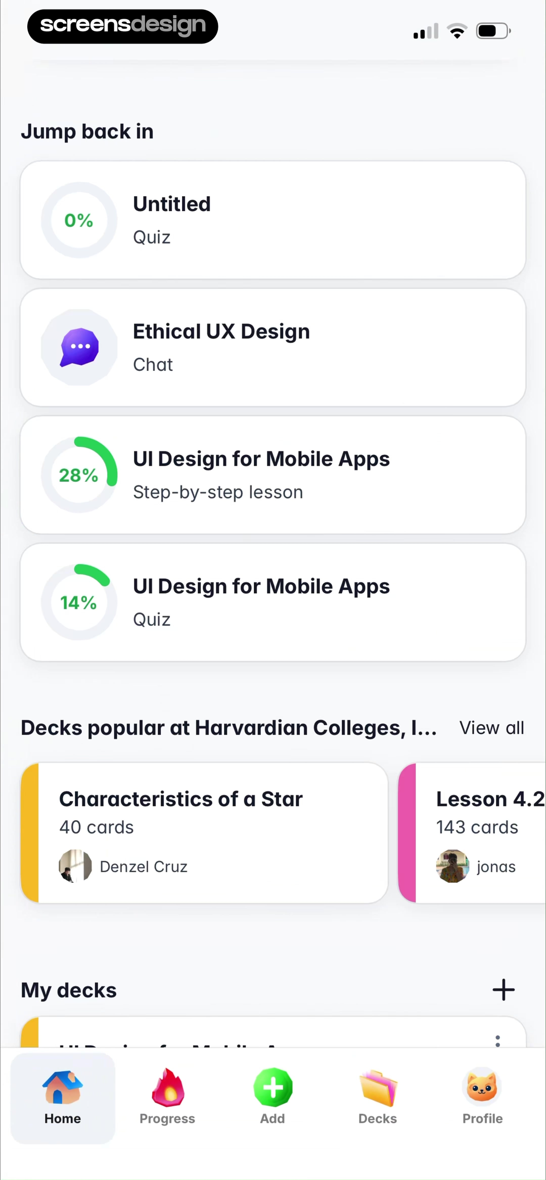
Can the user predict what Continue will reopen?
Show the object, current unit, progress, and action. A generic Continue button without that context shifts the recovery work back to the user.
02. Discover
Make the route into the catalog understandable.
Discovery needs a visible reason for what appears, plus a way to leave the feed and search deliberately.
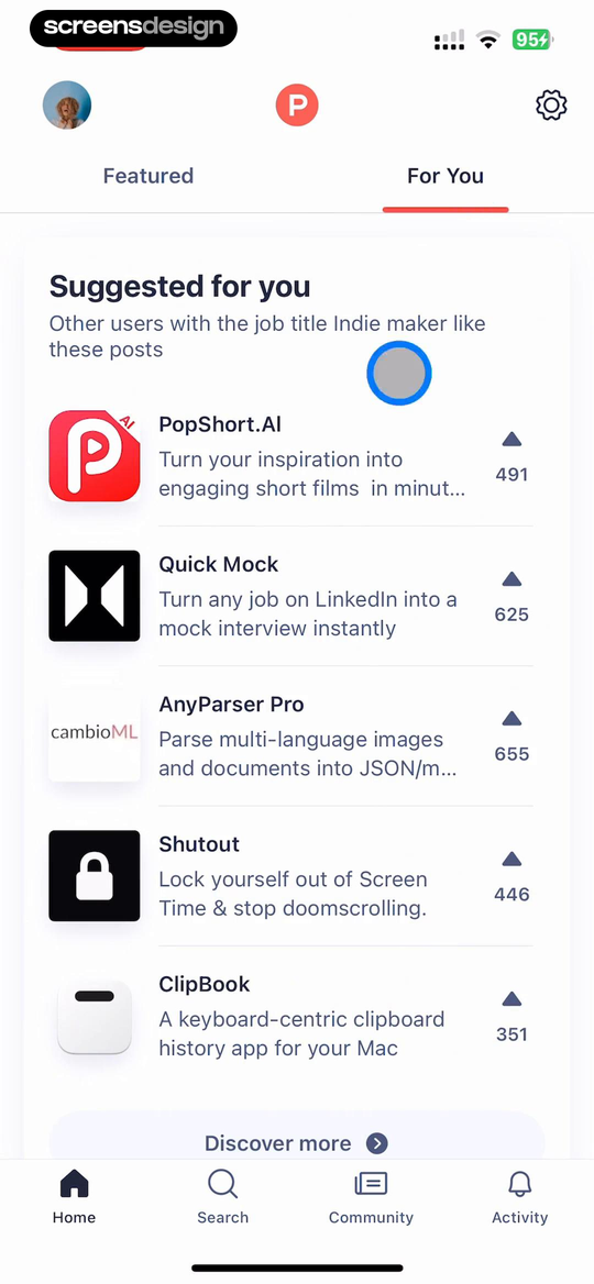
Product Hunt labels its personalized tab "For You" and says the suggestions reflect posts liked by other users with the same Indie maker job title. Product names, descriptions, and upvote counts support comparison, while Featured remains adjacent. Persistent Home, Search, Community, and Activity destinations keep the feed from becoming the entire information architecture.
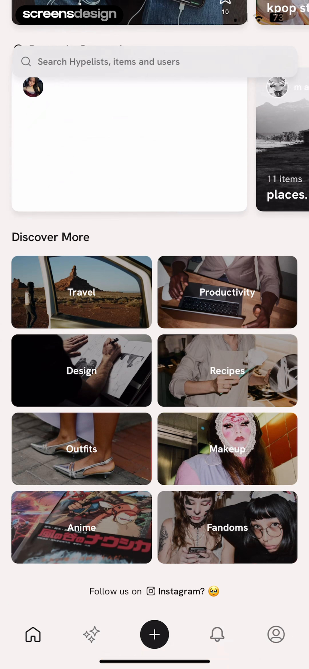
Hypelist begins with search, then moves through list previews into a "Discover More" grid. Travel, Productivity, Design, Recipes, Outfits, Makeup, Anime, and Fandoms are labeled category choices, not one stream. A central plus action and nearby discovery, notification, and profile destinations keep browsing and creating separate.
Product Hunt ranks items and states a personalization signal. Hypelist asks the person to choose a domain. Sparse preference data may favor categories first. Reliable profile or behavior signals can support recommendations, but search, topic controls, or a short explanation should still let users correct the feed.
03. Track
Turn progress into a specific next contribution.
A dashboard is useful when the interval, target, and action belong to the same behavior.
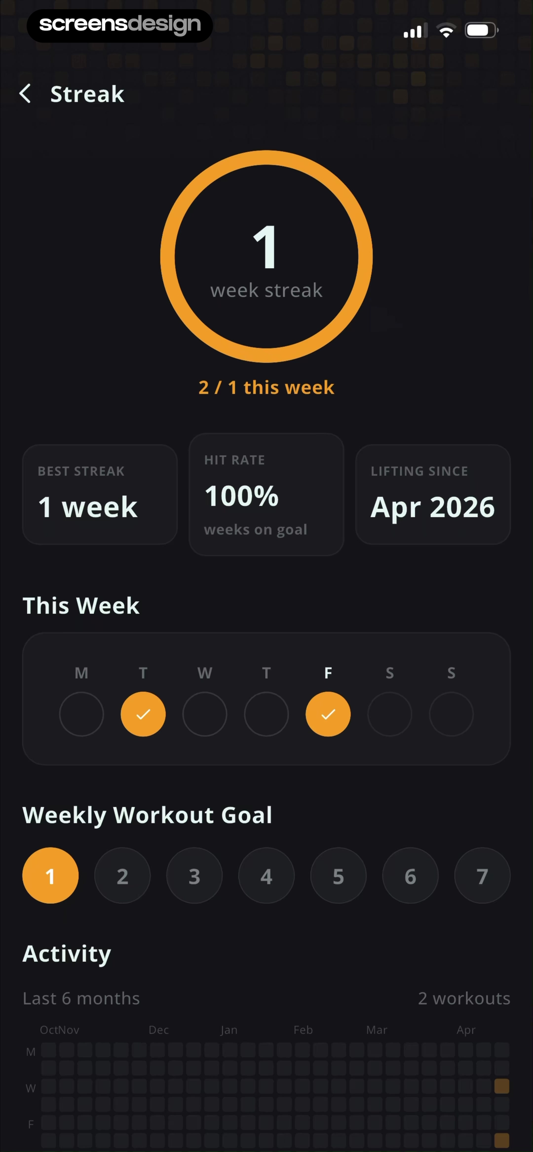
Stronger centers a one-week workout streak, qualified by "2 / 1 this week." Best streak, hit rate, and lifting-since date add context. A seven-day row, editable weekly goal, and six-month heat map explain the headline number across different intervals of the same workout behavior.
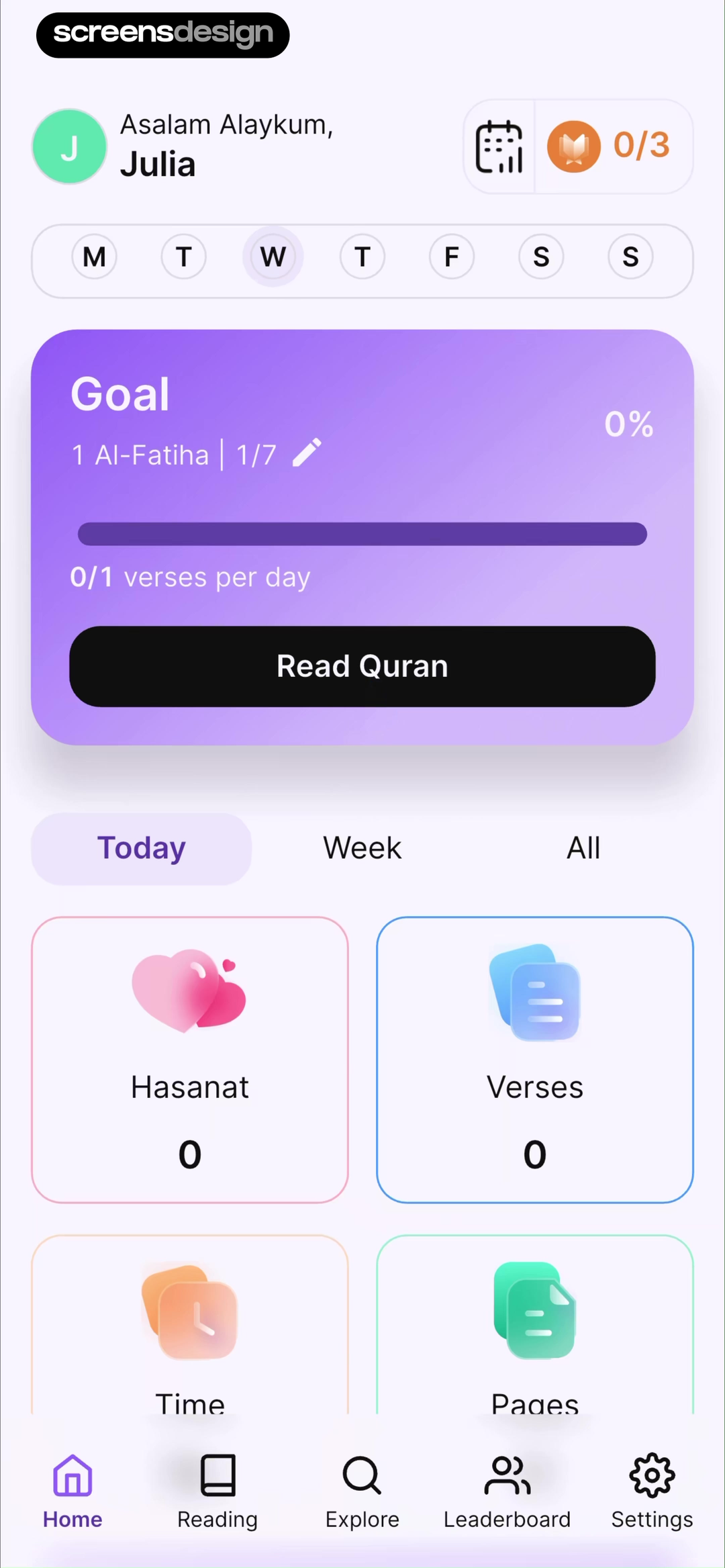
Quranly is more operational. A weekly row and 0/3 status sit above an Al-Fatiha Goal card with 0 percent progress, a daily verse target, and Read Quran. Today, Week, and All change the interval, while Home, Reading, Explore, Leaderboard, and Settings retain broader navigation.
Stronger helps diagnose a pattern. Quranly combines status and the next action. Name the period, target, and unit, then connect the metric to the action that changes it. Show zero honestly: a new goal at 0 percent still needs a clear starting route.
04. Create
Change the home hierarchy when work begins to exist.
First-use creation and returning creation are different states, even when they share the same bottom-bar plus action.
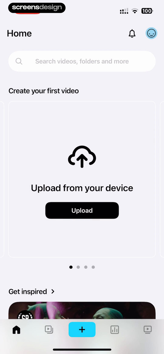
Vimeo's first-use card says "Create your first video" and names the route: "Upload from your device." Search stays above, inspiration below, and a central plus in the bottom navigation. The empty state uses the largest card to establish the first object and its source.
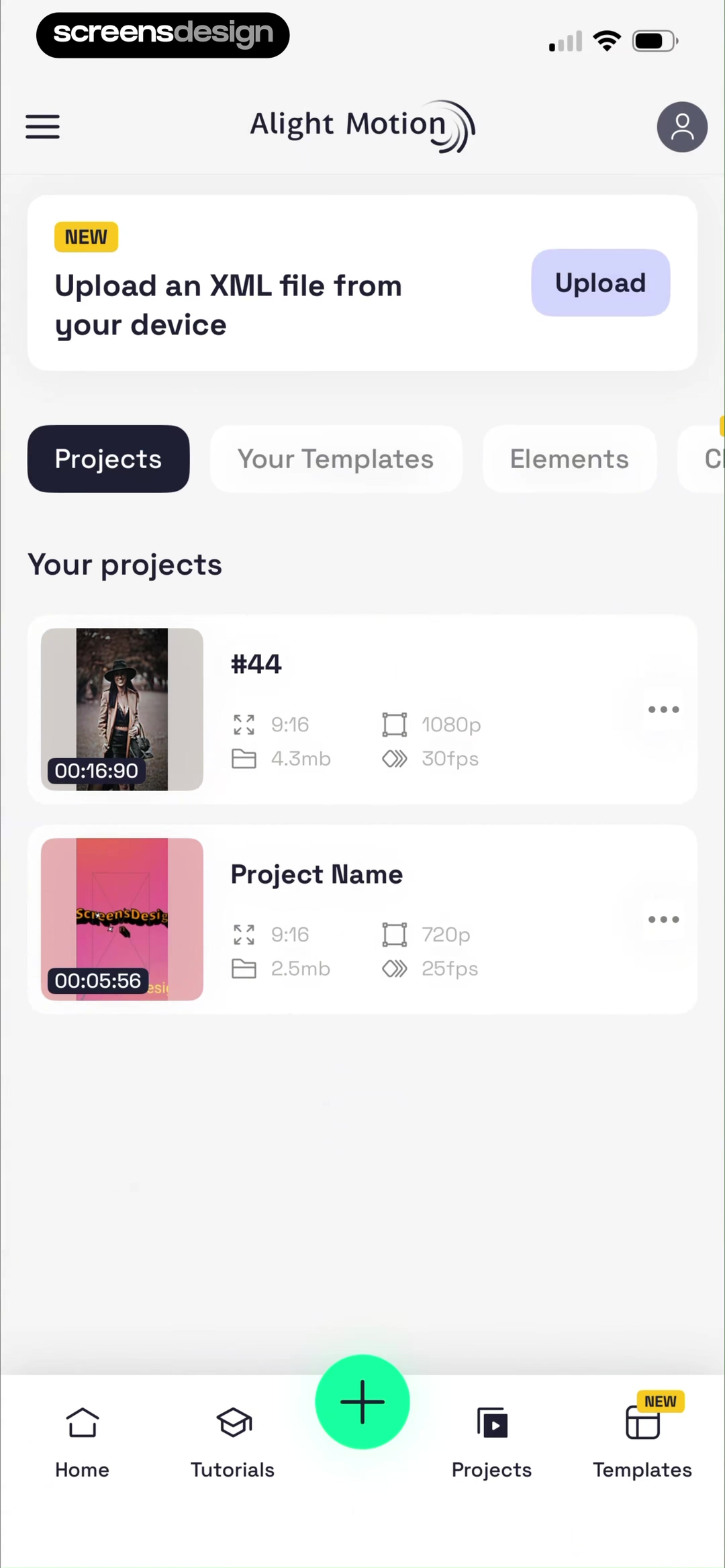
Alight Motion shows the returning state. A compact XML prompt is secondary to the Projects tab and two project cards. Each exposes a thumbnail, duration, aspect ratio, resolution, size, frame rate, and overflow menu. The central green plus needs no setup copy because existing projects reveal the product model.
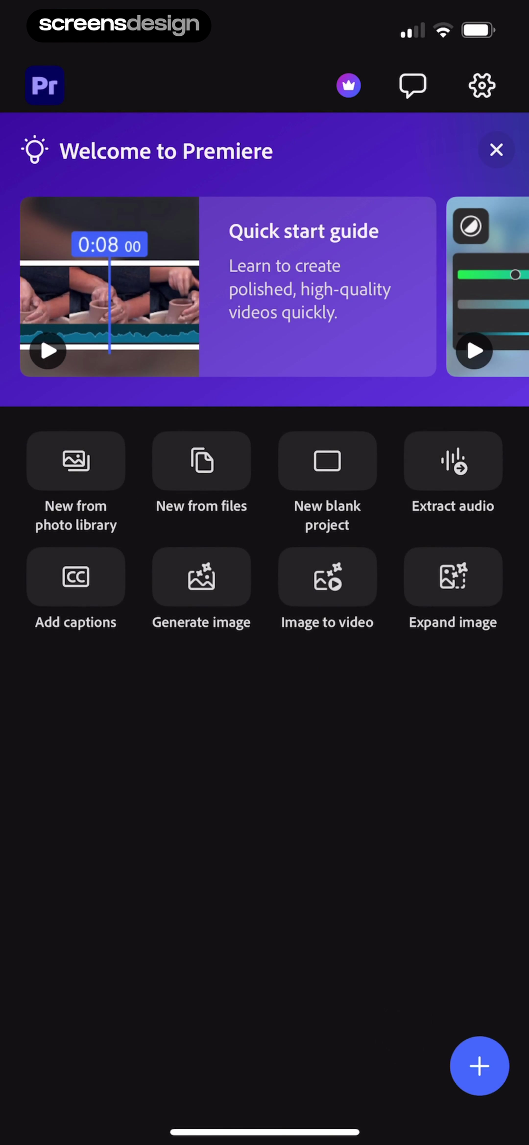
Adobe Premiere supports several starting materials. Its grid offers photo library, files, blank project, audio extraction, captions, image generation, image to video, and image expansion. The labels distinguish input or result, while a floating plus remains persistent.
Treat these as states. Before the first project, teach one likely route. After projects exist, prioritize recent work. When specialist actions matter, reveal a labeled creation menu without displacing projects. Remove large setup teaching after it has completed its job.
No projects
Explain the first object and emphasize one likely input.
Returning work
Move existing projects, recency, metadata, and resume access into the primary region.
Several creation modes
Name each action by its source or result instead of hiding every route behind one unexplained plus.
Keep creation reachable
A stable plus action can survive all three states while the content above it changes.
05. Decide
Organize the home screen around the decision rule.
A task dashboard should reveal why one item deserves attention before another.
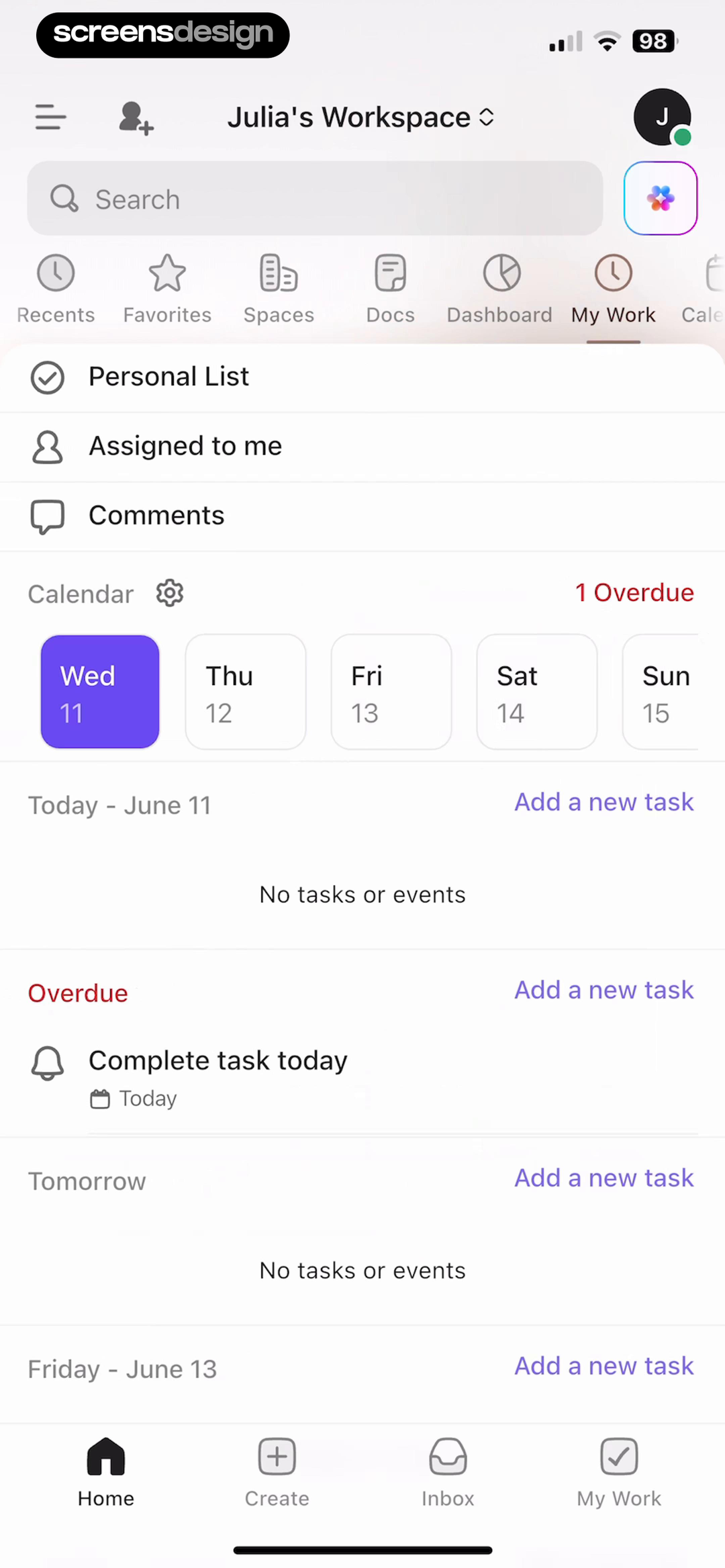
ClickUp uses a date-based rule. Workspace shortcuts sit above a calendar, then Today, Overdue, Tomorrow, and Friday groups. Today is empty, but one red overdue item remains visible beside Add a new task routes. Home, Create, Inbox, and My Work persist below.
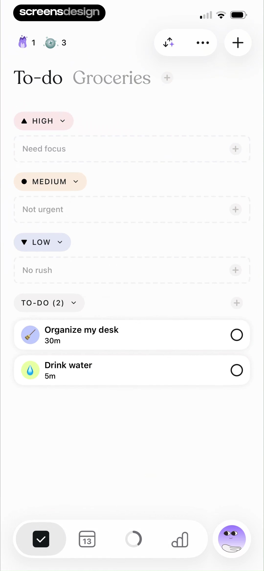
Tiimo uses priority instead. High means "Need focus," Medium "Not urgent," and Low "No rush." The remaining To-do section shows two timed tasks. Empty priority rows retain plus controls, so the screen supports deciding and reorganizing.
Use time when lateness, appointments, or sequence matters. Use priority when urgency drives action. If both matter, establish a primary sort and show the secondary attribute on each item. Equal weight for overdue, someday, and completed work hides the decision rule.
06. Respond
Separate attention required from activity observed.
A response-oriented home screen should identify what changed, what is waiting, and what the user can do next.
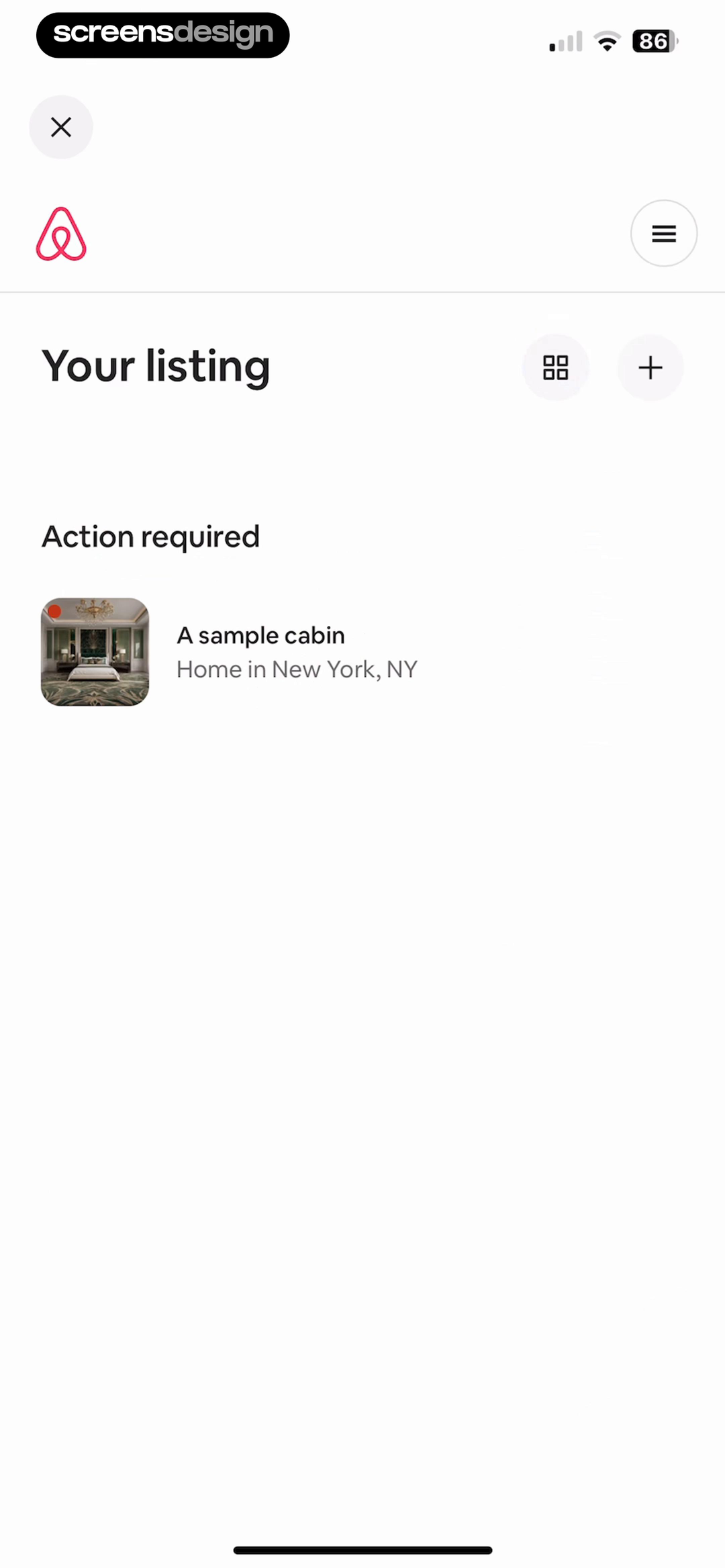
Airbnb's host dashboard is sparse. One "Action required" group contains a sample cabin and a red status dot. Grid and add controls remain in the header, but unrelated modules do not compete. Because the required action is not named here, the card must carry the transition into detail.
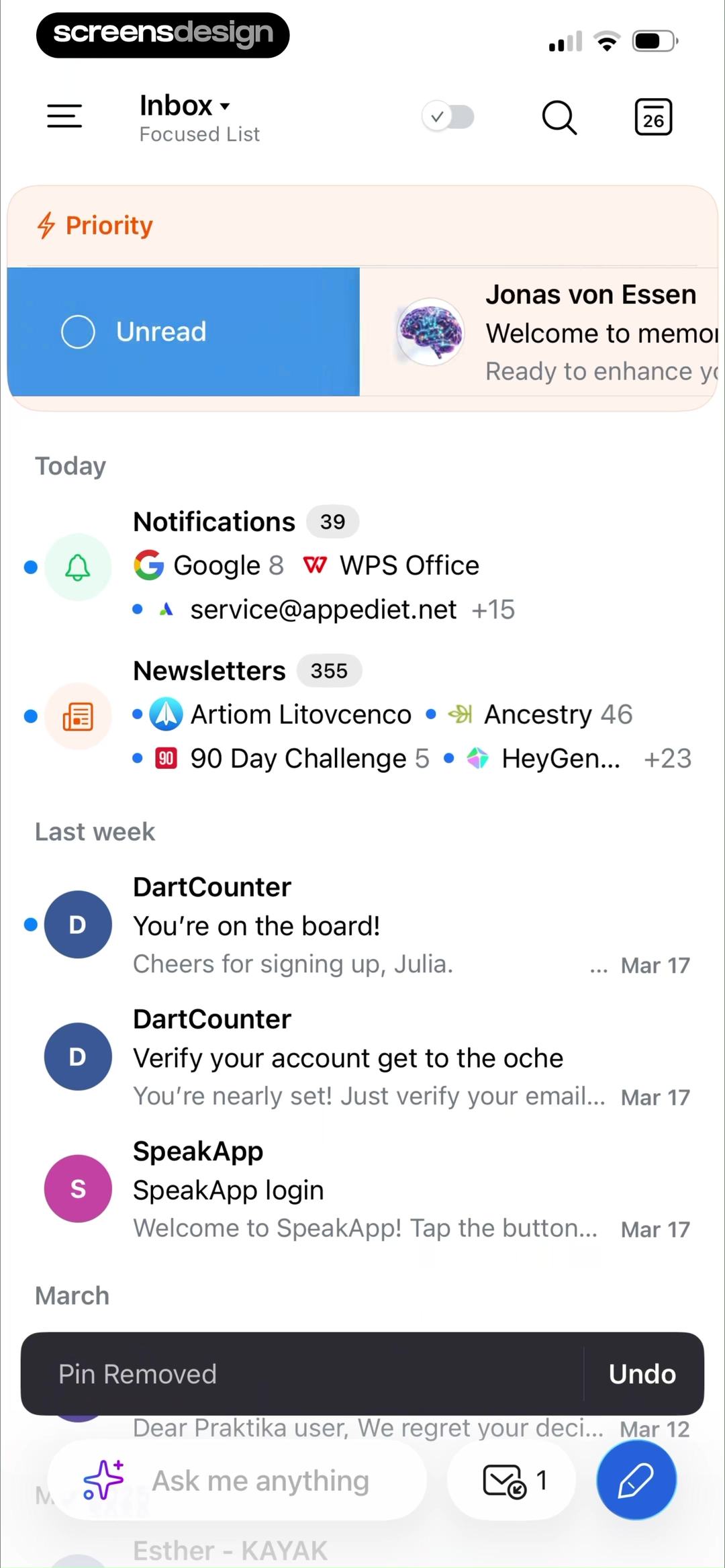
Spark manages a larger queue. Priority and Unread come first, followed by Today groups and older messages. Unread dots, counts, sender names, snippets, and dates support scanning. Search, calendar, mail count, and compose remain reachable. A Pin Removed message includes Undo for the latest action.
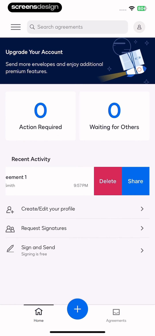
DocuSign shows workflow state before activity. Action Required and Waiting for Others both show zero, then a recent agreement exposes Delete and Share. Request Signatures and Sign and Send remain below. The zero counts distinguish a cleared queue from missing data and show that no response is blocked.
Organize attention by consequence. A host issue can justify one focused card. An inbox needs filters, counts, recency, and recovery. A document workflow must separate work the user owes from work another party owes. Informational, unread, and blocked states should not share identical prominence.
07. Review method
Audit the home screen as a state router.
Review the default frame, the action it prioritizes, and the state that replaces it after the action succeeds.
Use six realistic accounts: new, unfinished, completed, empty, overloaded, and blocked. Load the same home route for each. Record the first actionable module, why it has priority, the persistent destinations, and the action that changes the state.
Follow the primary action forward and back. Continue should reopen the named object. Read should update the goal. Upload should replace first-use teaching with a project. Resolving an item should remove or restate its alert. A home screen that never changes may be reflecting a fixed arrangement instead of user state.
Compare realistic extremes. Recommendations need weak-personalization behavior. Progress needs zero, partial, completed, missed, and unavailable-data states. Queues need zero, one urgent, and hundreds of mixed items. Persistent navigation should remain stable unless the task enters a focused mode.
- Name the home screen's primary job for each important account state.
- Make the first actionable module reflect that job, not an internal business priority.
- Show enough object context to predict what the primary action will open or change.
- Keep persistent navigation limited to stable destinations with distinct purposes.
- Explain recommendation logic or provide search and category controls that can correct it.
- Tie every progress number to a period, target, unit, and next contribution.
- Replace first-use instructions when real content or projects exist.
- Distinguish overdue, unread, waiting, informational, and action-required states.
- Test zero, partial, complete, overloaded, offline, and failed-data variants.
- Verify that success, undo, dismissal, and return navigation produce a coherent next home state.
If everything is a dashboard card, nothing explains what matters now.
Choose the first action from the user's state, then use size, order, labels, and contrast to make that decision visible.
Questions and answers
Mobile app home screen design questions
What should a mobile app home screen include?
Include the primary action for the current state, enough context to understand it, and persistent access to stable destinations. Add progress, recommendations, recent work, or alerts only when they support a real return job.
How do I choose the primary action on a home screen?
Identify why the user returns in each important state. Resume may lead for unfinished work, upload for an empty creator account, read for an active goal, or action required for a blocked workflow.
Should a mobile app use a dashboard or a feed?
Use a dashboard when statuses, goals, or tasks need comparison. Use a feed when recency or discovery is central. A hybrid can work, but one model should control the first screenful.
How should a home screen change for new and returning users?
Explain the first useful object or action for a new user. After content exists, replace that teaching with recent work, resume context, status, and creation access.
How many items belong in mobile bottom navigation?
Use stable destinations needed across major home states. Every item should have a distinct purpose, clear label or established icon, and predictable behavior. Keep contextual actions inside the current screen.
How should progress appear on a home dashboard?
State the period, target, unit, and current value, then provide the action that contributes to the metric. Test zero, partial, completed, missed, and unavailable-data states.
How can I research more mobile app home screens?
Open the exact replay links to inspect surrounding moments, then search the recorded library by job and state, such as resume lesson, empty creator home, weekly goal dashboard, overdue tasks, or action-required queue.
Apps referenced in this page
Open the products behind the examples.
 BrilliantYour personal tutor
 GizmoAI flashcards & quizzes
 Product HuntFind the best products in tech
 HypelistMovies, Music, Books & Places
 StrongerWeight Lifting & Exercise Log
 QuranlyView recorded app flows
 VimeoAd-Free Videos, Top Creators
 Alight MotionMotion Design & Video Effects
 Adobe PremiereCreate shorts, reels & videos
 ClickUp#1 AI Workspace & Agents
 TiimoSchedule Structured Daily Task
 AirbnbHomes, experiences, services
 Spark MailStreamline your email inbox
 DocuSignSign PDFs & Contracts
2,622 apps in the top charts.Ask them anything.
Search recorded mobile home and dashboard screens by job, compare the surrounding flows, and ask ScreensDesign Pro about the state you are designing.