Mobile app empty state examples
14 Mobile App Empty State Examples: Seven States to Design
Fourteen recorded mobile app empty states show how products handle first use, missing content, zero results, completion, blocked permissions, lost connections, and failed actions.
An empty state appears whenever the interface has a valid structure but nothing useful to show inside it. Sometimes that is expected, as with a new list. Sometimes it is earned, as with a cleared inbox. Sometimes it signals that the user cannot continue because a permission, connection, or request failed. Those conditions need different copy, actions, and emotional tone.
The design decision begins with the reason for absence. Name what happened, preserve enough context to orient the person, and offer the smallest action that changes the state. A large illustration can support that sequence, but it cannot replace an accurate explanation or a working recovery route.
ScreensDesign Editorial reviewed recorded in-app screens from 14 mobile apps on August 10, 2026. We checked visible copy, controls, surrounding screen context, exact replay links, and source image dimensions. The examples document what the interfaces show. They do not establish that a particular empty state improved conversion, retention, task completion, or user satisfaction.
App screen design guide: use its screen-level review method to place an empty state inside the complete task and navigation model.
Mobile app UI design guide: apply the broader system guidance for hierarchy, accessibility, feedback, and component consistency.
For the return states that surround empty and populated modules, read the mobile app home screen design review.
01. First use
Make the first action explain the product.
A new account does not need a welcome speech if the empty state can teach the core object and help create it.
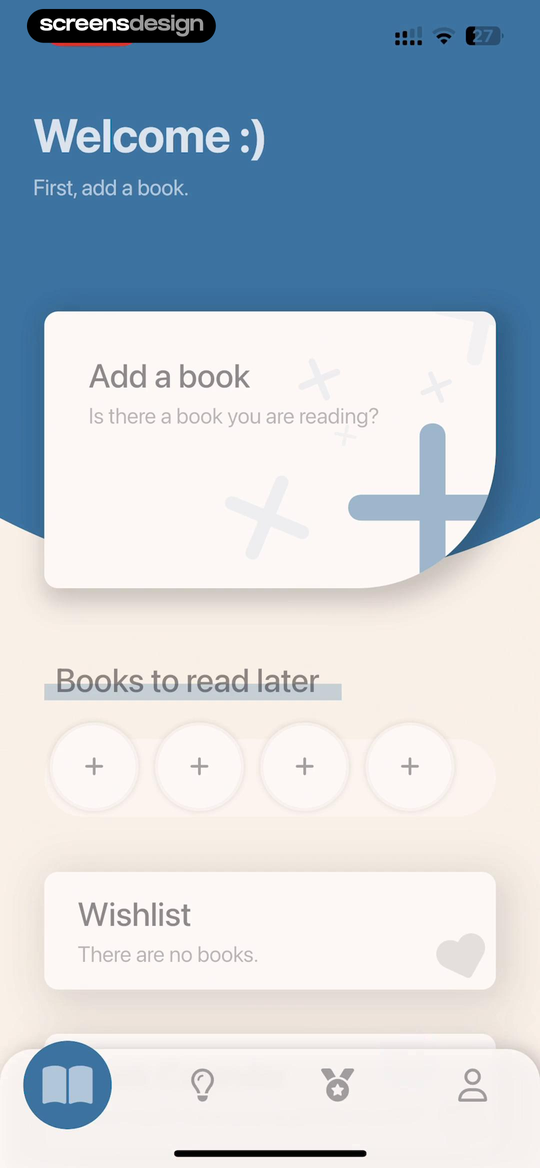
Bookmory opens with the instruction "First, add a book" and places the Add a book card above separate areas for books to read later and a wishlist. The page teaches the difference between the current reading record and supporting collections before any data exists.
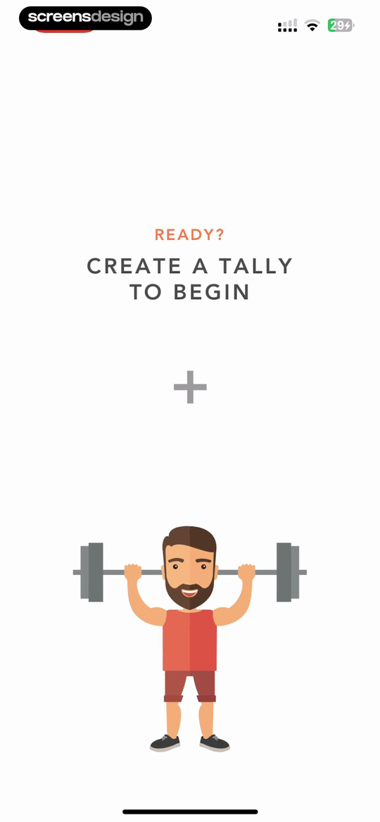
Tally uses fewer words: "Create a tally to begin" beside a large plus control. That directness fits a product whose core object can be understood from its name. A more specialized product may need a short example or a starter template, but the primary action should still name what will be created.
Plan first use as a state transition. Zero data should lead to one creation route, creation should preserve the chosen context, the first saved object should replace the empty message, and the returning view should make that object easy to resume. Testing only the zero-data frame misses most of the activation experience.
Zero data
Name the object and offer the most direct creation route.
Creation
Keep the selected list, category, or date attached to the new object.
First content
Replace setup copy with the saved object and its next meaningful action.
Return
Resume from the first object instead of replaying activation instructions.
02. No content
Keep an empty collection inside its working context.
A zero-item list should still look like the place where future items will be managed.
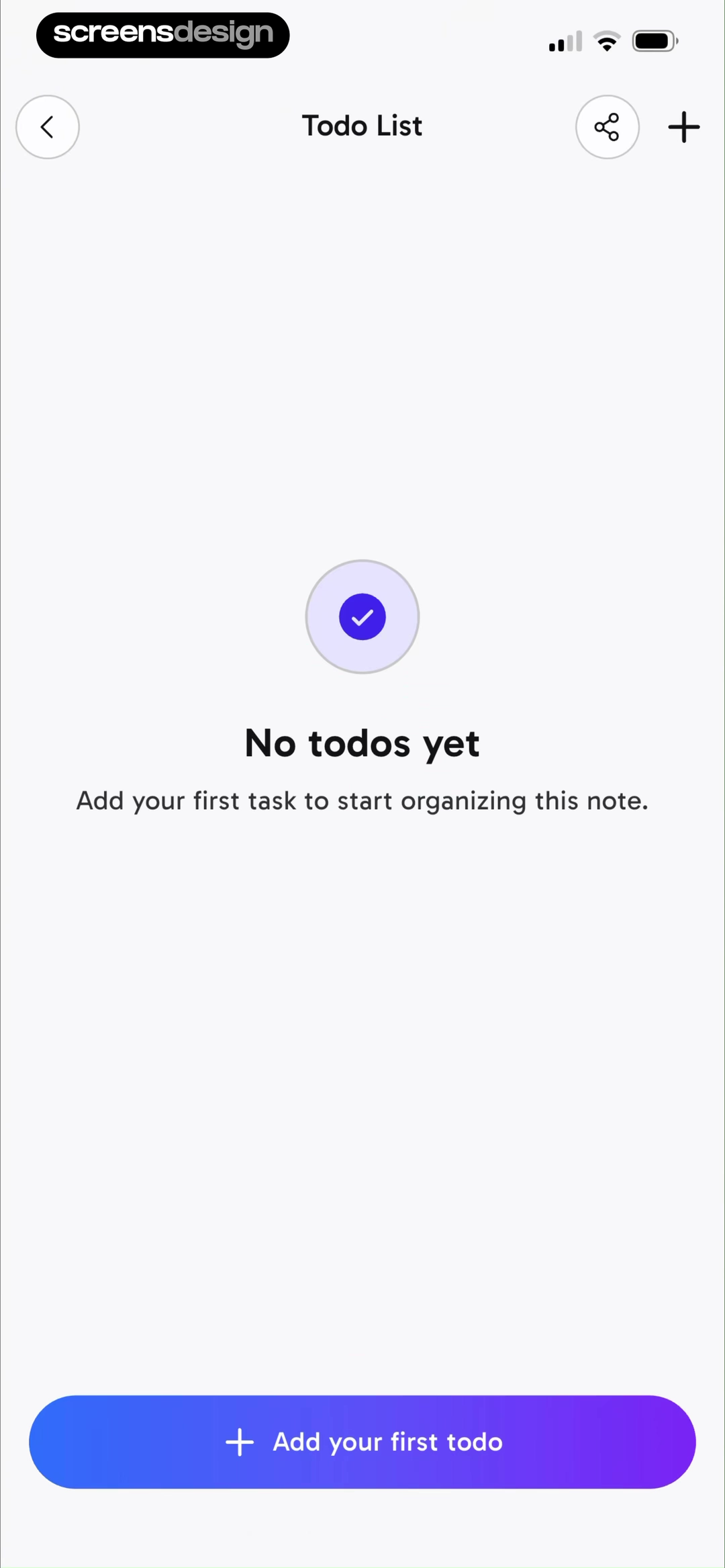
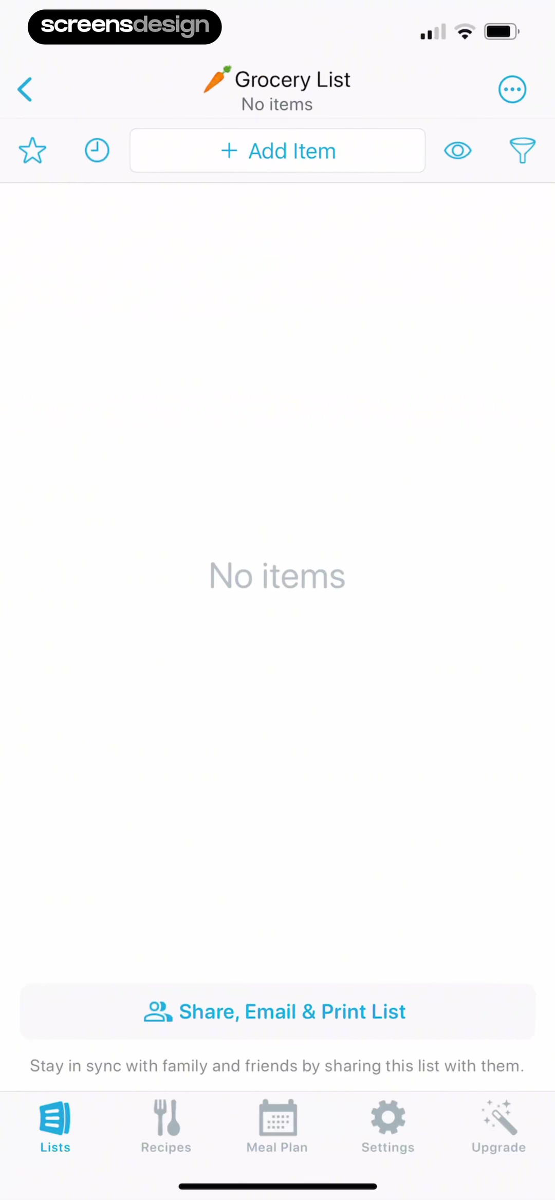
CraftNote keeps the Todo List title, navigation controls, and two creation entry points visible while saying "No todos yet." Its supporting line connects the first task to organizing the current note. AnyList keeps the Grocery List title, utility toolbar, Add Item action, sharing option, and normal bottom navigation in place even when the list contains no items.
These examples avoid turning absence into a detached marketing page. The user can still recognize where they are and which controls will remain after content arrives. Preserve the list name, scope, selected tab, filters, date, team, or other context that determines where the new item belongs.
03. No results
Explain which constraint produced zero matches.
A no-results state should help revise the current search, not send the user back to the beginning.
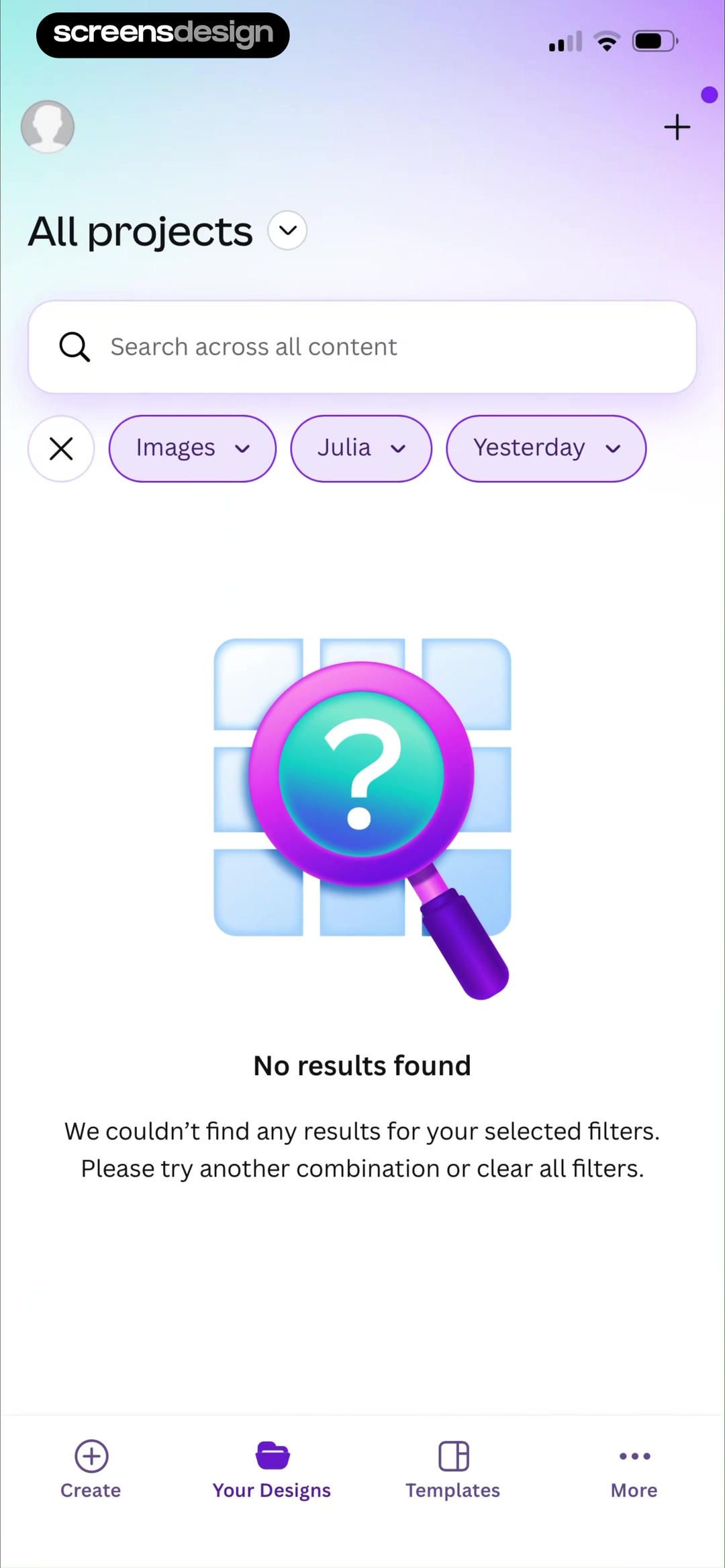
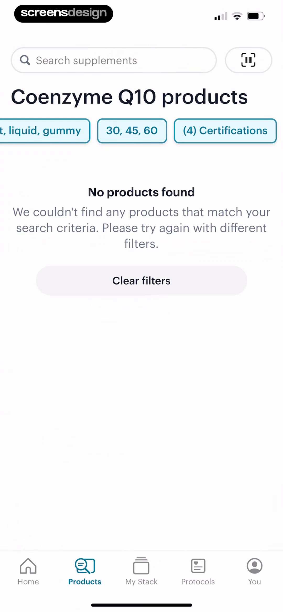
Canva leaves the selected Images, person, and date filters visible above "No results found," then recommends another combination or clearing all filters. SuppCo retains the Coenzyme Q10 category and three filter chips, then offers a prominent Clear filters action. Both make the cause of the zero-result state inspectable.
Choose recovery from the likely cause. If filters are too narrow, clear or edit them. If the spelling may be wrong, keep the query editable and suggest a correction. If the catalog truly lacks the item, offer adjacent categories, a request path, barcode scan, manual creation, or a saved search only when the product supports it.
Never erase the query before the user decides to broaden it. The entered terms and active constraints explain the result and let the person make a precise correction. Also distinguish zero matches from a failed search request. The first needs a new query; the second needs retry and system feedback.
04. Completed and cleared
Let earned emptiness feel complete.
An inbox that was cleared and an account that never received a message may both contain zero items, but they are not the same product moment.
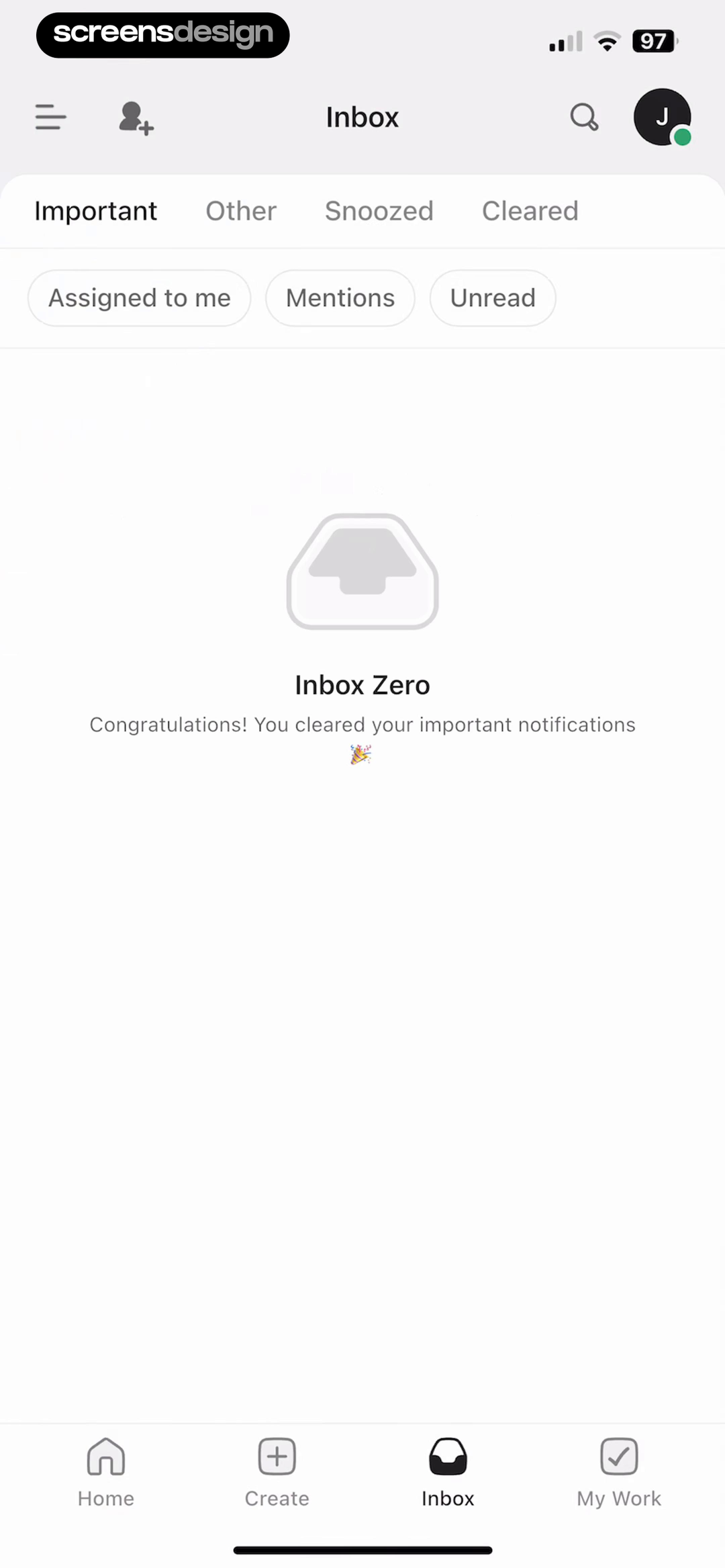
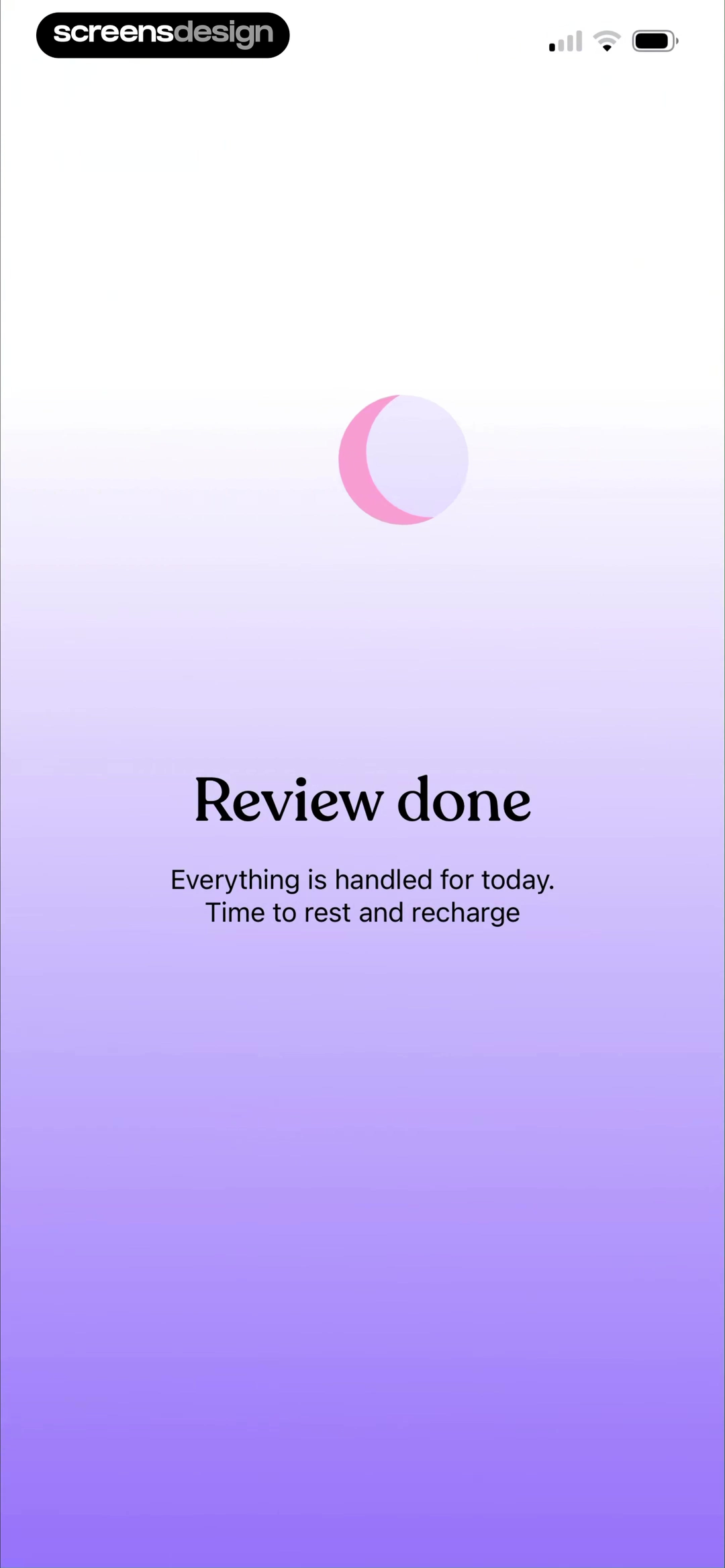
ClickUp labels the state "Inbox Zero" and specifies that important notifications were cleared. The tabs and filters remain available, so the user can inspect Other, Snoozed, or Cleared items without losing the completion message. Tiimo uses quieter language after a daily review: "Everything is handled for today" and "Time to rest and recharge."
Completion copy should identify what was finished. "All caught up" can be ambiguous when several queues or dates exist. Name the inbox, review period, selected filter, or cleanup scope. If another view may still contain work, keep that distinction visible instead of making a product-wide claim.
05. Permission blocked
Connect the missing permission to the blocked task.
After a denial, repeating the original request is not enough. The interface must explain the consequence and the route back.
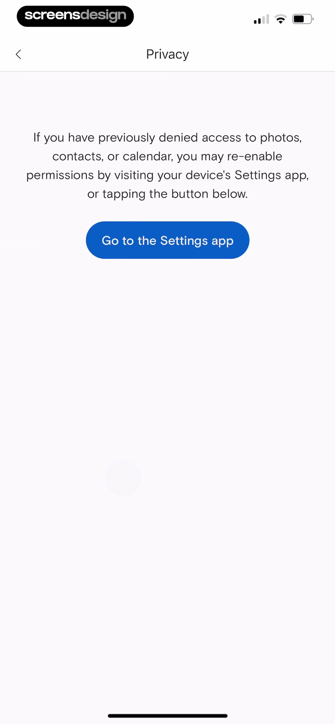
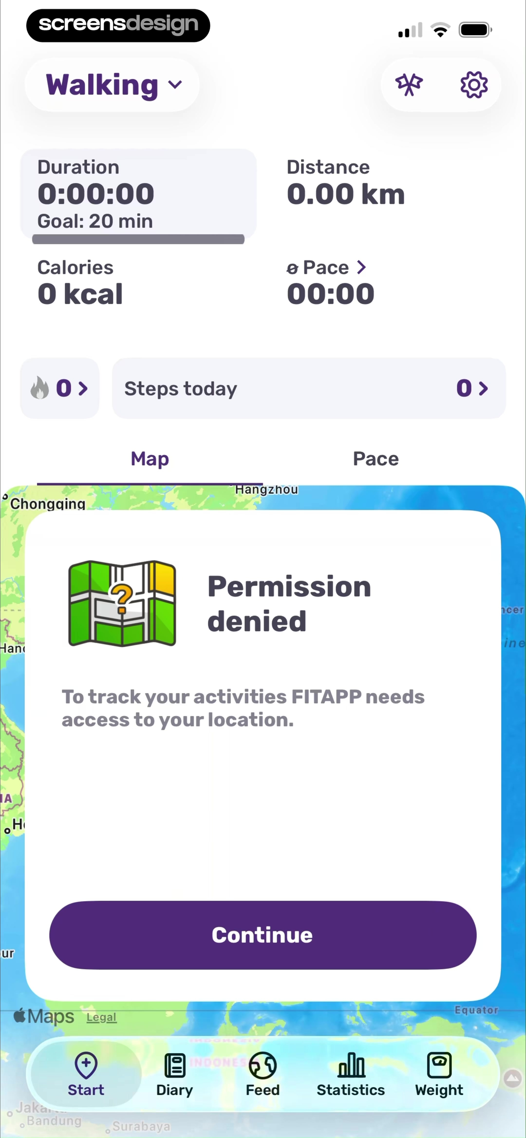
Paperless Post describes previously denied photo, contact, or calendar access and provides a button labeled Go to the Settings app. FITAPP places a Permission denied dialog over the walking tracker and states that location is required to track activities. The blocked feature remains visible behind the explanation.
Specificity matters. Name the permission, the action it enables, and whether the product can continue without it. A camera denial may still allow gallery import. A location denial may allow manual activity entry but not a mapped run. A contacts denial may permit typed addresses. Offer that alternate route when it is real.
06. Offline and loading errors
Say what remains safe when the connection disappears.
A network message should distinguish unavailable content from lost work and tell the user what retry will do.
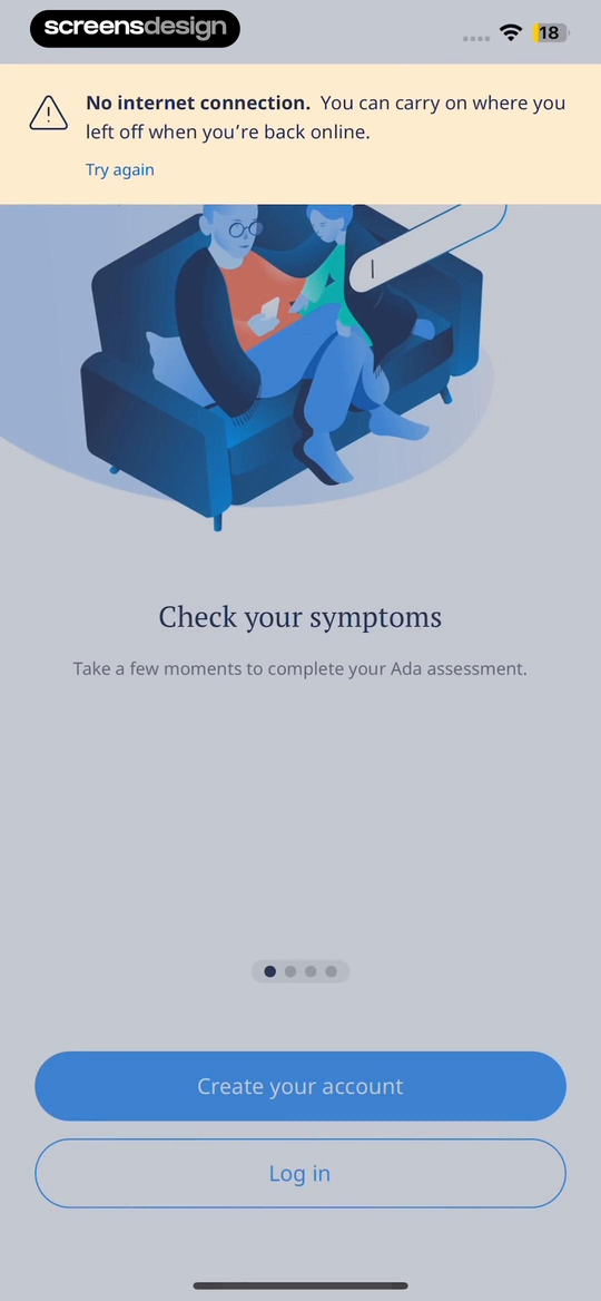
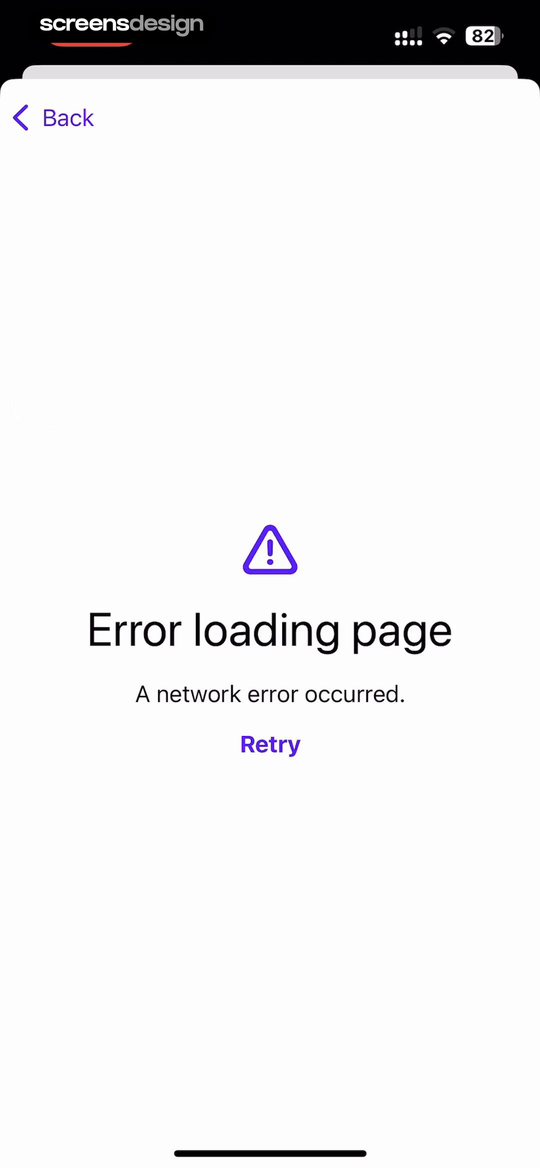
Ada uses a banner that says there is no internet connection and that the user can carry on where they left off when back online. The underlying onboarding content remains visible. HEY uses a focused full-page state for a network error, with Back and Retry as the two available routes.
The right presentation depends on how much of the product still works. Use an inline banner when cached or local content remains usable. Use a contained state inside the failed panel when only one module is unavailable. Reserve a full-screen interruption for a task that truly cannot proceed.
Tell the person whether input was saved, queued, or must be submitted again. Retry should repeat the smallest failed request without duplicating a purchase, upload, message, or record. When recovery depends on another system, avoid promising that a retry will succeed and keep a back route available.
07. Recovery actions
Offer a fallback when retry is not the only route.
The best error state preserves the failed intent and exposes another way forward when the same request may fail again.
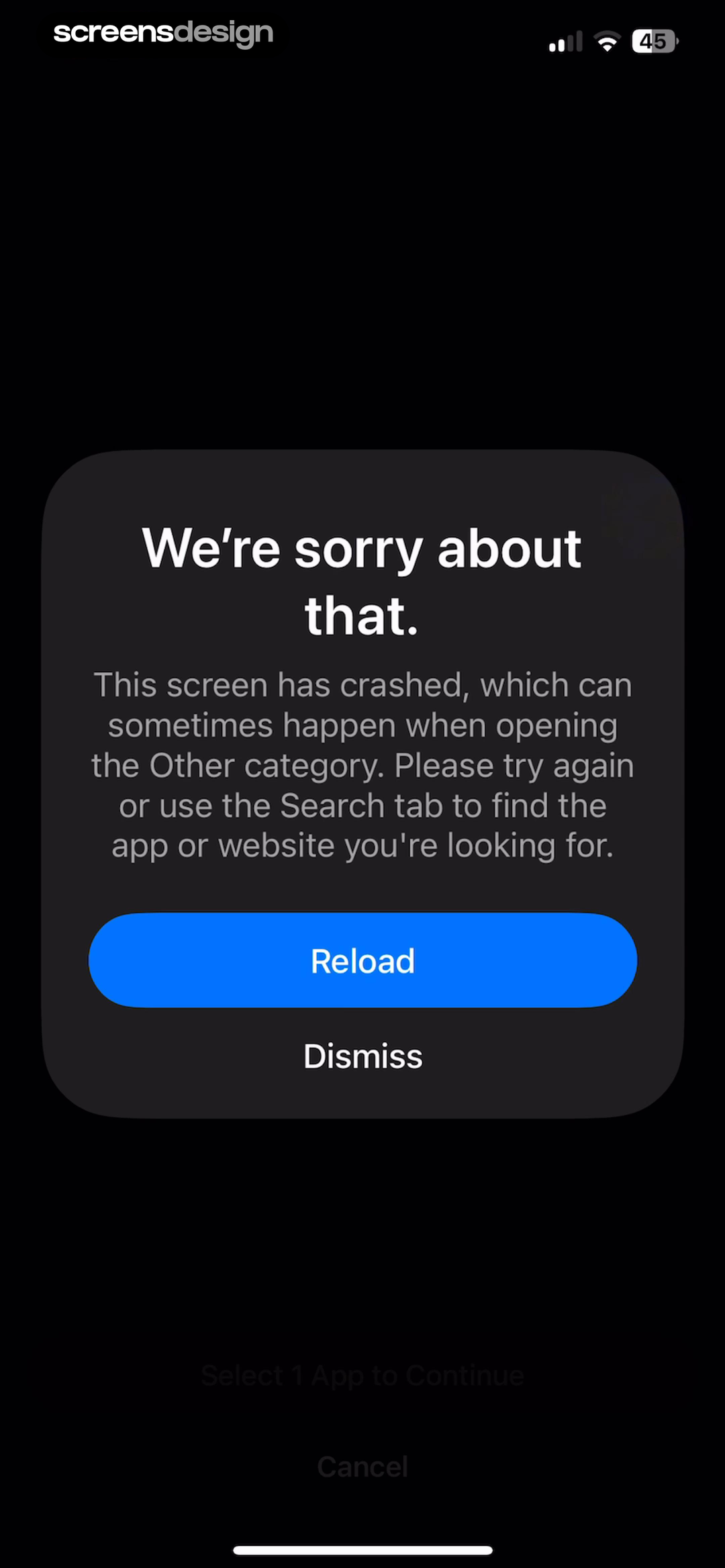
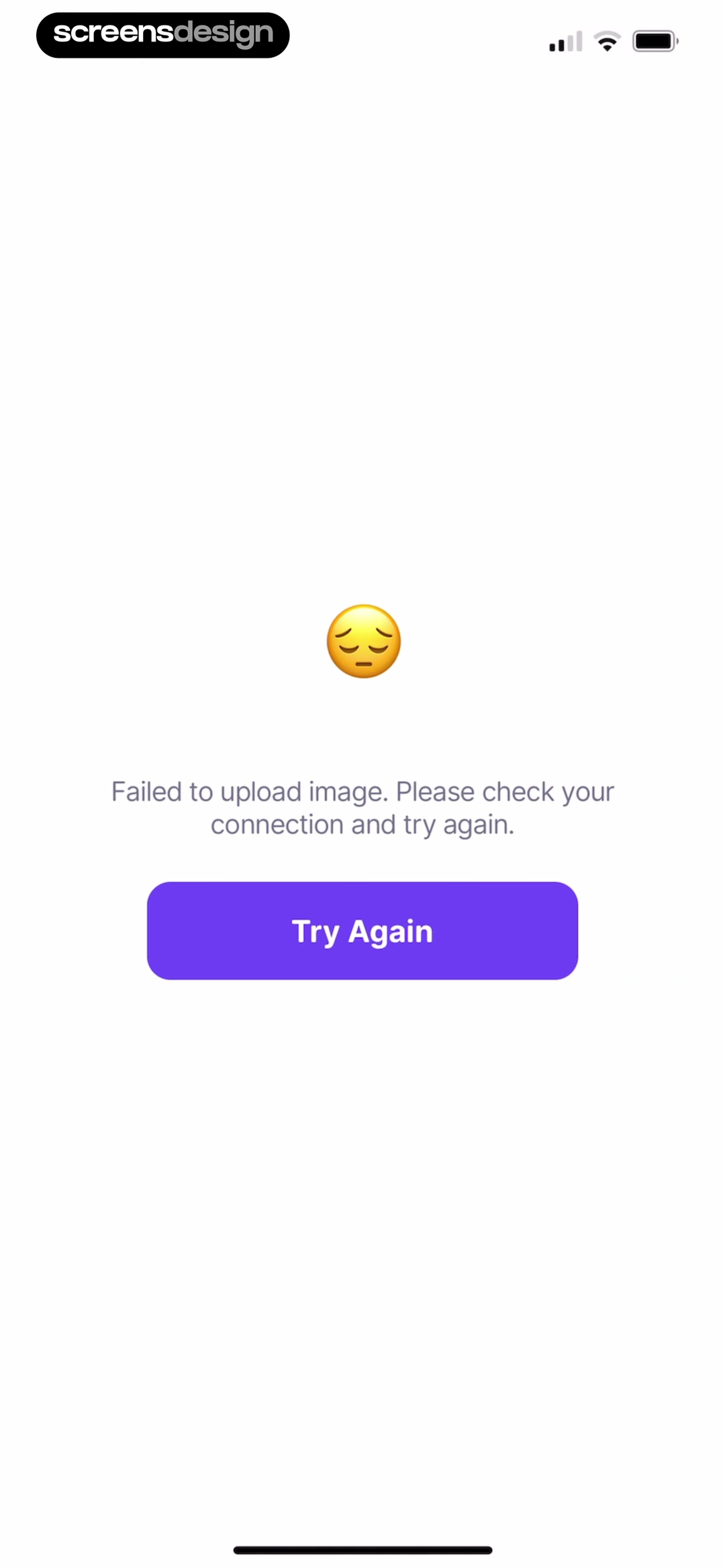
Opal reports that the Other category screen crashed, offers Reload and Dismiss, and suggests the Search tab as an alternate way to find the app or website. Depuff keeps its message tied to the specific failed event: image upload. Its Try Again button repeats that action instead of vaguely refreshing the whole product.
Design recovery around the unit of failure. A failed image upload should keep the selected image and edits. A failed search should keep the query. A crashed category can offer search or dismissal. A failed payment should check the transaction status before creating another charge. Generic reload behavior can destroy useful context or repeat side effects.
Error copy should be factual without assigning blame. State the affected action, what remains intact, and what the user can do. Log technical detail for support, but do not expose codes as the only explanation. If retry fails repeatedly, surface a durable support, save, export, or alternate path instead of trapping the person in a loop.
Name the failed unit
Identify the upload, panel, search, payment, or sync operation that did not finish.
State what remains
Tell the user whether input, files, drafts, and progress are still available.
Retry safely
Repeat only the failed operation and prevent duplicate side effects.
Provide another exit
Offer back, dismiss, settings, search, save, or support when retry is not enough.
08. Product review
Test every empty state as a transition.
Review the trigger, the empty frame, the action, and the resulting state with realistic data and interruptions.
Create a state inventory from actual product conditions, not from a generic component list. Include a new account, an empty secondary collection, zero search matches, cleared work, a denied permission, offline use, server failure, expired access, and a failed destructive or paid operation where relevant.
For each state, enter from the real preceding action and follow every exit. Verify that the new item lands in the right scope, filters clear without erasing the query, retry does not duplicate work, settings returns to the blocked task, offline drafts survive, and completion copy matches the queue that was actually cleared.
Finally, test without the illustration. The title, body, control labels, focus order, and status announcement should still make the condition understandable. Empty states often appear during stress or uncertainty, so accessibility and plain language are part of recovery, not a finishing pass.
- The message distinguishes first use, zero content, zero results, completion, and failure.
- The page keeps enough title, scope, query, filter, date, or navigation context to orient the user.
- The primary control names the object or operation it will create, clear, open, or retry.
- Permission recovery names the permission, its purpose, the settings route, and any reduced alternative.
- Offline and error states say whether drafts, uploads, progress, and selections remain safe.
- Retry repeats the smallest failed operation without duplicating messages, uploads, records, or charges.
- Completion copy matches the exact queue, period, filter, or task that became empty.
- A fallback such as back, dismiss, search, save, settings, or support exists when retry may not work.
- Screen readers announce the state and reach the main action in a logical focus order.
- Long copy, larger text, localization, reduced motion, and high contrast do not hide the recovery control.
Questions and answers
Mobile app empty state questions
What should a mobile app empty state include?
Include a precise title, enough context to explain why content is absent, and an action that changes the state. Keep relevant navigation, scope, queries, or filters visible. Use an illustration only when it supports the message rather than replacing it.
How is a first-use empty state different from no results?
First use should teach the core object and help create the first one. No results should preserve the current query or filters, explain that nothing matched, and help broaden or revise the search without starting over.
Should every empty state have a button?
No. An earned completion state may only need navigation that already exists, and an informational empty view may have no immediate action. Add a button when there is a clear, available operation that meaningfully changes the condition.
How should a permission-denied state work?
Name the denied permission and the feature it blocks. Send the user to device settings when required, allow another permission attempt only when the system supports it, and offer a reduced path when the task can continue without access.
What makes an error-state retry safe?
Retry the smallest failed operation, preserve the user's input and selections, and prevent duplicate side effects such as messages, uploads, records, or payments. Keep a back or alternate route available if the failure repeats.
How should empty states be tested?
Trigger each condition from the real preceding action, inspect the visible state, use every recovery control, and verify the resulting data. Repeat with offline mode, denied permissions, repeated failures, larger text, screen readers, and localized copy.
Apps referenced in this page
Open the products behind the examples.
 BookmoryTrack & Remember Your Books
 TallyHabits, Money, Symptoms, Pills
 CraftNoteAudio Meeting, Voice Notetaker
 AnyListRecipe Keeper & Meal Planner
 CanvaCollage Maker, Resume Builder
 SuppCoSupplement tracker & companion
 ClickUp#1 AI Workspace & Agents
 TiimoSchedule Structured Daily Task
 Paperless PostInvitation Maker, Text Invites
 FITAPPTrack my Run, Miles Walked, 5k
 AdaAccess health assessment
 HEY EmailEmail at its best, by Basecamp
 OpalFocus, App Blocker & Timer
 DepuffDebloat and analyze your face
2,622 apps in the top charts.Ask them anything.
Search recorded mobile empty states, open their surrounding flows, and compare the exact first-use, no-results, completion, permission, offline, or recovery moment you are designing.