Start with the state
14 app screen examples worth studying.
A screen is not merely a rectangle in a design file. It is the visible state produced by a user’s context, data, permissions, previous actions, and the system’s response.
A home route can show a first-use prompt, a partially completed plan, a fully populated dashboard, a loading placeholder, an offline warning, or an error. These may share navigation and components, but each is a distinct screen the team needs to understand and test.
In this guide, app screens means the interfaces people use inside a product, not the promotional screenshots displayed in an app store listing.
Why the person arrived
What they need to understand
What they can do next
What the system communicates
Where the journey continues
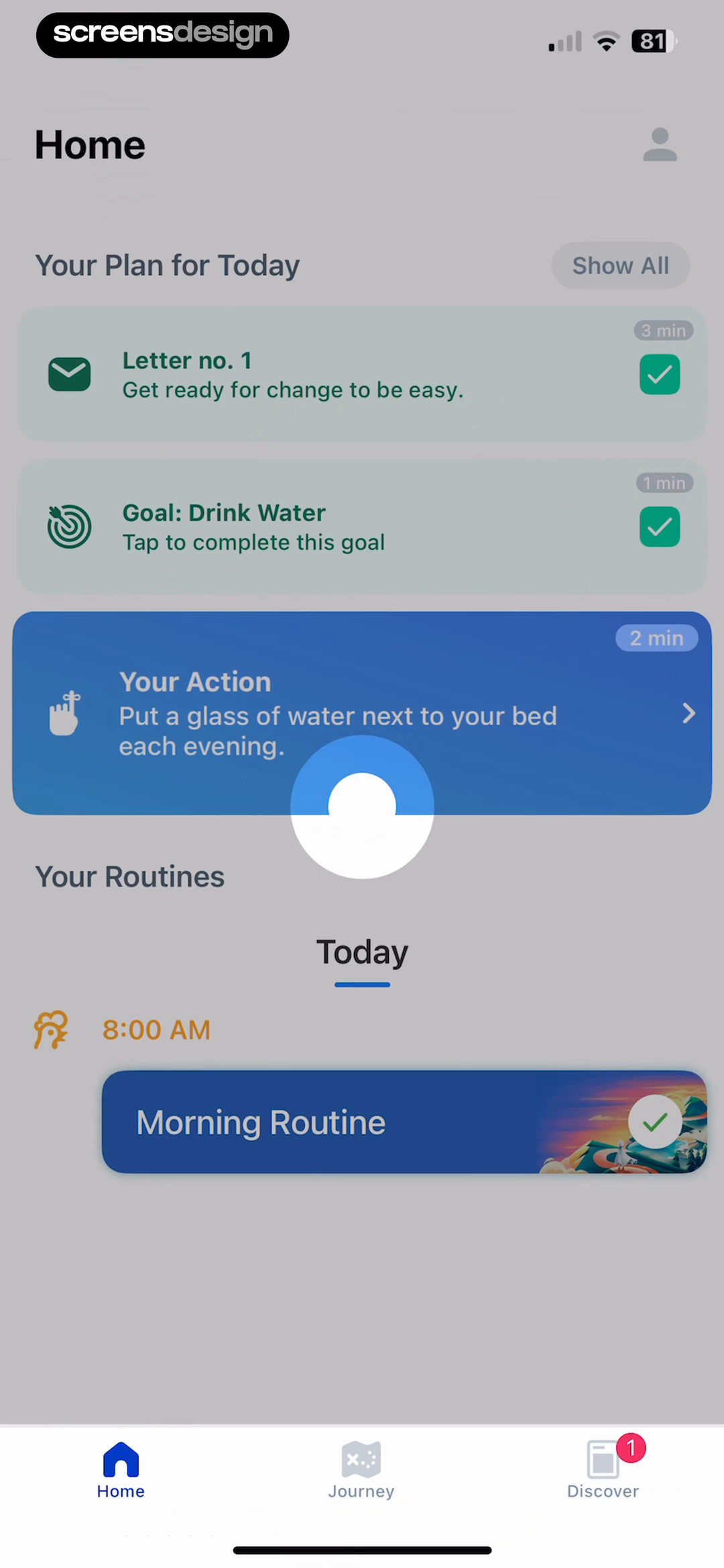
Read the hierarchy before the decoration.
- Today establishes the time context.
- Your Plan groups the work that matters now.
- Your Action translates intention into a specific behavior.
- Navigation keeps the wider product available without stealing focus.
The visual index
Seven common app screen families you will design repeatedly.
The labels below describe a screen’s job, not a rigid template. One product moment may combine several jobs, but one should remain primary enough for a user to understand.
Beyond the visual index
Other app screens every product team should consider.
The seven featured families cover frequent design work, but they are not the complete product. Add the screens and states your own journey requires before estimating scope or handing work to engineering.
Authentication, verification, password recovery, and account creation.
The complete object, story, product, lesson, task, or media experience.
Tabs, stacks, menus, sheets, deep links, and safe ways back.
Skeletons, progress, background work, cancellation, and delayed results.
Plain-language diagnosis, protected work, retry, and usable fallbacks.
Benefit-led preparation, native requests, denial, and Settings recovery.
Identity, preferences, privacy, subscription, export, and deletion.
Understandable controls, defaults, dependencies, and confirmation states.
Onboarding screens
An onboarding screen should remove a specific uncertainty. It can explain the product, ask a useful question, prepare a permission request, or help someone reach first value. It should not exist only because every other app has a carousel.
Can a new user explain the benefit after one glance?
Does the requested information change the experience?
Is the next action clear, and can optional work be skipped?
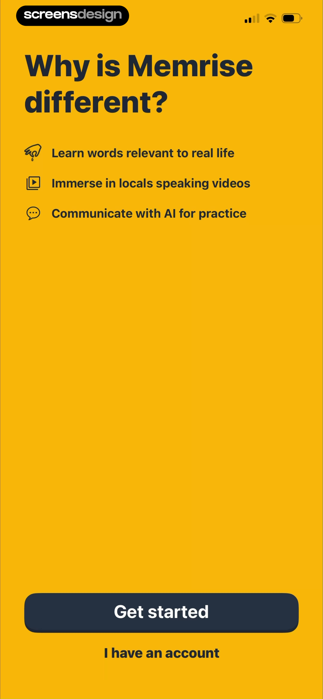
Differentiate the product before asking for setup.
Memrise answers the obvious question, “Why is this different?”, with three concrete capabilities: useful words, local-speaker videos, and AI practice. Get started is visually dominant, while returning users retain a quieter sign-in route.
Inspect the recorded screenSummarize the outcome at the end of a setup flow.
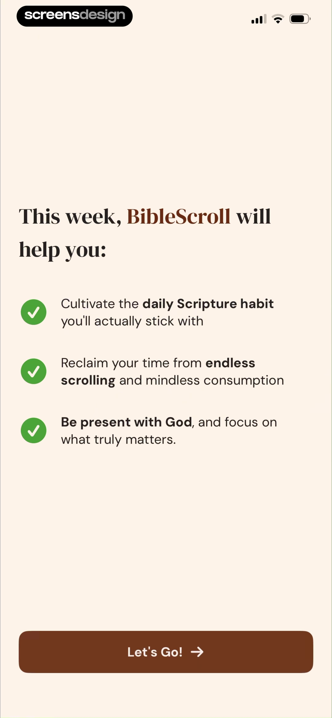
This screen turns earlier onboarding choices into a short weekly promise. Three checkmarked outcomes lead to one Let’s Go action. The screen works as a transition from questions into the product, not as another feature advertisement.
Inspect the recorded screenHome screens
A home screen is a decision surface, not a storage shelf. Its job is to recognize the user’s current state, make a useful next step obvious, and keep important routes available without giving every feature equal weight.
What should a returning user do first today?
Does the hierarchy reflect frequency and urgency?
Can the layout survive empty, partial, and dense content?
Make the next useful action specific.
The home screen is organized around Today. A plan, one goal, and a practical instruction are presented before broader discovery. The copy “Put a glass of water next to your bed” is more useful than a generic motivational card because it tells the user what to do.
Inspect the recorded screen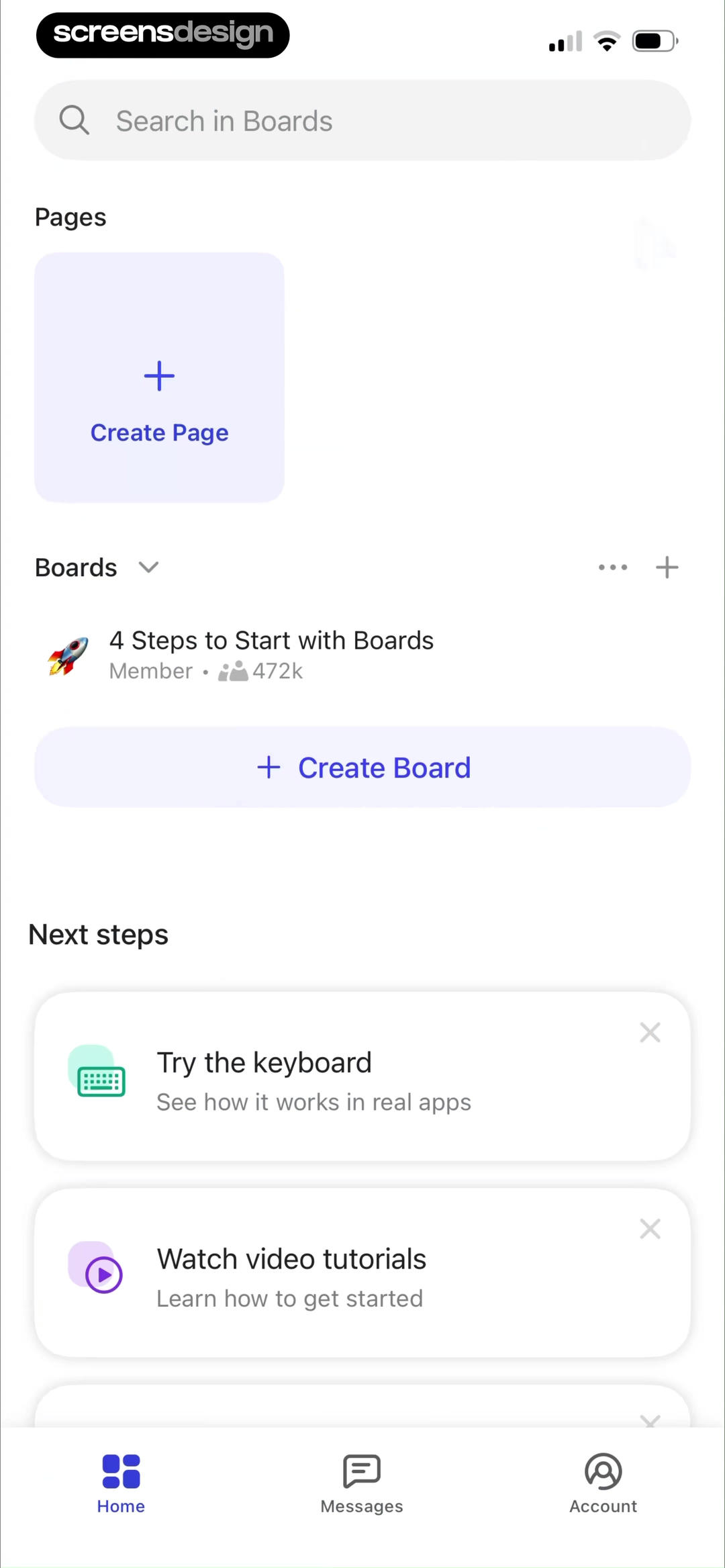
Blend product access with unfinished onboarding.
Boards keeps pages, boards, search, and creation available while a Next steps area continues setup in context. The user can work immediately, but the product still teaches important capabilities without reopening a blocking tutorial.
Inspect the recorded screenSearch and discovery screens
Search helps people retrieve something they can describe. Discovery helps them recognize something useful before they know its name. Strong products often need both, with filters that reflect real decisions rather than the shape of the database.
Are suggestions useful before the first query?
Can active filters be understood and removed quickly?
Does an empty result explain how to recover?
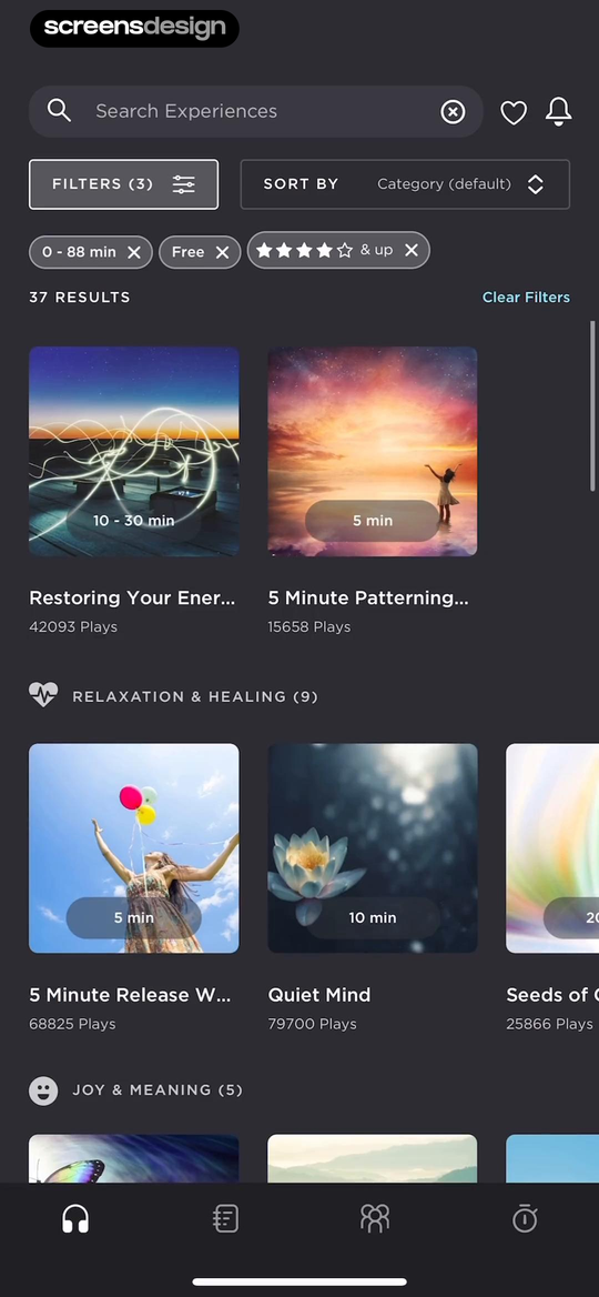
Keep filtering context visible beside the results.
Expand exposes the active duration, price, and rating filters before the content grid. The result count updates the user’s mental model, while category sections keep the screen browsable for people who arrived without an exact query.
Inspect the recorded screenLet the empty state preserve the discovery context.
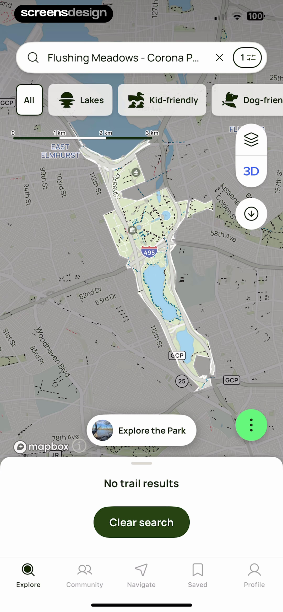
The map, location, category chips, and navigation remain visible when no trails match. A direct Clear search action gives the user a recovery path without discarding where they were looking or forcing them back to the beginning.
Inspect the recorded screenForms and quiz screens
A mobile form is a conversation with constraints. Good form screens make the current question easy to answer, preserve previous work, explain validation in context, and show progress when the commitment is longer than one step.
Is the input appropriate for the data being requested?
Can the user distinguish selection from submission?
Does feedback say what happened and how to continue?
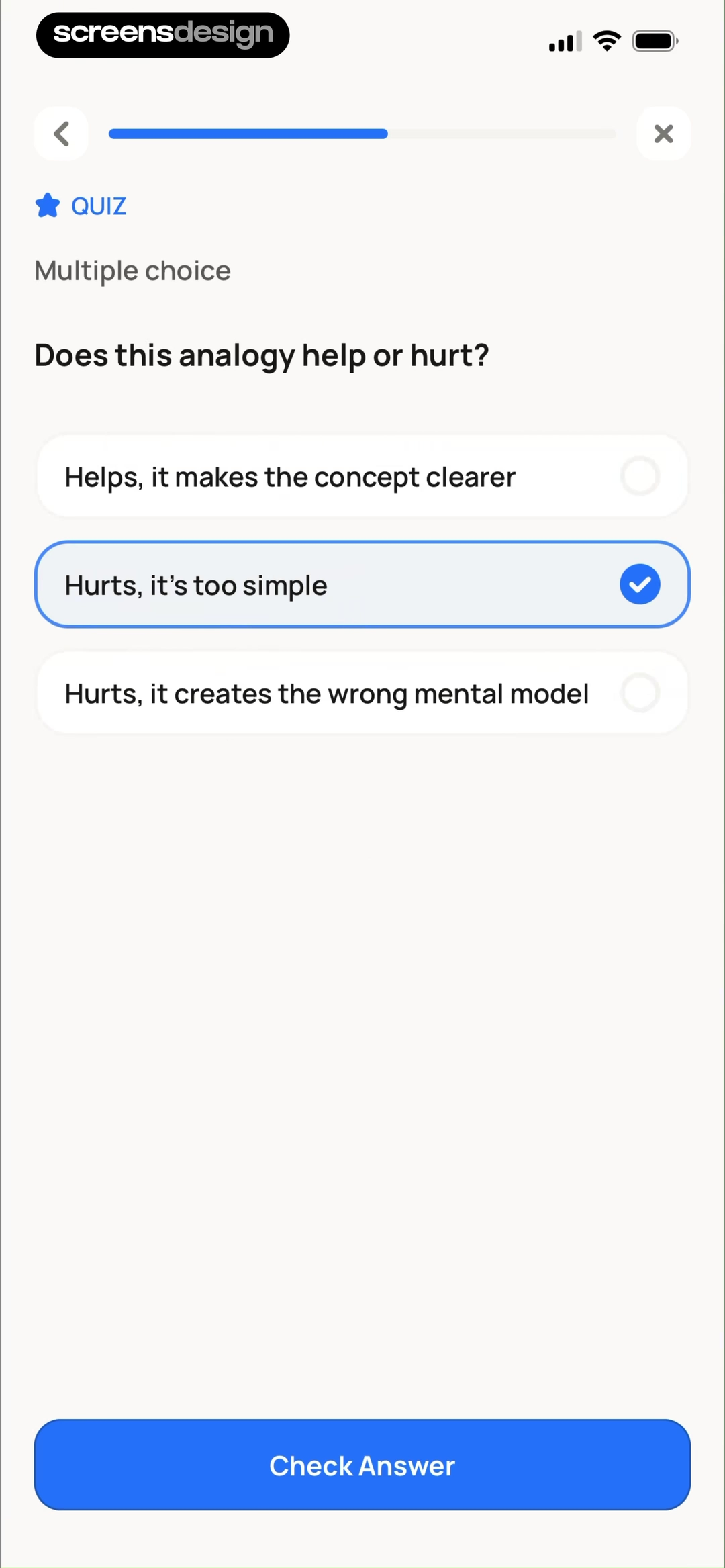
Separate choosing an answer from checking it.
One question, three full-width options, an unmistakable selected state, and one Check Answer button create a controlled rhythm. Progress and exit remain available, but neither competes with the current decision.
Inspect the recorded screen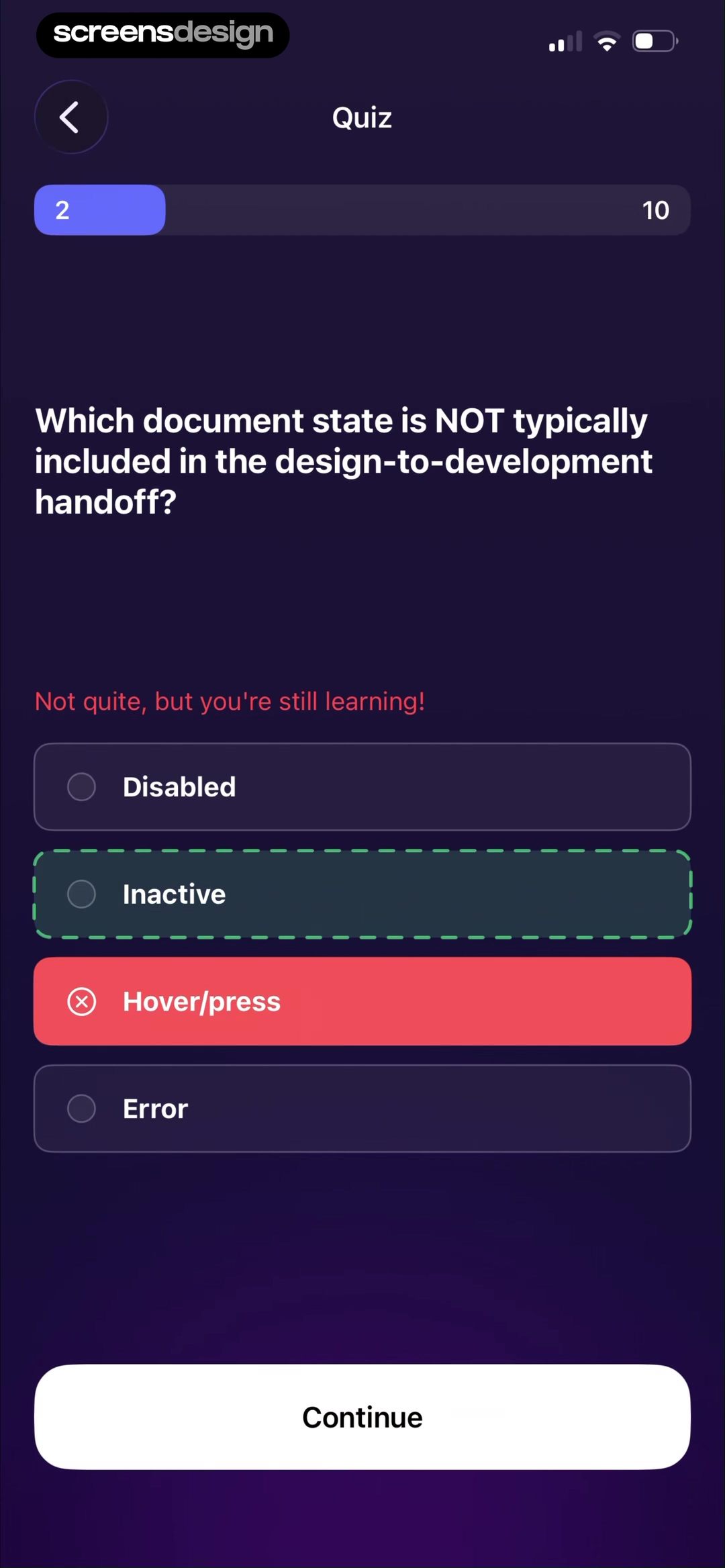
Make corrective feedback part of the interaction.
Kiwi AI shows the chosen answer, the incorrect state, the correct answer, and a supportive explanation before Continue becomes the next action. The feedback is visually attached to the decision, so users do not have to remember what they selected.
Inspect the recorded screenEmpty and recovery screens
An empty screen can mean a fresh start, missing permission, zero results, deleted content, or a failed request. Diagnose the cause before designing the message. The best empty state gets the person closer to useful content.
Does the screen explain why content is absent?
Is the recovery action possible from this context?
Can useful education or existing navigation remain available?
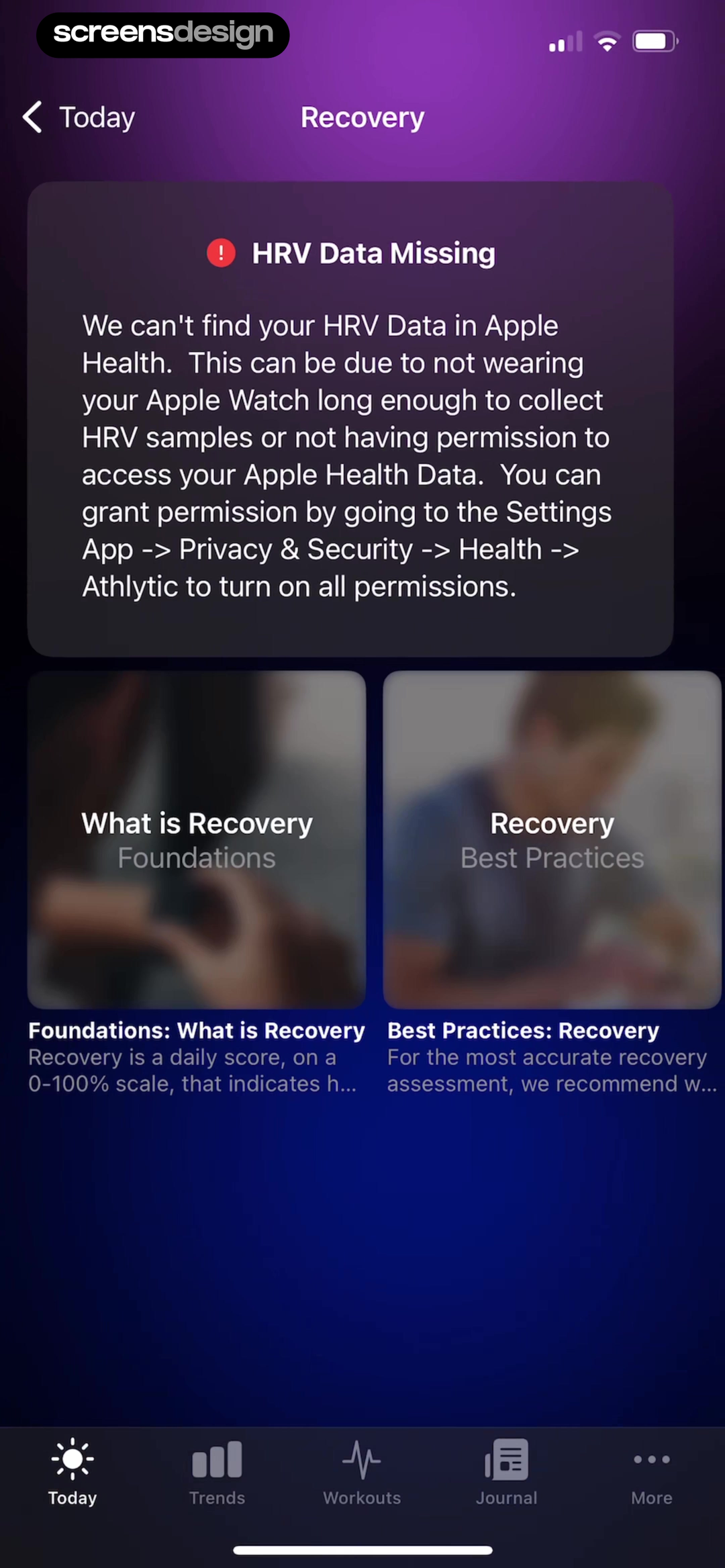
Explain missing data without hiding the product.
Athlytic names the missing HRV data, gives likely causes, and points to the exact permission route. Educational cards about recovery remain accessible below, so the screen is still useful while the data problem is unresolved.
Inspect the recorded screenTurn zero saved items into a route toward value.
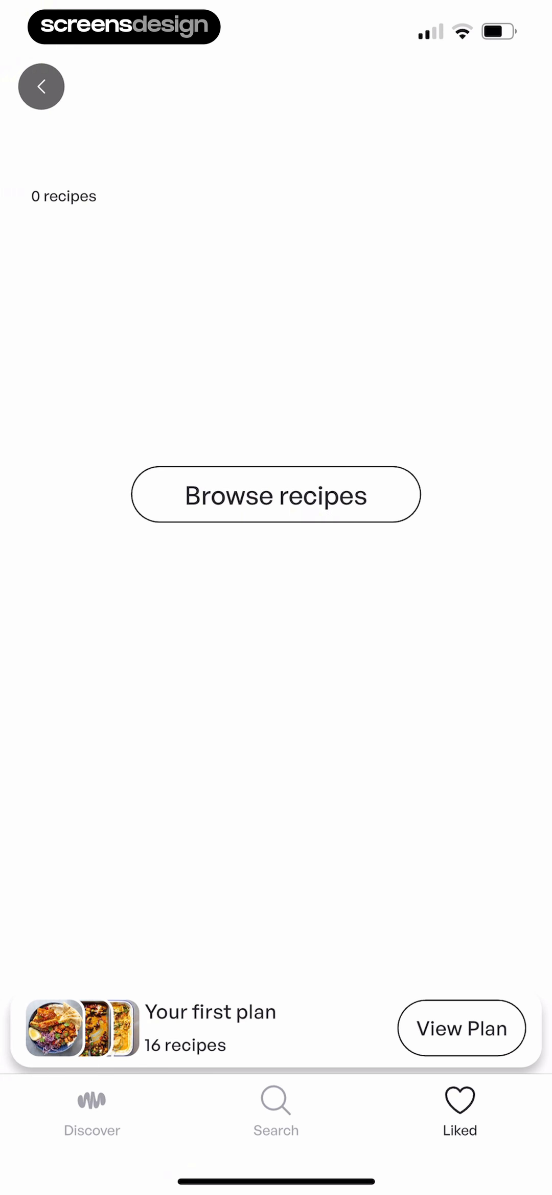
A collection with no recipes could feel like failure. Mob explains the state and provides a direct Browse recipes action while retaining navigation and access to the user’s plan. The empty state behaves like a bridge, not a dead end.
Inspect the recorded screenSuccess and completion screens
Success feedback should confirm the result, reflect the new state, and point to a sensible next step. Celebration can add personality, but it should never make the user wonder whether their work was saved or what the button will do.
Is the completed action named in plain language?
Does the interface show what changed?
Is the next step useful instead of merely dismissive?
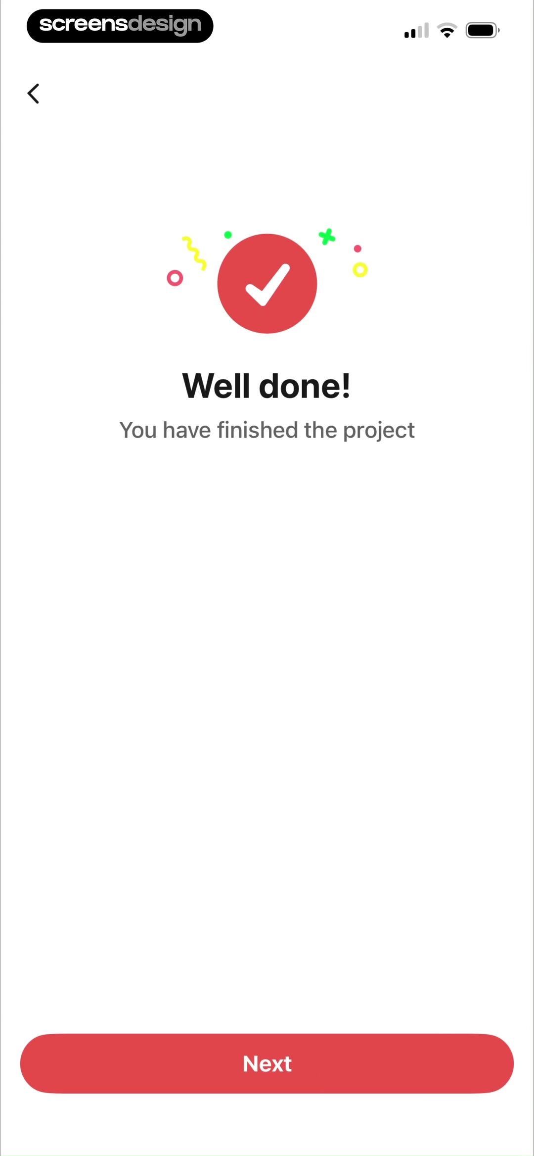
Use celebration to reinforce a concrete result.
A checkmark, “Well done!”, and “You have finished the project” make the result unambiguous. Confetti adds warmth without obscuring the message, and one Next button keeps the completion moment easy to leave.
Inspect the recorded screenGive success a meaningful continuation.
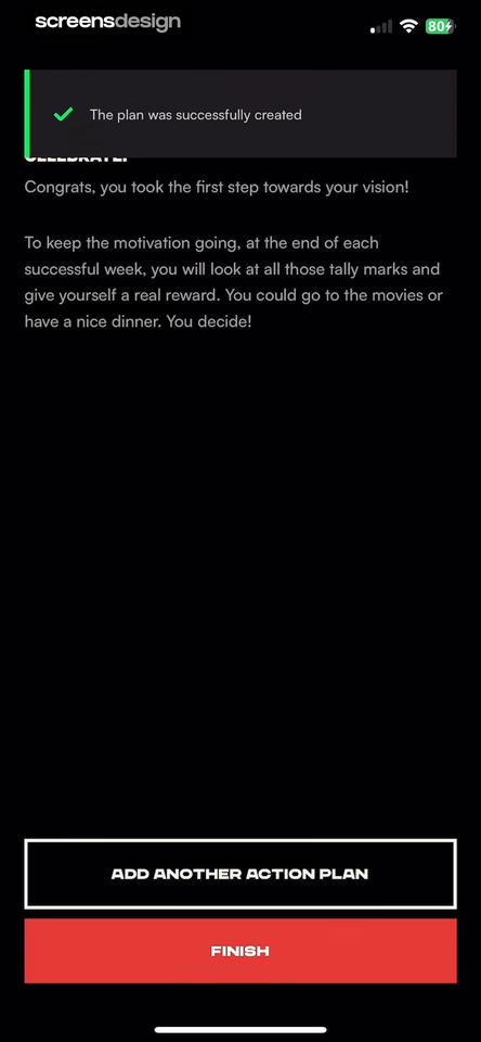
The screen confirms that the plan was created, explains how future rewards support motivation, and offers two clear routes: add another plan or finish. The product state and the possible next decisions are both visible.
Inspect the recorded screenPaywall screens
A paywall is a product decision and a trust decision. It must communicate what is included, what costs money, when billing starts, how the selected plan renews, and how users can restore a previous purchase.
Can the user state the immediate and recurring cost?
Are trial length, reminder timing, and renewal visible?
Are restore, close, legal terms, and plan selection usable?
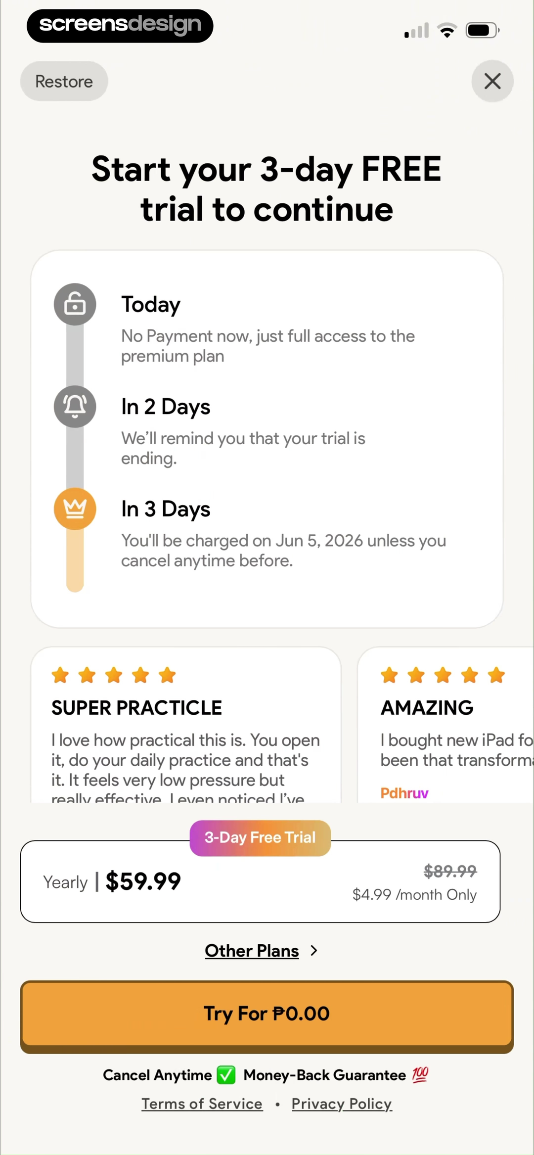
Make the trial timeline readable before commitment.
Today, reminder day, and billing day are presented as a sequence. The yearly price, monthly equivalent, selected plan, cancel message, restore route, and legal links remain visible around the primary trial action.
Inspect the recorded screen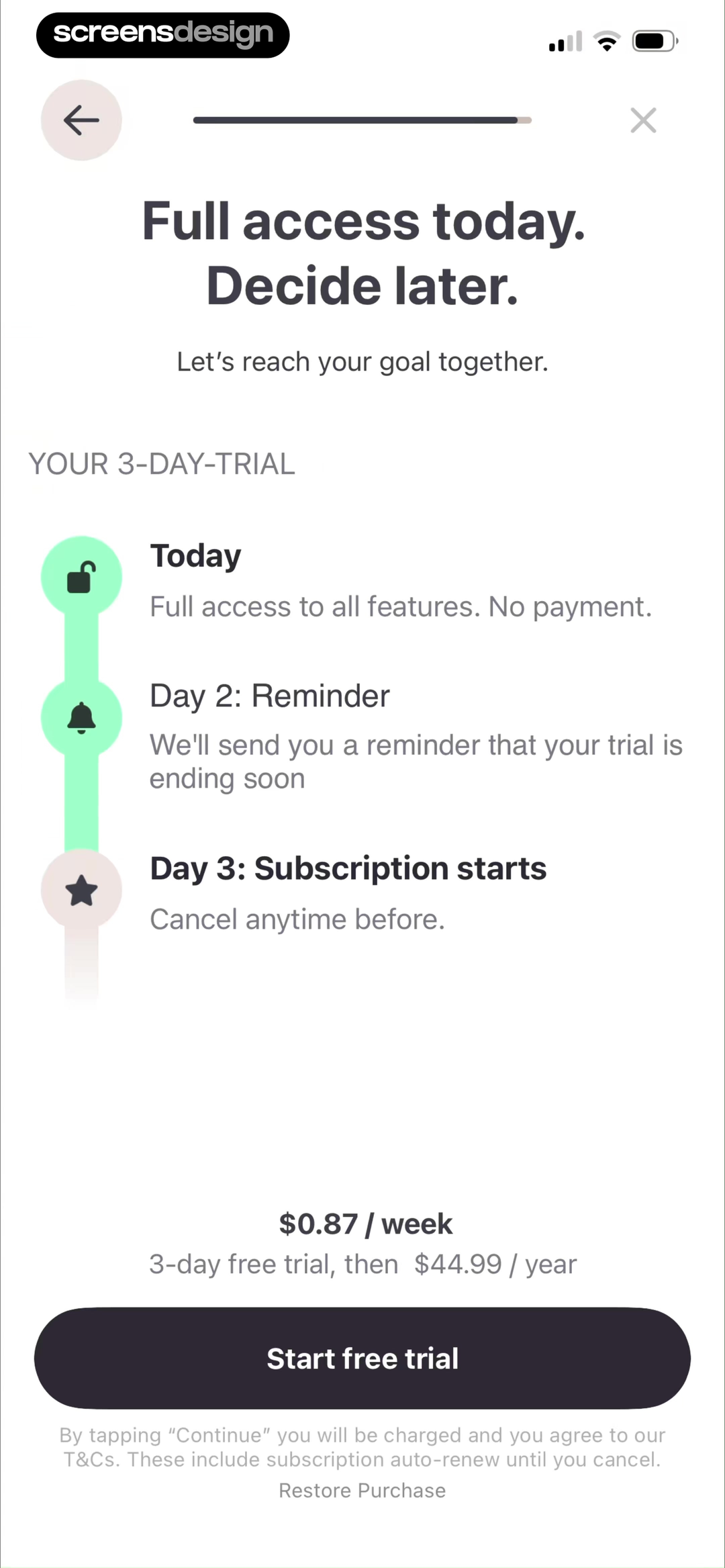
Repeat the actual terms near the action.
The screen explains the trial in three milestones, then places the weekly equivalent and full annual charge directly above the Start free trial button. Renewal language and Restore Purchase stay in the same decision area.
Inspect the recorded screenScreens in sequence
The screen before and after changes the answer.
A beautiful frame can hide a confusing journey. Study the order in which information appears, what each action promises, and whether the following state keeps that promise.
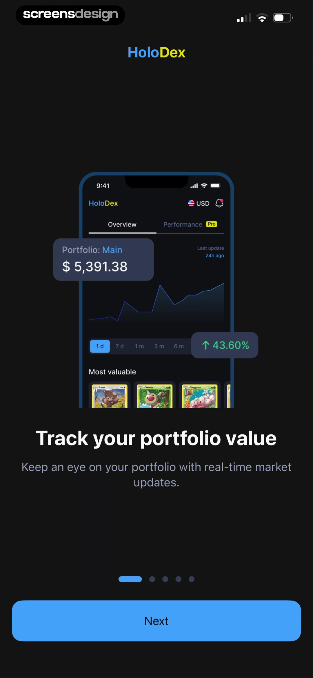
Introduce portfolio tracking as a reason to continue.
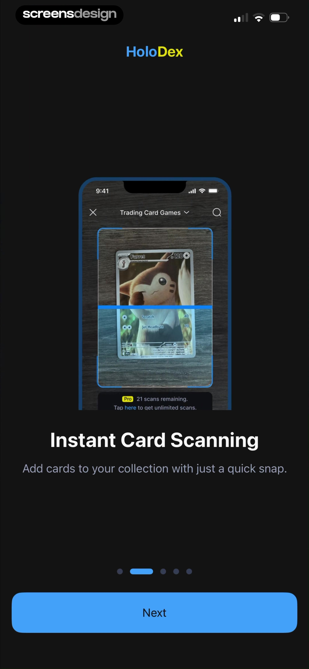
Explain that scanning turns a physical card into useful data.
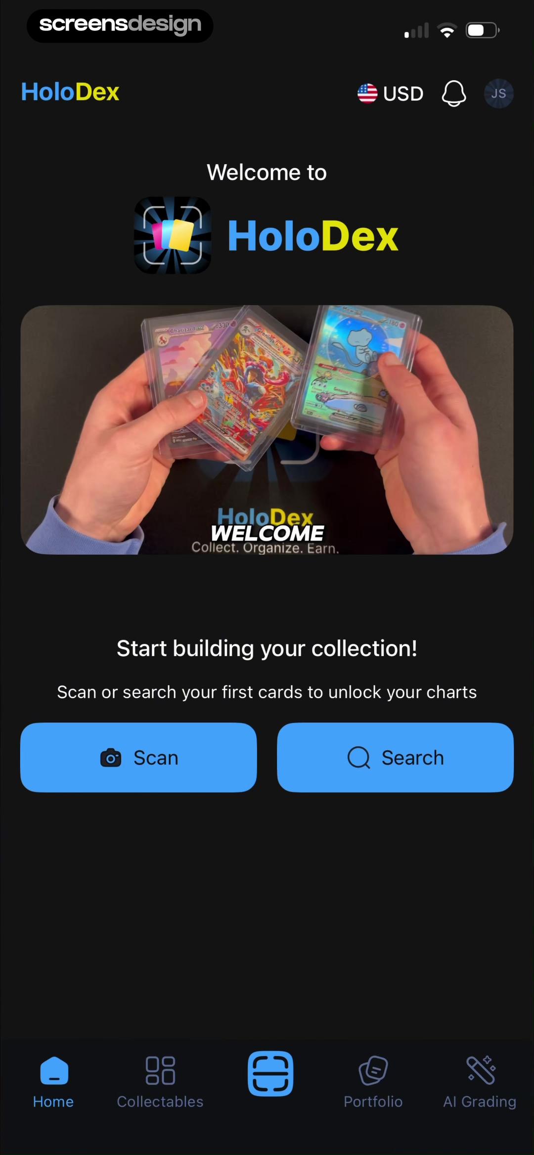
Land on a home screen where Scan and Search are ready.
HoloDex introduces outcomes first, names the scanning capability next, then lands on a home screen where Scan and Search are visible. The destination makes the earlier promise actionable.
A single image cannot show transition timing, back behavior, validation, gesture response, or whether a choice changes later content. Open the recorded flow when those details matter.
A repeatable review method
Ask five questions before saving the reference.
References become useful when the team can explain why a decision works, which conditions support it, and where it would fail in their own product.
What happened immediately before this screen?
Entry point changes interpretation. The same modal can feel helpful after an explicit action and intrusive when it appears without warning.
What receives attention first, second, and third?
Use scale, spacing, position, contrast, and grouping to trace the intended reading order before judging visual style.
What is the primary job of this screen?
Name the one outcome the screen should help the user reach. Then check whether the dominant control actually supports it.
What can change here?
Consider selected, loading, empty, error, disabled, keyboard, offline, permission, and returning-user states, not only the ideal screenshot.
What does the next screen prove?
A tap label is only a promise. The following state shows whether the action was understood, saved, rejected, or turned into progress.
A recorded screen shows a real design decision. Revenue, downloads, ranking, and rating can add commercial context, but none proves that the screen caused performance or conversion. Treat the interface as evidence to investigate, not a formula guaranteed to work.
Before design review
A practical app screen checklist.
Review these questions with realistic content on the smallest supported device and with larger text enabled. Then inspect the screen inside its complete journey.
Frequently asked questions
Questions about app screens and UI examples.
What is an app screen?
An app screen is one visible state of a mobile product at a particular moment. A screen includes its content, controls, navigation, data, feedback, and current state. The same route can produce several screens when data, permissions, selection, loading, or errors change.
Which app screens should every product design?
The exact set depends on the product, but most teams need to consider entry and onboarding, home or dashboard, navigation, search or discovery, detail, forms and input, loading, empty, error, success, permissions, settings, account, and monetization states.
How do I find good app screen examples?
Search by the user task and screen state, not only by visual style. Study several products, open the complete recorded flow around each example, and record what problem each interface decision solves before adapting it to your product.
Should I copy an app screen I like?
Use examples as evidence, not templates. Identify the user goal, product constraints, information structure, and sequence behind the screen. Reuse a principle only when those conditions match your own product, content, and platform.
How many screens does a mobile app need?
Count meaningful product states and journeys rather than static artboards. A small feature may need only a few routes but many loading, empty, error, permission, and success states. Scope the shortest successful journey first, then add branches and edge cases.
What makes an app screen design effective?
An effective screen makes its purpose and current state understandable, prioritizes one useful action, provides feedback, works with real content and accessibility settings, and fits coherently into the journey before and after it.
2,622 apps in the top charts.Ask them anything.
Find the exact screen you are designing, inspect its complete recorded flow, and turn real product evidence into a clearer app of your own.