Start with the decision
App screen design starts with one clear decision.
App screen design is the work of turning one user purpose into a complete interface contract. The screen must explain where the user is, what matters now, what can be done, what happens next, and how the interface behaves when content or conditions change.
A screen is not a static rectangle. It is one moment in a product journey with an entry condition, a primary job, content rules, interactive states, and an exit. Good screen design makes that moment legible before it makes it decorative.
Need a taxonomy and reference gallery? Use the app screens guide.
Need system-wide components and patterns? Use the mobile app UI design guide.
Need the whole product process? Use the mobile app design guide.
Research method: 14 recorded app screens were reviewed for purpose, hierarchy, content, controls, state transitions, validation, and accessibility. Each image links to its exact captured screen. Published August 2026. Research and review by ScreensDesign editorial.
Purpose
The user outcome this screen must support.
Hierarchy
The order in which information is noticed.
Behavior
What every control and state does.
Continuity
How context survives the next transition.
Before the first layout
Write the screen's job in one sentence.
The brief should describe a user decision or outcome, not a list of components. If the sentence needs several uses of “and,” the screen may contain multiple competing jobs.
When [entry condition], help [user] understand or do [primary job], so they can reach [successful exit] without losing [important context].
- What just happened before this screen appeared?
- What is the one decision the screen owns?
- What information is required to make it safely?
- What proves that the screen has succeeded?
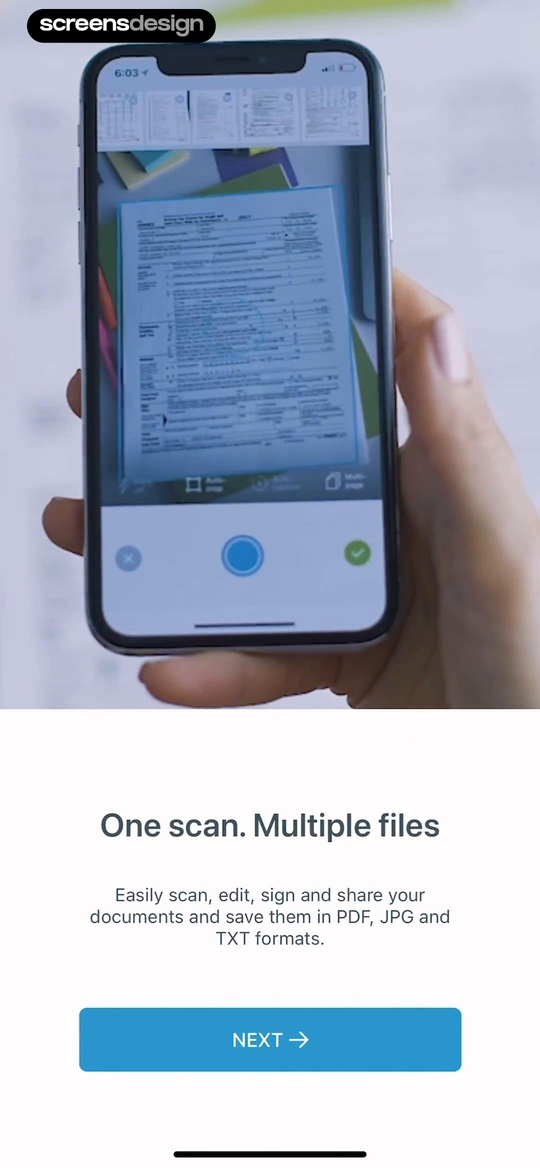
Scanner App gives the screen one communication job.
The recorded screen explains one feature promise, names the supported file formats, and provides one clear progression action. The image supports the promise rather than creating a second task.
This pattern works because the screen can be reviewed against a precise question: does the user understand this capability well enough to continue?
Scanner AppInspect the recorded flowDuomo separates completing an activity from moving on.
A long instruction occupies the central activity card. “Tap to complete” records the task itself, while Back and Next move within the five-activity sequence. The screen supports several controls, but they do not have equal meaning.
When a screen needs both an in-place action and journey navigation, label the difference in words, placement, and visual weight.
DuomoInspect the recorded flow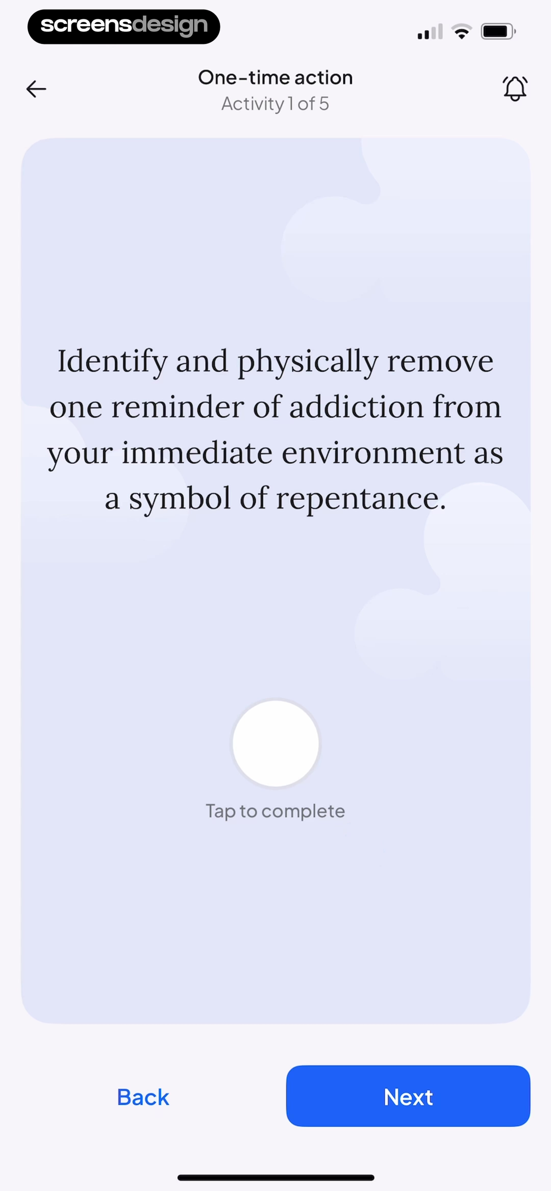
Reading order
Make importance visible before the user reads closely.
Hierarchy is a sequence of attention. A useful app screen makes the current context, primary content, supporting choices, and next action discoverable in that order.
Use position, grouping, type size, contrast, spacing, and persistence to express priority. Do not ask color alone to carry the entire hierarchy. Then blur the screen, read only the headings, and scan it one-handed. The primary structure should survive all three tests.
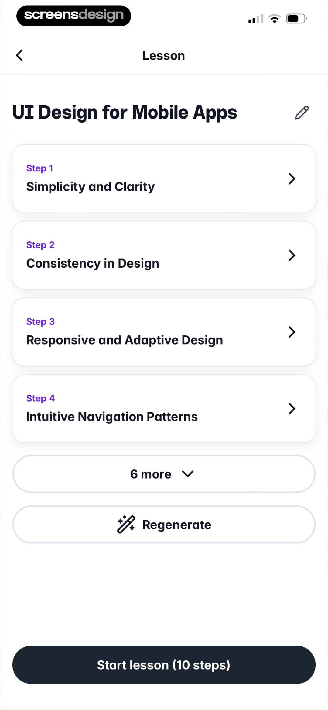
Gizmo keeps the lesson outline scannable.
The lesson title establishes context, numbered cards show sequence, “6 more” compresses secondary content, and the fixed “Start lesson (10 steps)” button names the next commitment.
Gizmo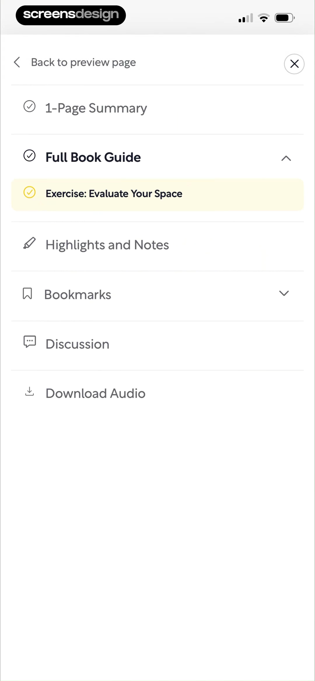
Shortform makes unlike destinations distinguishable.
Section names, icons, expansion chevrons, a highlighted exercise, and a direct close path turn a long menu into a navigable information model.
ShortformContext
Where am I, and why is this here?
Primary content
What must I understand now?
Decision
What choice or action is required?
Continuation
What will happen after I act?
Content before containers
Design with the data the product will really produce.
Placeholder names and tidy numbers conceal layout failures. Build the content model before polishing the card model, then test short, long, missing, repeated, private, and localized values.
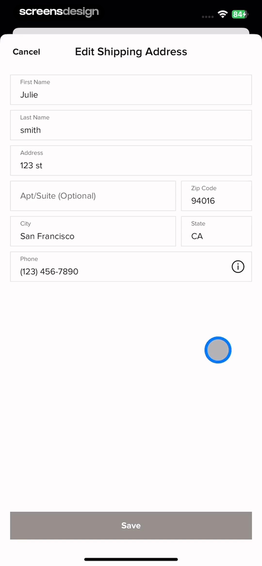
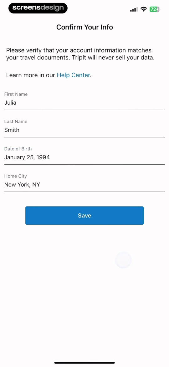
Content rules determine the form structure.
TripIt uses a short verification form with an explanation, privacy assurance, Help Center path, four values, and Save. Rent the Runway has a denser address edit with paired name fields, an explicitly optional apartment field, location inputs, phone help, Cancel, and Save.
Neither arrangement should be copied blindly. The useful evidence is how each screen reflects its information model, field dependencies, and consequence of submission.
Length
Double label and value lengths. Include wrapping.
Absence
Remove optional values and define the empty display.
Format
Test dates, units, currencies, phone numbers, and names.
Sensitivity
Explain why private data is needed and protected.
Repetition
Show many similar items without losing orientation.
Localization
Allow more text without shrinking below readable sizes.
Decisions need feedback
Choose controls by behavior, not visual novelty.
The control should reveal what can be selected, whether one or many choices are allowed, what is active, and when the decision takes effect.
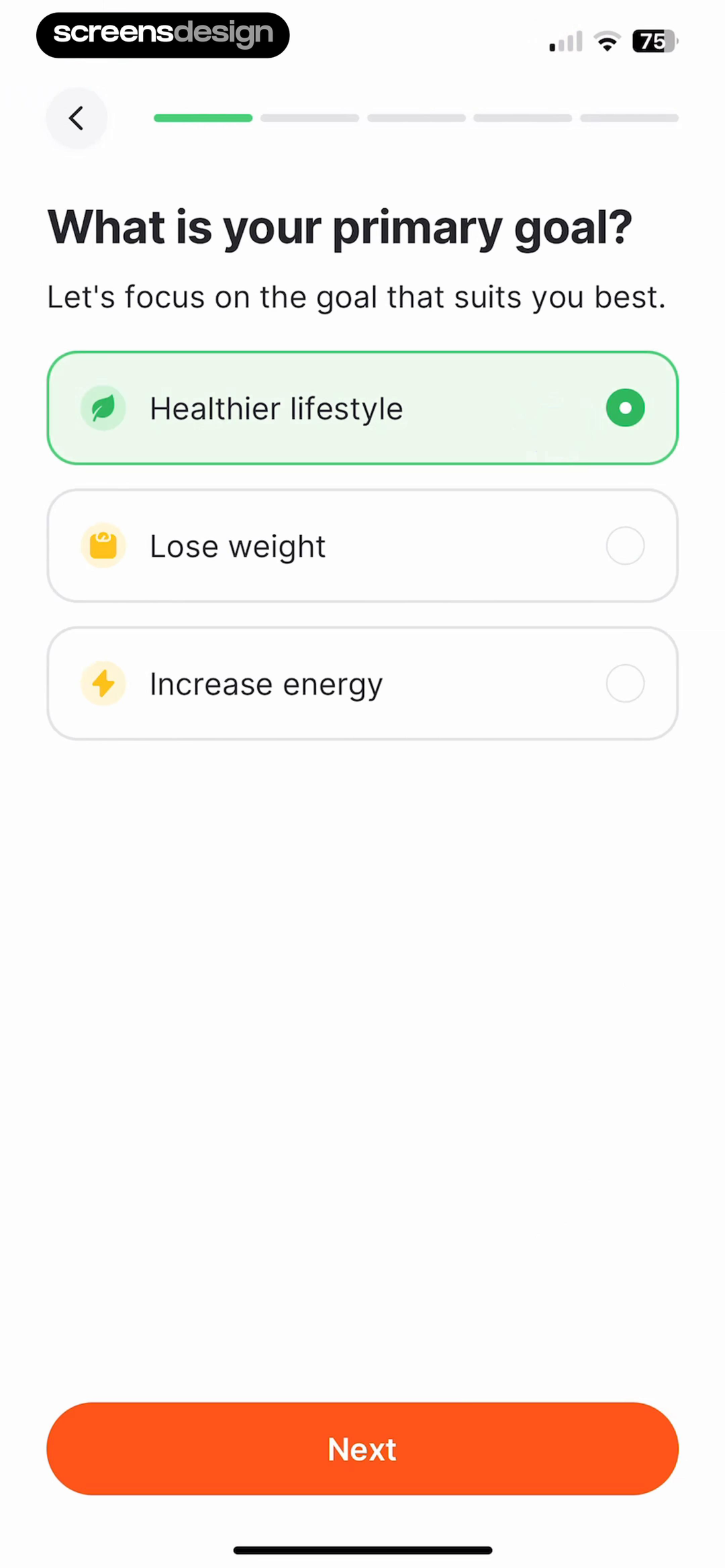
Fitself shows the option, selection, and continuation.
Three goal cards describe mutually exclusive choices. The selected card has both a green outline and filled radio indicator, so state does not depend on color alone. Next is visually separate and anchored to the bottom.
- Use radio behavior when exactly one choice is allowed.
- Make the entire labeled row the interaction target.
- Preserve the selection when the user returns.
- Define whether choosing submits immediately or enables Next.
The screen changes
Map every state that changes meaning or available action.
A screen is complete only when design covers the conditions the product can reach. Start with the default, then map interaction, loading, empty, success, error, permission, offline, and stale data states that affect the user's decision.
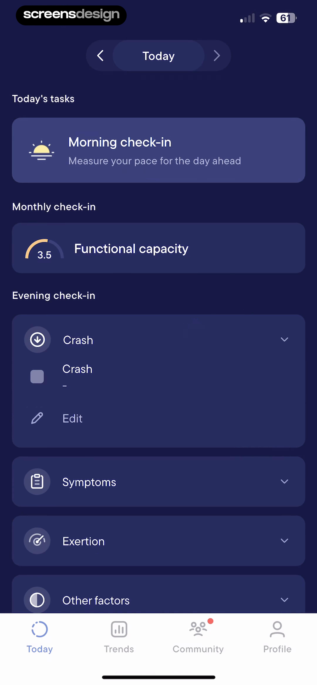
Visible expands detail without discarding context.
In the first captured screen, Crash, Symptoms, Exertion, Other factors, and Note remain compact. In the immediately following capture, Crash expands to show a recorded value and Edit. The dashboard date, check-ins, other categories, and bottom navigation stay in place.
This is a useful before-and-after test: the state change adds the needed action while preserving the user's place.
Visible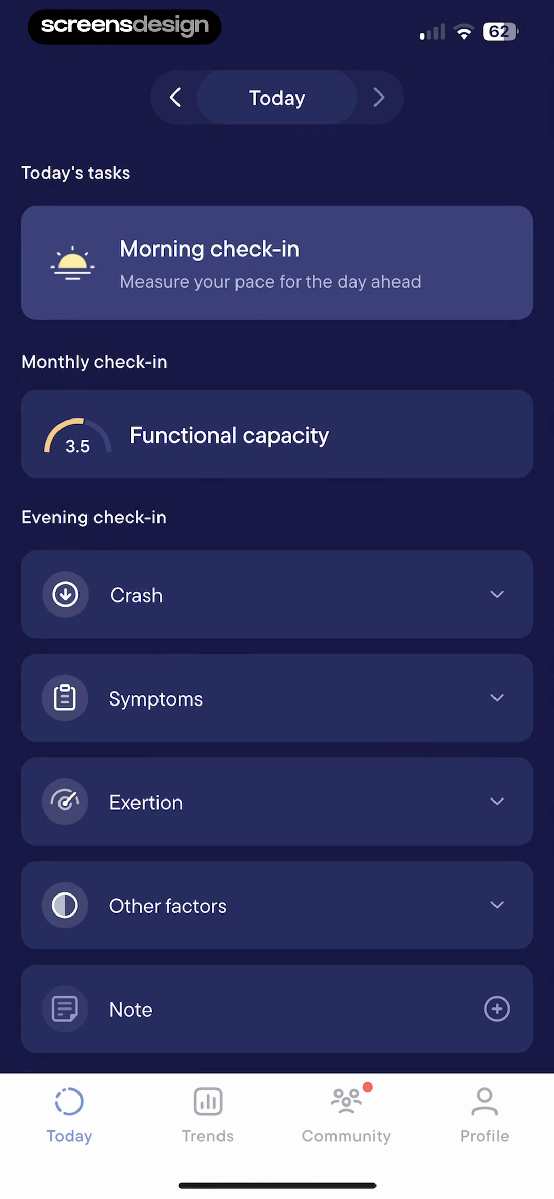
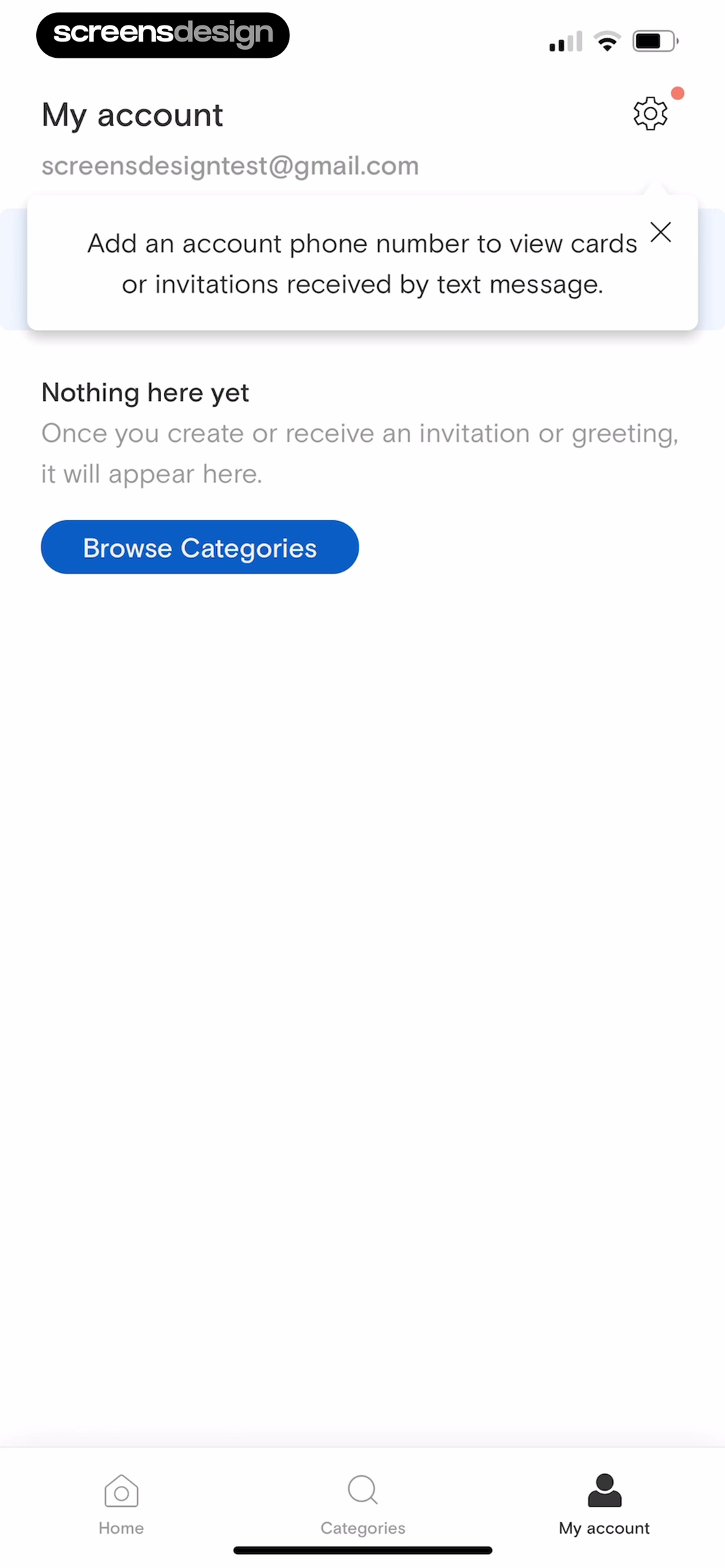
Explain what belongs here and offer a useful next step.
Paperless Post says when invitations will appear and offers Browse Categories instead of leaving an unexplained blank region.
Paperless Post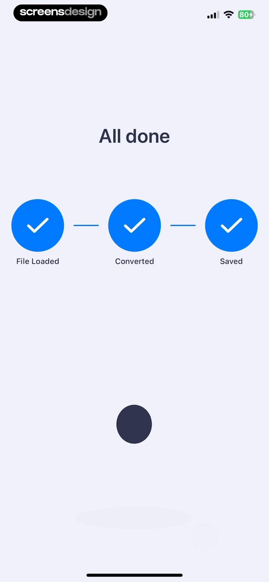
Confirm the result at the level the task needs.
PDF Scanner AI names each completed step: File Loaded, Converted, and Saved. The result is more informative than a detached checkmark.
PDF Scanner AIInspect the state before and after the polished screen.
Complete recordings reveal progress, validation, expanded controls, empty content, recovery, and success in the context where users actually encounter them.
Help the user recover
Validation should identify the problem and preserve progress.
An error message is part of the task, not a decorative warning. It should say what failed, connect to the affected input, explain how to fix it, retain valid work, and leave a credible next move.
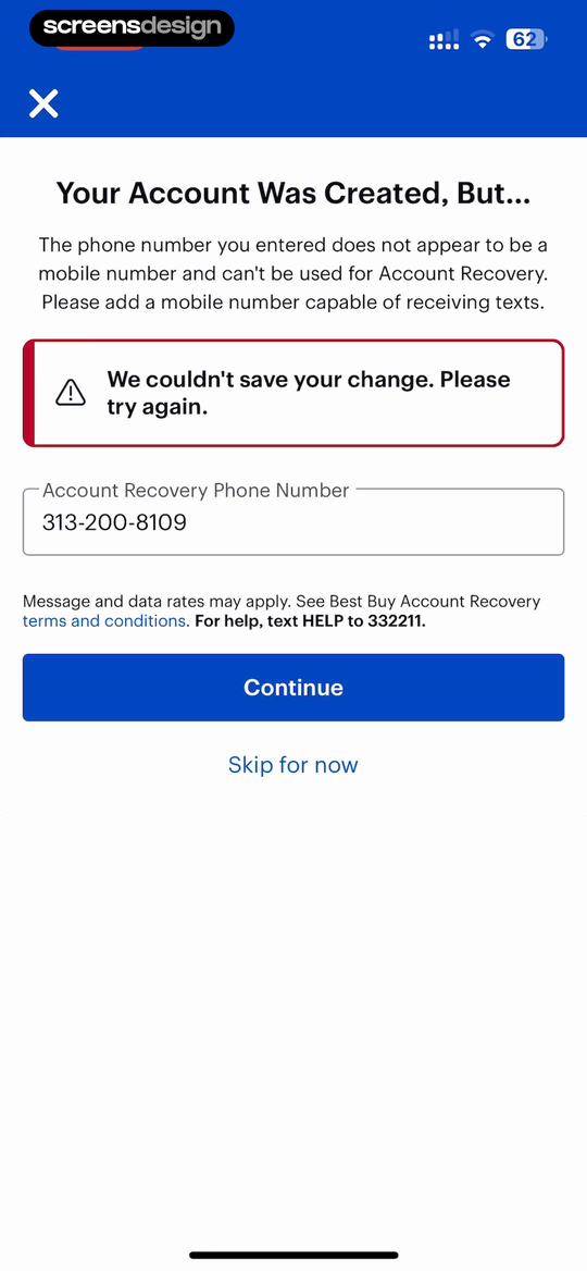
Best Buy explains both the condition and the consequence.
The heading acknowledges that the account was created. The body explains that the entered number is not a mobile number and therefore cannot receive account-recovery texts. A red status box reports the failed save, the field retains the value, and Continue and Skip for now remain available.
The screen is not perfect merely because it is detailed, but it demonstrates the information a recovery state needs: current outcome, cause, affected value, remedy, and exit.
Best BuyInspect the recorded flowOutcome
State what did and did not complete.
Cause
Use specific language when the cause is known.
Location
Place field errors beside the affected control.
Remedy
Tell the user what valid recovery looks like.
Preservation
Keep valid entries and completed work.
Escape
Offer support, retry, skip, cancel, or another route.
Design the variation
Accessibility changes the layout, behavior, and specification.
Accessibility is not a final contrast check. Text scaling, reduced motion, assistive labels, focus order, target size, keyboard behavior, and non-color state cues affect the screen's structure from the beginning.
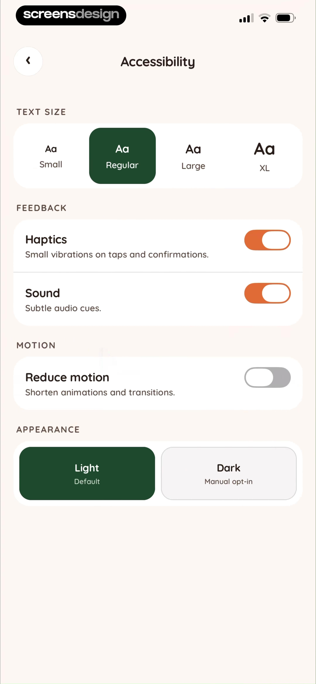
Juno makes several access choices explicit.
Text size, haptics, sound, reduced motion, and appearance are grouped as distinct preferences. Selected options and switches expose current state, while helper copy explains effects such as shortened transitions.
JunoInspect the recorded flow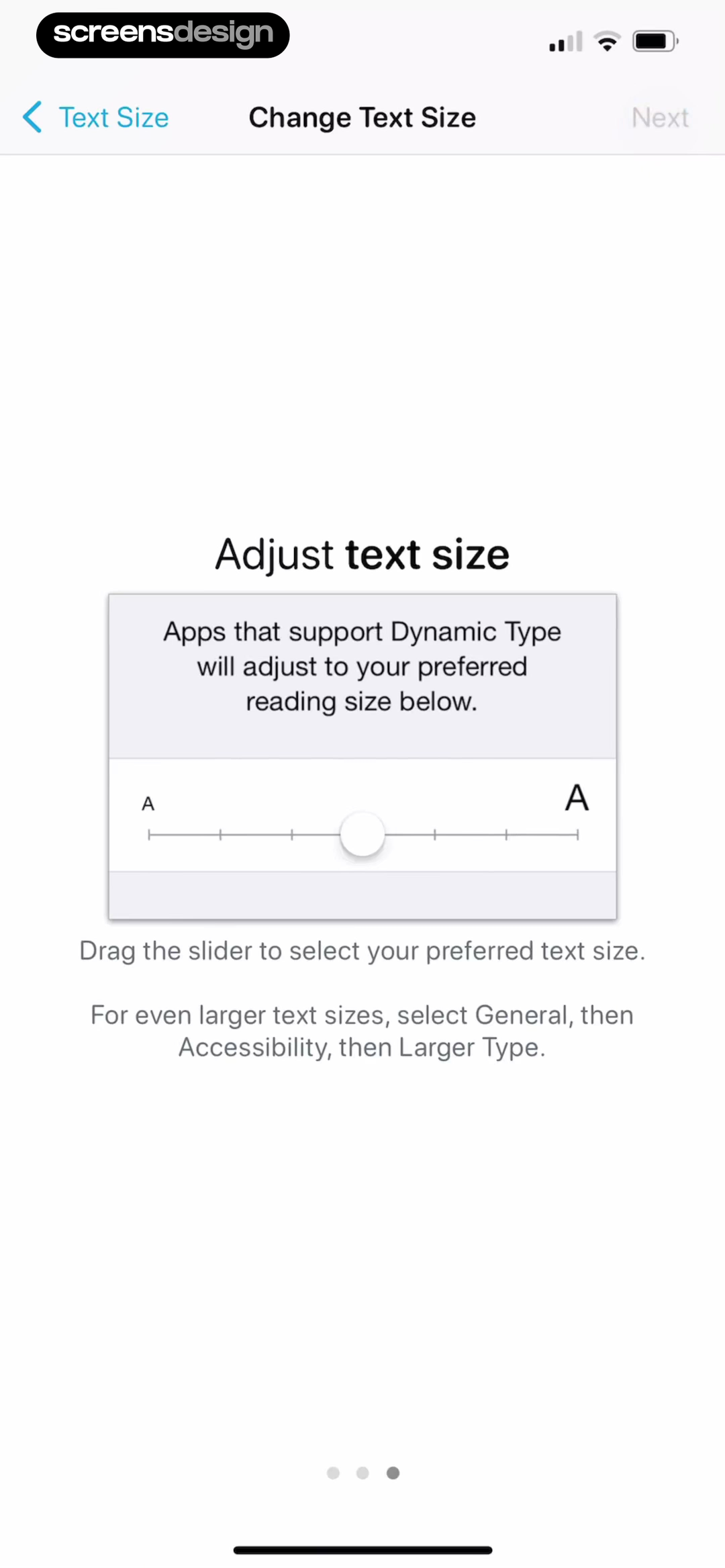
AnyList explains the platform relationship.
The screen names Dynamic Type, provides a slider, explains how supported apps respond, and points to system settings for larger sizes. This helps the user understand whether the control is local or system-wide.
AnyListInspect the recorded flowScale: Test the largest supported text size with the longest realistic content.
Order: Make visual, reading, keyboard, and focus order describe the same task.
Targets: Keep controls large enough to use without forcing labels to become the only tappable area.
State: Pair color with text, shape, icons, selection marks, or position.
Motion: Preserve meaning when motion is reduced or removed.
Semantics: Name controls by purpose and announce changes that are not otherwise perceivable.
From layout to contract
Hand off behavior, content rules, and state logic.
A developer should not have to infer when a button enables, how content wraps, which error replaces loading, or where focus moves. The screen specification should make these decisions reviewable before implementation.
- Purpose and entryTrigger, user goal, prerequisites, and source route.
- Content contractFields, formats, limits, fallback copy, and ownership.
- Component contractComponent names, variants, values, and interaction rules.
- State modelInitial, active, loading, empty, success, error, and offline.
- AccessibilityLabels, focus, reading order, text scale, motion, and targets.
- Exit and measurementNext routes, saved data, analytics events, and success signal.
A repeatable critique
Review the screen as evidence, not taste.
A useful critique connects an observation to the user's task and a testable consequence. “The CTA feels weak” becomes “the only action that completes the task has the same weight as optional controls, so first-time users may not find the exit.”
- 01
Purpose
Can everyone state the screen's primary job in the same words?
- 02
First attention
Does the first visual emphasis match the first user decision?
- 03
Content
Does hierarchy survive real, long, missing, and sensitive data?
- 04
Action
Are available, selected, disabled, and completed controls unambiguous?
- 05
State
Can the user understand progress, absence, failure, and recovery?
- 06
Continuity
Does the next state preserve context and confirm what changed?
- 07
Access
Does the task work with text scaling, reduced motion, and assistive input?
- 08
Handoff
Could implementation proceed without inventing behavior or copy?
Primary action
Search this decisionReal forms
Search this decisionScreen states
Search this decisionAccessibility
Search this decisionCompare screens that solve the same exact problem.
Search by task, component, content, and state, then inspect the complete recording to understand how the decision behaves before and after the captured moment.
Before calling it final
App screen design checklist.
Run this once on the default screen, then again on every state that changes content, action, or meaning.
The screen's primary job can be stated in one sentence.
Entry context and the successful exit are documented.
The first visual emphasis matches the first user decision.
Every visible element supports purpose, safety, or navigation.
Realistic long, missing, repeated, and localized content was tested.
Control type matches single choice, multiple choice, toggle, or action behavior.
Selected, disabled, focused, loading, and completed states are specified.
Empty and error states explain what happened and what can happen next.
Valid work survives validation, retry, back navigation, and interruption.
Text scaling, reading order, focus, target size, contrast, and reduced motion were tested.
Handoff names data, components, state transitions, events, and next routes.
The screen was reviewed inside the preceding and following flow.
Continue with the app screens reference for screen roles, the mobile app UI design guidefor component systems, or the mobile app design guidefor the wider product process. For a stronger reference-search method, use the app design inspiration guide.
Apply this review method to the focused examples in the mobile home screen article and the mobile empty state article.
Common questions
Questions about app screen design.
What is app screen design?
App screen design is the process of turning one user purpose into a usable interface. It defines the screen's hierarchy, content, controls, component states, validation, accessibility behavior, and relationship to the screens before and after it.
How do you design an app screen step by step?
Start with the screen's job, entry context, required decision, and successful exit. Rank the information, choose controls that fit the decision, write realistic content, map default and non-default states, test accessibility, document behavior, and review the screen inside its complete flow.
What should be included in an app screen specification?
Include the screen purpose, entry and exit conditions, content rules, component names, states, validation, permissions, analytics events, accessibility semantics, responsive behavior, and links to the preceding and following screens. Use real examples for long, missing, and unusual content.
How many states should one mobile app screen have?
There is no fixed number. Most screens need at least an initial or loading state, a usable default state, interaction states, a completed state, and relevant empty, error, disabled, offline, or permission states. Map only states the product can genuinely reach, but do not stop at the polished default.
What is the difference between app screen design and mobile app UI design?
App screen design focuses on one screen as a task, content, and state contract. Mobile app UI design is broader and covers the component families, navigation patterns, and visual system used across many screens. Whole-product mobile app design also includes research, product structure, flows, testing, and measurement.
How should real app screen examples be used?
Compare examples that solve the same job or state. Inspect what is visible, what the primary action is, which content is grouped, how controls change, and what happens next in the recorded flow. Reuse the reasoning that fits your constraints, not another product's surface styling.
2,622 apps in the top charts.Ask them anything.
Search the exact screen decision you are designing, inspect recorded states and complete flows, and turn real product evidence into a clearer interface.