Calorie tracker app design
16 Calorie Tracker App Design Examples: From Scan to Progress
Sixteen recorded screens show how calorie and nutrition apps collect health context, capture food, correct estimates, explain daily progress, support habits, and present paid access.
A calorie tracker has to turn an uncertain real-world event, eating a meal, into useful structured data. It also has to explain what that data means without presenting an estimate as certainty. The central design question is therefore not how many nutrients fit on a dashboard. It is what decision the person needs to make next.
The strongest recorded examples separate the job into clear moments: establish a goal, request only the health context needed for a plan, offer several logging routes, expose a correction path, update the day, and provide feedback that can be understood at a glance. Each screen below links to its exact replay moment in ScreensDesign.
ScreensDesign Editorial reviewed recorded in-app screens across calorie counters, food scanners, nutrition diaries, and fitness trackers on August 10, 2026. The method was interface observation: visible controls, copy, values, and screen order were checked against the replay evidence. No screen is treated as proof of conversion, accuracy, health outcomes, or long-term behavior.
Mobile app UI design guide: use the broader screen-system framework there for navigation, states, hierarchy, accessibility, and component decisions that sit outside nutrition tracking itself.
For the hierarchy behind dense nutrition dashboards, continue with the mobile app color and typography review.
01. First intent
Ask for the goal before building the plan.
Weight loss, maintenance, and gain can lead to different targets and different explanations.
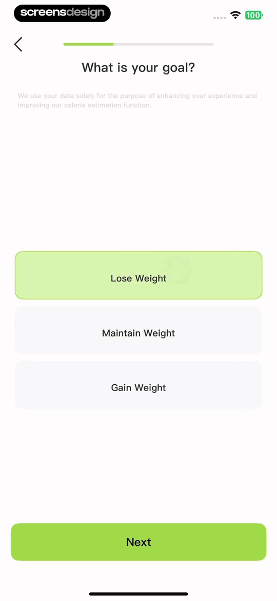
Cal Scanner begins with three explicit choices: Lose Weight, Maintain Weight, and Gain Weight. It also places a short data use statement beside the question. The screen does not yet ask the person to understand a calorie budget. It first records the direction that later calculations will serve.
A useful first question should change something visible later. If two answers produce the same plan and the same home screen, the question adds ceremony rather than context. Write down the product consequence for every onboarding answer before adding the field.
App onboarding screens guide: apply its first-value and permission principles when deciding which calorie-tracker questions belong before the first food log.
Describe what the answer will change.
Tie each answer to a target, recommendation, capture default, reminder, or explanation that the person can later recognize.
02. Goal and health data
Show why a measurement is needed and what follows from it.
Health data becomes easier to evaluate when the interface connects the input, calculation, and editable plan.
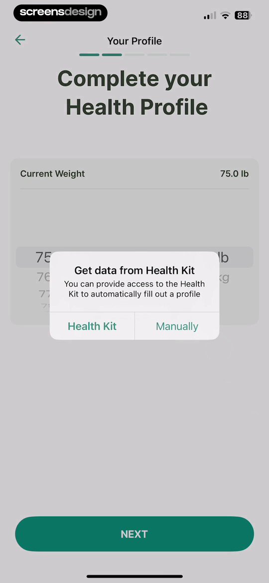
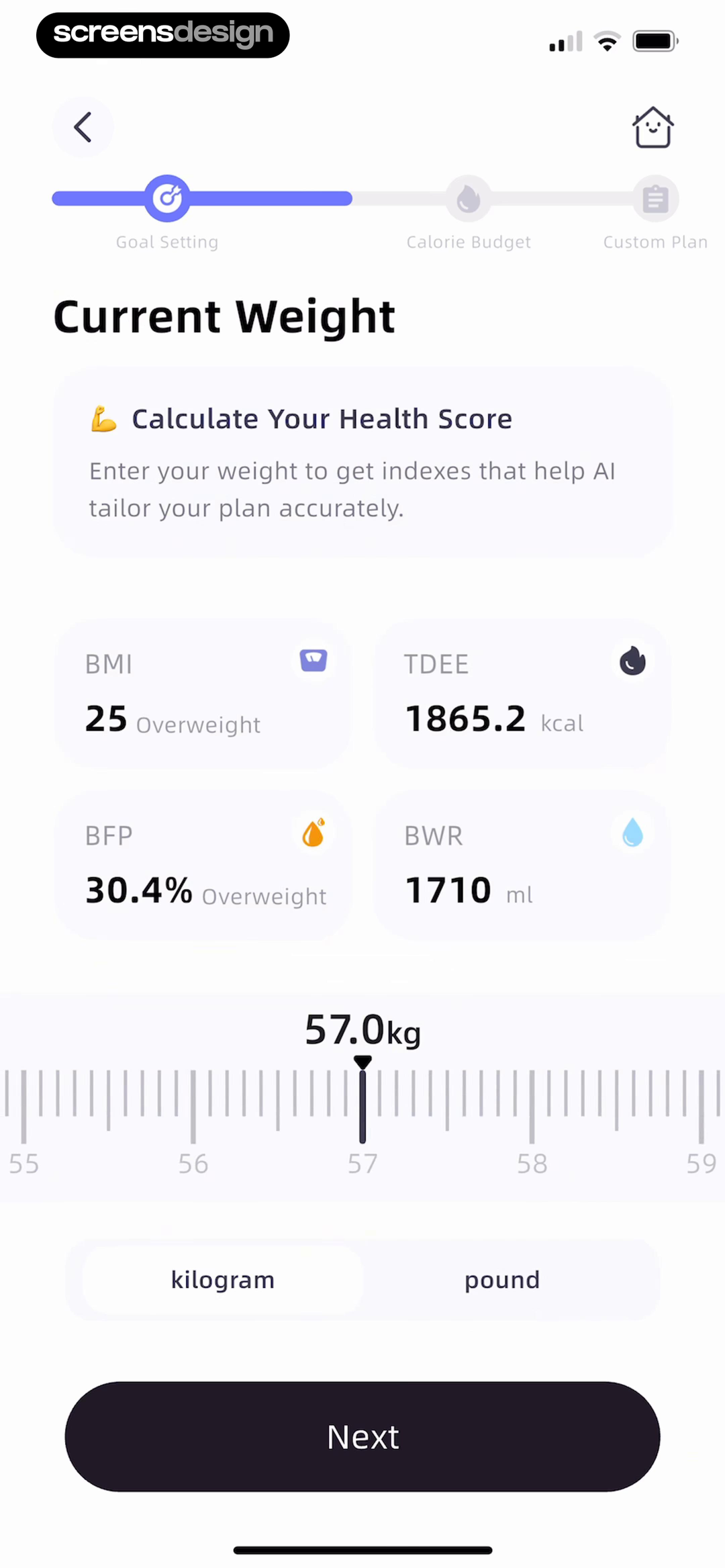
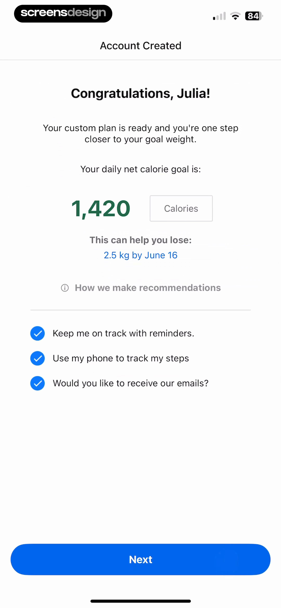
Calorie Counter offers HealthKit import and manual entry in the same prompt, so synchronization is a convenience rather than the only route forward. CalorieMate displays BMI, TDEE, body fat percentage, and a water value while current weight is being set. MyFitnessPal later presents a daily net calorie goal, a dated weight projection, and a link titled How we make recommendations.
These screens reveal three separate decisions that should not be collapsed. First, choose whether to import or enter data. Second, inspect the values derived from it. Third, accept or revise the plan. A single Continue button beneath an unexplained target leaves little room to spot an incorrect unit, an outdated weight, or an unsuitable assumption.
Use plain units and label estimates as estimates. Keep manual entry available, explain the role of activity and exercise data, and provide a route to update inputs later. Health metrics can look authoritative simply because they are numerical, so supporting copy should be specific about what the product calculated and what the person controls.
03. Food capture
Design several logging routes around the meal in front of you.
A camera is useful for one situation. Packaged foods, repeated meals, and known items need other paths.
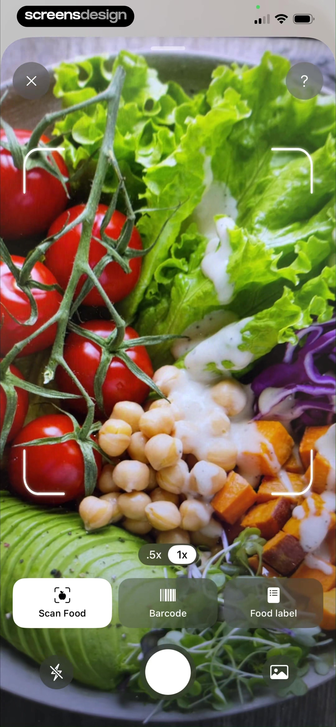
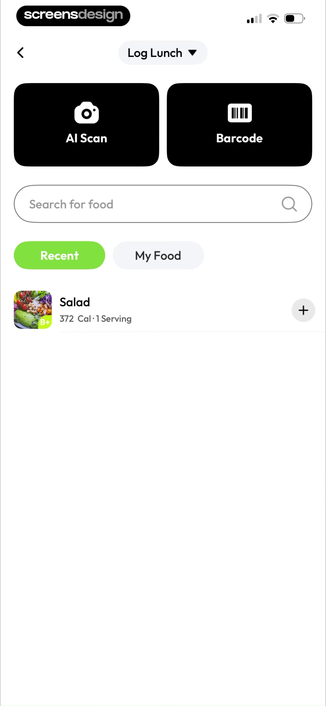
Cal AI keeps Scan Food, Barcode, and Food label together inside the camera surface. SnapCal combines AI Scan and Barcode with search, recent foods, and a personal-food tab. The screens expose different input methods before capture, instead of making a failed recognition result the point at which alternatives finally appear.
Choose the default from the current context. Opening capture from Breakfast can preserve the meal category. Repeating yesterday's lunch may be faster from recents. A package can begin with its barcode, while a restaurant plate may begin with a photo or description. Keep switching inexpensive and do not discard work when the user changes methods.
The capture view should also set expectations. Show the active mode, camera framing, flash or gallery access, and where the item will be logged. Avoid implying that the shutter completes the record. Recognition still needs review.
04. Correction
Treat correction as part of capture, not an exception.
People need to see what the scanner inferred before calories and macros are accepted into the diary.
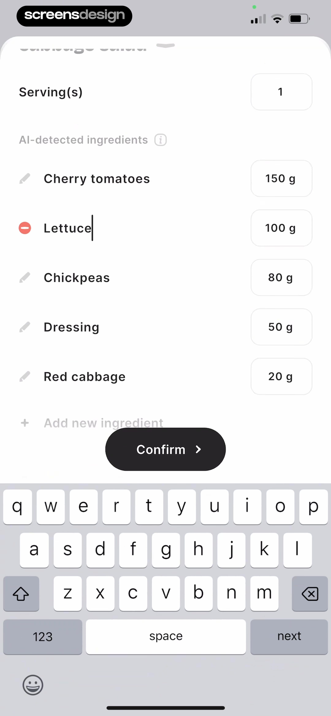
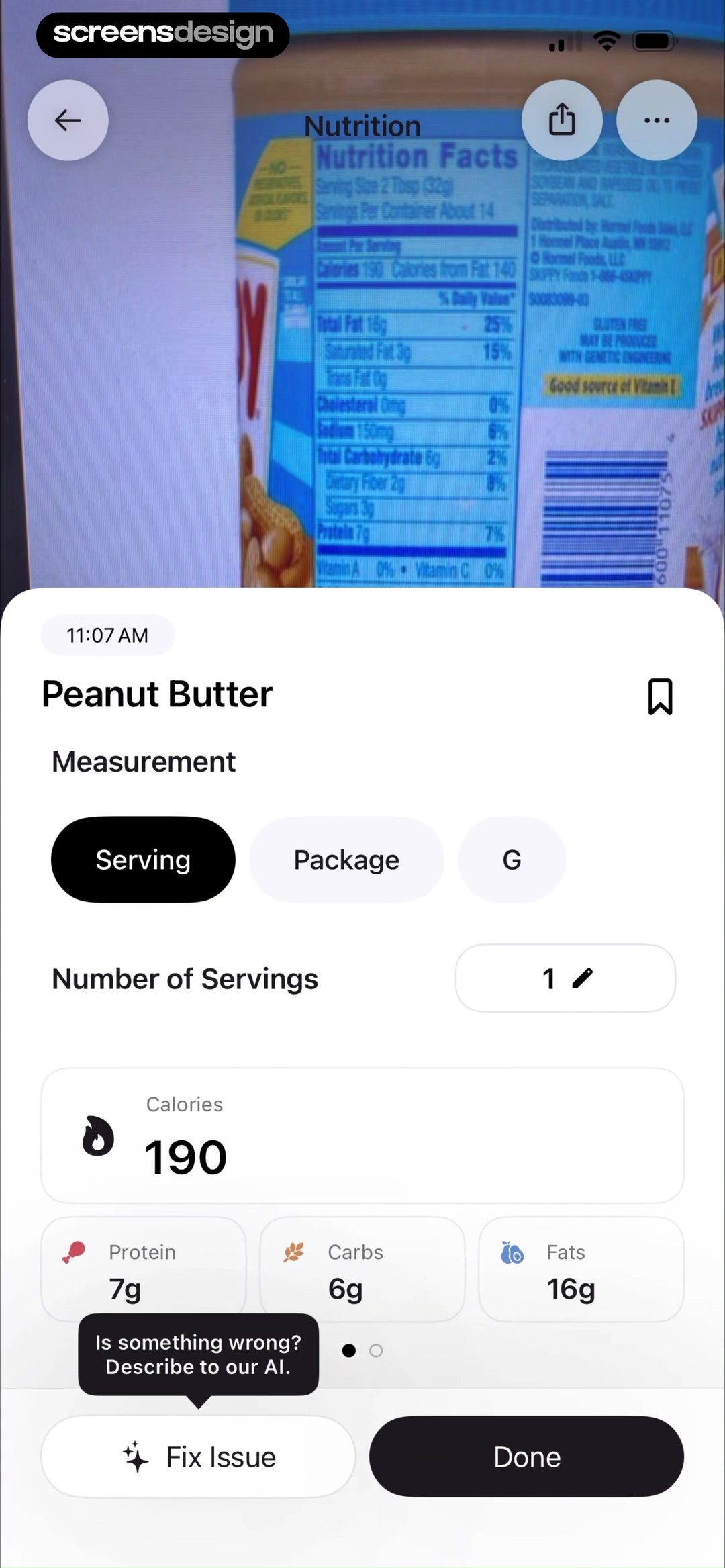
BitePal lists AI-detected ingredients with gram amounts, edit and removal controls, an Add new ingredient action, and a final Confirm button. Cal AI shows the source label image beside measurement choices, number of servings, calories, macros, Fix Issue, and Done. Both screens give the estimate a visible structure that can be challenged.
Correction should happen at the level where the mistake occurred. If the meal is right but the portion is wrong, keep the ingredients. If one ingredient is missing, do not force a complete rescan. If the barcode points to the wrong variant, let the person search or create an item without losing the meal and serving context.
Make edited values distinguishable in history and allow a safe undo. The interface can say detected, estimated, or entered rather than presenting every number with the same status. That distinction is especially important when a photo contains sauces, mixed dishes, or hidden ingredients.
- Keep the captured image or source label visible during review.
- Edit ingredients, portions, servings, and meal category separately.
- Offer manual search when recognition does not produce a useful item.
- Preserve the rest of the meal when one value changes.
05. Daily sequence
Make one food log update the same numbers everywhere.
The dashboard should explain the consequence of the last action, not make the person reconcile separate totals.
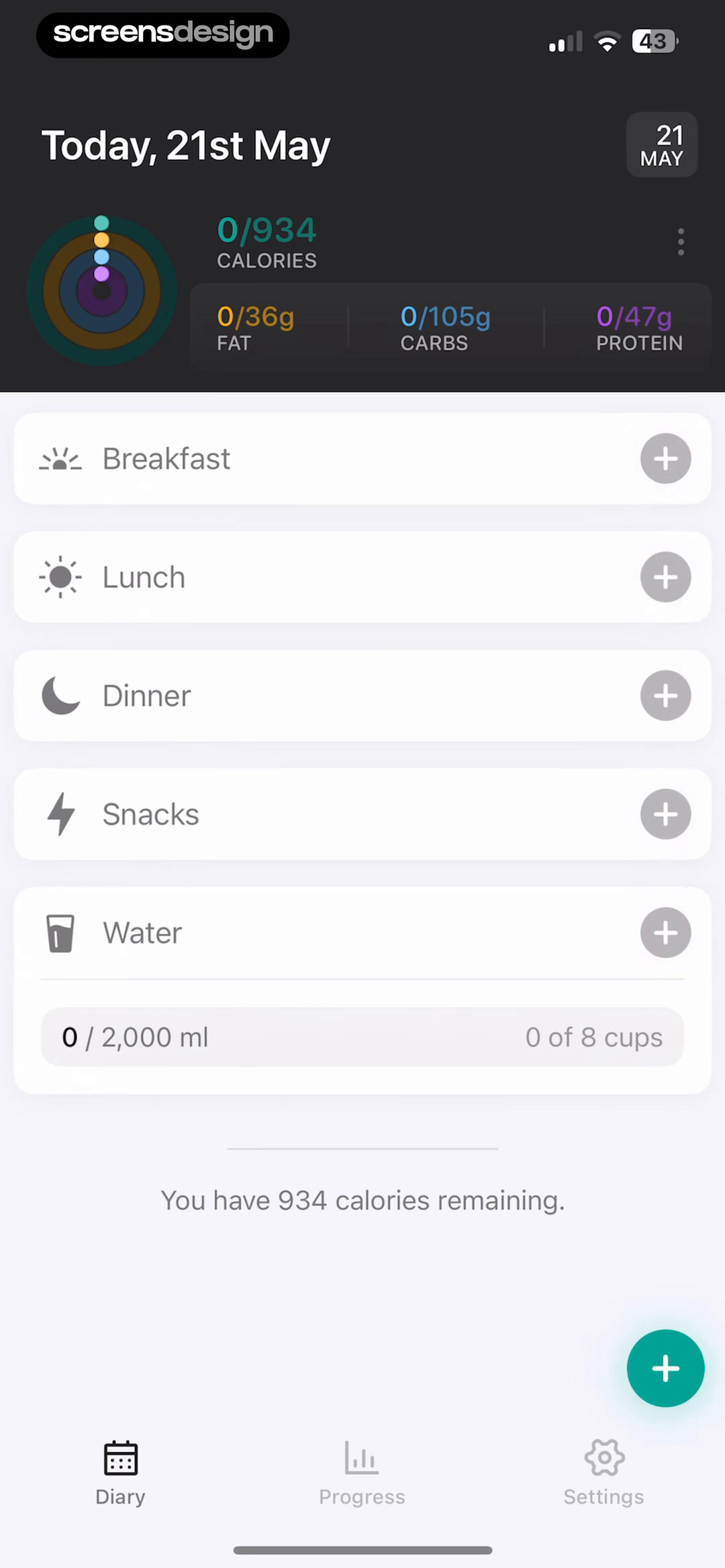
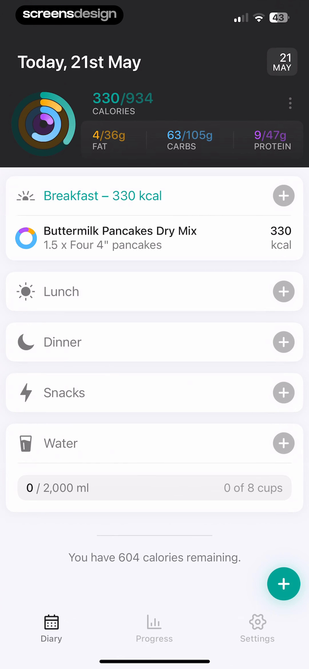
The EatWell pair is a short recorded sequence. Before logging, calories and macros are at zero, meal slots are empty, and 934 calories remain. After breakfast is added, the same view shows 330 calories, updated fat, carbohydrate, and protein totals, the serving description, and 604 calories remaining. The change is legible without opening a report.
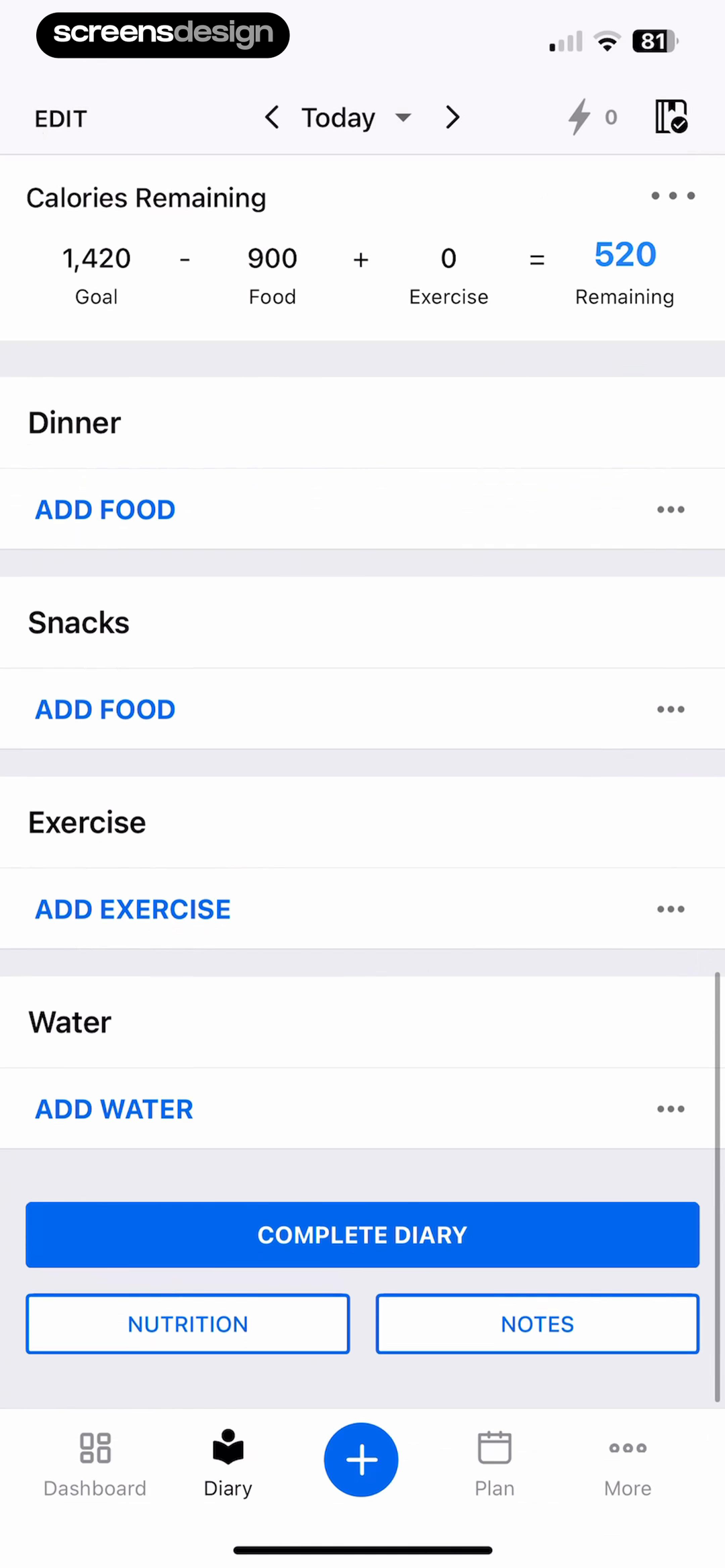
MyFitnessPal uses a visible equation: goal minus food plus exercise equals remaining. Meal, exercise, water, nutrition, notes, and Complete Diary actions sit in the same vertical record. This makes the definitions of food, exercise, and remaining inspectable on the day itself.
Define one source of truth for the day. A corrected serving should update the meal, nutrients, remaining calories, charts, and any completion summary together. If exercise changes the budget, label that rule and allow it to be reviewed. Avoid celebrating completion while required data is still processing or obviously incomplete.
06. Habit feedback
Attach progress feedback to a behavior the user can repeat.
Meal logs and weigh-ins are different behaviors, so they deserve different rhythms and recovery rules.
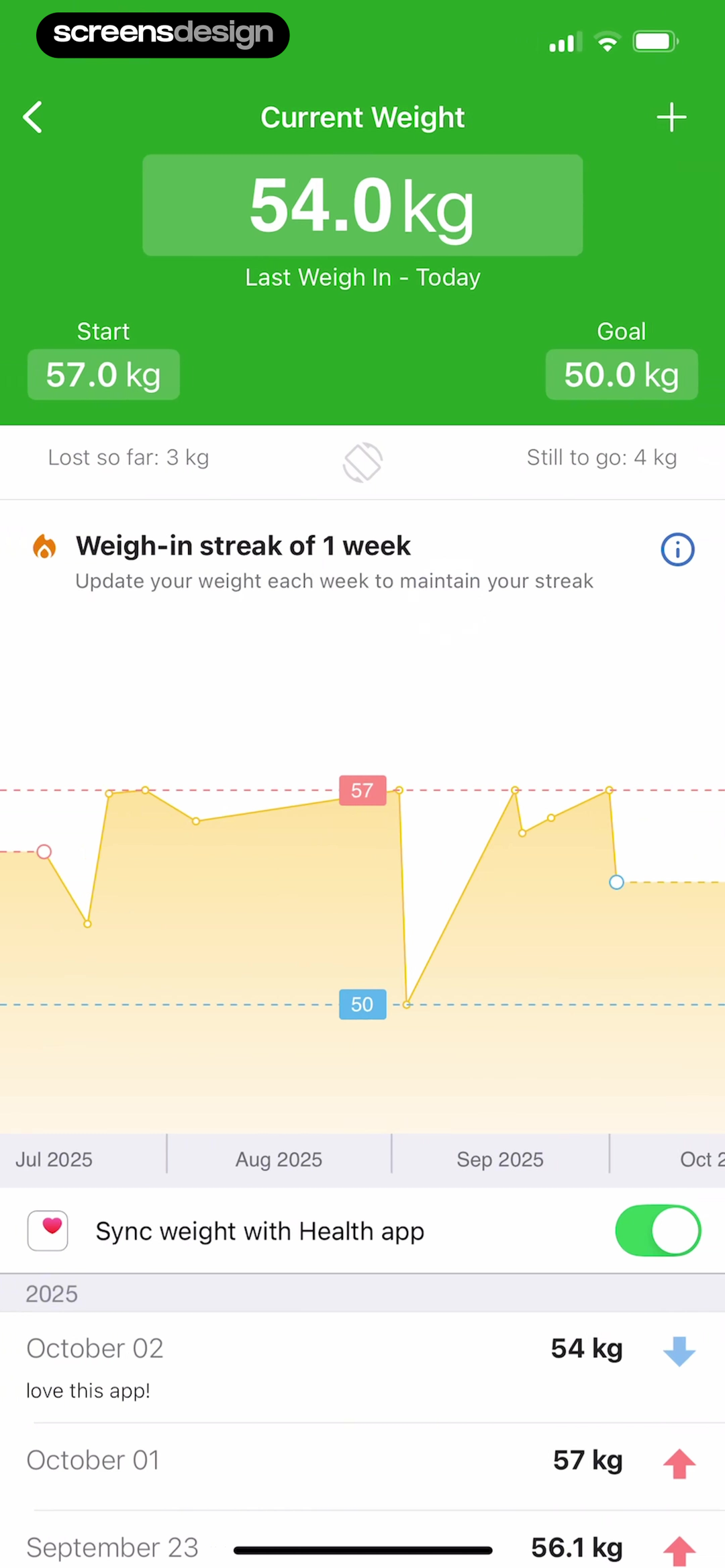
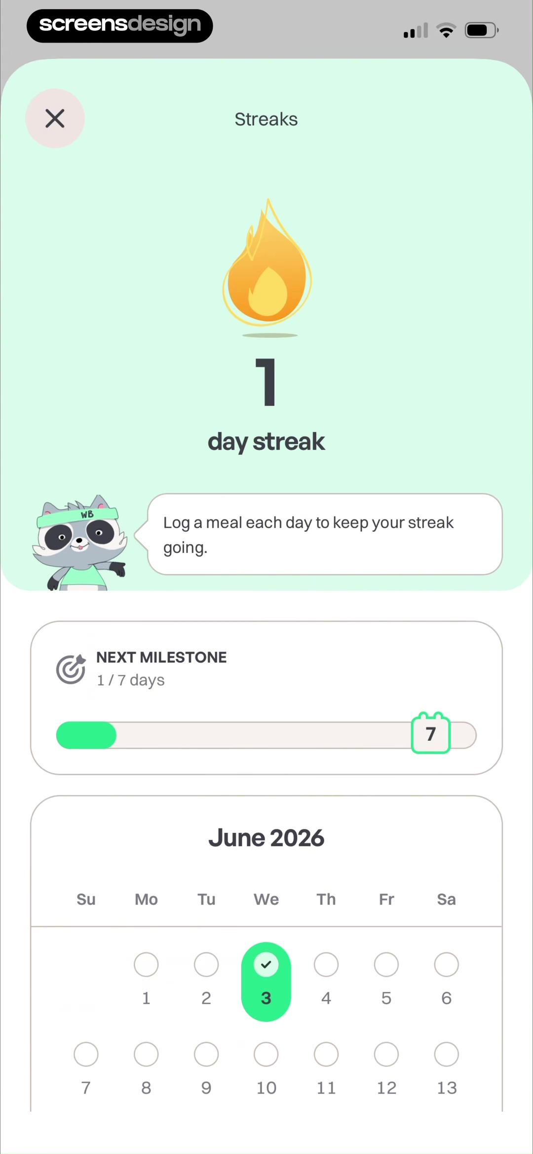
FatSecret shows current, start, and goal weights, amount lost and remaining, a weight chart, a one-week weigh-in streak, and a prompt to update weight weekly. WeightBuddy ties its streak to logging a meal each day and shows progress toward a seven-day milestone on a calendar. Each screen names the action behind the count.
Do not use one generic streak for every activity. Logging a meal, completing a diary, reaching a nutrient target, and weighing in have different appropriate frequencies. A weekly weight check can be complete even when no weight value changes. A meal-log streak can continue without implying that the logged foods met a health goal.
Design the restart state at the same time as the milestone. Show the last useful action, preserve historical progress, and offer a clear next step after a gap. Feedback should describe recorded behavior rather than moralize food choices or present a missed day as failure.
07. Trust and monetization
Explain sensitive data and paid access with equal precision.
Nutrition histories, body measurements, health connections, and subscriptions all require readable choices and consequences.
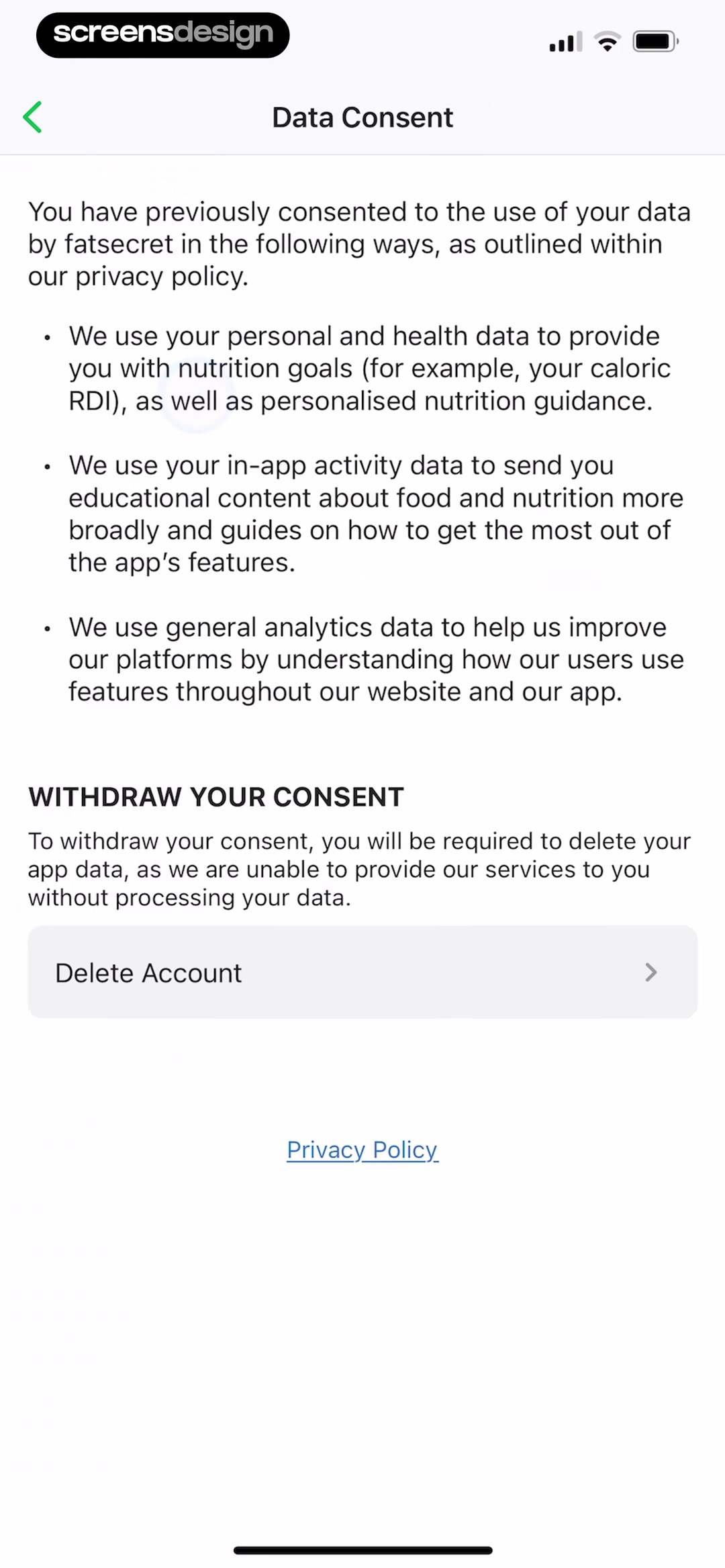
FatSecret's Data Consent page states separate uses for personal and health data, in-app activity, and general analytics. It also explains that withdrawing consent requires deleting app data and provides Delete Account and Privacy Policy paths. The important observation is the specificity of the visible categories, not merely the presence of a privacy link.
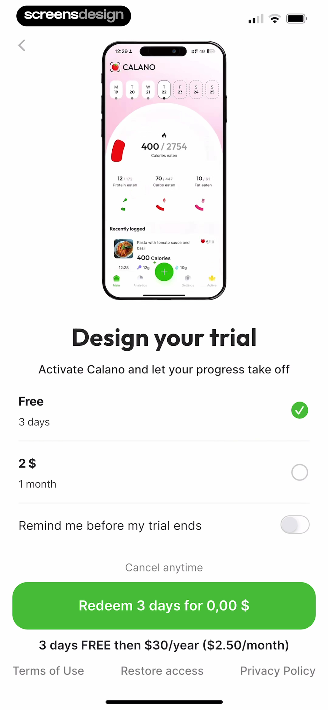
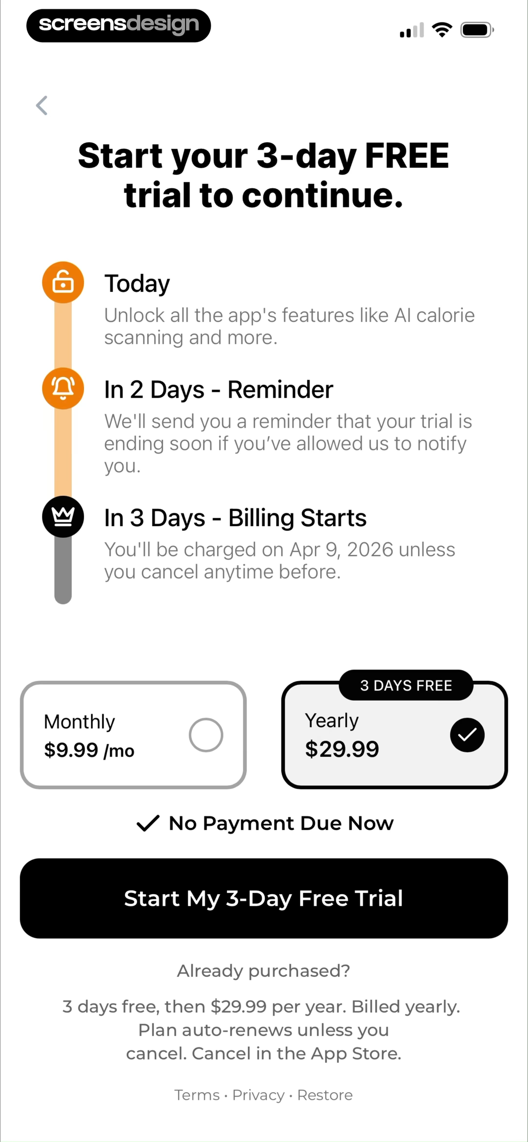
Calano presents a three-day trial, a one-month alternative, a reminder toggle, cancellation language, the annual renewal amount, terms, restore, and privacy links. Cal AI uses a timeline for access today, a reminder in two days, and billing in three days, followed by monthly and yearly choices and an auto-renewal statement.
Review trust copy as interface content, not footer content. Keep trial length, selected billing period, charge date, renewal price, cancellation route, restore action, and data deletion consequences readable before commitment. A paywall can show what is included without implying that subscription improves the accuracy of a food estimate unless that claim is separately supported.
08. Product review
Review the complete loop with real meals and imperfect data.
A polished dashboard cannot compensate for a capture path that loses context or a correction that fails to update the day.
Test the product as a sequence: choose a goal, enter or import health data, inspect the calculated plan, log a simple food, scan a mixed meal, correct an ingredient, change a serving, review the updated day, close the diary, and return after a gap. Use both metric and imperial units and include a denied health permission.
Check the numbers across every state. The same meal should not have one calorie value in the result, another in the diary, and a stale total on progress. Verify rounding, time zones, meal reassignment, duplicate scans, offline recovery, deleted entries, restored purchases, and a subscription that ends while data remains in the account.
Finally, read the interface without relying on color or charts. Targets, consumed values, remaining values, units, estimate status, selected plan, and destructive actions should remain understandable with larger text and assistive technology. The user needs a reliable record more than a perfect-looking score.
- The first goal answer visibly changes the plan or first task.
- Health imports have a manual alternative and a clear purpose.
- Photo, barcode, label, search, recents, and manual entry appear where relevant.
- Scanner results expose ingredients, quantity, serving, units, and estimate status.
- Corrections update the diary, remaining target, nutrients, charts, and summaries together.
- Daily feedback distinguishes goal, consumed food, exercise, and remaining amount.
- Streaks name the exact behavior and its appropriate frequency.
- Privacy, deletion, trial, billing, cancellation, and restore paths use readable copy.
- Empty, loading, offline, permission-denied, and failed-recognition states offer a next step.
- Dynamic type, screen readers, contrast, and non-color cues are tested with real data.
Questions and answers
Calorie tracker app design questions
What should a calorie tracker home screen show?
Show the current day, the calorie equation or budget, important nutrient targets, logged meals, and the next logging action. Keep goal, food, exercise, and remaining values clearly labeled rather than relying only on a ring.
Which food logging methods should be included?
Choose methods that match the product and audience. Photo scanning, barcode scanning, nutrition-label capture, search, recent foods, saved meals, and manual entry cover different situations and should share context.
How should an app handle inaccurate food scans?
Present the result as reviewable. Let people edit the food name, ingredients, amounts, serving size, and meal, add or remove components, switch to search, and undo changes without rescanning everything.
How much health data belongs in onboarding?
Request only data needed for the first useful plan and explain the consequence of each answer. Offer manual entry when health-platform access is declined and make the inputs editable after onboarding.
Are streaks appropriate for calorie trackers?
A streak can describe a repeatable action such as a daily meal log or weekly weigh-in. It should not imply that logging equals a health outcome, and the product should provide a calm restart after a gap.
What makes a calorie tracker paywall clear?
Keep the feature scope, selected plan, trial duration, charge date, renewal price, cancellation method, restore action, terms, and privacy link visible before purchase. Do not hide material terms behind visual hierarchy.
Apps referenced in this page
Open the products behind the examples.
 Cal Scanner AI Calorie TrackerCalorie AI & AI Food Tracker
 Calorie Counter: Food TrackerMeal Mentor・Macros Calculator
 Calorie Tracker-CalorieMateFasting macros&calorie counter
 MyFitnessPal: Calorie CounterWorkout & AI Nutrition Tracker
 Cal AI - Calorie TrackerFood & Macro Counter
 SnapCal: AI Calorie CounterFood Tracker for Weight Loss
 BitePal: Food Calorie TrackerAI Scan Meals & Easy Tracking
 Diet & Food Tracker: EatWellCount calories and lose weight
 Calorie Counter by fatsecretDiet & Weight Loss Tracker
 WeightBuddy: Calorie TrackerSimple weight loss app.
 CALANO: Calorie TrackerFood Scanner & Macro Counter
2,622 apps in the top charts.Ask them anything.
Search recorded calorie tracker screens, open their surrounding flows, and compare the exact product moment you are designing.