Design for the platform people already know
iOS app design that feels native, not anonymous.
iOS app design turns a product idea into an interface that works with Apple-platform expectations: familiar navigation, clear presentations, system-aware input, honest permissions, accessible text, and feedback that survives interruption.
Feeling at home on iOS does not mean copying Apple or removing every trace of brand. It means deciding which behavior should remain familiar, where the product needs its own expression, and how custom choices will preserve accessibility and predictability.
This guide focuses on Apple-platform conventions and system behavior. Use the mobile app design guide for the wider product and UX process, and the mobile app UI design guide for cross-platform components and interface states.
Research method: 15 recorded iOS screens were reviewed across navigation, input, overlays, system permissions, accessibility, feedback, and recovery. Published August 2026. Research and review by ScreensDesign editorial.
Familiarity
Preserve the behavior people already understand on iOS.
Context
Choose pushes, sheets, and alerts by task relationship.
Adaptation
Respond to text size, appearance, motion, and device space.
Identity
Express the product without obscuring common controls.
Platform conventions
Use conventions as behavioral infrastructure.
A convention is more than a visual style. A back control carries history. A sheet implies temporary, related work. A switch changes a persistent binary preference. A tab bar promises a small set of peer destinations. Reproducing the shape without the behavior creates an interface that looks familiar but feels unreliable.
Navigation
Back paths, large titles, tab destinations, toolbars, and disclosure.
Presentation
Pushes, sheets, popovers, alerts, and full-screen tasks.
Input
Focus, keyboard type, return action, validation, Save, and Cancel.
System access
Permissions, Settings recovery, sharing, authentication, and pickers.
Adaptation
Safe areas, orientation, appearance, Dynamic Type, and reduced motion.
Feedback
Progress, haptics, success, failure, undo, retry, and interruption.
the interaction is frequent, system-owned, security-sensitive, or already strongly understood through iOS.
the product has a specialized task that a standard control cannot express clearly, and the team can match native accessibility and state coverage.
Navigation and hierarchy
Make place, depth, and the next action visible together.
iOS navigation works best when people can distinguish stable destinations from local actions. Tab bars represent durable places. Navigation bars hold the current title and nearby actions. Back controls preserve a path. Segmented controls switch closely related views inside one destination.
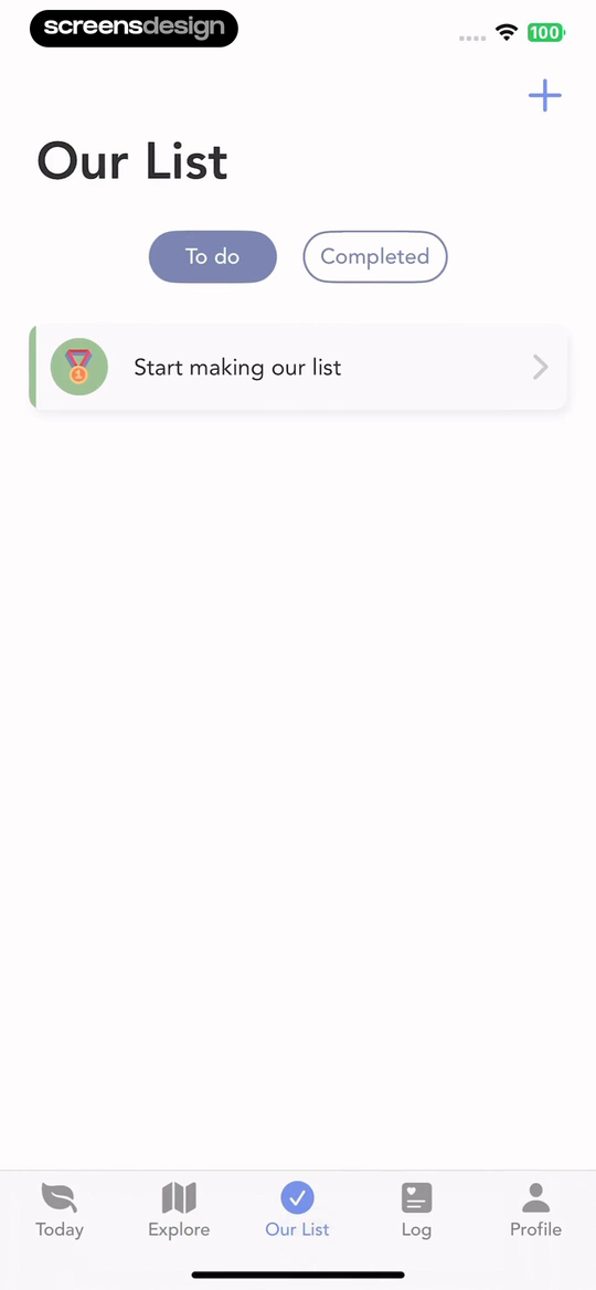
Evergreen separates where you are from what you see.
Our List is selected in the five-item tab bar, so location remains visible. The To do and Completed segmented control changes only the content inside that destination. The plus action adds an item without pretending to be another place.
This separation reduces one common navigation mistake: mixing destinations, filters, and actions at the same visual level.
Open the recorded list flowTodoist lets people see the navigation model they edit.
The settings screen names the Tab Bar separately from Menu Items, shows which destinations are included, and explains that a tab-bar item will be hidden from the menu. Edit, Hide All, checkmarks, disclosure, and a switch each communicate a different kind of change.
Configuration screens need more than controls. They need a model of how each choice affects the rest of the interface.
Inspect the settings journey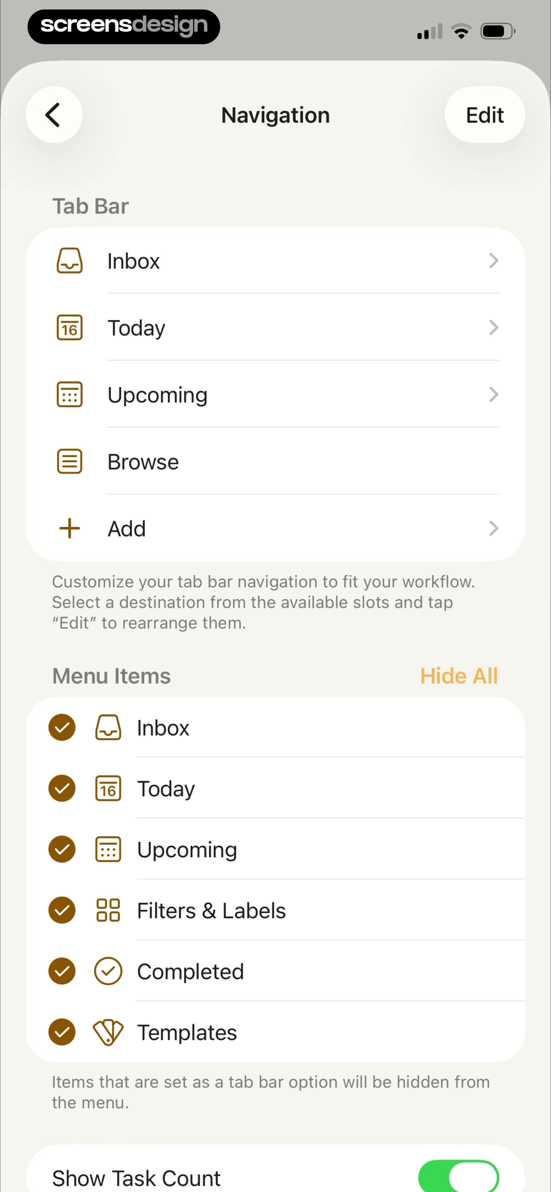
Sheets and alerts
Match the presentation to the weight of the decision.
Use a sheet for temporary work or contextual choices that still belong to the current screen. Use an alert for a short decision that requires immediate attention. Avoid stacking presentations unless each layer is essential, and keep cancellation easy when the user has not committed.

Must keeps one bulk choice lightweight.
The dimmed collection remains visible while the action sheet offers one specific operation. Cancel sits in its own group, which makes dismissal easy to identify.
Must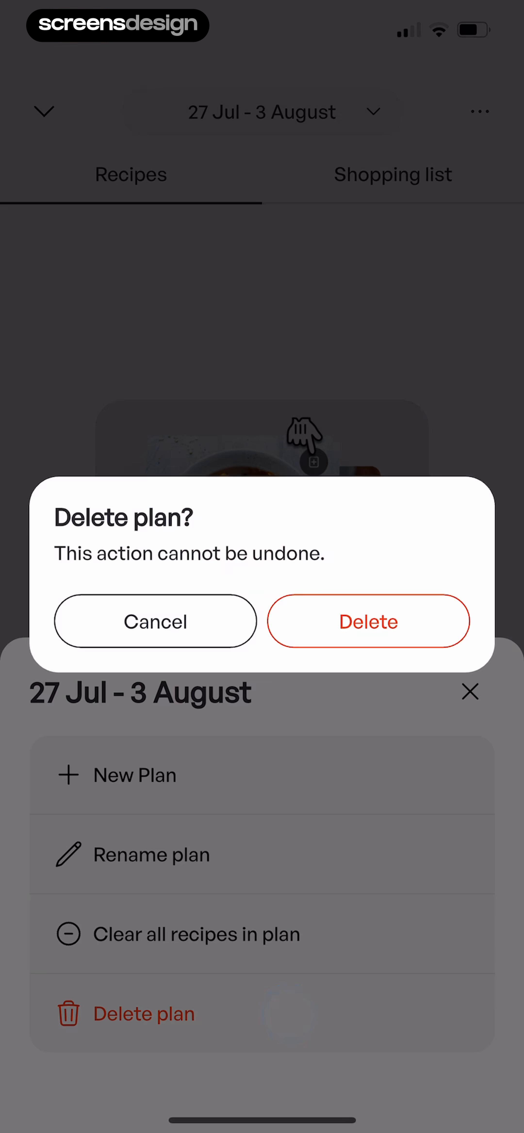
Mob names the action and its permanence.
Delete plan? identifies the affected object. The warning states that the action cannot be undone, and the neutral Cancel choice remains beside Delete.
MobForms and keyboards
Design the focused screen, not only the empty form.
The keyboard can occupy half the screen, move content, cover an action, or change the meaning of Return. Design with it visible. Keep the active field identifiable, use the appropriate input type, preserve labels, expose validation near the cause, and make Save or Done reachable without hiding the route back.
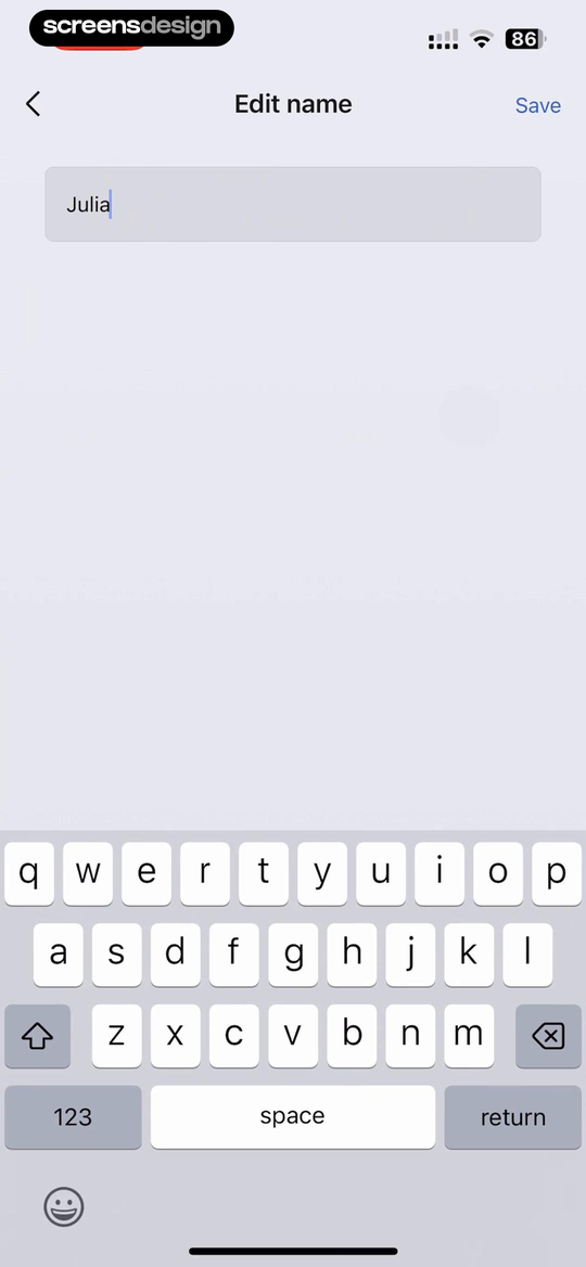
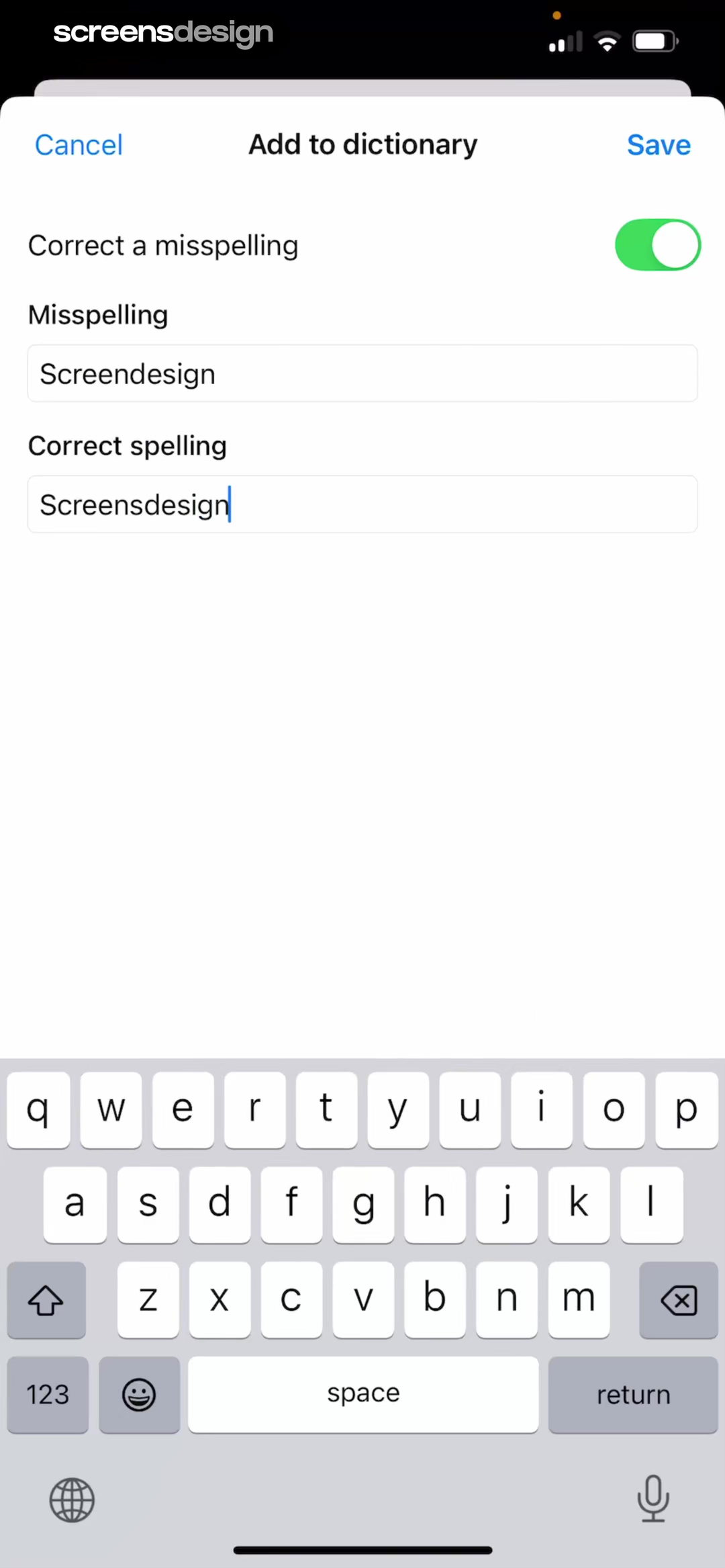
Wispr supports a rule. Zepp isolates one value.
Wispr Flow combines a switch with two labeled fields because the user is defining a correction rule. Cancel and Save make the modal task explicit. Zepp edits one name, so the screen can remain sparse while keeping Back, title, and Save in the navigation bar.
- Keep field labels visible after entry.
- Choose a keyboard that matches the expected value.
- Define Return, Save, Cancel, and validation behavior.
- Test long values, autofill, dictation, and error copy.
Compare the form with its keyboard visible.
Search recorded iOS forms, then inspect focus, validation, Save, Cancel, and the screen that follows submission.
System permissions
Earn the system prompt before iOS asks the question.
A notification, camera, location, microphone, photo, or tracking request should arrive when the capability is relevant. The app can explain why first, but it cannot replace the system choice or imply that permission is required when the task can continue without it.
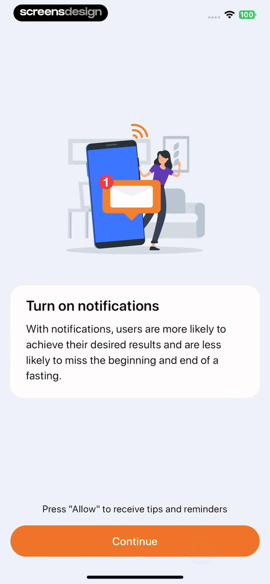
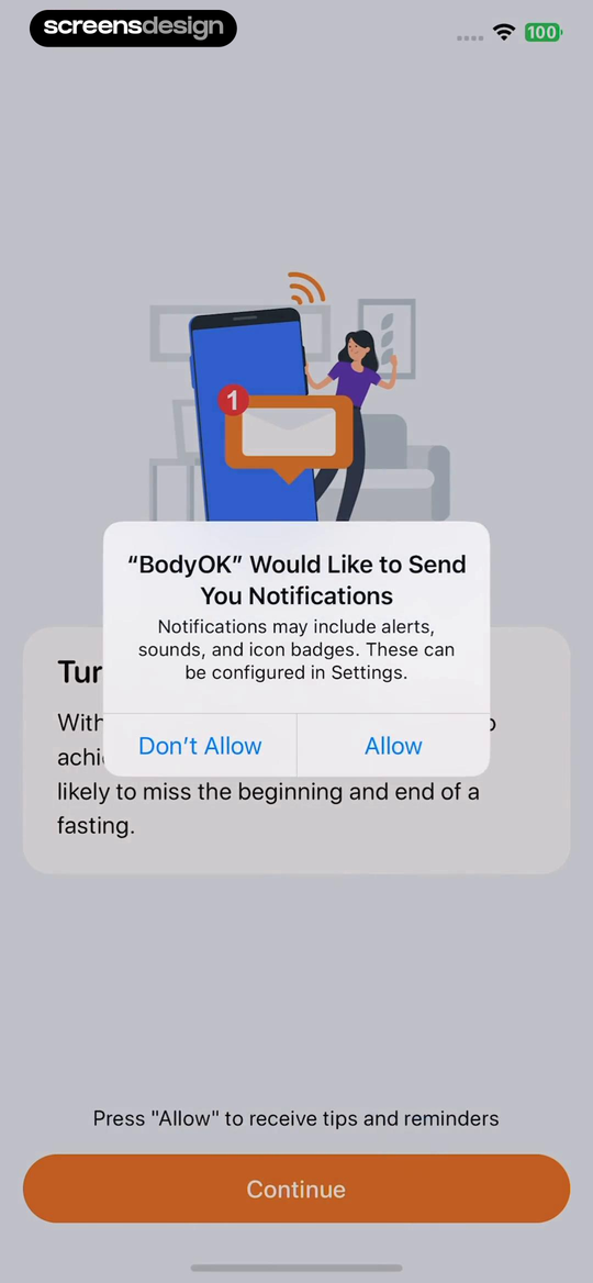
BodyOK keeps its explanation behind the native alert.
The first screen connects notifications to fasting reminders. Continue then triggers the native iOS alert, where the user chooses Don't Allow or Allow. The app provides context; iOS owns the final wording and decision.
The next design responsibility is recovery. If permission is denied, explain which feature is unavailable and provide a direct route to Settings only when the user tries to use it.
Watch the permission transition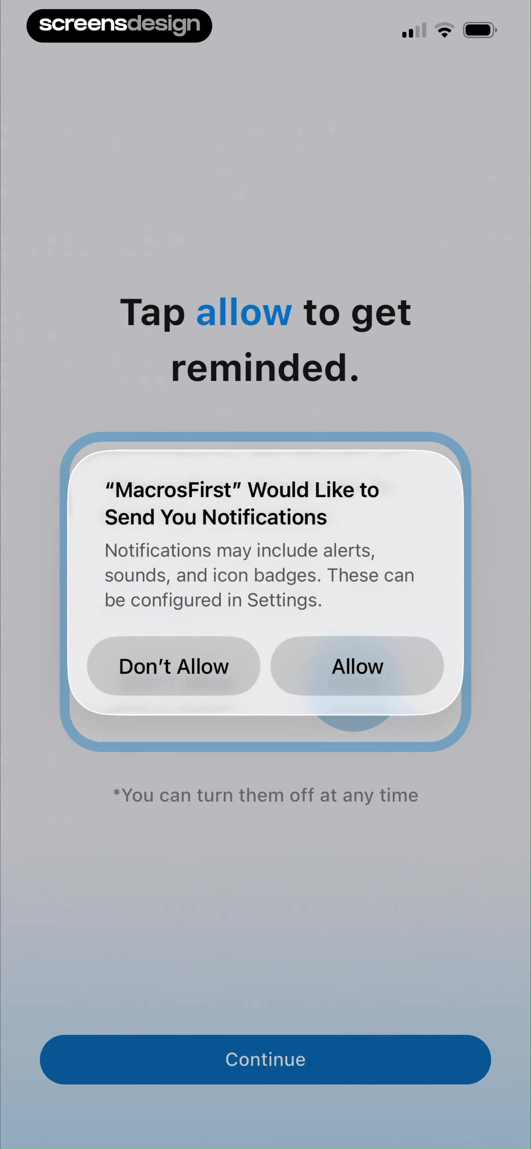
MacrosFirst makes the requested capability visible.
The system alert lists alerts, sounds, and badges while the surrounding onboarding says the purpose is reminders. This is a useful boundary: the product explains the moment, and the operating system presents the authoritative choice.
Open the recorded permission flowAccessibility and Dynamic Type
User settings are part of the interface specification.
iOS app design must remain usable when text grows, appearance changes, motion is reduced, contrast needs increase, audio is unavailable, or touch precision is limited. Accessibility is not a separate version of the screen. It is how the same product adapts to real people and environments.
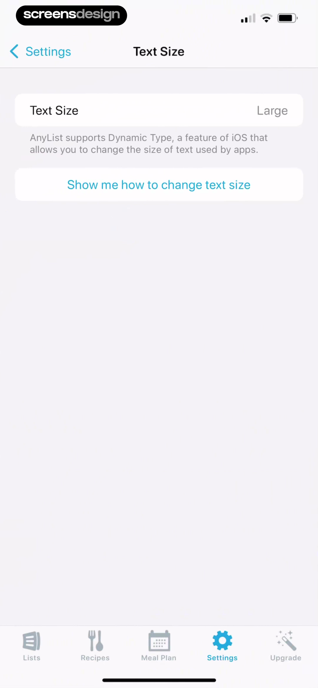
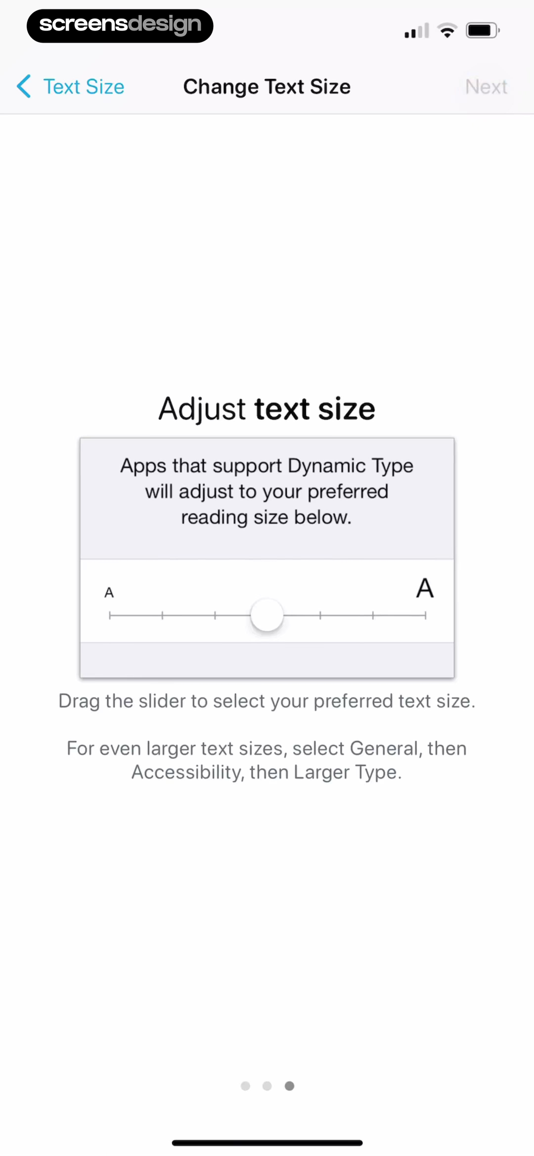
AnyList connects app guidance to the iOS setting.
The first screen states the current Large value and explains Dynamic Type. The recorded journey then presents the iOS text size control with a readable small-to-large scale and a route to even larger accessibility sizes.
Supporting Dynamic Type means more than offering a slider. Text styles must scale semantically, containers must grow, rows must wrap, and important actions must remain visible at accessibility sizes.
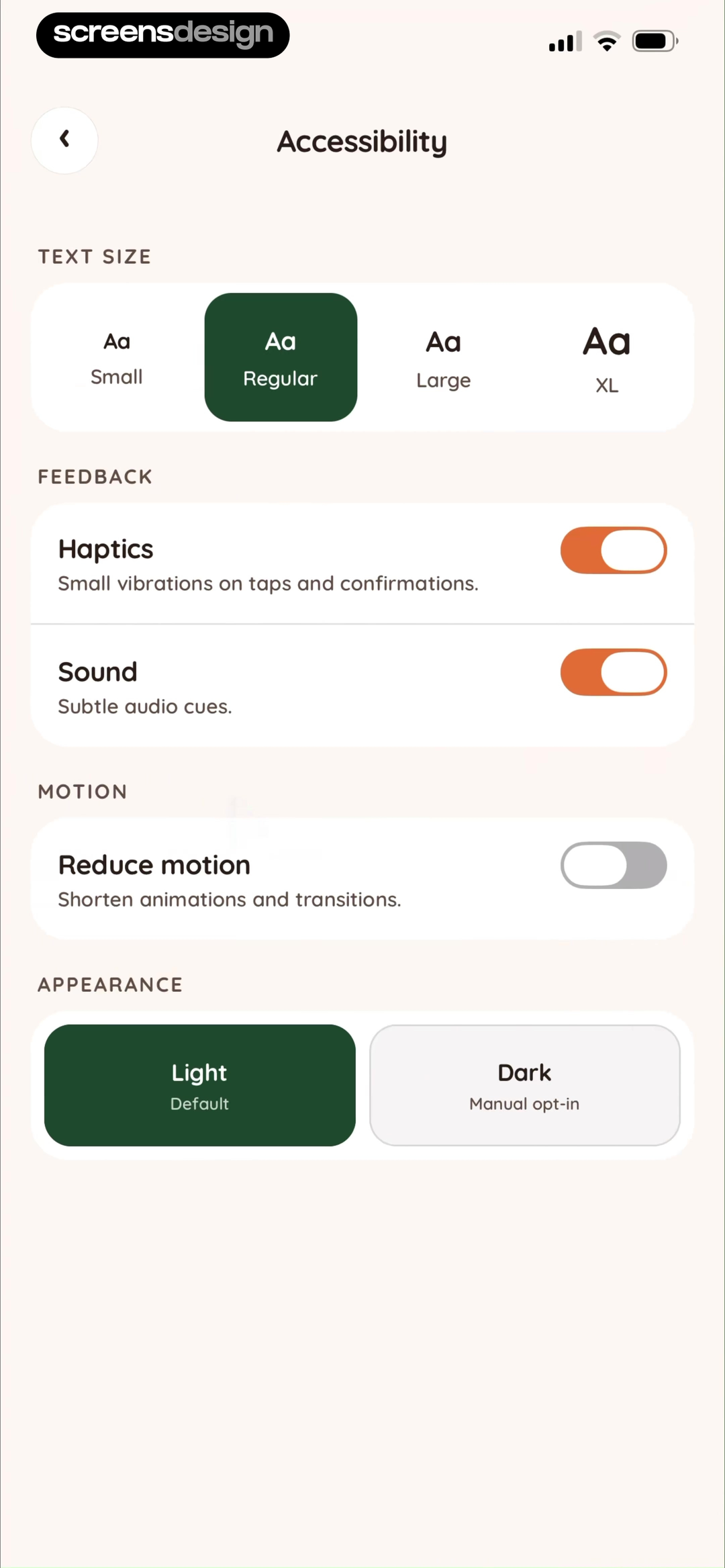
Inspect the complete settings flowJuno groups feedback, motion, and appearance together.
Text Size offers four visible choices. Haptics and Sound each include explanatory text. Reduce motion states what it will change, and Light and Dark appear as explicit appearance options. The screen makes accessibility settings discoverable without treating them as one undifferentiated toggle.
- Do not rely on color alone for selected state.
- Keep touch targets generous around text and icons.
- Provide text alternatives for meaningful imagery.
- Reduce or remove nonessential animated displacement.
Feedback and recovery
Tell people what changed and what remains possible.
Feedback should arrive close to the action, remain available long enough to understand, and provide recovery when the outcome needs attention. Haptics can reinforce a change, but visible status is still necessary. A success message should confirm the object or outcome. An error should preserve context and offer a useful next step.
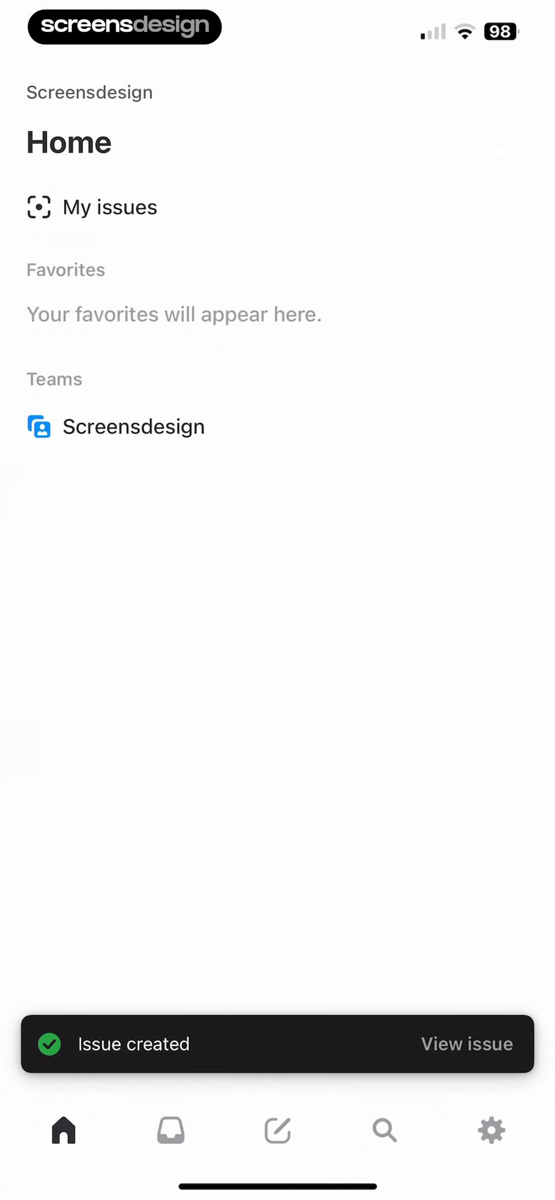
Linear confirms creation and links to the result.
Issue created confirms the completed action. View issue gives the temporary toast a useful continuation without forcing navigation away from Home.
Linear Mobile
Unsplash keeps the failed destination and offers Retry.
The Stats title and back path remain intact. The screen states that the server is down and provides one direct recovery action instead of replacing the entire interface.
UnsplashSearch by iOS behavior
Compare the pattern in the state you need to design.
Search for a concrete interaction, system surface, or state. Then inspect what happens before and after it. A static collection of polished screens cannot show keyboard behavior, permission timing, sheet dismissal, success feedback, or recovery.
Tab bars and navigation
Large titles, back paths, tab destinations, toolbars, and disclosure.
Search these iOS screensSheets and alerts
Contextual actions, confirmation, cancellation, and destructive choices.
Search these iOS screensForms and keyboards
Focused fields, keyboard-safe layouts, validation, Save, and Cancel.
Search these iOS screensPermission requests
Useful context before the system prompt and clear post-denial recovery.
Search these iOS screensAccessibility settings
Dynamic Type, contrast, motion, appearance, haptics, and sound.
Search these iOS screensFeedback and recovery
Progress, success, empty, error, retry, and reversible outcomes.
Search these iOS screensResearch the behavior, not only the visual style.
Ask ScreensDesign how recorded iOS apps handle the exact navigation, permission, input, or recovery moment in your app.
A repeatable iOS design review
Review the interface as behavior across states.
Start with the product task, then decide where iOS behavior can carry part of the experience. This five-step review keeps brand expression connected to system behavior and real implementation.
- 01
Name the platform behavior.
List the navigation, keyboard, permission, presentation, accessibility, and system-state behavior the task depends on before styling the screen.
Check: what will iOS own, and what will the app own?  02
02Choose the familiar container.
Start with a push, sheet, alert, grouped list, tab destination, or full-screen task according to the relationship between the current and next state.
Check: does the presentation preserve the right context?- 03
Map input and interruption.
Test keyboard appearance, focus, error messages, sheet heights, permission timing, cancellation, and what remains visible behind an overlay.
Check: can the task survive every interruption? - 04
Stress accessibility settings.
Increase text size, raise contrast needs, reduce motion, change appearance, and navigate without relying on color or a precise gesture.
Check: does the hierarchy survive user preferences? - 05
Review the complete state change.
Record the screen before interaction, during system UI, after success, and after failure. A static handoff cannot describe the whole product behavior.
Check: can the user understand what happened next?
Before implementation
Use an iOS checklist that includes the operating system.
Review these points on device with realistic content. Repeat the check for first use, keyboard entry, system prompts, large text, dark appearance, loading, success, error, denial, and interruption.
Tab destinations represent stable peer sections rather than actions.
Back, Cancel, Done, Save, and destructive actions have distinct meanings.
Pushes, sheets, alerts, and full-screen tasks match the relationship between states.
Safe areas protect content and controls across supported devices.
Focused fields remain visible when the keyboard appears.
Keyboard type, Return behavior, validation, and autofill match the data.
Permission requests arrive in context and denial has a recovery path.
Text scales through accessibility sizes without clipping or hiding actions.
Light and dark appearance preserve hierarchy and contrast.
Reduced motion removes nonessential movement without hiding state changes.
Haptics and sound reinforce feedback but are never the only feedback.
Success, empty, loading, and error states preserve the user's context.
Custom controls expose familiar semantics, states, and touch targets.
Brand choices strengthen the task instead of disguising platform behavior.
Continue with mobile UI components and interaction patterns, review the wider mobile app design process, or study how to choose evidence in the app design inspiration guide.
Frequently asked questions
Questions about iOS app design.
What is iOS app design?
iOS app design is the product, interaction, interface, and accessibility work required to create an app that feels coherent on Apple platforms. It includes navigation structure, system presentations, controls, input behavior, permissions, feedback, typography, and adaptation to device and user settings.
Should an iOS app use only native components?
No. Native components are a strong default because they carry familiar behavior and accessibility support. Custom components can express a distinct product or solve a specialized interaction, but they should preserve the platform expectations people rely on, including focus, touch targets, text scaling, state feedback, and dismissal.
What is the difference between iOS app design and mobile app UI design?
Mobile app UI design covers the components, hierarchy, and states of mobile interfaces across platforms. iOS app design narrows that work to Apple-platform behavior such as tab and navigation bars, sheets, alerts, system permissions, keyboard behavior, Dynamic Type, appearance, and platform accessibility conventions.
How should designers handle iOS permission prompts?
Ask only when the requested capability is relevant to the current task. Explain the benefit in the app before triggering the system prompt, avoid making the custom screen look like the system alert, and provide a useful path to Settings when permission has already been denied.
How should Dynamic Type affect an iOS layout?
Text should scale without clipping, overlapping, or hiding important actions. Components need flexible heights, layouts should reflow where necessary, and meaningful text should use semantic styles. Test larger accessibility sizes on real devices instead of assuming the default size represents the product.
How can an iOS app feel branded without fighting the platform?
Put brand expression into content voice, typography choices, imagery, color roles, spacing rhythm, motion, and distinctive product interactions. Keep high-frequency platform behavior predictable unless a custom alternative offers a clear benefit and matches the accessibility of the native control.
2,622 apps in the top charts.Ask them anything.
Search the iOS behavior you are designing, compare recorded screens and complete flows, and use stronger evidence to improve your own app.