Bible app design research
12 Bible App Design Examples: Onboarding, Reading and Retention
Twelve recorded screens show how leading Bible and prayer apps turn a vast body of content into one clear, repeatable next step.
A Bible app is not just a reading interface. It may need to support study, prayer, audio, reflection, questions, notes, community, and a daily habit. The difficult design problem is deciding which of those jobs should be visible now and which can wait.
The strongest examples in this review do not begin with a crowded library. They establish intent, shape a small daily session, and make progress easy to understand. This gives the product a rhythm: arrive, know what to do, complete something meaningful, then return with context intact.
We reviewed recorded product screens from Bible Chat, Hallow, YouVersion Bible, Duomo, Scroll The Bible, Dwell, Haven, and Bible Note. Each example below links to the exact screen in ScreensDesign, so you can inspect the surrounding flow instead of judging a polished screenshot in isolation.
01. Onboarding
Start with the user's spiritual intent, not a feature tour.
The first useful decision is often why someone opened the app today.
Bible Chat asks whether the person wants to study scripture or work through a life challenge. Hallow asks for at least two prayer interests using illustrated choices. Both screens collect information that can change the next recommendation, which makes the questions feel earned.
The distinction matters. Asking for age, denomination, goals, reminders, and subscription intent in one long sequence can create the appearance of personalization without producing an obviously different experience. A smaller set of high-signal questions is usually stronger. The user should be able to predict what will change after each answer.
For a new Bible product, begin with one decision that separates the major use cases. Reading, guided prayer, audio listening, and help with a personal concern lead to very different first sessions. Route the user to value first, then collect more preferences when the need becomes clear.
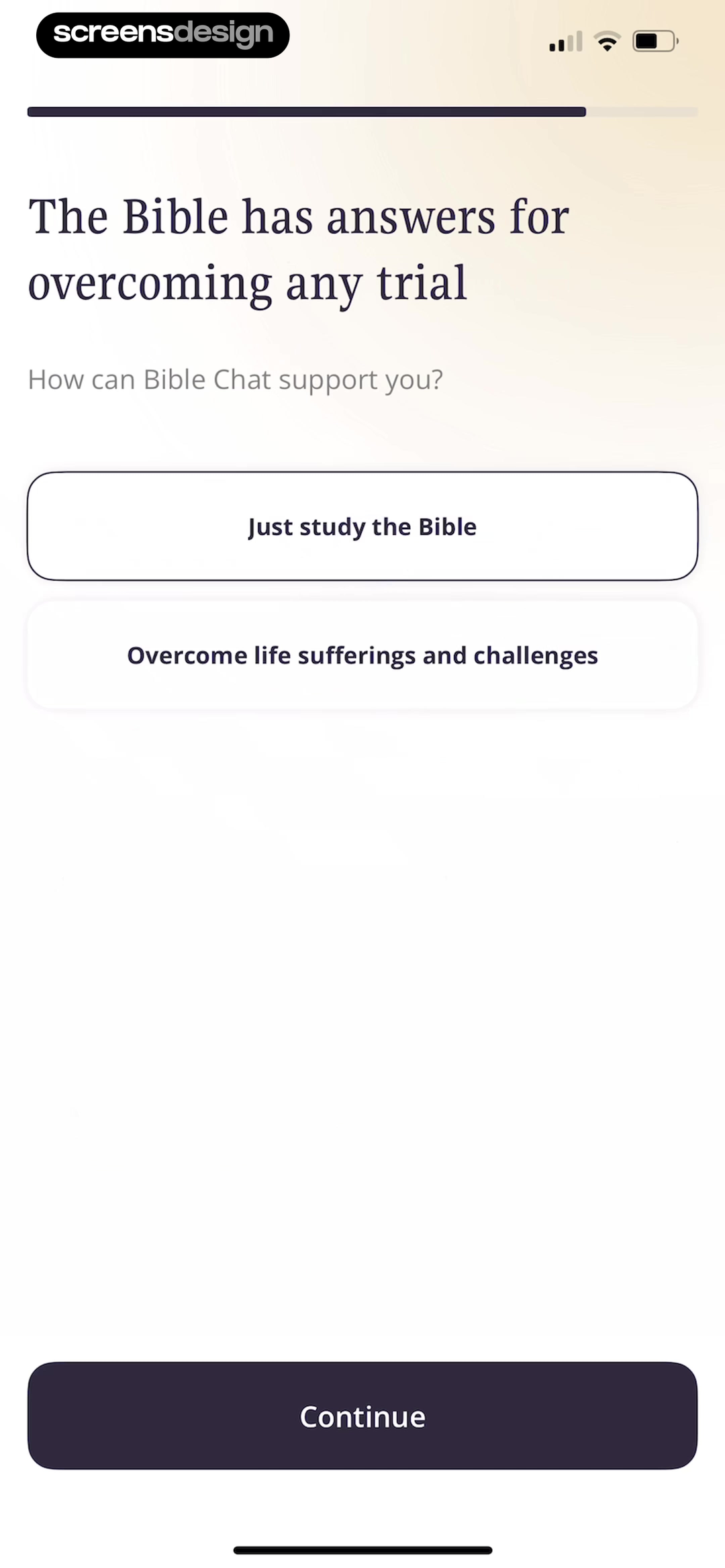
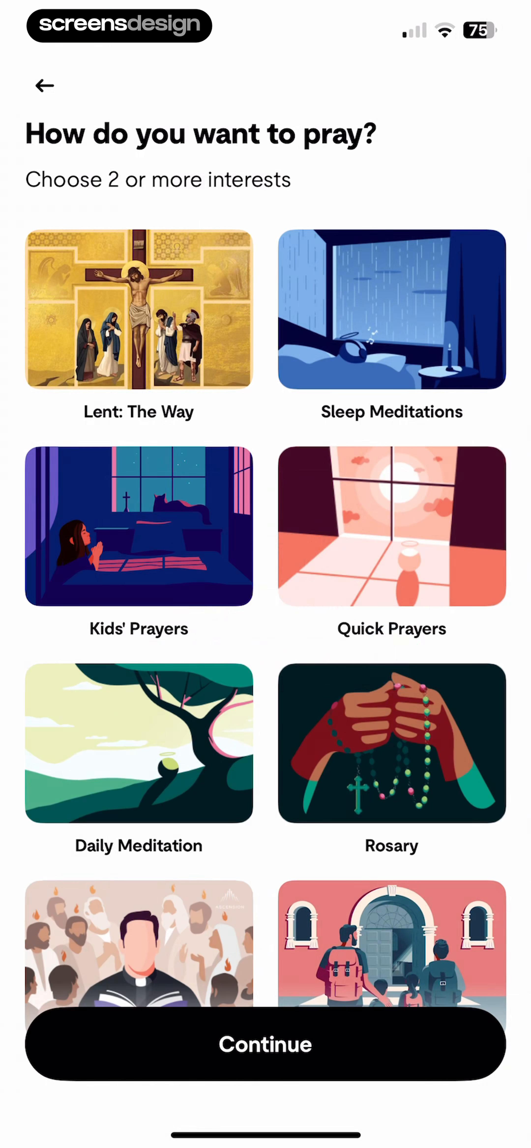
Can the user see the consequence of the question?
If an answer does not change content, sequence, tone, or reminders, postpone the question until it does.
02. Daily use
Turn a large library into today's next step.
Bible apps contain more content than any home screen can explain. The answer is sequencing, not more navigation.
YouVersion's Today screen groups a verse, guided scripture, and prayer into a daily feed. Duomo is more prescriptive: it presents a connected timeline of prayer, scripture, a quiz, an action, and reflection. The models are different, but each answers the same question within seconds: what should I do now?
A useful daily plan balances direction with choice. Too much direction can make a spiritual practice feel like a task manager. Too much choice transfers the editorial work to the user. Give one recommended action clear visual priority, then keep alternatives close enough for a person who arrives with a different need.
The plan also needs a natural end. Endless feeds are good at extending sessions, but weak at communicating a completed practice. A short sequence with a visible finish can create more confidence and a clearer reason to return tomorrow.
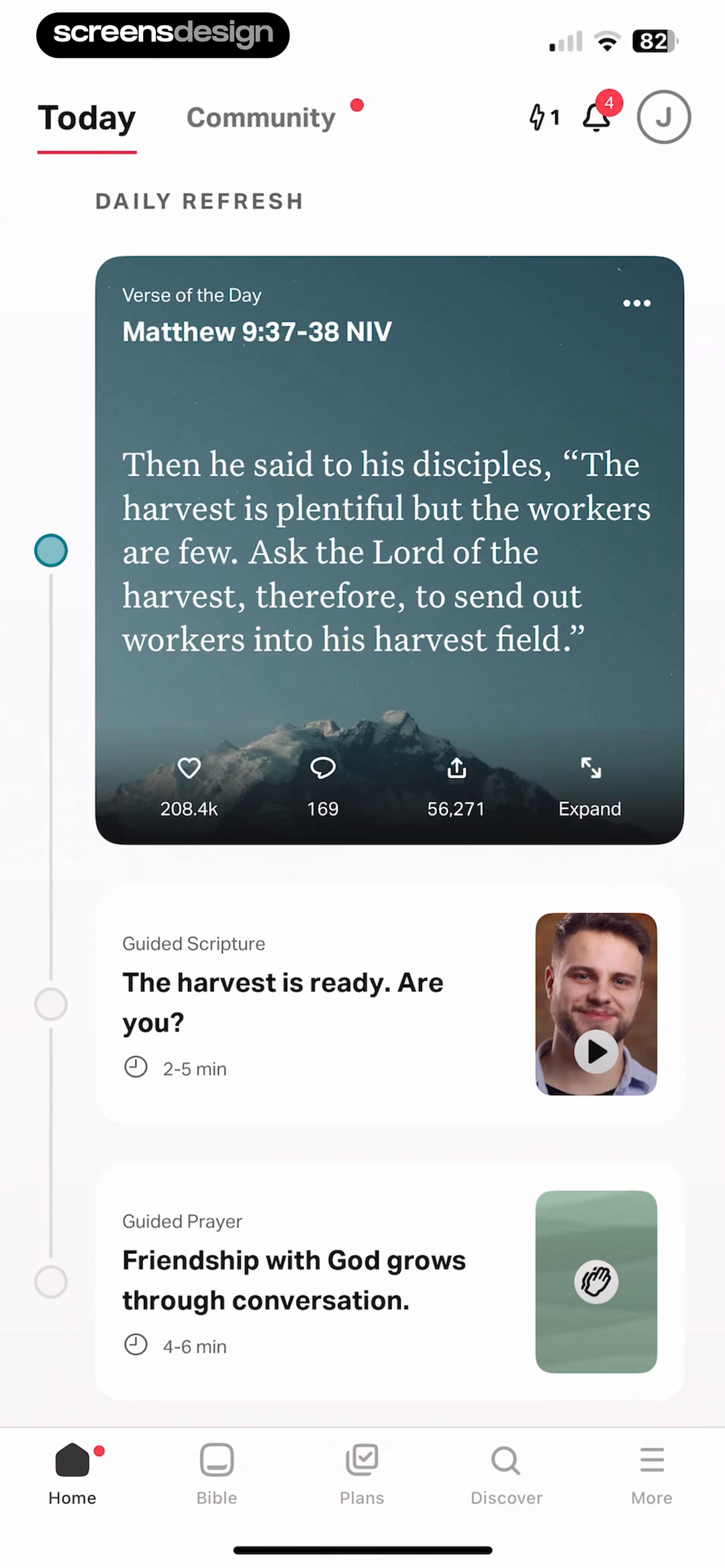
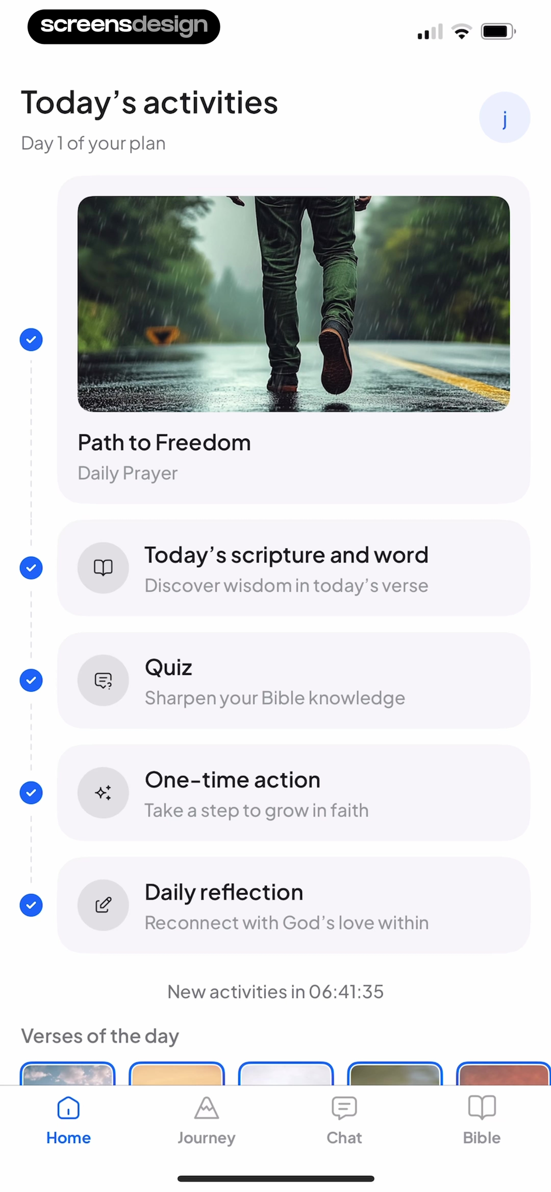
- Show one recommended action before secondary content.
- Explain the expected length when a session has several steps.
- Keep completed and remaining steps visually distinct.
- Let users resume without rebuilding context.
03. Reading and listening
Design the reading mode around attention.
Scripture is the interface. Controls should be available without becoming the loudest element on the screen.
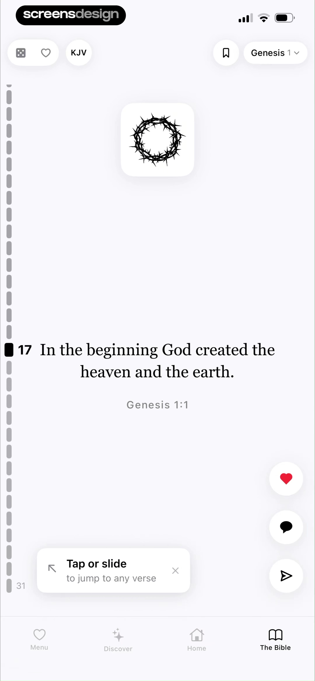
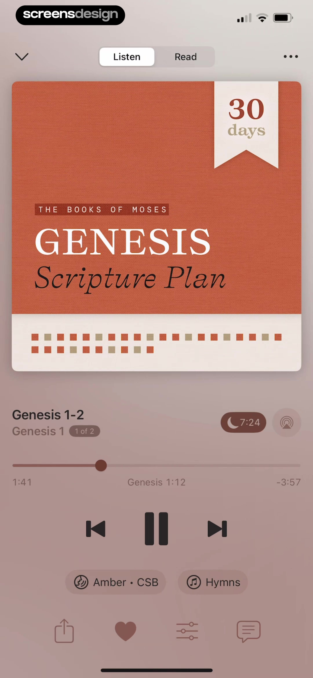
Scroll The Bible borrows the familiar vertical paging behavior of short-form feeds, but applies it to one verse at a time. That choice lowers the effort required to begin. Dwell takes the opposite route and treats scripture as a long-form listening experience, with a prominent Listen and Read switch, plan context, and audio controls.
Neither pattern is automatically correct. Verse-by-verse paging is useful for discovery and short sessions, but can weaken the relationship between a passage and its surrounding chapter. Audio is strong for continuity and accessibility, but needs precise resume behavior and clear navigation between a plan, a book, and the current passage.
Choose the primary reading model from the behavior you want to support. If the goal is study, preserve context and annotations. If the goal is a five-minute daily practice, reduce setup. If the goal is listening, make speed, narrator, queue, and progress available without covering the text.
Keep context close
Show book, chapter, translation, and progress without forcing a trip back to the library.
Protect the resume point
A returning listener should continue from the exact passage with the same narrator and speed.
Make tools selection-aware
Notes, highlights, explanations, and sharing should stay attached to the selected verse.
Let presentation adapt
Text size, contrast, line spacing, and audio should be first-class reading preferences.
04. Habits and progress
Use progress to support the practice, not replace it.
A streak can help someone return, but the meaningful unit is the practice they completed.
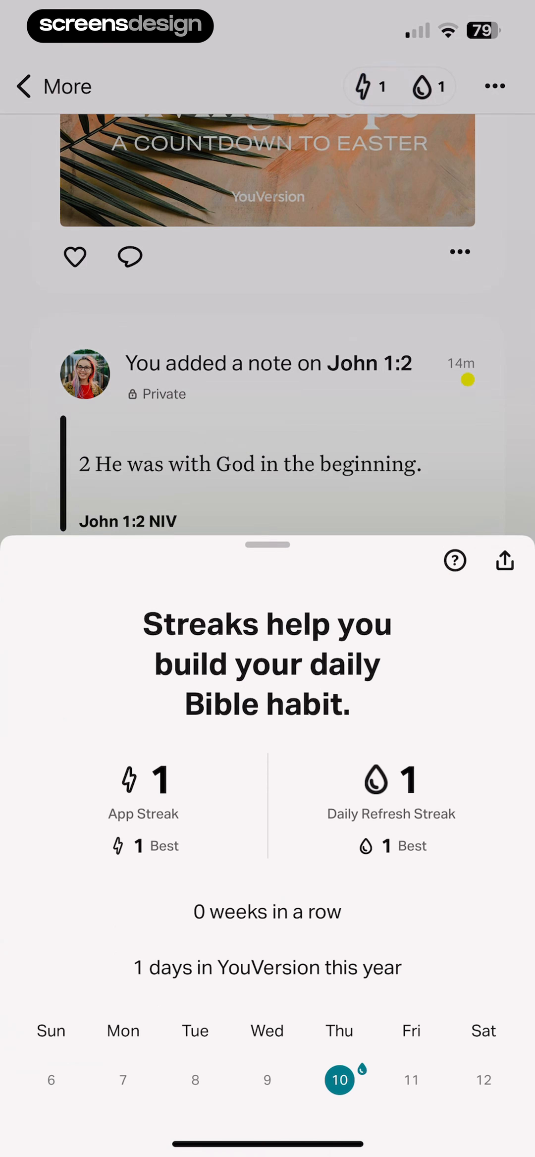
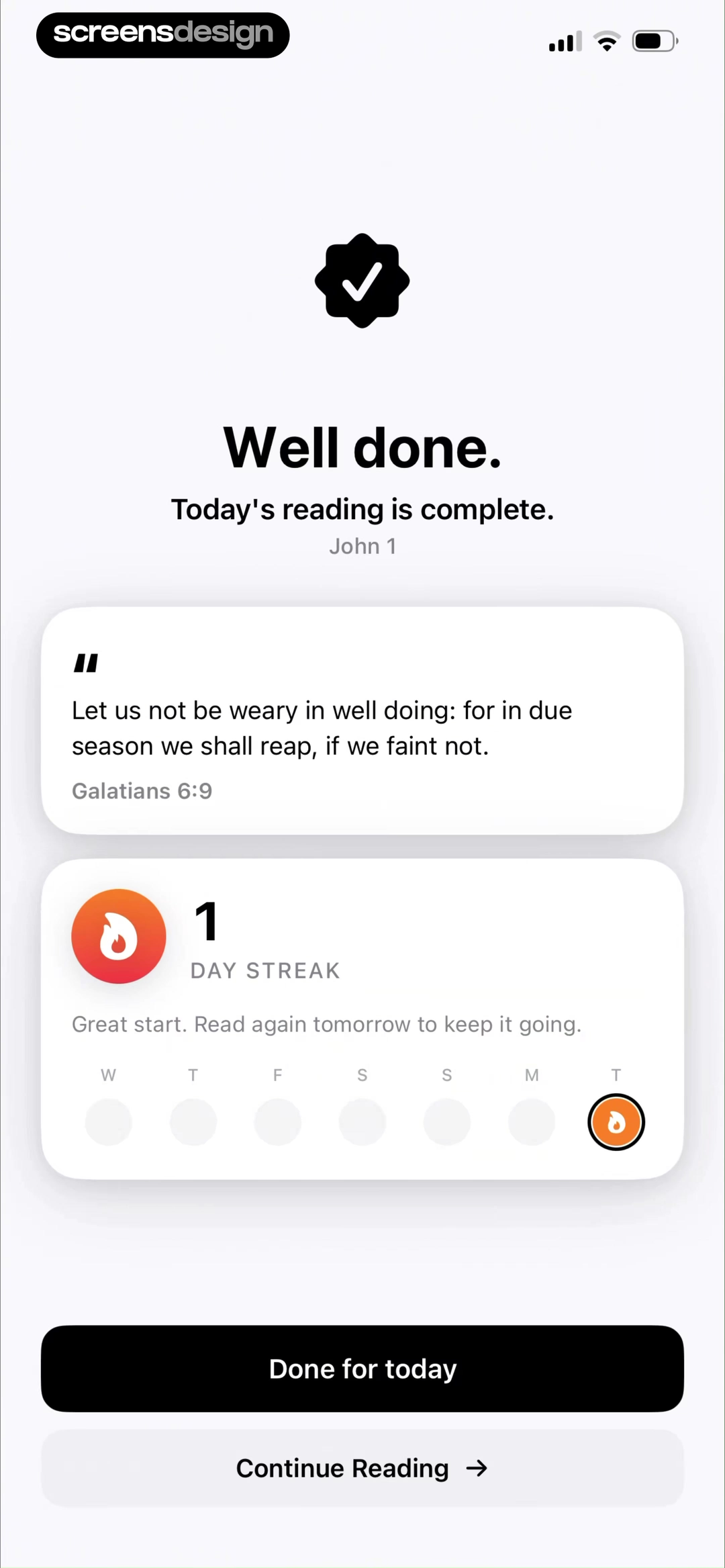
YouVersion explains the streak after the behavior and shows both current and longest streak. Scroll The Bible closes the session with a direct completion message, a passage, and the current day count. In both examples, progress appears as feedback. It does not interrupt the reading before value has occurred.
This order protects the tone of the product. Aggressive loss messaging, oversized streak numbers, and constant progress prompts may increase short-term compliance, but they can make a reflective experience feel transactional. Positive closure is usually a better fit: acknowledge the action, preserve the record, and offer a calm next step.
Design for recovery as carefully as continuity. Missing a day should not erase identity or make the app feel punitive. Consider weekly consistency, flexible plans, grace days, or a simple invitation to continue. The goal is to help the person restart, not to prove that they failed.
05. Bible chat
Use AI to deepen a passage, not become a blank prompt.
The strongest Bible chat entry point begins with context and a useful question.
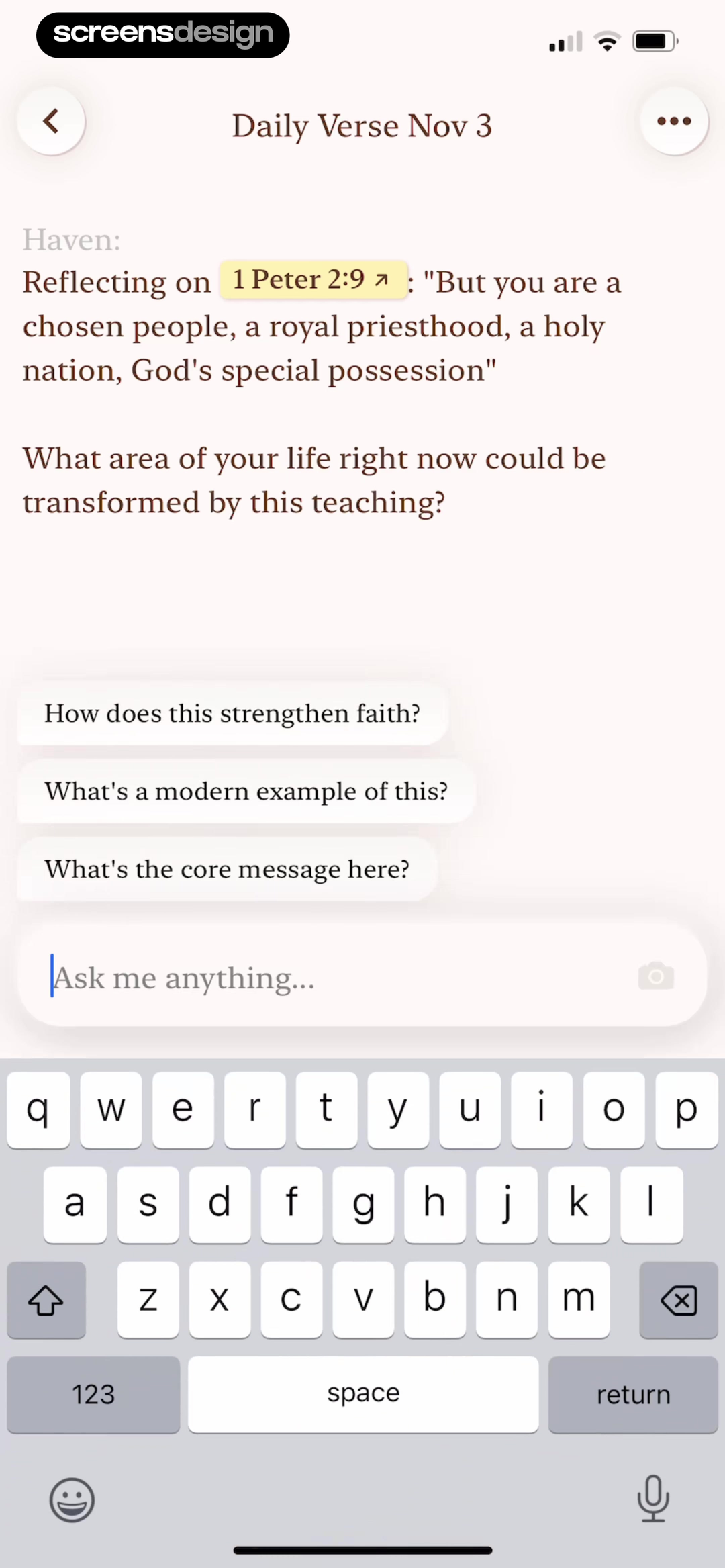
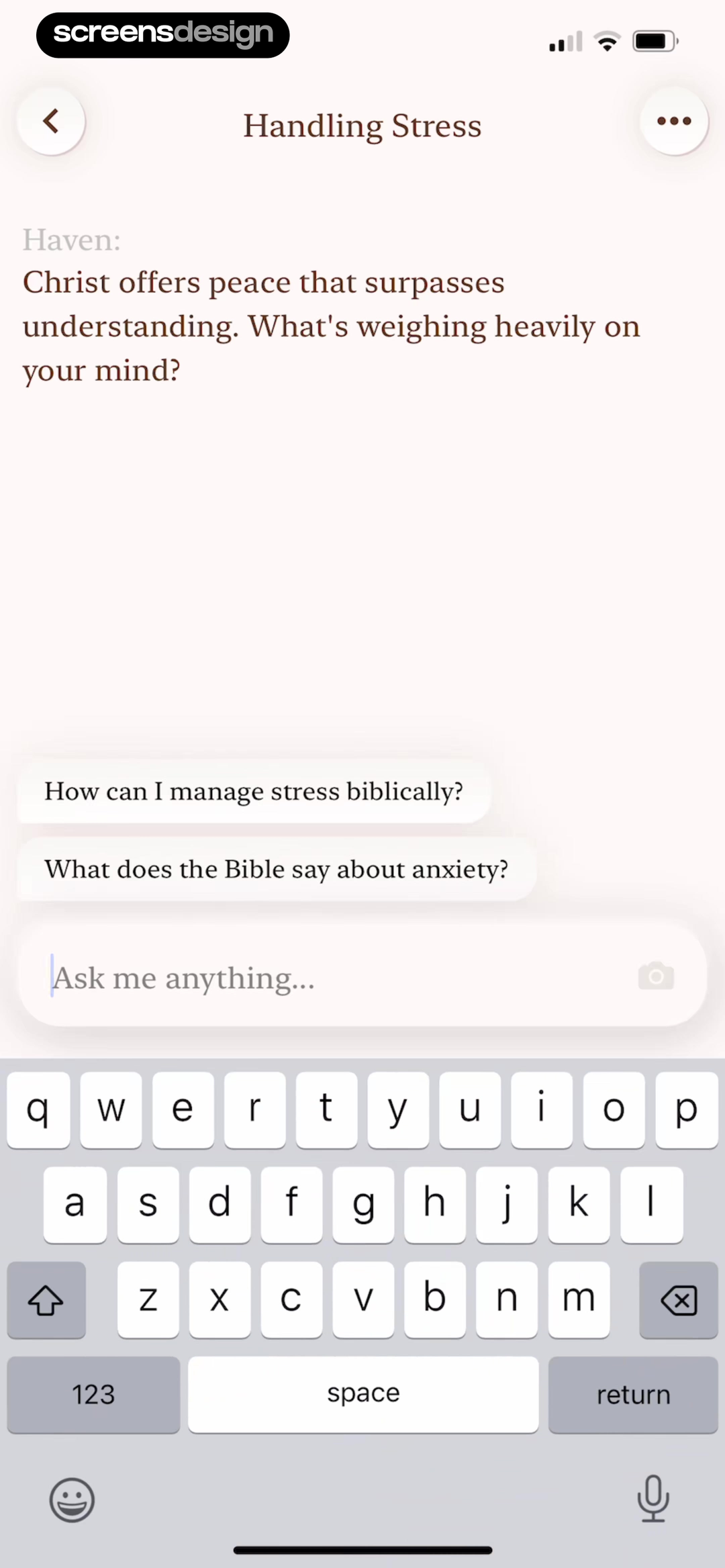
Haven turns a daily verse into a guided conversation by placing reflection prompts beside the passage. It also uses topic-specific starters for stress and anxiety. This removes the blank-page problem and signals the kind of answer the product is prepared to provide.
Context is especially important in a faith product. A response should make its scriptural basis visible, separate quotation from interpretation, and let the user open the source passage. If the app has selected a devotional, denomination preference, translation, or prior answer, explain how that context influences the response.
A conversational surface also needs clear limits. Users may bring grief, mental health concerns, abuse, or emergencies into a spiritual conversation. The interface should not imply pastoral, medical, or crisis authority it does not have. Helpful escalation, reporting, source links, and privacy language belong in the product design, not only in legal copy.
- Carry the verse, plan, or topic into the first message.
- Offer specific prompts that reveal the assistant's useful range.
- Link interpretations back to their source passages.
- Explain privacy before asking for sensitive personal context.
- Create an escalation path for high-risk requests.
06. Study tools and monetization
Earn trust before asking for more commitment.
Advanced study features and paid plans should feel like a continuation of demonstrated value.
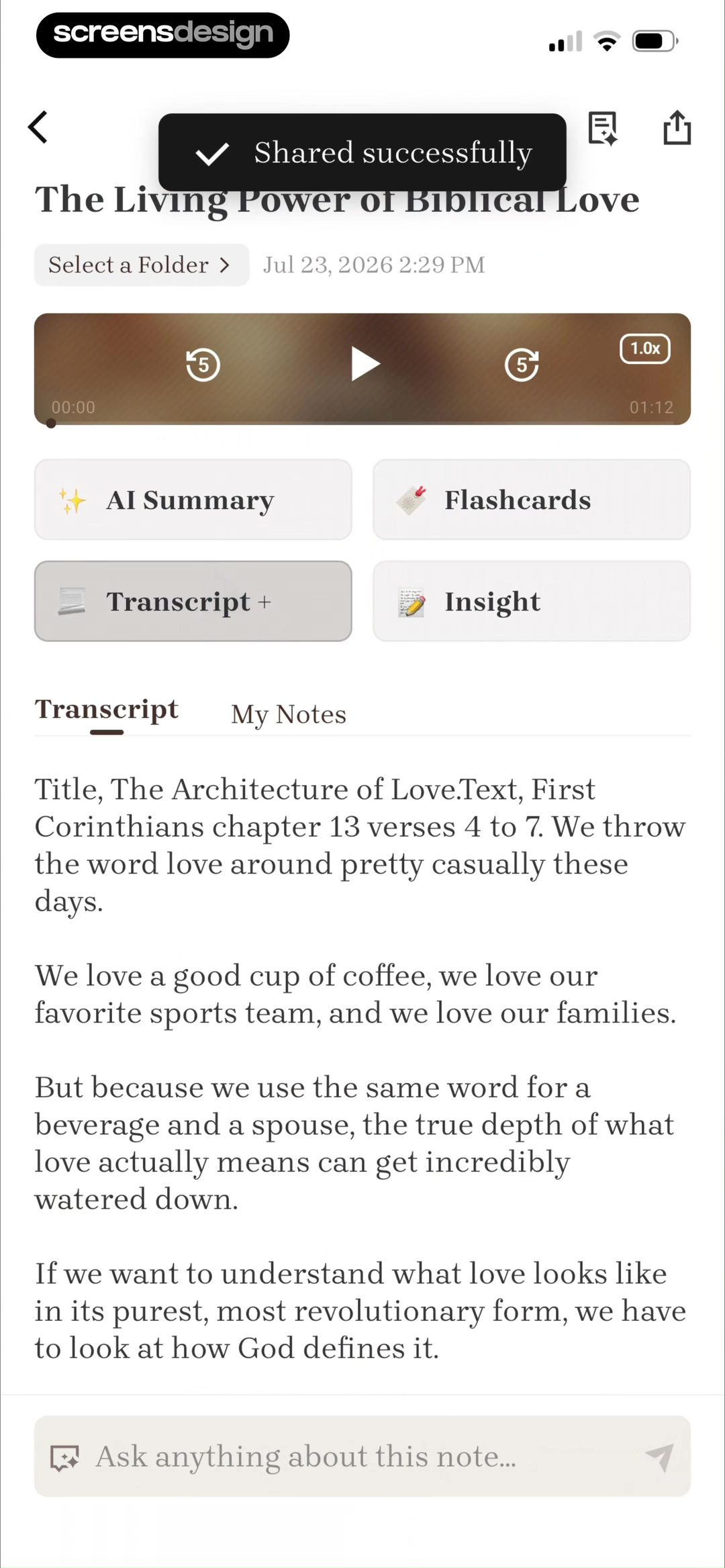
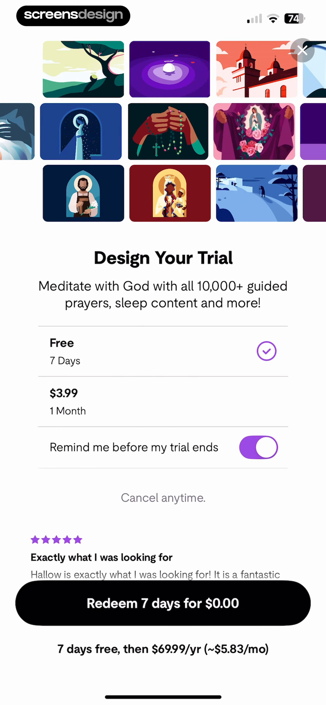
Bible Note keeps the original sermon recording, transcript, summary, and study outputs in one workspace. The benefit is concrete: spoken content becomes something the user can revisit and develop. Hallow uses a visual premium preview, a choice between trial and monthly access, a reminder toggle, social proof, and explicit renewal terms.
The product lesson is not to reproduce every element. It is to align the offer with the experience immediately before it. A paywall after a personalized prayer selection should show the prayer library and explain what the trial unlocks. A paid study tool should demonstrate a useful summary or note before asking the person to subscribe.
Clarity is part of conversion. Keep the selected plan, billing period, trial length, renewal price, cancellation path, and dismiss action readable at the same time. Trust is particularly important when the product handles prayer history, personal reflections, recordings, or AI conversations.
Borrow the decision structure, then test it in your own product.
A pattern works because of its timing, content, audience, and surrounding flow. Use the linked recordings to study what happens before and after each screen.
07. Product blueprint
A practical structure for a new Bible app.
Start with a coherent loop before expanding the library or adding more engagement mechanics.
A useful first version can be small. Choose one audience, one repeated practice, and one primary content format. A focused daily Bible reader for new Christians needs a different information architecture from an audio study tool for commuters or a prayer companion for established routines.
Map the experience as a sequence rather than a set of screens. The user arrives with an intent, receives one recommendation, completes a reading or prayer, records something if useful, sees a clear ending, and returns to the right place. Each extra feature should strengthen one part of that loop.
Before shipping, test the complete path with real content and realistic interruptions. Check a short and long passage, offline recovery, audio resumption, notification denial, a missed day, an expired trial, dynamic type, and a sensitive chat request. These states reveal more about product quality than the perfect home screen.
Choose the practice
Reading, listening, prayer, study, or conversation should be the clear center of the first version.
Define one daily loop
Specify the entry point, primary action, completion state, and resume behavior.
Add context carefully
Use translation, plan, goal, and prior activity only when they improve the next recommendation.
Test trust states
Review permissions, private content, subscriptions, AI limits, and recovery before polishing growth loops.
- The home screen makes the next action clear within five seconds.
- The reading view preserves passage and translation context.
- Audio and text resume from the correct position.
- Progress rewards consistency without punishing recovery.
- Chat answers expose sources and boundaries.
- Personal reflections and recordings have understandable privacy controls.
- The paywall states the trial and renewal terms without hidden hierarchy.
- Every empty, loading, offline, and error state gives a useful next step.
Questions and answers
Bible app design questions
What should a Bible app home screen include?
It should make one useful next action obvious, preserve progress, and keep alternatives such as reading, prayer, audio, or plans easy to reach. Avoid presenting the entire content library at equal priority.
How should a Bible app personalize onboarding?
Ask a small number of questions that directly change the first recommendation, such as the intended practice, current goal, preferred format, or prayer interest. Defer demographic and low-impact questions.
Are streaks a good fit for Bible apps?
They can support consistency when they follow a meaningful action and make recovery easy. They become harmful when loss messaging or the number itself receives more attention than the spiritual practice.
What makes Bible chat trustworthy?
Ground the conversation in visible scripture, link interpretation to sources, explain how personal context is used, set clear limits, and provide escalation for sensitive or high-risk requests.
When should a Bible app show its paywall?
After the user understands the specific value being offered. The paywall should continue the active task, state the trial and renewal terms clearly, and keep dismiss and restore options readable.
How can I research more Bible app screens?
Use ScreensDesign to open the linked app pages, inspect complete recorded flows, and search for related screens such as daily plans, scripture readers, prayer onboarding, Bible chat, streaks, and subscription offers.
Apps referenced in this page
Open the products behind the examples.








2,622 apps in the top charts.Ask them anything.
Search recorded Bible app screens, inspect the complete flows around them, and ask ScreensDesign Pro how leading products handle the moment you are designing.