Search for decisions, not decoration
UI design inspiration that leads to better decisions.
UI design inspiration is useful when it helps you explain why an interface works, compare alternative solutions, and turn an observed pattern into a system that fits your own product.
This guide stays focused on the visual interface: composition, hierarchy, typography, color, components, states, and motion cues. For wider product and journey research, use the app design inspiration guide. For implementing components and interaction patterns, use the mobile app UI design guide. For a taxonomy of screen types, use the app screens guide.
Research method: 16 recorded ScreensDesign screens reviewed across hierarchy, type, color, component behavior, system states, and visual motion cues. Published August 2026. Research and review by ScreensDesign editorial.
Purpose
Name the interface job before judging the style.
Hierarchy
Trace what the eye meets first, second, and third.
System
Identify reusable type, color, spacing, and component rules.
State
Inspect what changes when content or interaction changes.
Build a useful reference set
Collect screens that answer the same design question.
A good UI inspiration board is not organized by whatever looks nice today. Each group should answer one decision with several credible alternatives.
What is the user trying to do?
Search for the product moment, such as choosing a lesson, reviewing a schedule, or recovering from a failed request.
What makes this screen difficult?
Note density, trust, urgency, one-handed use, long copy, accessibility, and platform expectations.
What new answer does this reference add?
Keep one example for each meaningfully different hierarchy, interaction, or visual-system approach.
Can you inspect the surrounding state?
Prefer recorded screens and flows so the reference includes behavior, content changes, and recovery paths.
Clarify supports action. Matter supports discovery.
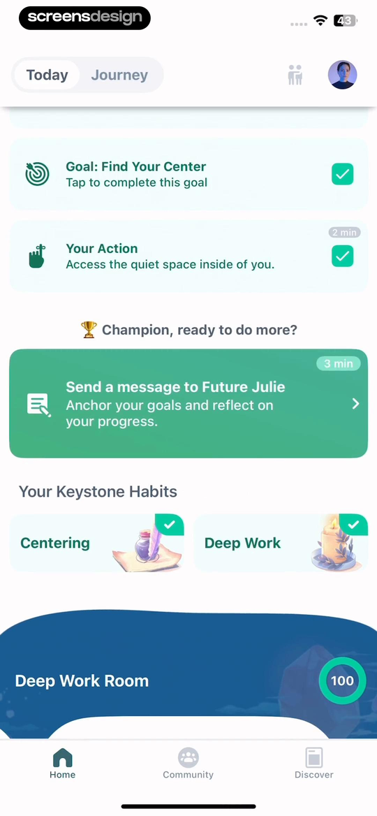
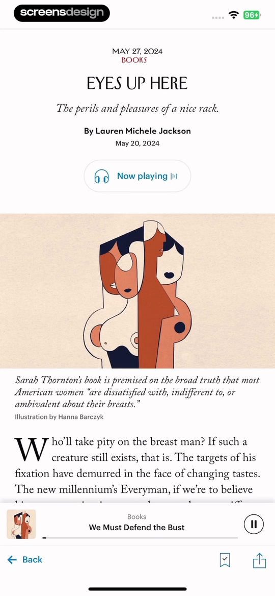
Clarify groups goals, an action prompt, habits, and a focus room into a daily dashboard. Matter establishes a staff pick, supporting article cards, and a persistent audio state. Both are home screens, but they should not enter the same board unless your question concerns prioritizing mixed content.
Composition and hierarchy
Read the screen before you borrow its visual style.
Composition determines how the interface spends attention. Map the reading order, dominant area, repeated modules, persistent controls, and deliberate empty space before discussing colors or decoration.
Sections make a busy day scan in layers.
Goals and actions appear before keystone habits, then the deep work room closes the page with a visually heavier card. The hierarchy reflects a sequence of daily attention.
One lead story turns a catalog into an editorial choice.
A large staff pick precedes smaller article cards. The audio player remains visible without competing with discovery, so active listening and future reading share one composition.
- Which element owns the largest visual mass?
- Where does scale change to create a new group?
- Which controls stay visible while content scrolls?
- What would break if the content doubled in length?
Typography and color
Study roles and relationships, not isolated style choices.
A typeface or accent color is not a system. Useful references show how several roles work together across content, interaction, navigation, feedback, and accessibility.
Separate editorial voice from reading utility.
The New Yorker uses publication date, category, headline, standfirst, byline, illustration credit, article copy, and a listening state in one visible hierarchy. Matter exposes a font selector with several reading and accessibility choices. Together they show that expressive type and adjustable reading preferences solve different parts of the experience.
Compare editorial interfaces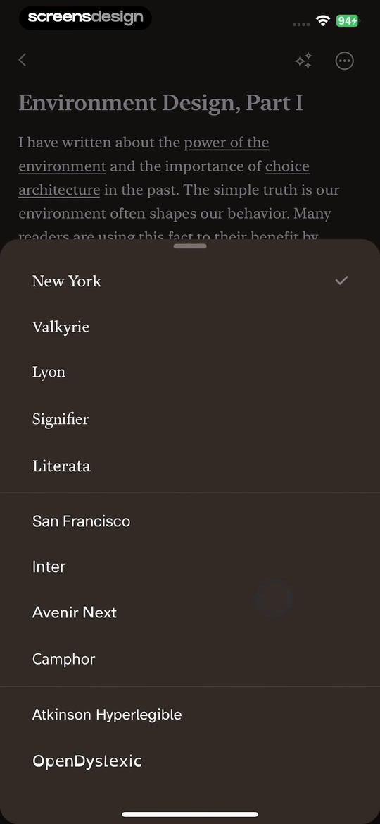
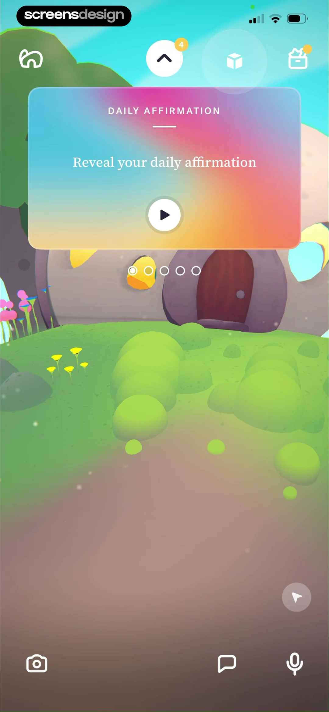
Tolan uses color to make the product feel like a place.
The illustrated environment carries personality, while the daily affirmation remains a distinct interactive card.
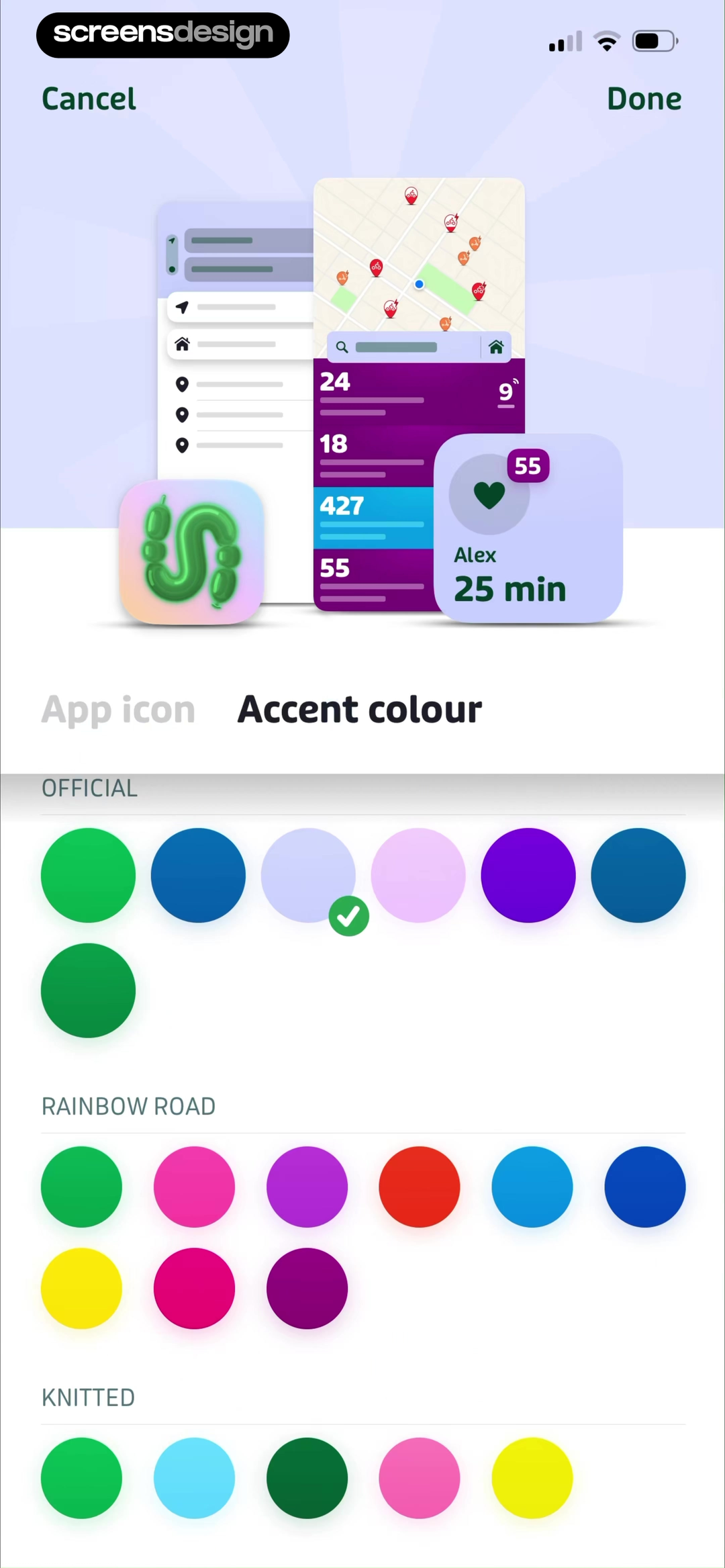
Transit previews accent color in context.
Swatches sit beside an interface preview, letting the user judge the color as part of navigation and content.
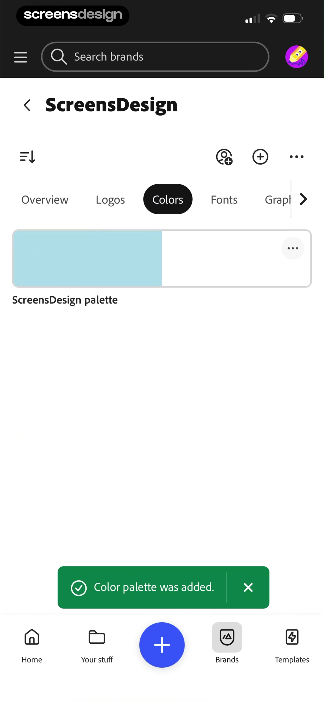
Adobe Express turns color into a named brand asset.
The palette belongs alongside logos, fonts, and graphics, while a success message confirms that it was added.
Components and states
Never save only the component’s prettiest state.
A component reference becomes useful when it shows how the same control communicates availability, selection, expansion, completion, failure, and recovery.
 Default
 Expanded
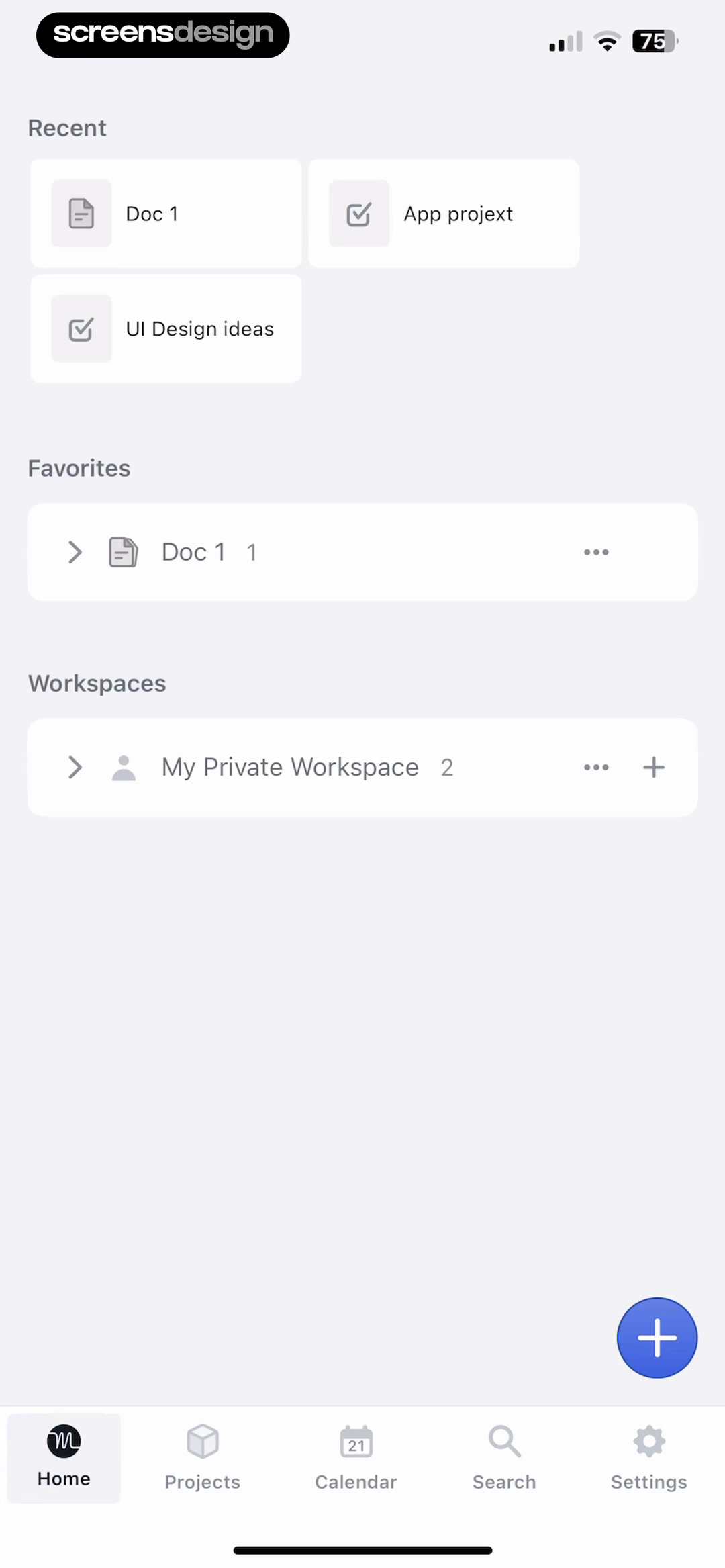
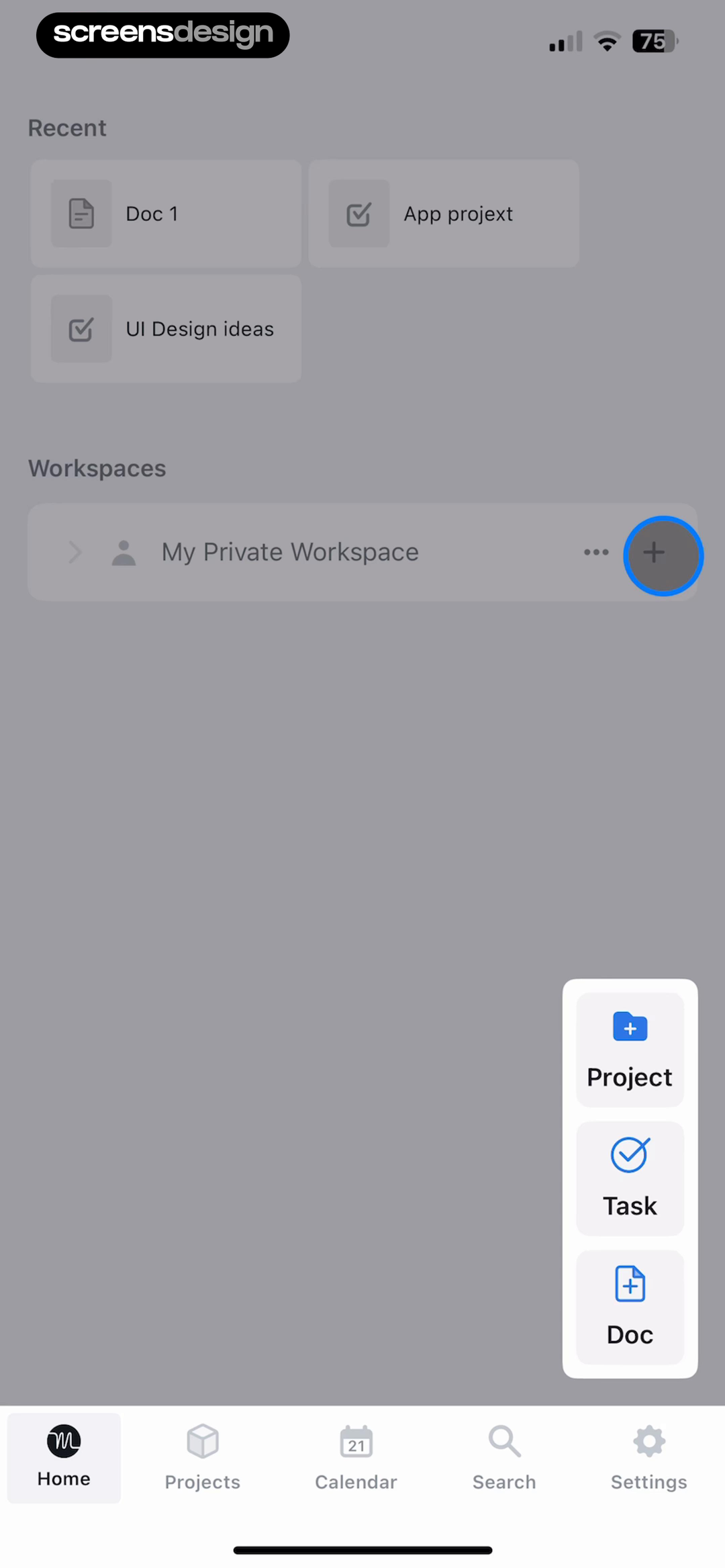
Motion preserves the home screen while creation expands.
The floating create action opens into Project, Task, and Doc options without replacing the surrounding context. The state change is easy to compare because the underlying layout remains stable.
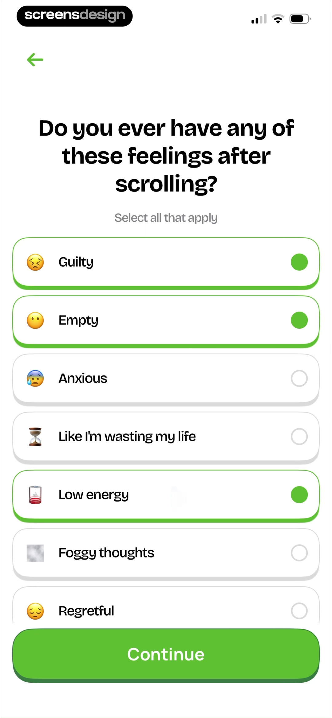
Open the recorded flowSelected options remain comparable to the full set.
Unrot changes border and indicator treatment while keeping every answer visible and the Continue action stable.
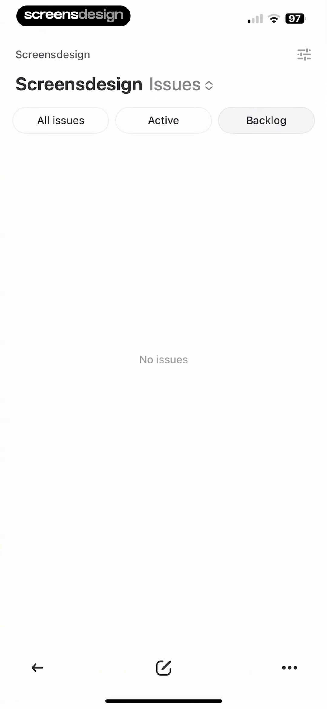
No content does not erase the interface.
Linear keeps project context, issue filters, and creation controls visible around the short “No issues” message.

The recovery action belongs to the visual system.
Unsplash keeps the Stats context, explains that the server is down, and offers one clear Retry action.
Find the missing state before you design it
Search comparable components, then inspect the recorded flow around each result with ScreensDesign Pro.
Motion cues in still frames
Look for the visual grammar that makes movement understandable.
A recorded still cannot prove timing or easing, but it can reveal the cues an interface uses to explain direction, progress, and what comes next. Open the full flow before documenting actual motion behavior.
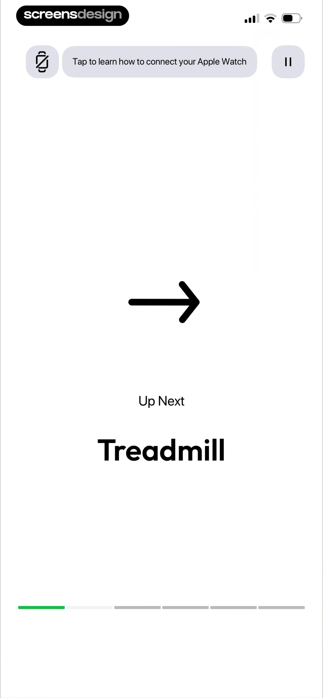
Zing AI makes the next exercise unmistakable.
A large directional arrow, “Up Next” label, exercise name, and segmented progress bar describe both destination and position inside the workout.
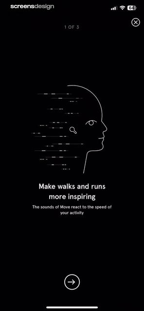
Endel draws speed into the illustration.
Trailing lines behind the profile visually support the copy about walking and running, while “1 of 3” and the forward control explain the sequence.
Translate into a system
Borrow the rule, then test it with different content density.
A reference is ready to use when you can state its transferable rule and prove that the rule survives your content, states, and platform constraints.
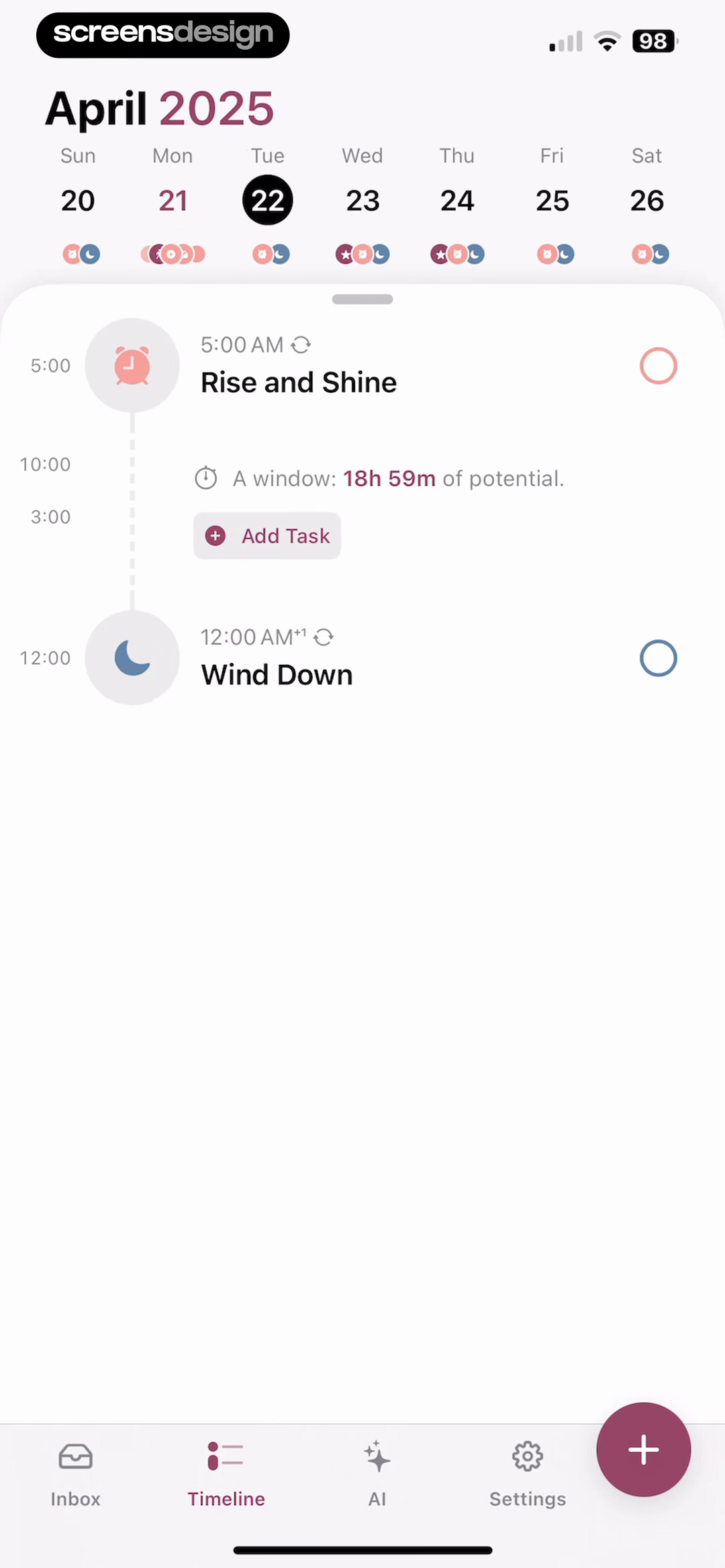
Structured keeps open time and busy time legible.
The sparse day uses the vertical timeline to frame two events and a long window of potential. The fuller day uses the same calendar, line, time markers, task nodes, checkboxes, and creation action for completed work, upcoming tasks, and setup prompts.
The transferable idea is not the exact colors or icons. It is the spatial model: time runs on one axis, each task attaches to that axis, and open space becomes useful information.
The mechanism
Reading order, grouping, state logic, component role, and the relationship between content and action.
The source expression
Brand assets, distinctive illustration, signature copy, exact layout, and visual tokens that belong to the source.
Your constraints
Real content length, localization, accessibility, platform conventions, empty data, errors, and compact screen sizes.
Search by visible pattern
Start the next inspiration board with a specific query.
Use the interface job, content type, component, or state in your query. Each card opens a semantic ScreensDesign search for more recorded examples.
Editorial hierarchy
Lead story, supporting content, reading controls, and long-form typography.
Search this patternExpressive product worlds
Illustration, depth, and personality organized around a usable primary action.
Search this patternSelected and unselected states
Cards, chips, controls, and buttons that reveal state without relying on color alone.
Search this patternEmpty and recovery states
Interfaces that preserve context, explain the condition, and offer a useful next action.
Search this patternA repeatable review method
Move from reference search to one original UI rule.
Keep the research traceable. A teammate should be able to see the question, compare the evidence, understand the observation, and review the translated result.
- 01
Name the interface decision.
Write the decision as a question, such as how to prioritize one action on a busy home screen. This keeps the search focused on a mechanism instead of an aesthetic adjective.
Output: one decision and its product constraint. 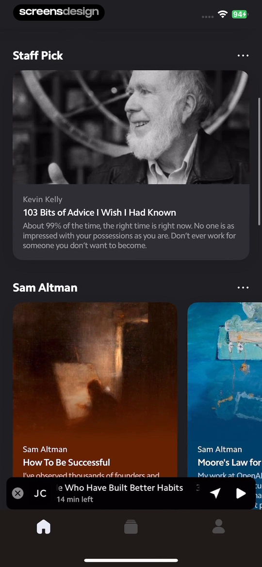 02
02Collect contrasting answers.
Keep references that solve the same problem differently. Two near-identical screens create confidence without creating useful comparison.
Output: three to five meaningfully different approaches.- 03
Annotate the visible mechanism.
Mark reading order, scale changes, spacing groups, color roles, interaction states, and content density. Describe what creates the effect before judging whether you like it.
Output: observations that another designer can verify. - 04
Open the neighboring state.
Check what happens when the control expands, content disappears, data fails, or the user completes an action. A good reference should explain more than its default state.
Output: the state change and the rule that stays stable. 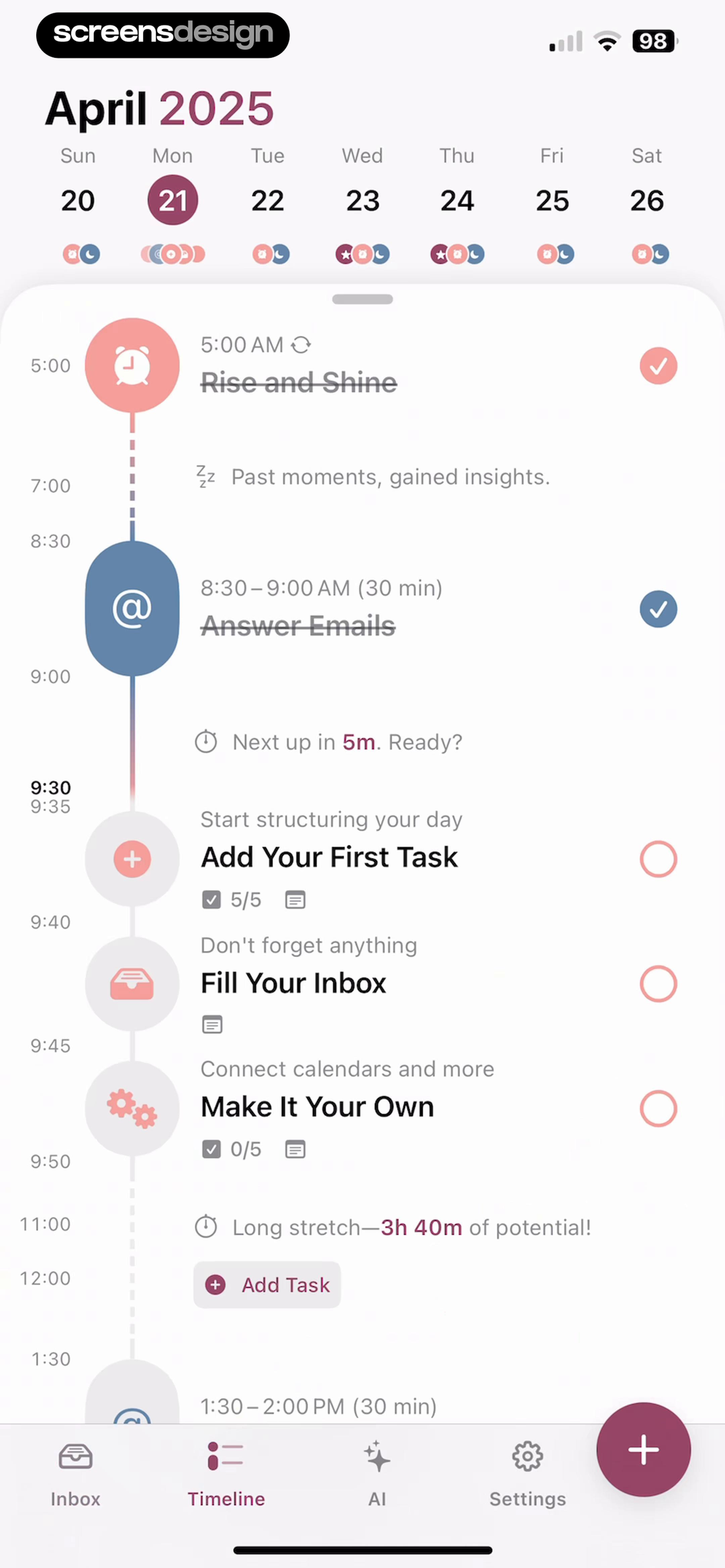 05
05Rebuild the rule with your content.
Use your information model, components, tokens, and accessibility requirements. If the idea only works with the source product's copy or imagery, it has not been translated yet.
Output: one original screen and its reusable system rule.
Research with the screen you are building
Ask the library for alternatives, edge states, and complete flows instead of starting from an empty canvas.
Before you start designing
Review every UI inspiration board with this checklist.
The board answers one clearly named interface decision.
References solve the same job through different mechanisms.
Every screen links to the exact recorded product evidence.
Notes separate visible observations from assumptions.
Typography is described through roles and reading order.
Color is mapped to content, action, status, and feedback roles.
The set includes default, changed, empty, and failure states.
Motion claims are checked against a recorded sequence or flow.
The translated design uses your content and system tokens.
The final rule survives realistic density and accessibility checks.
Continue with the broader app design inspiration process, study implementation in the mobile app UI design guide, or browse specific screen types in the app screens guide.
Frequently asked questions
Questions about UI design inspiration.
What is UI design inspiration?
UI design inspiration is a researched set of interface references used to understand hierarchy, typography, color, components, states, interaction cues, and visual-system decisions. Useful inspiration helps a team explain and test a design rule, rather than merely collecting attractive screenshots.
Where can I find UI design inspiration for mobile apps?
Search recorded product screens by task, component, state, and category. Recorded interfaces are especially useful because you can inspect what happens before and after the screenshot instead of judging an isolated marketing mockup.
How many references should a UI inspiration board include?
For one design decision, three to five contrasting references are usually enough. A board for an entire product may contain more, but each group should answer a named question. Remove duplicates that do not add a different mechanism or constraint.
How do you use UI inspiration without copying?
Describe the underlying rule, then rebuild it with your own content model, component library, platform conventions, accessibility requirements, and brand tokens. Avoid copying distinctive illustrations, exact layouts, signature interactions, or brand assets.
Should UI inspiration include empty and error states?
Yes. Default screens hide many design decisions. Empty, loading, selected, disabled, success, and error states show whether the interface system communicates status and recovery clearly.
What should I annotate on a UI reference?
Annotate the screen's primary job, reading order, dominant action, spacing groups, type roles, color roles, component states, navigation model, content density, and the change that occurs in the next state. Keep observations separate from assumptions about performance.
2,622 apps in the top charts.Ask them anything.
Search the exact interface decision you are working on, compare real states and flows, and turn stronger references into an original visual system.