Mobile app paywall research
16 Mobile App Paywall Design Examples for 2026
Sixteen recorded paywall screens show how subscription apps frame value, organize plans, explain trials, use proof, and respond when someone dismisses the first offer.
A mobile app paywall has a narrow job under difficult conditions. It must connect a paid plan to the task the person was trying to complete, make the cost understandable, and support an informed choice. Decoration cannot repair a weak offer or unclear billing.
The examples below come from recorded in-app experiences, not App Store listing creatives. Each image links to its exact replay moment, keeping the observations tied to visible evidence and making the surrounding sequence available for inspection.
This article concentrates on subscription decisions. For the broader visual system around them, use the mobile app UI design guide. For the path that often leads to a paywall, see the app onboarding screens guide.
For the tailored plans and evidence that often lead into an offer, read the personalized app onboarding review.
01. Timing
Show the paywall when the paid outcome is concrete.
The screen before the offer determines whether the subscription feels like a useful next step or an interruption.
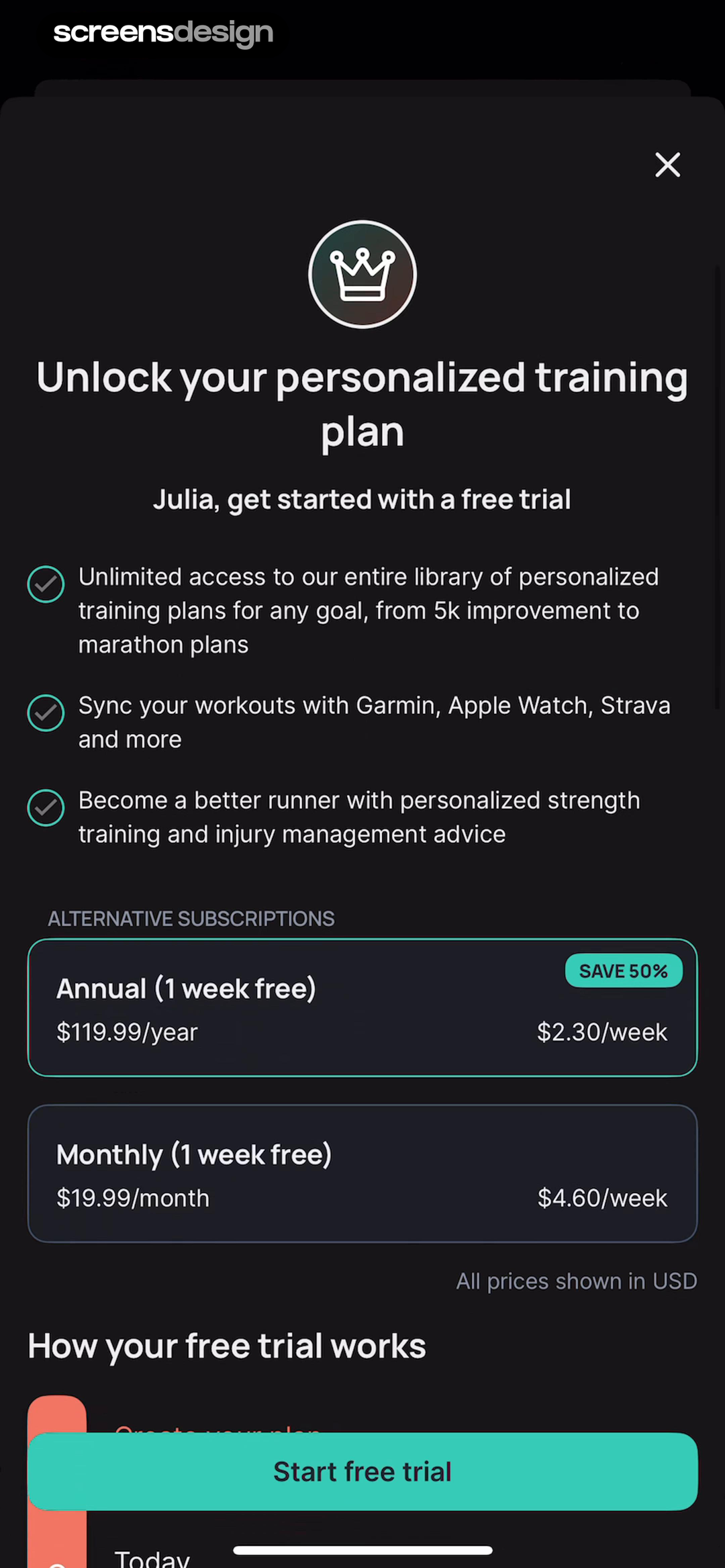
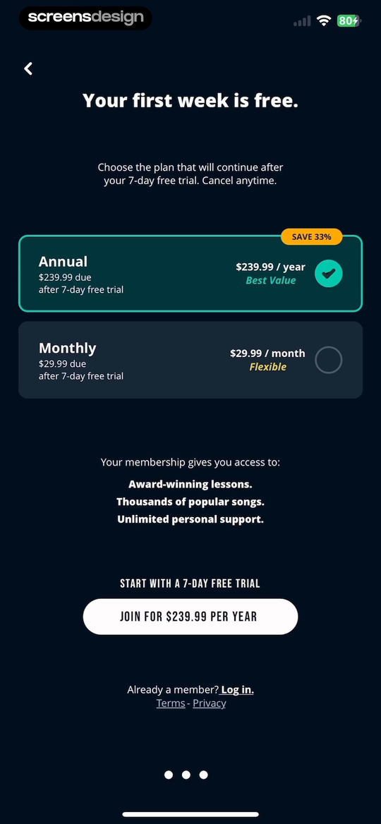
Runna names the personalized training plan and repeats the person's name before listing plan access, device syncing, and strength guidance. Musora arrives after account creation and ties membership to lessons, songs, and support. In both recorded flows, the product category and the promised access are clear when price appears.
That context matters more than a universal rule such as showing a paywall on the third screen. An onboarding offer can follow a legible personalized plan. A feature-triggered offer can follow a real limit. A cold launch offer has more explanatory work to do.
Map the entry point alongside the complete setup journey. The onboarding screen patterns are useful for checking whether preference questions, results, and the offer form one coherent sequence.
The outcome is still abstract
Move the offer later or make the preceding value explanation more specific.
The next step is understood
The person can connect payment to the plan, feature, content, or capacity they were trying to use.
02. Information hierarchy
Make value, commitment, and action readable in that order.
A paywall can contain a lot of information without making every element equally loud.
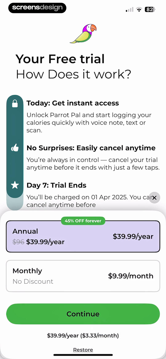
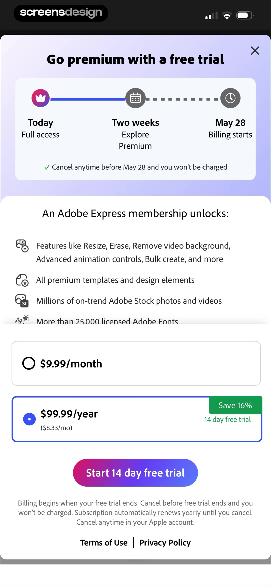
ParrotPal puts the trial mechanism and cancellation reassurance above annual and monthly prices. Adobe Express starts with the trial timeline, follows with a detailed premium feature list, and then presents monthly and yearly billing. Both screens establish the offer before asking for the tap.
The useful hierarchy is not always headline, benefits, price, button. It depends on the uncertainty at this moment. If the person already hit a usage limit, a concise limit comparison may be enough. A trial gives billing dates more importance, while materially different plans give selection more importance.
Check the page at a glance and at reading speed. At a glance, the paid outcome, selected plan, and primary action should be obvious. At reading speed, full price, trial, renewal, restore, and terms should remain available. A sticky button must not cover its billing consequence.
03. Plan architecture
Offer enough choice to clarify the product, not obscure it.
The number of plans is a product decision before it becomes a card layout decision.
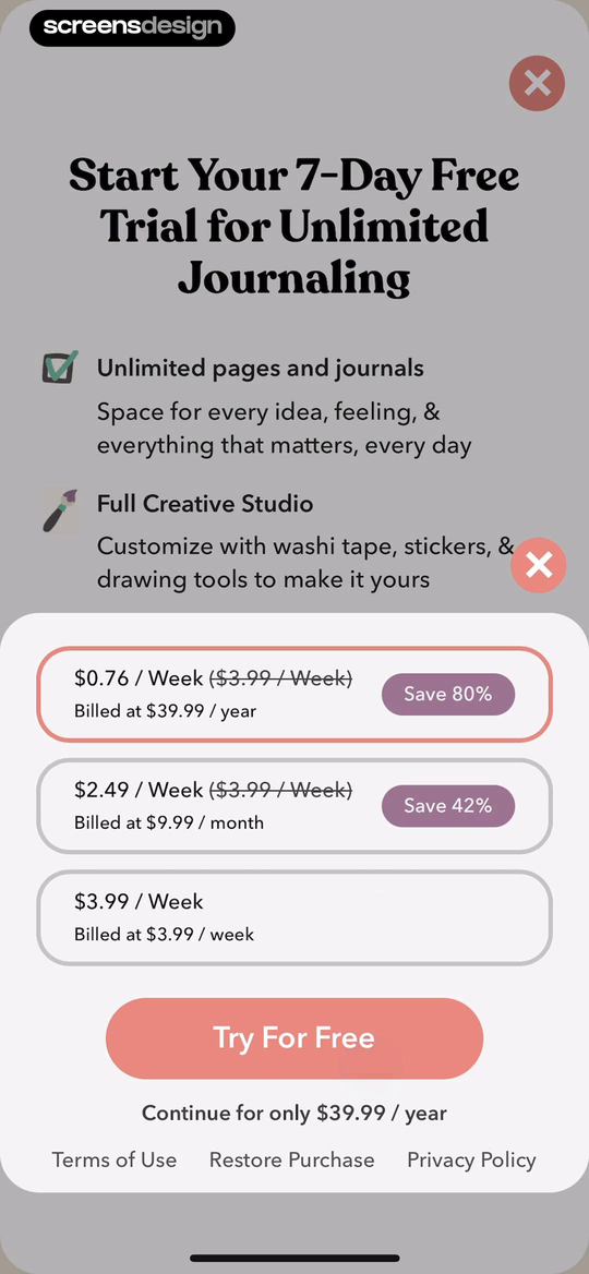
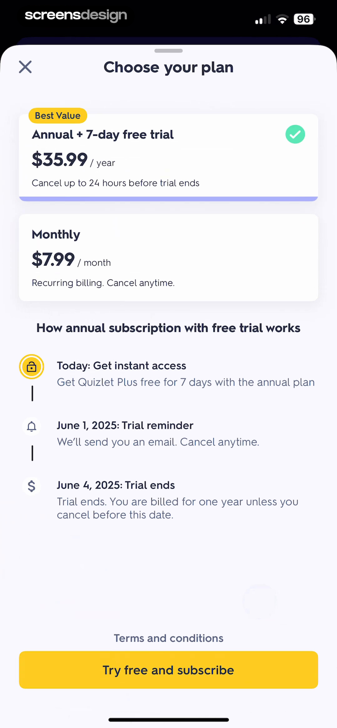
Zinnia exposes yearly, monthly, and weekly options together, with the recurring total beside the normalized weekly price. Quizlet uses a simpler annual versus monthly choice and reserves the trial for the annual plan. These designs describe different offer structures, so copying the visual pattern without the pricing logic would be misleading.
Normalize prices only as supporting information. A weekly equivalent helps compare billing periods, but the full amount and billing cadence should remain visually adjacent. Savings badges need a clear baseline. A default must not make other choices look disabled.
More choices can serve people with different commitment levels, but every option adds comparison work. If several periods unlock the same product, ask whether each is necessary. When tiers differ by limits, compare capabilities instead of adding price cards.
Reduce comparison
Use when the product has one intentional package and the commitment is already understood.
Compare commitment
Monthly and annual plans can express flexibility versus savings without a complex matrix.
Expose meaningful ranges
Add a third period only when it serves a real audience or purchase behavior.
Compare capability
Use limits and feature access when price alone cannot explain why an upgrade matters.
04. Trial clarity
Explain the trial as a dated sequence, not a free button.
A trial creates at least three states: access now, a possible reminder, and paid renewal.
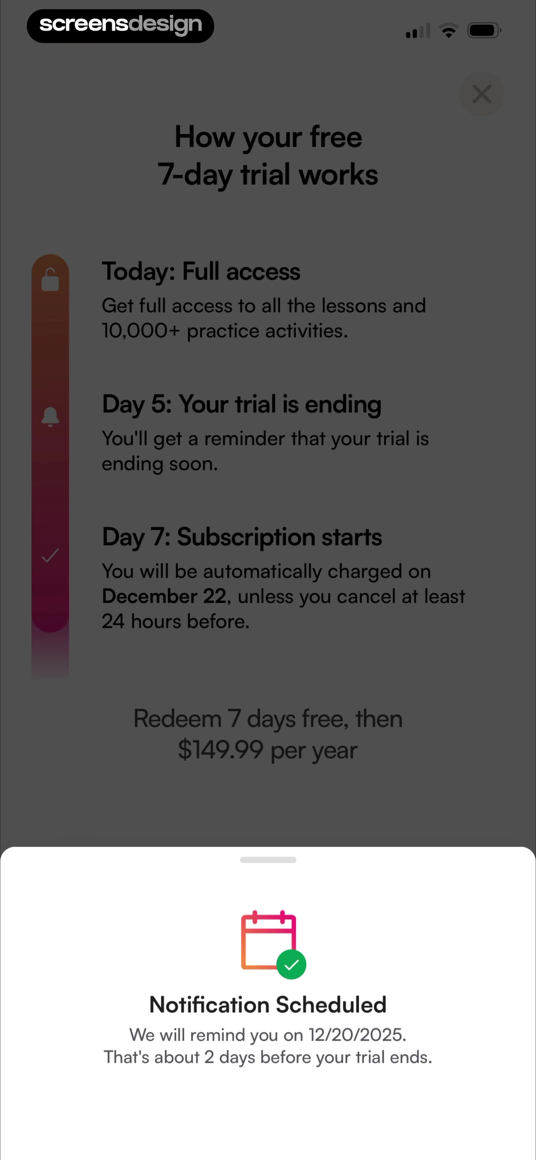
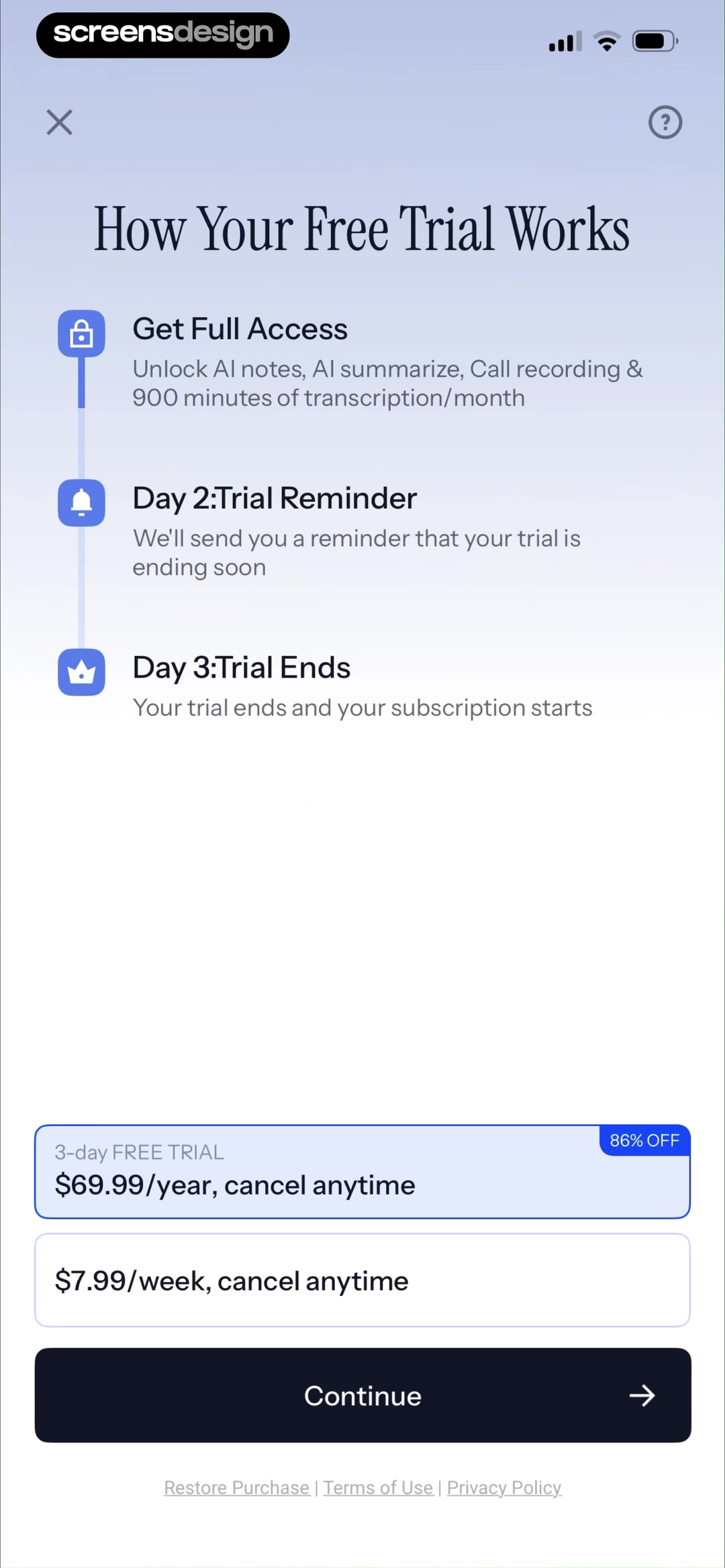
BoldVoice makes the seven-day sequence visible and shows a confirmation after scheduling the reminder. Owll combines a three-day trial timeline with annual and weekly choices, including the point when the subscription starts. Both screens treat the future charge as part of the main interface.
Write trial copy with calendar precision whenever possible. “Day 7” requires mental arithmetic, while a date reduces ambiguity. State whether cancellation must happen before a specific cutoff. Explain whether a reminder is a notification, email, or calendar event, and account for missing permission.
The action label should match the selected option. “Start seven-day free trial” is more informative than “Continue.” If a plan has no trial, its button and billing sentence should update immediately. Keep restore, terms, privacy, and dismissal reachable.
- Name the exact trial length and eligible plan.
- State what access begins today.
- Show the renewal date and full recurring amount.
- Explain the cancellation cutoff in plain language.
- Keep reminder behavior accurate when notifications are denied.
05. Proof and comparison
Use proof to answer doubt, not fill empty space.
Testimonials, ratings, and comparison tables are useful only when they clarify a believable question about the paid product.
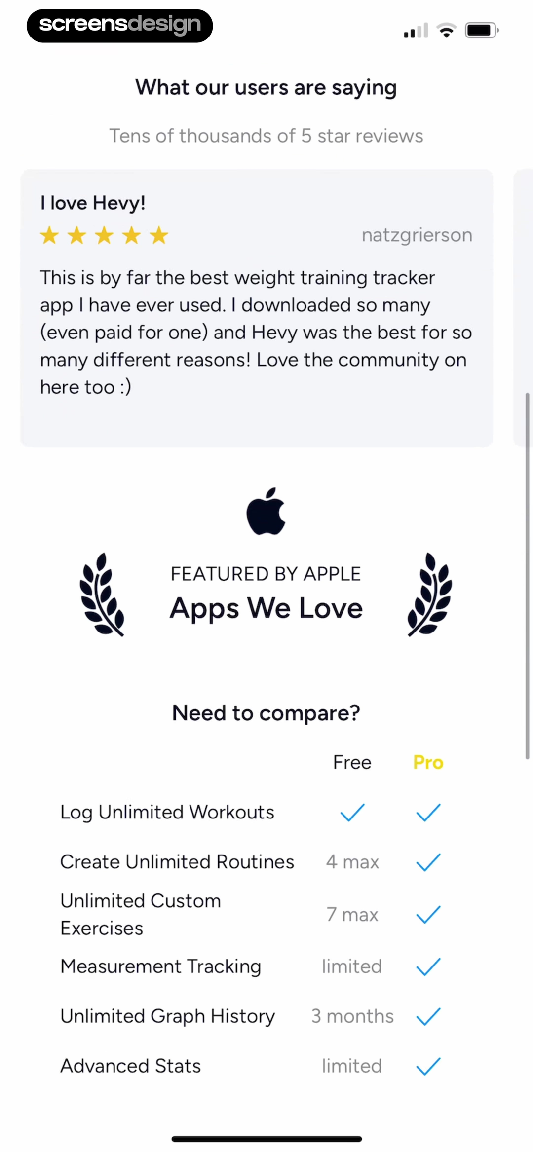
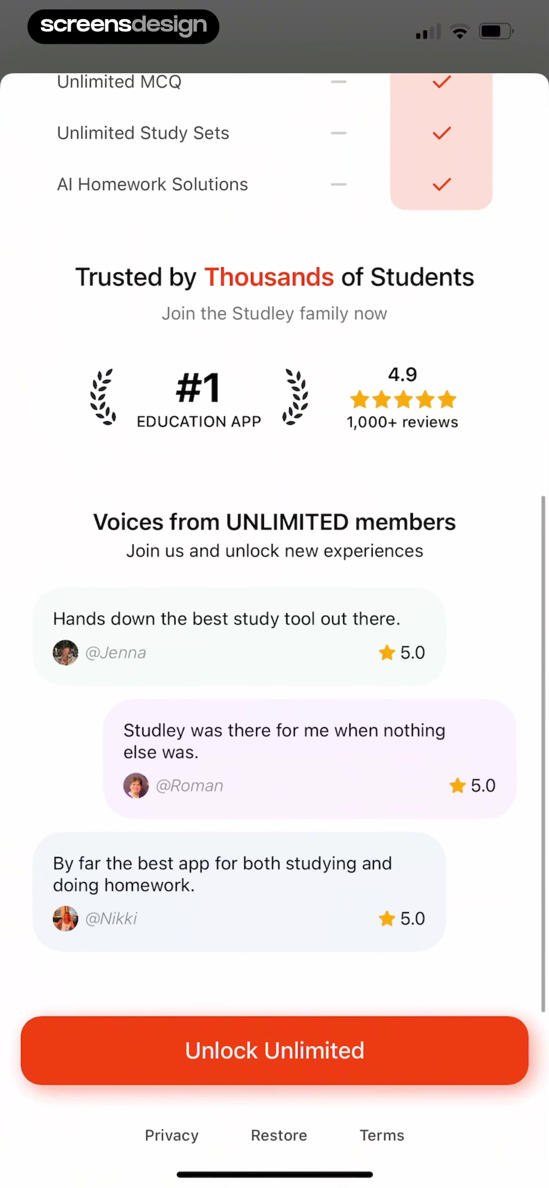
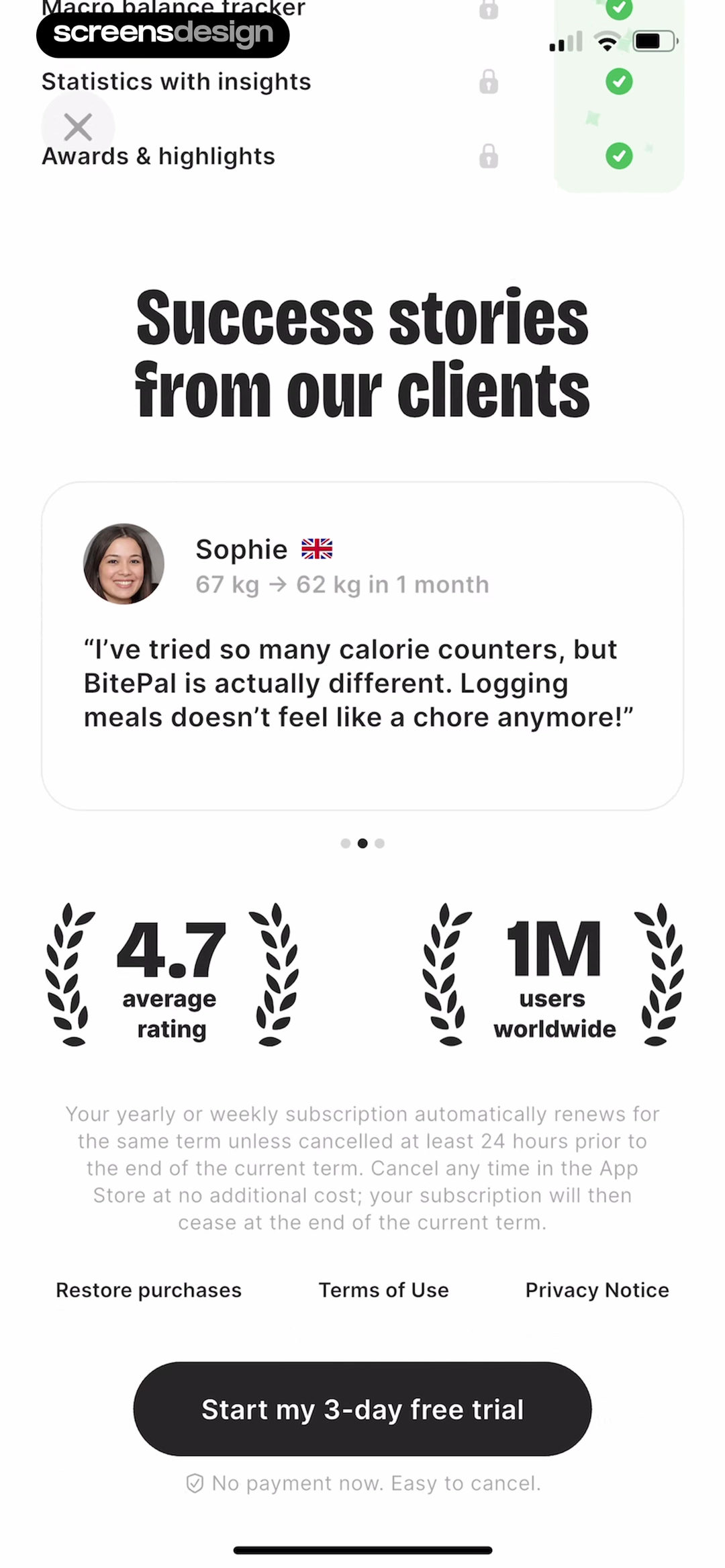
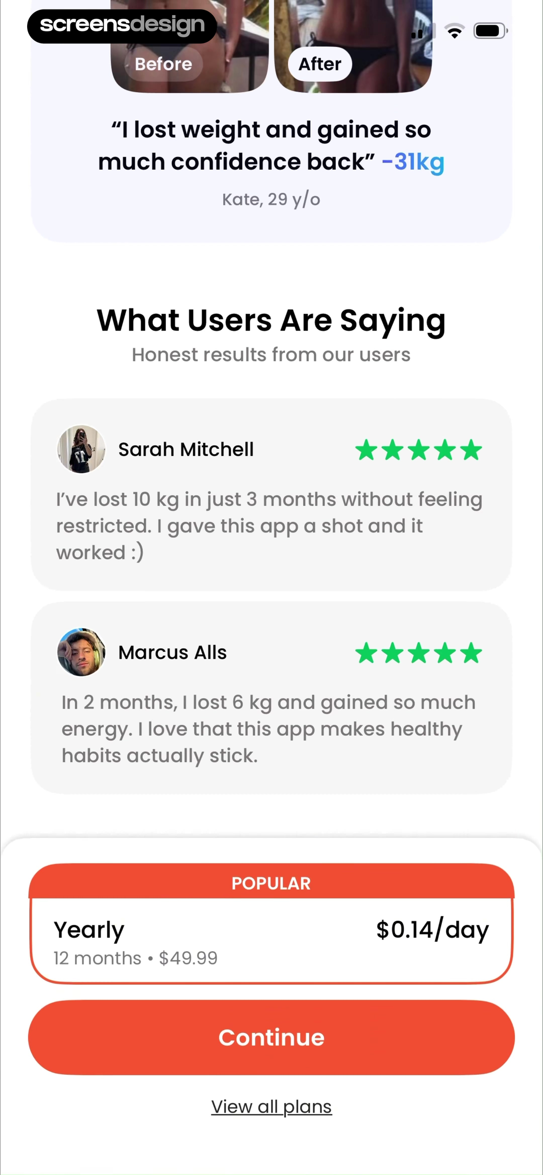
Hevy uses a free-versus-Pro table to make limits visible, then supports it with a review and an editorial recognition claim. Studley combines unlimited study features with ratings and member quotes. BitePal and Fasting App use outcome stories. Each form of proof answers a different question.
A feature comparison answers “what changes?” A review may answer “does this fit someone like me?” A before-and-after story attempts to answer “what result is possible?” Outcomes vary, so a selected story must not read like a typical or guaranteed result.
Proof must also be legible and attributable. Do not invent star counts, press marks, scarcity, or quotations. Keep the source and scope near the claim. Without credible evidence, use a product preview or transparent limit comparison.
06. Offer sequences
Treat the dismissal offer as part of the same promise.
A second paywall can change price, but it also changes what the person believes about the first price.
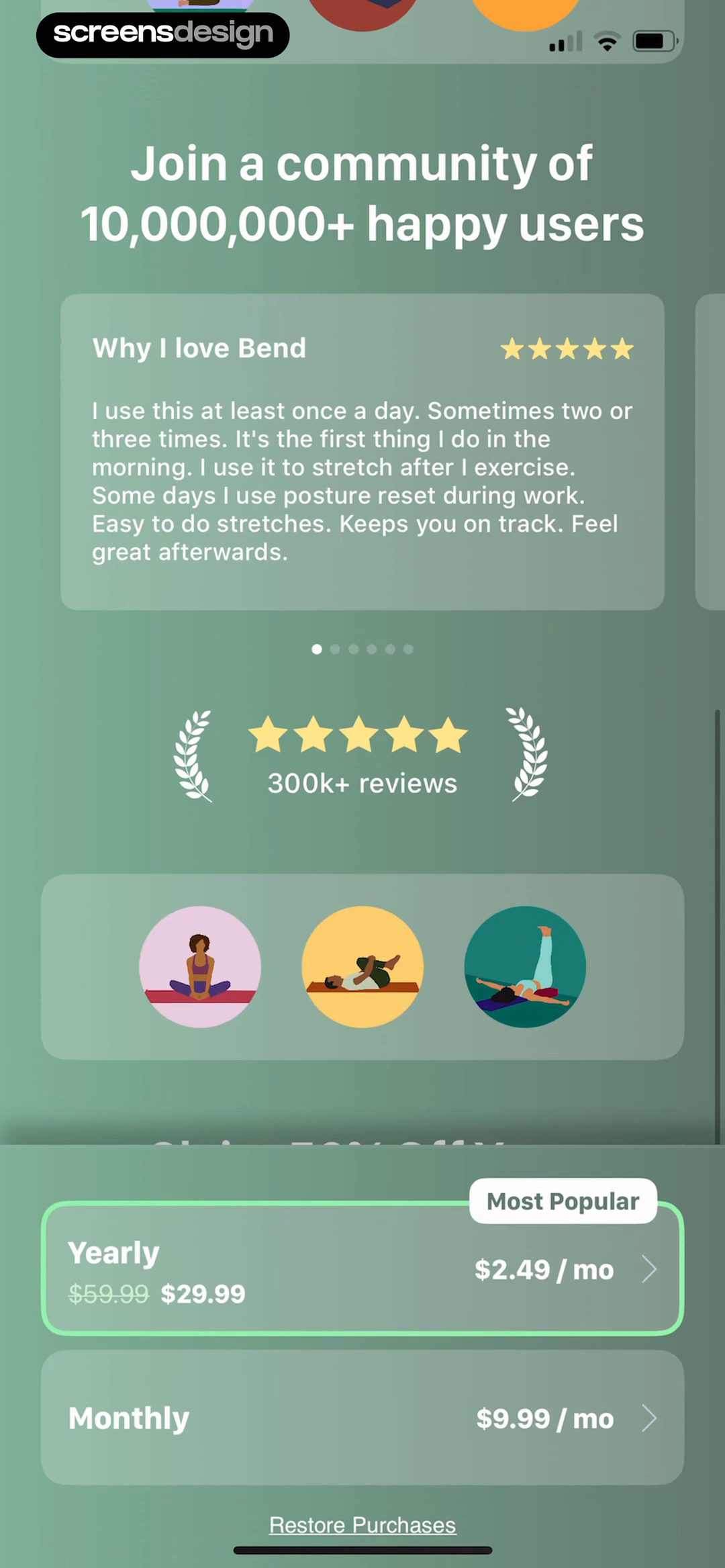
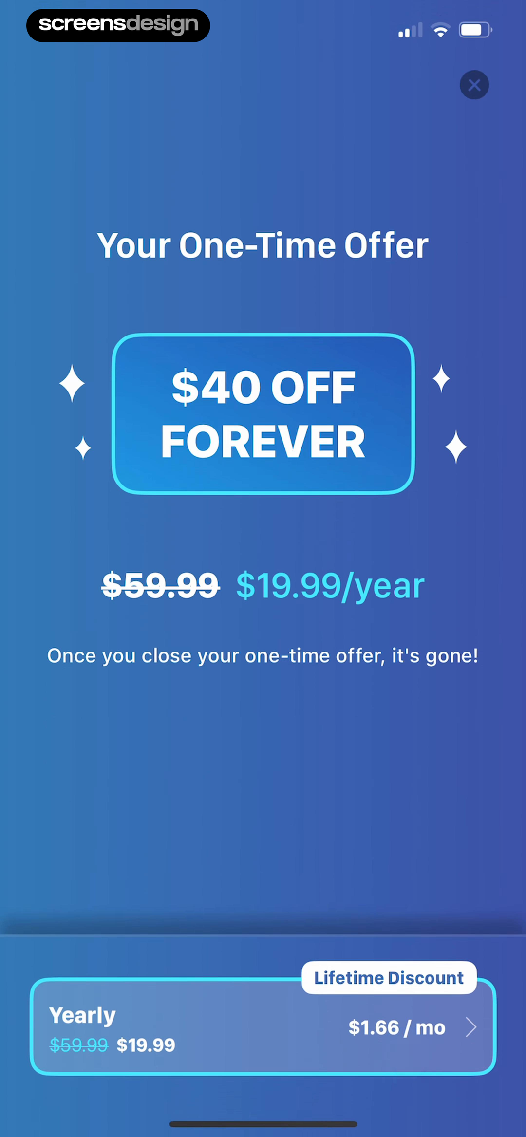
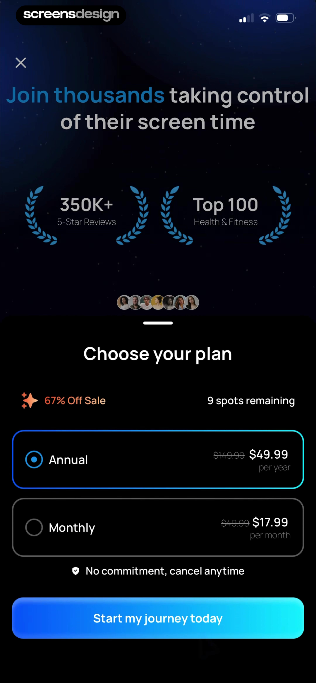
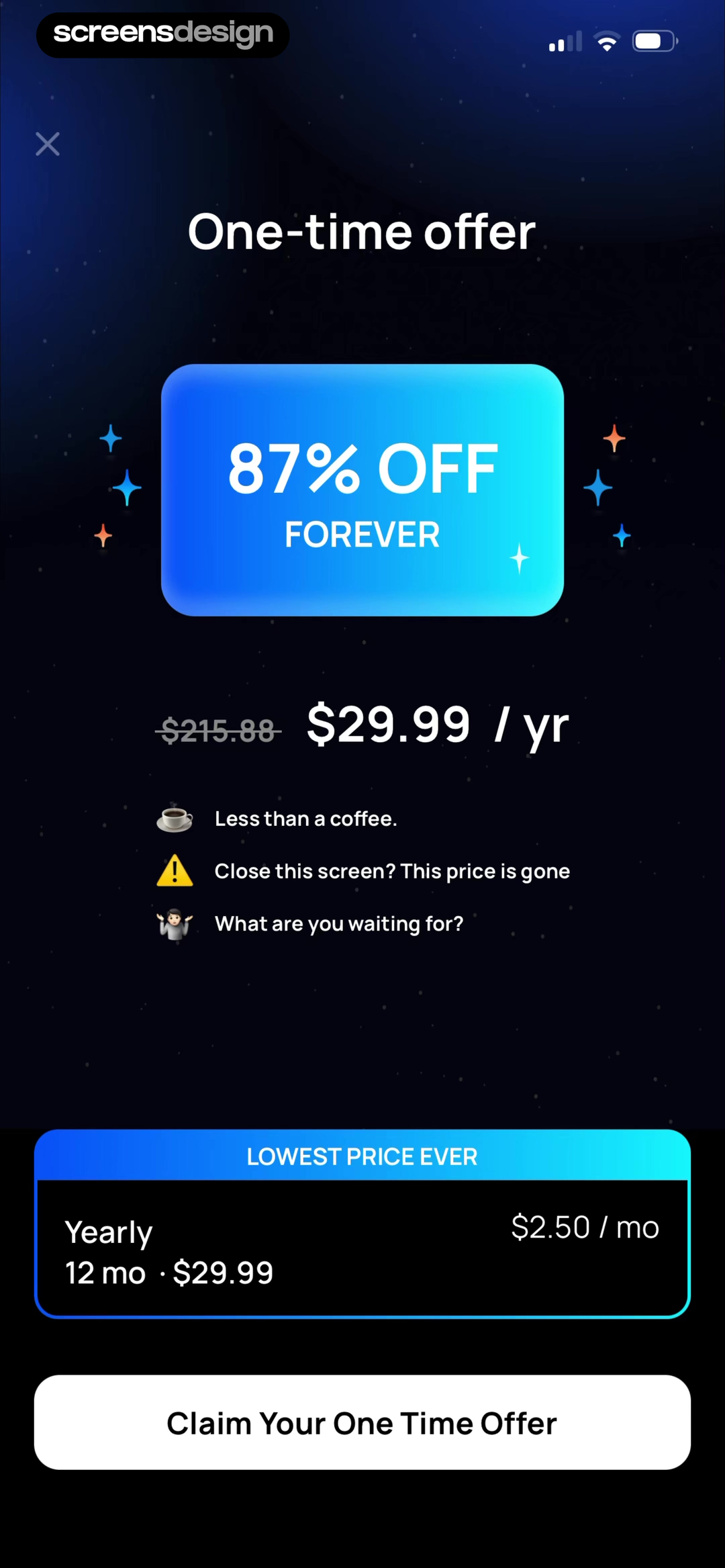
The recorded Bend sequence first shows a yearly plan at $29.99 and monthly access at $9.99. After dismissal, it presents $19.99 per year as $40 off forever. Pushscroll moves from annual and monthly options to a $29.99 yearly forever discount.
These screens demonstrate a common sequence, not evidence that the sequence performs well. A lower follow-up price can teach people to close the first offer. Scarcity and disappearing prices require truthful rules.
Before shipping a dismissal offer, define eligibility, duration, renewal, and return behavior. Confirm that the App Store product matches the display and that any countdown has a real deadline.
The respectful alternative is not necessarily removing discounts. It is making pricing consistent enough to explain. A retention offer or annual promotion can be clear when eligibility and renewal are explicit. The second screen should resolve one objection without contradicting the first.
Set a credible reference
The primary price, value, and billing terms must stand alone.
Respect the exit
Do not use repeated modals or hide free access.
Resolve one objection
Change the offer for a defined reason and state renewal.
Keep the rule consistent
An expiring offer should not reset or conflict with later prices.
07. Review process
Review the subscription decision in context.
A polished paywall can still fail basic product, billing, accessibility, and recovery checks.
Begin with a plain-language offer statement: what becomes available, which plan is selected, what happens today, and what will be charged later. Compare it with every headline, button, price card, and legal line. Any contradiction is a content bug.
Then test the full state model. Enter from onboarding and from a locked feature. Change plans, dismiss the screen, reopen it, start a purchase, cancel it, restore access, lose connectivity, expire a trial, and return as a subscriber. Check large text, screen reader order, contrast, reduced motion, and keyboard behavior.
Finally, compare the paywall with the rest of the mobile interface design system. Plan selection, close controls, loading states, and purchase feedback should feel native. Use the checklist in review, then inspect complete flows instead of isolated screens.
- The paid outcome matches the task that led to the paywall.
- The selected plan, billing period, and full recurring price are visible together.
- Savings have a truthful comparison price and period.
- Trial length, charge date, renewal, and cancellation cutoff are written in plain language.
- The primary button describes the selected purchase or trial.
- Dismiss, restore, terms, and privacy remain reachable.
- Testimonials and outcome claims have a defensible source and do not imply guaranteed results.
- Large text and screen reader order preserve plan and price relationships.
- Loading, purchase cancellation, failure, expiry, and restored-access states provide a clear next step.
- A follow-up discount has real eligibility, duration, and renewal rules.
Can someone explain the offer after one careful read?
If the answer depends on hidden terms, mental price conversion, or guessing what the button will do, revise the offer before adding more persuasion.
Questions and answers
Mobile app paywall design questions
What should a mobile app paywall include?
Include the paid outcome, selected plan, billing period, full price, renewal, a precise action, restore access, terms, and privacy. Add proof only when it answers a real objection.
When should an app show its paywall?
Show it when the user can connect payment to a concrete plan, feature, content, or usage limit. The moment depends on the journey, not a fixed onboarding step.
How many subscription plans should a paywall show?
Use the smallest set that represents meaningful choices. One plan reduces comparison, two can separate flexibility from savings, and three need a clear reason.
How should a free trial be explained?
State what starts today, the trial length, the plan that renews, the charge date, recurring amount, and cancellation cutoff. Describe reminders accurately.
Are testimonials effective on app paywalls?
They can answer fit and trust questions when they are authentic and specific. They should not replace product explanation or present unusual outcomes as typical.
Should an app show a discount after dismissal?
Only when the offer has eligibility, duration, comparison pricing, and renewal. Review how the lower price changes the first offer and respect the attempt to exit.
Apps referenced in this page
Open the products behind the examples.
 Runna5k to Marathon Training
 MusoraDrums, Guitar, Piano & Singing
 ParrotPalLose weight with easy food log
 Adobe ExpressGraphic Design, All In-One App
 ZinniaNotebook & Creative Diary
 QuizletWalk into every test ready
 BoldVoiceSpeak English, Pronunciation
 OwllRecord, Transcribe Voice Notes
 HevyWeight Lifting Routine Planner
 StudleyAI flashcards, notes & quizzes
 BitePalAI Scan Meals & Easy Tracking
 Fasting AppIntermittent Fasting Timer
 BendDaily Yoga, Stretch & Mobility
 PushscrollWorkout to Earn Screen Time
2,622 apps in the top charts.Ask them anything.
Search recorded mobile app paywalls, open their complete flows, and ask ScreensDesign Pro how products handle your subscription decision.