Evidence from 13 recorded apps
16 Personalized App Onboarding Examples That Show What Answers Change
Sixteen recorded screens show how apps ask for useful context, expose the consequence of an answer, and preserve choice when a recommendation does not fit.
Personalized onboarding is a sequence, not a quiz theme. The product asks for a signal, uses it to change a route or recommendation, and shows the user what changed. If the last part is missing, a polished questionnaire may collect profile data without improving the first session.
This review focuses on six practical decisions: which goals deserve a question, when to profile progressively, how defaults and branches stay reversible, how to explain sensitive data, what a credible personalized result contains, and where a paid boundary belongs. The examples are recorded product interfaces, not App Store listing creatives.
Use the: app onboarding screens guide to map the complete first-session journey, and the: mobile app design guide to review hierarchy, navigation, and interaction choices beyond onboarding.
For the broader 2026 sample and its first-session decision chain, read the app onboarding trends review.
01. Questions with consequences
Ask about the decision the product needs to make next.
A useful onboarding question separates real first-session paths instead of merely describing the audience.
Quizard asks whether the user wants understanding, speed, or a way to check work. Go Viral asks whether recommendations should focus on reach, engagement, audience loyalty, or brand opportunities, and says that insights will match the selected goal. These choices describe competing jobs, not broad personality labels.
WoodSense asks which tools the person can access, from no tools through a professional setup. That signal could constrain which projects and instructions are safe or practical. It is more actionable than asking whether someone is a beginner without defining what beginner means in the product.
Before keeping a question, write the exact interface change beside every answer. If two answers lead to the same first screen, copy, and default, combine them or ask later. Include an Other, Not sure, or editable path when a fixed list cannot represent everyone accurately.
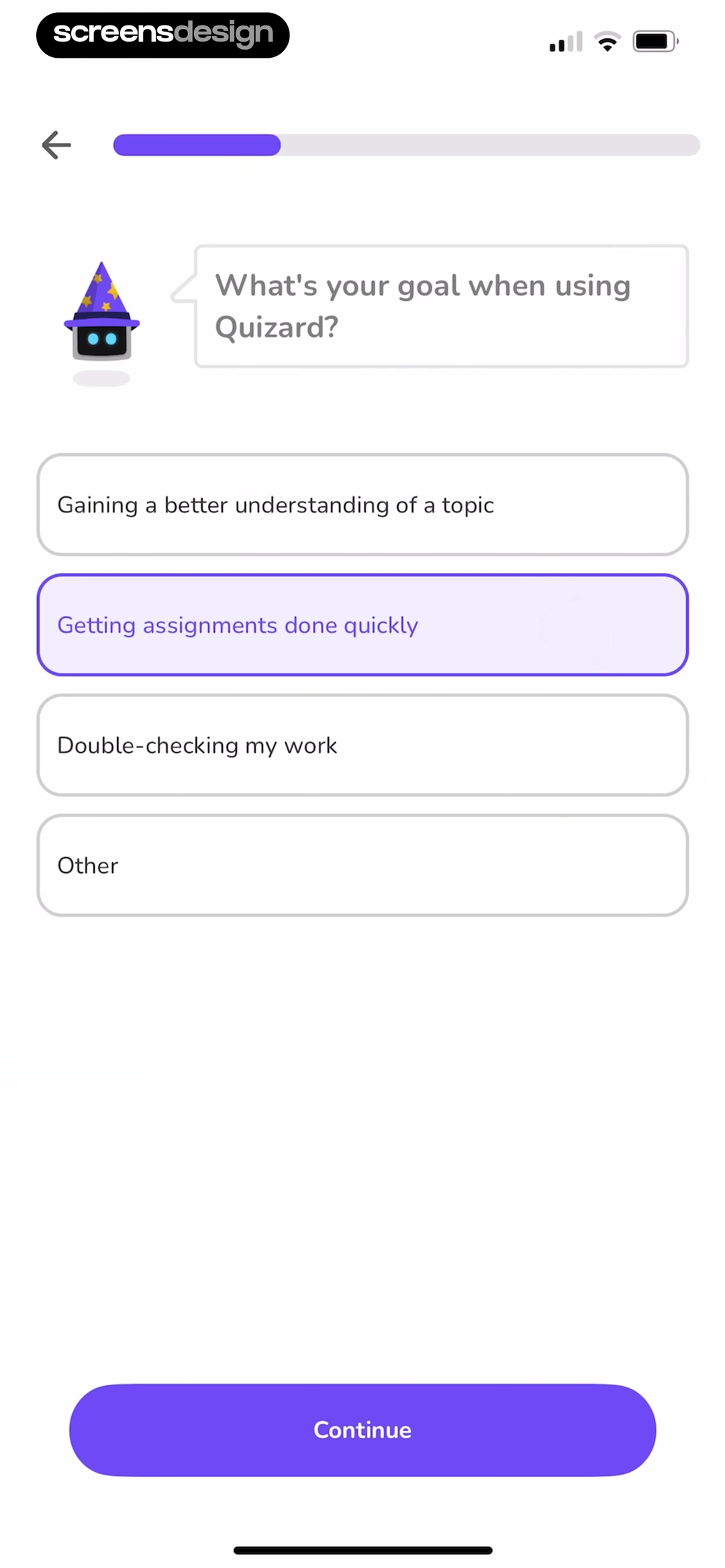
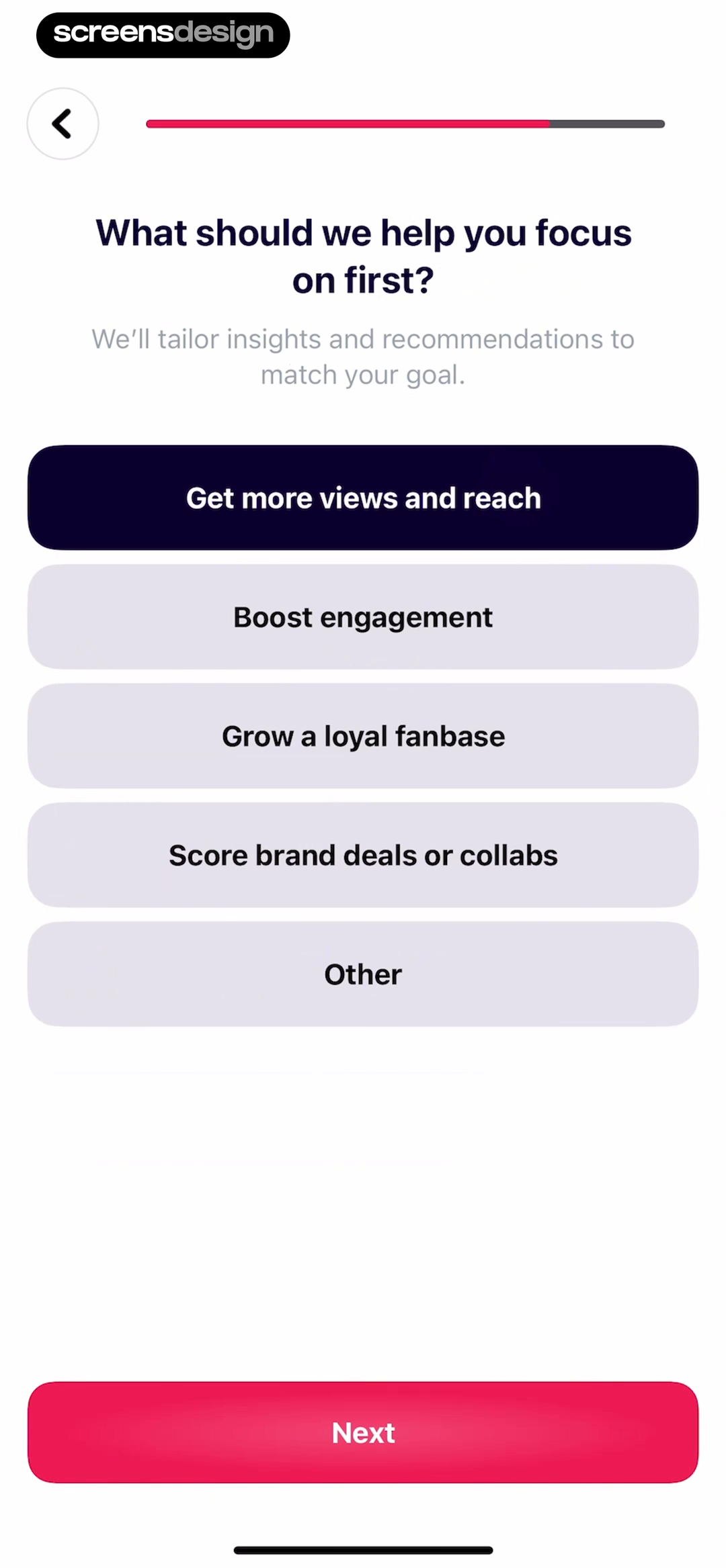
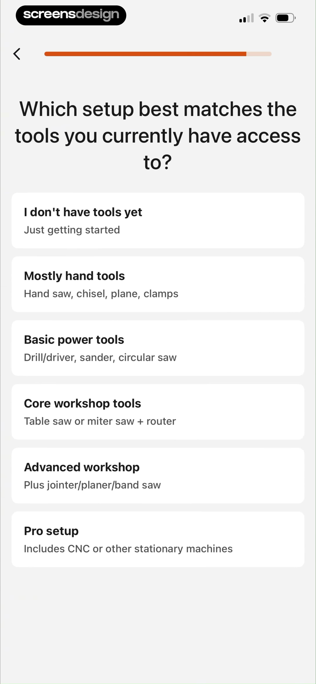
Name the downstream change before asking.
A question is earned when the team can point to the content, order, default, safety constraint, or saved preference that will be different.
02. Progressive profiling
Move from a broad goal to details that refine the same result.
A sequence feels coherent when each additional answer narrows a plan the user already understands.
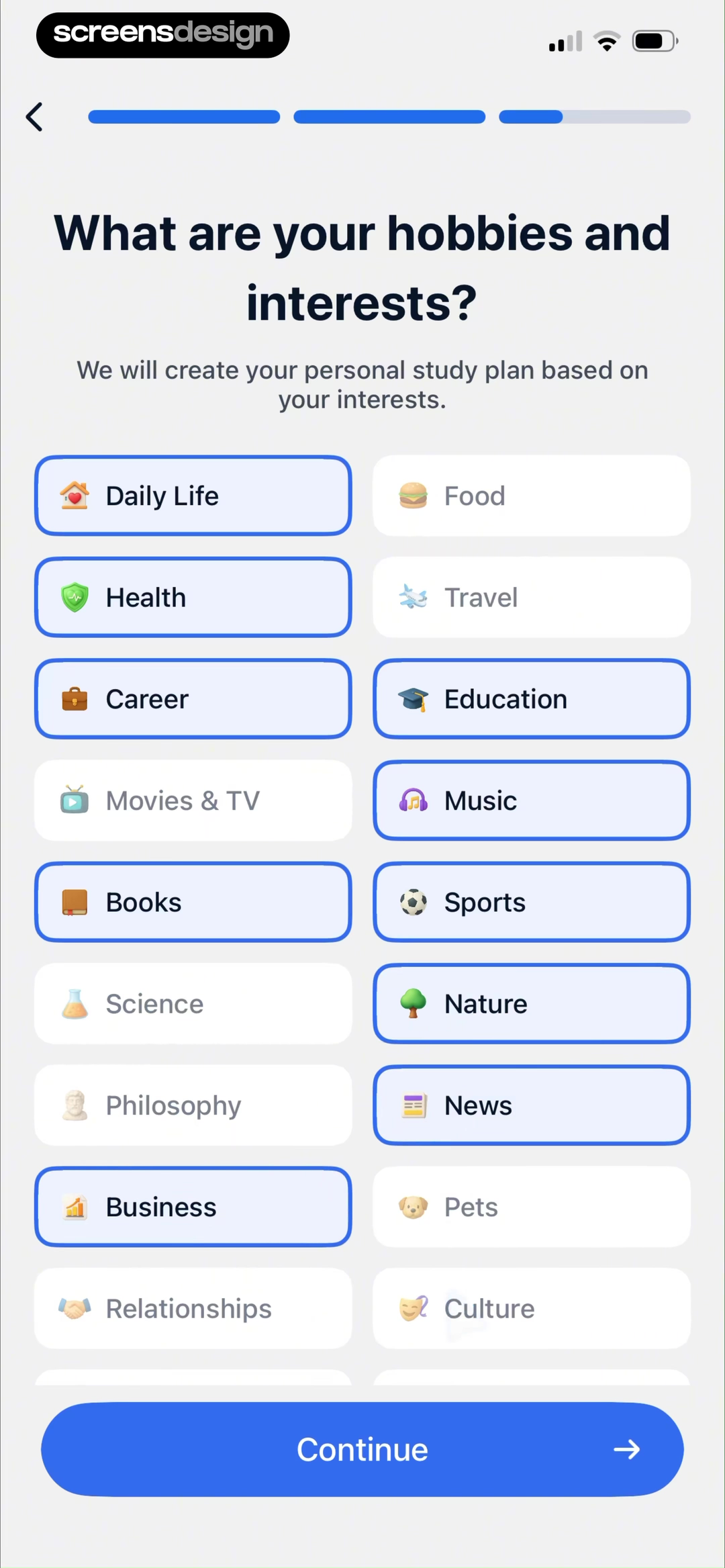
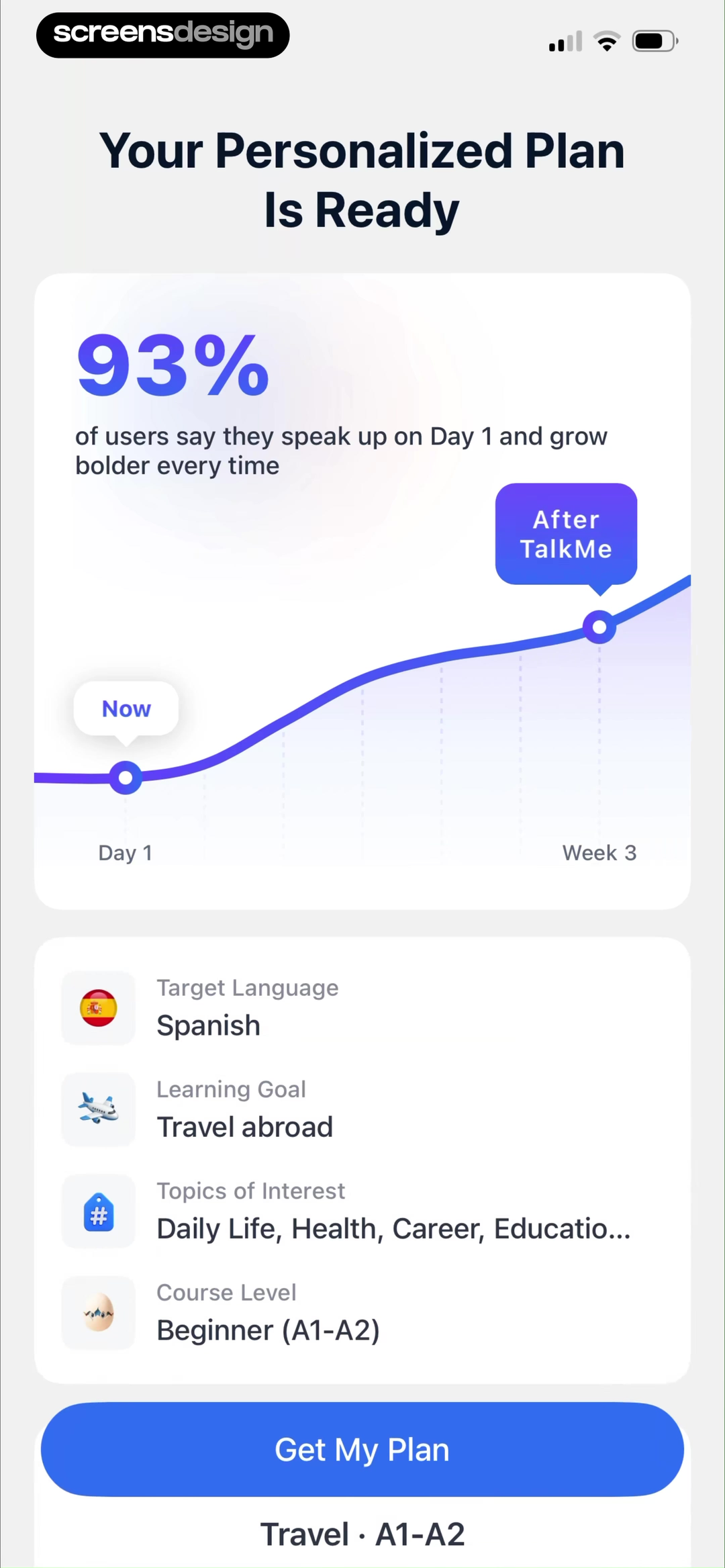
TalkMe first asks for the learning context and records Travel abroad. The next shown screen asks for hobbies and interests, explaining that they will shape a personal study plan. Later, the plan summary repeats the target language, travel goal, selected topics, and course level. The visible recap closes the loop between questions and output.
This question-to-result sequence illustrates progressive profiling. Start with the signal that determines the main route, then request supporting preferences that refine content inside that route. Do not begin with every attribute the profile might eventually hold. The sequence should stop when the product has enough information to deliver a useful first recommendation.
The summary also creates a review point. A person can compare what they entered with what the product understood before starting the plan. Teams should add an edit path wherever an incorrect level, topic, goal, or unit could make the next experience irrelevant or unsafe.
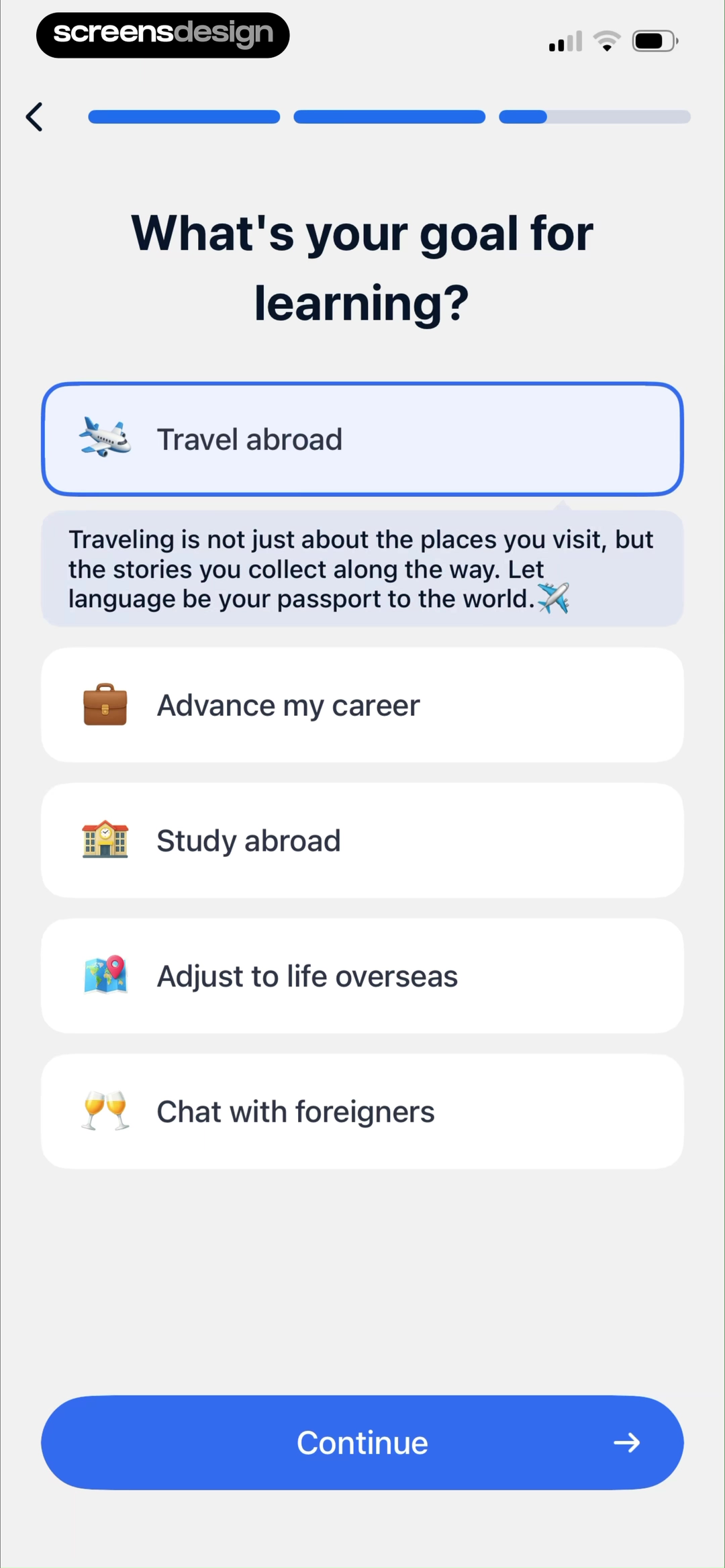
Choose the route
Ask for the goal, job, or context that changes the first destination.
Refine the content
Collect topics, level, constraints, or format only when they improve the chosen route.
Recap the inputs
Show the settings behind the recommendation so the user can judge and correct it.
03. Defaults, branches, and skips
Recommend a path without pretending it is the only valid path.
A default reduces setup effort only when the alternative remains legible and recoverable.
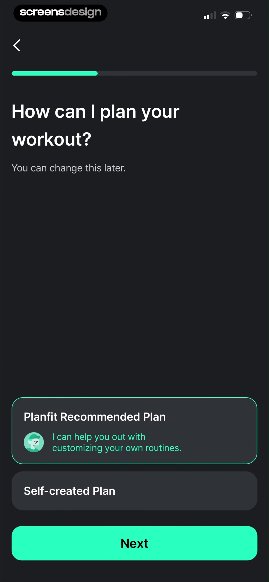
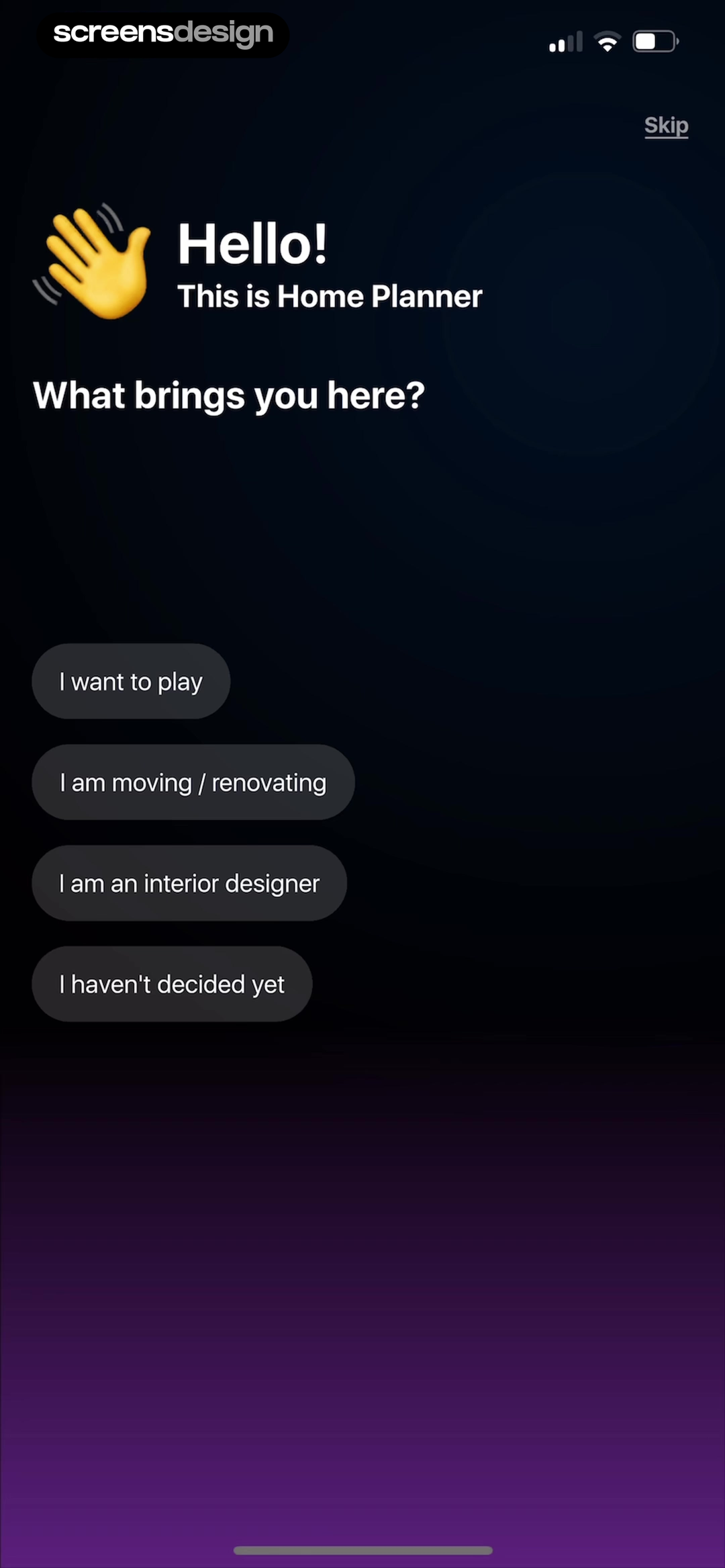
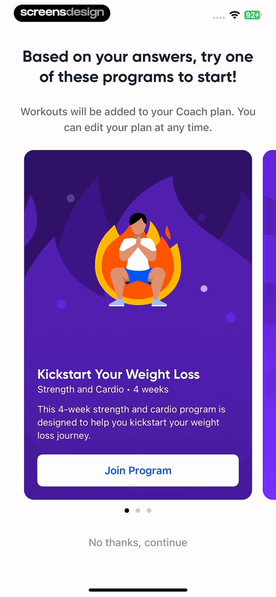
Planfit preselects its recommended plan but also offers a self-created plan and states that the choice can be changed later. Home Planner combines persona choices with I haven't decided yet and a separate Skip action. Both designs acknowledge that the product may not know enough to force an accurate branch.
Aaptiv presents a program based on earlier answers, explains that it can be edited later, and keeps No thanks, continue below the recommendation. The skip path does not erase the result. It lets the person decline this particular program while continuing into the product.
Defaults should be based on an understandable rule, not on whichever choice benefits the funnel. Show what is selected, explain its consequence, and preserve the answer if the user goes back. If skipping produces a generic experience, make that experience complete rather than using missing preferences to create a dead end.
04. Sensitive personal data
Explain the calculation, alternative, and data handling before collecting the answer.
Health, body, identity, and relationship questions need more context than a progress bar can provide.
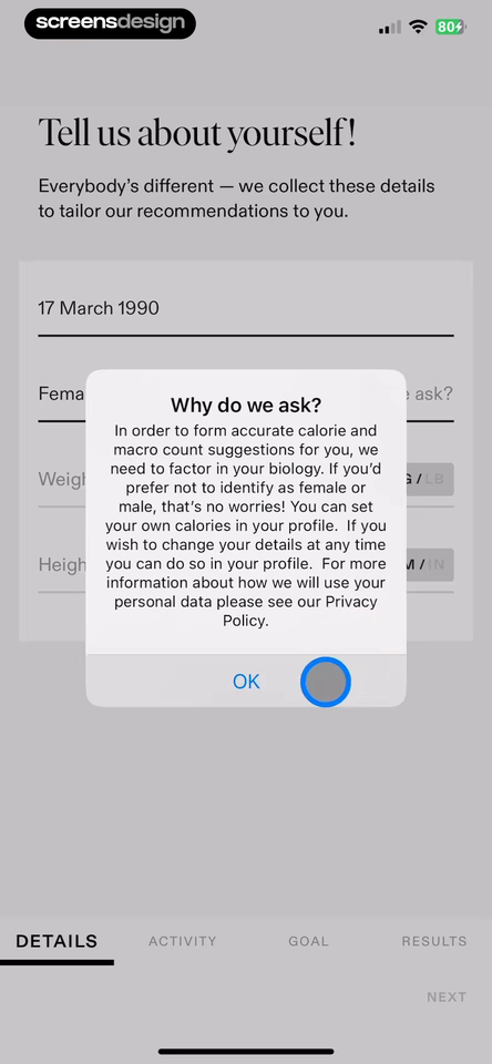
Tammy Fit places a Why do we ask explanation over fields for date of birth, gender, weight, and height. The text connects biological information to calorie and macro suggestions, mentions a profile-based manual calorie setting, and links to the privacy policy. The interface gives the request a product reason and names an alternative.
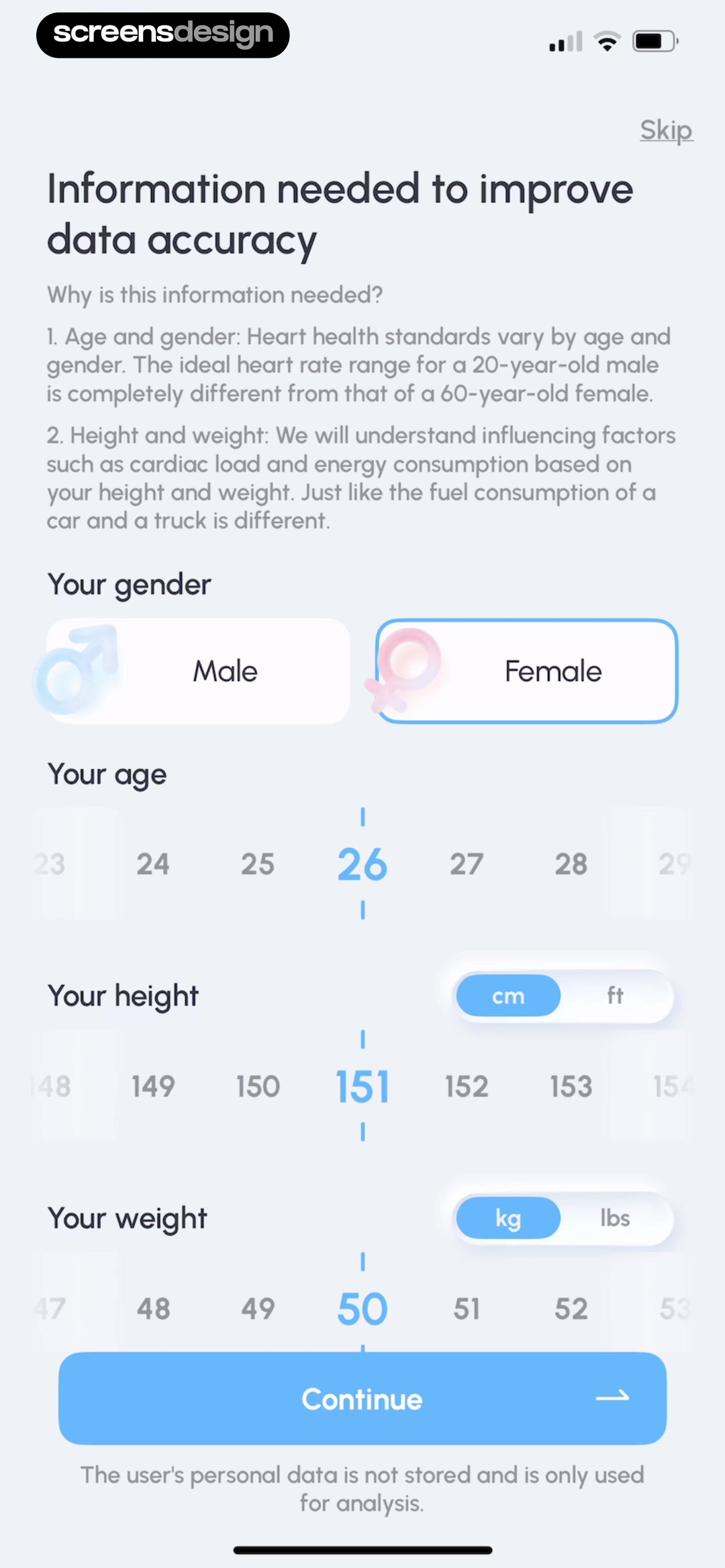
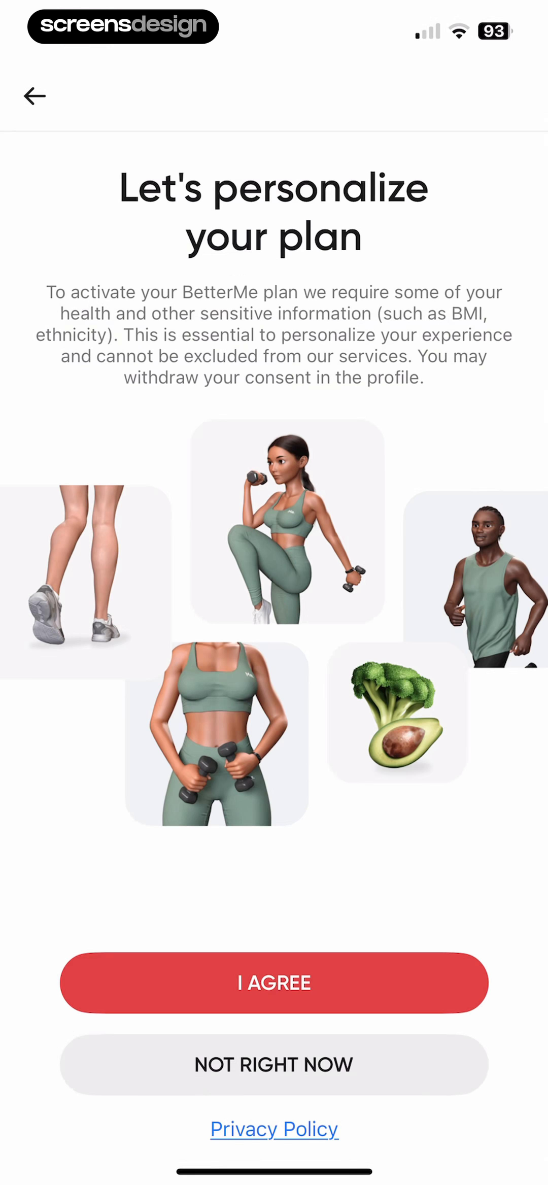
PulseTrackr explains how age, gender, height, and weight relate to data accuracy, includes unit controls, shows Skip, and states that personal data is not stored and is used only for analysis. BetterMe uses a separate consent screen for health and other sensitive information, names BMI and ethnicity as examples, links its privacy policy, and provides Not right now.
These screens show different disclosure structures, not proof that the underlying practices are sufficient. Product and legal teams still need to verify necessity, retention, deletion, access, consent withdrawal, regional requirements, and whether every requested field actually changes the service. Plain language must match real system behavior.
Ask at the moment the benefit becomes concrete. Separate required processing from optional marketing or analytics. Avoid using a required-looking Continue button for consent that is legally optional, and do not make a Skip action visually disappear when the product can operate without the data.
The explanation must describe the real system.
Review collection, processing, storage, sharing, deletion, and withdrawal behavior before turning any privacy statement into onboarding copy.
05. Visible consequences
Return a recommendation that names its source and can be adjusted.
Personalization becomes credible when the result carries recognizable inputs into the next task.
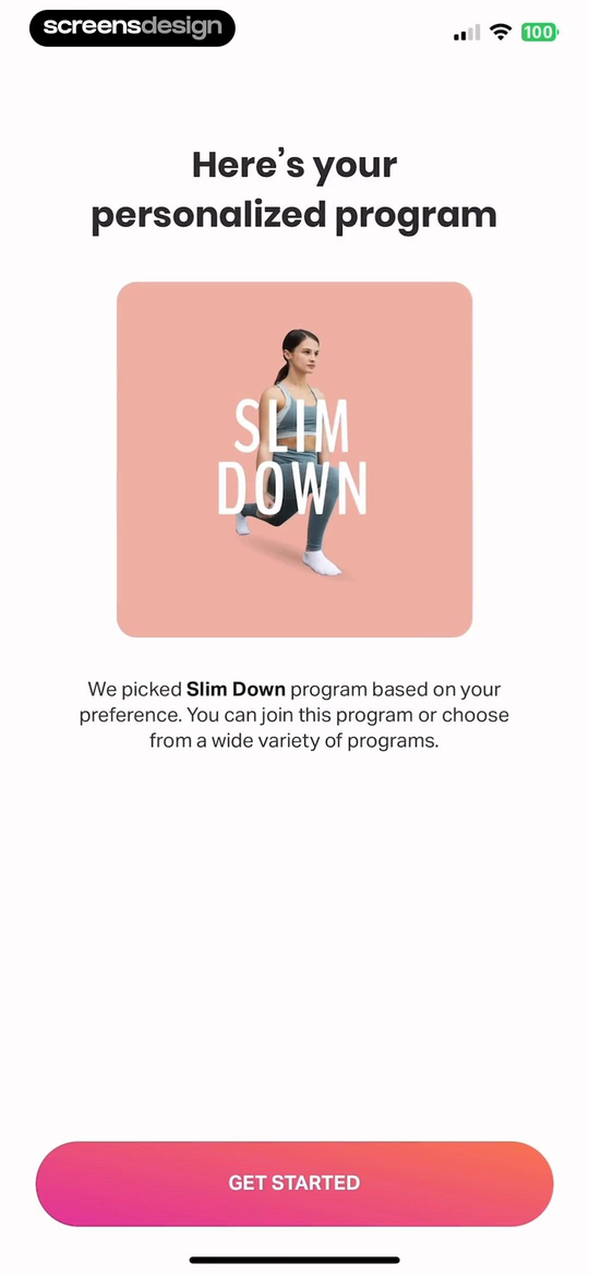
FitOn names a Slim Down program and states that it was picked based on the user's preference. It also says that other programs remain available. This is a compact consequence: one recommendation, one reason, and one route beyond the default.
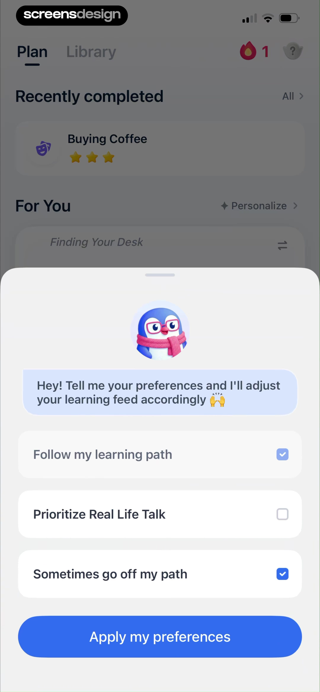
TalkMe continues personalization after onboarding. A modal over the home dashboard lets the user choose whether to follow the learning path, prioritize real-life talk, or sometimes move outside the path. The checked choices and Apply my preferences action make later adjustment part of the product rather than a one-time setup promise.
A result should expose the settings that matter, distinguish user inputs from product assumptions, and keep an edit route nearby. Avoid a generic Your plan is ready screen when the plan itself is hidden. The user should be able to describe what is different before a subscription or account request interrupts the sequence.
06. Personalized paywalls
Keep the result legible when the next action is payment.
A paid offer should continue the personalized task without overstating certainty or hiding the commercial boundary.
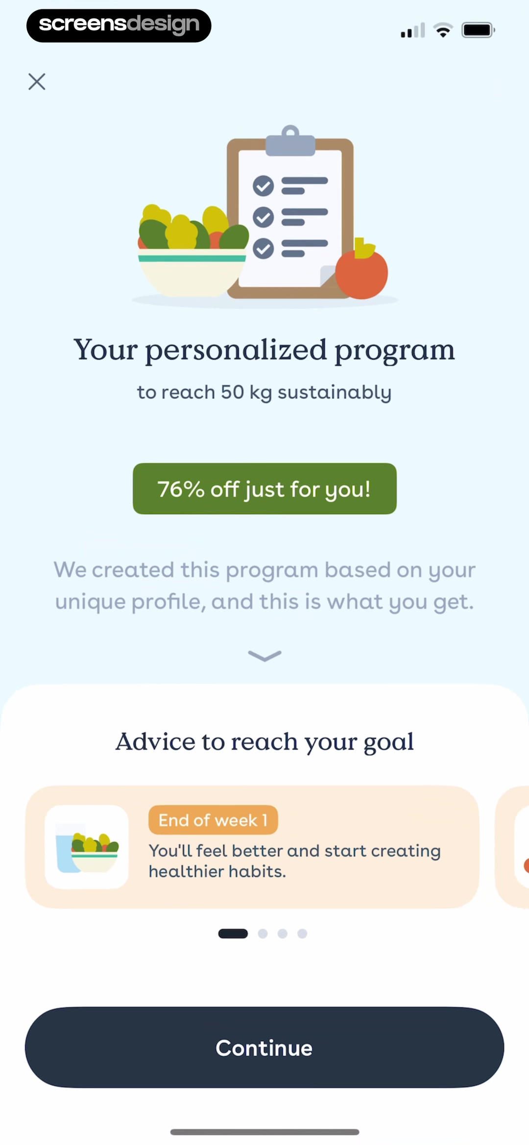
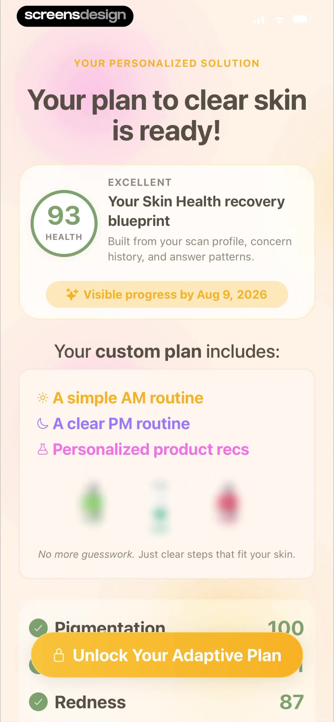
Foodvisor shows a target of 50 kilograms, says the program is based on the user's profile, previews advice, and places a discount badge on the same screen. Skan shows a skin score, a projected progress date, plan components, and an Unlock Your Adaptive Plan action. In both recordings, a personalized output is directly connected to monetization.
The design risk is using specific numbers to make the offer feel more authoritative than the evidence supports. A target, score, date, or projected outcome needs a defined source, appropriate uncertainty, and an edit or review path. The screens demonstrate what is visible, not that the recommendations or projections are accurate.
Keep price, billing period, trial terms, renewal, cancellation, restore, and dismissal readable in the surrounding paid flow. Preserve the answers if the user leaves the paywall. If most of the promised plan remains locked, show enough real structure to clarify the purchase without presenting a generic preview as completed value.
07. Flow review
Audit the path from question to consequence as one system.
A strong individual screen can still belong to an overlong, unclear, or fragile onboarding flow.
Map every requested answer to the first visible place it changes the product. Then test the path with a skipped question, an edited answer, interruption, a declined consent choice, an unsuitable recommendation, and a dismissed paywall. The generic route should remain useful, and completed input should survive recoverable exits.
Review language separately from logic. Copy can promise personalization while every branch reaches the same screen. It can also imply certainty where the system only has a rough estimate. Compare the question, stored value, applied rule, visible result, and later edit surface. A mismatch at any handoff weakens trust.
- Every question changes a route, default, recommendation, safety rule, or saved preference.
- The user can understand why each answer is requested before submitting it.
- Broad goals appear before details that only refine the chosen route.
- Defaults are visibly selected, explained, and reversible.
- Other, Not sure, Skip, or manual setup exists when fixed answers are incomplete.
- Sensitive data has purpose, necessity, handling, consent, and alternative context.
- The result repeats the inputs and assumptions that shaped it.
- Users can correct an answer without restarting unrelated setup.
- Skipping, denial, interruption, and paywall dismissal preserve a useful next step.
- Specific targets, scores, dates, and claims use calibrated language and review paths.
- The final screen starts a real task instead of ending at a personalization message.
Questions and answers
Personalized app onboarding questions
What is personalized app onboarding?
It is a first-session flow that uses a person's goals, context, constraints, or preferences to change a route, default, recommendation, or saved setting. The changed result should be visible and adjustable.
How many personalization questions should onboarding ask?
Ask only what is needed for the first useful result. Start with the signal that selects the main route, add details that improve that route, and defer profile enrichment until its benefit is clear.
What is progressive profiling in mobile onboarding?
Progressive profiling collects context in stages. A broad goal establishes the path, supporting preferences refine it, and later prompts appear when the product can explain why another detail improves the experience.
Should users be able to skip onboarding questions?
Yes when the app can provide a safe and useful generic experience. If a field is required for safety, regulation, identity, or the core calculation, explain that dependency and what remains available without it.
How should an app ask for sensitive personal data?
State the immediate purpose, whether the field is required, how the data is processed and retained, how consent can be withdrawn, and what alternative exists. The explanation must match actual system behavior and legal requirements.
When should a personalized onboarding paywall appear?
After the user can understand the paid result and the inputs behind it. Keep projections calibrated, preserve completed answers, and make price, trial, renewal, cancellation, restore, and dismissal terms readable in the offer flow.
Apps referenced in this page
Open the products behind the examples.
 Quizard AIInstant Math Problem Solver
 Go ViralBlow up on social media
 WoodSenseDIY craft tutorials, wood ID
 TalkMeLanguage Learning & Practice
 PlanfitPersonal Trainer Fitness Plans
 Home PlannerRoom Planner・House Generator
 AaptivPersonal Training for Everyone
 Tammy FitView recorded app flows
 PulseTrackrLog Blood Pressure & Oxygen
 BetterMePilates, calisthenics, yoga
 FitOnCardio, Yoga & Pilates classes
 FoodvisorDiet Tracker for Weight Loss
 SkanSkin Scan & Product Finder
2,622 apps in the top charts.Ask them anything.
Search recorded personalized onboarding screens by goal question, profile input, skip path, tailored plan, home state, or paywall, then inspect the complete replay around each result.