Start with the outcome
App onboarding screens that lead to first value.
App onboarding is the first-use journey that helps a new user understand the product, complete essential setup, and reach a useful result. It may include welcome screens, account creation, a short quiz, permission requests, teaching, or a prepared starting state. It does not need all of them.
The best test is not whether the carousel looks polished. Ask whether every step removes uncertainty, enables a feature, or returns value. If deleting a screen would not change what the user understands or can do, that screen is probably delaying the product.
What is this and is it for me?
What useful outcome can I expect?
What must change for my situation?
Why does the app need this data or access?
What is the first useful thing I can do?
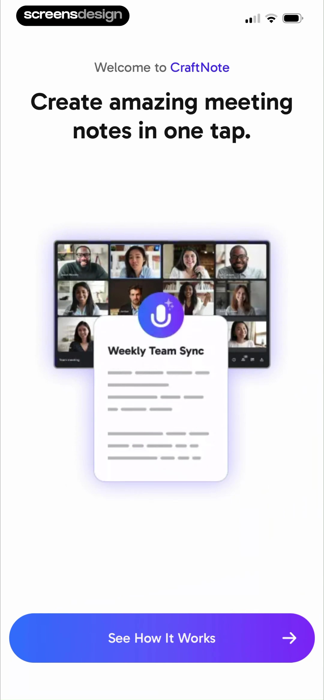
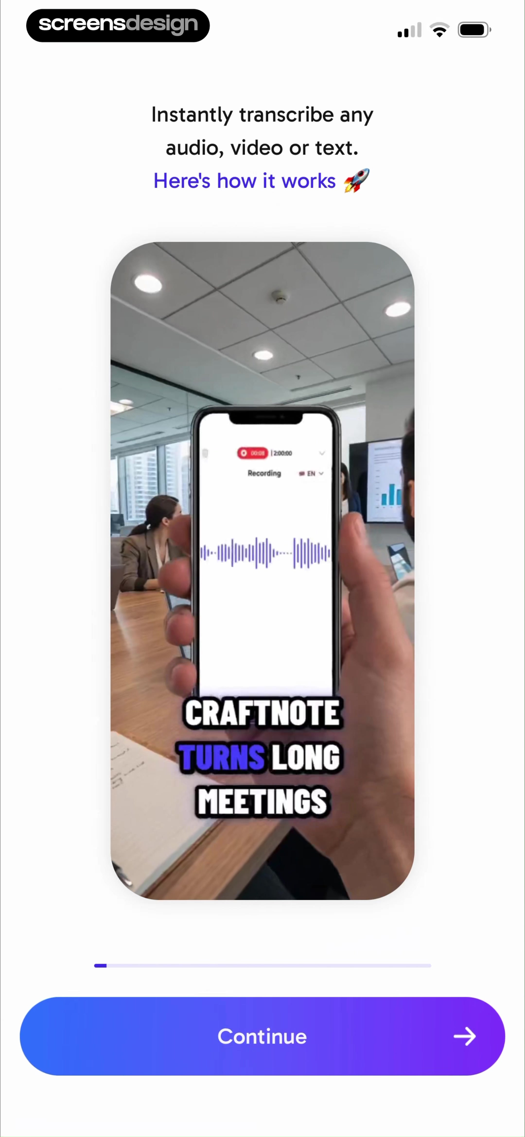
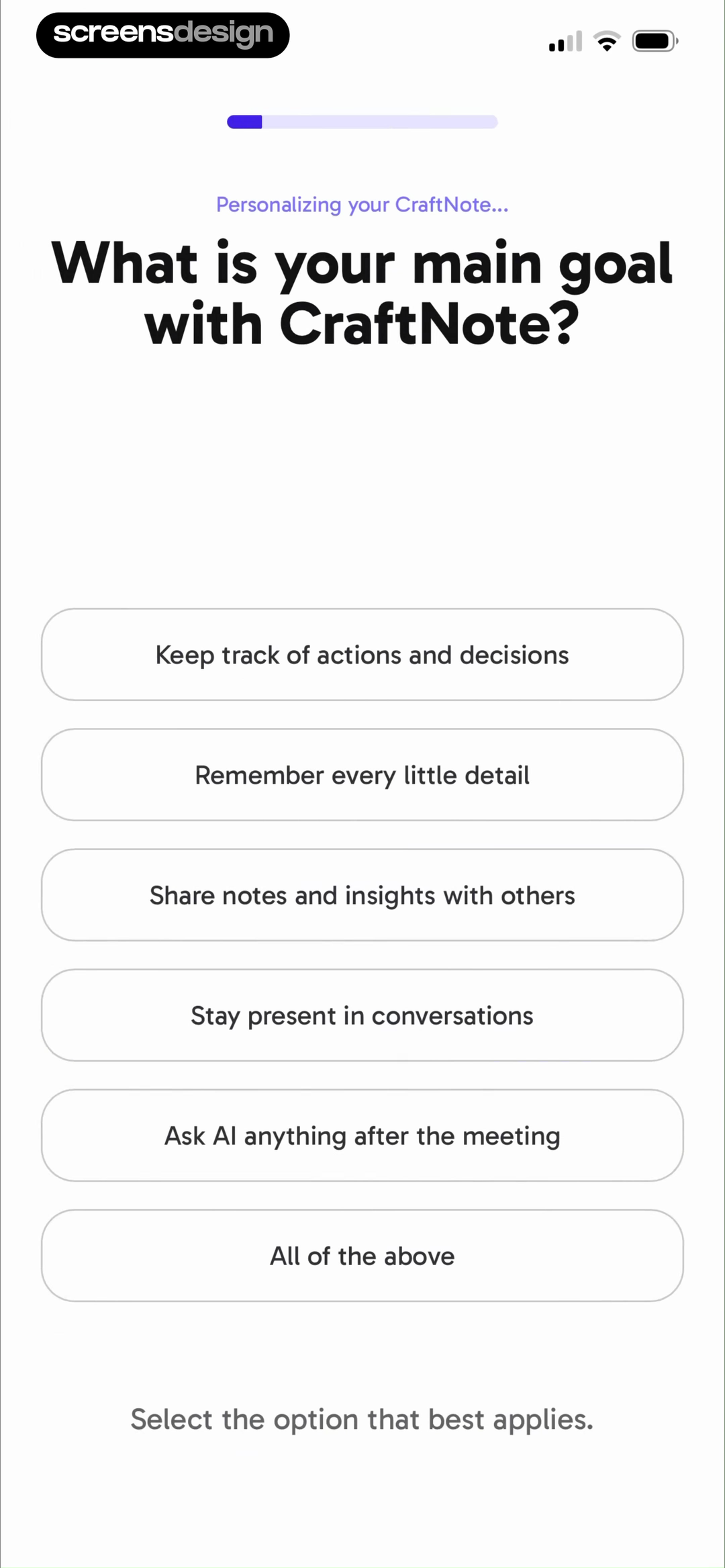
Read the sequence, not only the frames.
CraftNote begins with the product promise, shows how the product works, then asks for a goal. The question makes more sense because the user has enough context to answer it.
Open the 27-screen flowSeven practical patterns
Give each onboarding screen one reason to exist.
These are jobs a screen can perform, not a mandatory template. Combine them when the result remains clear, and omit any pattern that does not help your user reach value.
Set a concrete expectation
A welcome screen should make the product legible in seconds. Name the problem it handles, the useful outcome, and what the next tap begins. A brand line alone leaves the user to reconstruct the value proposition.
Can a first-time user explain what happens next?Demonstrate before explaining more
A short product demonstration can replace several abstract feature slides. Show an input becoming an output, a task getting easier, or a result appearing. The example should answer the uncertainty that prevents someone from continuing.
Does this step remove doubt, or repeat the marketing page?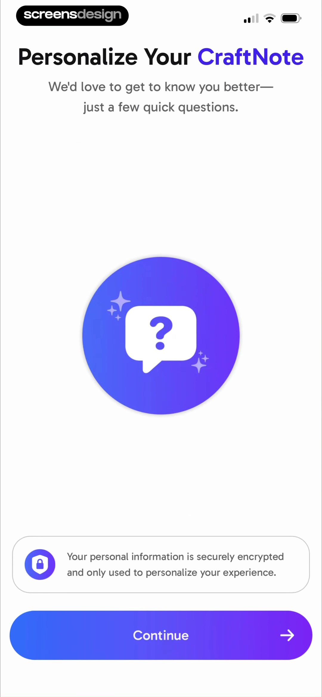
Ask only questions that change the experience
Personalization earns its place when the answer changes content, defaults, recommendations, or the starting path. Explain why the question matters, keep the choices distinct, and avoid collecting profile data merely because it may be useful later.
What will visibly change after this answer?Make progress believable
Progress should help people estimate effort. Use step counts for known sequences, section labels for grouped questions, or a clear processing state when the system is generating a result. Decorative progress that stalls or jumps erodes trust.
Can the user tell how much work remains?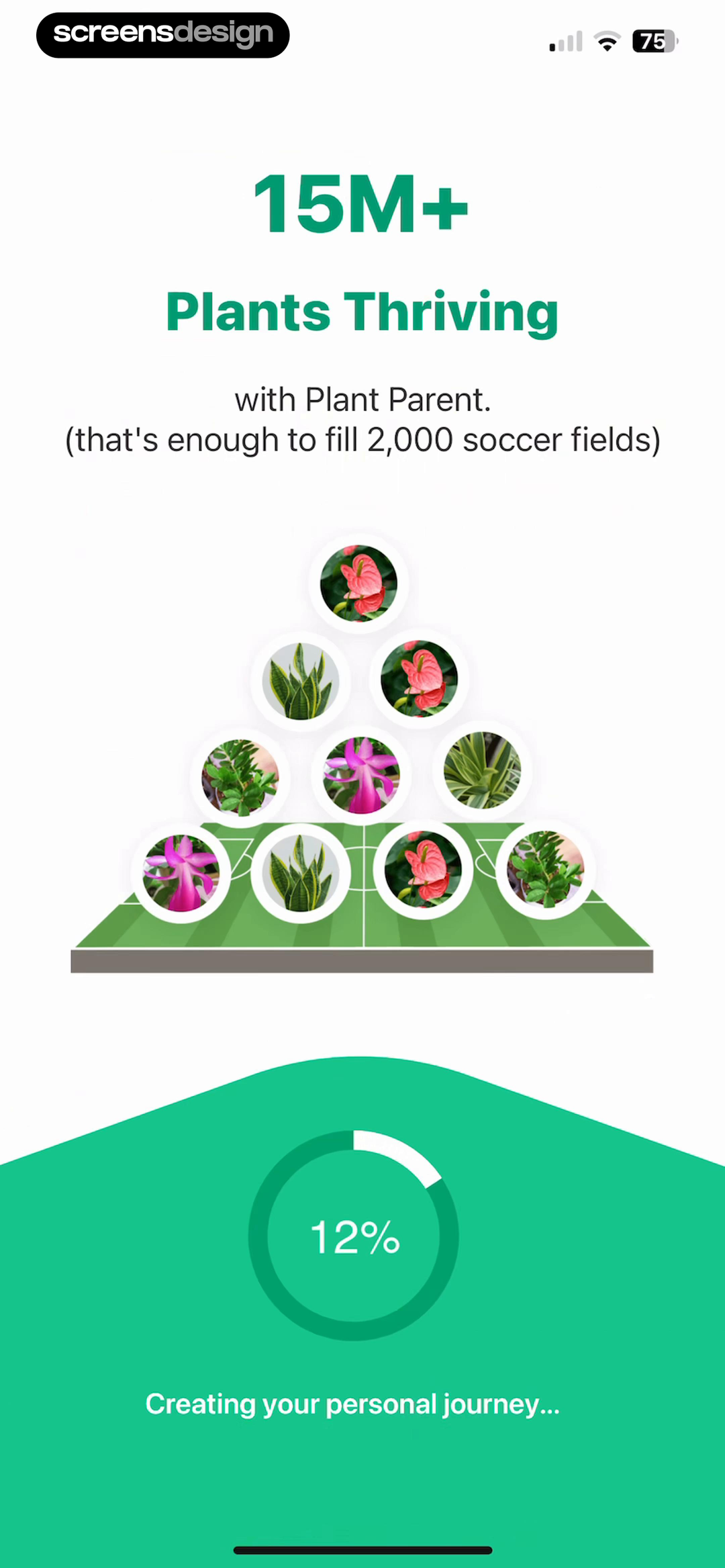
Explain permissions in context
Request a system permission immediately before the feature needs it. A warm-up can show the alerts, location behavior, camera task, or health data the permission enables. The native prompt should then feel like the expected next step.
Has the value been understood before the OS asks?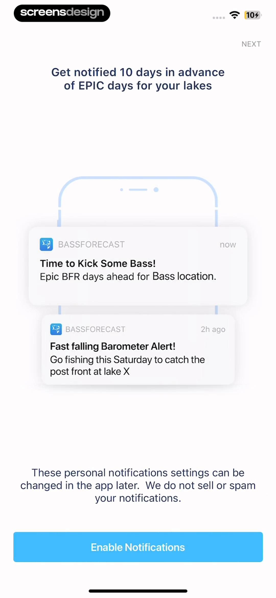
Return value from the answers
A summary closes the loop. Reflect the user’s selections, show what was configured, and connect that work to a plan or starting point. Generic praise after a long questionnaire makes the earlier effort feel extractive.
Where can the user see that their answers mattered?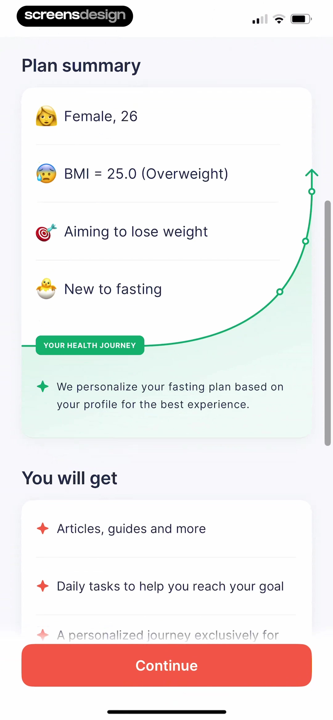
End at a useful first action
Completion is not the goal. The handoff should lead to the smallest meaningful action in the product: add the first object, run the first task, open a prepared plan, or learn the core interaction in context.
Is the final button a destination, not a dead end?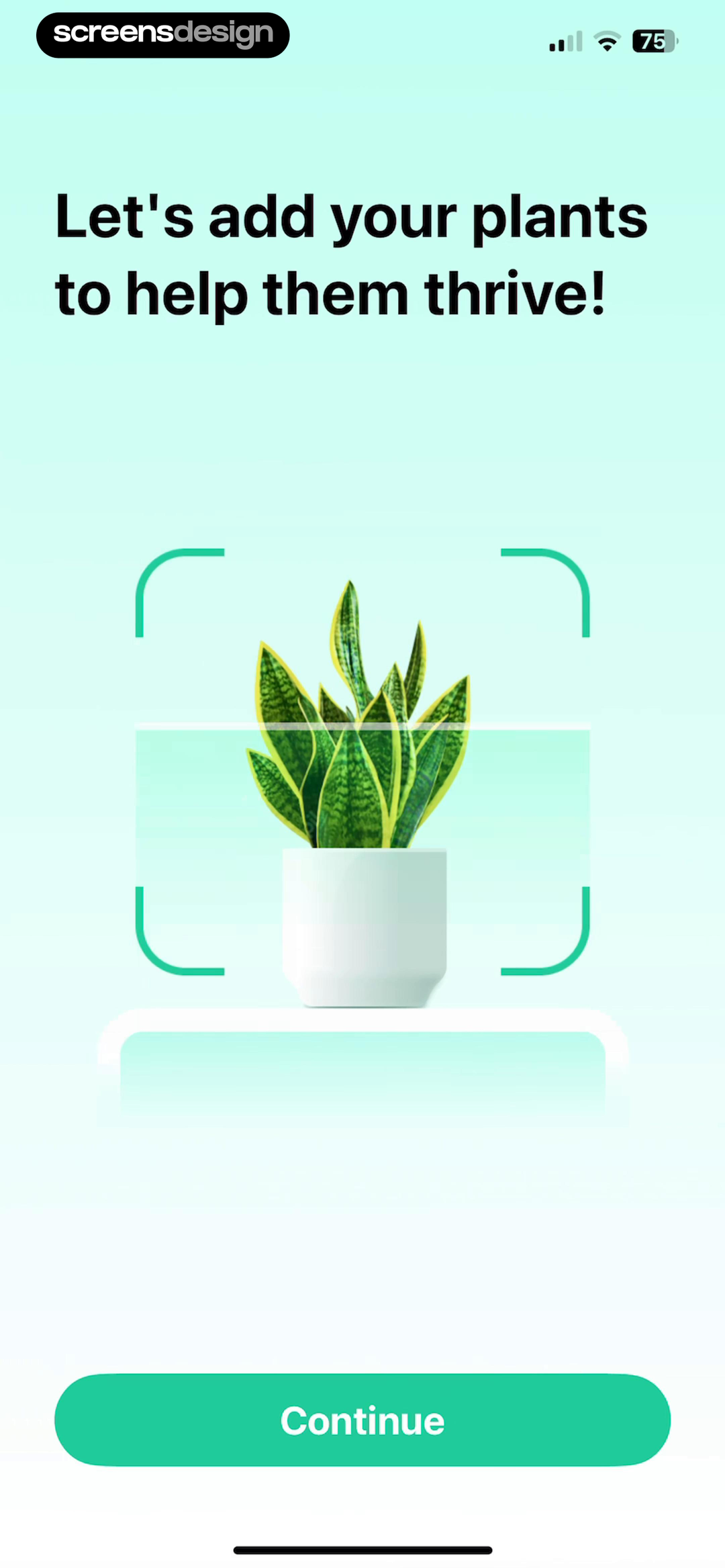
Recorded examples
Four app onboarding flows worth opening in full.
A single screenshot can show hierarchy, copy, and a visible choice. It cannot show timing, back behavior, branching, persistence, or the promise made by the previous screen. These examples link to both the exact frames and the complete recorded journeys.
The observations below describe visible product decisions. Flow length, ratings, downloads, or revenue do not prove that a screen caused conversion or retention.
Move from promise to proof to personalization.
The recorded flow introduces one-tap meeting notes, demonstrates how source material becomes a transcript and summary, then asks about note-taking habits and goals. The strongest connection is causal: the questions arrive after the product has made its value understandable.
Inspect the complete flow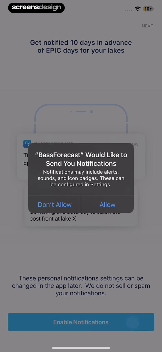
Show the notification before requesting it.
BassForecast previews two specific alert types and says notification settings can be changed later. The next recorded screen is the native permission dialog. The pair is useful because the user sees both the product’s explanation and the actual operating-system request.
Inspect the complete flow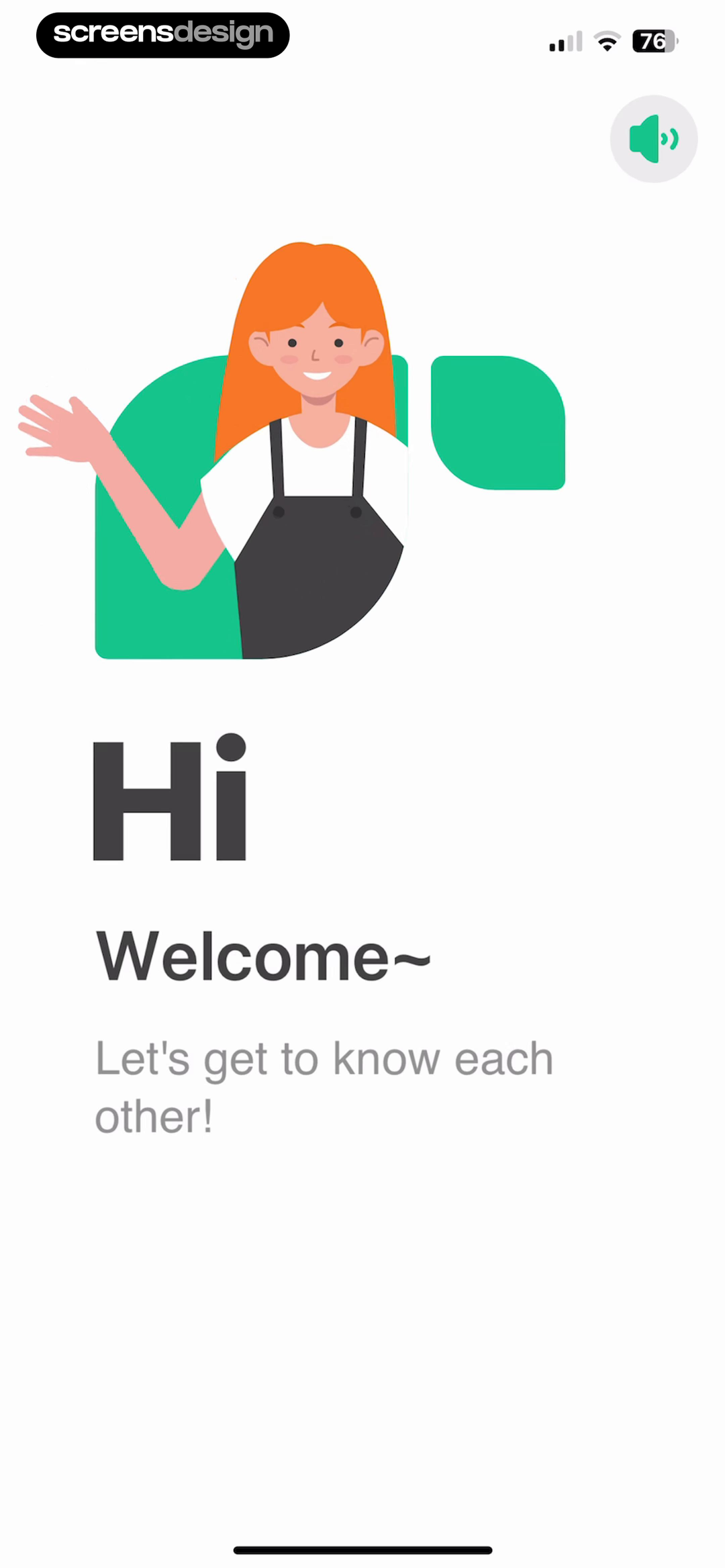
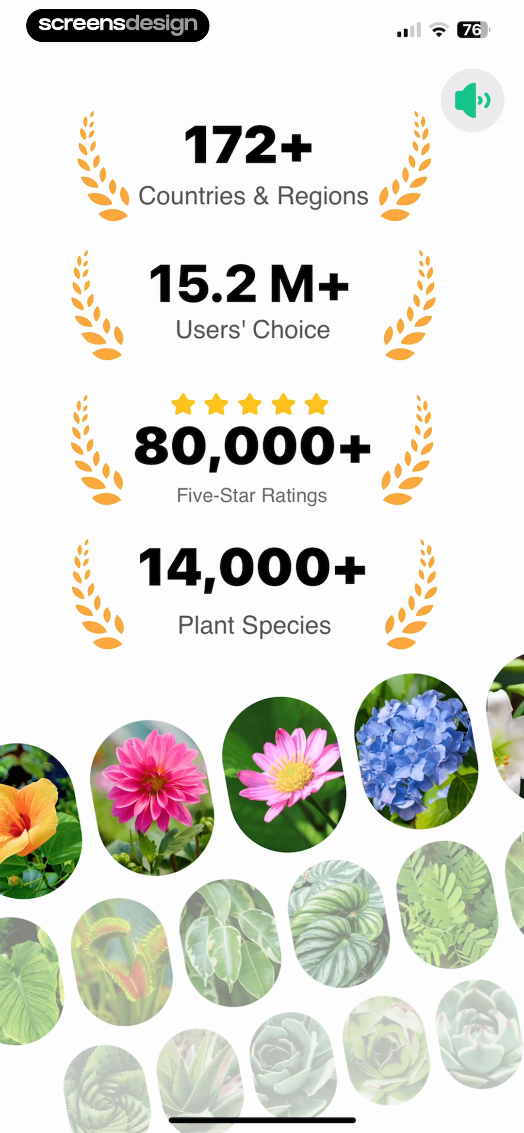
Keep one narrative through a long setup.
This longer flow introduces the care companion, establishes proof, asks about the user’s plants, shows progress while creating a personal journey, and finishes by asking the user to add a first plant. The sequence is coherent even though the commitment is substantial.
Inspect the complete flowShow the receipt for a long questionnaire.
Kompanion’s plan summary repeats profile details and explains what the health journey contains. That does not tell us whether 51 recorded screens are optimal, but it does show one way to make collected information visible before the next commitment.
Inspect the complete flowPermission requests
Prepare the decision, then let the system ask.
Camera, photo, location, notification, tracking, contacts, and health access are trust decisions. Ask at the moment of need, explain the user benefit precisely, and make the next screen match what you promised.
Preview real notification value.
BassForecast shows advance alerts and a falling-barometer example before the native dialog appears.
Make the OS prompt expected.
The native request arrives immediately after the benefit explanation, preserving the context of the choice.
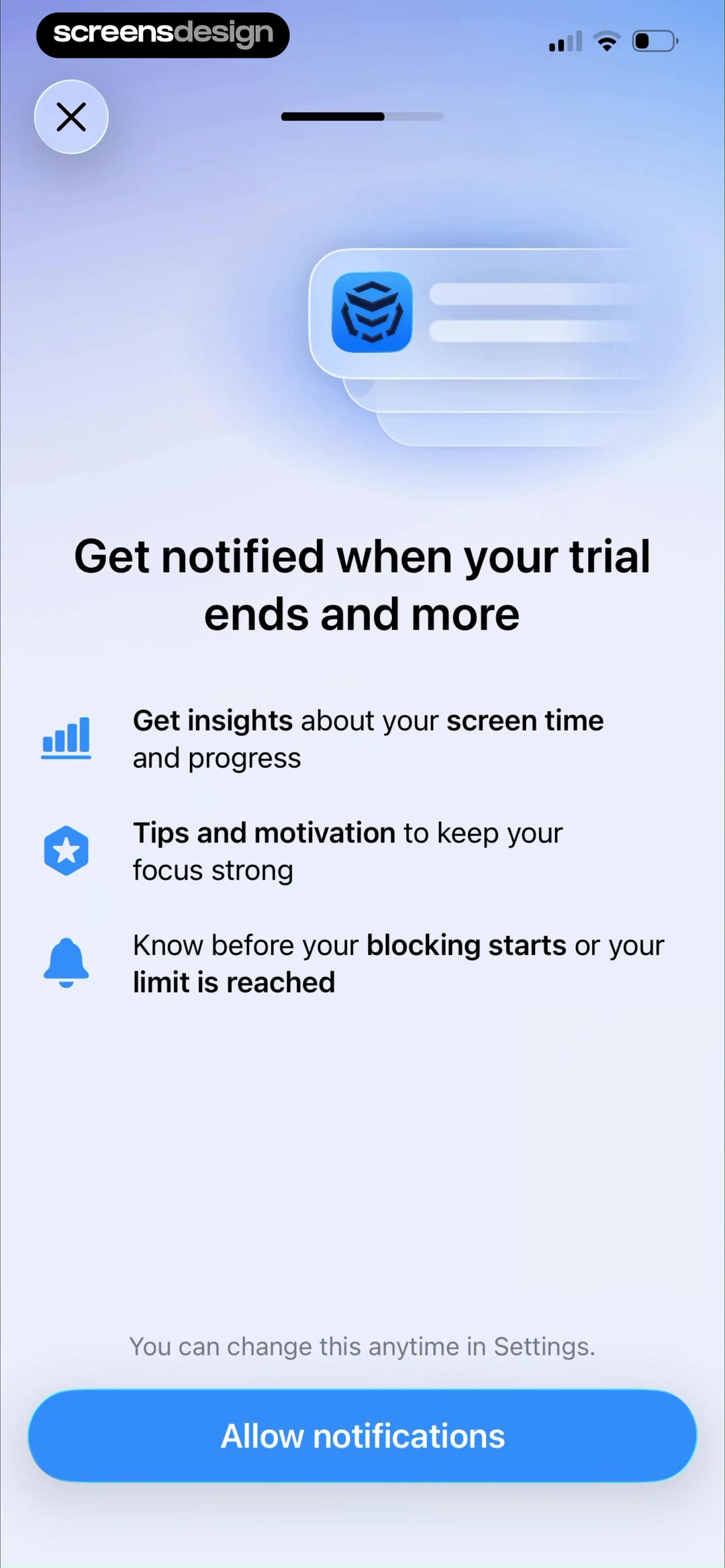
Another approach: list the moments that depend on access.
AppBlock names screen-time insights, motivation, and alerts before its notification request. The copy also says the choice can be changed in Settings, which reduces ambiguity without promising that permission is risk-free.
Flow length
There is no magic number of onboarding screens.
The right length depends on what must be understood or configured before value. The recorded journeys below range from 10 to 51 screens. That range is evidence of different product choices, not a benchmark telling you to copy the average.
Keyboard setup and permissions
Signup, location, permissions, tutorial
Signup, proof, questions, permissions
Value, personalization, plan, first task
Learning goals, setup, permissions, handoff
Health profile, goals, plan, monetization
For every step, write the uncertainty it resolves, the setup it enables, or the value it returns. Remove the step if the answer is vague. Then test whether the remaining journey still makes sense for a first-time user.
Design the journey
Build onboarding from the first useful action backward.
Starting with a carousel encourages the team to fill slides. Starting with first value reveals the minimum understanding, data, permission, and practice the user actually needs.
- 01
Define first value
Name the earliest observable result that proves the product is useful to this user.
- 02
Map prerequisites
List only the knowledge, data, account state, and permissions required before that result.
- 03
Order by dependency
Place each question or explanation immediately before the decision or feature it supports.
- 04
Prototype every branch
Include skip, back, denial, invalid input, slow processing, interruption, and returning-user routes.
- 05
Write interface copy
Use direct labels that state the benefit, choice, and consequence without invented urgency.
- 06
Test comprehension
Ask users what they expect before tapping and compare that expectation with the next state.
- 07
Instrument the path
Track entry, completion, drop-off, errors, permissions, and the first-value event by step.
- 08
Keep teaching in product
Move advanced education into contextual tips, prepared examples, and help that appears during real use.
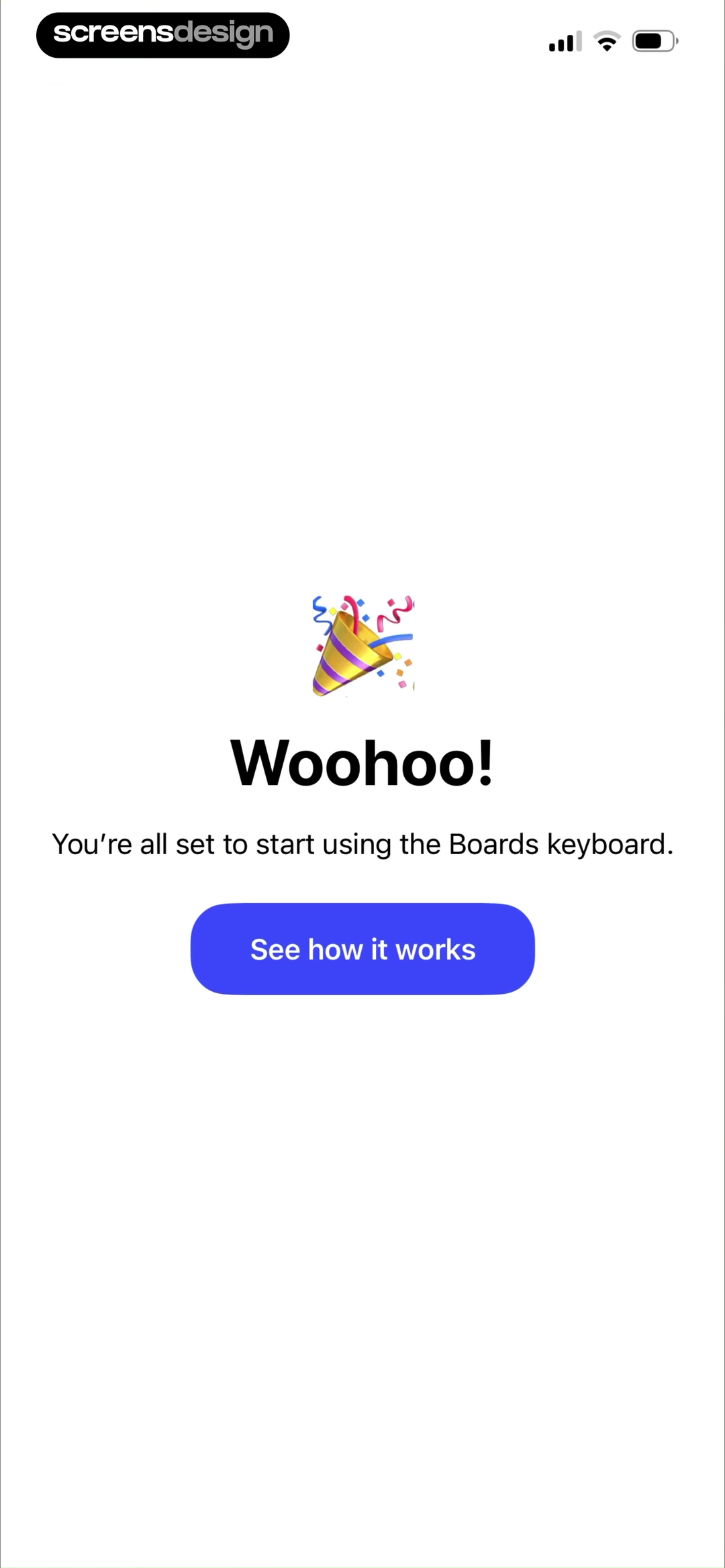
The final action names a next step instead of ending with a generic confirmation.
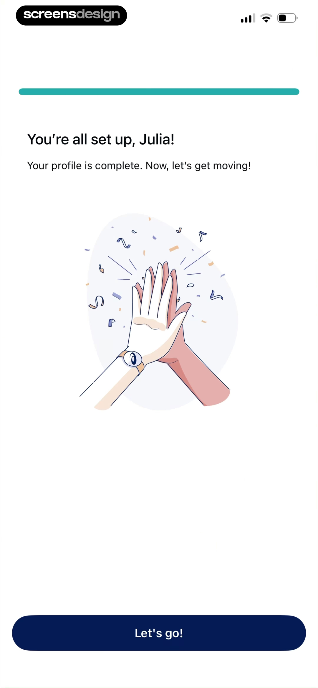
The final action names a next step instead of ending with a generic confirmation.
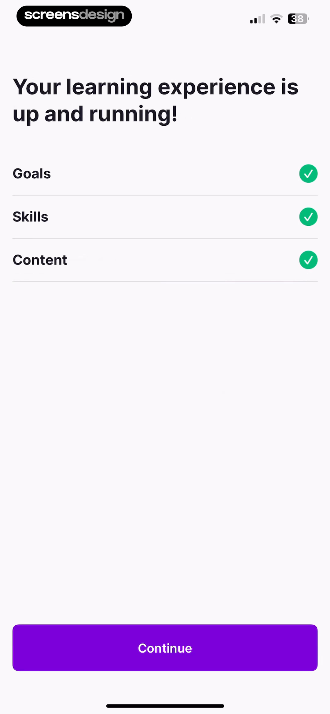
The final action names a next step instead of ending with a generic confirmation.
Measurement
Measure the path to value, not completion alone.
A high completion rate can hide people tapping through without understanding, while a lower rate can reflect an honest choice that the product is not relevant. Combine behavioral events with usability observation and support feedback.
Step completion
Entry, completion, back, skip, and exit by screen and user segment.
Time and hesitation
Time per step, repeated taps, corrections, and unusually long pauses.
Permission outcome
Warm-up viewed, native prompt shown, allowed, denied, and later enabled.
First value
The first meaningful product event, not merely arrival at the home screen.
Early return
Whether people return and repeat the core action after the setup session.
Qualitative evidence
What users expected, what confused them, and which questions felt unjustified.
Common mistakes
Most onboarding friction begins with the wrong job.
The feature parade
Several slides list capabilities without helping the user understand which result matters now.
The premature questionnaire
The app asks personal questions before earning context or explaining what the answers change.
The permission ambush
Native prompts appear on launch, before a user has seen the feature or relevant benefit.
The false progress bar
Progress advances unpredictably, hides remaining effort, or reaches 100 percent before more work appears.
The generic finish
A celebratory screen says setup is complete but gives no clear first product action.
The one-time tutorial
Critical instructions appear only before use and cannot be recalled when the interaction is actually needed.
Before shipping
A practical app onboarding review checklist.
Frequently asked questions
Questions about mobile app onboarding screens.
What is an app onboarding screen?
An app onboarding screen is one step in the first-use experience that helps a new user understand the product, configure relevant preferences, grant a needed permission, learn a core interaction, or reach a first useful result.
How many onboarding screens should a mobile app have?
There is no universal number. Use the fewest steps that resolve the uncertainties and setup requirements blocking first value. A short flow can still be wasteful, while a longer flow can be justified when every answer changes the result and progress is clear.
Should users be able to skip onboarding?
Optional education and nonessential personalization should usually be skippable. Required account, safety, legal, or technical setup may not be. If a step is mandatory, explain why and keep recovery paths available.
When should an app request notification permission?
Ask when the user can understand the relevant benefit and is close to using the feature. A contextual warm-up should preview what notifications do, then lead directly to the native operating-system prompt.
What should happen after onboarding?
The user should reach a useful, prepared state with one clear next action. The product should remember completed setup, avoid replaying the full flow, and offer later access to preferences or education that was skipped.
How do you measure mobile app onboarding?
Measure completion and drop-off by step, time and hesitation, permission outcomes, errors, first-value completion, and short-term return behavior. Pair analytics with usability observation so the team understands why people stop or succeed.
2,622 apps in the top charts.Ask them anything.
Find onboarding patterns for your category, inspect each screen inside its complete journey, and improve the first-use experience in your own app.