In-app feedback surveys
10 In-App Feedback Survey Design Examples
Ask about a recent, recognizable experience and be ready to act on the answer.
In-app surveys are most useful when the customer can remember the exact feature, result, session, purchase, or form being evaluated. A generic How do you like the app prompt produces broad sentiment but little diagnostic evidence. Trigger, question, scale, and follow-up need to describe the same event.
These ten recorded examples cover overall experience, feature satisfaction, result quality, form experience, subscription outcomes, star ratings, sentiment labels, branching reasons, and open feedback. They show the tradeoff between comparable quantitative answers and the context available in a short explanation.
Start with the product decision. If the team cannot say what will change for each possible answer, remove or rewrite the question. Ask the minimum, let the customer dismiss without penalty, preserve their task, and explain how submitted feedback will be used.
Read how to use user data to improve mobile app design for the adjacent product state and its handoff into this decision.
01. One measurable question
Keep the first prompt tied to one decision.
Overall, result, recommendation, and feature satisfaction are different constructs.
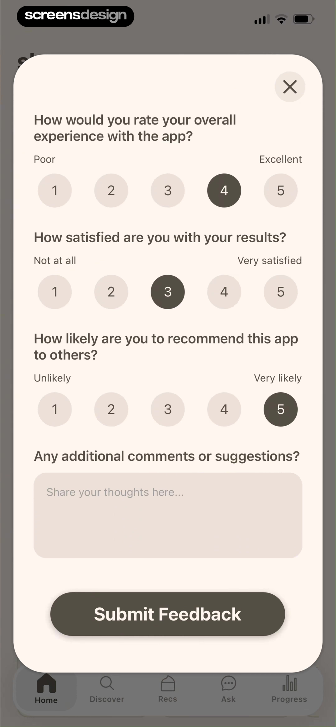
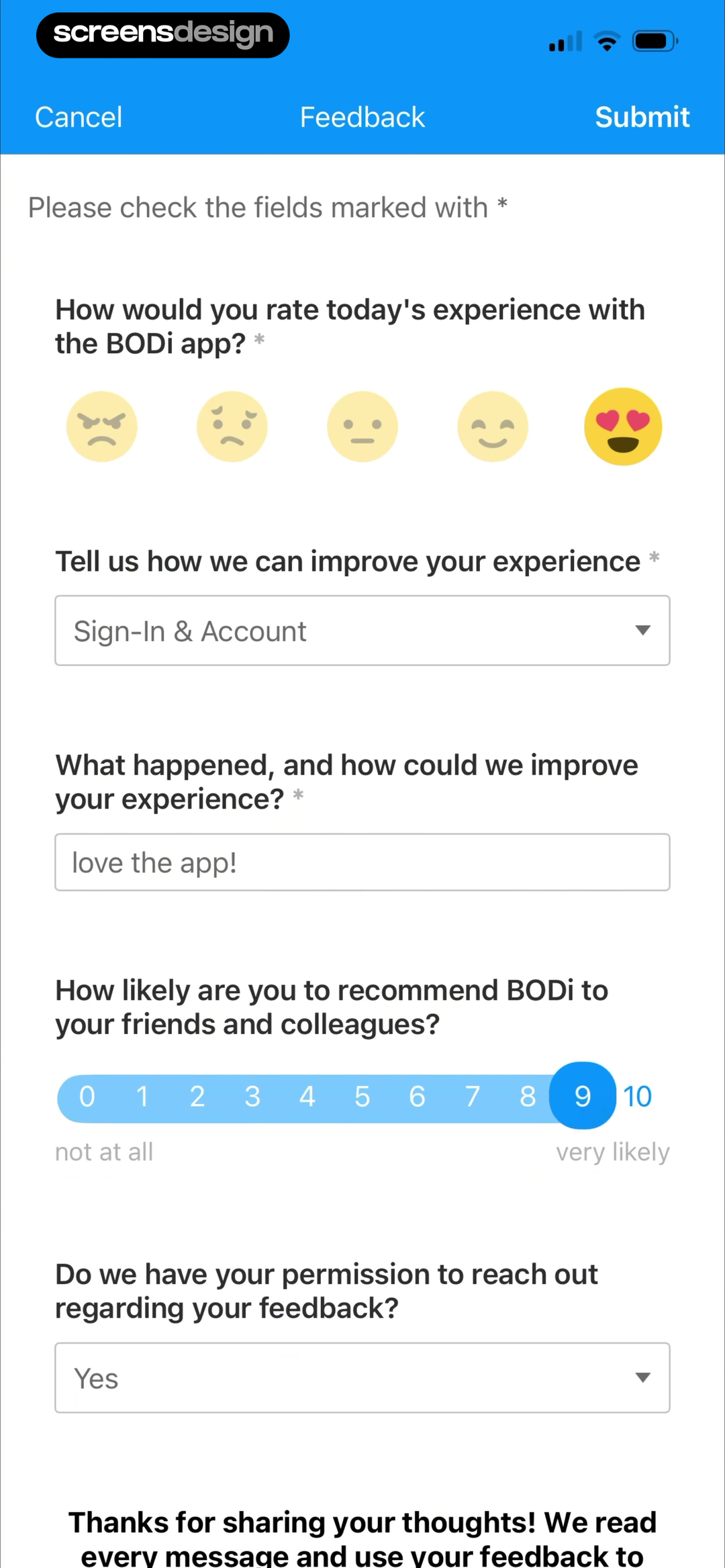
Skan - #1 Skincare App shows that the survey separates overall experience, result satisfaction, and recommendation intent into explicit scales. BODi Fitness: Home Workouts takes a different but compatible approach: today's experience, an improvement category, and an open explanation field are collected before Submit. Together, the examples reveal which details must stay visible at the decision point rather than being deferred to support or legal copy.
Use one primary measure, then branch only when the answer can guide a specific follow-up. Avoid placing several similar scales on a small modal without explaining why they differ.
Test the normal path, dismissal, back navigation, interruption, app relaunch, slow network, stale account data, and the state after completion. The primary label, confirmation, saved data, and next destination should describe the same outcome. Check large text, screen readers, keyboard focus, translated copy, and reduced motion so the decision remains understandable without relying on layout or color alone.
02. Labeled scales
Make every response option interpretable.
Numbers and stars need visible anchors.
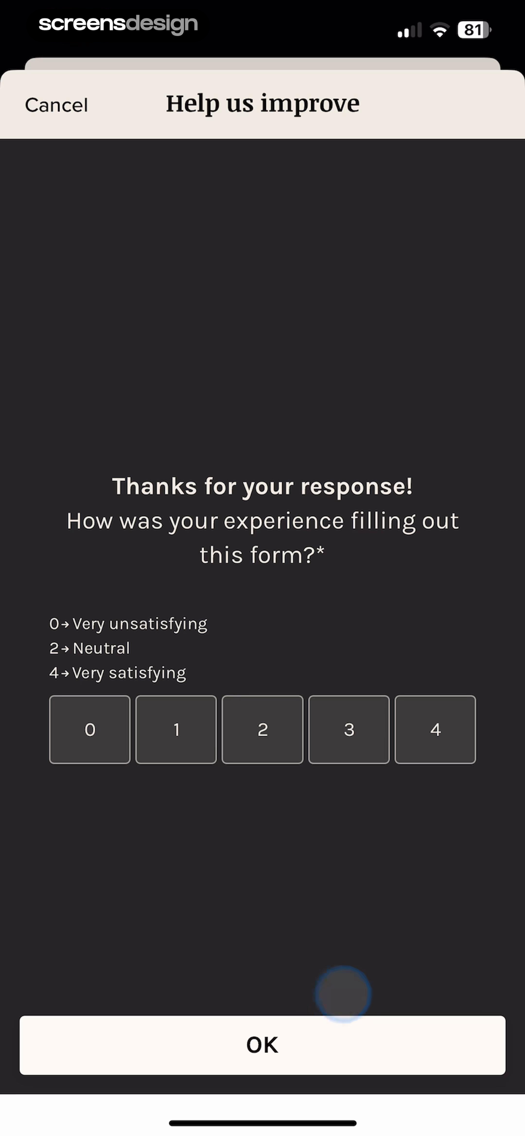
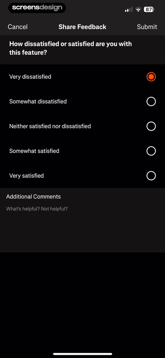
Vocabulary - Learn words daily shows that the follow-up asks about the experience of the form itself and anchors the scale from unsatisfying to satisfying. Strava: Run, Bike, Walk takes a different but compatible approach: feature satisfaction uses fully labeled choices from very dissatisfied to very satisfied. Together, the examples reveal which details must stay visible at the decision point rather than being deferred to support or legal copy.
Label endpoints and, when ambiguity matters, intermediate choices. Keep scale direction consistent and do not rely on color or facial expressions alone.
Test the normal path, dismissal, back navigation, interruption, app relaunch, slow network, stale account data, and the state after completion. The primary label, confirmation, saved data, and next destination should describe the same outcome. Check large text, screen readers, keyboard focus, translated copy, and reduced motion so the decision remains understandable without relying on layout or color alone.
03. Event context
Ask immediately after a recognizable outcome.
A diagnosis, subscription, workout, export, or edit provides useful scope.
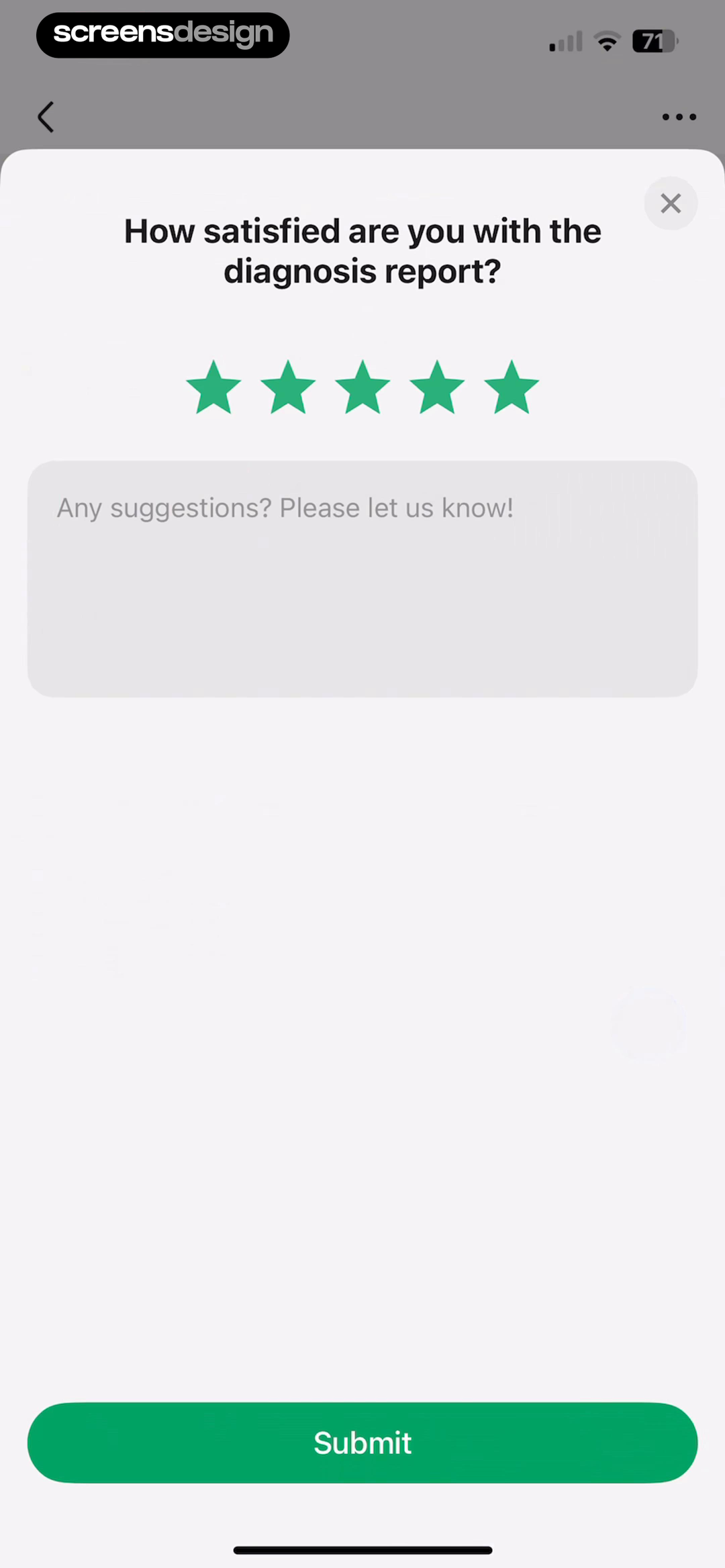
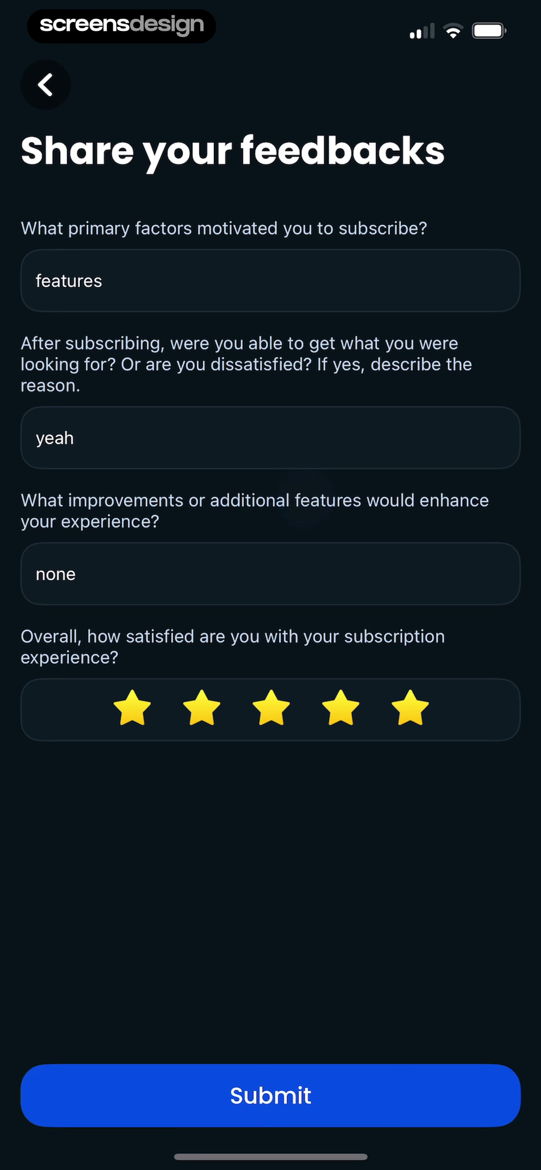
PictureThis - Plant Identifier shows that the question is tied to the diagnosis report and follows the rating with an optional suggestion field. TravelAnimator: Journey Route takes a different but compatible approach: subscription motivation, unmet expectations, improvements, and overall satisfaction appear in one focused form. Together, the examples reveal which details must stay visible at the decision point rather than being deferred to support or legal copy.
Name the result or feature in the question. Delay the survey when it would interrupt a safety-critical, emotional, or time-sensitive moment.
Test the normal path, dismissal, back navigation, interruption, app relaunch, slow network, stale account data, and the state after completion. The primary label, confirmation, saved data, and next destination should describe the same outcome. Check large text, screen readers, keyboard focus, translated copy, and reduced motion so the decision remains understandable without relying on layout or color alone.
04. Scope and branching
Use a broad rating to open a relevant follow-up.
Branching can shorten the form and improve specificity.
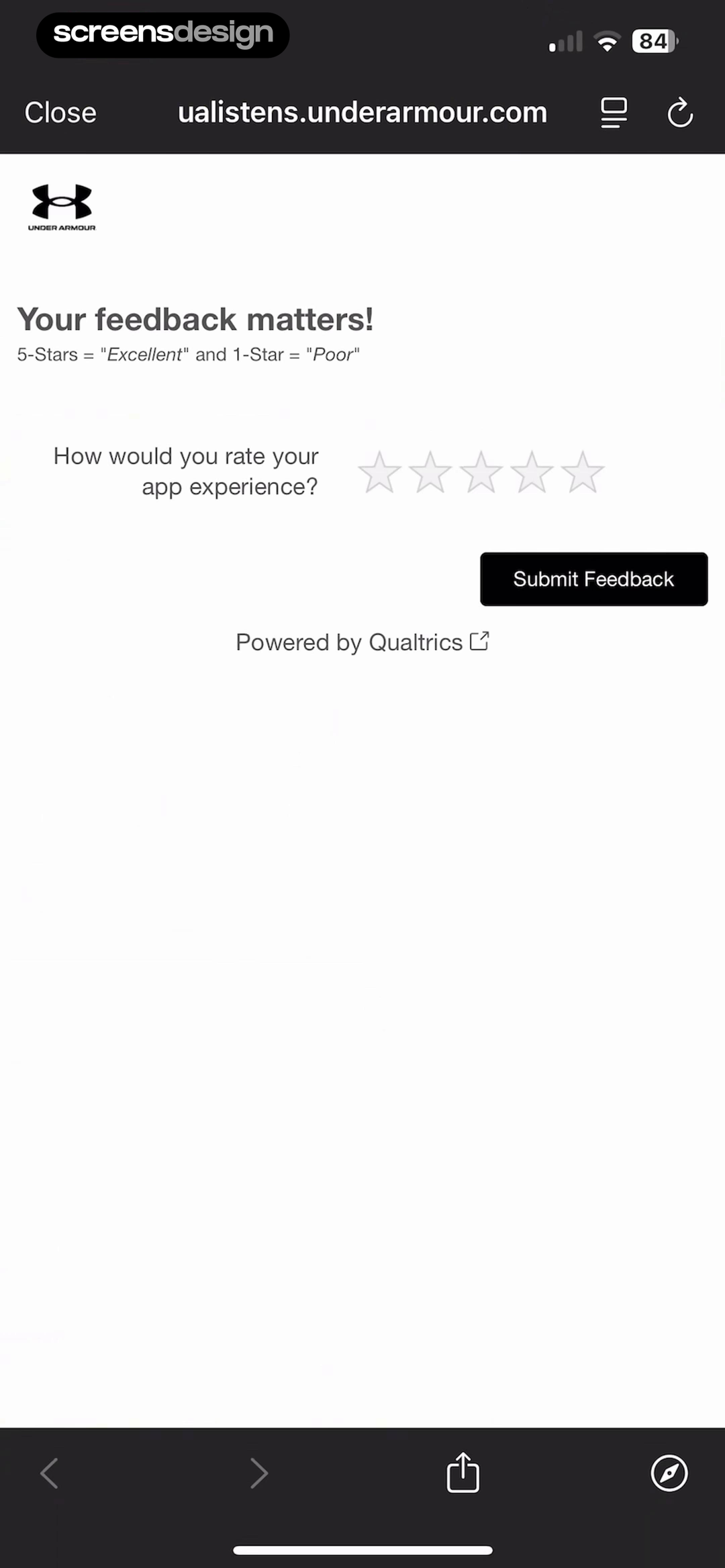
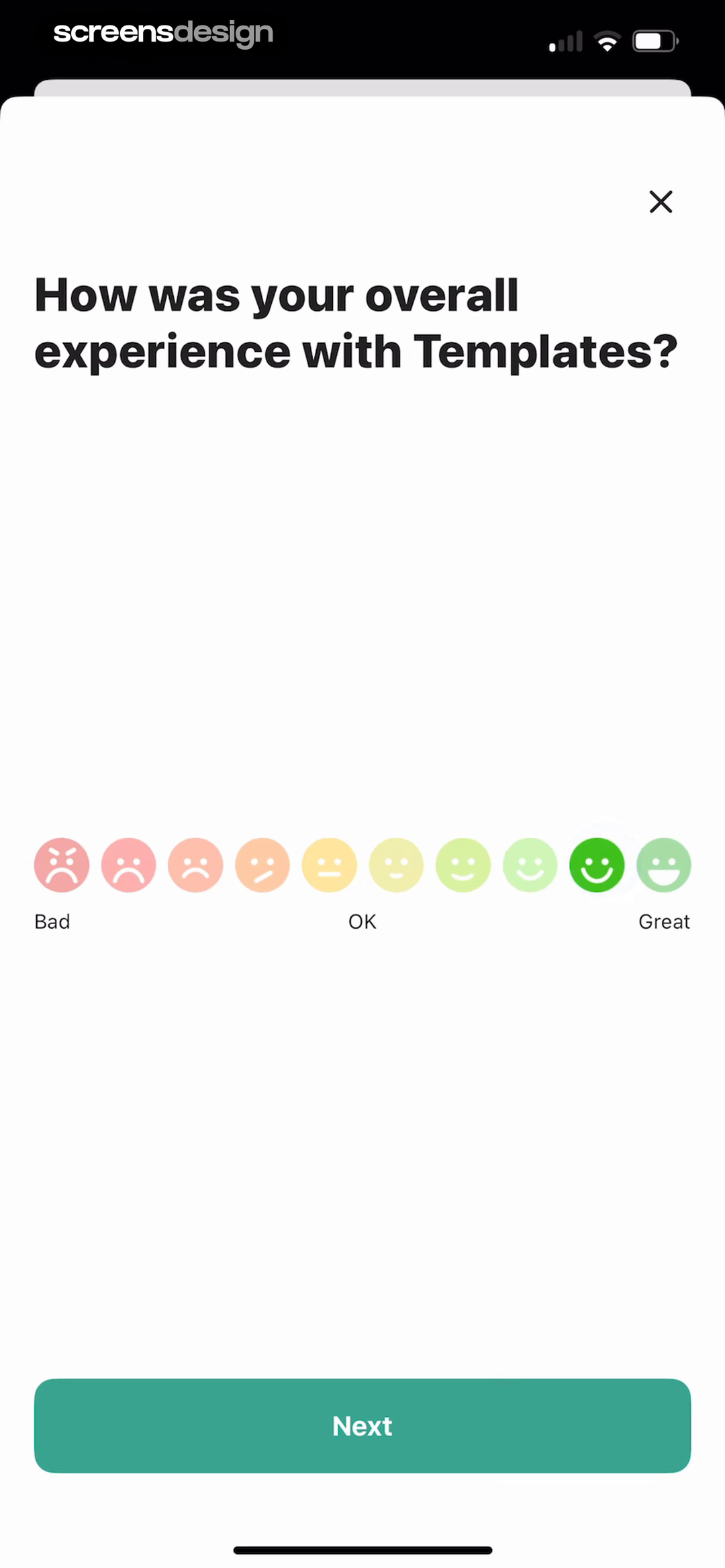
Under Armour shows that the app-experience prompt explains that five stars means excellent and one star means poor. Lift: AI Video & Photo Editor takes a different but compatible approach: templates are evaluated with Bad, OK, and Great before the survey asks a relevant follow-up. Together, the examples reveal which details must stay visible at the decision point rather than being deferred to support or legal copy.
Ask dissatisfied customers what failed and satisfied customers what worked. Keep categories mutually understandable and always allow an optional explanation or skip.
Test the normal path, dismissal, back navigation, interruption, app relaunch, slow network, stale account data, and the state after completion. The primary label, confirmation, saved data, and next destination should describe the same outcome. Check large text, screen readers, keyboard focus, translated copy, and reduced motion so the decision remains understandable without relying on layout or color alone.
05. Open feedback
Give text fields a distinct job.
One empty box often creates vague requests and difficult analysis.
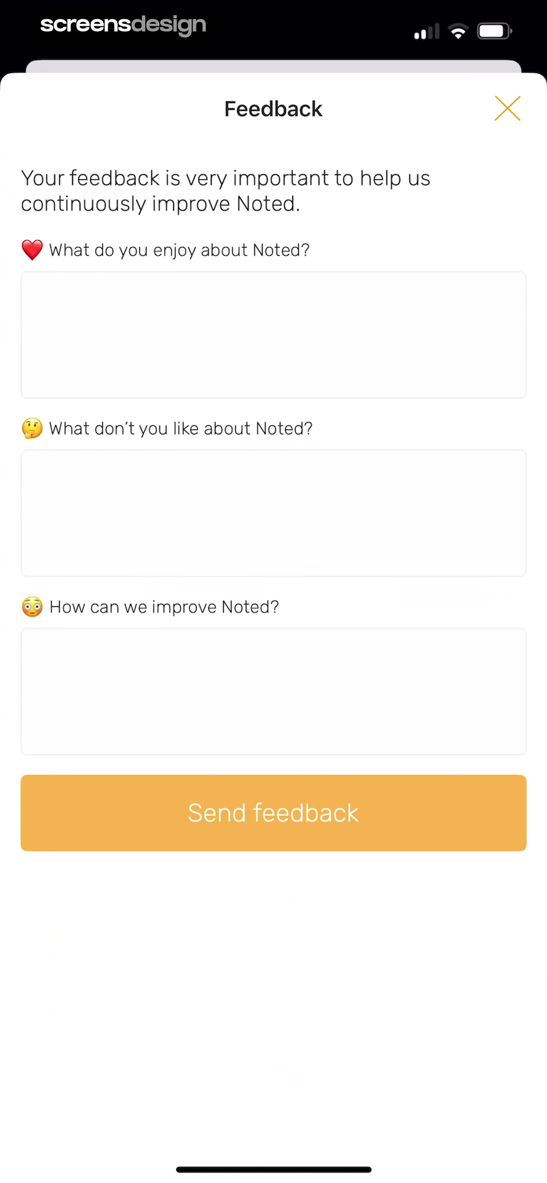
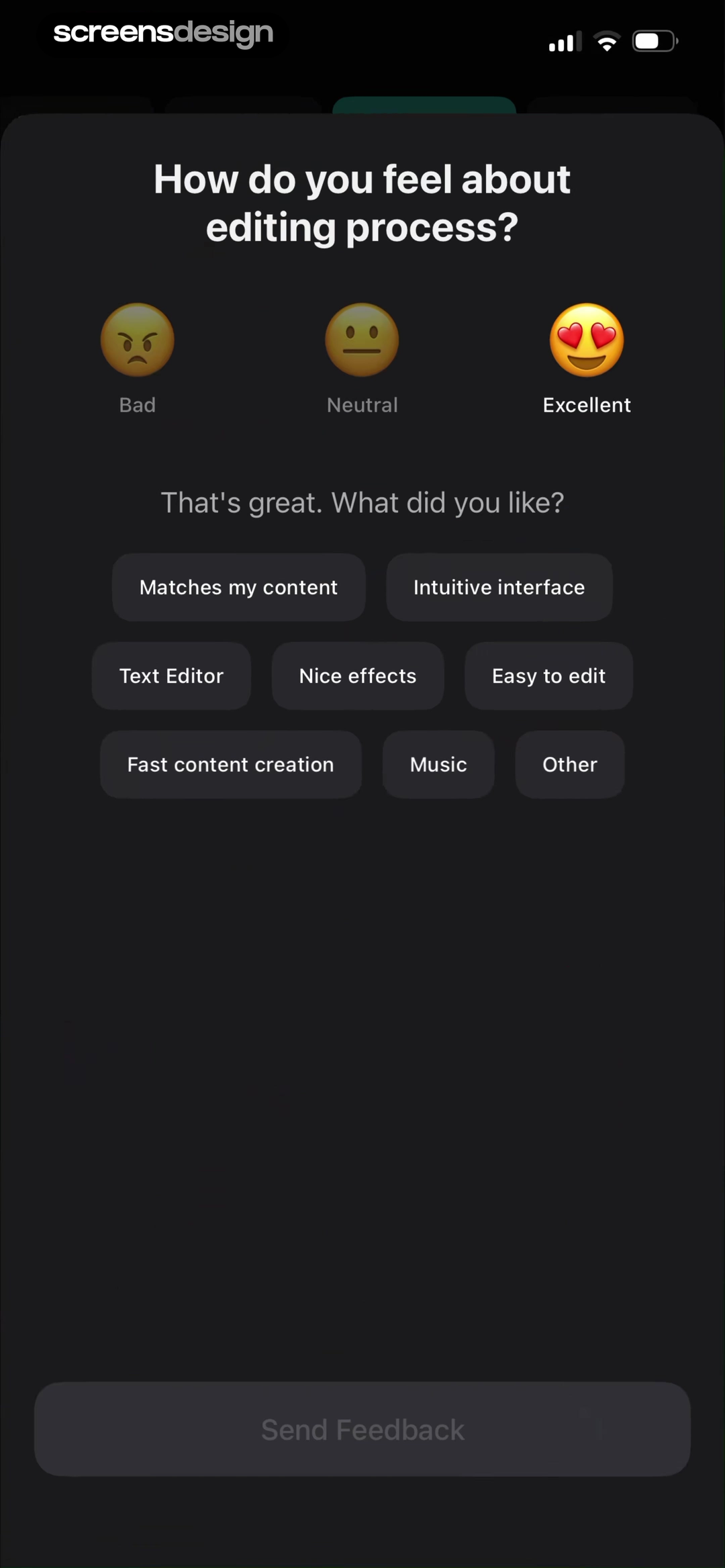
Noted: Record & AI Transcribe shows that enjoyment, dislike, and improvement prompts give open feedback distinct jobs instead of one empty text box. Vids AI - Reels Video Editor takes a different but compatible approach: the editing-process rating branches into selectable reasons such as content match, interface, and text editing. Together, the examples reveal which details must stay visible at the decision point rather than being deferred to support or legal copy.
Separate enjoyment, problem, and improvement only when the customer can answer each. Preserve typed text across validation errors and state whether contact information is collected.
Test the normal path, dismissal, back navigation, interruption, app relaunch, slow network, stale account data, and the state after completion. The primary label, confirmation, saved data, and next destination should describe the same outcome. Check large text, screen readers, keyboard focus, translated copy, and reduced motion so the decision remains understandable without relying on layout or color alone.
Implementation
Build the state model before polishing the screen.
Interface quality depends on entitlement, account, billing, content, and analytics state agreeing.
Define survey identifier, version, eligible event, delay, sampling, cooldown, exclusion rules, questions, scale, branch logic, dismissal behavior, and destination for each response. Keep the experience event attached so the team knows which feature version and outcome the customer saw.
Make the survey non-blocking unless feedback is required for a genuine support or compliance process. Support keyboard and screen readers, label every scale choice, allow dismissal, preserve text, handle offline submission, and confirm receipt. Do not request sensitive health, financial, or personal details through an unprotected general feedback field.
Test repeated triggers, back navigation, app relaunch, slow submission, offline mode, validation, large text, translated labels, right-to-left layout, low and high scores, branching, account deletion, underage users, and a customer who already submitted.
- The trigger and question refer to the same recent event.
- Every scale has clear labels and consistent direction.
- The survey is dismissible and does not destroy the current task.
- Branching asks only relevant follow-ups.
- Typed feedback survives validation and network errors.
- The team has an owner and action for the collected responses.
Measurement
Measure the completed outcome, not only the first tap.
A visible control is useful only when the customer reaches the expected state and can continue.
Track survey shown, survey dismissed, response completion, branch completion, and product action from feedback. Define the successful product state before launch and verify it from server or platform truth where possible. A button tap without the promised entitlement, schedule, reward, survey result, or recovered access should be counted as an error, not conversion.
Segment by entry point, customer state, current plan or program, platform, app version, locale, accessibility settings, prior failures, and whether the person returned after leaving the flow. Compare immediate completion with what happens during the next relevant session so a short-term click does not hide confusion or regret.
Review guardrails alongside the primary metric: repeated attempts, backtracking, support contact, refund, cancellation, incorrect access, disabled reminders, abandoned tasks, and manual corrections. Read open feedback and replay representative failures with sensitive information protected. The goal is a trustworthy customer outcome, not a higher number produced by obscuring alternatives.
Review checklist
Test the content, the control, and the resulting account state.
Create accounts for the new, active, returning, expired, interrupted, unsupported, and already-completed states. Verify copy, available actions, confirmation, account data, navigation, and the destination for each one.
Run the flow with slow and failed network calls, app relaunch, another device, large text, screen reader, localization, denied permissions where relevant, and a customer who changes their mind. Every path should preserve data and provide a clear way forward.
- The trigger and question refer to the same recent event.
- Every scale has clear labels and consistent direction.
- The survey is dismissible and does not destroy the current task.
- Branching asks only relevant follow-ups.
- Typed feedback survives validation and network errors.
- The team has an owner and action for the collected responses.
Questions and answers
In-app feedback surveys questions
When should an app show a feedback survey?
Show it after a recent recognizable outcome when the customer can answer without losing their task. Use sampling and cooldowns to avoid repetition.
How many questions should an in-app survey ask?
Ask the minimum needed for one product decision. Start with one measure and branch to a short relevant follow-up.
Should rating scales label every option?
Label at least the endpoints, and label intermediate choices when users might interpret the numbers differently. Keep the direction consistent.
How should open feedback be collected?
Give the field a specific prompt, make it optional where possible, preserve text through errors, and explain whether the team may contact the customer.
What makes survey data actionable?
Attach the response to the relevant event, feature version, segment, and question version, then assign an owner and decision threshold before launch.
Apps referenced in this page
Open the products behind the examples.
 Skan - #1 Skincare AppSkin Scan & Product Finder
 BODi Fitness: Home WorkoutsWorkout tracker, gym, yoga
 Vocabulary - Learn words dailyWord of the day widget & games
 Strava: Run, Bike, WalkTrack & share with friends
 PictureThis - Plant IdentifierPlant care and identification
 TravelAnimator: Journey Route3D Travel Map Video Animator
 Under ArmourShop Athletic Clothing & Shoes
 Lift: AI Video & Photo EditorReels & Story Maker
 Noted: Record & AI TranscribeTake notes, voice memo, audio
 Vids AI - Reels Video EditorTrending Filters & Effects
2,715 apps in the top charts.Ask them anything.
Search real app flows, compare the screens around each decision, and turn stronger references into your own product.