15 screens from 4 recorded apps
15 Onboarding Microinteraction Examples: Motion, Feedback and Progress
The useful onboarding microinteraction is not decoration. It connects an action to a visible response, keeps a wait credible, teaches an unfamiliar gesture, or marks a real transition.
A microinteraction is a small loop: a trigger, a rule, feedback, and a resulting state. During onboarding, it may begin with a selection, wait, swipe, or completed setup. It succeeds when the person can tell what the product registered and what happens next.
Use the: app onboarding screens guide to plan the complete first-session journey, then use the: app screen design guide to refine hierarchy, states, controls, and screen-level composition.
A static screenshot cannot prove animation, so the strongest evidence appears as ordered replay frames. Fitself moves through progress into a result, looklike teaches two swipes, and Retain Cards moves from a setting into completion. Single frames support only state-level claims. The recordings do not expose haptic output, so no vibration is claimed.
For a related first-result sequence with loading and correction states, read the AI app onboarding examples.
01. Selection feedback
Let the selected state carry meaning before Continue is tapped.
A choice should look registered, remain easy to change, and reveal whether one or several answers are allowed.
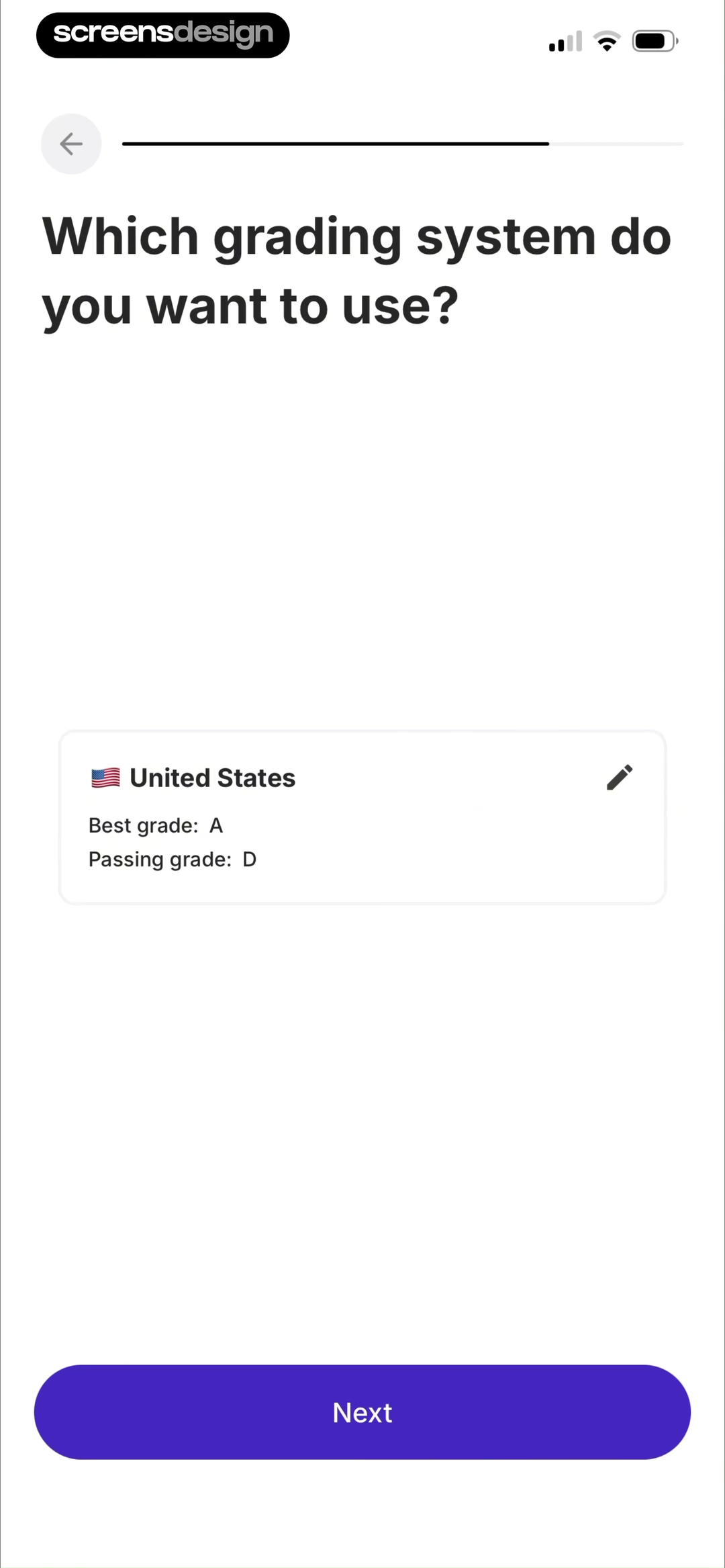
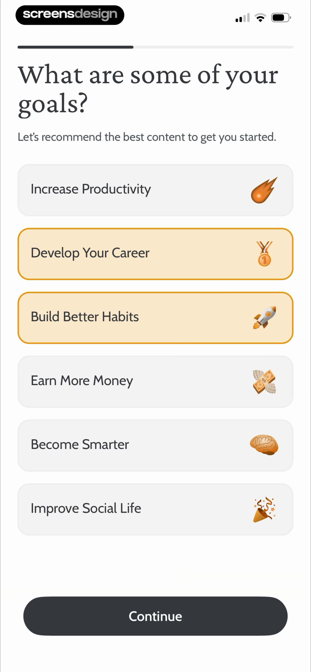
Retain Cards shows a grading system as a summarized selection card at position 16 and 52.2 seconds. The country, best grade, passing grade, and edit icon make the stored choice inspectable before the person proceeds. Deepstash uses a different pattern at position 13 and 67.6 seconds: two goal cards receive visible borders while four alternatives remain available. The interface makes multi-select behavior legible without a separate explanation.
Treat this response as functional feedback, not a color flourish. Pair color with a check, border, label, icon, or shape change. Keep unselected choices stable, persist the answer, and expose an edit path. If selection enables Continue, update the button in the same response window. Reserve automatic advance for low-risk, reversible choices so navigation does not feel accidental.
02. Progress
Use changing progress to explain the work, not merely occupy time.
A percentage earns trust only when the stages and final state remain consistent with it.
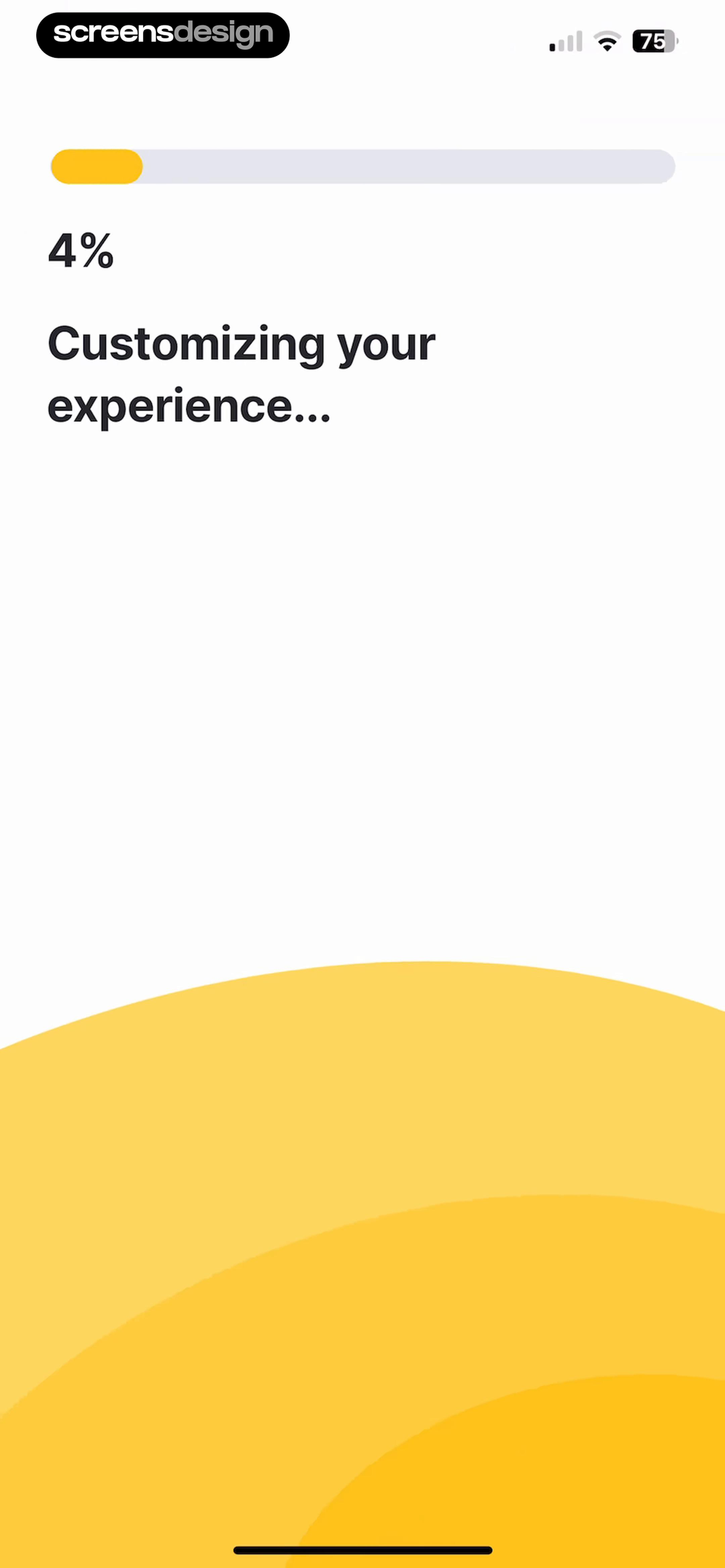
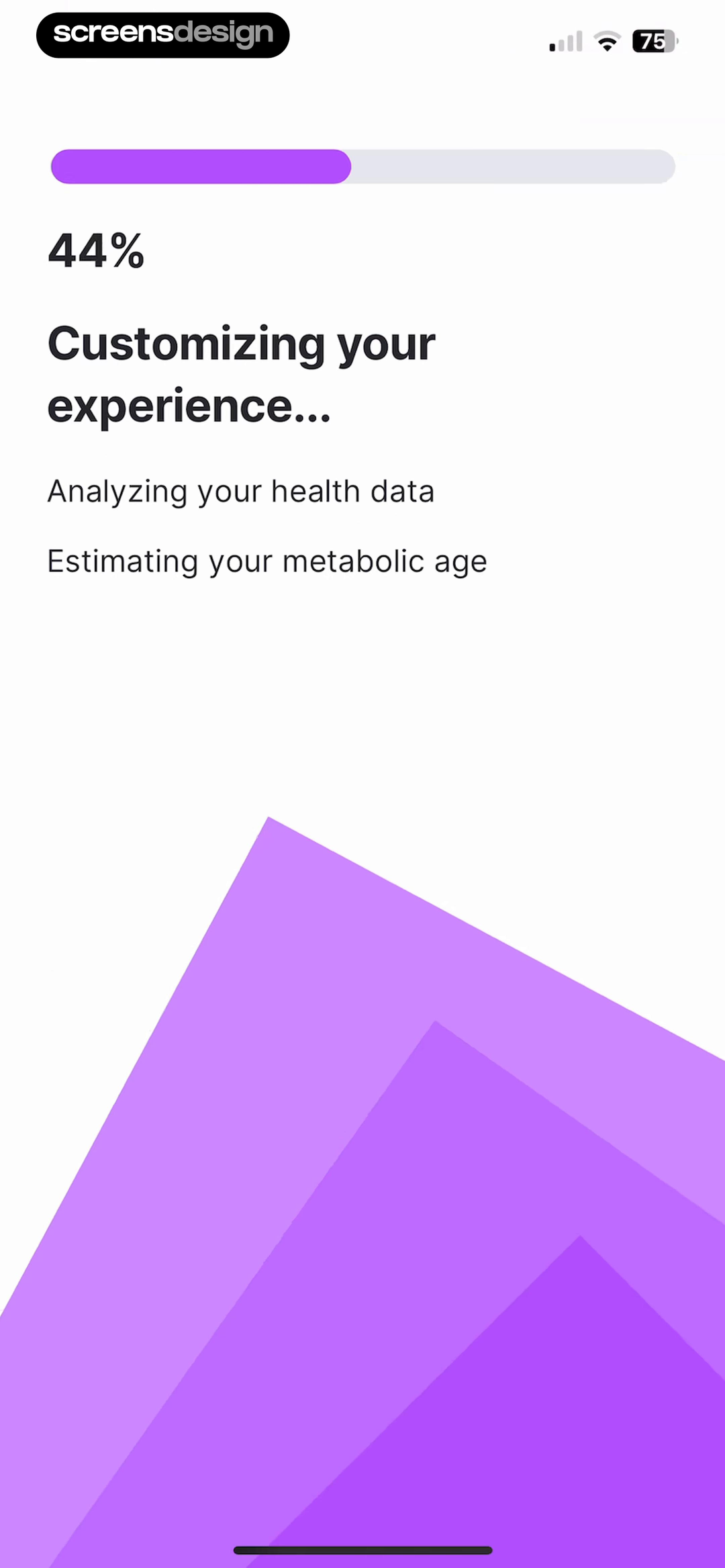
Fitself provides the clearest ordered loading sequence. Positions 37 through 40 occur at 141.3, 144.7, 147.1, and 148.8 seconds. Progress changes from 4 to 44 to 81 to 96 percent. Status lines accumulate from no task to health analysis, metabolic age, fasting plan, learning center, and final setup. Color also changes yellow, purple, orange, and green. These are distinct recorded states, not one static loader.
Be careful with numeric precision. If the backend cannot report real completion, a percentage implies knowledge the system does not have. Use an indeterminate indicator for an uncertain wait, or map progress to actual milestones. Status text should describe real work without repeating sensitive answers.
Preserve progress if the app backgrounds, explain when setup can continue later, and provide retry or recovery when generation fails. Motion should reduce uncertainty, not hide a blocked request.
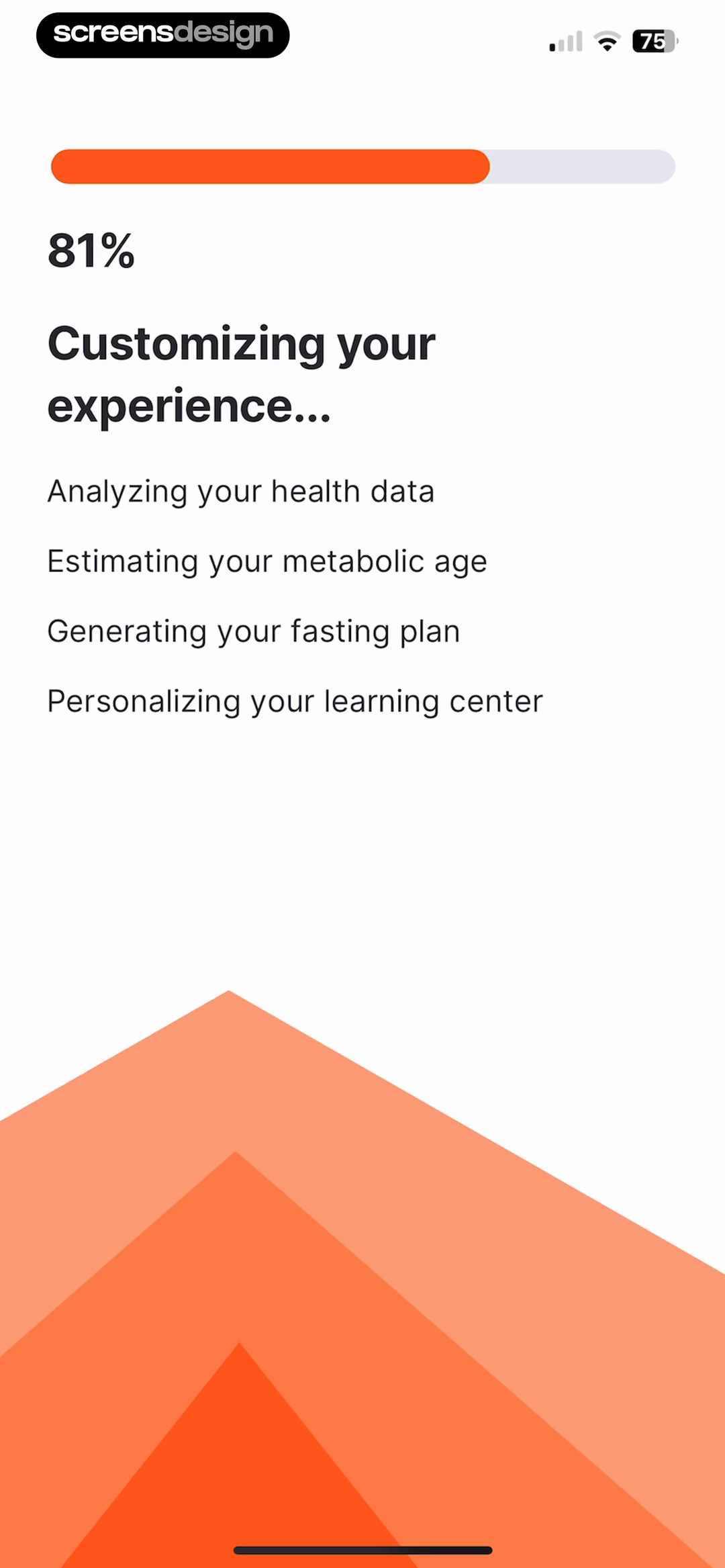
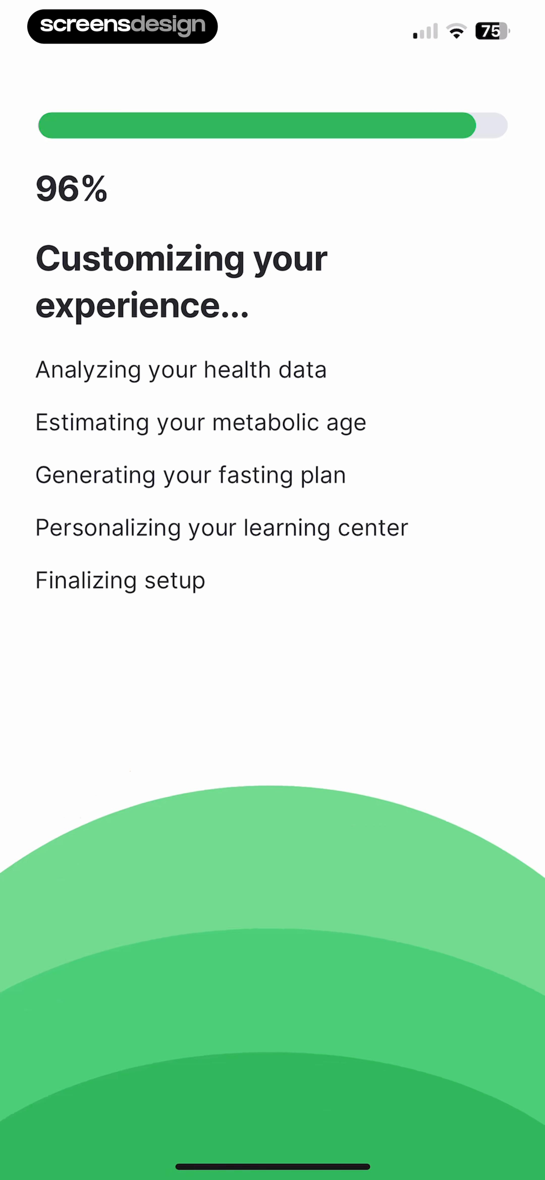
The wait needs a destination.
Fitself's four changing progress frames are followed by a plan-ready screen at the next recorded position. That ordered result matters more than the percentage animation alone.
03. Result transition
Make the first frame after loading prove that something changed.
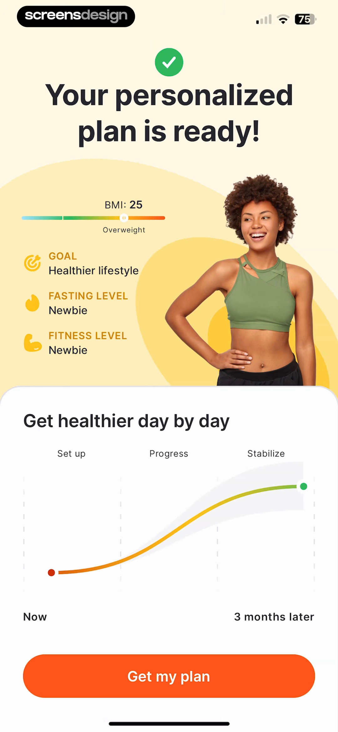
Completion is credible when the result carries forward the inputs and tasks named during the wait.
At position 41 and 150.9 seconds, Fitself replaces the loading treatment with Your personalized plan is ready. The screen shows BMI, goal, fasting level, fitness level, a three-month progression graphic, and Get my plan. This is the fifth consecutive frame in the sequence. The transition closes the promise made by Customizing your experience instead of dropping the person into an unrelated home screen.
Reuse the language, object, or visual anchor from loading so the person recognizes the result. If setup built a workspace, open it. If it analyzed preferences, show the changed settings or recommendations. Avoid a generic checkmark that forces another tap before inspection.
Generated health, finance, or learning recommendations should expose assumptions and edit paths. This recording shows a fitness-plan summary, but it does not establish clinical validity. Motion can clarify a handoff, not validate the calculation.
04. Gesture rehearsal
Teach an unfamiliar gesture through one safe, visible consequence.
Gesture copy is easier to learn when direction, object movement, feedback, and reversal appear as one short sequence.
looklike records five consecutive moments from positions 26 through 30. At 199.2 seconds, setup reaches 100 percent. At 201.1 seconds, the next screen says swipes improve the style model. At 202.7 seconds, a cue says swipe right to like. At 205.8 seconds, cards and a like pill show the result. At 207.8 seconds, the instruction changes to swipe left. These frames establish sequence, not easing, duration, or physics.
The sequence connects direction to meaning before real browsing. Keep the practice object disposable and reversible, show one gesture at a time, and provide controls that perform the same actions. Visible Like and Reject buttons support assistive input and people who find swiping uncomfortable.
Rehearsal is justified when the product assigns a specific consequence to a motion that is not safely obvious. End after understanding, remember completion, and keep the tutorial available from help.

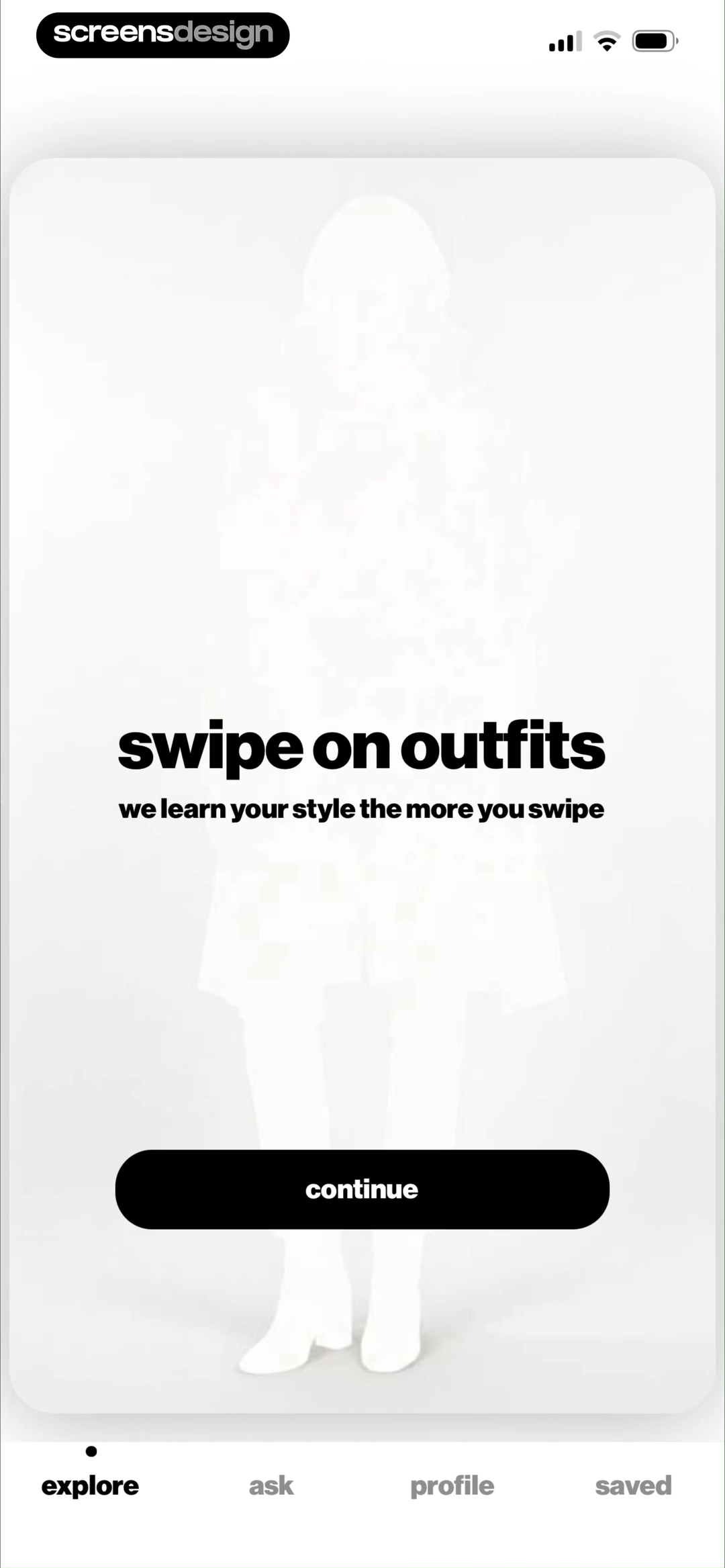
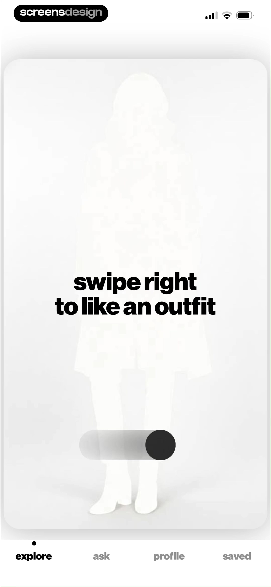
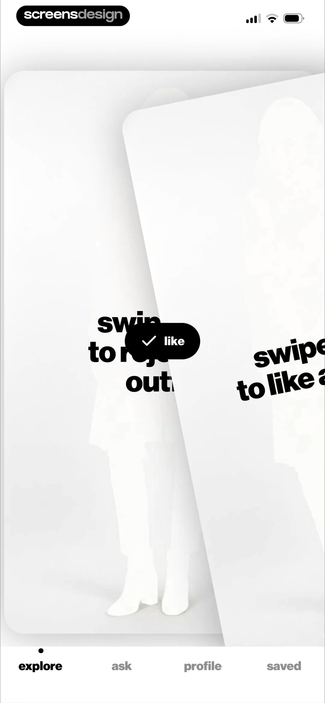
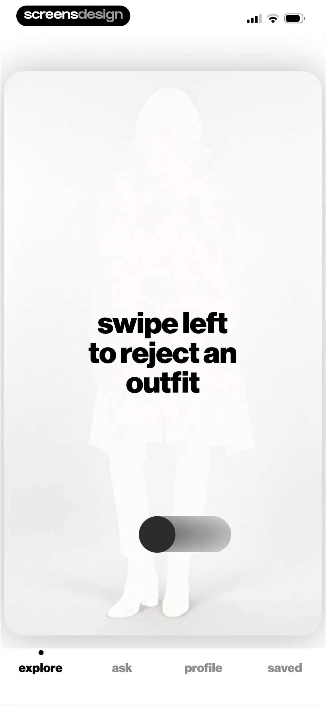
Show the gesture, then show its state change.
The right-swipe instruction at position 28 is followed by a like state at position 29, then the flow introduces the opposite gesture. The ordered frames support the learning sequence without pretending to reveal every animation frame.
05. Confirmation and celebration
Celebrate a completed change, then return attention to the result.
Confetti is useful only when the user can tell what finished and what to do next.
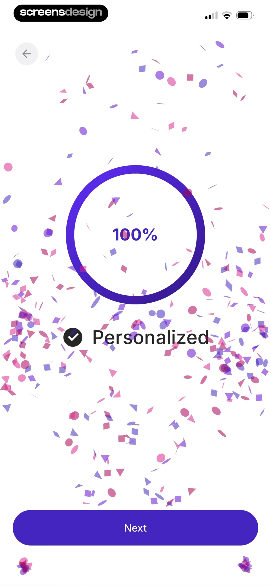
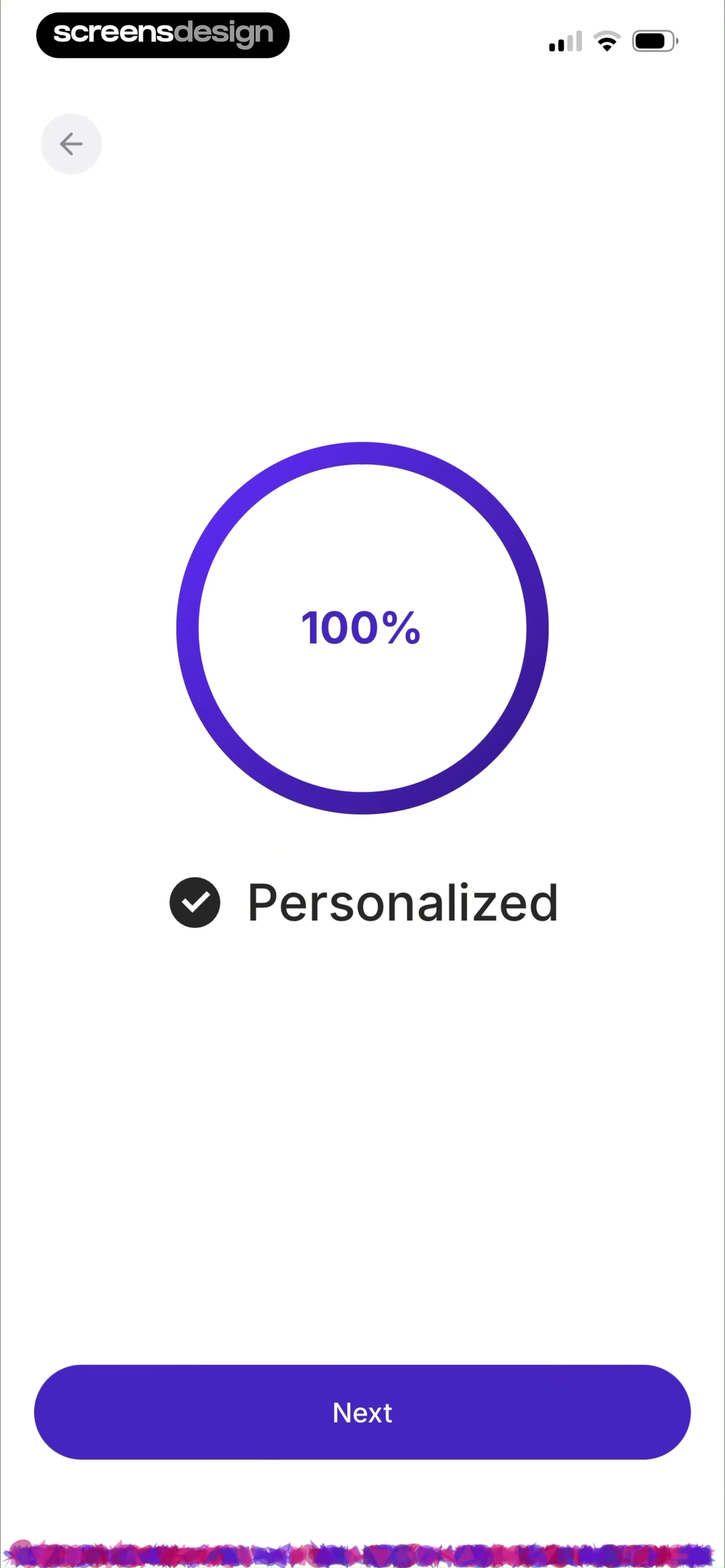
Retain Cards positions 16 through 18 form another ordered sequence. The selected grading system at 52.2 seconds is followed by a 100 percent Personalized state with confetti at 63.2 seconds. At 78.5 seconds, the same completion message remains while the confetti has cleared and a quieter footer treatment is visible. The two completion frames suggest a celebration resolving into a stable state, although the recordings do not establish the animation curve or whether haptics accompanied it.
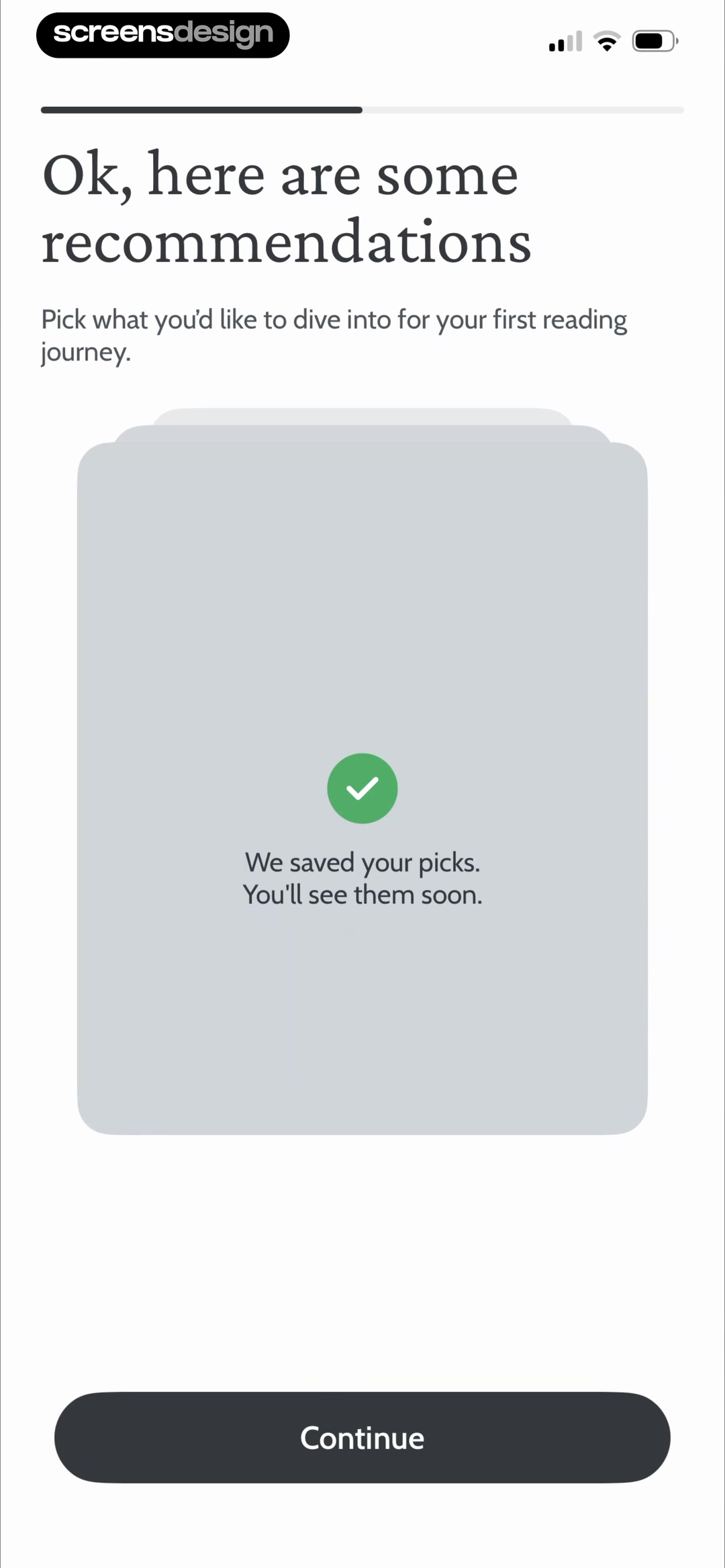
Deepstash offers a quieter confirmation at position 23 and 86.4 seconds. After goal selection and intervening recommendations, a green check says We saved your picks and You'll see them soon. This is not an adjacent pair, so it is end-state evidence only. It works because it names what was saved and what follows.
Match intensity to significance. Completed setup may justify a brief celebratory layer. A routine toggle needs only a persistent check or toast. Keep the next button stable, stop repeated particles, preserve screen-reader focus, and never use celebration to distract from a commitment.
06. Motion boundaries
Specify motion, sound, and haptics as separate feedback channels.
A polished transition can still fail when it is inaccessible, non-deterministic, or asked to carry meaning alone.
Write a state table before an animation brief. For every trigger, define the previous state, next state, visible confirmation, focus destination, reduced-motion behavior, interruption path, and error recovery. Then decide whether movement adds spatial continuity or merely repeats information already available. Selection should remain visible after motion ends, loading should expose status in text, and success should be announced without requiring a particle effect to be seen.
Honor Reduce Motion with shorter fades or immediate state changes. Avoid parallax, rapid zoom, flashing, and uncontrolled loops. Preserve focus during transitions. If haptics are used, define their semantic role separately and provide a setting where appropriate. A recording without device telemetry cannot verify any haptic.
Test slow networks, low power mode, backgrounding, larger text, and repeated onboarding. Meaning must survive when motion is skipped or interrupted.
Persist the state
Do not let meaning disappear when the animation completes.
Announce the change
Move focus deliberately and expose concise status text.
Keep the consequence
Remove travel and scale while preserving feedback and order.
Use one semantic signal
Map patterns to meaning and never make vibration the only feedback.
07. Practical review
Review onboarding microinteractions as complete state changes.
The final test is whether every trigger produces understandable, recoverable feedback under realistic conditions.
Record the onboarding from a fresh install and annotate every state change in timestamp order. Capture the frame before input, the response, the settled state, and the next destination. Ask engineering which progress values are real, which transitions can be interrupted, and how state is restored after backgrounding. Ask design and content whether the same meaning survives without color, sound, motion, or haptics.
Review on the slowest supported device and network. A crisp prototype can mask delayed response, duplicate taps, or focus loss. Keep evidence with the decision so later redesigns preserve intentional behavior.
- Name the user or system trigger for every microinteraction.
- Show a persistent selected state that does not rely on color alone.
- Use real milestones for determinate progress and honest uncertainty otherwise.
- Keep status copy consistent with the result that follows.
- Teach one unfamiliar gesture at a time with an accessible alternative.
- Make confirmations name the object, choice, or setup that changed.
- Match celebration intensity to the significance of the completed action.
- Define reduced-motion, screen-reader, keyboard, and large-text behavior.
- Specify haptics independently and never infer them from visual evidence.
- Test interruption, backgrounding, failure, retry, repeat onboarding, and double taps.
- Capture before, response, settled, and next states in timestamp order.
- Verify that motion can be skipped without losing meaning or control.
Questions and answers
Onboarding microinteraction questions
What is an onboarding microinteraction?
It is a small first-use feedback loop. Selecting, swiping, waiting, or completing setup leads to a rule, feedback, and a resulting state the user can understand.
How fast should selection feedback appear?
The control should feel connected to the input. Persist the result with a check, border, label, icon, or shape change, then update the next action in the same response window.
Should onboarding loading screens show percentages?
Only when the number maps to real progress or stable milestones. Use an indeterminate treatment when completion is unpredictable, with plain status text and failure recovery.
When does onboarding need a gesture tutorial?
Use one when a core task depends on a product-specific gesture whose consequence is not safely obvious. Let the person rehearse on a disposable object, show the result, and provide visible buttons or another accessible alternative.
Are confetti and celebration good onboarding feedback?
They can mark a meaningful completion when the finished result and next step stay clear. Keep the effect brief, non-blocking, reduced-motion safe, and proportional to the achievement. Routine selections usually need quieter confirmation.
How should onboarding haptics be documented?
Specify the trigger, semantic purpose, platform pattern, intensity, repetition, user control, and non-haptic equivalent. Do not infer haptics from screenshots or ordinary screen recordings because those sources do not verify device vibration.
How can I research more onboarding microinteractions?
Search recorded onboarding screens by state or task, then open the exact replay around each result. Compare the frame before input, the response, the settled state, and the next destination instead of copying one isolated screenshot.
Apps referenced in this page
Open the products behind the examples.



2,622 apps in the top charts.Ask them anything.
Search recorded onboarding screens for selection feedback, progress, loading, gesture tutorials, confirmation, and celebration, then inspect the surrounding replay.