Evidence from 12 recorded apps
7 App Onboarding Trends for 2026, Shown in 16 Real Screens
Seven recurring choices in 16 recorded screens show onboarding moving from explanation toward evidence, consequence, rehearsal, and better-timed commitment.
The useful shift is not a new visual style. It is a change in the bargain between product and user. Strong onboarding now spends less time asserting that an app is easy or personalized and more time showing an outcome, asking a consequential question, previewing what the answer changed, or letting the person perform the real task safely.
This is a time-stamped decision report. For the enduring flow anatomy, open: the evergreen app onboarding screens guide. For interaction hierarchy beyond the first session, use: the mobile app UI design guide.
The framework below evaluates onboarding as a chain of seven decisions: what outcome to show, what signal to ask for, how to reveal the consequence, where proof belongs, when permission is justified, which behavior deserves rehearsal, and where an account becomes necessary. That keeps the review focused on cause and sequence instead of treating every welcome screen, quiz, and paywall as a separate pattern.
For a focused treatment of questions, branching, and tailored results, read the personalized app onboarding review.
01. Outcome before explanation
Show one believable result before describing the feature set.
A concrete artifact can answer what the product does faster than a carousel of abstract benefits.
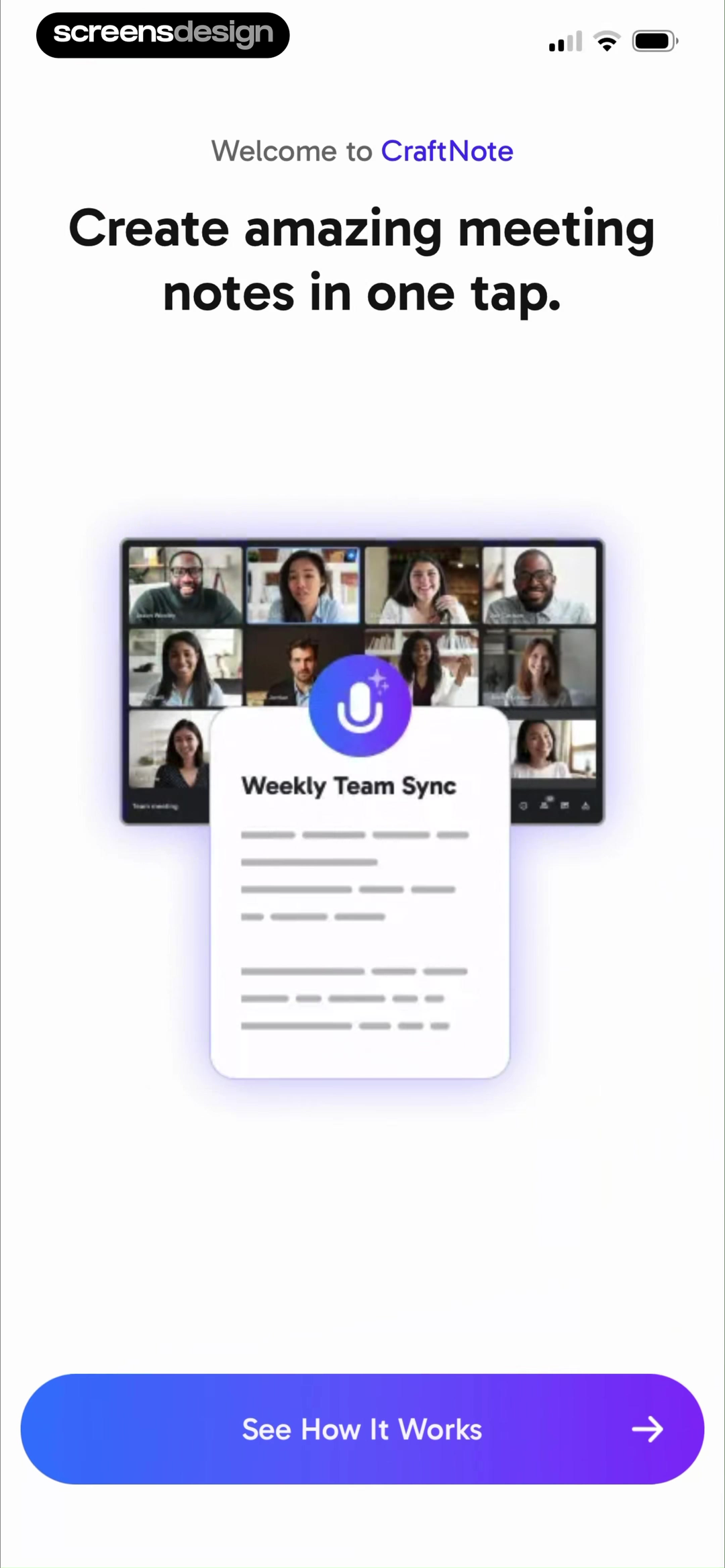
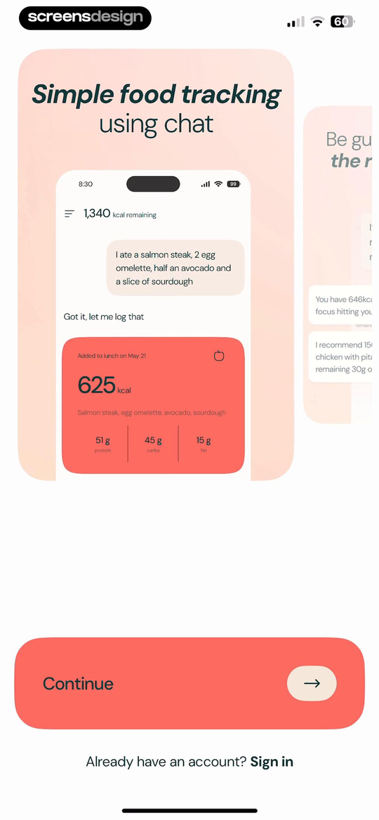
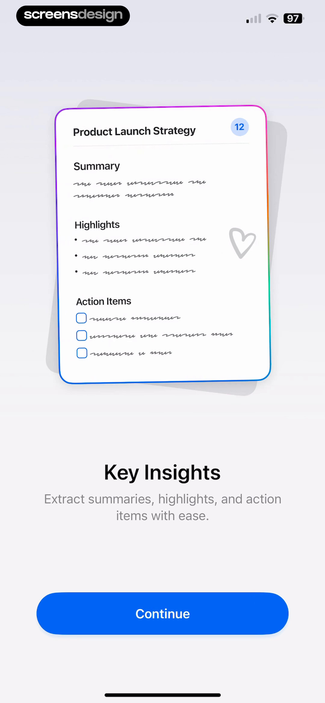
CraftNote opens this part of its flow with a Weekly Team Sync card under the promise of meeting notes in one tap. Welling stages a complete meal-logging exchange, including calories and macronutrients. Echo shows the anatomy of a processed meeting note with a summary, highlights, action items, and key insights. Each screen names an output and gives it enough detail to be judged.
The product decision is to choose the smallest honest sample of value. A static mock result is useful when the task requires unavailable data, such as a meeting recording or meal photo. It should still look like the real object the user will receive, use plausible content, and avoid suggesting that a result has already been generated for this person. The goal is comprehension, not simulated progress.
This approach also creates a cleaner test. Ask a new user to describe what they expect after tapping Continue. If the answer is still a category such as productivity, wellness, or AI assistant, the screen has not done enough. If they can name the artifact, such as an action-item list or a logged meal, the promise is specific enough to support the next step.
02. Higher-signal questions
Ask for a decision the product can actually use.
The number of questions matters less than the ratio of useful signal to effort.
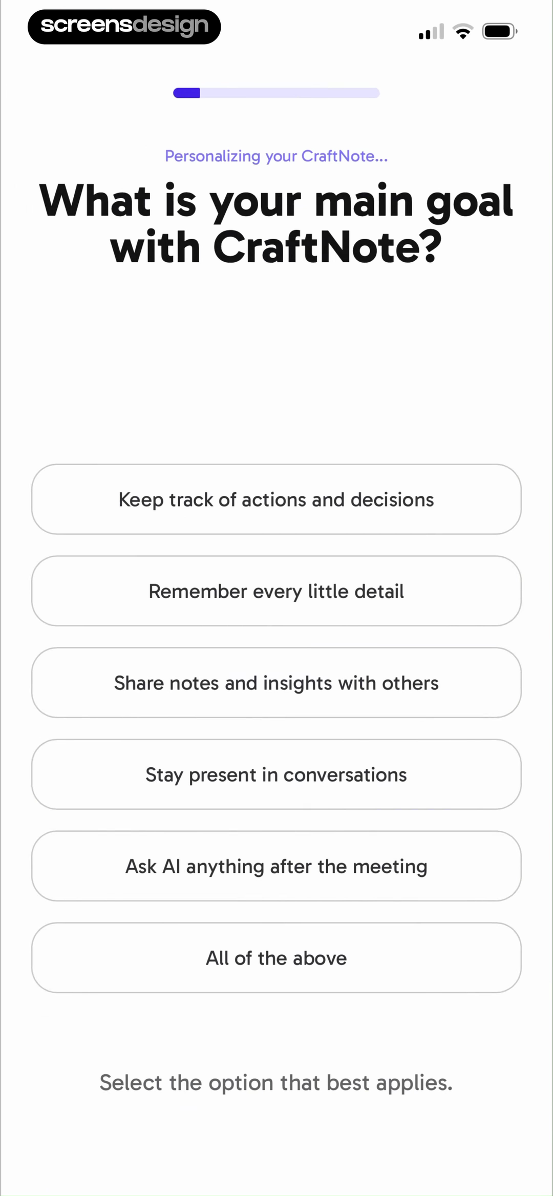
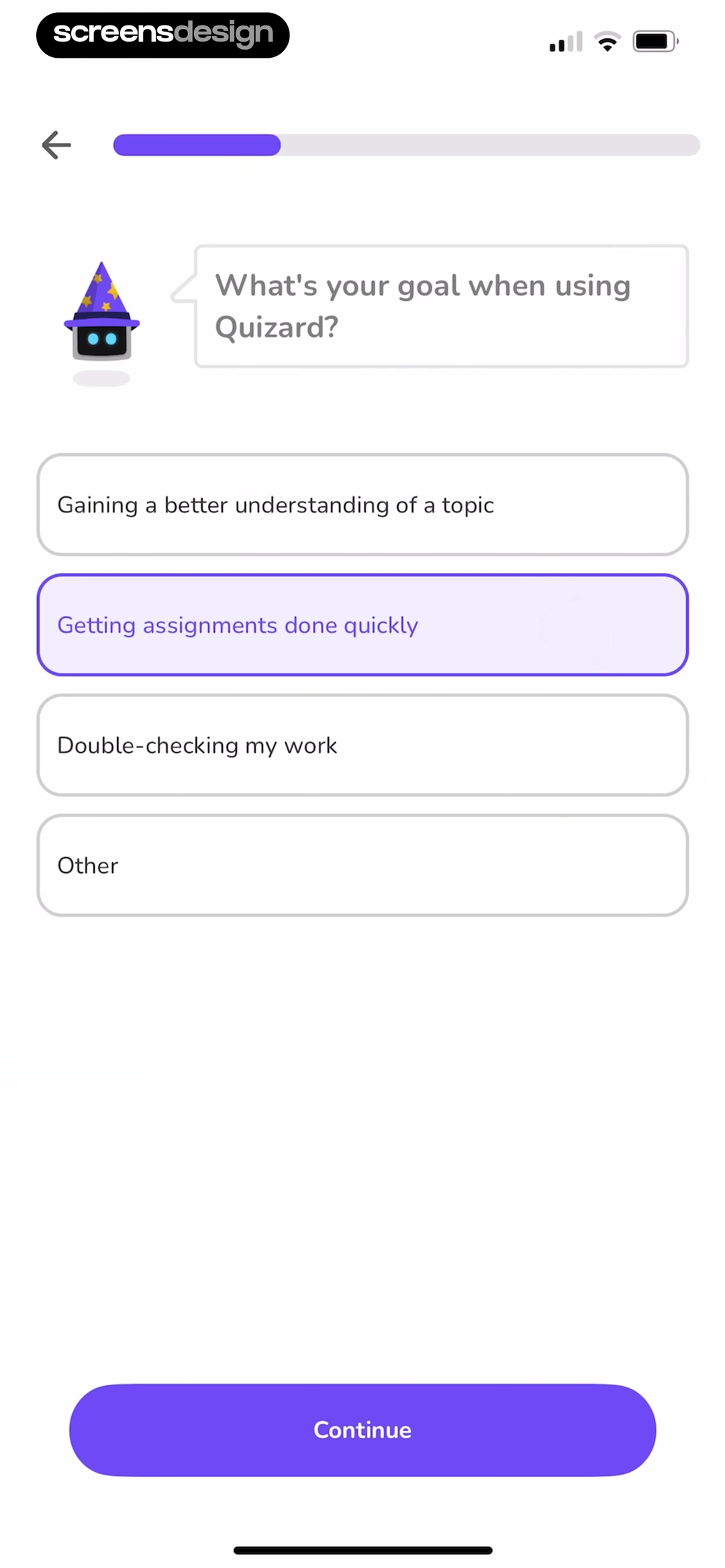
CraftNote asks what the user mainly wants from meeting notes, with choices that imply different priorities: decisions, detail, sharing, presence, or later AI questions. Quizard separates understanding a topic, finishing work quickly, and checking work. These are not demographic labels. They are competing jobs that could change the first recommendation, the emphasized feature, or the language used next.
A polished single-select card is not automatically good onboarding. The full CraftNote replay contains more questions after this one, including pain point, role, context, and acquisition source. That makes it a useful reminder to audit the complete sequence. A strong question can still sit inside an overlong questionnaire. Count every tap and field from launch to first value, then mark the exact downstream behavior each answer changes.
Keep an answer when it affects a default, route, example, safety rule, or saved preference. Defer it when it only enriches a profile or a marketing segment. If the user cannot predict why the app is asking, add a plain explanation or move the question to the moment its relevance becomes obvious. Also provide Other, Skip, or editability when the choices cannot represent everyone accurately.
Draw a line from every answer to a visible change.
If the line ends at analytics, CRM enrichment, or a future possibility, collect the data later or remove the question.
03. Visible personalization
Return the value of an answer before asking for commitment.
Personalization becomes credible when the user can see what changed and correct it.
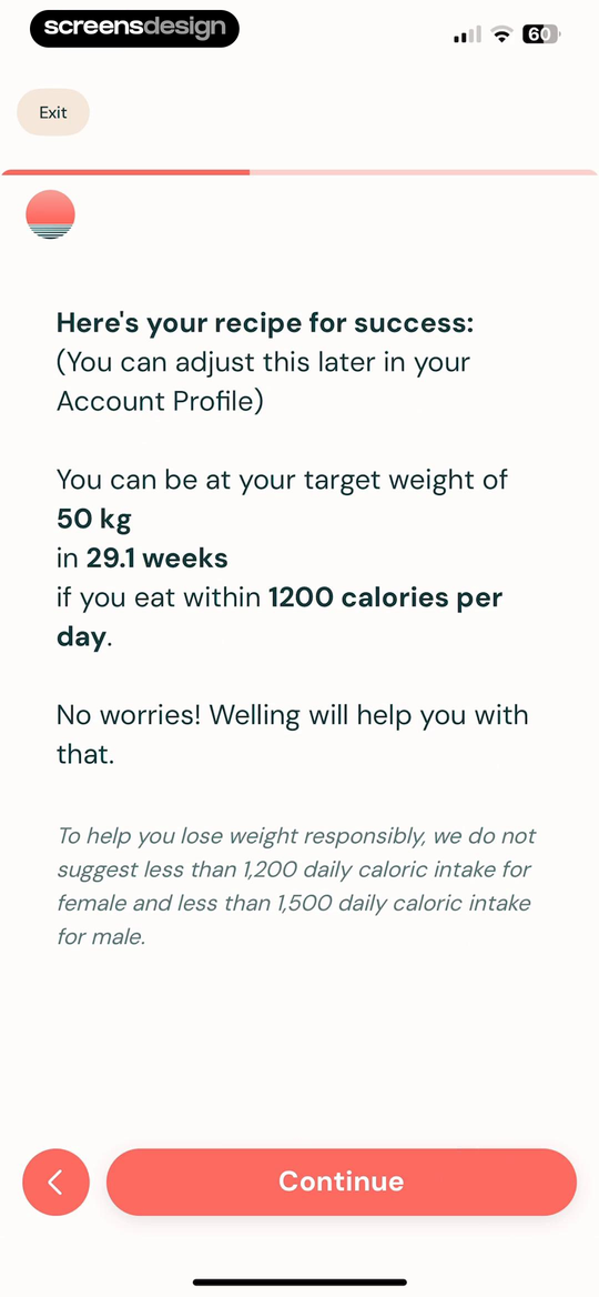
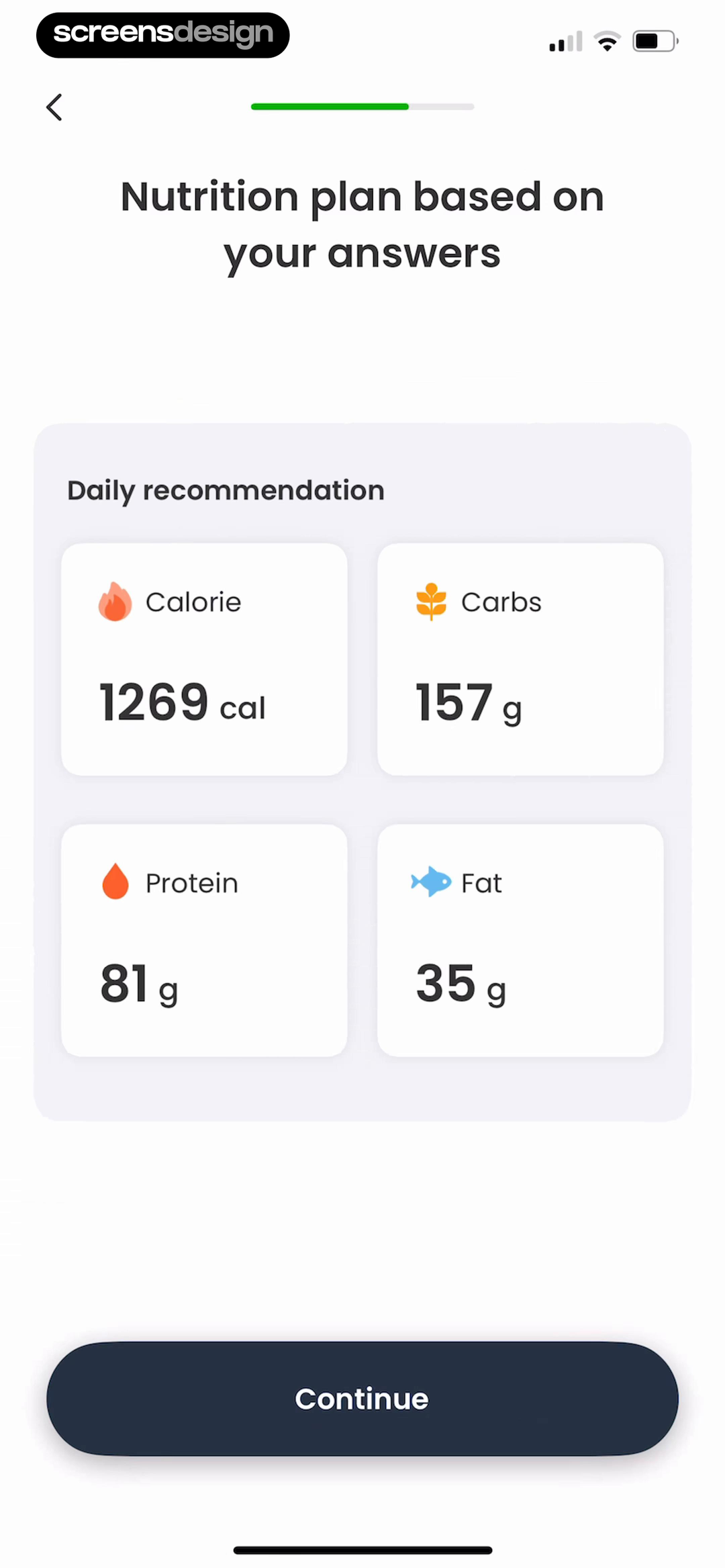
Welling turns earlier health inputs into a target timeline and daily calorie figure, while CaloCare presents a calorie and macronutrient recommendation explicitly based on the user's answers. Both screens close a loop: input goes in, a legible configuration comes back. The result is more persuasive than a loading animation that simply announces personalization is complete.
Specific output raises the standard for explanation. Health and financial recommendations need understandable assumptions, responsible ranges, and a clear path to edit the source data. Welling states that the plan can be adjusted later and includes a lower-intake safeguard in its visible copy. That does not prove clinical quality, but it shows the interface acknowledging that the number needs context rather than presenting it as magic.
For lower-risk products, the same principle still applies. A learning app can show lesson length and level. A task app can show the chosen workspace and first template. A news app can preview followed topics. Label which answer produced which setting, allow correction before irreversible work begins, and avoid manufacturing a dramatic result only to make the paywall feel more valuable.
04. Proof in context
Match proof to the user's selected job, or leave it out.
A rating becomes more relevant when the surrounding example reflects the problem the person just named.
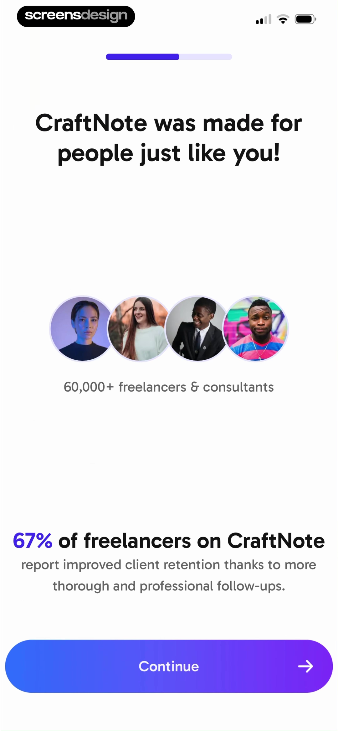
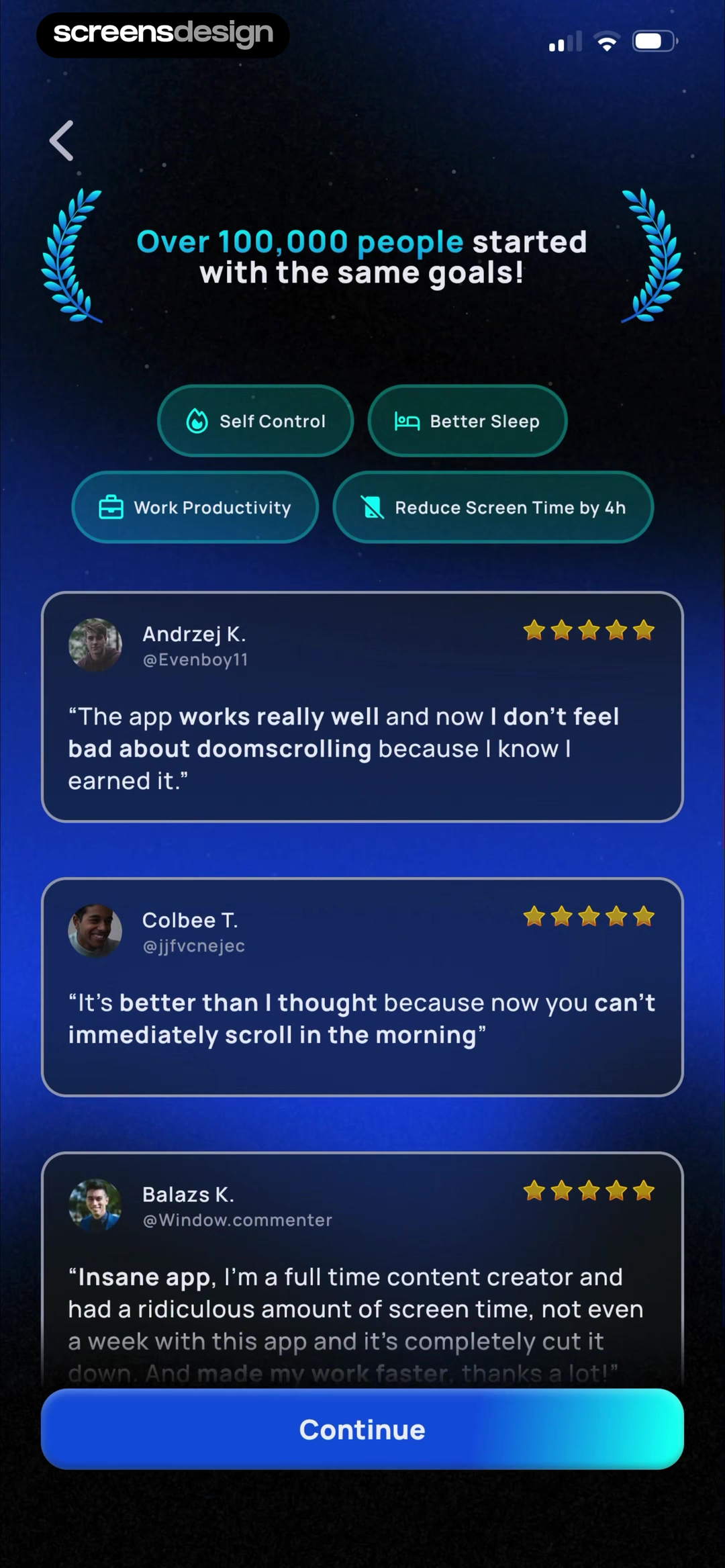
CraftNote follows a role selection with copy about freelancers and consultants. Pushscroll groups testimonials under goals such as self-control, sleep, productivity, and reduced screen time. The observable pattern is contextual placement: proof is not isolated on a generic review slide, but connected to identity or intent gathered earlier in the flow.
The numbers and testimonials shown here are product marketing claims visible in the recordings. This review does not independently verify them, and they do not demonstrate onboarding performance. Teams should retain the source, date, sample, and permission for any claim they publish. Avoid dynamically restating an answer as proof, such as saying thousands of people are just like you, unless the underlying segmentation actually supports it.
Use proof to answer a live objection. After a role question, show a role-relevant workflow. Before a difficult setup step, show why people complete it. Near a price decision, show the paid outcome rather than broad popularity. If the evidence is generic, old, or impossible to substantiate, a transparent product preview is stronger than an inflated statistic.
Record the source before designing the card.
Keep evidence, permission, date, and qualifying language with the content so the interface cannot outrun what the team can support.
05. Permissions as choices
Let the user configure the benefit before the system prompt.
The best permission warm-up behaves like a useful setting, not a plea for access.
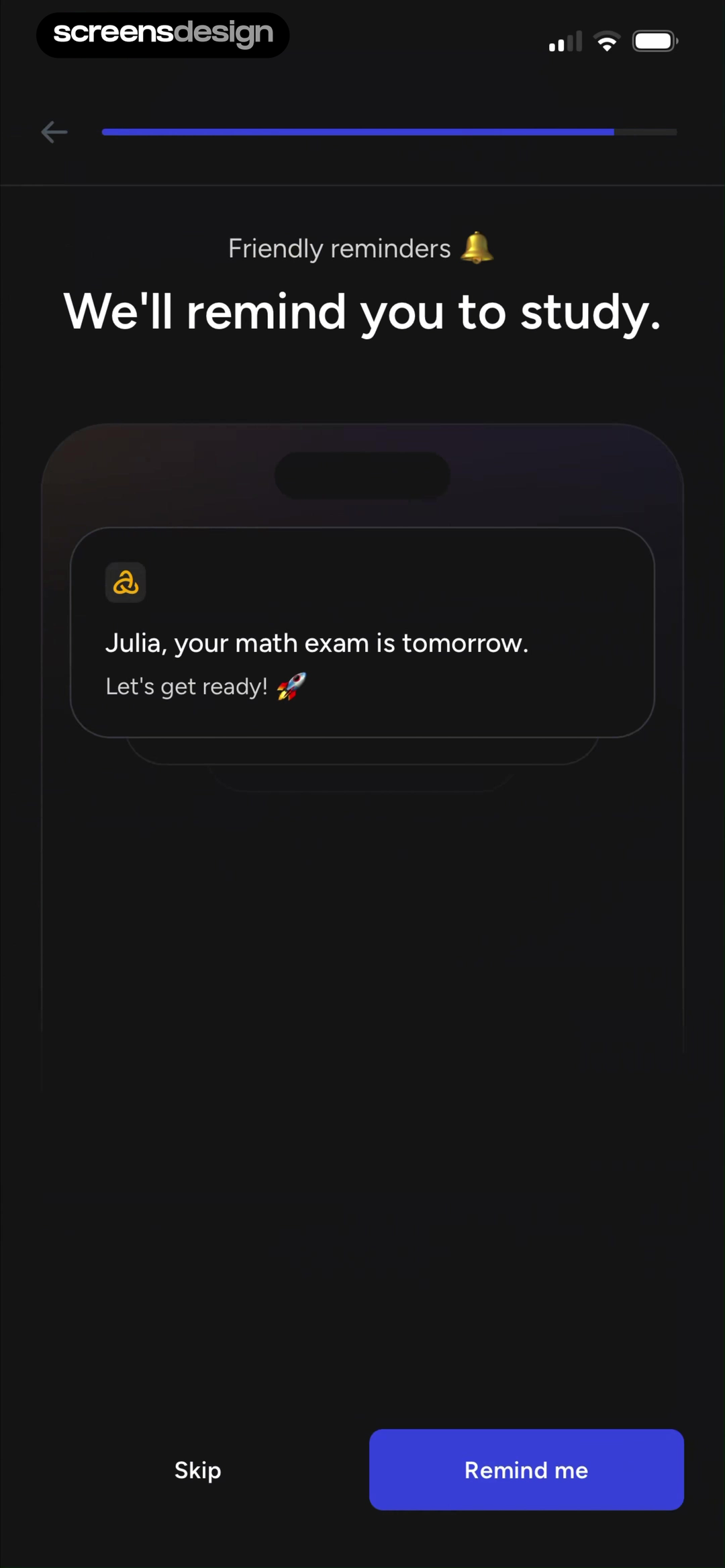
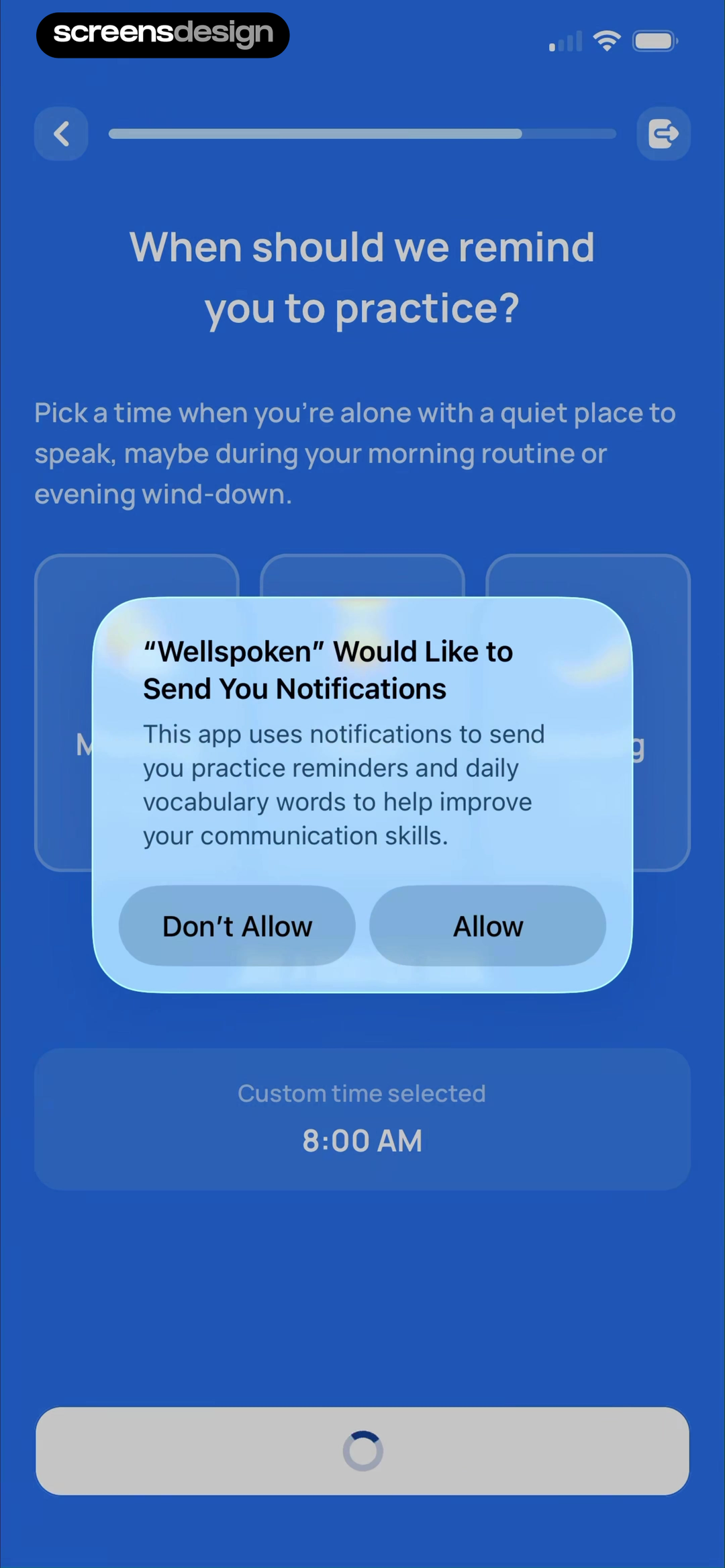
Astra previews a plausible exam reminder and offers Skip or Remind me. Wellspoken goes further by asking when practice fits a quiet part of the day and showing 8:00 AM as the selected time before the system notification request. In both cases, the permission is connected to content and timing rather than an abstract promise to stay updated.
This ordering produces a more informed choice. First establish the job, then let the person configure it, then request operating-system access. Do not make the warm-up button imply a different action from the prompt that follows. If tapping Remind me immediately opens the system dialog, the copy should make that transition understandable. If permission is denied, keep the app usable and show a reversible route through settings when the feature is requested again.
The same model applies beyond notifications. Explain photo access when the person wants to scan, microphone access when recording begins, contacts when inviting, and location when a nearby result is needed. A contextual request may still be declined. Treat that outcome as a supported branch with manual input, limited mode, or a precise explanation of what cannot work.
06. Rehearsal over walkthrough
Teach the core gesture with a safe, complete practice task.
A user who performs the behavior once has learned more than a user who swiped through four descriptions.
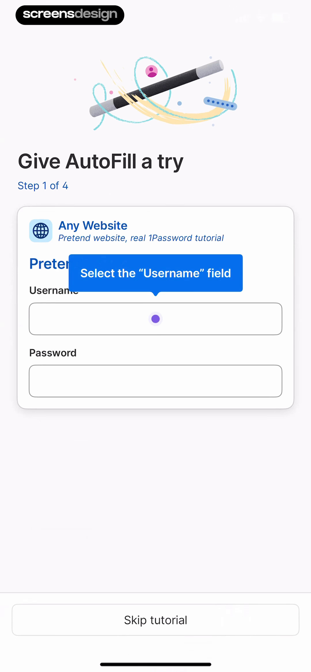
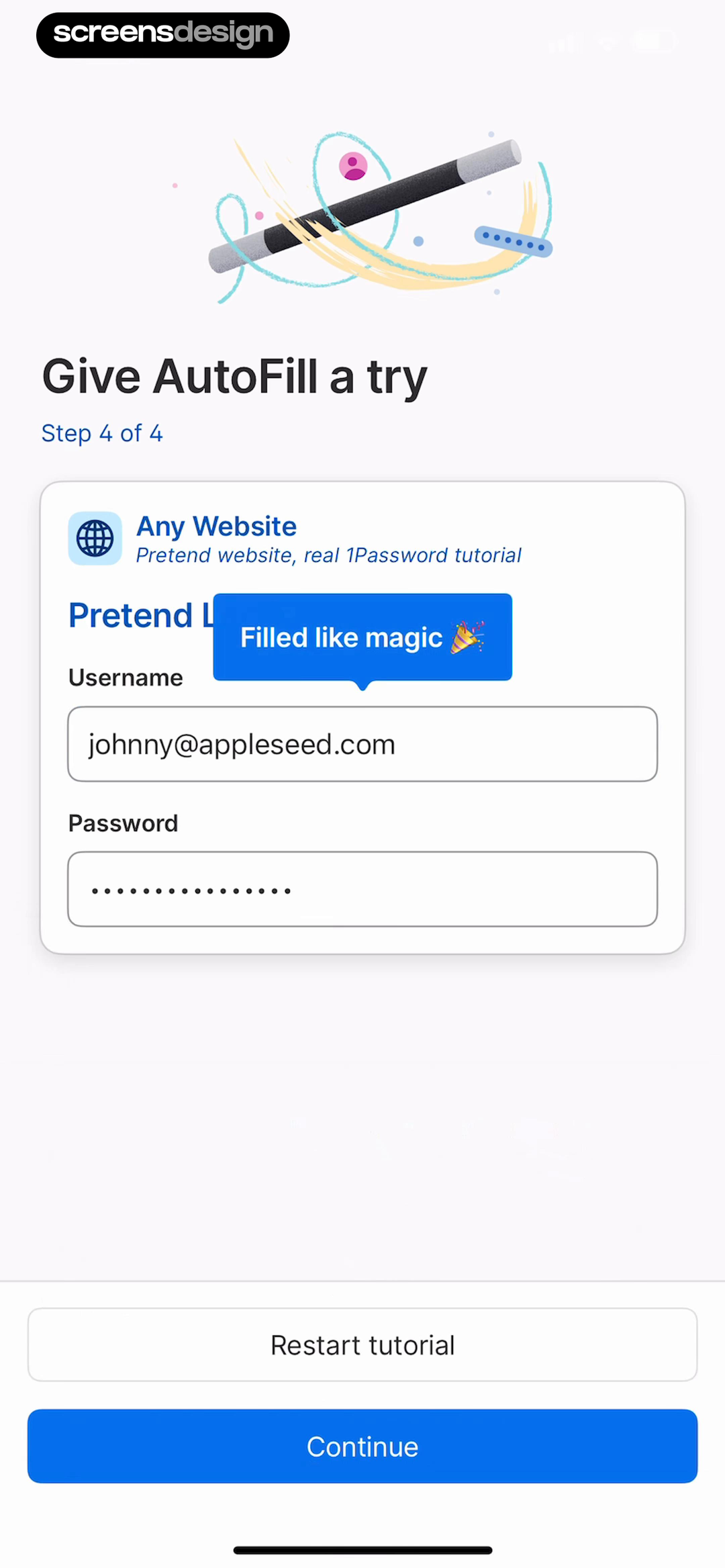
1Password builds a controlled four-step AutoFill rehearsal on a pretend website. The sequence begins by asking the user to select a username field and ends with the credential filled and a clear completion state. The product can teach a system interaction without asking the user to risk a real login or infer what success looks like.
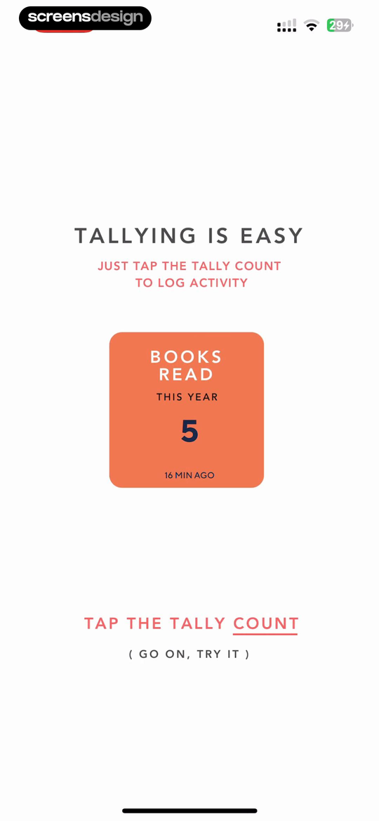
Tally compresses the same principle into one screen: tap a visible count to log an activity. The sample object, instruction, target, and feedback all occupy the product surface. This is especially useful when the differentiating behavior is a gesture, extension, keyboard, scan, import, or automation that static slides cannot accurately convey.
Design the rehearsal around one observable success event. Keep extra navigation out, make Skip available, and return the user to a useful state when the practice ends. For the broader rules behind targets, feedback, hierarchy, and recovery, see: the mobile app UI design guide.
Use a safe object
Provide a pretend login, sample tally, demo document, or other object the user can change without consequence.
Name one target
Ask for the exact tap, gesture, selection, or input required by the real product behavior.
Confirm the outcome
Show the filled field, changed count, imported item, or completed artifact before moving on.
07. Commitment after continuity
Ask for an account when there is something worth preserving.
Cloud sync, saved preferences, and cross-device continuity explain an account better than a generic Create profile heading.
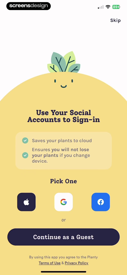
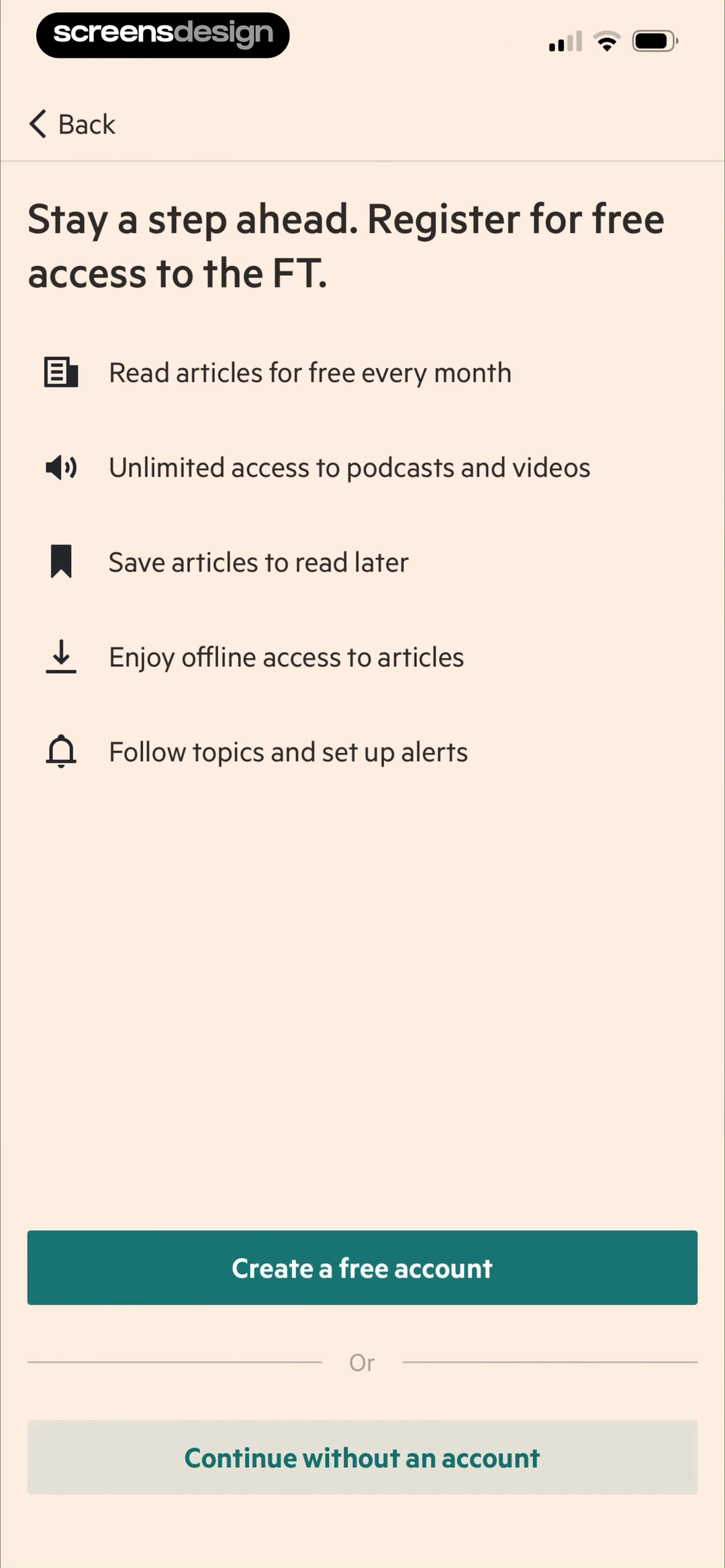
Planty explains that social sign-in saves plants to the cloud and protects them when the device changes, while still offering Continue as a Guest. The Financial Times lists saved articles, offline access, followed topics, and alerts, then offers Continue without an account. Both make the account benefit legible and preserve a lower-commitment route.
An optional path is not right for every product. Regulated records, team workspaces, paid entitlements, and cross-device security may require identity earlier. The decision should follow actual data and continuity needs. If value can be demonstrated locally, let the user reach it first. If an account is required, explain the dependency in task language and preserve completed setup so authentication does not erase progress.
Review the entire onboarding as one sequence: outcome preview, high-signal input, visible consequence, justified proof, configured permission, safe rehearsal, and continuity. Not every app needs all seven moments. The audit below is designed to remove unsupported steps and repair handoffs, not to turn this report into another mandatory template.
- A real output appears before a long explanation or data request.
- Every question maps to a visible product change, safety need, or saved preference.
- Users can see and correct the consequence of personalization.
- Claims and testimonials have a recorded source, date, permission, and qualifier.
- Permission warm-ups name the content, timing, and fallback after denial.
- The defining interaction is practiced on a safe object when explanation is insufficient.
- Account timing follows a real need for identity, continuity, security, or entitlement.
- Skip, back, edit, interruption, and resume paths preserve completed work.
- The complete path is tested with accessibility settings and realistic content.
- Success means reaching first useful value, not merely completing the onboarding screens.
Questions and answers
App onboarding trends questions
What are the main app onboarding trends in 2026?
In this recorded sample, the recurring choices are concrete outcome previews, higher-signal questions, visible personalized results, contextual proof, configurable permission warm-ups, safe interactive rehearsals, and account requests tied to continuity.
How many onboarding steps should an app use?
There is no universal number. Keep a step when it changes the product, supports safety, or teaches a necessary behavior. Count the full distance to first useful value and remove questions whose answers have no visible consequence.
What makes onboarding personalization credible?
Show what changed because of the user's answers, explain important assumptions, and let the user edit the source data. A generic personalized-for-you message without a different result is weak evidence.
When should onboarding request notification permission?
Ask after the user understands the notification's job. Preview its content, let the user choose useful timing when relevant, state that the system prompt is next, and keep denial recoverable.
Are interactive tutorials better than onboarding carousels?
They are better when the core value depends on learning a gesture or system behavior. Use a safe sample task with one clear target and completion state. A concise preview is enough when the output is self-explanatory.
Should account creation be required during onboarding?
Require it when identity, security, team access, regulated data, or paid entitlement genuinely depends on it. Otherwise, demonstrating value first and explaining continuity benefits can make the decision more informed.
Apps referenced in this page
Open the products behind the examples.
 CraftNoteAudio Meeting, Voice Notetaker
 WellingTrack Protein, Calorie, Fiber
 EchoLive Meeting Talk Transcriber
 QuizardInstant Math Problem Solver
 CaloCareWeight Loss Food Tracker
 PushscrollWorkout to Earn Screen Time
 Astra AISchool questions & homework
 WellspokenView recorded app flows
 1PasswordSave & share passwords safely
 TallyHabits, Money, Symptoms, Pills
 PlantyTree Identification, Ad- Free
 Financial TimesDaily Global Market News
2,622 apps in the top charts.Ask them anything.
Search recorded onboarding screens by goal, permission, tutorial, account, or personalization moment, then inspect the complete replay around each result.