AI app onboarding examples
15 AI App Onboarding Examples: From Prompt to First Result
Fifteen recorded screens show how AI apps frame the first job, teach useful input, establish trust, handle the wait, support correction, and place paid access around demonstrated value.
AI onboarding has a special activation problem. A blank prompt can do almost anything, yet that breadth gives a new user little direction. The interface has to turn an open-ended capability into one task, then carry the person from an example input to a result they can judge and change.
The useful unit is the whole first-result path. The promise, sample, privacy explanation, permission, generation state, output controls, and offer all shape whether the product feels understandable and safe.
ScreensDesign Editorial reviewed recorded in-app screens from 11 AI products on August 10, 2026. The method was direct interface observation: copy, controls, order, deep links, and image dimensions were checked against recorded evidence. The examples show design choices, not measured conversion, output quality, safety, or retention.
Mobile app UI design guide: use the broader framework there for hierarchy, navigation, responsive states, accessibility, and component decisions beyond the first AI result.
For the feedback states around generation, correction, and completion, continue with the onboarding microinteractions review.
01. Outcome preview
Show the job before asking the user to configure it.
A concrete outcome gives the first button a destination and sets a standard the rest of onboarding has to meet.
Base44 places a changing object inside a simple sentence: Build a daily planner app. The sample is specific enough to make the capability imaginable, while Get Started remains a low-complexity action. The product is not asking the person to choose models, agents, databases, or deployment options before they understand the core job.
A useful preview names an object and implies a finished state. For a writing app that might be a reply in a chosen tone. For a study tool it might be an answer with sources. For a photo product it might be an editable before and after.
Choose the preview from the first job the product can reliably complete. Keep advanced capabilities only when they help someone choose. Reduce uncertainty about the next tap instead of displaying the full feature inventory.
App onboarding screens guide: apply its first-value framework when deciding which AI explanation belongs before the first task.
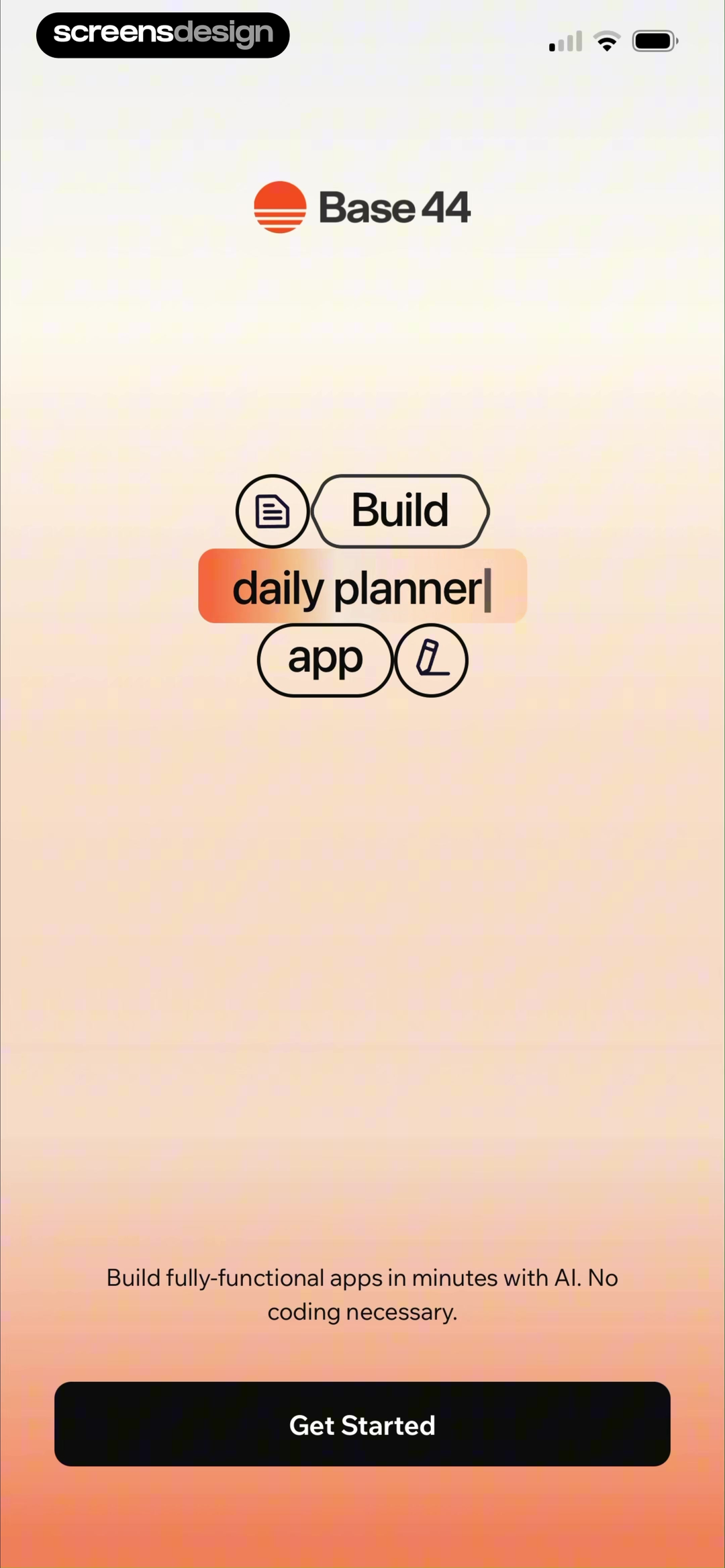
Use a noun and a finished state.
If the opening claim cannot be illustrated with one credible input and one reviewable output, it is probably too broad for onboarding.
02. Prompt guidance
Teach input with examples a person can reuse.
Prompt starters work when they reveal the product vocabulary and shorten the distance to a meaningful first attempt.
AI Logo Maker compares Coffee cup with a longer, more prescriptive alternative and labels the shorter request Good. It also places the lesson inside a visible five-step path from Idea to Preview. The screen teaches both the input style and what the system will ask next.
GoatChat takes a different approach. It groups starters under jobs such as Write and Edit, Translate, and Social, then includes details like audience, tone, and destination inside the sample sentences. The user can discover range without inventing a request from nothing.
These approaches should not be copied blindly. A short prompt works only when the product can infer or collect the missing structure. A chat assistant may need role, audience, source, and format. A logo flow may collect idea, style, and color separately. Teach the actual interface contract.
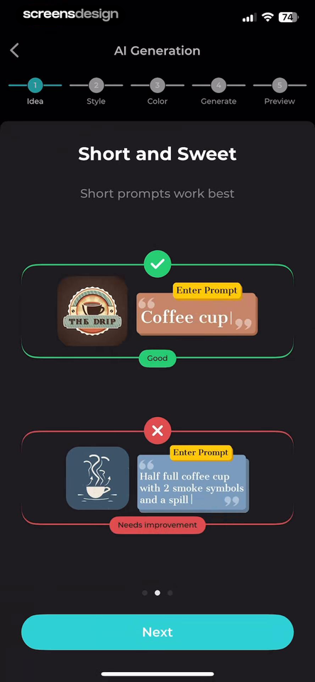
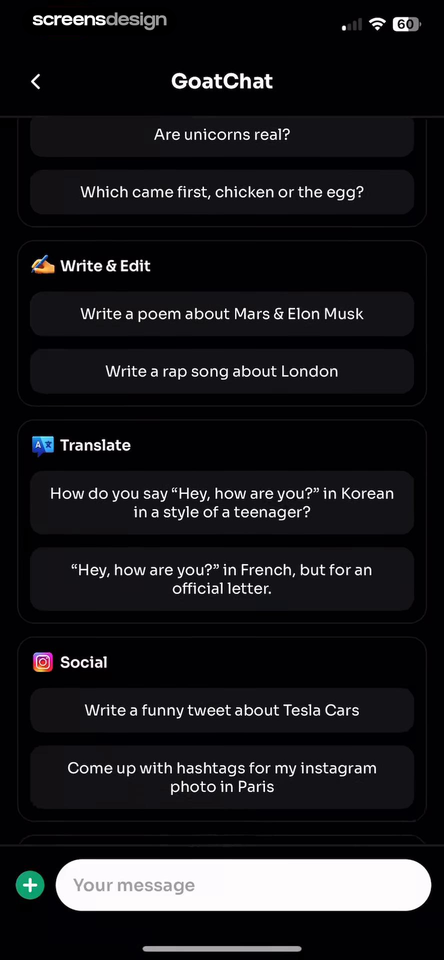
- Use real tasks that the current product can complete.
- Include the detail that materially changes the output.
- Group examples by user job, not by model name.
- Let a starter populate an editable input instead of submitting silently.
- Keep the blank input available for people who already know their task.
03. Trust boundary
Explain data use before the sensitive input.
Trust copy is most useful at the moment a person can still make an informed choice about what to share.
Mindvalley places a dedicated notice before Eve AI. It states that the responses are general information, names professional categories the assistant does not replace, and describes how voluntarily shared health or personal information is handled. The later prompt-starter screen repeats a compact limitation beside topics such as stress, sleep, fitness, confidence, and leadership.
HiNoter uses a more operational notice. It identifies audio recordings, transcripts, notes, and text input as the content involved in AI features, describes the processing purpose, and gives Cancel equal conceptual importance to Agree and Continue. The notice appears during setup, before those content types become the product input.
The design lesson is placement and specificity. A privacy policy link does not answer what is sent, why, how long it remains, whether it trains a model, or what refusal changes. Use supportable claims, separate product limits from data handling, and retain the explanation after consent.
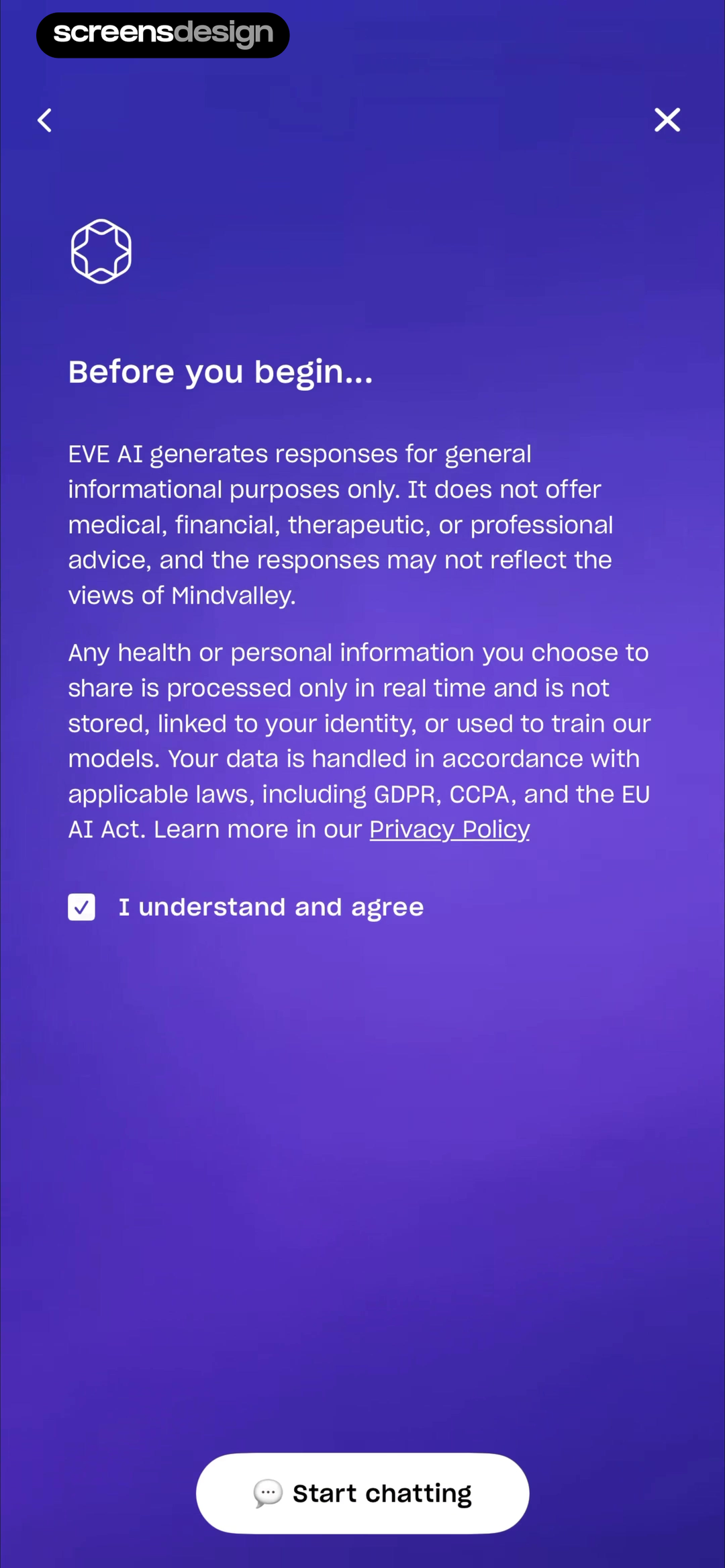
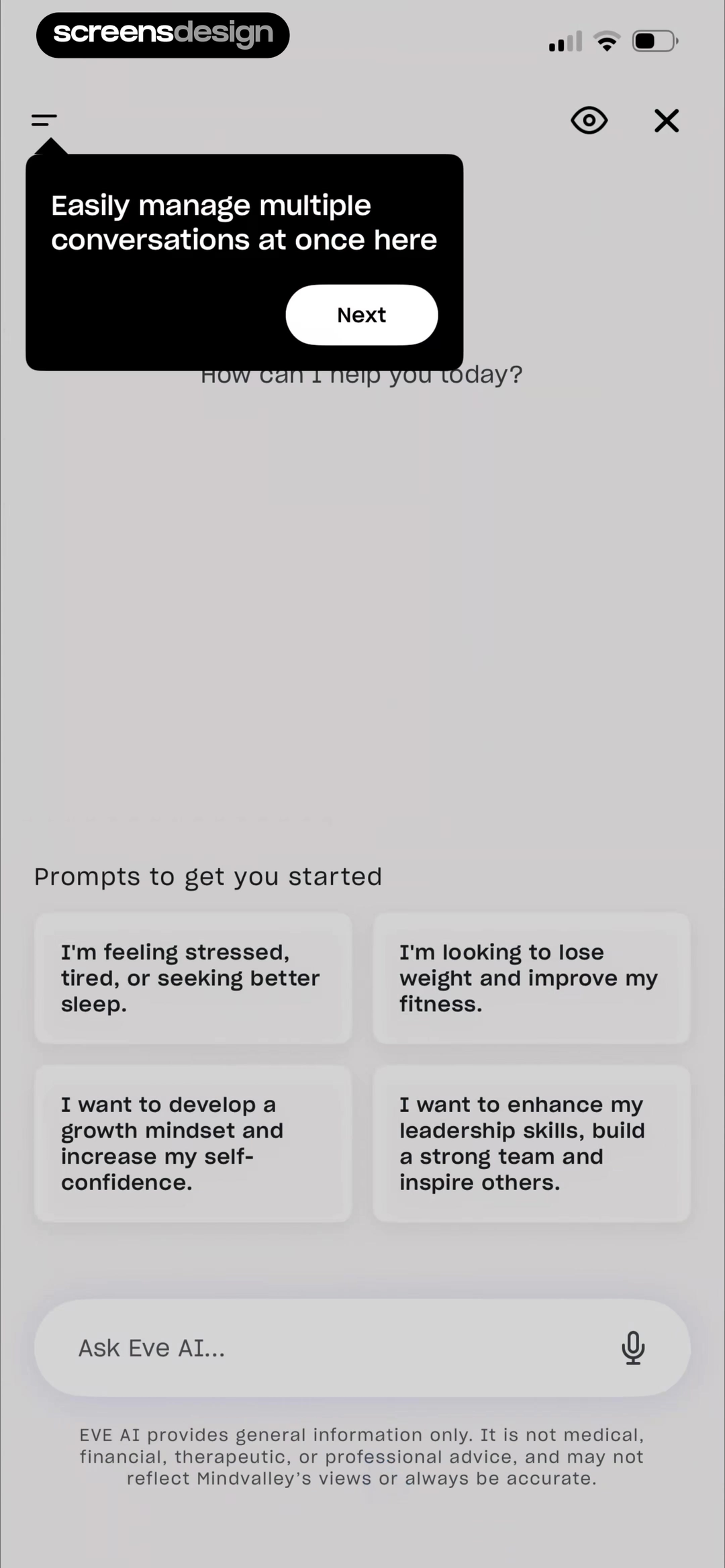
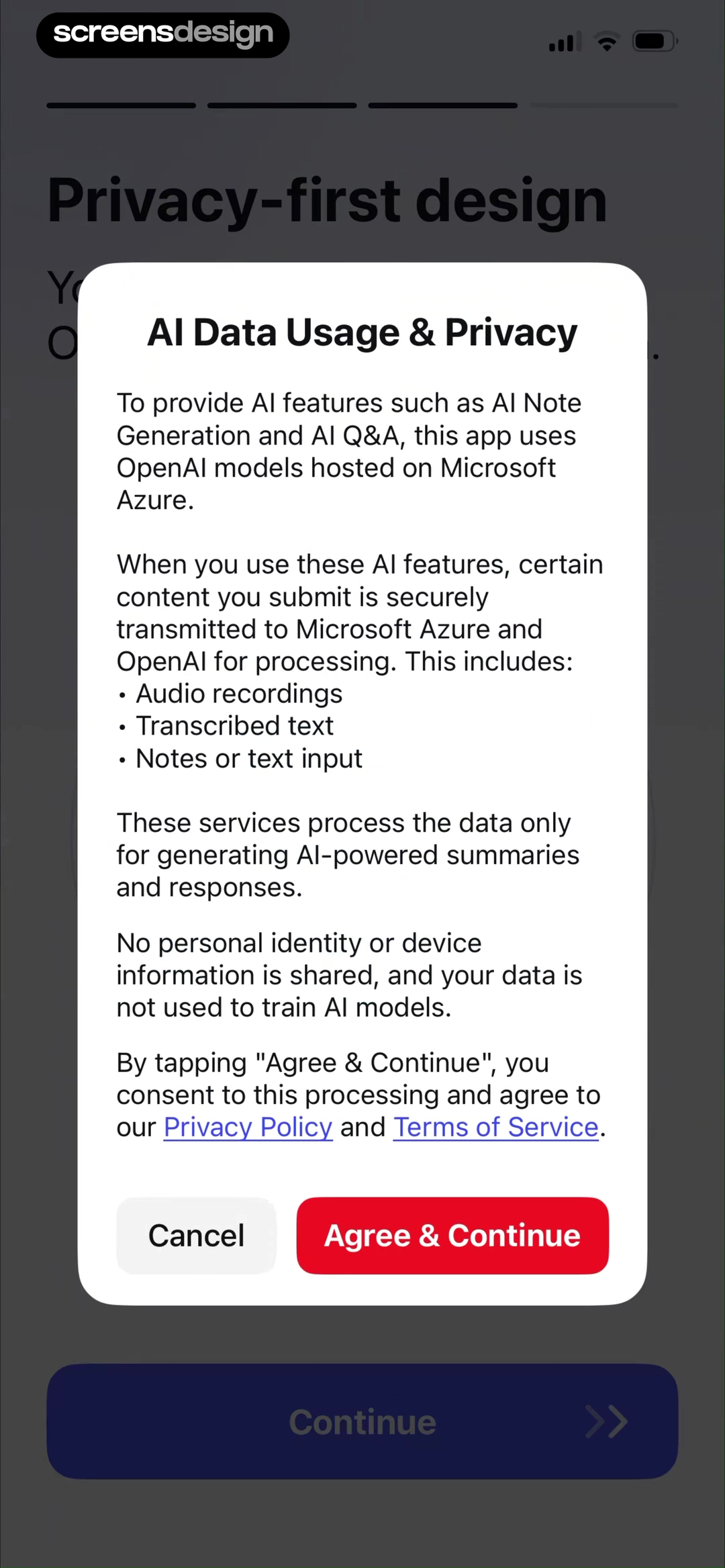
What can the assistant do, and what happens to the input?
Capability limits and data practices solve different trust problems. Give each a direct answer instead of compressing both into a vague safety statement.
04. Permission timing
Request access when the feature is ready to use it.
A permission request is easier to evaluate when the next action makes its purpose visible.
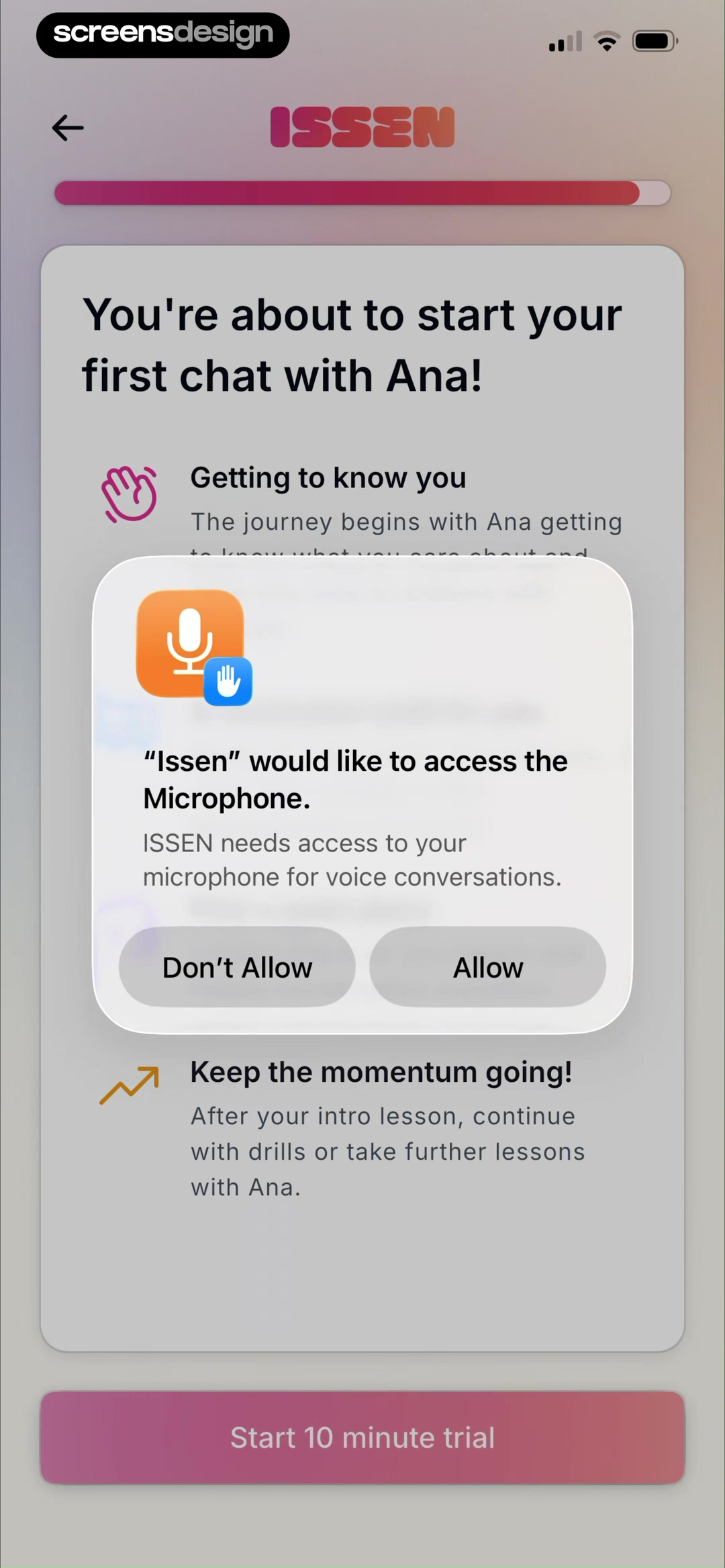
ISSEN asks for microphone access as the user is about to start a first voice chat with Ana. The surrounding screen frames the conversation as a get-to-know-you session, and the system prompt states that microphone access supports voice conversations. The request is connected to an action the person has chosen, not presented at cold launch.
Apply the same timing to photos, camera, files, contacts, speech recognition, and notifications. Show the input route, let the person select it, explain the immediate benefit, then trigger the platform sheet. Keep any manual or text alternative visible after denial.
The explanation must match the real data path, and denial needs a useful state. Test denial, later approval, interrupted recording, revoked access, and return from settings. Preserve the first-result path when another input is possible.
Name the task
Show what the person is about to record, upload, scan, or hear.
Keep the reason literal
The platform explanation should describe the selected feature, not a generic better experience.
Preserve a route
Offer typed input, file selection, manual entry, or a clear way to grant access later.
05. Prompt to result
Treat input, waiting, and output as one continuous path.
The user should know what is being processed, whether progress continues, and what choices will appear when it finishes.
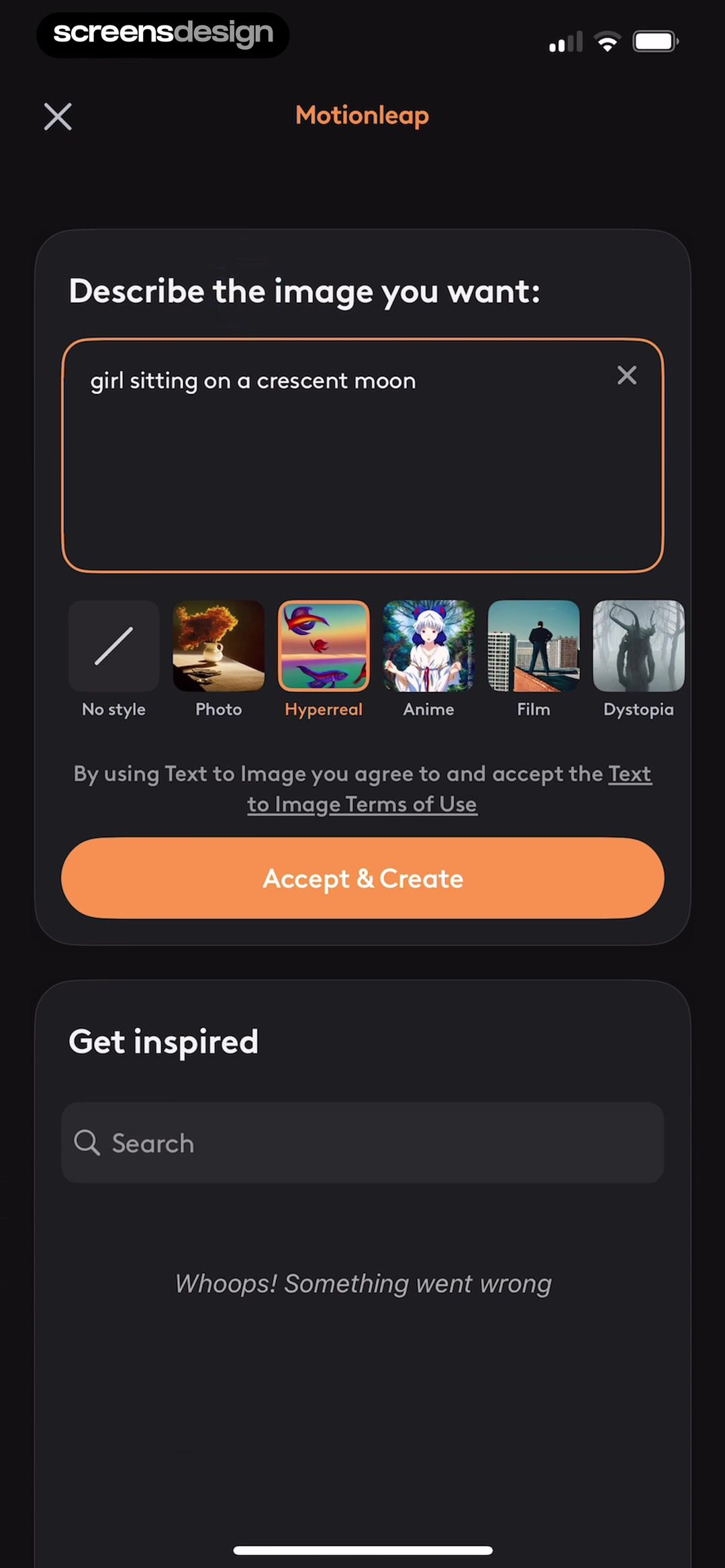
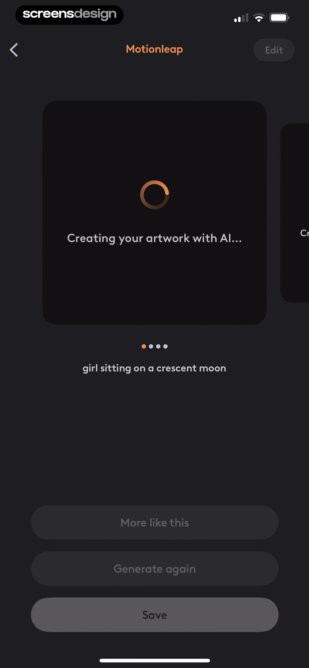
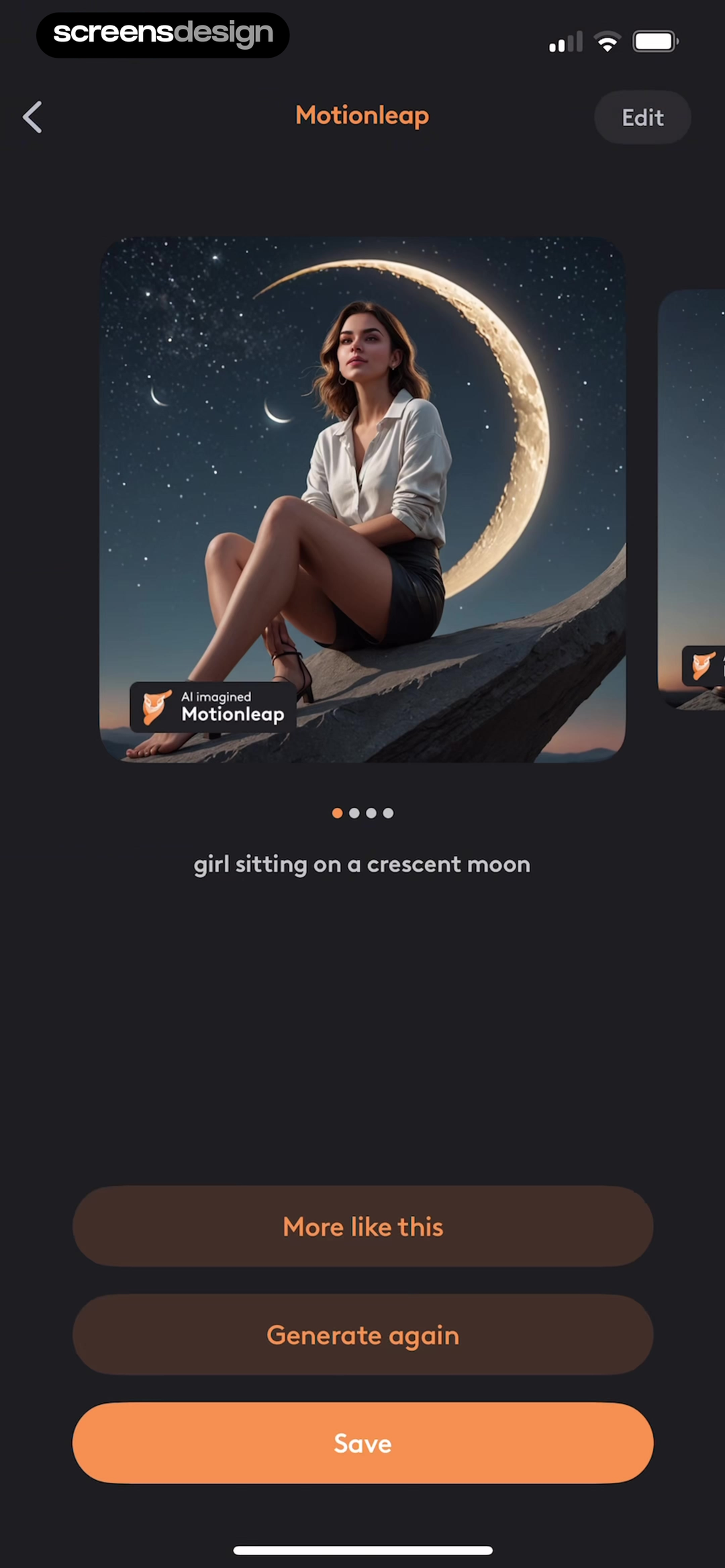
Motionleap provides a compact three-screen sequence. The input preserves the request girl sitting on a crescent moon, offers style choices, and names the action Accept and Create. The loading state keeps the same request visible. The result then presents More like this, Generate again, Save, and Edit around the generated image.
Continuity matters because generation is uncertain and can take time. Keep the prompt, mode, source asset, and settings recoverable. Explain whether the person can leave, cancel, or continue another task. Use honest stage copy when progress cannot be measured.
The result should answer three immediate questions: what did the system use, what can I do with this output, and how do I try again without rebuilding the request? Design slow, moderated, failed, and partial states with specific recovery.
06. Result control
Make correction a primary action, not an admission of failure.
Generated output is a draft until the user can inspect it, change direction, and decide what deserves to be saved.
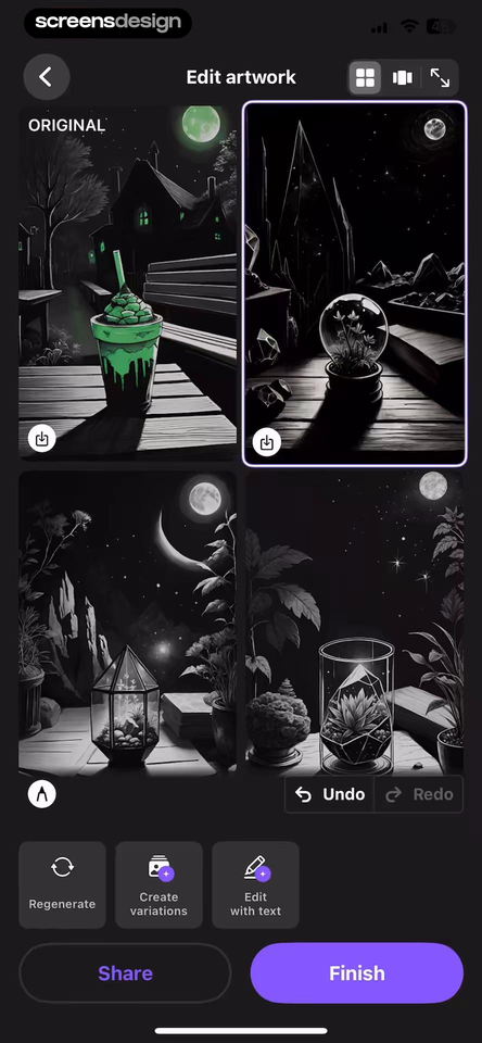
WOMBO Dream treats the result as an editable object. Undo, Redo, Regenerate, Create variations, Edit with text, Share, and Finish sit together around the artwork. The controls distinguish reversing a local change from asking the system for another interpretation.
Gencraft keeps the original description beside the result and separates actions such as Download, Animate, Magic Edit, and Regenerate. It also places an upgrade message beside commercial use. The screen connects the output to its source request while making next steps explicit.
Choose verbs from the real operation. Retry may repeat the same request, regenerate may introduce a new output, vary may preserve composition, and edit may change part of the result. Explain differences through labels, previews, or history. Preserve the previous version until replacement is accepted, especially when an attempt consumes credits or time.

Can the user change direction without starting over?
Keep the input, settings, source asset, result history, and credit cost available long enough to compare the current output with the next attempt.
07. Monetization
Price access around an understood capability.
A paywall should clarify the product boundary and billing commitment without pretending that a preview is a result.
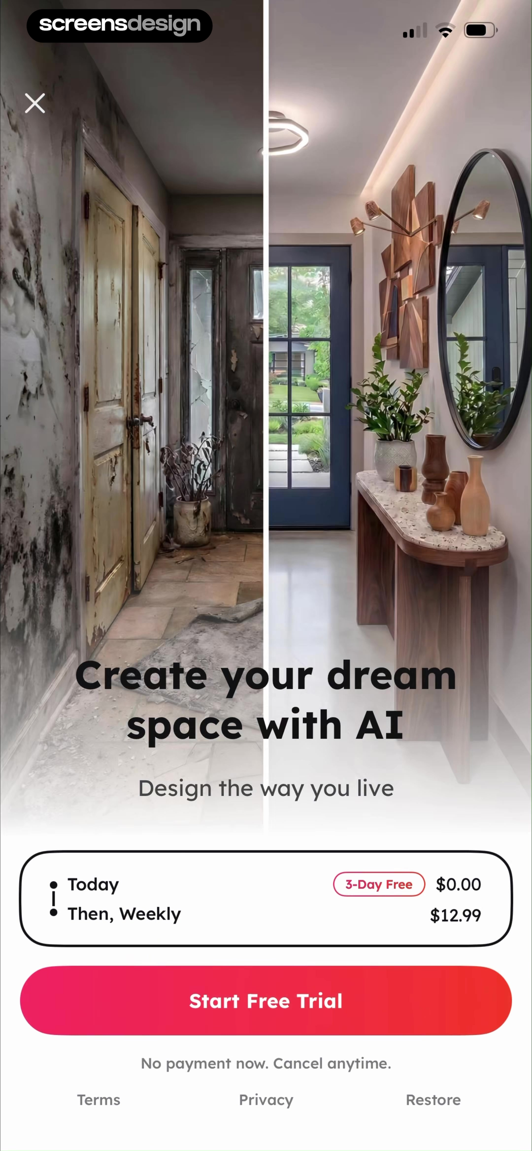
House AI uses a before-and-after room image behind its offer, then states three days free, the weekly price, and that no payment is due now. The image makes the paid job concrete, but it is still a demonstration rather than the user's own generated room.
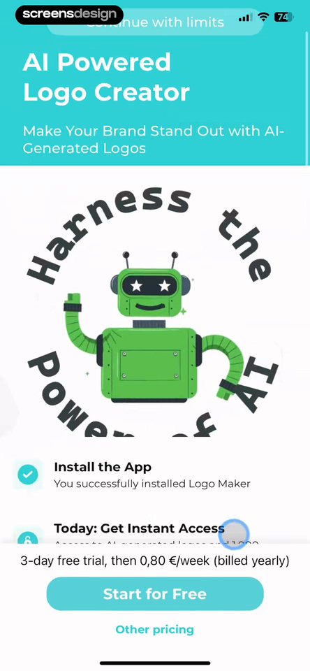
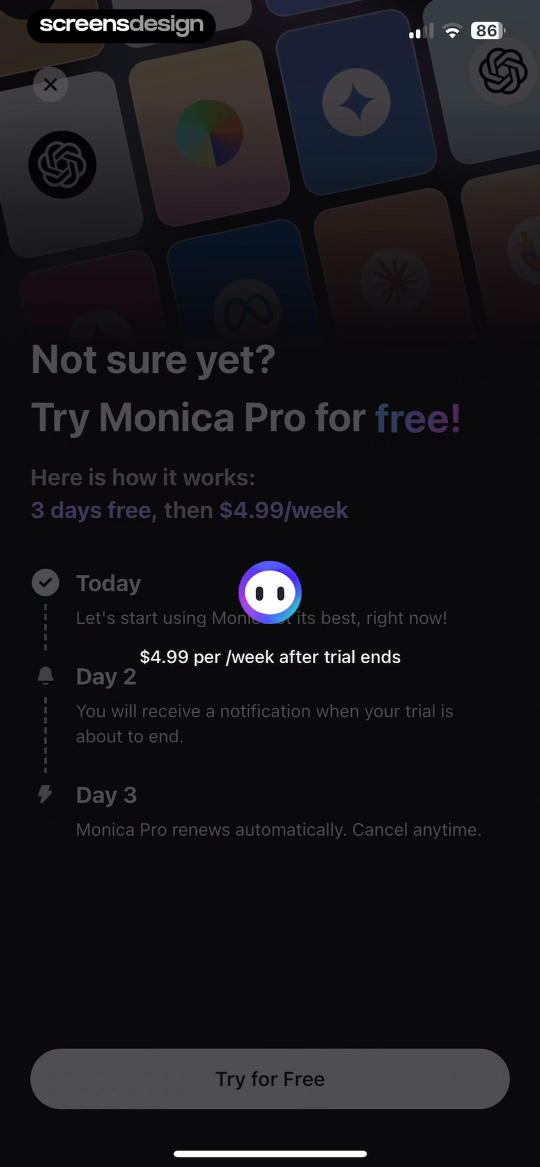
AI Logo Maker includes Continue with limits above the offer, alongside the trial price and an Other pricing route. Monica uses a short timeline for today, the reminder, and automatic renewal. Together the screens expose three useful questions: what remains free, what unlocks now, and what happens when the trial ends.
Place paid access at a point that matches the business model and generation cost, but distinguish a sample from personal value. Before the first output, make limits and alternatives explicit. After a result, preserve it and name the paid next action. Keep plan, period, trial, renewal, cancellation, restore, terms, and dismiss behavior readable.
08. Product review
Review the first-result path as one system.
Test with realistic prompts, sensitive inputs, delayed outputs, denied access, weak results, and changing subscription states.
Ask a person unfamiliar with the product to predict the outcome, adapt an example, and explain what data they think will leave the device. Record hesitation and whether the result matches the task they believed they chose.
Run the same path with a short input, a detailed input, an unsupported or sensitive request, denied permission, lost connection, backgrounded generation, moderation block, and an output that is close but wrong. Recovery should not lose context or the previous result.
Finally, repeat the flow as a free user, a trial user, a paid user, and someone whose subscription ended. Keep credits, limits, watermarks, export rights, and commercial-use rules consistent from prompt through library. Do not change material terms after generation.
- The opening screen names one credible task and finished state.
- Prompt examples teach useful detail, audience, format, or constraints.
- Sensitive inputs have a timely explanation of purpose and handling.
- Capability limits are distinct from privacy and consent claims.
- Permissions appear at the selected feature and have a denied-state route.
- Loading preserves the submitted input and explains cancel or background behavior.
- Results retain their source request, relevant settings, and version history.
- Retry, regenerate, vary, refine, edit, save, share, and exit use precise verbs.
- Failed, moderated, slow, partial, and offline states each offer recovery.
- Free limits, credits, trials, renewal, cancellation, restore, and usage rights stay readable.
- Dynamic type, screen readers, contrast, motion, and progress announcements are tested.
Questions and answers
AI app onboarding questions
What should an AI app show first?
Show one credible user job, a concrete example input, and the kind of result that will follow. Introduce models, modes, and advanced settings only when they help the person choose or complete that first task.
How many prompt starters should onboarding include?
Use a small set that covers distinct jobs and teaches what changes the output, such as audience, source, tone, format, or style. Let people edit a starter and keep a blank input for experienced users.
When should an AI app explain privacy?
Explain data handling before the person submits sensitive text, images, audio, files, or personal context. State what is sent, why, who processes it, relevant retention or training practices, and what happens after refusal.
What makes an AI loading state useful?
Keep the submitted request and important settings recoverable, describe the current stage honestly, and explain whether the user can cancel, leave, or continue another task. Provide a specific recovery action on failure.
How should an AI app support a weak result?
Preserve the original input and prior output, then offer clearly different actions such as edit, refine, vary, retry, or regenerate. Explain credit costs before a new attempt and avoid replacing accepted work without warning.
When should an AI app show a paywall?
Place it where the user understands the capability and the paid boundary. If it appears before a personalized result, distinguish the preview from actual value and state free limits, trial terms, renewal price, restore, cancellation, and dismiss behavior clearly.
Apps referenced in this page
Open the products behind the examples.
 Base44Turn ideas into software
 AI Logo MakerLogos, Flyers & Poster Creator
 GoatChatPowered by smart AI programs
 MindvalleyMindset, Meditation & Growth
 HiNoterAuto transcribe & summarize
 ISSENLearn English, Spanish & More
 MotionleapAdd Motion/Animation/AI Art
 WOMBO DreamAI Art, Photo & Video Maker
 GencraftCreate AI photos, art, videos
 House AIRemodel Interior Decor Planner
 MonicaChat, Search, Write, Translate
2,622 apps in the top charts.Ask them anything.
Search recorded AI onboarding screens, open the surrounding flows, and compare the exact first-result moment you are designing.