Observed across 13 recorded apps
14 Mobile App Permission Screen Examples: Timing, Copy and Privacy
Fourteen recorded permission and pre-permission screens show how mobile apps prepare people for notifications, location, device sensors, personal data, and tracking choices.
A permission screen must explain the product benefit in language the person can evaluate and prepare them for an informed choice in the system dialog. The strongest timing is contextual: the person has started a task and can see what access will do.
Permission timing often begins in the first session. Use the: app onboarding screens guide to map the surrounding journey, and the: iOS app design guide to review platform conventions, hierarchy, and system-owned controls.
Treat the examples as decision structures, not templates to copy. Preview notifications, name location scope, request device access after an initiated action, explain personal-data handling, and state the purpose of tracking.
For the broader sequence around those requests, continue with the 2026 app onboarding trends review.
01. Notifications
Preview a useful message before asking to send it.
A notification request is easier to understand when the user can see the event, timing, and frequency it will support.
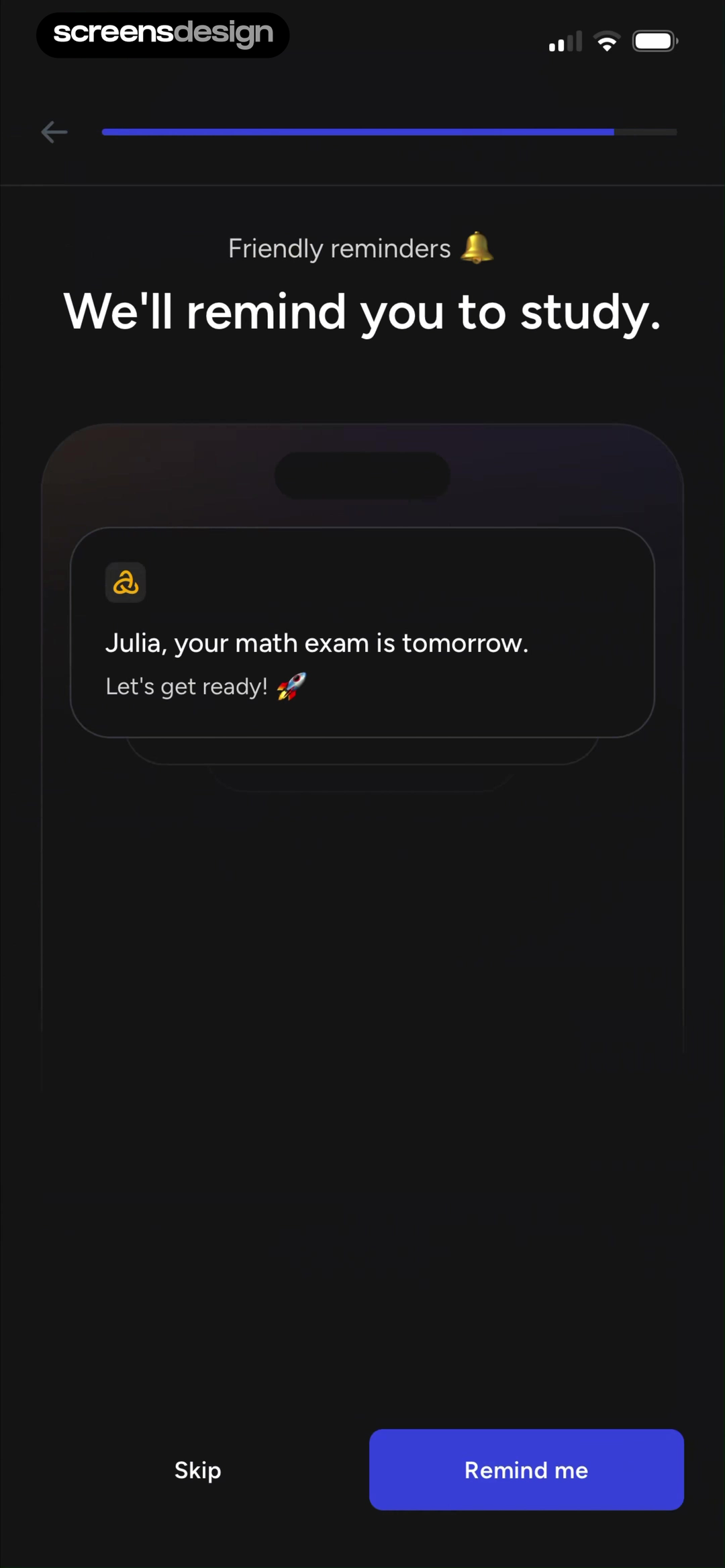
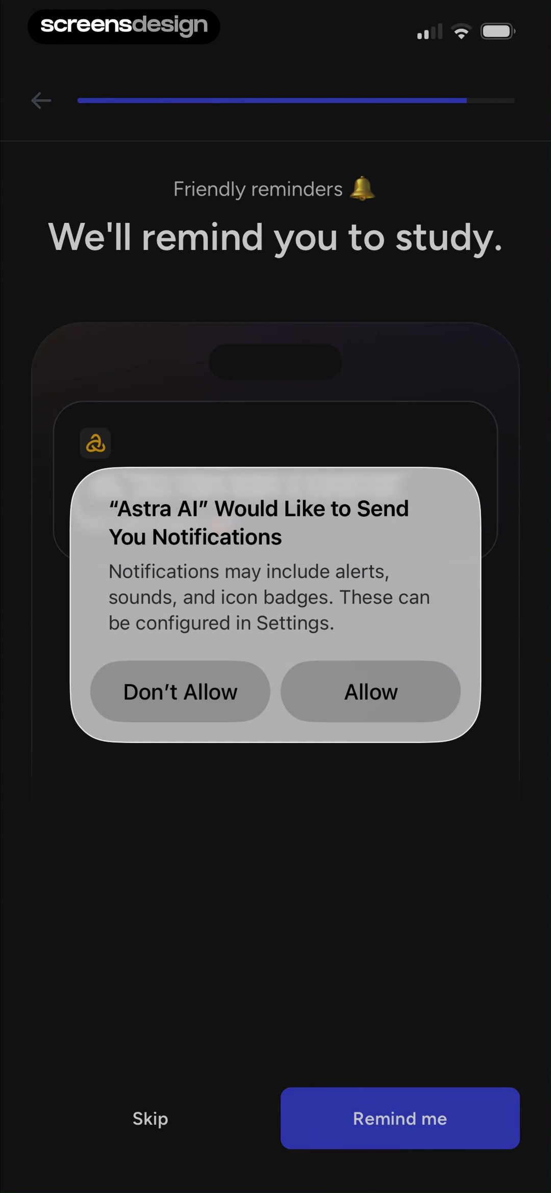
Astra AI provides a clean before-and-after request sequence. At 114.8 seconds, its branded screen promises study reminders and previews a message about an upcoming math exam. At 116.4 seconds, the native notification dialog appears over the same screen. The action label, Remind me, corresponds to a benefit the person has just seen. The next recorded moment at 124.8 seconds moves into building a personalized learning experience, so the request stays inside the setup path rather than becoming a dead end.
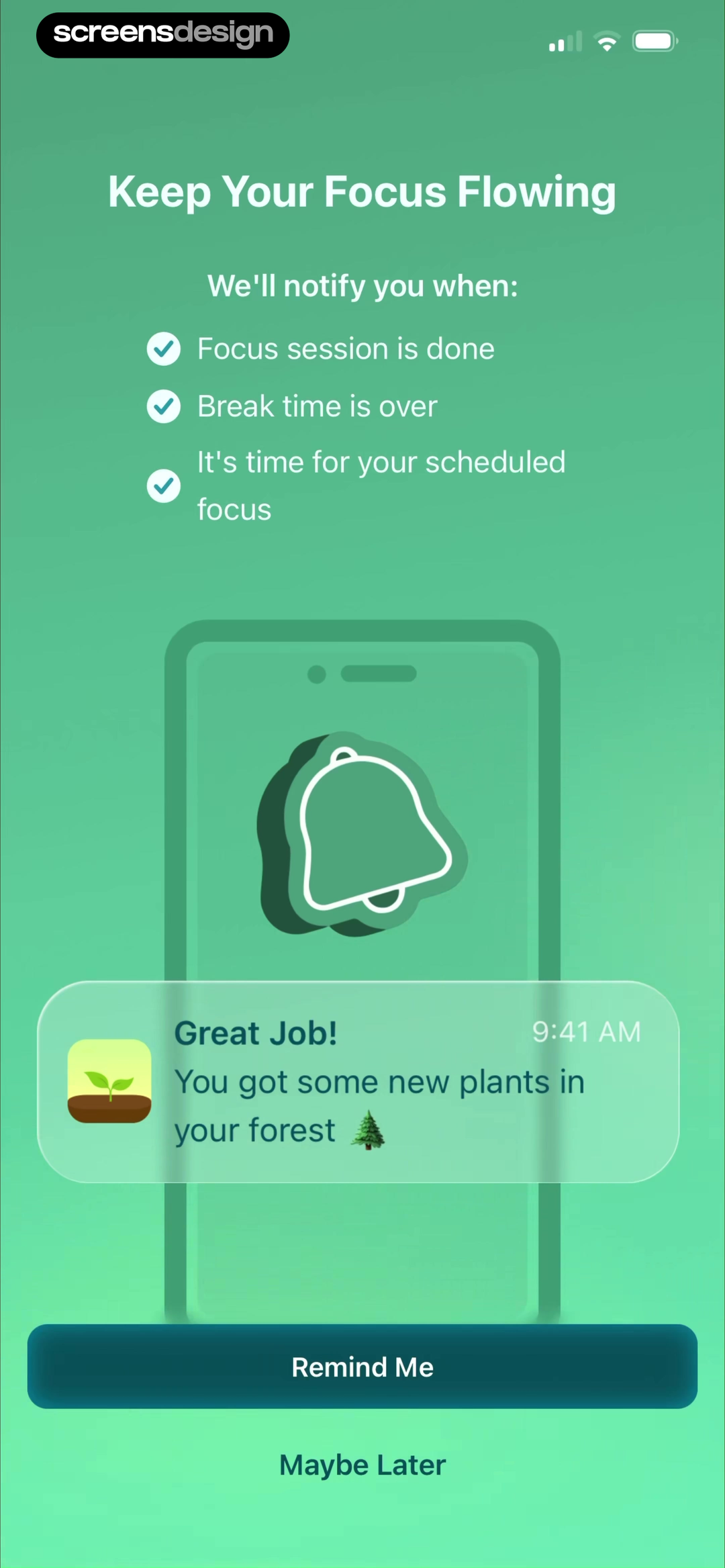
Forest uses a broader but still concrete preview at 120.2 seconds. It lists session completion, break completion, and scheduled focus as the three notification events, then shows a sample reward message. The request follows email verification and the native prompt arrives at 122.4 seconds. The contract is legible, although teams should still question whether account creation must come first.
Do not treat success-rate statistics on warm-up screens as proof. They are product claims visible in a recording, not measured outcomes from this review. A stronger design test is whether the user can answer three questions: what will arrive, when will it arrive, and where can it be changed?
Make the warm-up promise match the native request.
If the branded screen promises one reminder per day, the product should not immediately send promotions, social alerts, or unrelated streak messages.
02. Location
Tie location scope to a visible place-based task.
Location is not one permission decision. The user may be deciding between one-time, in-use, precise, approximate, or background access.
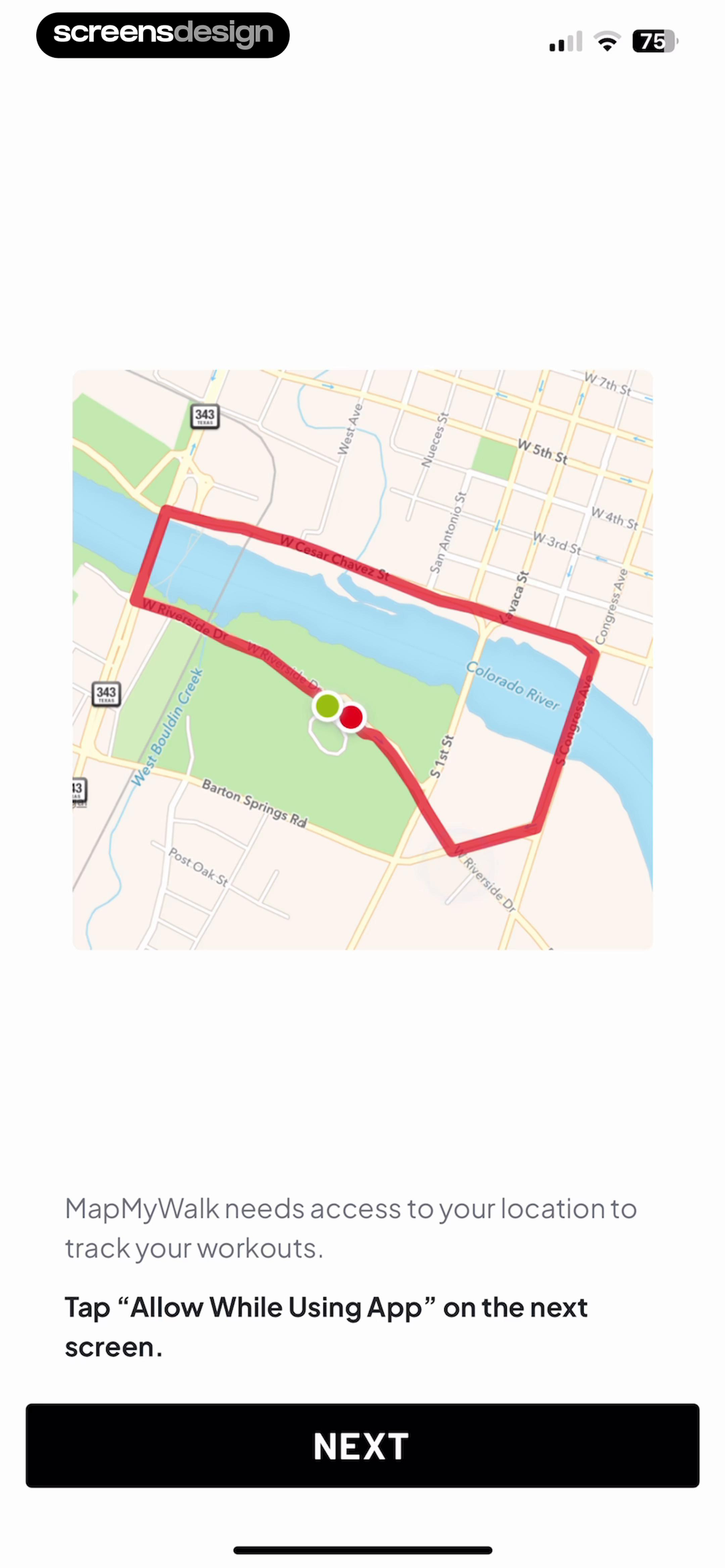
Map My Walk waits until 107.9 seconds, after account setup and a recorded purchase-success moment, to explain that location tracks workouts. A route map illustrates the result and the copy tells the person to choose Allow While Using App on the next screen. The replay then moves to a notification prompt at 115 seconds, so this evidence does not show which location choice was made. That gap matters. A warm-up can be evaluated, but approval should not be assumed.
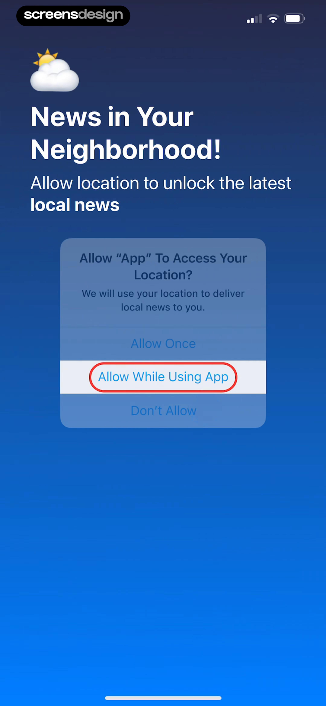
SmartNews asks much earlier. At 5.5 seconds, a native location dialog appears over the promise of local news, immediately after a notification request at 3.4 seconds and before topic selection at 15.1 seconds. The benefit is clear, but the timing asks for two permissions before the person has shaped a feed. Compare that sequence with a contextual request triggered when someone opens Local or asks for nearby coverage.
Write the explanation around the least access needed for the task. Route tracking can justify in-use location. Nearby news may also work with a typed city. Background access needs a separate explanation of what continues after the app closes.
03. Camera, photos, and microphone
Wait for the person to start the device-powered action.
Camera, library, and microphone access feel different when they are a direct response to scan, edit, import, or record.
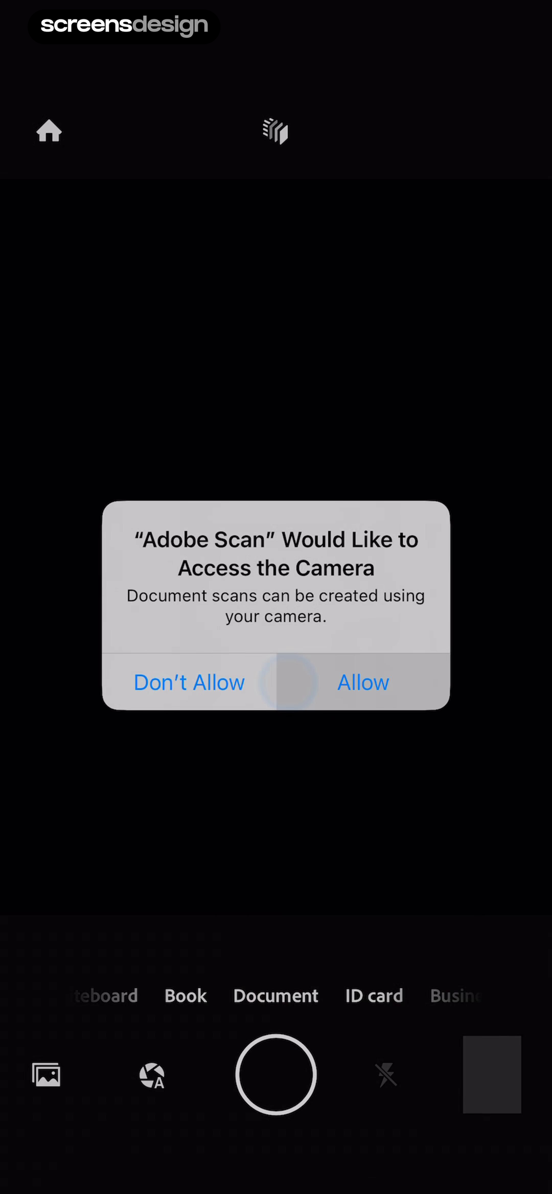
Adobe Scan introduces camera access at 51.3 seconds after a welcome screen says that scans use the camera. The system dialog appears over the live scanning interface, where Whiteboard, Book, Document, and ID card modes are already visible. The next screen at 52.9 seconds contains a captured document and editing tools. The permission sits directly between declared intent and the result it enables.
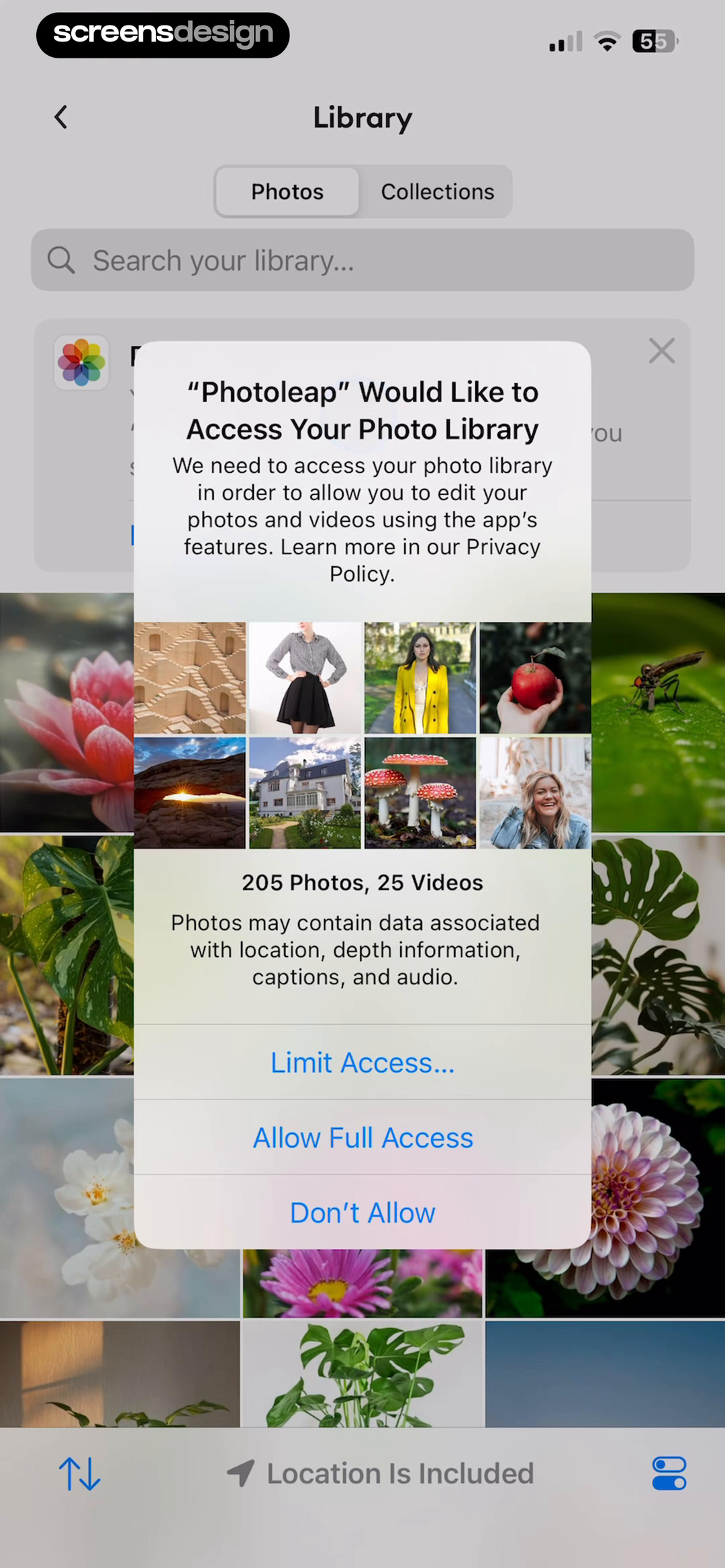
Photoleap follows the same action-first logic for photos. A Start new project screen appears at 164.5 seconds, the library request appears at 167.8 seconds, and a limited-access picker appears at 170.3 seconds. The native options include Limit Access, Allow Full Access, and Do Not Allow. A design that supports selected-photo access should avoid presenting full library access as the only useful path.
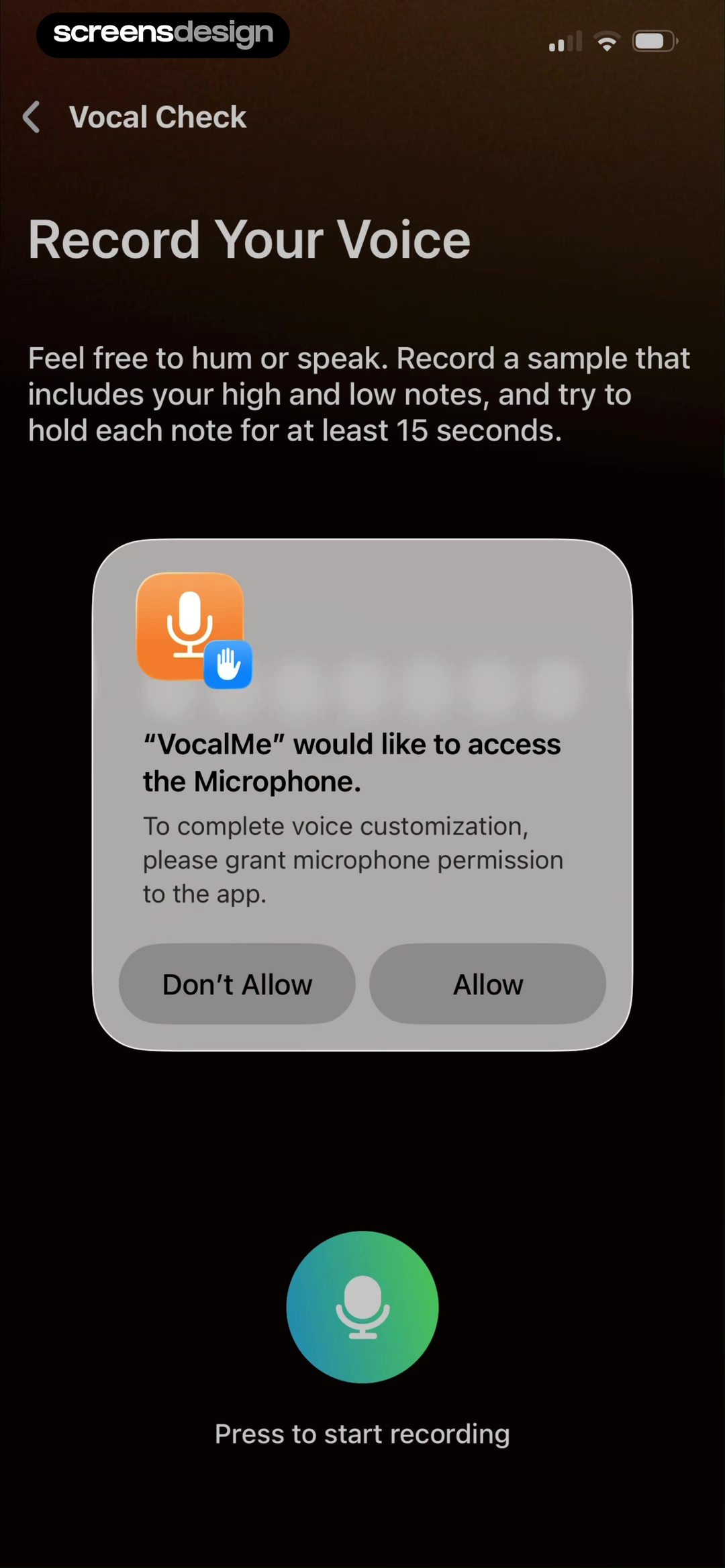
VocalMe requests the microphone at 318.8 seconds on a Record Your Voice task. Its prompt says access completes voice customization, while the underlying screen explains what to record. At 327.3 seconds, the replay shows an active timer and stop control. For sensitive voice features, this functional explanation should be accompanied elsewhere by retention, processing, deletion, and model-use details.
Trigger access from an explicit verb. Scan can ask for camera, Edit for selected photos, and Record for microphone. A launch-time bundle makes people predict future features before seeing why they matter.
04. Contacts
Explain what leaves the device before asking for contacts.
Find friends and add guests are understandable benefits, but the handling of the address book is the more important trust question.
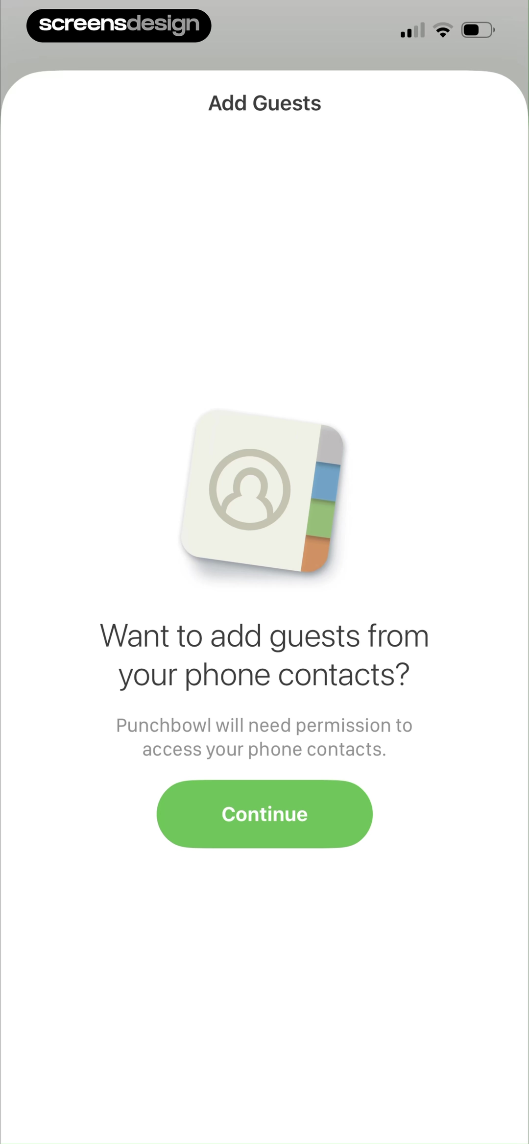
Punchbowl requests contacts inside guest management, not at launch. At 215.2 seconds, the person chooses Contacts from four guest-entry methods. The warm-up at 216.8 seconds says phone contacts can add guests, and the native request follows at 218 seconds. Manual guest entry, past invites, and a share link remain visible alternatives in the surrounding flow.
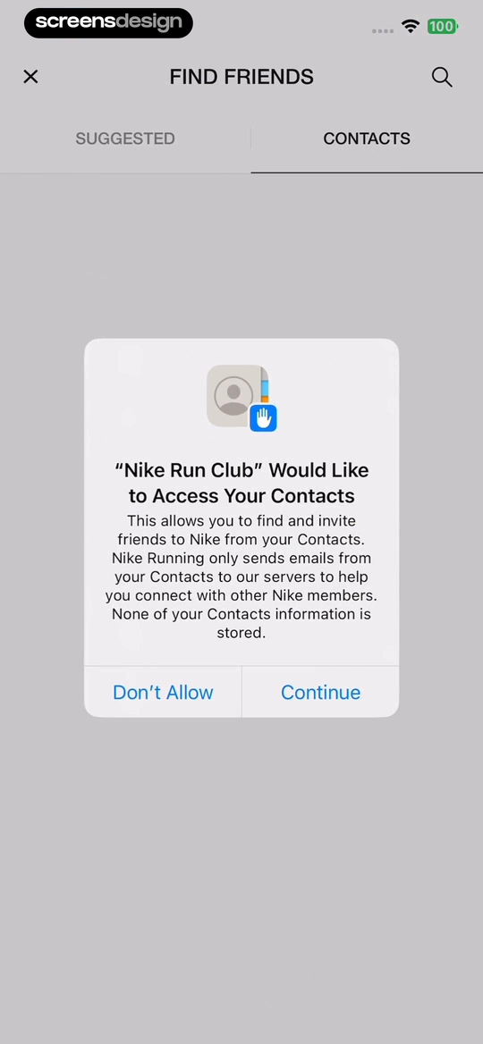
Nike Run Club goes further in the request copy at 657.6 seconds. It says contact emails are sent to its servers to connect members and says contact information is not stored. The request follows a Find Friends action at 655.3 seconds. At 661.3 seconds, iOS offers selected-contact or full-access choices. Those details let a person separate the feature benefit from the data transfer required to provide it.
Permission copy should name the data subset, transfer, retention, matching method, and deletion path. It should also preserve a manual route. Access to an entire address book should not be the entrance fee for inviting one person.
05. Health and activity
Name the measurement each health permission improves.
Health and motion requests need more precision than a generic promise of better personalization.
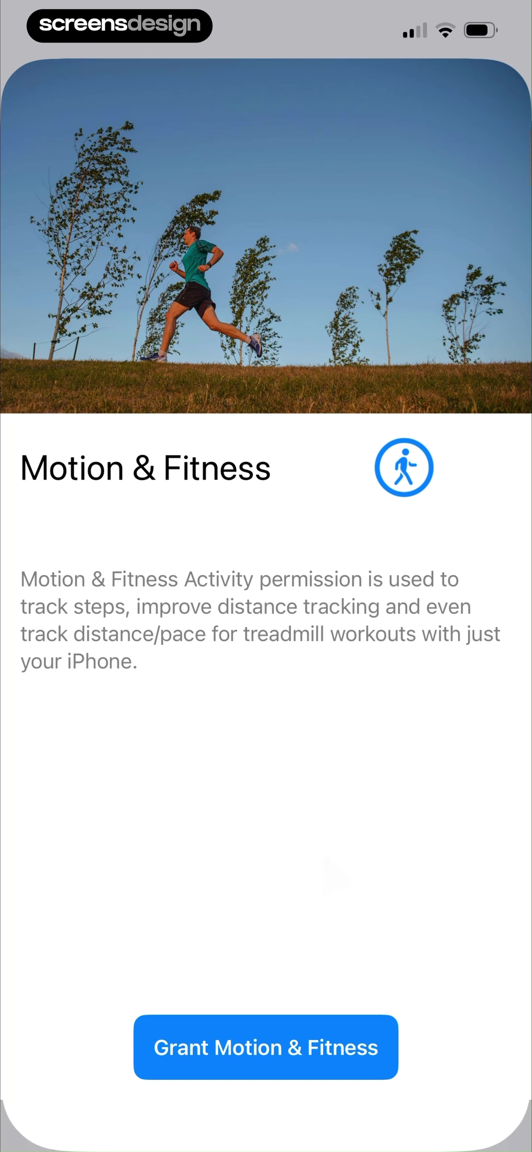
None to Run separates related capabilities during its Accept Permissions flow. After a location explanation at 47.6 seconds, its motion warm-up at 51.7 seconds names step tracking, improved distance, and treadmill pace. The native Motion and Fitness prompt follows at 53.4 seconds. Apple Health is treated as another step rather than folded into one undifferentiated approval.
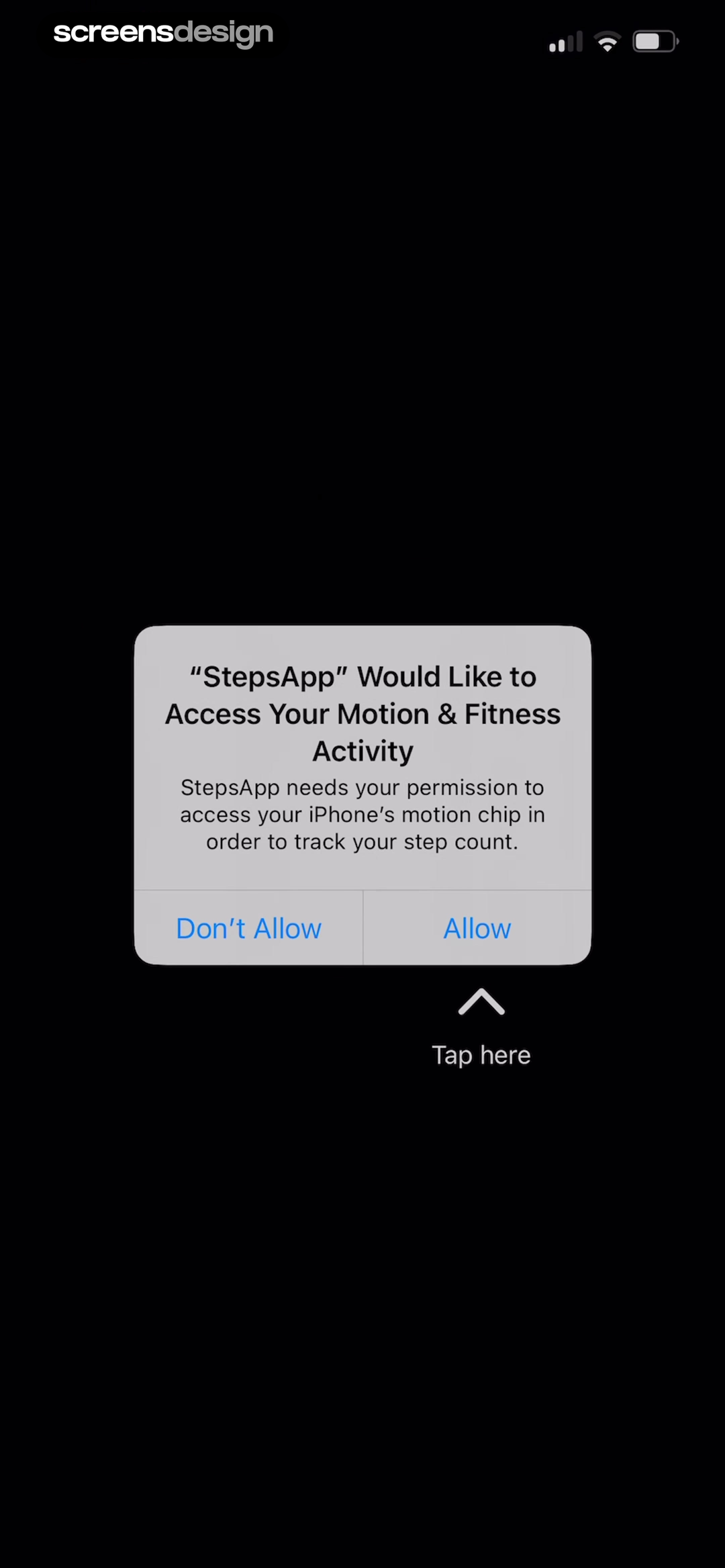
StepsApp uses a tighter sequence. A motion-sensor explanation appears at 52.4 seconds, the native prompt at 54.7 seconds, and the next setup screen at 57.2 seconds asks for gender, birth year, weight, and height while offering Apple Health sync. This makes the dependency visible, but it also creates a dense cluster of sensitive inputs that should each have a clear calculation or feature consequence.
Document every read and write separately. Explain whether the app counts steps locally, imports body measurements, writes workouts, or continuously syncs activity. Ask only for the data types needed now, and let people revisit the connection when a later feature needs more.
06. Tracking and privacy
State the advertising purpose before the tracking choice.
Tracking permission should not be disguised as a product feature when its purpose is attribution, advertising, or measurement.
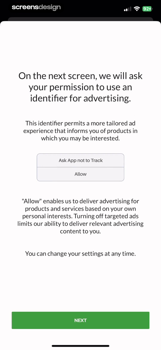
MarketWatch uses a pre-permission screen at 6.6 seconds to say the next request concerns an advertising identifier and tailored ads. The native App Tracking Transparency dialog follows at 9.4 seconds. The wording also says settings can be changed later. This is more informative than a generic better experience promise, although the flow still places tracking immediately after a notification dialog and before the main news feed.
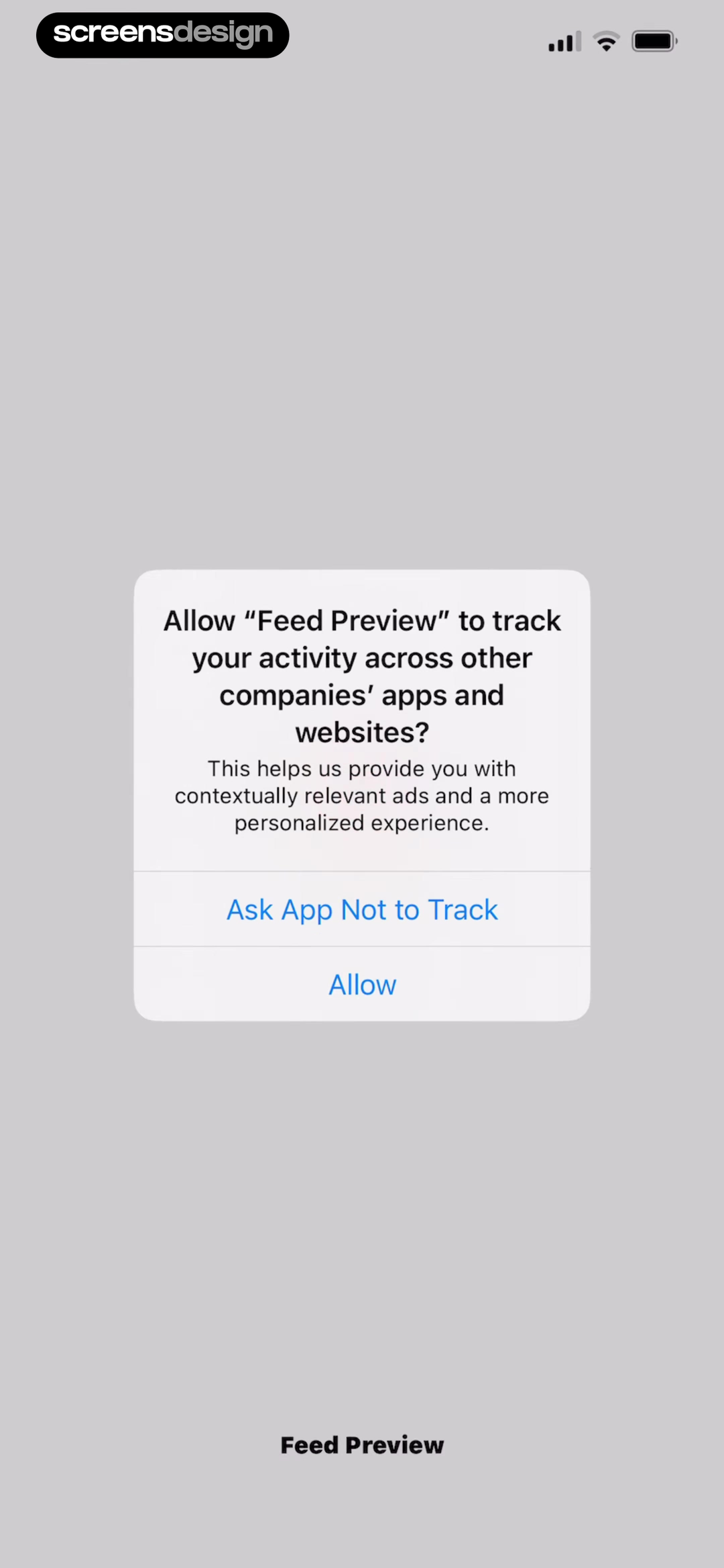
Feed Preview shows the contrasting sequence. Its native tracking prompt appears at 2.7 seconds, immediately after the splash screen and before a welcome screen at 5.5 seconds. The prompt mentions relevant ads and personalization, but the person has not yet seen the planner or made a product choice. The recorded timing gives the request little contextual support beyond the system text itself.
A tracking warm-up must not pressure the user, imitate the native buttons, or suggest that Ask App Not to Track disables the core product when it does not. Keep both outcomes functional. Explain the real purpose, identify what remains available after declining, and make later privacy controls easy to find.
Describe the data practice, not an abstract benefit.
Personalization is too broad on its own. Name attribution, ad measurement, cross-company tracking, or content recommendation when that is the actual purpose.
07. Practical review
Review the permission chain from trigger to recovery.
The final quality check is not whether the prompt looks polished. It is whether the complete path stays honest and usable.
Start by writing the user action that triggers each request. Then capture the warm-up, native dialog, approval path, denial path, restricted or selected-access path, and later settings recovery. Test the sequence on a fresh install and again after a denial. Many permission bugs live in the second attempt, when the system dialog can no longer be shown automatically.
Read every line as a data-handling statement. Confirm it with engineering, legal, and the SDK configuration. Claims about contact retention, reminder frequency, and selected-photo support must match actual product behavior.
Finally, inspect order. Several recordings place multiple requests within seconds of one another. Combine them only when one initiated task genuinely needs every capability. Otherwise move each request to the moment its feature becomes visible.
- Name the exact user action that triggers the request.
- Explain one concrete benefit without hiding the data purpose.
- Match warm-up language to the native permission and scope.
- Offer a useful path when the person declines or limits access.
- Test fresh, denied, restricted, selected-only, and revoked states.
- Show how to recover access later without repeated pressure.
- Verify retention, sharing, upload, and deletion statements.
- Check accessibility, localization, dynamic type, and screen readers.
- Review adjacent prompts so requests do not become a launch-time wall.
- Record the evidence and decision owner for every permission.
Questions and answers
Mobile app permission screen questions
What is a pre-permission screen?
It is an app-owned screen shown before a native permission dialog. It explains why access is relevant and what will happen next. It should support an informed choice, not pressure the person or imitate the system prompt.
When should an app ask for notification permission?
Ask when the user understands the event a notification will support, such as a scheduled study session, completed focus timer, order update, or safety alert. Preview the message and let the person choose timing or frequency when the product supports it.
Should permissions be requested during onboarding?
Only when the onboarding task already makes the need concrete. Location for an active route or notifications after scheduling a reminder can be understandable. Camera, contacts, photos, microphone, and health access are often clearer when their feature is first used.
What should happen when a user denies permission?
Continue with the best available alternative, explain only the missing capability, and provide a later settings path when the feature is attempted again. Do not repeatedly interrupt unrelated tasks or imply that denial was an error.
How should photo and contact scope be handled?
Support the smallest useful scope. Selected photos and selected contacts should work when the platform offers them. Explain whether data is uploaded, matched, retained, or deleted, and keep manual import or invitation options available where possible.
What should an App Tracking Transparency warm-up say?
State the real purpose in plain language, such as ad attribution, measurement, or personalized advertising. Avoid vague benefit claims and make clear that declining does not remove unrelated core functionality.
How can I research more permission screen examples?
Use ScreensDesign to search exact recorded screens, then open the surrounding replay to inspect the trigger, native dialog, denial path, approval path, and later settings recovery instead of copying one isolated prompt.
Apps referenced in this page
Open the products behind the examples.
 Astra AISchool questions & homework
 ForestPomodoro Timer, ADHD & Study
 Map My WalkGPS Step Counter, Weight Loss
 SmartNewsRead in English or Spanish
 Adobe ScanText Document, Photo Converter
 PhotoleapProfessional Headshot Editor
 VocalMeVoice, Song Cover, Music Video
 PunchbowlSend by Text or Email
 Nike Run ClubWorkout App & Distance Tracker
 None to RunTraining Plans & Tracker App
 StepsAppStep Counter, Walking Tracker
 MarketWatchPersonal Finance & Market News
 Feed PreviewGrid Layout & Filter Schedule
2,622 apps in the top charts.Ask them anything.
Search recorded permission screens by data type, request timing, and user task, then inspect the complete flow around each result.