Screen time design research
13 Screen Time App Design Examples
Screen time design should tell people what will be blocked, when it will happen, how strict it is, and how to recover when the rule is wrong.
A screen time app sits between intention and access. That makes small ambiguities costly. If a schedule uses the wrong day, a limit counts the wrong activity, or an emergency bypass is hidden, the product can interrupt work, safety, or communication. Strong design makes scope and state explicit, supports different levels of commitment, and preserves a clear way to understand what is happening.
This review uses thirteen recorded screens from Useless, OffScreen, FocusFlight, AppBlock, Opal, and Bark. Every example comes from a screen time, app blocking, focus, or parental-control product and opens its exact recorded moment. No interface is treated as proof of reduced usage, improved wellbeing, or retention.
For permission timing, use the mobile app permission screen examples. For state hierarchy after setup, compare the mobile app home screen guide.
01. Authorization
Explain app access before asking for control.
The permission should follow a selected blocking job, not the first launch.
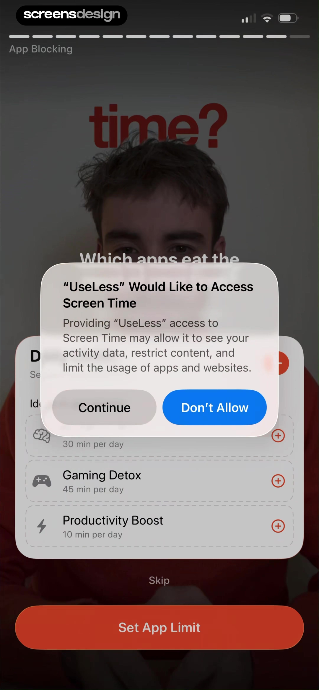
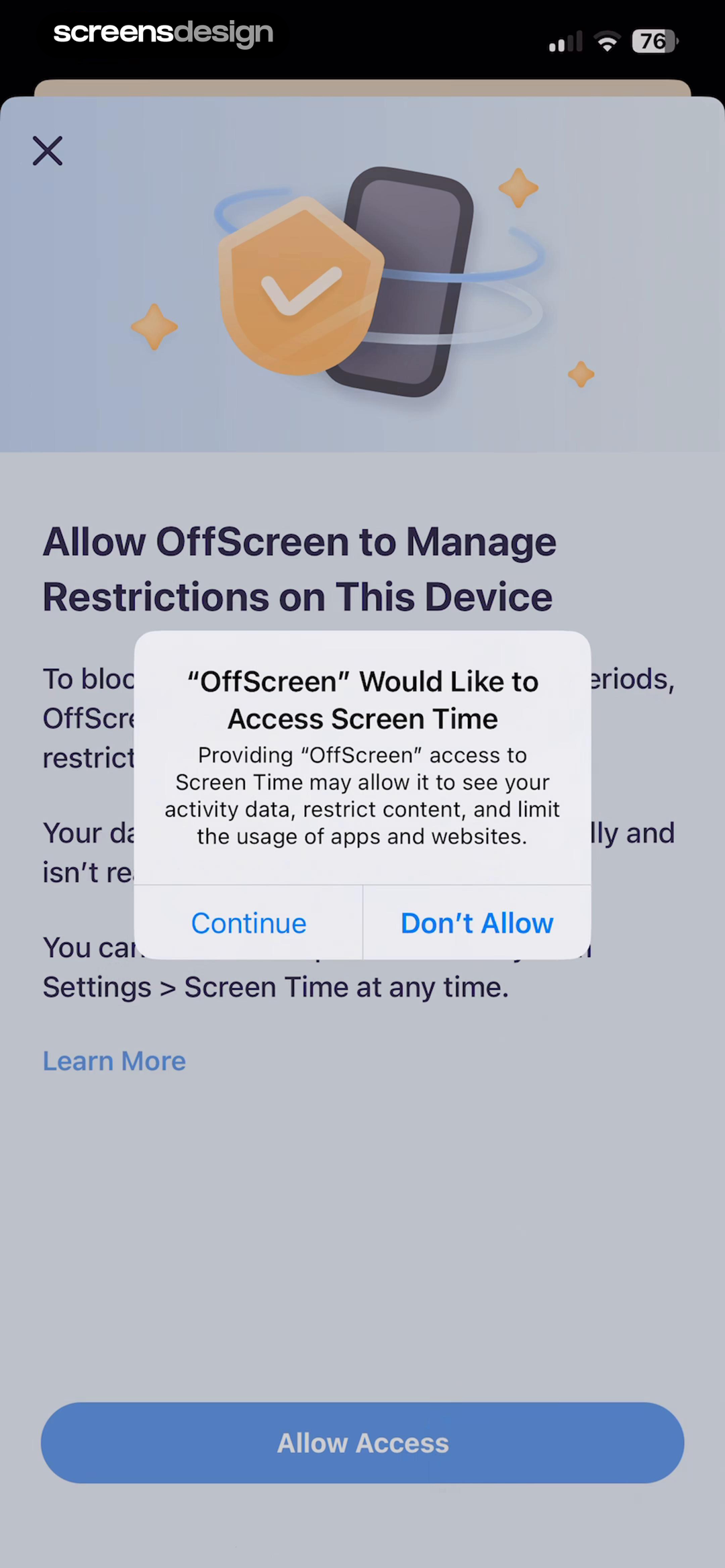
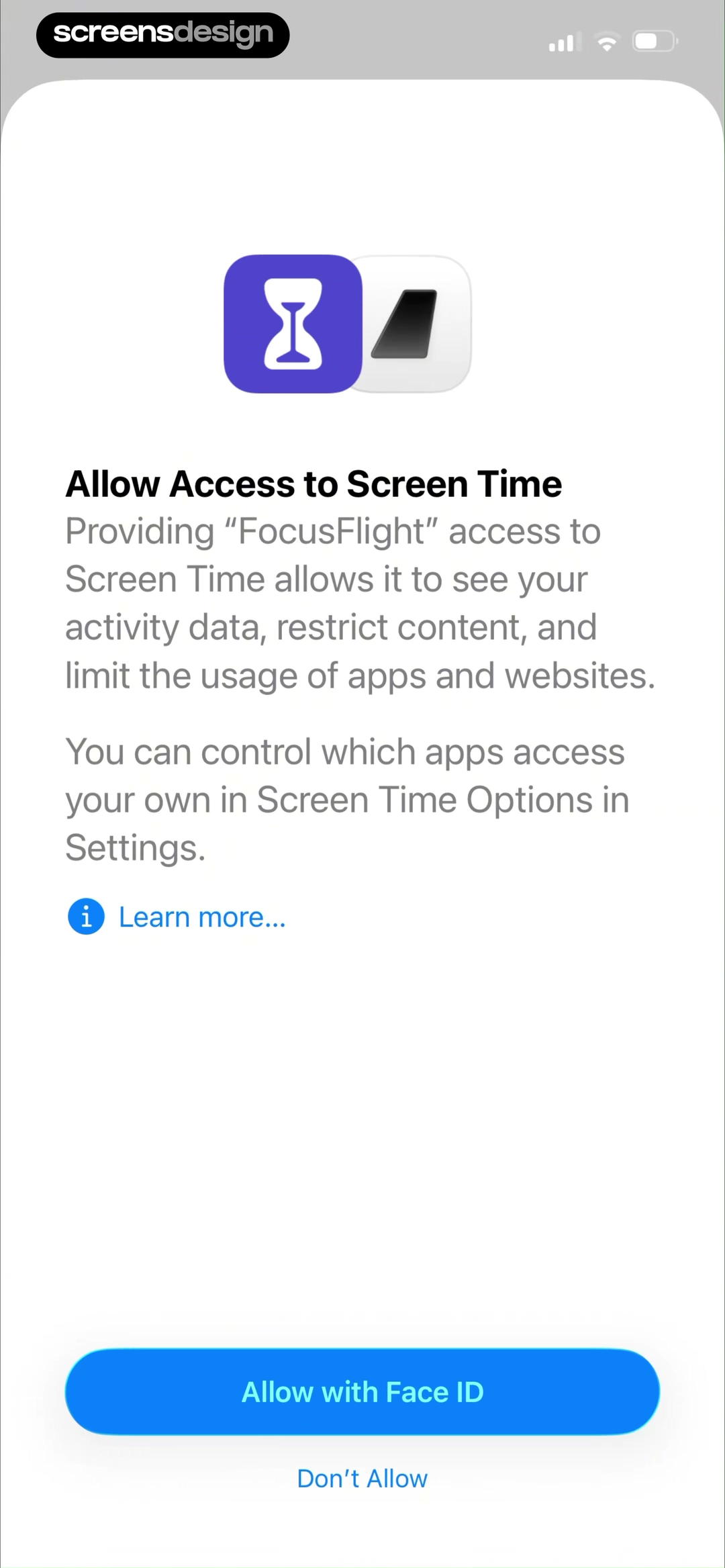
Useless introduces app blocking through recognizable intentions such as deep work, gaming detox, and productivity. OffScreen then explains why Screen Time access is needed, states that its data is processed locally, and tells users where authorization can be changed. FocusFlight shows the system-level consequence with both Allow and Don't Allow available.
A screen time pre-permission screen should name the operating-system access, which apps or categories can be read or restricted, what usage data the product stores, and which features remain without access. Do not imply that authorization is mandatory when reminders or manual sessions can still work. Link to a clear privacy explanation without moving the main consequence off screen.
If access is denied or later revoked, show the affected rules as inactive rather than silently failing. Provide a direct settings path, explain what will resume after authorization, and do not ask on every launch. An onboarding success state should confirm the selected scope, not only celebrate that permission was granted.
02. Daily limits
Name the app, allowance, reset, and strictness together.
A limit card should be readable before and after enforcement begins.
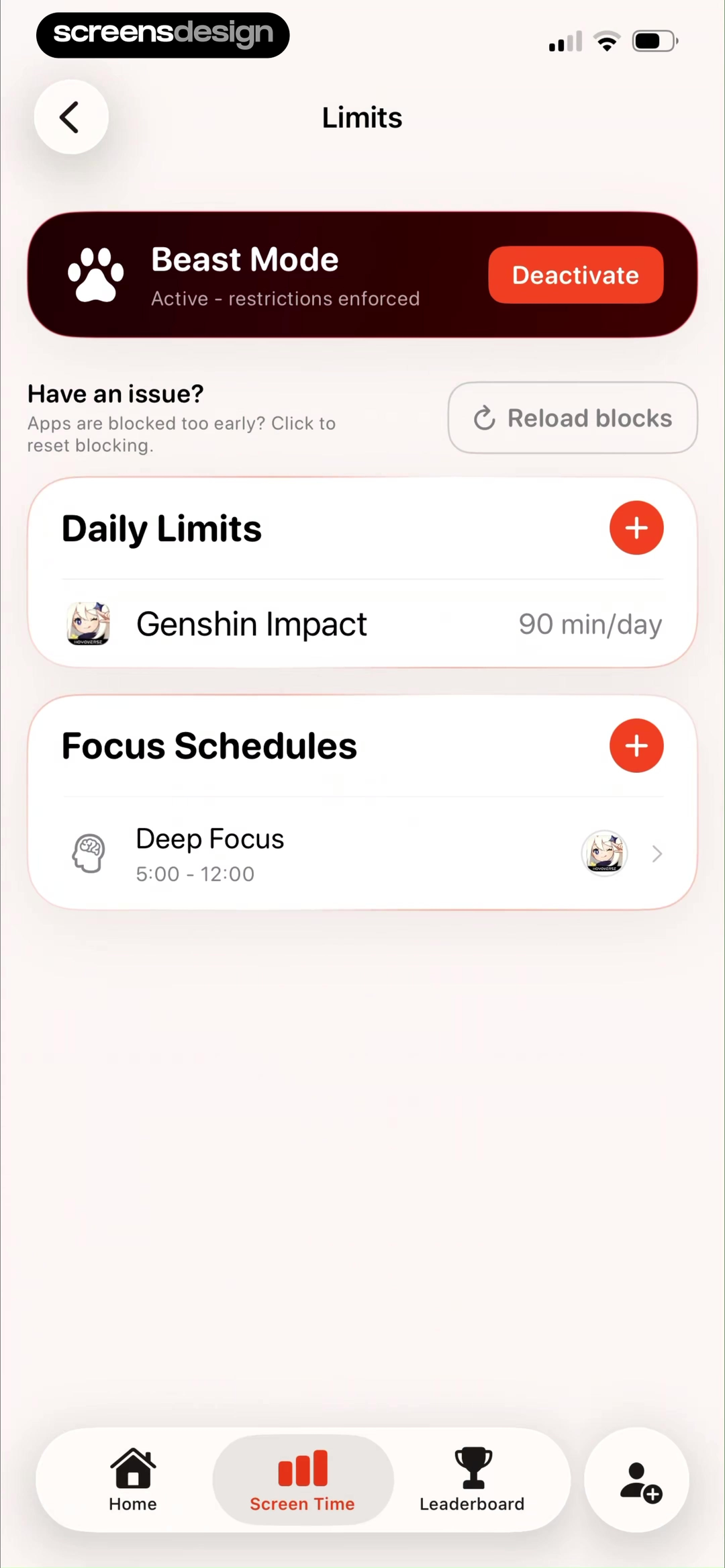
Useless shows a Daily Limits section with a named app and minutes per day, while the surrounding surface exposes Beast Mode and a recovery action for blocks that occur too early. A later active state changes the status to restrictions enforced and makes deactivation visible. These labels reduce the need to infer behavior from a toggle color.
Define what counts toward a limit. Foreground use, background audio, web domains, widgets, and system apps may behave differently. State the reset time and account for timezone changes. If multiple rules overlap, explain which one currently blocks access and when each rule ends.
Strict modes require extra care. Before activation, summarize the commitment, protected apps, emergency behavior, and whether uninstalling or changing device time affects the rule. Use a deliberate confirmation, not a preselected switch. If the user chooses a recovery, show the tradeoff without shame and preserve the underlying goal.
03. Focus schedules
Build the schedule as a sentence the user can verify.
Selected apps, start, end, days, and strictness should read as one rule.
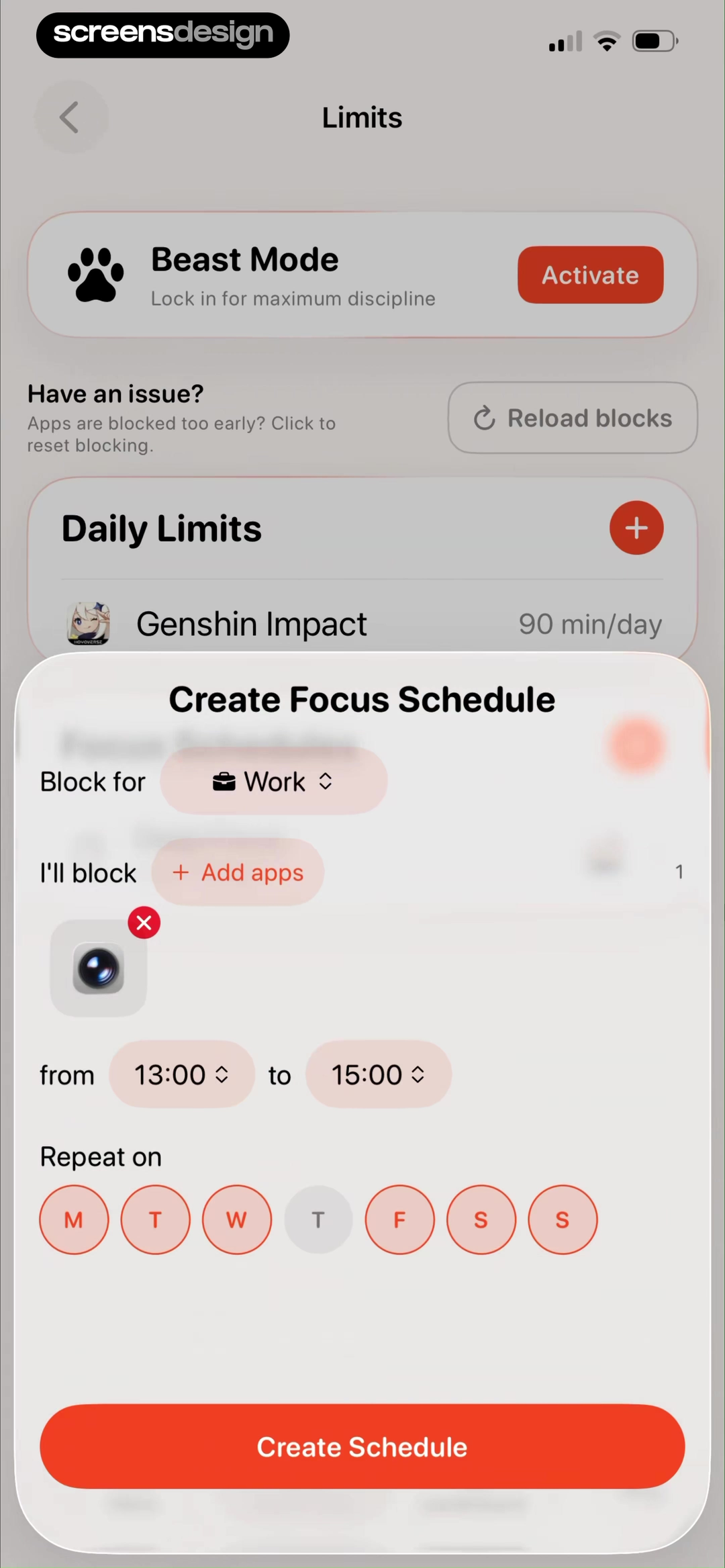
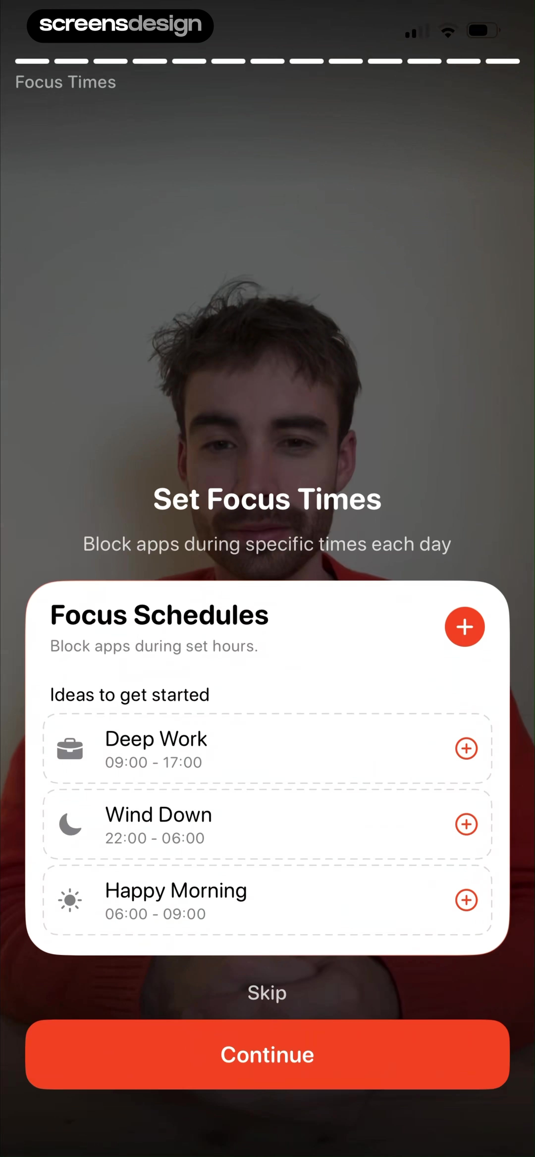
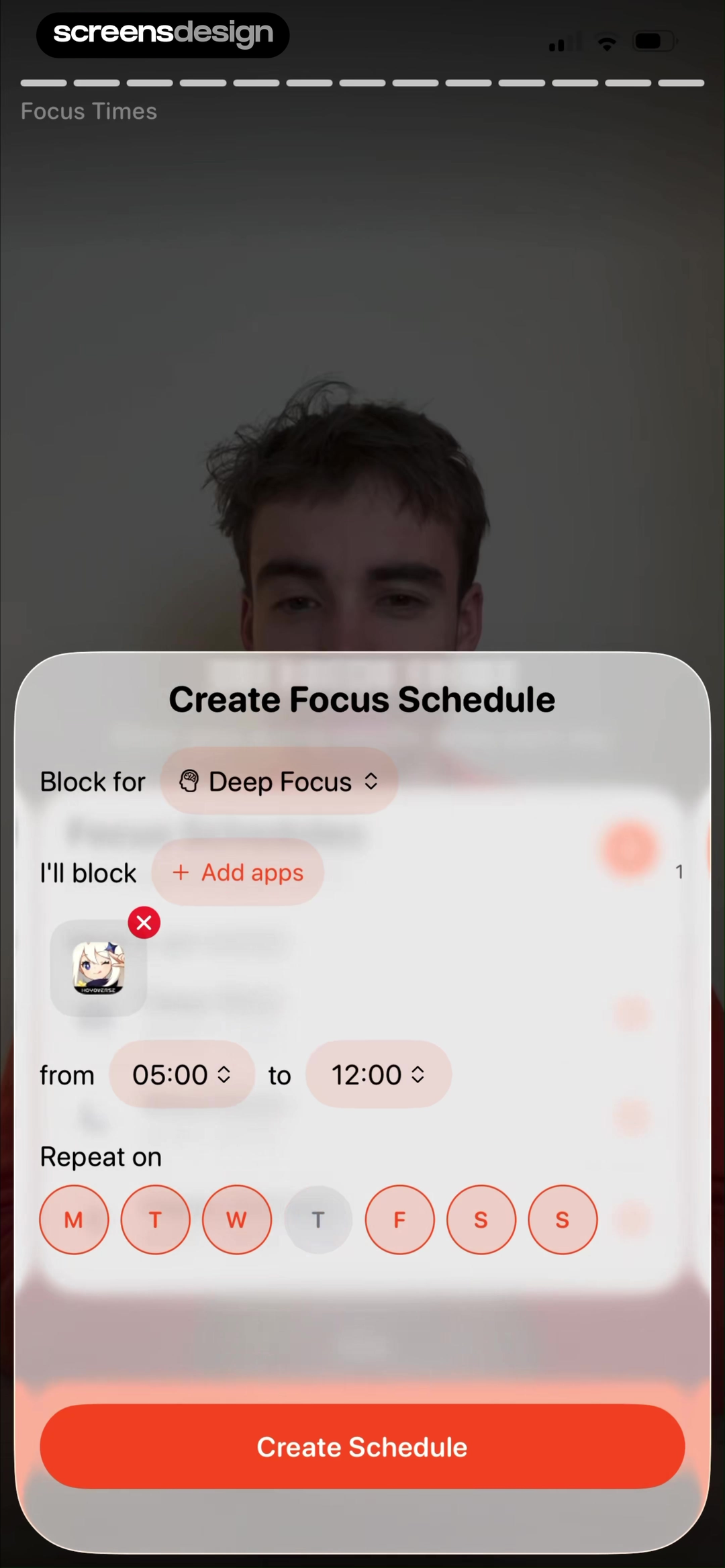
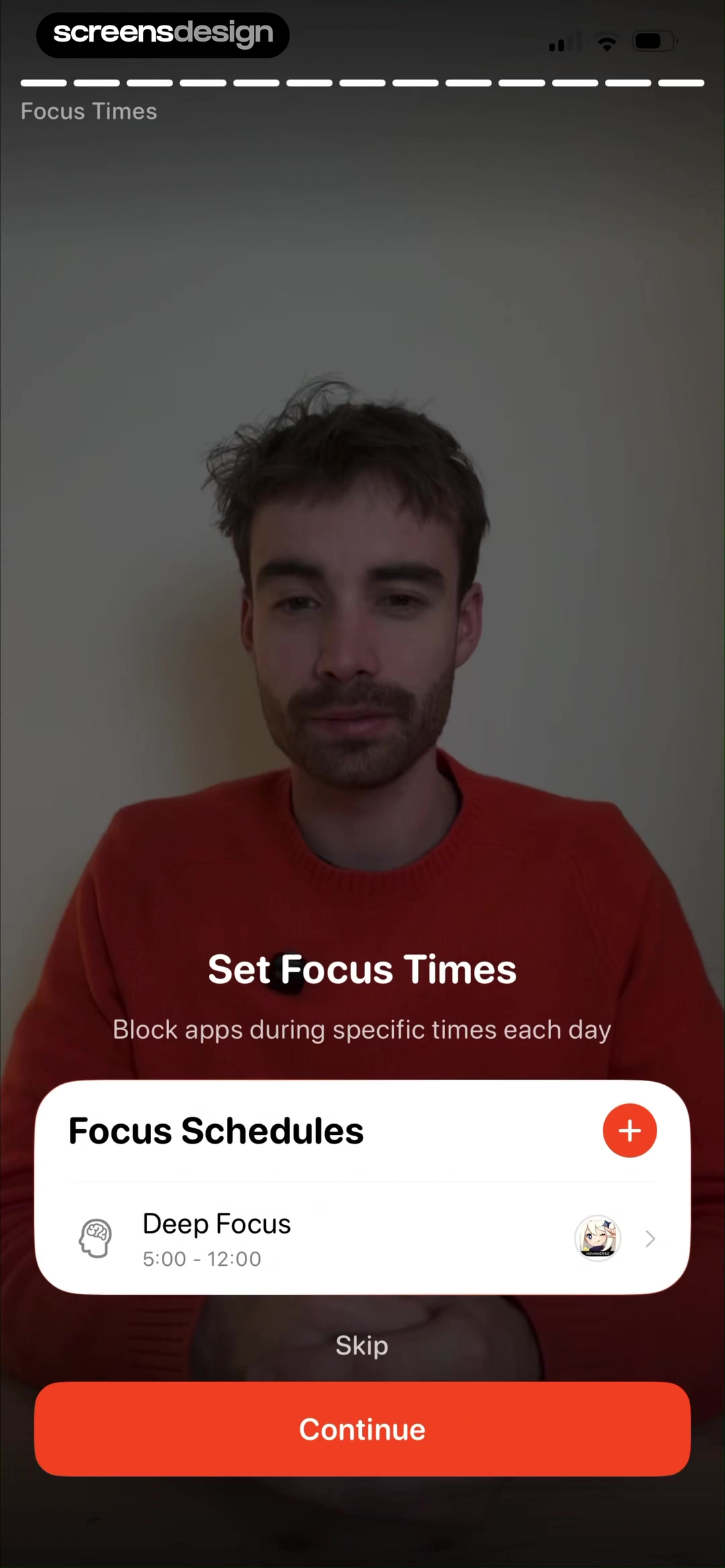
Useless shows schedule templates such as Deep Work and Wind Down, then a form with title, selected apps, start, end, and repeat days. The final schedule appears as a named item with its time window. Templates reduce setup work, but a preview must make every inherited value editable before activation.
Handle overnight windows explicitly. A schedule from 22:00 to 06:00 should state which morning it ends. Show locale, timezone, and travel behavior where relevant. Warn about overlapping schedules and let users decide whether rules combine, one takes precedence, or the strictest wins.
The app-selection step needs search, categories, current selection, and exclusions for essential tools. Use plain language for all apps versus chosen apps. Before saving, produce a confirmation such as Block Instagram and TikTok from 09:00 to 17:00 on weekdays. That sentence is also useful later in the schedule list and notifications.
04. Monitoring and reports
Connect every chart to an action the user controls.
A usage report should support reflection, not turn attention into a judgment score.
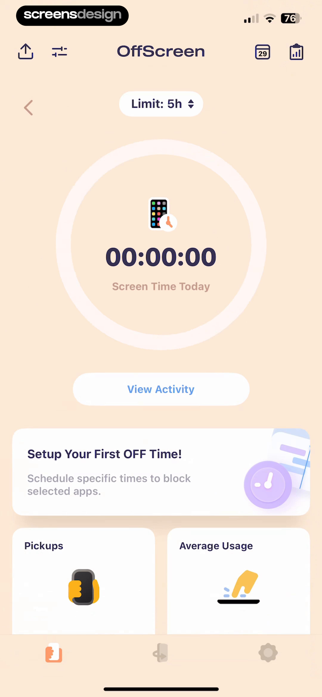
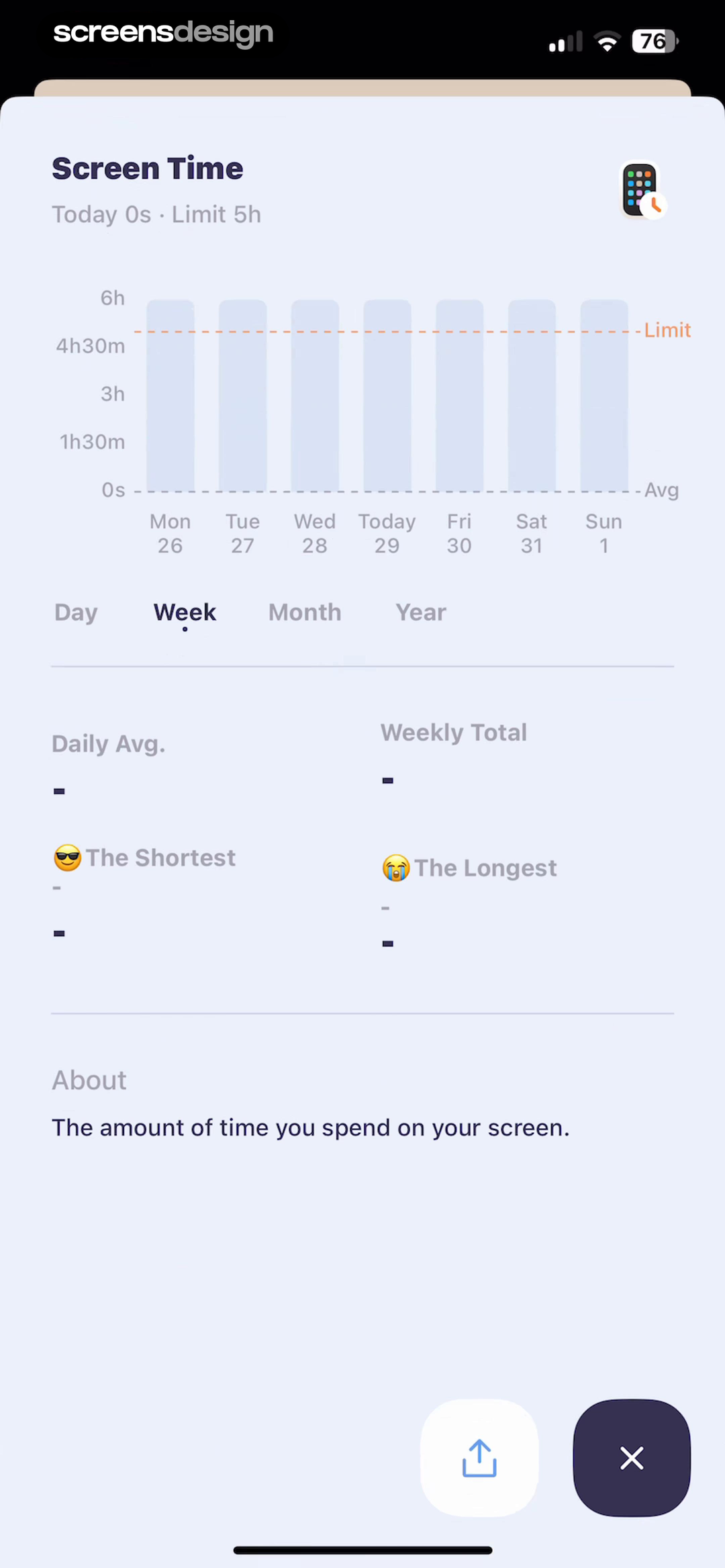
OffScreen's home combines today's total, a five-hour limit, activity access, a first schedule action, pickups, and average usage. Its report separates day, week, month, and year, then labels daily average, weekly total, shortest, and longest use. The two screens connect a current state to a more detailed history without presenting a single opaque score.
Every metric needs a period, unit, source, and explanation. Show incomplete or unavailable data rather than drawing a smooth chart from gaps. Let users move from an observation to a rule change, such as editing a limit, changing a schedule, or excluding an essential app. Avoid presenting correlation as a health conclusion.
Reports should accommodate success without demanding ever lower usage. Some apps are tools for work, learning, navigation, or accessibility. Let users define which use is intentional. Compare against their chosen goal and preserve neutral language when the target is missed.
05. Enforcement and recovery
Keep the active rule and the exit path in the same view.
People need to know what is blocked, how long remains, and what each recovery action changes.
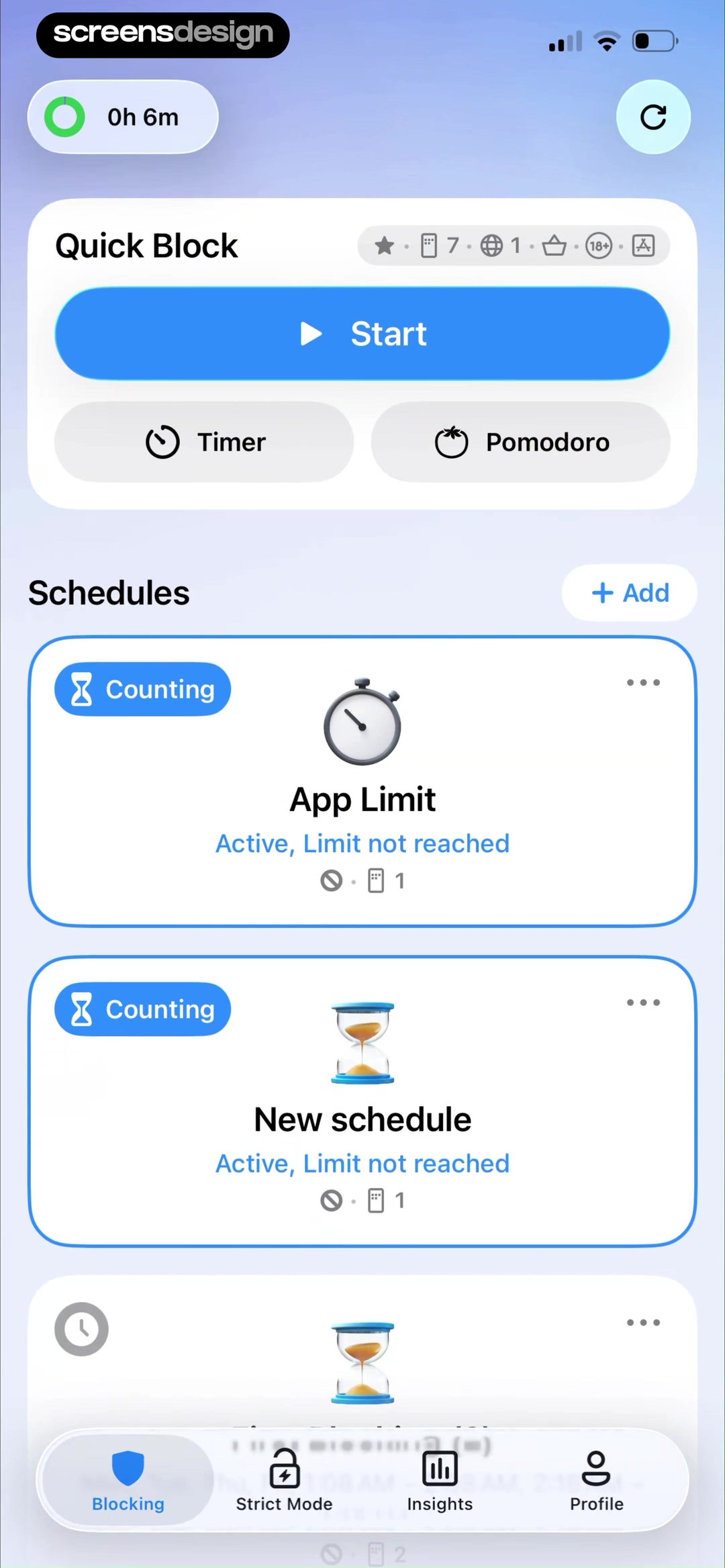
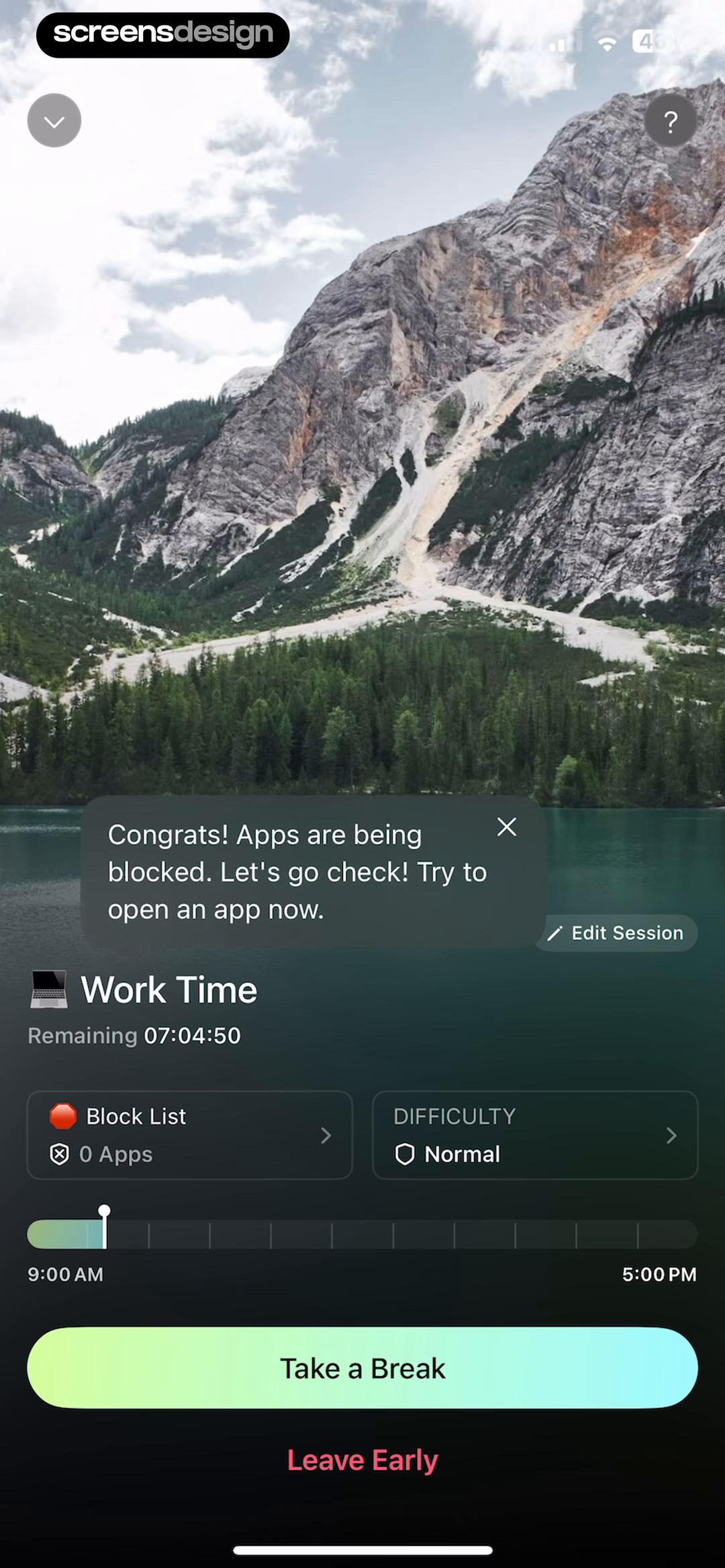
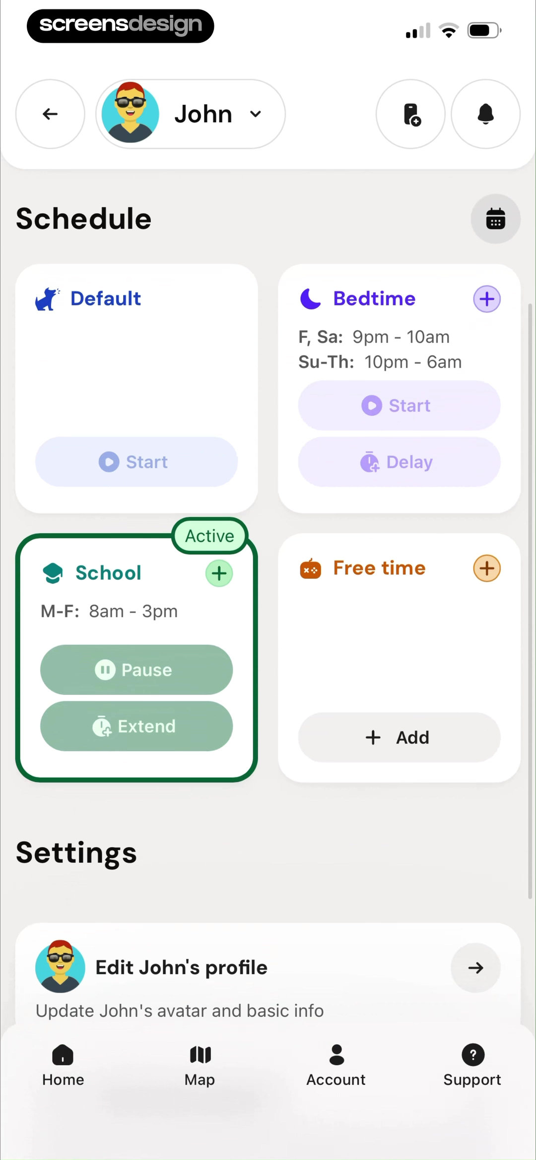
AppBlock places quick blocking, timers, Pomodoro sessions, schedules, app limits, and Strict Mode in one control center. Opal's active session names Work Time, remaining duration, block list, difficulty, start and end, plus Take a Break and Leave Early. Bark uses a family schedule with visible active states and actions to delay, pause, extend, or add free time.
Recovery actions need different names when they have different consequences. A break may preserve the session, leaving early may end it, pausing may affect every device, and extending may shift a child's schedule. Show the affected apps, duration, approval rules, and whether the change is logged before confirmation.
Paid boundaries should be legible before commitment. Pro might add multiple app groups, recurring schedules, strict mode, longer history, cross-device sync, or richer analysis. Keep one useful free path, explain the exact limit, and do not hold emergency access behind a paywall. ScreensDesign Pro helps teams compare these controls across complete recorded flows, including what happens after a rule is paused, dismissed, or overridden.
Review checklist
Test every rule before, during, and after enforcement.
Create limits, schedules, and sessions with allowed and denied access, overlapping rules, overnight windows, timezone changes, revoked permission, emergency bypass, early exit, and subscription expiry. Confirm that the product always explains which rule is active and when it ends.
Review the emotional tone as carefully as the mechanics. The interface should help users make intentional choices without moralizing ordinary device use. Make recovery visible, preserve settings after a missed goal, and allow complete deletion of usage history and account data where promised.
- Authorization follows a chosen blocking or monitoring task and explains data use.
- Limit cards name scope, allowance, reset period, counted activity, and enforcement.
- Schedules summarize selected apps, start, end, days, timezone, and overlap behavior.
- Strict modes disclose emergency access and recovery before activation.
- Active and inactive states use explicit text, not color alone.
- Reports label period, unit, source, missing data, and a useful next action.
- Reminders use user-chosen purpose, time, days, preview, and easy disable controls.
- Pro limits never obscure safety, unexpectedly remove control, or trap settings.
Questions and answers
Screen time app design questions
What should a screen time limit screen show?
Show the selected app or category, counted activity, daily allowance, reset time, current use, behavior at the limit, strictness, and a clear edit path.
How should a focus schedule handle overnight hours?
State the start day and end day explicitly, show timezone behavior, and summarize the complete rule before activation.
When should a screen time app request authorization?
After the user chooses to create a limit, schedule, or session. Explain the exact access, data use, unavailable features, and denied path before the system request.
How can screen time apps improve retention ethically?
Make controls reliable, reports actionable, goals adjustable, and return after a lapse respectful. Use reminders chosen by the user and avoid shame, forced streaks, or obstructive cancellation.
What screen time features can belong to Pro?
Multiple schedules, richer history, cross-device sync, advanced groups, or automation can be paid. Core safety, emergency access, data deletion, and control over active restrictions should remain clear.
How should a screen time app show progress?
Compare a clearly defined metric and period with the user's chosen goal, identify missing data, and provide the relevant next action without presenting usage as a clinical judgment.
Apps referenced in this page
Open the products behind the examples.






2,715 apps in the top charts.Ask them anything.
Search recorded focus, limit, schedule, and usage-report screens, inspect the full enforcement sequence, and ask ScreensDesign Pro how leading apps handle the exact control or upgrade moment you are improving.