Pricing plan comparison
10 Mobile App Pricing Plan Comparison Examples
Separate what the customer gets from how often and how much they pay.
Mobile pricing pages often mix two decisions: product tier and billing term. Free, Lite, Plus, and Pro describe access, while monthly, annual, and lifetime describe payment. When those dimensions are mixed into one row of cards, customers cannot tell whether a higher price buys more capability or simply a longer commitment.
These ten recorded examples compare free and paid entitlements, quantified limits, creator workflows, annual savings, lifetime purchases, feature matrices, AI usage, transcription minutes, and support levels. The strongest comparisons use customer tasks as the unit of value rather than a long collection of checkmarks.
Design from the product model. Identify the few capabilities that genuinely differ, show the limit and current usage where relevant, then present billing choices for the selected tier. Keep the charged total, recurring cadence, trial, renewal, and cancellation terms close to the action.
Read mobile app paywall design examples for the adjacent product state and its handoff into this decision.
01. Entitlements
Compare the features that change the product experience.
A short decision table is more useful than an exhaustive inventory.
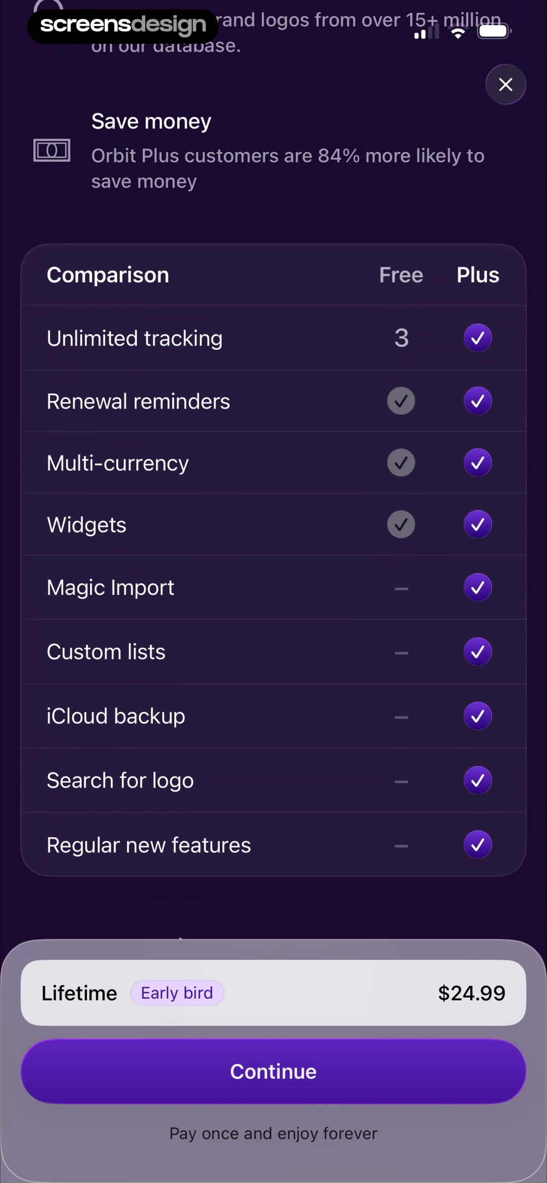
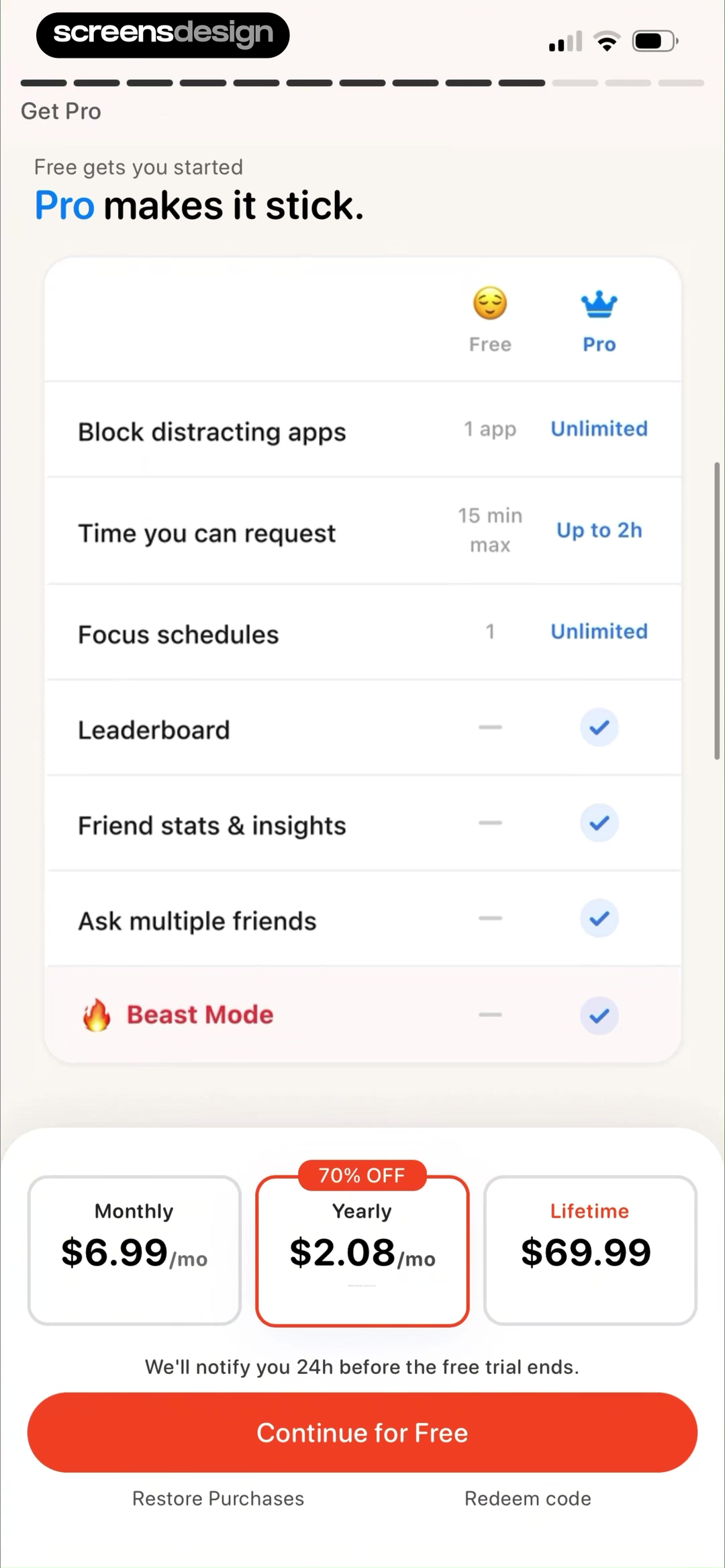
Subscription Manager: Orbit shows that free and Plus are compared through tracking, reminders, currencies, widgets, and import capabilities. Useless - Screen Time Control takes a different but compatible approach: the Free versus Pro table quantifies blocked apps and request duration instead of relying on vague labels. Together, the examples reveal which details must stay visible at the decision point rather than being deferred to support or legal copy.
Choose capabilities customers recognize from the product. Quantify limits such as apps, projects, reminders, devices, or exports so Free and Pro do not depend on subjective words.
Test the normal path, dismissal, back navigation, interruption, app relaunch, slow network, stale account data, and the state after completion. The primary label, confirmation, saved data, and next destination should describe the same outcome. Check large text, screen readers, keyboard focus, translated copy, and reduced motion so the decision remains understandable without relying on layout or color alone.
02. Usage model
Connect the paid plan to the job it supports.
Features become persuasive when they form a complete workflow.
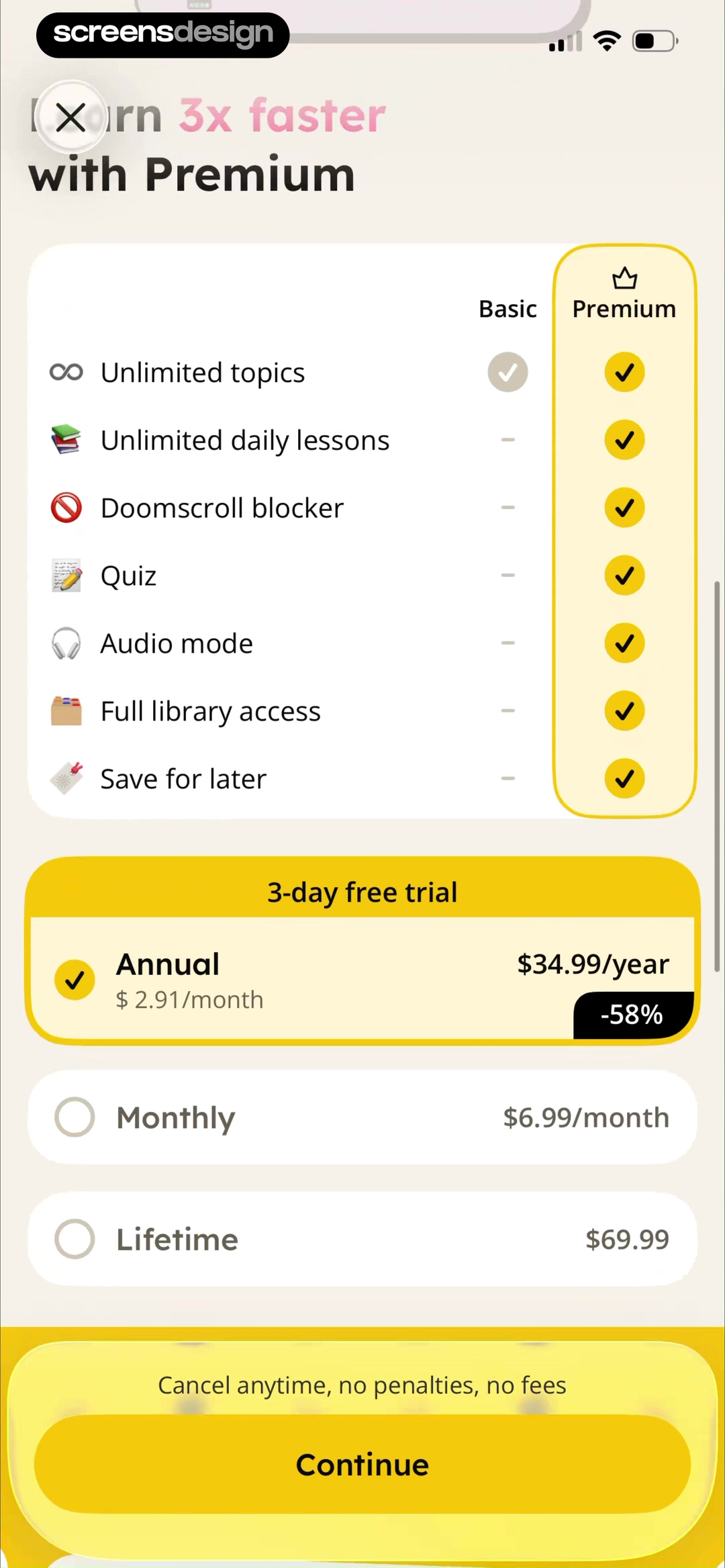
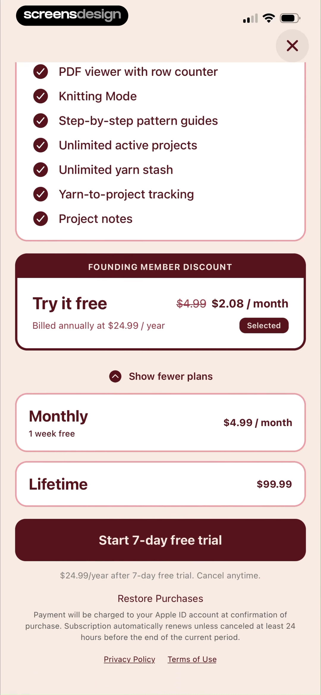
GenK: Daily Learning & Quiz shows that basic and Premium are mapped to topics, lessons, quiz, audio, blockers, and library access. LooseLoop - Craft Companion takes a different but compatible approach: the offer connects price to concrete craft workflows such as row counting, projects, yarn, and pattern guides. Together, the examples reveal which details must stay visible at the decision point rather than being deferred to support or legal copy.
Group related capabilities around learning, crafting, saving time, creation, or collaboration. Avoid listing infrastructure details that do not help a customer choose.
Test the normal path, dismissal, back navigation, interruption, app relaunch, slow network, stale account data, and the state after completion. The primary label, confirmation, saved data, and next destination should describe the same outcome. Check large text, screen readers, keyboard focus, translated copy, and reduced motion so the decision remains understandable without relying on layout or color alone.
03. Tier and term
Separate access level from billing cadence.
A tier comparison and a monthly-versus-annual decision should not compete.
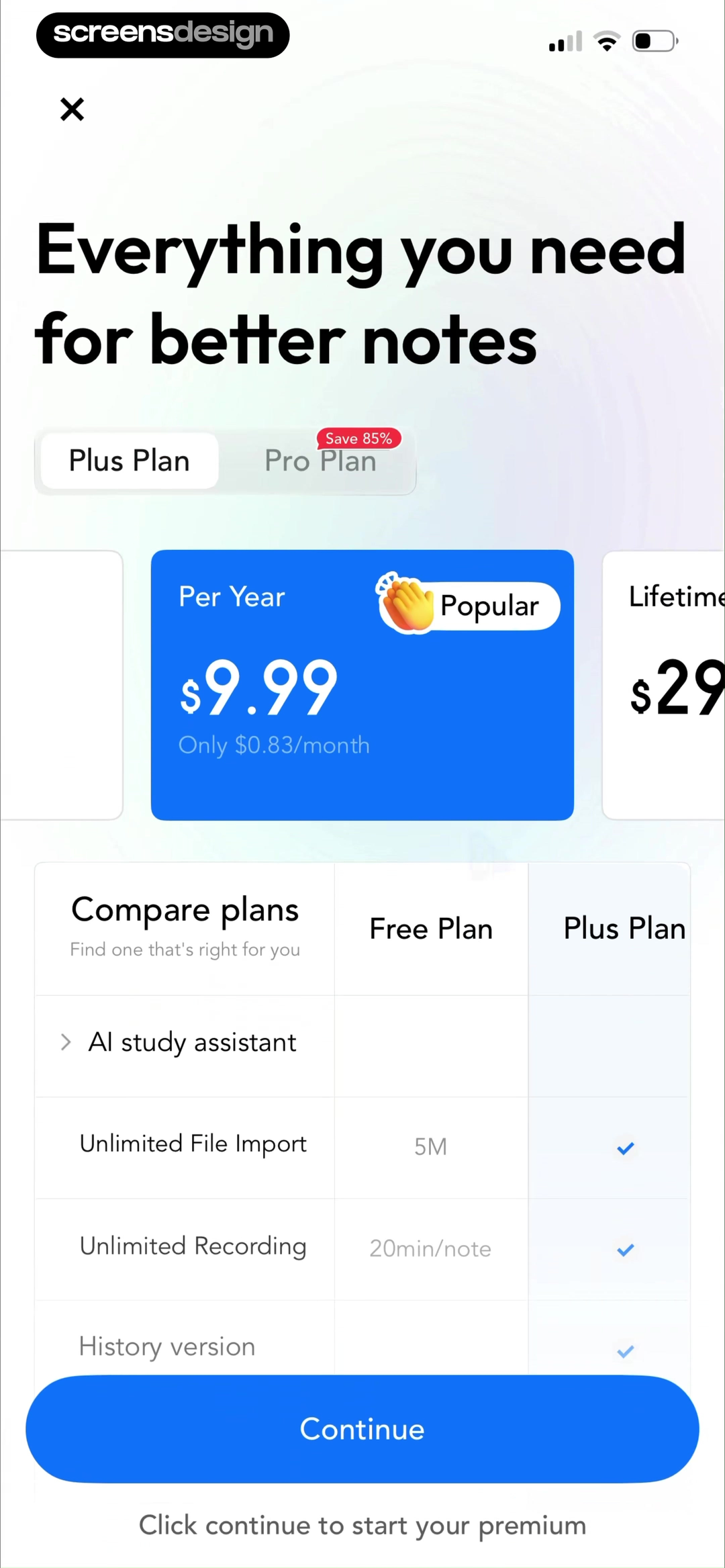
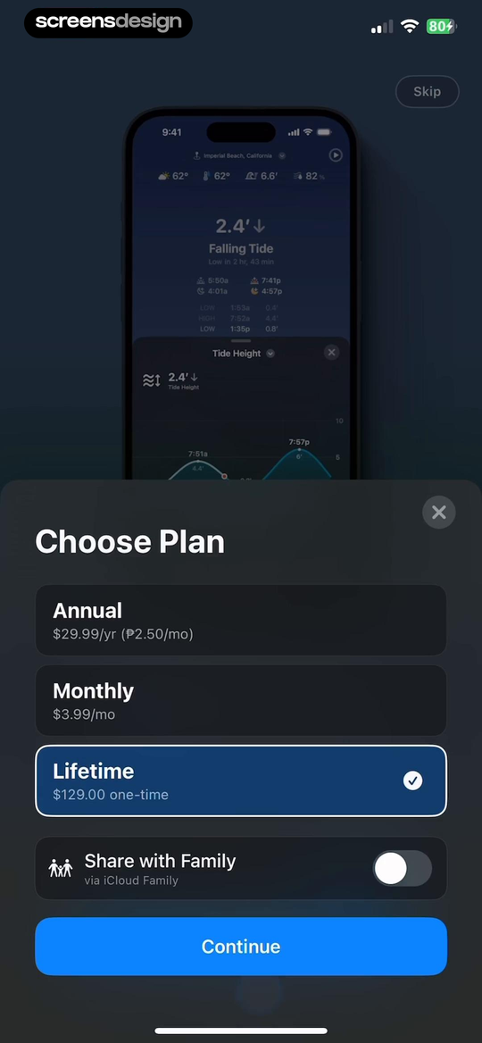
Freenotes®: AI Notes Taking shows that plus and Pro are separated from annual and lifetime billing, with the popular choice and savings made visible. Tide Guide: Charts & Tables takes a different but compatible approach: annual, monthly, and lifetime terms use comparable totals and equivalents, with a clear Skip route. Together, the examples reveal which details must stay visible at the decision point rather than being deferred to support or legal copy.
Let the customer understand Plus versus Pro, then choose annual, monthly, or lifetime where offered. Preserve the selected tier while the billing term changes.
Test the normal path, dismissal, back navigation, interruption, app relaunch, slow network, stale account data, and the state after completion. The primary label, confirmation, saved data, and next destination should describe the same outcome. Check large text, screen readers, keyboard focus, translated copy, and reduced motion so the decision remains understandable without relying on layout or color alone.
04. Savings and limits
Show the full price behind savings claims.
Equivalent monthly prices help comparison only when the charged total remains visible.
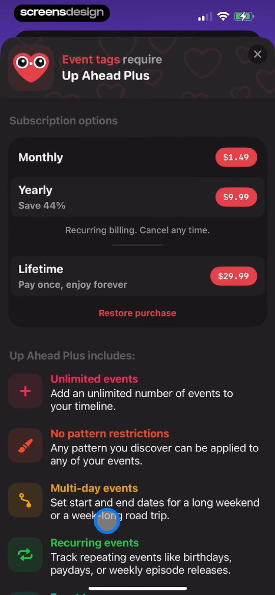
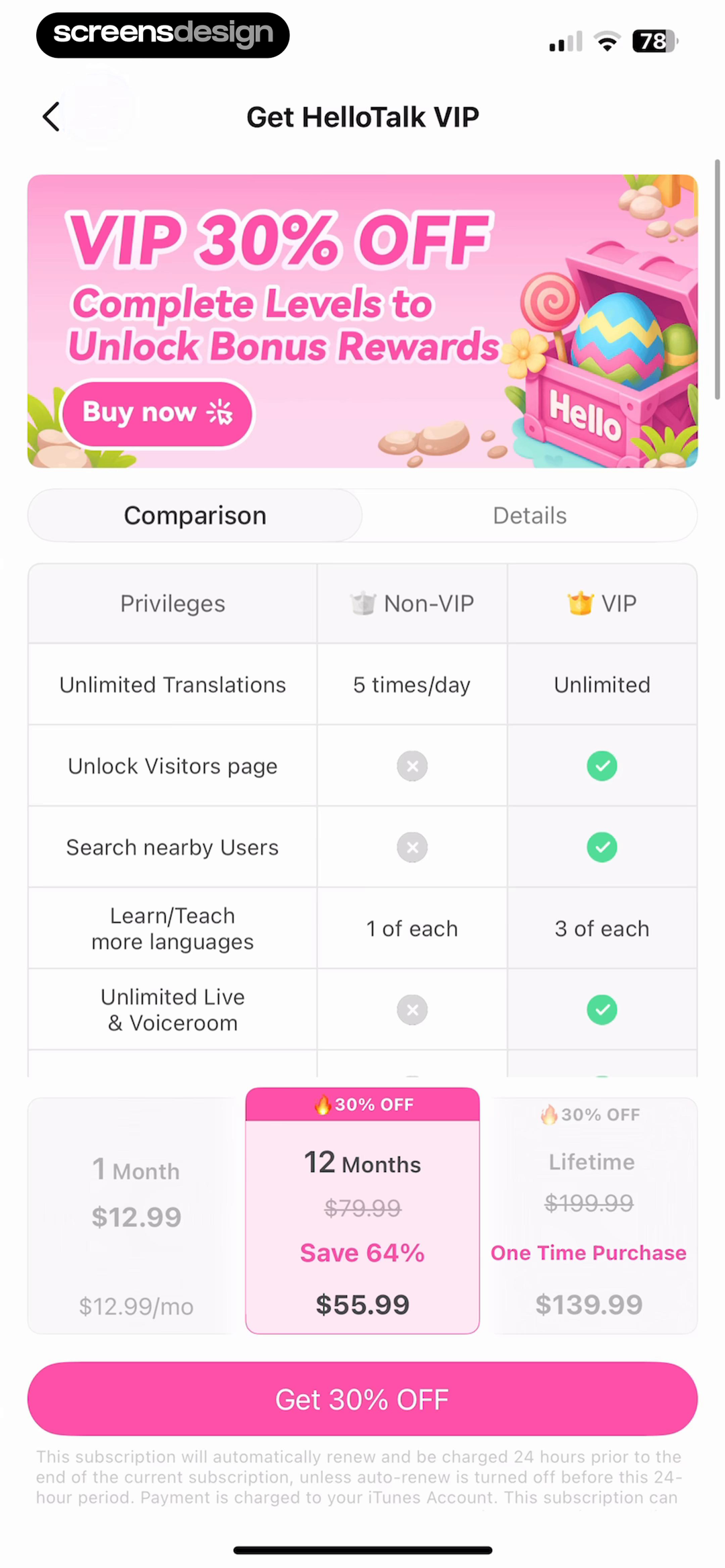
Up Ahead: Countdown Widgets shows that the trigger feature appears first, then monthly, yearly, and lifetime options with savings and billing language. HelloTalk - Language Learning takes a different but compatible approach: non-VIP and VIP privileges are shown in a comparison view before the discounted purchase action. Together, the examples reveal which details must stay visible at the decision point rather than being deferred to support or legal copy.
State the annual total, renewal cadence, trial, and original reference price. Explain whether lifetime covers the same features and future updates as recurring plans.
Test the normal path, dismissal, back navigation, interruption, app relaunch, slow network, stale account data, and the state after completion. The primary label, confirmation, saved data, and next destination should describe the same outcome. Check large text, screen readers, keyboard focus, translated copy, and reduced motion so the decision remains understandable without relying on layout or color alone.
05. Advanced capacity
Use measurable limits for professional plans.
Power users compare throughput and access, not badges.
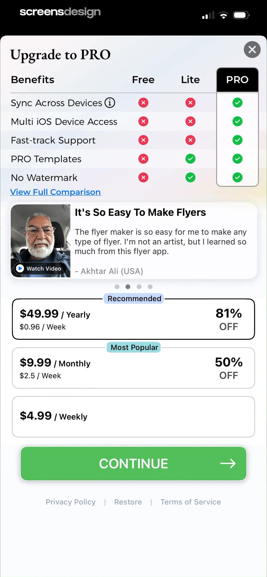
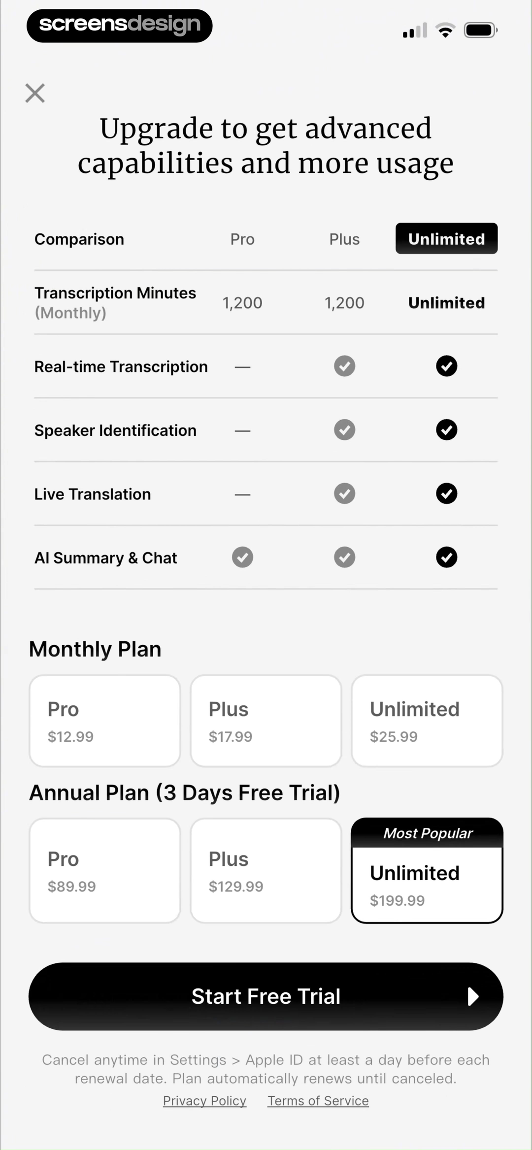
Flyer Maker + Poster Maker shows that free, Lite, and Pro are compared through sync, device access, support, templates, and watermark removal. HyNote: AI Note Taker, Summary takes a different but compatible approach: pro and Plus use transcription minutes, translation, speaker identification, and real-time capabilities as decision units. Together, the examples reveal which details must stay visible at the decision point rather than being deferred to support or legal copy.
Expose transcription minutes, exports, AI usage, device sync, team seats, support, templates, and watermark rules. If usage can exceed the included amount, explain overages or hard stops.
Test the normal path, dismissal, back navigation, interruption, app relaunch, slow network, stale account data, and the state after completion. The primary label, confirmation, saved data, and next destination should describe the same outcome. Check large text, screen readers, keyboard focus, translated copy, and reduced motion so the decision remains understandable without relying on layout or color alone.
Implementation
Build the state model before polishing the screen.
Interface quality depends on entitlement, account, billing, content, and analytics state agreeing.
Generate comparison content from the same entitlement catalog used by feature gating. Each capability should have a stable customer label, tier availability, numerical allowance, renewal period, and overage behavior. This prevents the pricing page from promising access the product does not grant.
Normalize prices before rendering. Keep currency, tax handling, billed amount, equivalent period, discount basis, trial duration, renewal, and cancellation terms available to accessibility tools and localization. Do not encode the recommended plan only through color, scale, or animation.
Test small screens, large text, long localized prices, regional currencies, unavailable products, returning subscribers, upgrade and downgrade states, trials, family plans, lifetime ownership, expired offers, and price changes. Confirm that the selected product identifier matches the visible plan and term.
- Tier and billing term are modeled separately.
- The most important differences use customer language.
- Limits are quantified and tied to a renewal period.
- The charged total remains visible beside equivalent pricing.
- Trial, renewal, tax, cancellation, and lifetime scope are clear.
- The selected product matches the entitlement actually granted.
Measurement
Measure the completed outcome, not only the first tap.
A visible control is useful only when the customer reaches the expected state and can continue.
Track plan comparison viewed, tier selected, billing term selected, purchase completion, and plan-change support contact. Define the successful product state before launch and verify it from server or platform truth where possible. A button tap without the promised entitlement, schedule, reward, survey result, or recovered access should be counted as an error, not conversion.
Segment by entry point, customer state, current plan or program, platform, app version, locale, accessibility settings, prior failures, and whether the person returned after leaving the flow. Compare immediate completion with what happens during the next relevant session so a short-term click does not hide confusion or regret.
Review guardrails alongside the primary metric: repeated attempts, backtracking, support contact, refund, cancellation, incorrect access, disabled reminders, abandoned tasks, and manual corrections. Read open feedback and replay representative failures with sensitive information protected. The goal is a trustworthy customer outcome, not a higher number produced by obscuring alternatives.
Review checklist
Test the content, the control, and the resulting account state.
Create accounts for the new, active, returning, expired, interrupted, unsupported, and already-completed states. Verify copy, available actions, confirmation, account data, navigation, and the destination for each one.
Run the flow with slow and failed network calls, app relaunch, another device, large text, screen reader, localization, denied permissions where relevant, and a customer who changes their mind. Every path should preserve data and provide a clear way forward.
- Tier and billing term are modeled separately.
- The most important differences use customer language.
- Limits are quantified and tied to a renewal period.
- The charged total remains visible beside equivalent pricing.
- Trial, renewal, tax, cancellation, and lifetime scope are clear.
- The selected product matches the entitlement actually granted.
Questions and answers
Pricing plan comparison questions
What should a mobile app pricing comparison include?
Compare meaningful entitlements and numerical limits, then show billing term, charged amount, trial, renewal, cancellation, and tax information.
How many plans should an app show?
Show only plans that represent distinct customer needs. More tiers are justified when their limits and workflows are easy to explain.
Should annual pricing be shown per month?
A monthly equivalent can help, but keep the full annual charge and renewal cadence equally visible.
How should lifetime pricing be compared?
State which features, devices, updates, and future services it covers. Do not imply that lifetime and recurring plans are identical if they are not.
What makes a recommended plan trustworthy?
Use a reason tied to a real use case or value threshold. Avoid making the recommendation only a visual trick or unsupported popularity claim.
Apps referenced in this page
Open the products behind the examples.
 Subscription Manager: OrbitSpending & Expense Tracker
 Useless - Screen Time ControlFriends limit your Screen Time
 GenK: Daily Learning & QuizBite-Sized Knowledge Cards
 LooseLoop - Craft CompanionYour Home for Crafting.
 Freenotes®: AI Notes TakingDocs PDF Memo Planner Pencil
 Tide Guide: Charts & TablesNOAA Tides, Weather & Alerts
 Up Ahead: Countdown WidgetsVacation & birthday reminders
 HelloTalk - Language LearningPractice with native speakers
 Flyer Maker + Poster MakerAI Flyer & Poster Generator
 HyNote: AI Note Taker, SummaryAI Notebook, AI Meeting Notes
2,715 apps in the top charts.Ask them anything.
Search real app flows, compare the screens around each decision, and turn stronger references into your own product.