Subscription downgrade UX
10 Subscription Downgrade Flow Examples
The customer needs to compare today with what changes after the new plan takes effect.
Downgrade is a retention path for customers who still value a product but no longer need the current capacity, features, or price. A good experience protects that relationship by showing the active plan, the alternative, the effective date, the new price, and the specific limits that will change. It does not hide the smaller plan behind cancellation or turn the comparison into a sales page.
The ten recorded examples cover direct downgrade language, current-plan labels, monthly and annual alternatives, freemium fallbacks, feature matrices, renewal timing, and capacity-based tiers. The strongest screens let a person answer two questions quickly: what will I still be able to do, and when will the change happen?
Design the flow around real customer objects. If a smaller plan supports fewer projects, imports, seats, devices, saved items, or AI minutes, show the current usage beside the new limit. State whether excess data becomes read-only, is archived, or must be removed before the change.
Read mobile app feature gating examples for the adjacent product state and its handoff into this decision.
01. Resulting tier
Name the destination and the features that remain.
Downgrade copy should describe the smaller product, not only the loss.
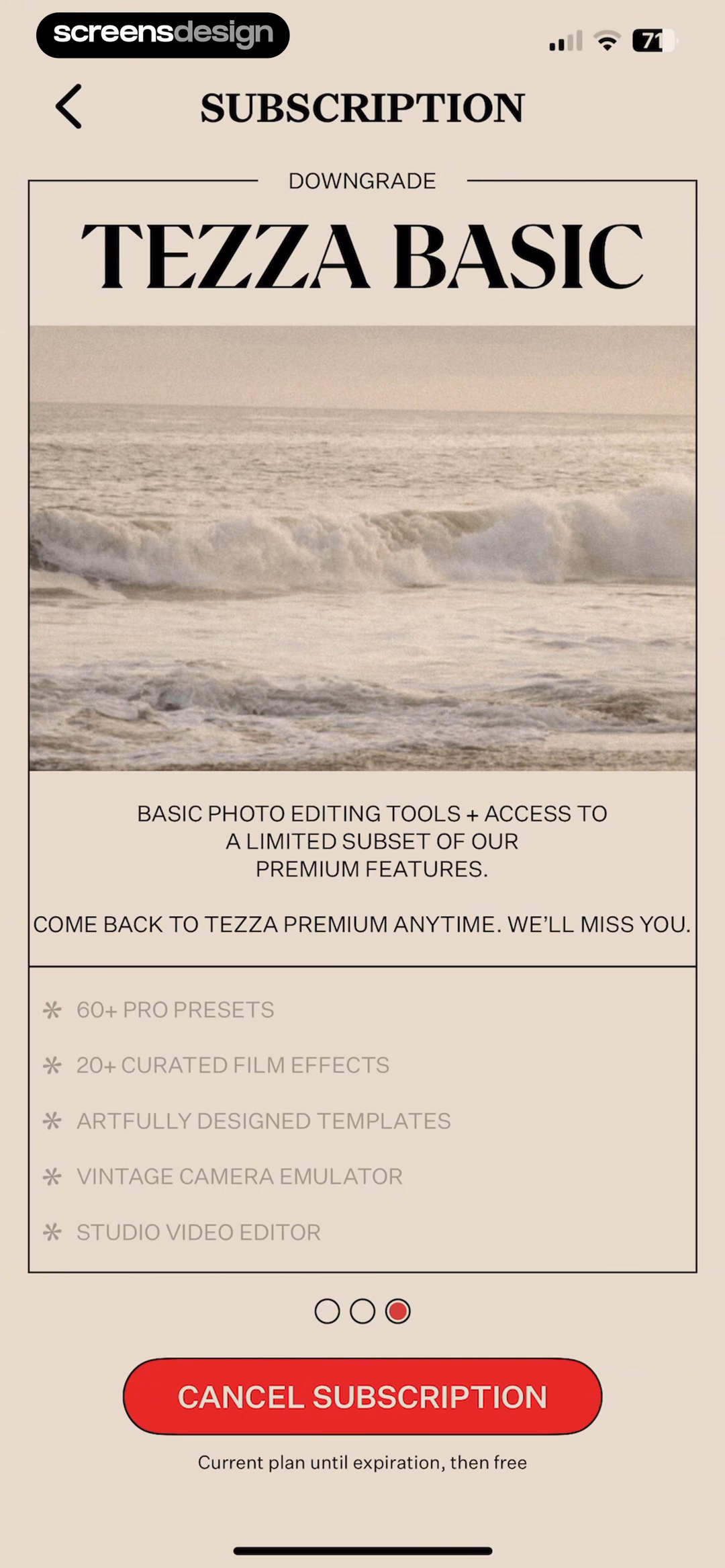
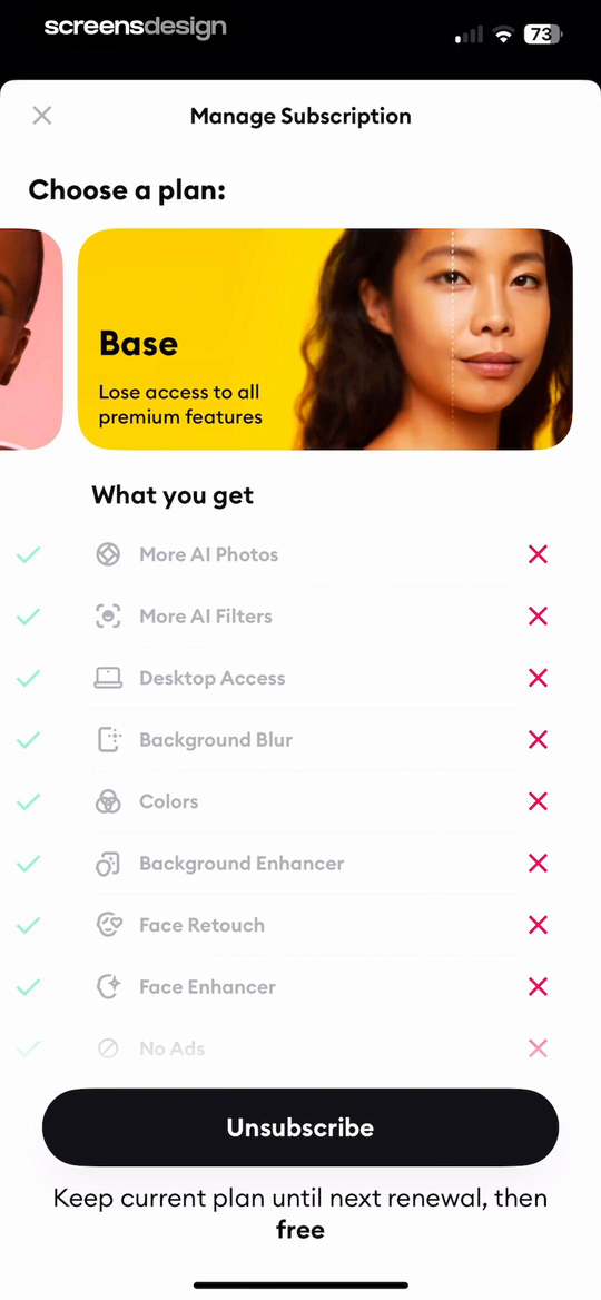
Tezza: Aesthetic Photo Editor shows that the downgrade state names Tezza Basic and lists the premium presets, effects, templates, and tools that will disappear. Remini - AI Photo Enhancer takes a different but compatible approach: base is described as losing premium access while the remaining photo and desktop capabilities stay visible. Together, the examples reveal which details must stay visible at the decision point rather than being deferred to support or legal copy.
List retained capabilities first, then the important losses. Use the same feature names customers see in the product so they can judge whether the smaller tier still supports their work.
Test the normal path, dismissal, back navigation, interruption, app relaunch, slow network, stale account data, and the state after completion. The primary label, confirmation, saved data, and next destination should describe the same outcome. Check large text, screen readers, keyboard focus, translated copy, and reduced motion so the decision remains understandable without relying on layout or color alone.
02. Current and alternatives
Anchor every choice to the active plan.
A comparison is difficult when the customer cannot see where they are starting.
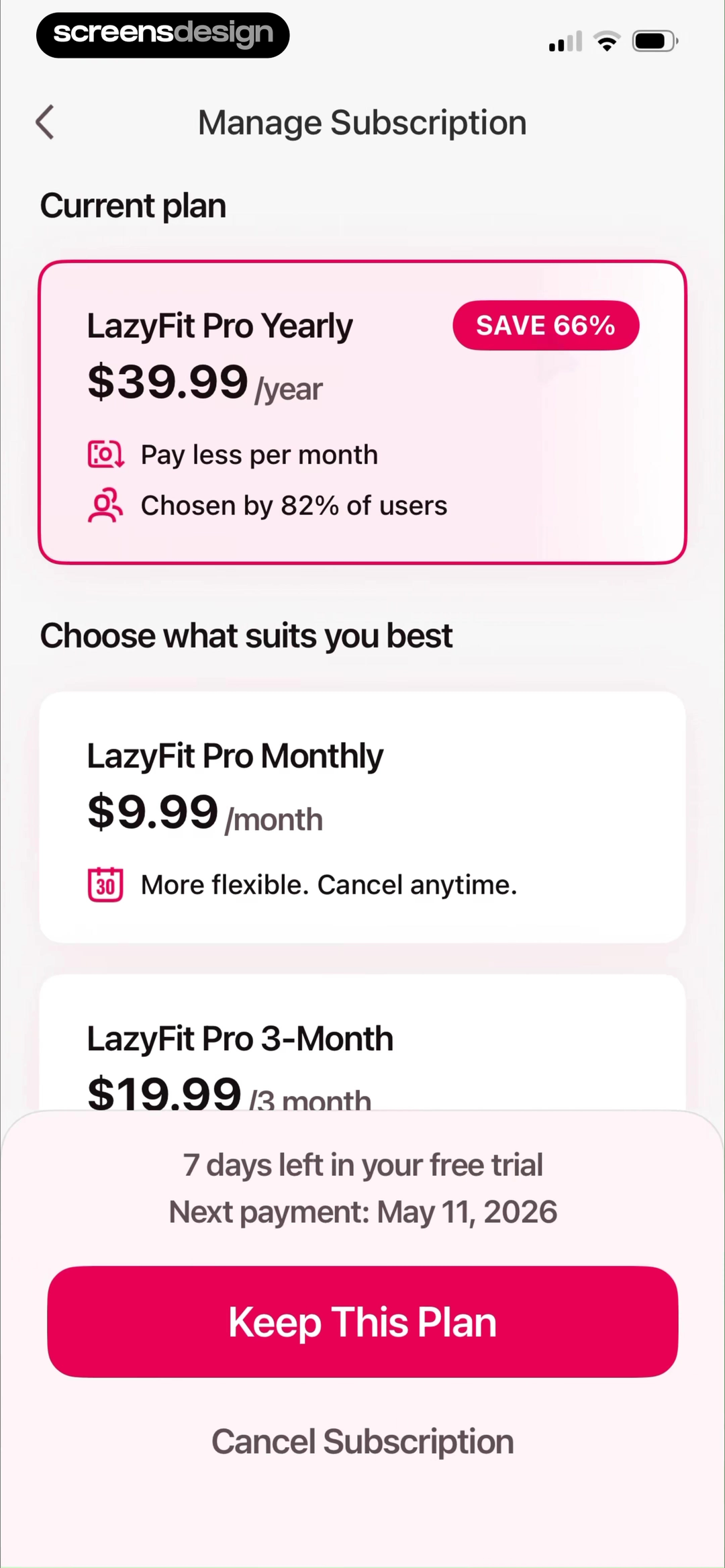
LazyFit: Workout For Beginners shows that the current yearly plan appears before monthly and three-month alternatives with comparable prices and flexibility. BoldVoice: Accent Training takes a different but compatible approach: current access, conversion date, cancellation, and alternative Standard and Annual plans share one management view. Together, the examples reveal which details must stay visible at the decision point rather than being deferred to support or legal copy.
Mark the current tier and billing term, then present viable alternatives. Include conversion or renewal dates so a trial, monthly plan, and annual plan are not visually confused.
Test the normal path, dismissal, back navigation, interruption, app relaunch, slow network, stale account data, and the state after completion. The primary label, confirmation, saved data, and next destination should describe the same outcome. Check large text, screen readers, keyboard focus, translated copy, and reduced motion so the decision remains understandable without relying on layout or color alone.

03. Billing math
Make total cost and billing cadence comparable.
Monthly equivalents can help, but the charged amount matters more.
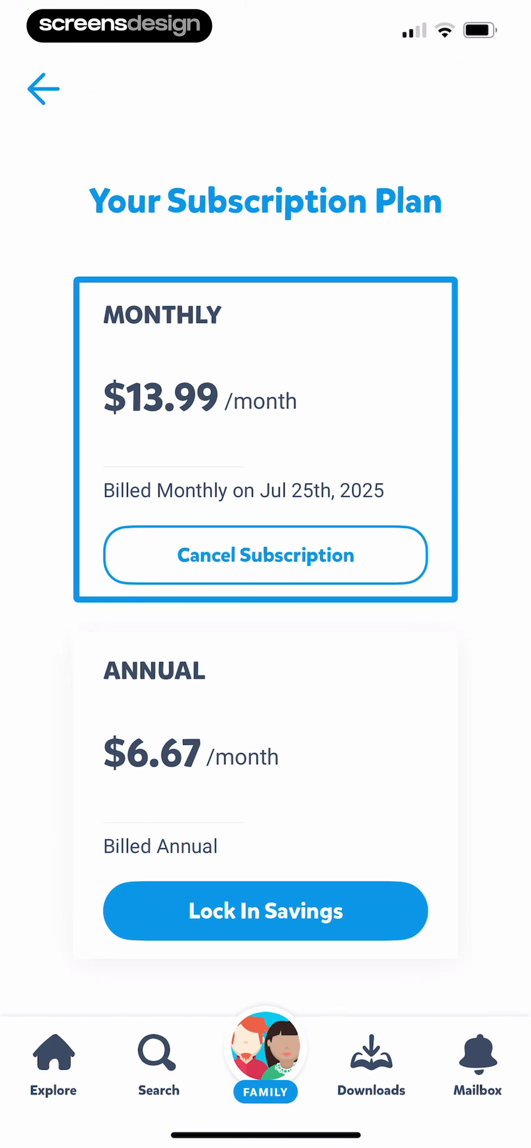
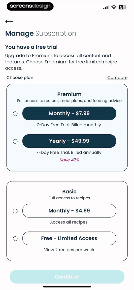
Epic - Kids' Books & Reading shows that monthly and annual billing are shown together with the next monthly charge and the annual equivalent. Little Lunches: Kids Meals takes a different but compatible approach: premium and Freemium are framed around recipe, meal-plan, and feeding-advice access before the price choice. Together, the examples reveal which details must stay visible at the decision point rather than being deferred to support or legal copy.
Show the amount charged, billing period, taxes or regional variance when relevant, and effective date. Do not make an annual total disappear behind a small weekly equivalent.
Test the normal path, dismissal, back navigation, interruption, app relaunch, slow network, stale account data, and the state after completion. The primary label, confirmation, saved data, and next destination should describe the same outcome. Check large text, screen readers, keyboard focus, translated copy, and reduced motion so the decision remains understandable without relying on layout or color alone.
04. Change timing
State when access and price change.
Immediate and next-renewal downgrades have different risks.
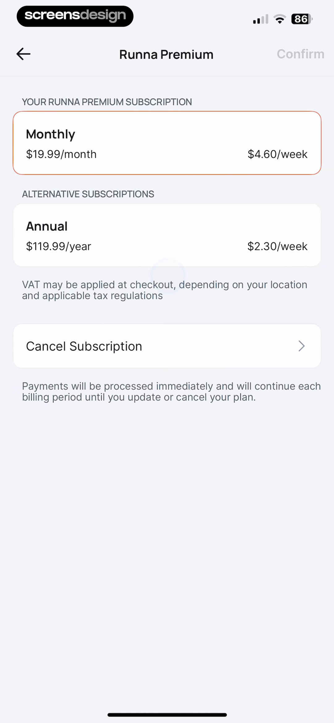
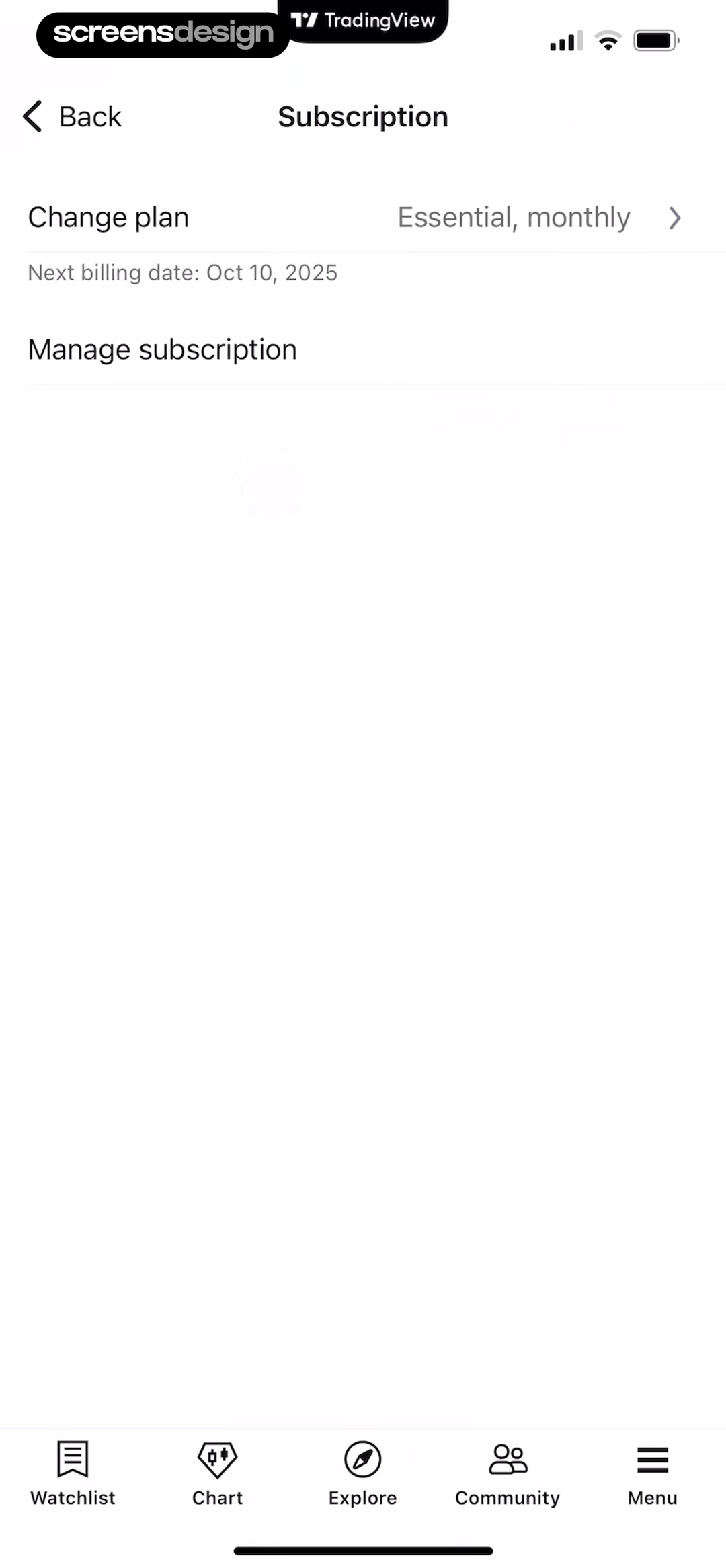
Runna: Running Plans & Coach shows that the current monthly subscription is separated from an annual alternative with both total and weekly prices. TradingView: Track All Markets takes a different but compatible approach: the management screen identifies the active Essential monthly plan and its next billing date before Change plan. Together, the examples reveal which details must stay visible at the decision point rather than being deferred to support or legal copy.
Tell customers whether the current tier remains until renewal, whether a prorated credit applies, and whether changing the billing term starts a new purchase immediately.
Test the normal path, dismissal, back navigation, interruption, app relaunch, slow network, stale account data, and the state after completion. The primary label, confirmation, saved data, and next destination should describe the same outcome. Check large text, screen readers, keyboard focus, translated copy, and reduced motion so the decision remains understandable without relying on layout or color alone.
05. Value and capacity
Compare the usage limits that drive the decision.
Tier names are weak decision tools without capacity and entitlement details.
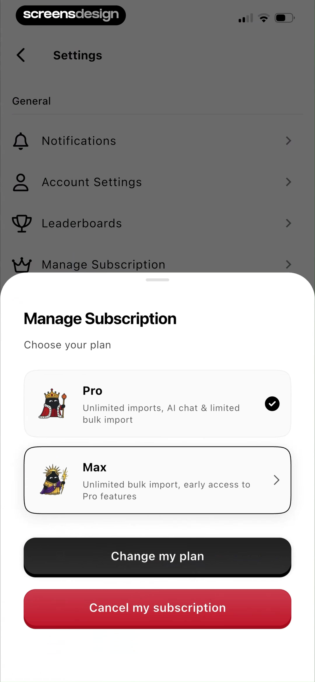
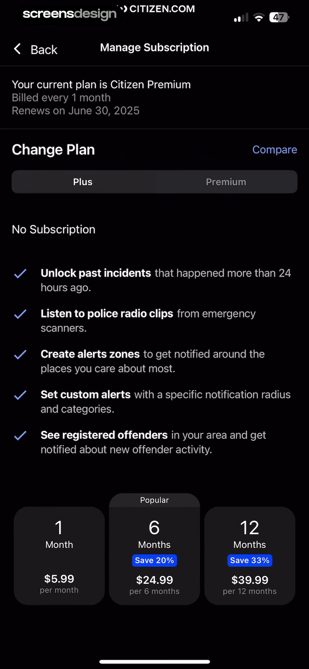
Albo: Save & Organize shows that pro and Max use concrete import and AI limits so a change is about capacity rather than tier names alone. Citizen: Safety & Live Video takes a different but compatible approach: current plan, billing frequency, renewal date, Change Plan, and a Plus versus Premium comparison stay connected. Together, the examples reveal which details must stay visible at the decision point rather than being deferred to support or legal copy.
Use imports, AI usage, lessons, devices, alerts, projects, seats, or saved items as explicit units. Show current usage when exceeding the new limit could block the change.
Test the normal path, dismissal, back navigation, interruption, app relaunch, slow network, stale account data, and the state after completion. The primary label, confirmation, saved data, and next destination should describe the same outcome. Check large text, screen readers, keyboard focus, translated copy, and reduced motion so the decision remains understandable without relying on layout or color alone.
Implementation
Build the state model before polishing the screen.
Interface quality depends on entitlement, account, billing, content, and analytics state agreeing.
Create a plan-change preview from the active entitlement, proposed entitlement, current usage, billing source, renewal date, currency, tax region, and proration policy. The preview should be generated by the same rules that will execute the change, not by a separate marketing table that can drift.
Handle over-limit objects deliberately. Decide whether they remain readable, become archived, require selection, or prevent the downgrade. Explain that before confirmation and provide an export when data could become inaccessible. Keep restoration behavior documented if the customer upgrades again.
Confirm the resulting plan, charged amount, effective date, next renewal, retained features, restricted features, and any credit. Test trial conversion, annual-to-monthly changes, family or team plans, expired cards, App Store purchases, regional pricing, refunds, and two plan changes submitted close together.
- The current plan and billing term are marked.
- The new plan names retained features and important losses.
- Total charge, cadence, renewal date, and effective date are explicit.
- Current usage is compared with new limits where relevant.
- Over-limit data has a safe, explained outcome.
- The confirmation matches the entitlement and invoice actually created.
Measurement
Measure the completed outcome, not only the first tap.
A visible control is useful only when the customer reaches the expected state and can continue.
Track downgrade completion, downgrade abandonment, post-change upgrade, over-limit error, and support contact after change. Define the successful product state before launch and verify it from server or platform truth where possible. A button tap without the promised entitlement, schedule, reward, survey result, or recovered access should be counted as an error, not conversion.
Segment by entry point, customer state, current plan or program, platform, app version, locale, accessibility settings, prior failures, and whether the person returned after leaving the flow. Compare immediate completion with what happens during the next relevant session so a short-term click does not hide confusion or regret.
Review guardrails alongside the primary metric: repeated attempts, backtracking, support contact, refund, cancellation, incorrect access, disabled reminders, abandoned tasks, and manual corrections. Read open feedback and replay representative failures with sensitive information protected. The goal is a trustworthy customer outcome, not a higher number produced by obscuring alternatives.
Review checklist
Test the content, the control, and the resulting account state.
Create accounts for the new, active, returning, expired, interrupted, unsupported, and already-completed states. Verify copy, available actions, confirmation, account data, navigation, and the destination for each one.
Run the flow with slow and failed network calls, app relaunch, another device, large text, screen reader, localization, denied permissions where relevant, and a customer who changes their mind. Every path should preserve data and provide a clear way forward.
- The current plan and billing term are marked.
- The new plan names retained features and important losses.
- Total charge, cadence, renewal date, and effective date are explicit.
- Current usage is compared with new limits where relevant.
- Over-limit data has a safe, explained outcome.
- The confirmation matches the entitlement and invoice actually created.
Questions and answers
Subscription downgrade UX questions
What belongs on a subscription downgrade screen?
Show the current plan, proposed plan, retained features, lost features, new limits, price, billing cadence, effective date, and any proration or credit.
Should a downgrade happen immediately?
Use the policy that matches the billing platform and contract, but state it clearly. Many services keep the current tier until renewal to avoid taking away paid access.
How should an app handle data above the new limit?
Explain whether it stays readable, becomes archived, must be reduced, or blocks the change. Offer export before access can be lost.
Is a cheaper annual plan a downgrade?
Not necessarily. Changing billing cadence can reduce the effective price while preserving features. Label plan level and billing term separately.
Should cancellation appear beside downgrade?
It can, but downgrade should remain a complete honest path. Do not force customers to threaten cancellation before showing a suitable smaller plan.
Apps referenced in this page
Open the products behind the examples.
 Tezza: Aesthetic Photo EditorPresets & Filters for Pictures
 Remini - AI Photo EnhancerEnhance quality and restore!
 LazyFit: Workout For BeginnersChair Yoga,Tai Chi & Pilates
 BoldVoice: Accent TrainingSpeak English, Pronunciation
 Epic - Kids' Books & ReadingChildren’s Learning & eBooks
 Little Lunches: Kids MealsBaby Food, Toddler & Family
 Runna: Running Plans & Coach5k to Marathon Training
 TradingView: Track All MarketsFrom stocks to crypto
 Albo: Save & OrganizeBookmark reels & screenshots
 Citizen: Safety & Live VideoCrime Map & Breaking News
2,715 apps in the top charts.Ask them anything.
Search real app flows, compare the screens around each decision, and turn stronger references into your own product.