Pause and resume UX
10 Subscription Pause Flow Examples
People need to know what stops, what remains, when billing or activity resumes, and how to return early.
A pause can protect a customer relationship when timing, money, travel, illness, workload, or simple fatigue makes continued use unrealistic. It only earns that trust when the interface distinguishes pausing billing from pausing reminders, content, a plan, a streak, or an active session. The word pause is not enough because every one of those states carries different consequences.
These ten recorded interfaces show the building blocks of a reliable pause and resume experience: a stated duration, preserved progress, an explicit return route, clear ownership, and visible alternatives. Several examples are activity or program pauses rather than billing pauses, which makes their state-preservation language especially useful for subscription teams designing the same interaction.
Treat pause as a reversible contract. Store the original entitlement and progress state, state the effective date, decide what notifications continue, and show the customer how to resume. If the platform or purchase owner prevents pausing, say that directly and offer the closest honest option instead of presenting a control that cannot work.
Read subscription cancellation win-back examples for the adjacent product state and its handoff into this decision.
01. Preserve progress
Say exactly what the customer keeps.
Preserved progress is the main emotional difference between pause and cancel.
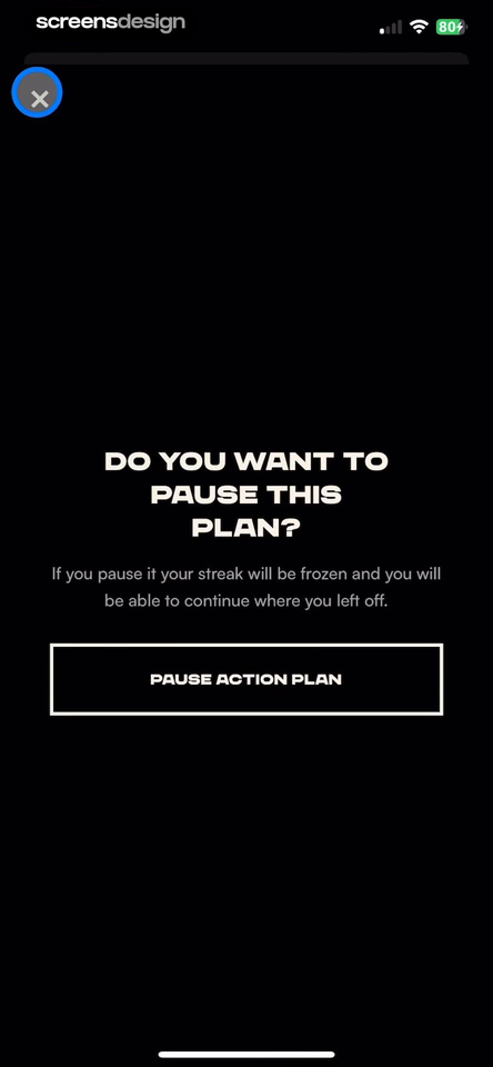
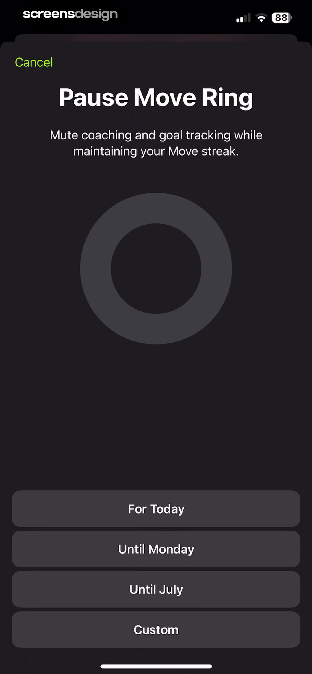
Pump Club: Fitness + Nutrition shows that a confirmation explains that pausing freezes the streak and lets the member continue from the same point. Apple Fitness takes a different but compatible approach: the pause control offers today, a named date, and a custom duration while explaining which coaching signals stop. Together, the examples reveal which details must stay visible at the decision point rather than being deferred to support or legal copy.
Name the streak, plan position, downloads, saved items, entitlements, and history that remain. Avoid promises such as nothing changes when access, billing, or reminders do change.
Test the normal path, dismissal, back navigation, interruption, app relaunch, slow network, stale account data, and the state after completion. The primary label, confirmation, saved data, and next destination should describe the same outcome. Check large text, screen readers, keyboard focus, translated copy, and reduced motion so the decision remains understandable without relying on layout or color alone.
02. Define the scope
Separate pausing a plan from pausing the whole product.
A customer should not have to infer which surfaces become quiet.
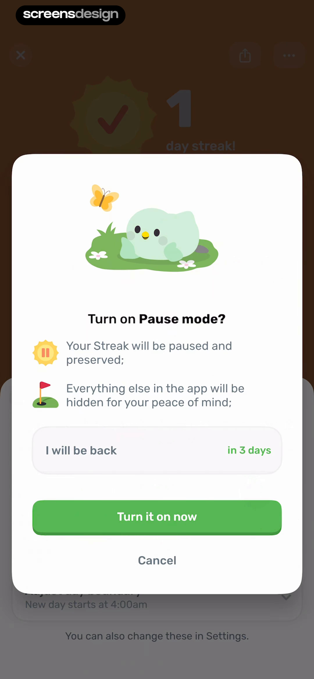
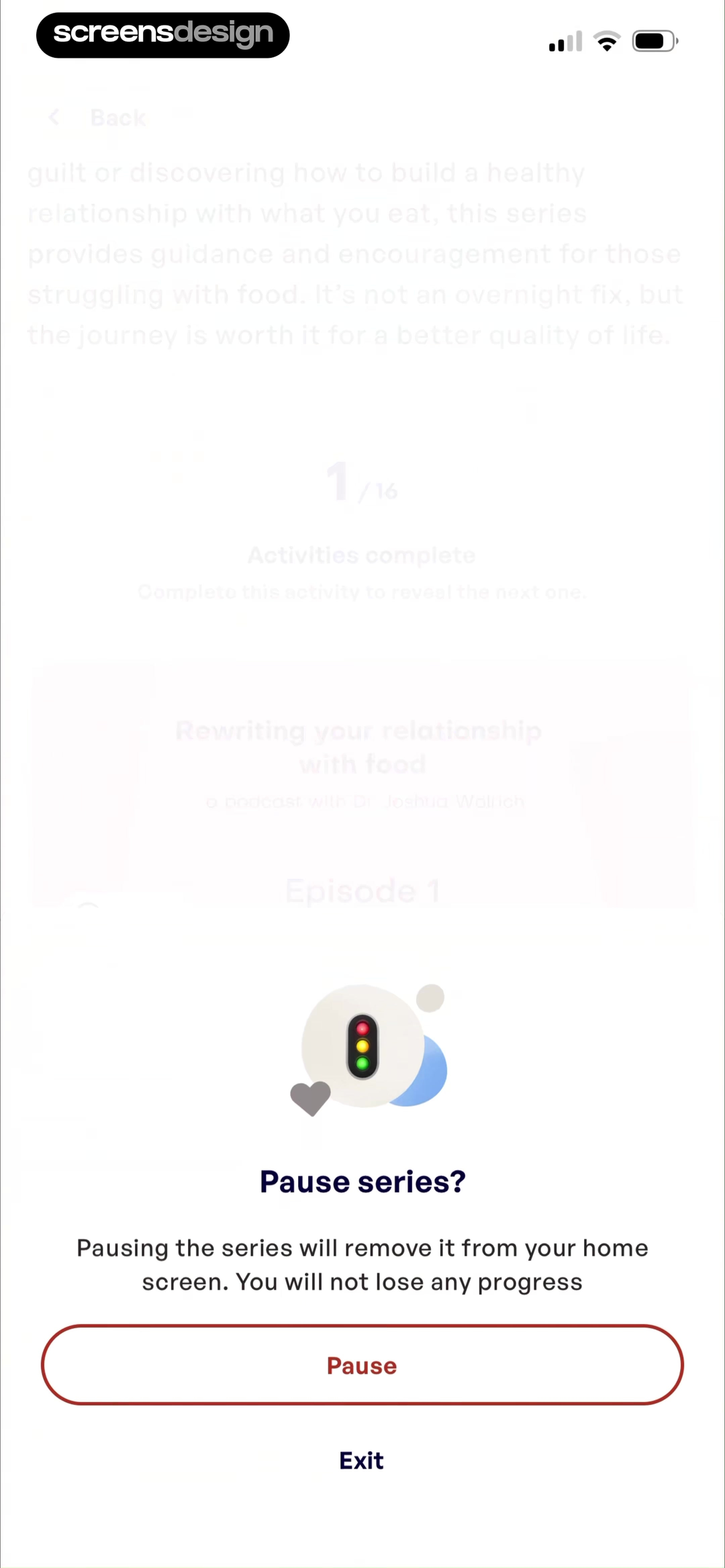
Finch: Self-Care Pet shows that pause mode states that the streak is preserved and lets the person choose when they expect to return. Mila: Home Workout & Fitness takes a different but compatible approach: the series pause message separates removal from the home screen from loss of completed progress. Together, the examples reveal which details must stay visible at the decision point rather than being deferred to support or legal copy.
List the affected program, series, coaching, goals, billing, and notifications. If only a home-screen module disappears, do not imply that the account or subscription is suspended.
Test the normal path, dismissal, back navigation, interruption, app relaunch, slow network, stale account data, and the state after completion. The primary label, confirmation, saved data, and next destination should describe the same outcome. Check large text, screen readers, keyboard focus, translated copy, and reduced motion so the decision remains understandable without relying on layout or color alone.
03. Predictable automation
Explain the trigger and the return condition.
Automatic pause is useful only when people can predict it.
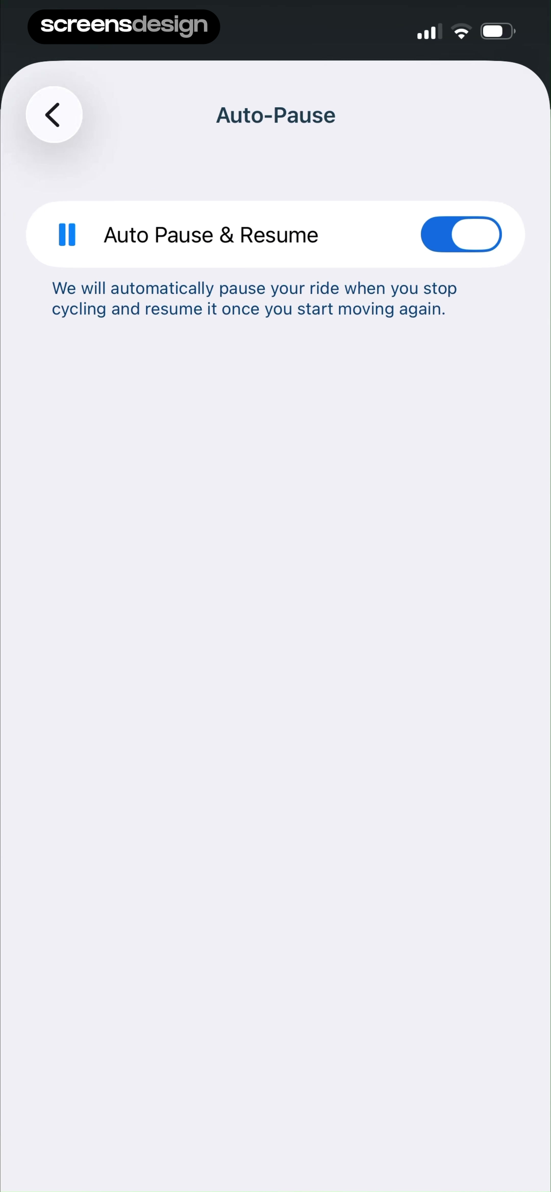
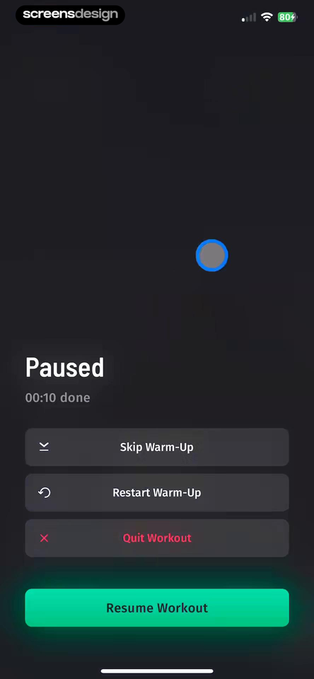
Bikemap: Bicycle Tracker & GPS shows that auto Pause and Resume describes the trigger in plain language, so the rider knows when recording stops and starts. 30 Day Fitness - Home Workout takes a different but compatible approach: the paused workout keeps elapsed activity visible and separates resume, restart, skip, and quit. Together, the examples reveal which details must stay visible at the decision point rather than being deferred to support or legal copy.
Show whether a date, inactivity, sensor state, or manual action starts and ends the pause. Give people a way to edit the rule and show the current state while it is active.
Test the normal path, dismissal, back navigation, interruption, app relaunch, slow network, stale account data, and the state after completion. The primary label, confirmation, saved data, and next destination should describe the same outcome. Check large text, screen readers, keyboard focus, translated copy, and reduced motion so the decision remains understandable without relying on layout or color alone.
04. Safe controls
Keep resume, restart, quit, and settings distinct.
The paused state is still a decision screen.
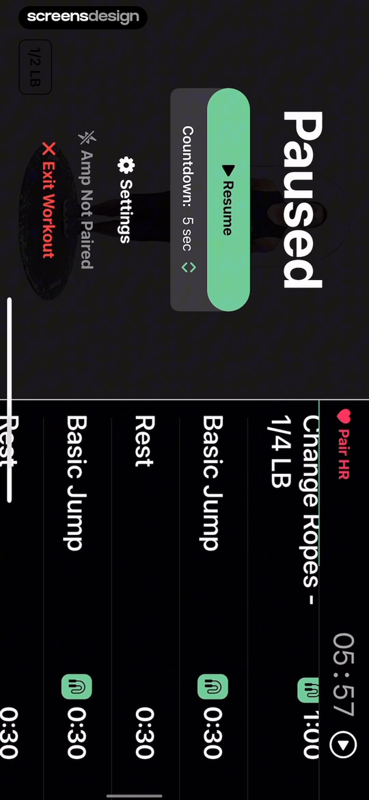
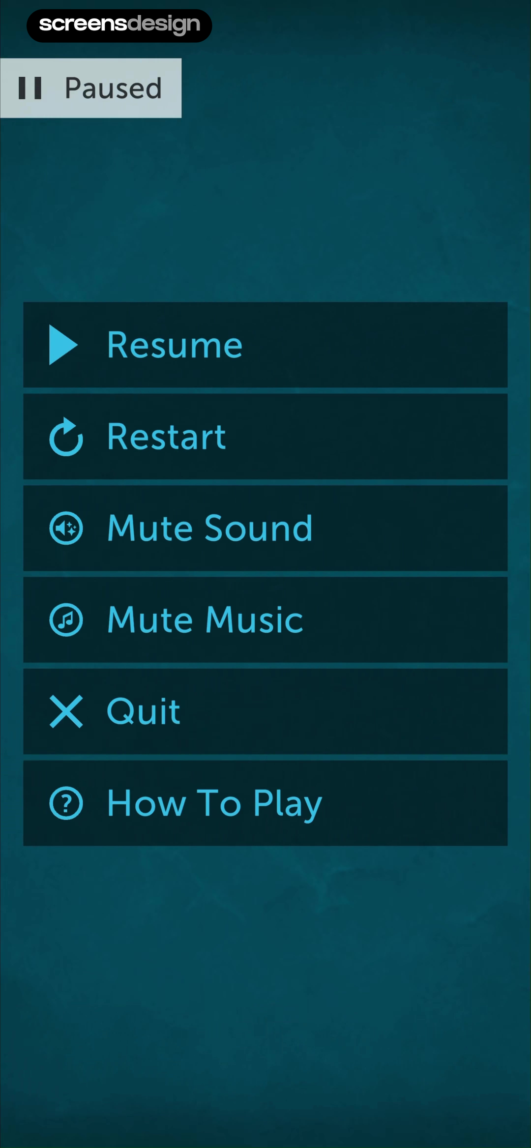
Jump Rope Training | Crossrope shows that resume sits beside a countdown, equipment settings, heart-rate pairing, and an explicit exit route. Lumosity: Brain Training Games takes a different but compatible approach: the pause menu distinguishes resume, restart, quit, instructions, and sound controls without hiding consequences. Together, the examples reveal which details must stay visible at the decision point rather than being deferred to support or legal copy.
Resume should restore the saved position. Restart and quit should explain what they discard. Settings can remain secondary, but they should not make the primary continuation action ambiguous.
Test the normal path, dismissal, back navigation, interruption, app relaunch, slow network, stale account data, and the state after completion. The primary label, confirmation, saved data, and next destination should describe the same outcome. Check large text, screen readers, keyboard focus, translated copy, and reduced motion so the decision remains understandable without relying on layout or color alone.
05. Limits and ownership
Explain when pausing is unavailable.
A truthful limitation is better than a broken promise.
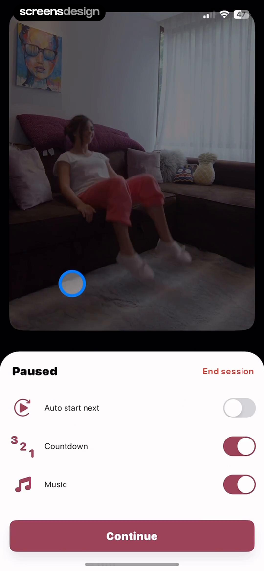
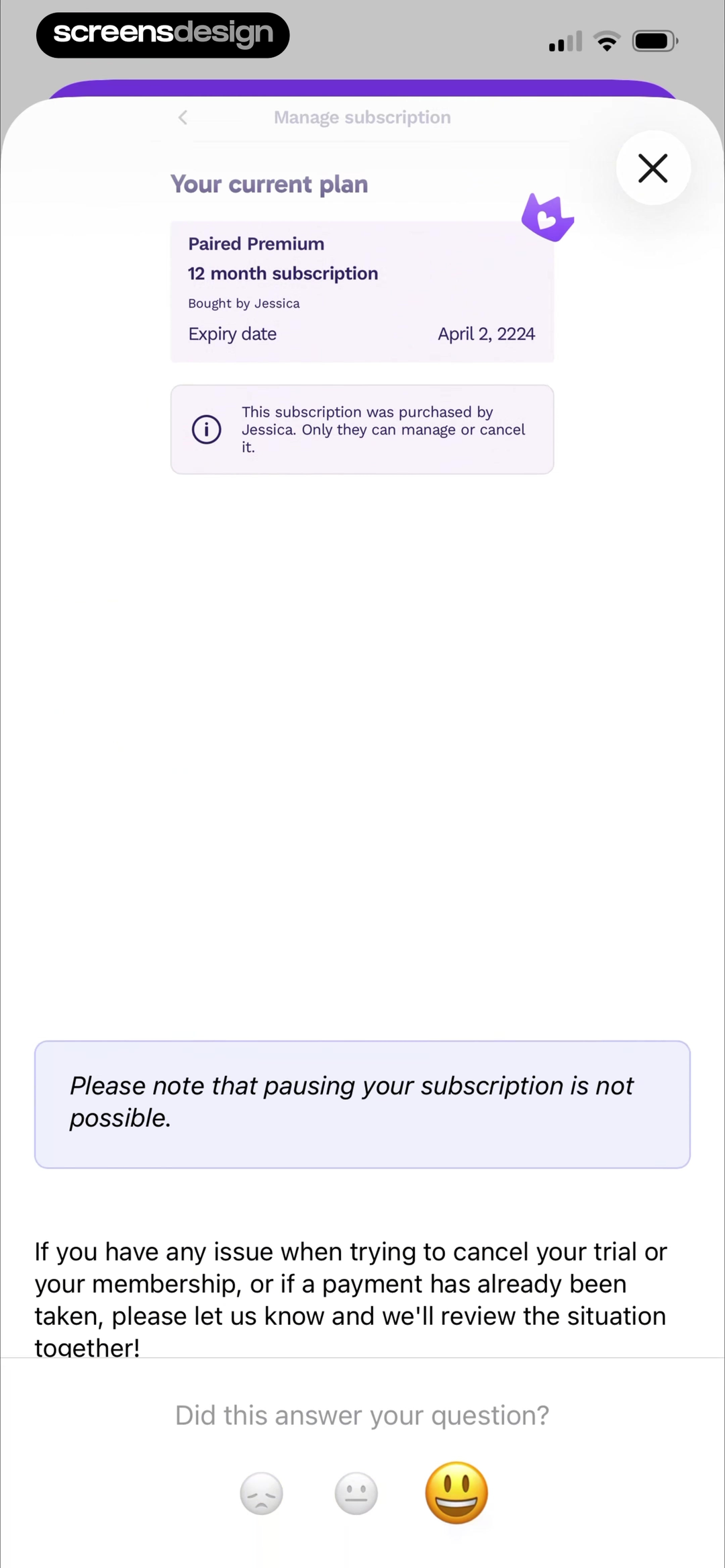
Wakeout! Break the Sit Habit shows that continue is primary while ending the session and changing automatic progression remain reachable. Paired: Couples & Relationship takes a different but compatible approach: the subscription help state clearly says pausing is unavailable and identifies who can manage the shared purchase. Together, the examples reveal which details must stay visible at the decision point rather than being deferred to support or legal copy.
Shared purchases, App Store billing, partner entitlements, and certain plans may prevent in-app pause. Identify the owner and management route, then explain whether downgrade, cancellation, or reminder changes are available instead.
Test the normal path, dismissal, back navigation, interruption, app relaunch, slow network, stale account data, and the state after completion. The primary label, confirmation, saved data, and next destination should describe the same outcome. Check large text, screen readers, keyboard focus, translated copy, and reduced motion so the decision remains understandable without relying on layout or color alone.
Implementation
Build the state model before polishing the screen.
Interface quality depends on entitlement, account, billing, content, and analytics state agreeing.
Model pause separately from cancellation in entitlement, billing, messaging, and content systems. Record requested start, effective start, expected resume, actual resume, source, reason when voluntarily provided, and the preserved state. A scheduled pause should survive device changes and should not depend on a local timer.
Write the confirmation from concrete nouns. State the plan or subscription, the exact effective date, the resume date or duration, the next charge when known, preserved progress, retained access, and notifications that continue. Send a confirmation people can revisit. Before automatic resume, provide notice and a direct route to adjust or cancel where policy permits.
Test early resume, repeated pause, pause near renewal, refund windows, expired payment methods, shared subscriptions, offline devices, timezone changes, deleted content, plan migrations, and a customer who cancels while paused. Support should see the same state and dates the customer sees.
- The exact subscription, plan, series, or activity being paused is named.
- Start and expected resume dates are visible.
- Billing, access, progress, streaks, and notifications each have a stated outcome.
- Resume early is easy to find and restores the promised state.
- Unavailable pauses explain ownership and the nearest honest alternative.
- Support and customer views show the same status and dates.
Measurement
Measure the completed outcome, not only the first tap.
A visible control is useful only when the customer reaches the expected state and can continue.
Track pause completion, resume success, unexpected charge contact, pause-to-cancel conversion, and retained subscription after resume. Define the successful product state before launch and verify it from server or platform truth where possible. A button tap without the promised entitlement, schedule, reward, survey result, or recovered access should be counted as an error, not conversion.
Segment by entry point, customer state, current plan or program, platform, app version, locale, accessibility settings, prior failures, and whether the person returned after leaving the flow. Compare immediate completion with what happens during the next relevant session so a short-term click does not hide confusion or regret.
Review guardrails alongside the primary metric: repeated attempts, backtracking, support contact, refund, cancellation, incorrect access, disabled reminders, abandoned tasks, and manual corrections. Read open feedback and replay representative failures with sensitive information protected. The goal is a trustworthy customer outcome, not a higher number produced by obscuring alternatives.
Review checklist
Test the content, the control, and the resulting account state.
Create accounts for the new, active, returning, expired, interrupted, unsupported, and already-completed states. Verify copy, available actions, confirmation, account data, navigation, and the destination for each one.
Run the flow with slow and failed network calls, app relaunch, another device, large text, screen reader, localization, denied permissions where relevant, and a customer who changes their mind. Every path should preserve data and provide a clear way forward.
- The exact subscription, plan, series, or activity being paused is named.
- Start and expected resume dates are visible.
- Billing, access, progress, streaks, and notifications each have a stated outcome.
- Resume early is easy to find and restores the promised state.
- Unavailable pauses explain ownership and the nearest honest alternative.
- Support and customer views show the same status and dates.
Questions and answers
Pause and resume UX questions
What should a subscription pause screen explain?
Explain what pauses, what the customer keeps, the effective and resume dates, billing consequences, notification behavior, and how to resume early.
Is pausing a subscription the same as cancelling?
No. A pause normally preserves the relationship and some state for a defined period, while cancellation ends renewal or access according to the plan terms.
Should progress and streaks survive a pause?
Preserve them when the product promise allows it. If any state expires or changes, name that consequence before confirmation.
How long should customers be allowed to pause?
Offer durations that match billing and product use, then show the exact resume date. Avoid a vague indefinite state unless support and billing can manage it reliably.
What if App Store billing does not support pause?
Say that pause is unavailable for that purchase, identify who can manage it, and offer honest alternatives such as changing plan, adjusting reminders, or cancelling renewal.
Apps referenced in this page
Open the products behind the examples.
 Pump Club: Fitness + NutritionYour all-in-one fitness app
 Apple FitnessFitness and Fitness+
 Finch: Self-Care PetDaily Journal & Habit Tracker
 Mila: Home Workout & FitnessBeginner, Yoga & Prenatal App
 Bikemap: Bicycle Tracker & GPSBike Navigation & Cycling Maps
 30 Day Fitness - Home WorkoutDaily workouts to lose weight
 Jump Rope Training | CrossropeCrossrope - Fitness
 Lumosity: Brain Training GamesMemory, Math & Logic Puzzles
 Wakeout! Break the Sit HabitDesk Stretches & Move Games
 Paired: Couples & RelationshipQuestions, Long Distance Games
2,715 apps in the top charts.Ask them anything.
Search real app flows, compare the screens around each decision, and turn stronger references into your own product.