Onboarding progress indicators
10 Onboarding Progress Indicator Examples: Bars, Steps, Counts, and Skips
A useful onboarding progress indicator tells people where they are, whether they can go back, and roughly how much work remains without making a promise the flow cannot keep.
Progress is not decoration above a questionnaire. It is a compact contract about sequence. A bar, row of steps, percentage, or named stage changes how a person estimates effort and decides whether to continue. If the indicator barely moves, jumps backward, or reaches 100 percent before the result exists, the interface breaks that contract.
The right pattern depends on what the product knows. A fixed four-step setup can show an exact count. A branching health assessment may be safer with named sections or a continuous bar. A brief carousel can use dots when each page has similar weight. The design should represent meaningful progress through the task, not the number of screens rendered by the implementation.
The examples below show visible interface choices in recorded mobile apps. They help compare hierarchy, wording, navigation, and state transitions. They do not prove that one indicator style increases completion. Treat the surrounding questions, value returned, and ability to recover as part of the same design decision.
01. Bars and controls
Keep progress, back, and skip in one understandable system.
The top of an onboarding screen should explain both position and available movement before attention reaches the question.
Habit Tracker places a slim progress bar between a back control and Skip while asking when the user acts after setting a goal. The arrangement makes three facts visible: this question belongs to a longer sequence, the previous answer is reachable, and this prompt is optional. The disabled Continue button also makes the selection requirement explicit without changing the navigation model.
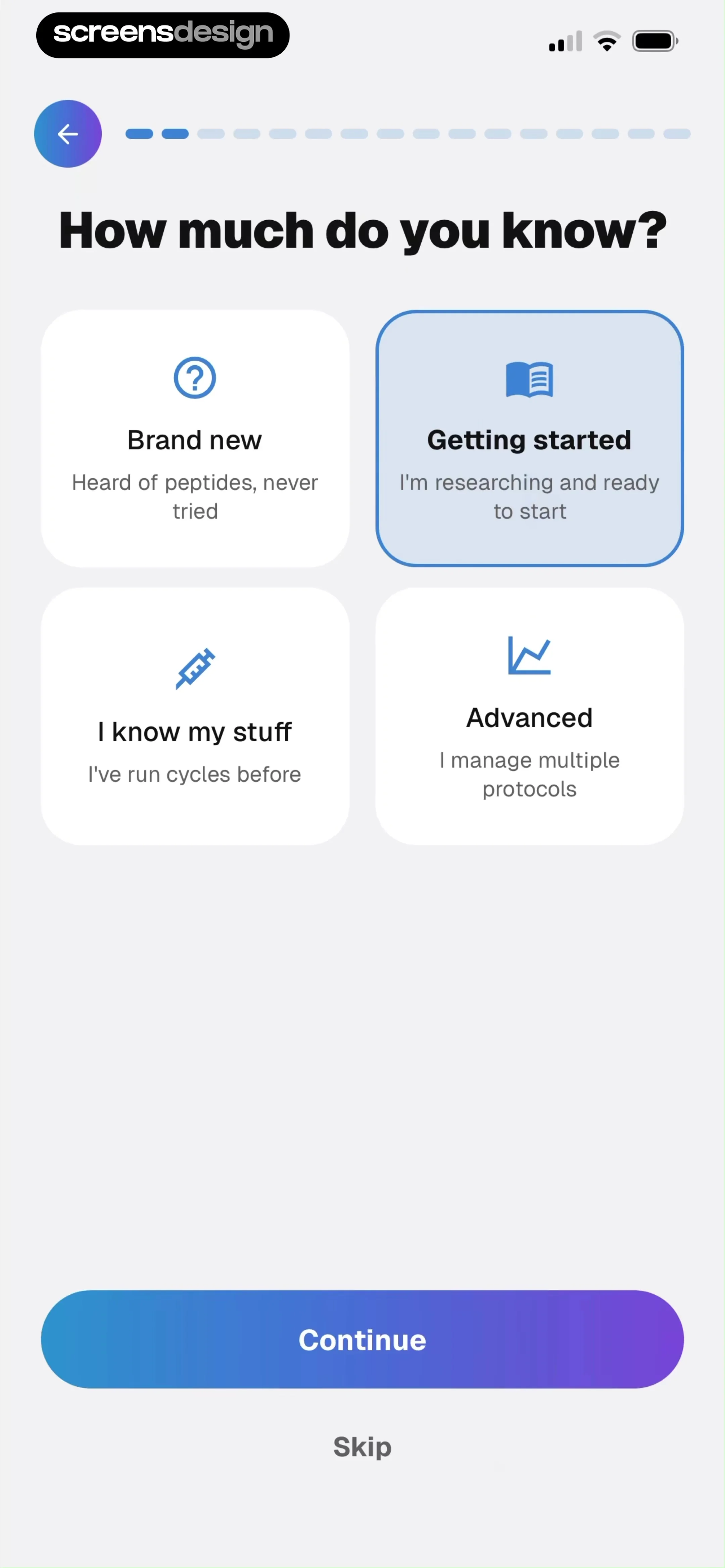
Pep AI uses a segmented bar, a back arrow, Continue, and Skip around an experience-level question. Segments suggest a finite set of stages more strongly than a smooth bar. That implication is useful only if later branches do not add or remove large portions of the journey. If the number of remaining screens changes, update the representation by section rather than pretending every respondent has the same count.
Keep skip semantics specific. Skipping one optional question is different from skipping all setup. Label the latter as Skip setup or Do this later when the consequence matters. Preserve answers when someone goes back, and do not count validation errors, reinforcement pages, or native permission dialogs as new progress unless they are meaningful planned stages.

02. Named stages
Use section names when the work matters more than the screen count.
A named stage can orient people inside a long or branching setup without promising an exact number of taps.
Intermittent Fasting Tracker labels the current stage Lifestyle, marks Body data as complete, leaves Eating habits ahead, and separately shows that the personal plan is 33 percent complete. The screen communicates structure rather than a raw page number. It also connects the current questions to the output being built, which gives the progress cue a reason to exist.
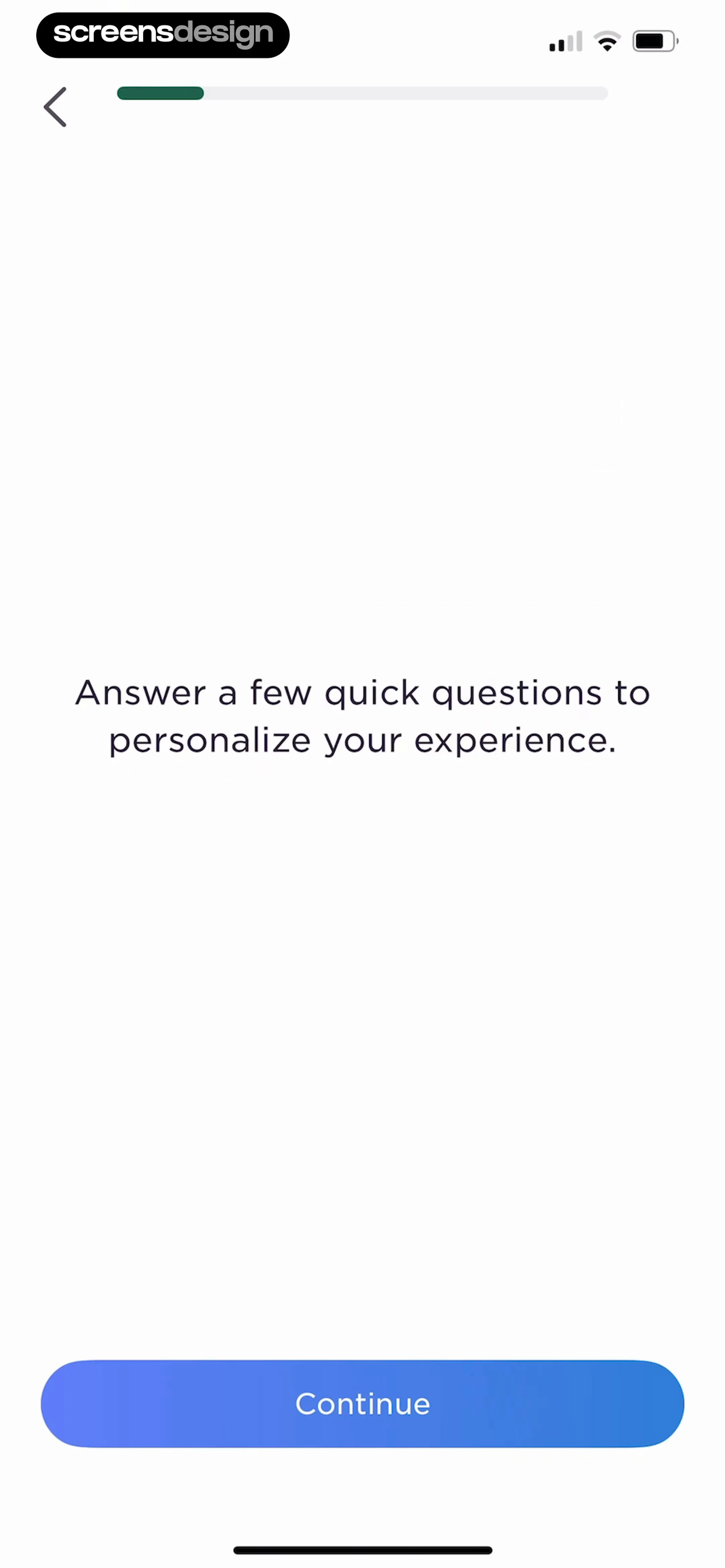
Imprint takes a lighter approach. A single bar appears above an explanation that a few questions will personalize the experience. The copy sets an effort expectation without claiming an exact duration. That restraint works when the immediate purpose is clear and the remaining path is short enough that a detailed map would add noise.
Name stages in user language. Data collection, processing, and permissions may be accurate engineering categories, but Body data, Lifestyle, and Eating habits are easier to anticipate. If a stage contains many more decisions than another, a simple equal-width stepper can be misleading. Either weight the progress or use completed and current states without suggesting equal duration.

03. Counts and position
Make the current position legible without turning onboarding into paperwork.
Explicit counts are strongest when the path is fixed, short, and made of comparable decisions.
Affemity shows 3 out of 4 above a daily time-commitment question. This format is compact and easy to announce with assistive technology. It also creates a precise promise: one numbered stage remains after the current one. Product teams should test every branch against that promise, including skipped questions, returning users, and answers that introduce an extra consent step.
Wellspoken combines a bar with Back and a next control while asking how often a speaking issue occurs. The selected answer remains visible in the card list, which matters when navigation allows review. Progress should not replace local state feedback. The user still needs to know which choice is saved, whether Next is available, and what going back will preserve.
Do not show a denominator simply because analytics tracks page numbers. Count decisions a person recognizes. A confirmation page can complete the previous step rather than becoming a new one. A system permission sheet belongs to the permission action, not an extra surprise step. When a path contains optional questions, say Optional and preserve stable progress instead of making the bar retreat after a new branch appears.


04. Reinforcement
Let a pause confirm progress without disguising another step.
A reinforcement page can restore motivation in a long flow, but it should not make the journey feel longer than the indicator suggested.
Sprout pauses its questionnaire to say that four interviews per week is achievable and that the user is on track. Horizontal segments visualize progression while Continue keeps the path moving. The page works as feedback on a prior answer rather than a new question. If reinforcement pages appear after every response, however, the progress system can feel slower than the visible count predicts.
MyNetDiary similarly uses Every step counts as an encouraging interlude. The progress bar remains present, so the user does not lose position when the content changes from input to reassurance. Keep these moments brief, truthful, and tied to a choice the person just made. Generic encouragement adds time without adding orientation.
Model reinforcement as part of the preceding decision. On Back, decide whether it should reappear or whether the person should return directly to the editable answer. On resume, return to the next unfinished decision rather than replaying motivational content. In analytics, separate time spent reading from abandonment so a pause is not mistaken for confusion.


05. Meaningful progress
Distinguish progress through setup from the progress the product will eventually track.
An onboarding indicator should describe setup, while product previews should demonstrate the value that setup unlocks.
90 Day Challenge uses a progress bar above a daily-step picker and keeps Back and Next visible at the bottom. The setup cue tells the user this measurement belongs to a sequence. The picker itself needs immediate selection feedback and a stored value, because moving forward without confidence about the chosen number makes later personalization harder to trust.
Clear30 shows a preview called Progress Showcase with days checked in, days without weed, and money saved. A separate onboarding bar appears at the bottom. This makes an important distinction visible: the bar tracks completion of the tour, while the cards preview future product progress. Combining those concepts into one percentage would leave the user unsure what was actually complete.
Keep the two data models separate. Onboarding progress answers how much setup remains. Product progress answers how much of a routine, course, goal, or plan is complete. Give each a different label, visual location, and persistence rule. When setup ends, remove its indicator cleanly and land on a state where the saved answers visibly affect the product.


Implementation
Calculate progress from durable decisions, not transient views.
The interface stays credible when its numerator and denominator come from the same explicit onboarding model.
Define stable stage identifiers, completion rules, optionality, prerequisites, and resume destinations. Derive the indicator from completed durable decisions plus the current stage. Do not increment on every rendered screen, animation, validation message, or permission sheet. Store answers before advancing, make writes idempotent, and keep a draft version so Back and app relaunch do not erase work.
For branching flows, calculate position within a named section or show completed sections instead of a fixed total that can change. If later answers remove a branch, never move progress backward without explanation. If remote configuration adds a new question, version the flow so a returning user is not placed behind a step they previously completed.
Expose navigation rules to accessibility APIs. Announce Step 3 of 4 or Lifestyle, current step as text, not only through color or bar length. Maintain contrast in filled and unfilled segments, give Back and Skip clear labels, and keep focus on the new section heading after navigation. Reduced-motion settings should remove animated filling without removing the final state.
Loading and submission also need explicit states. Disable duplicate continuation while saving, preserve the selected answer, and surface a retry that repeats only the failed write. If progress is saved locally before synchronization, explain when the person can safely leave. A connection problem should not silently reset a long assessment.
Stable stages
Give each meaningful decision an identifier, completion rule, and resume destination.
Honest scope
Use sections or flexible progress when the remaining path depends on prior answers.
Saved answers
Preserve selections across Back, interruption, relaunch, and safe retry.
Text equivalent
Announce the same position and optionality that the visual indicator communicates.
Measurement
Measure where expectation and effort stop matching.
Completion rate alone cannot tell whether the progress indicator made the journey clearer.
Track entries, completed durable decisions, validation failures, Back, Skip, resume, and exits by stable stage identifier. Compare the displayed position with remaining interactions so teams can find sections that feel disproportionately long. A high exit rate after a bar barely moves may indicate hidden effort, but inspect question sensitivity, performance, and downstream value before blaming the indicator.
Measure answer preservation after Back and relaunch, successful resume from interruption, and whether the first product state reflects the collected inputs. Add accessibility checks for announced position, logical focus order, contrast, Dynamic Type, localization, and reduced motion. The guardrail is trust: do not shorten the apparent journey while leaving the actual workload unchanged.
Review checklist
Review the progress system across every branch.
Test the indicator from first step through completion, interruption, and return.
Use realistic long labels, slow requests, denied permissions, optional skips, changed answers, and app termination. The displayed progress, saved data, and next destination should remain consistent in every case.
- The indicator represents meaningful user decisions rather than every rendered screen.
- A fixed denominator is used only when the remaining path is truly fixed.
- Back preserves answers and returns focus to the relevant heading or control.
- Skip explains whether it omits one question or the remaining setup.
- Optional branches do not make progress retreat or jump without explanation.
- Reinforcement pages do not secretly extend the promised number of steps.
- Setup progress is visually and semantically distinct from product goal progress.
- The position has a text equivalent for screen readers and does not rely on color.
- Saving, offline recovery, resume, and repeated Continue taps cannot duplicate or erase answers.
- The first product screen visibly reflects the information collected during onboarding.
Questions and answers
Onboarding progress indicator questions
Should onboarding show a progress bar?
Use one when setup contains several meaningful steps and knowing position reduces uncertainty. A one-screen setup does not need it, and a highly variable path may be better represented with named completed stages than a precise percentage.
Which is better, a progress bar or step count?
A step count is best for a short fixed sequence with comparable steps. A continuous bar works for longer flows where exact labels would add clutter. Named stages are safer when branches vary in length.
Should the progress bar include optional questions?
Optional work should not surprise the denominator. Mark optional questions clearly and keep progress stable when they are skipped. If optional branches are substantial, represent progress by section instead of a fixed total.
How should Back affect onboarding progress?
Back should move the visual position to the previous stage while preserving its answer. If the user changes an answer that changes the branch, update later progress predictably and explain any newly required work.
How do you make a progress indicator accessible?
Provide a text value such as Step 3 of 4 or Lifestyle, current step. Do not rely only on color or width, maintain contrast, preserve logical focus after navigation, and honor reduced-motion settings.
What should teams measure?
Measure completed decisions, exits, Back, Skip, validation failures, resume success, and answer preservation by stable stage. Compare visible progress with actual remaining effort and verify that onboarding inputs change the first product experience.
Apps referenced in this page
Open the products behind the examples.
 Habit TrackerGoal Tracker & ADHD Planner
 Pep AI: Peptide GLP-1 TrackerPeptide Wegovy Zepbound GLP1
 Intermittent Fasting Tracker -Easy Fast Timer, Lose Weight
 Imprint: Visual Micro LearningLearn and grow daily
 Affemity: Relationship CoachChallenges, Articles, Insights
 Wellspoken: Articulation CoachView recorded app flows
 Sprout - AI Job SearchLand Your Dream Job
 Calorie Counter - MyNetDiaryFood Nutrition Macro Tracker
 90 Day ChallengeView recorded app flows
 Clear30: Reset From WeedQuit, Break, Moderate, Grow
2,805 apps in the top charts.Ask them anything.
Compare recorded onboarding screens and complete flows to see how progress, Back, Skip, and branching behave around the exact question you are designing.