Loyalty rewards design
10 Mobile App Loyalty Rewards Design Examples
Show the current balance, next meaningful reward, how to earn it, and how to redeem it.
Loyalty programs ask customers to learn a second economy. Points, crowns, stamps, nights, trip elements, tiers, certificates, and coupons only motivate when the conversion into value is visible. A large balance is not useful if the person cannot tell what it buys, when it expires, or how far away the next reward is.
These ten recorded examples cover balances, next thresholds, status levels, annual progress, milestone rewards, reward catalogs, point history, earning rules, coupon conversion, donations, experiences, and expiration. The strongest screens answer now and next on the same view.
Design from the ledger and reward rules. Show confirmed and pending balances separately, define the earning event, state exclusions, express progress in the program's real unit, and reveal the nearest attainable benefit before presenting the full catalog.
Read mobile app referral program examples for the adjacent product state and its handoff into this decision.
01. Balance and threshold
Pair the current balance with the next useful outcome.
A number becomes meaningful when it has a reachable destination.
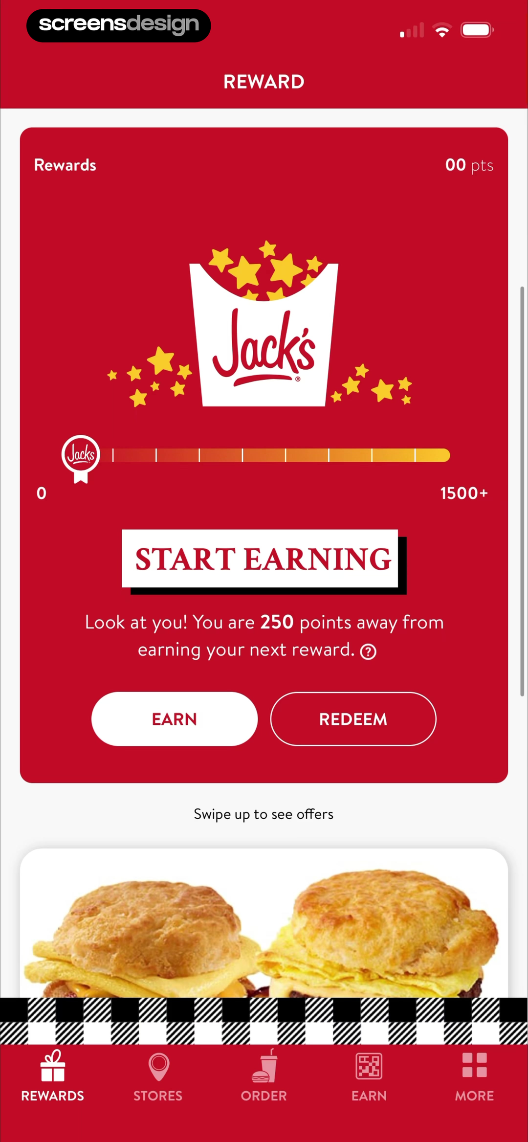
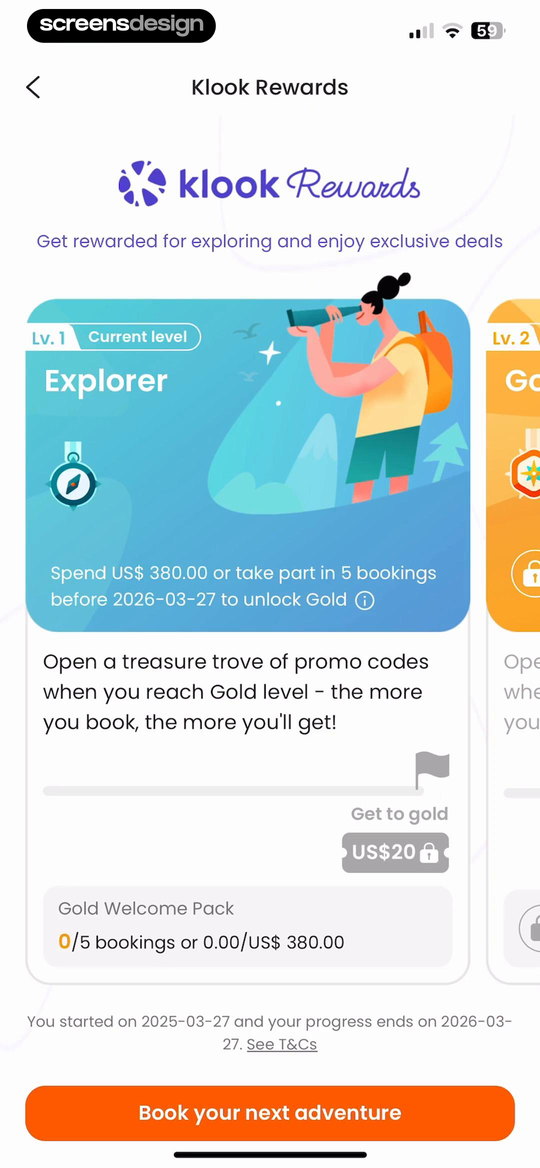
Jack's shows that the balance, next 250-point reward, and Earn versus Redeem routes establish the immediate loyalty task. Klook: Travel & Activities takes a different but compatible approach: explorer status is tied to spend or booking progress, a deadline, Gold, and a concrete welcome pack. Together, the examples reveal which details must stay visible at the decision point rather than being deferred to support or legal copy.
Show points remaining, the named reward, and an Earn or Redeem route. When there are multiple thresholds, prioritize the closest eligible one without hiding the broader ladder.
Test the normal path, dismissal, back navigation, interruption, app relaunch, slow network, stale account data, and the state after completion. The primary label, confirmation, saved data, and next destination should describe the same outcome. Check large text, screen readers, keyboard focus, translated copy, and reduced motion so the decision remains understandable without relying on layout or color alone.
02. Tiers and milestones
Explain how status changes over time.
Tier progress needs a unit, deadline, and benefit.
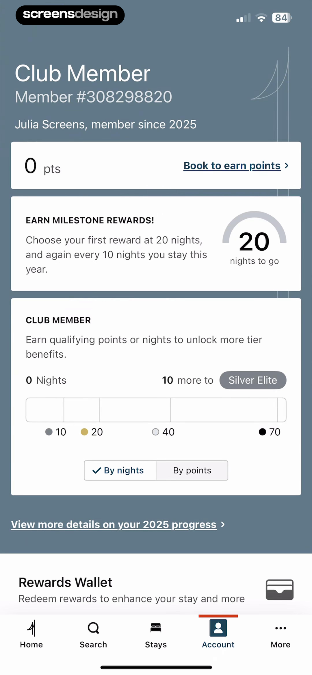
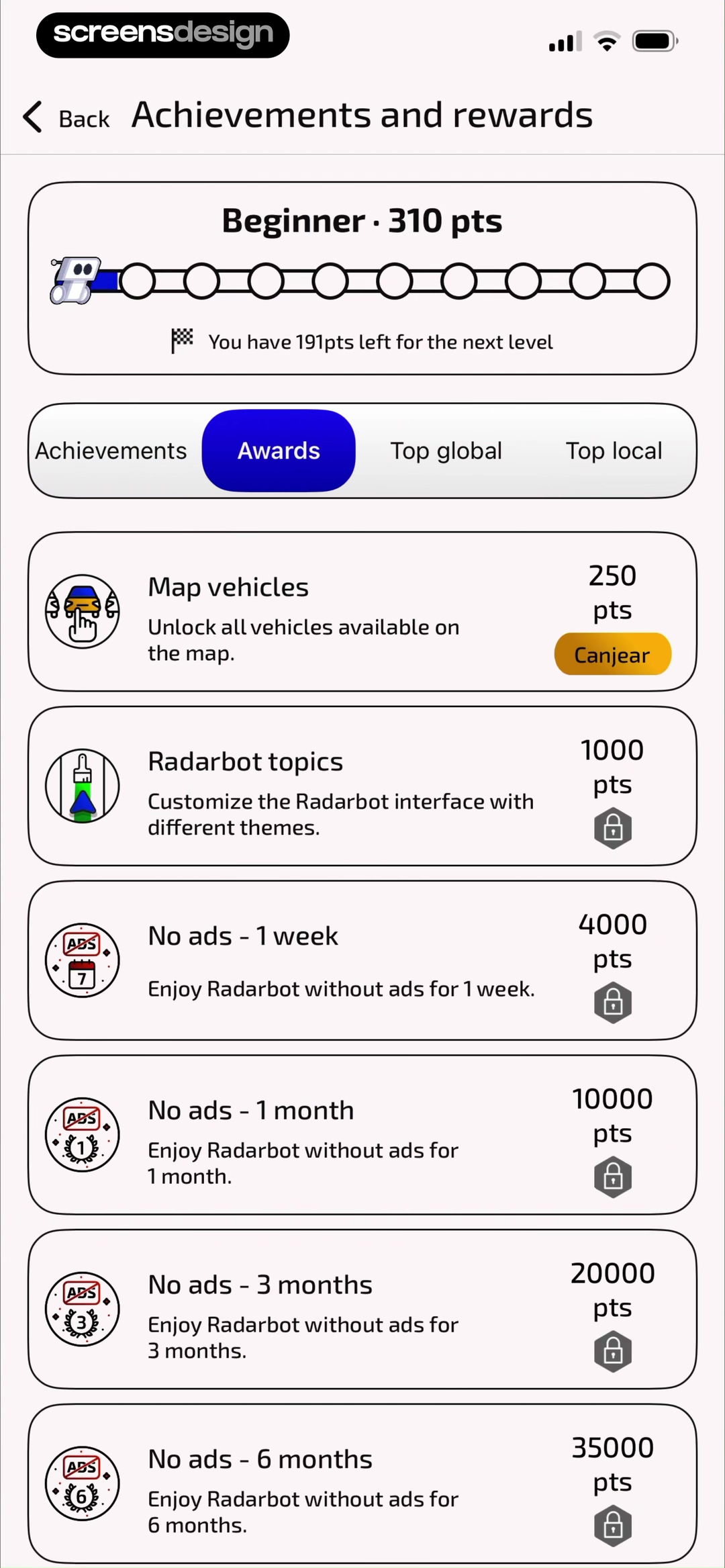
IHG One Rewards: Book Hotels shows that points, nights, the next tier, and milestone reward cadence are visible from the member overview. Radarbot: Speed Camera GPS App takes a different but compatible approach: beginner status, current points, the next-level gap, achievements, awards, and rankings share one system. Together, the examples reveal which details must stay visible at the decision point rather than being deferred to support or legal copy.
Use spend, bookings, nights, points, or achievements consistently. State the qualification window, what resets, and what the next tier unlocks.
Test the normal path, dismissal, back navigation, interruption, app relaunch, slow network, stale account data, and the state after completion. The primary label, confirmation, saved data, and next destination should describe the same outcome. Check large text, screen readers, keyboard focus, translated copy, and reduced motion so the decision remains understandable without relying on layout or color alone.
03. Recognition and progress
Make achievement visible without obscuring utility.
Status can reinforce identity, but redemption still needs clarity.
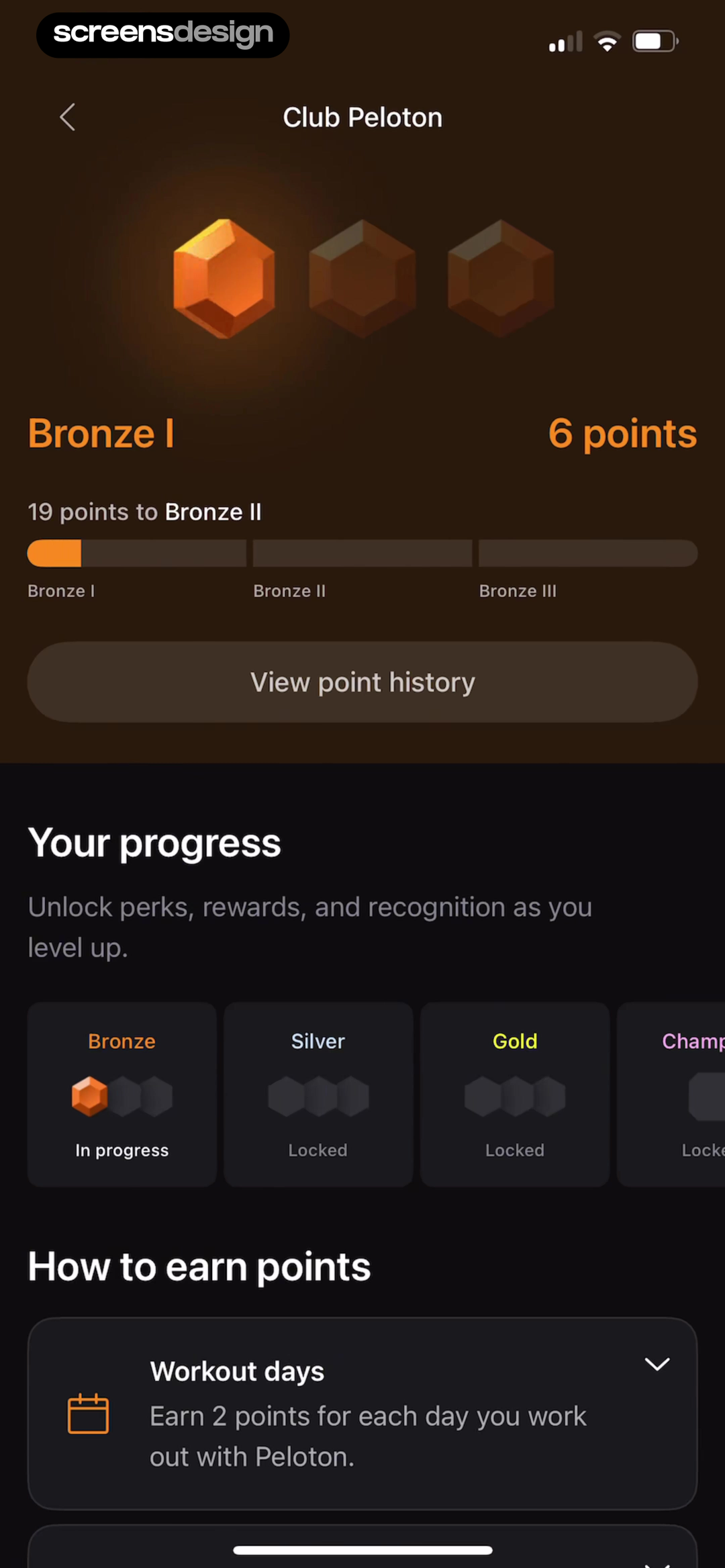
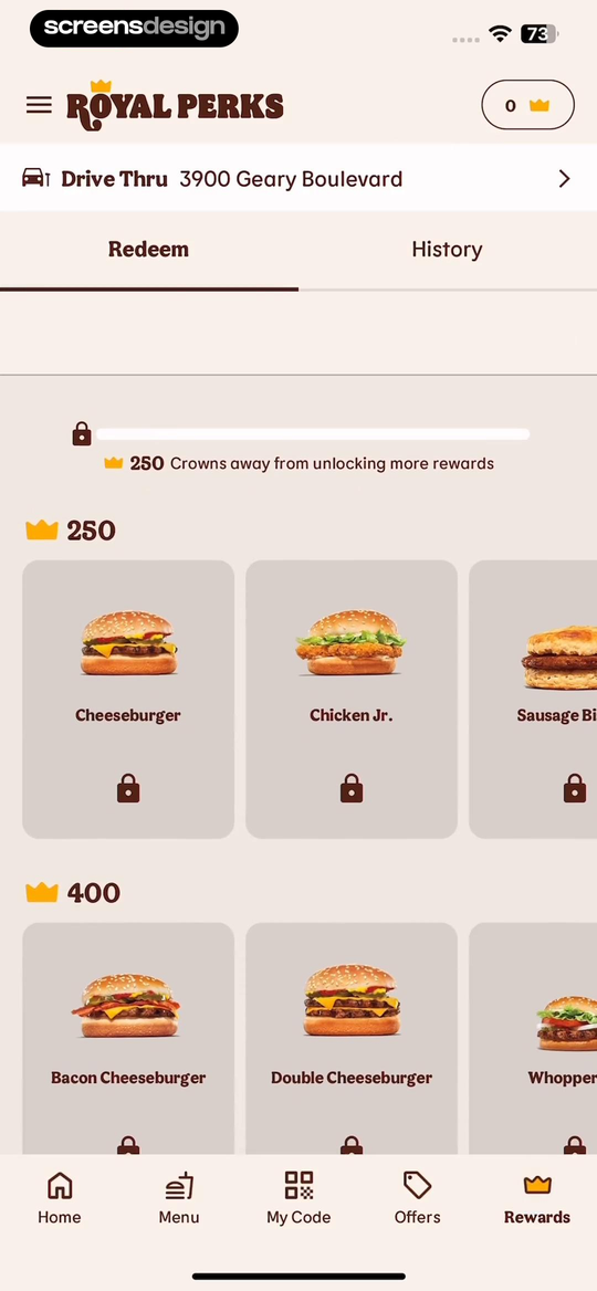
Peloton: Fitness & Workouts shows that bronze I shows six points, the exact gap to Bronze II, point history, and the broader reward ladder. BURGER KING® App takes a different but compatible approach: royal Perks connects crown thresholds to named food rewards and keeps History beside Redeem. Together, the examples reveal which details must stay visible at the decision point rather than being deferred to support or legal copy.
Show history and progress beside the badge. Avoid celebration that hides a zero balance, an expired reward, or a long gap to the next level.
Test the normal path, dismissal, back navigation, interruption, app relaunch, slow network, stale account data, and the state after completion. The primary label, confirmation, saved data, and next destination should describe the same outcome. Check large text, screen readers, keyboard focus, translated copy, and reduced motion so the decision remains understandable without relying on layout or color alone.
04. Currency conversion
Translate loyalty currency into customer value.
Points should connect to coupons, money, nights, products, or services.
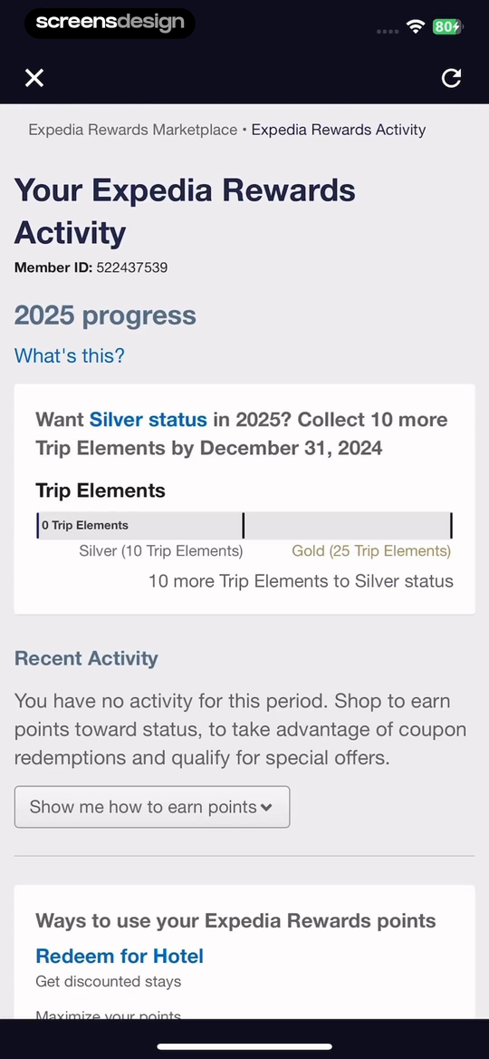
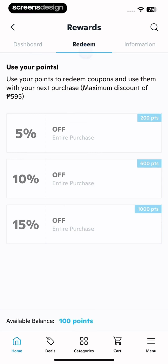
Expedia: Hotels, Flights, Cars shows that the progress year, Trip Elements, Silver and Gold thresholds, and deadline explain status movement. Wish: Shop and Save takes a different but compatible approach: points become coupons with visible percentage discounts, point costs, and a maximum discount rule. Together, the examples reveal which details must stay visible at the decision point rather than being deferred to support or legal copy.
State point cost, discount, maximum value, item eligibility, and expiration. If several currencies coexist, explain which actions earn and spend each one.
Test the normal path, dismissal, back navigation, interruption, app relaunch, slow network, stale account data, and the state after completion. The primary label, confirmation, saved data, and next destination should describe the same outcome. Check large text, screen readers, keyboard focus, translated copy, and reduced motion so the decision remains understandable without relying on layout or color alone.
05. Earn and redeem
Keep earning rules and reward inventory connected.
Customers should not have to search another area to understand the program.
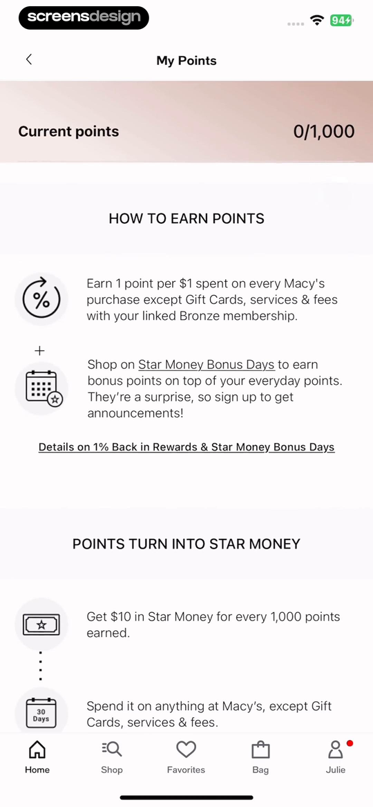
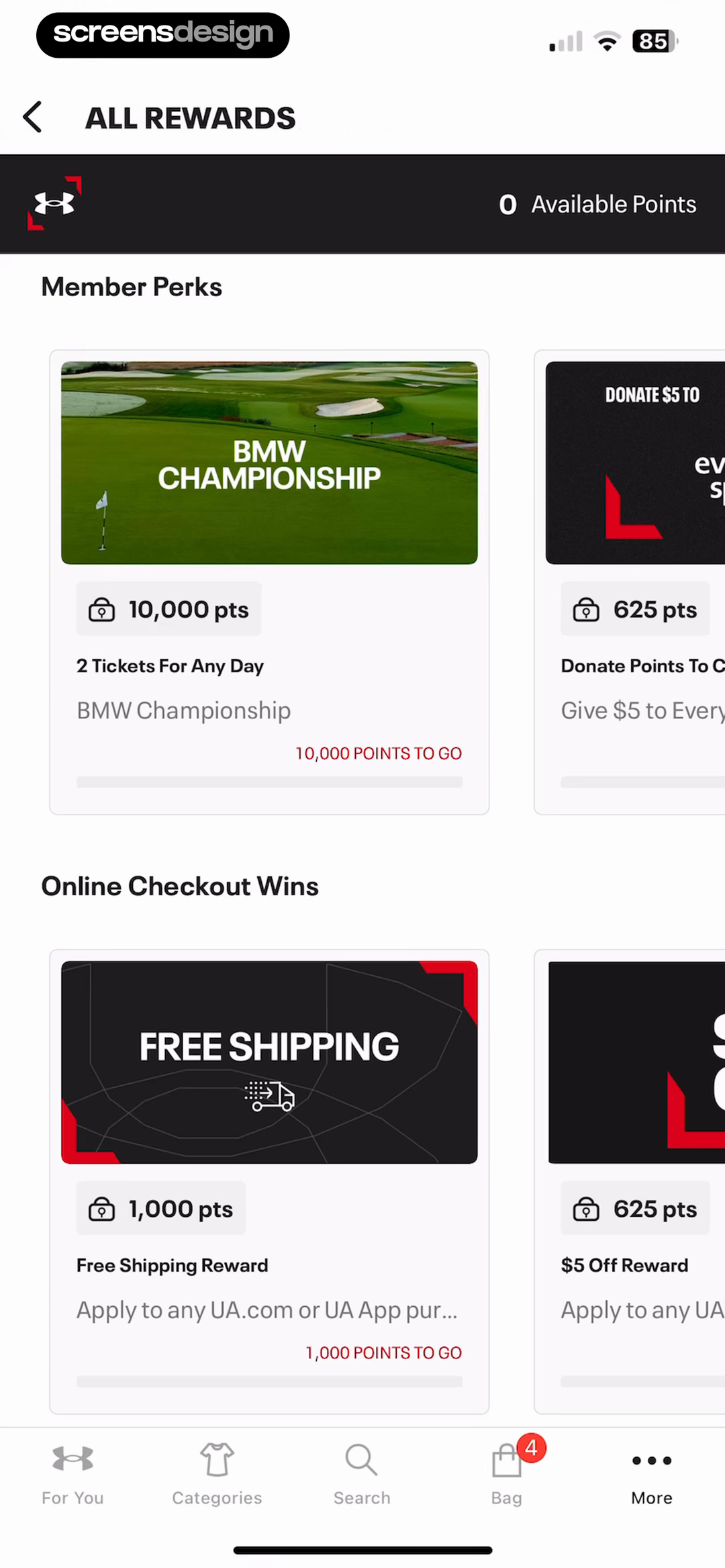
Macy's: Shop, Save, and Earn shows that the screen explains one point per dollar, exclusions, bonus days, and the 1,000-point conversion into Star Money. Under Armour takes a different but compatible approach: the reward catalog combines experiences, donations, perks, point prices, and remaining-point messages. Together, the examples reveal which details must stay visible at the decision point rather than being deferred to support or legal copy.
Show rate, exclusions, bonus periods, catalog availability, remaining points, and redemption method. Indicate whether rewards are in-store, online, account-bound, or time limited.
Test the normal path, dismissal, back navigation, interruption, app relaunch, slow network, stale account data, and the state after completion. The primary label, confirmation, saved data, and next destination should describe the same outcome. Check large text, screen readers, keyboard focus, translated copy, and reduced motion so the decision remains understandable without relying on layout or color alone.
Implementation
Build the state model before polishing the screen.
Interface quality depends on entitlement, account, billing, content, and analytics state agreeing.
Build the interface from a trustworthy ledger with available, pending, expired, redeemed, and reversed balances. Represent each rule with earning event, rate, currency, cap, eligibility, qualification period, expiration, reward inventory, and redemption channel. Never calculate a displayed balance from client events alone.
Create a next-best-reward service that respects eligibility and inventory, not only point distance. A reward the customer cannot use should not dominate the dashboard. Show progress with text as well as graphics, and make exact dates available for expiration and tier windows.
Test returns, cancellations, reversed purchases, delayed points, pending travel, partial redemption, insufficient balance, inventory changes, expired rewards, tier reset, bonus events, offline use, account merge, region changes, and accessibility with large numbers and long reward names.
- Available and pending balances are distinguished.
- The next attainable reward and remaining gap are visible.
- Tier units, qualification period, and reset rules are explicit.
- Point value, exclusions, expiration, and redemption channel are clear.
- Unavailable inventory does not appear as redeemable.
- Returns and reversals keep the ledger and interface consistent.
Measurement
Measure the completed outcome, not only the first tap.
A visible control is useful only when the customer reaches the expected state and can continue.
Track reward dashboard view, earn-rule view, redemption start, redemption completion, and expired unused value. Define the successful product state before launch and verify it from server or platform truth where possible. A button tap without the promised entitlement, schedule, reward, survey result, or recovered access should be counted as an error, not conversion.
Segment by entry point, customer state, current plan or program, platform, app version, locale, accessibility settings, prior failures, and whether the person returned after leaving the flow. Compare immediate completion with what happens during the next relevant session so a short-term click does not hide confusion or regret.
Review guardrails alongside the primary metric: repeated attempts, backtracking, support contact, refund, cancellation, incorrect access, disabled reminders, abandoned tasks, and manual corrections. Read open feedback and replay representative failures with sensitive information protected. The goal is a trustworthy customer outcome, not a higher number produced by obscuring alternatives.
Review checklist
Test the content, the control, and the resulting account state.
Create accounts for the new, active, returning, expired, interrupted, unsupported, and already-completed states. Verify copy, available actions, confirmation, account data, navigation, and the destination for each one.
Run the flow with slow and failed network calls, app relaunch, another device, large text, screen reader, localization, denied permissions where relevant, and a customer who changes their mind. Every path should preserve data and provide a clear way forward.
- Available and pending balances are distinguished.
- The next attainable reward and remaining gap are visible.
- Tier units, qualification period, and reset rules are explicit.
- Point value, exclusions, expiration, and redemption channel are clear.
- Unavailable inventory does not appear as redeemable.
- Returns and reversals keep the ledger and interface consistent.
Questions and answers
Loyalty rewards design questions
What should a loyalty rewards home screen show?
Show available balance, pending value, the nearest eligible reward, progress, earning rules, expiration, and direct Earn and Redeem routes.
How can an app make points easier to understand?
Translate points into concrete rewards or money value and state the remaining gap to the next attainable benefit.
Should loyalty tiers use annual progress?
Use the qualification period that matches the program, then show its exact start, end, reset rule, and required unit.
How should expired points be handled?
Give advance notice, show the exact expiration date and amount, and provide a realistic redemption path without manufacturing urgency.
What metrics matter for loyalty design?
Measure earning understanding, redemption completion, unused expiration, repeat participation, reversal accuracy, and customer support, not only dashboard visits.
Apps referenced in this page
Open the products behind the examples.
 Jack'sAll About Rewards
 Klook: Travel & ActivitiesTickets, Tours, Transport
 IHG One Rewards: Book HotelsBook 7,000+ hotels worldwide
 Radarbot: Speed Camera GPS AppRadar traps, traffic & maps.
 Peloton: Fitness & WorkoutsYoga, Cardio & Gym Training
 BURGER KING® AppCoupons & Mobile Order
 Expedia: Hotels, Flights, CarsTrip planner & travel deals
 Wish: Shop and SaveFashion, Decor & Electronics
 Macy's: Shop, Save, and EarnShopping, Rewards and Savings
 Under ArmourShop Athletic Clothing & Shoes
2,715 apps in the top charts.Ask them anything.
Search real app flows, compare the screens around each decision, and turn stronger references into your own product.