Failed payment recovery
10 Failed Payment Recovery Screen Examples
Name what failed, preserve the selected product, and route the customer to retry, update, restore, or return later.
Payment failure is not one condition. A card may be declined, authentication may be abandoned, the store may be unavailable, the network may time out, an existing entitlement may not sync, or the customer may simply cancel the system purchase sheet. A generic error that says try again treats different causes as if they have the same remedy.
These ten recorded screens show modal errors, persistent alerts, membership action-required states, retry controls, later-retry language, and restore paths. Their strongest shared behavior is continuity: the selected plan and the value behind it remain understandable after failure, so recovery does not begin from zero.
Design recovery around what the app actually knows. Do not claim a card was declined if the store only returned an unknown error. Provide a safe immediate action, preserve the pending selection, prevent duplicate purchases, and give an existing subscriber a separate restore route.
Read subscription renewal reminder design for the adjacent product state and its handoff into this decision.
01. Name and retry
Use a specific, reversible first action.
The first error state should reduce uncertainty without inventing a cause.
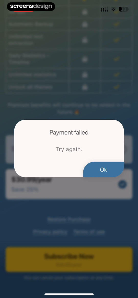
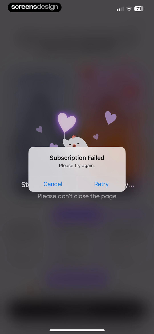
Bookmory - reading tracker shows that a compact Payment failed alert returns the reader to the same paywall, where retry and restore remain possible. Me+ Lifestyle Routine takes a different but compatible approach: subscription Failed offers Retry and Cancel without making the person rebuild the purchase selection. Together, the examples reveal which details must stay visible at the decision point rather than being deferred to support or legal copy.
Say whether the subscription, purchase, or renewal failed. Keep Retry available only when it is safe, and offer Cancel or Back so the person is not trapped in an automatic loop.
Test the normal path, dismissal, back navigation, interruption, app relaunch, slow network, stale account data, and the state after completion. The primary label, confirmation, saved data, and next destination should describe the same outcome. Check large text, screen readers, keyboard focus, translated copy, and reduced motion so the decision remains understandable without relying on layout or color alone.
02. Preserve context
Keep the selected product and access problem visible.
Recovery is easier when the customer remembers what they were buying.
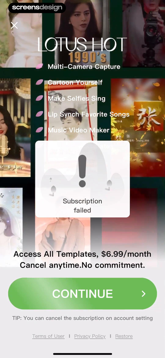
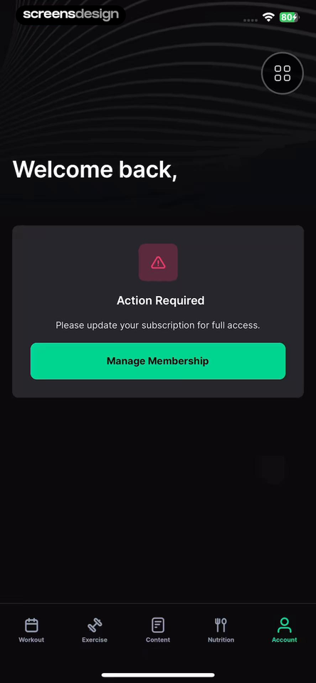
Lotus - AI Photo Face Animator shows that the failure appears over the premium feature gallery, preserving the reason the person attempted to subscribe. STNDRD Workout & Fitness Plans takes a different but compatible approach: action Required explains that membership needs attention and sends the returning member to Manage Membership. Together, the examples reveal which details must stay visible at the decision point rather than being deferred to support or legal copy.
Show the plan, price, feature, or membership state behind the error. Returning members should see which access is affected and where to manage the billing source.
Test the normal path, dismissal, back navigation, interruption, app relaunch, slow network, stale account data, and the state after completion. The primary label, confirmation, saved data, and next destination should describe the same outcome. Check large text, screen readers, keyboard focus, translated copy, and reduced motion so the decision remains understandable without relying on layout or color alone.
03. Retry versus offer
Separate transaction recovery from plan persuasion.
A failed purchase is not evidence that the customer needs a different sales message.
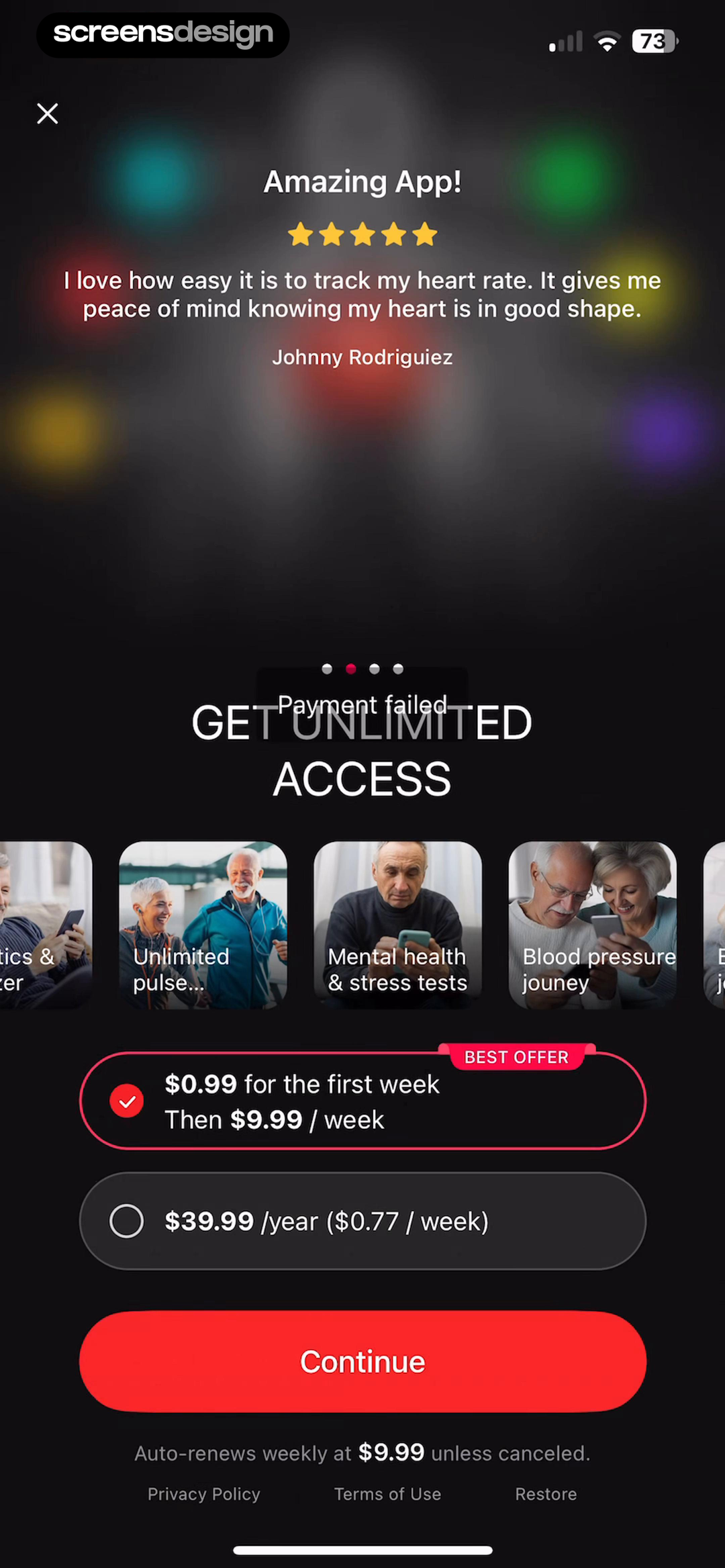
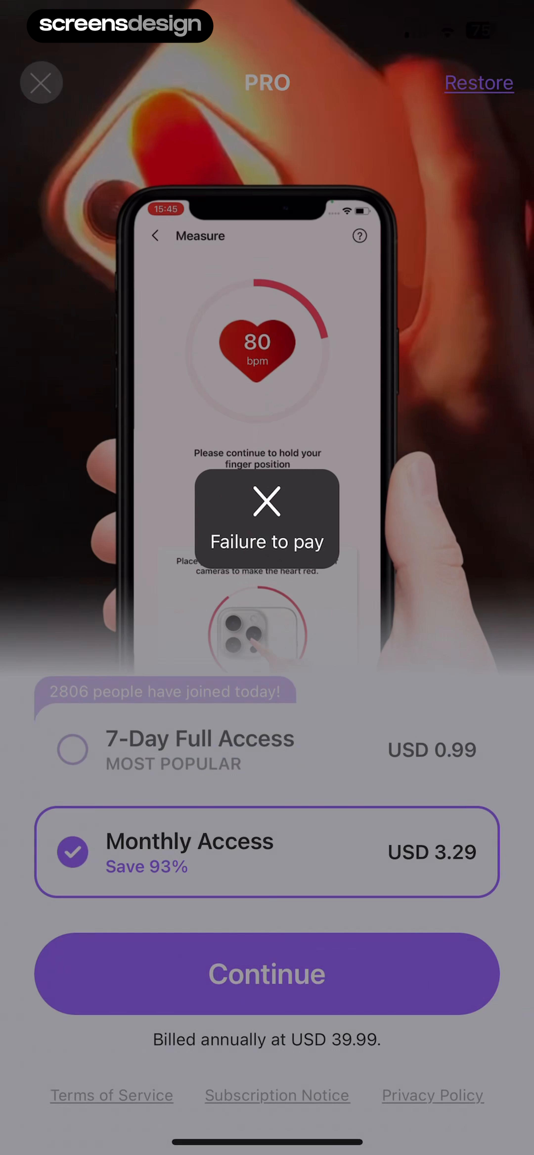
iCardio - Heart Rate Tracker shows that payment failed remains visible inside the unlimited-access offer instead of silently dismissing the purchase. Blood Pressure: Healthy Life takes a different but compatible approach: failure to pay appears with plan options and Restore, but the next recovery action needs stronger hierarchy. Together, the examples reveal which details must stay visible at the decision point rather than being deferred to support or legal copy.
Keep pricing available for review, but make the error and recovery action visually dominant. Avoid urgency, social proof, or countdowns that compete with a technical problem.
Test the normal path, dismissal, back navigation, interruption, app relaunch, slow network, stale account data, and the state after completion. The primary label, confirmation, saved data, and next destination should describe the same outcome. Check large text, screen readers, keyboard focus, translated copy, and reduced motion so the decision remains understandable without relying on layout or color alone.
04. Persistent error
Make failure noticeable without destroying the task.
Banners, alerts, and inline errors each fit different moments.
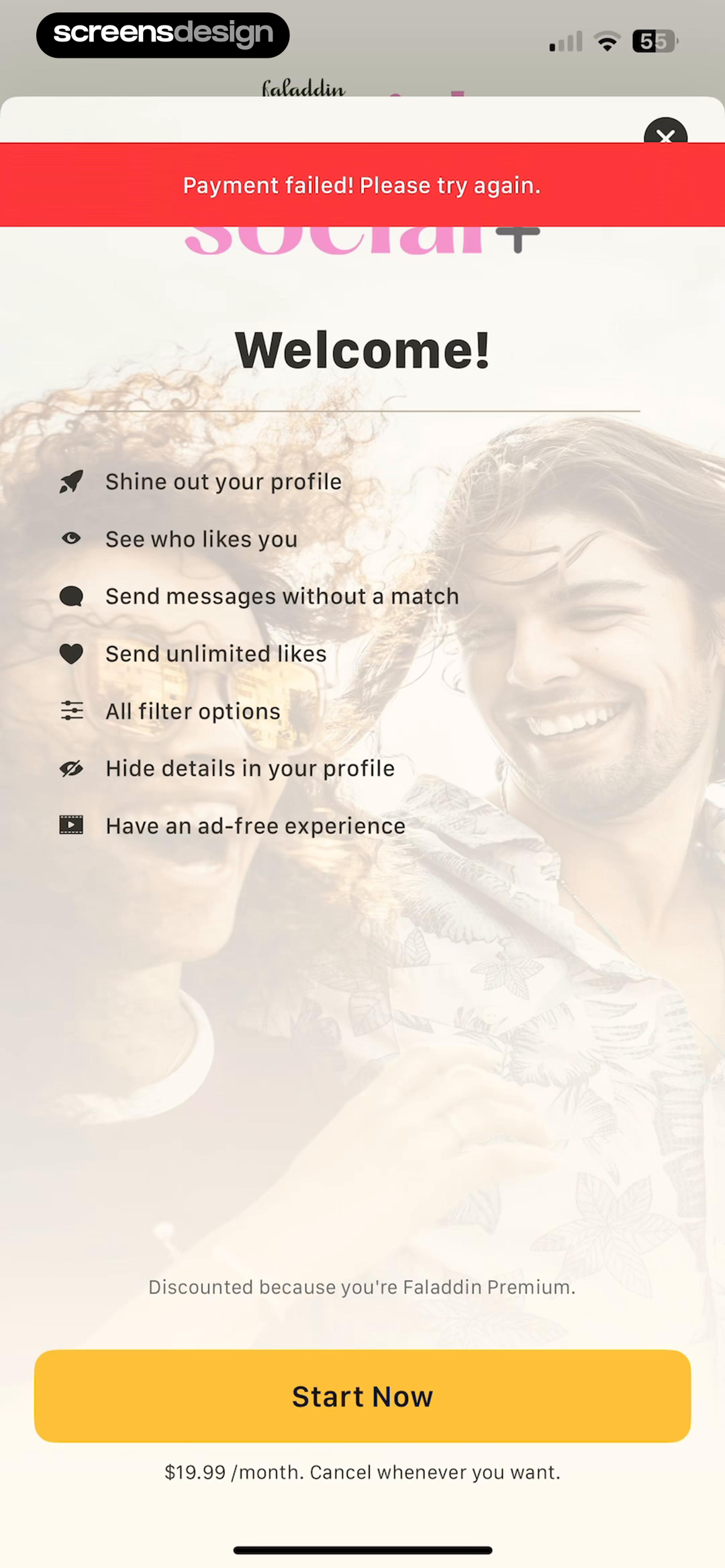
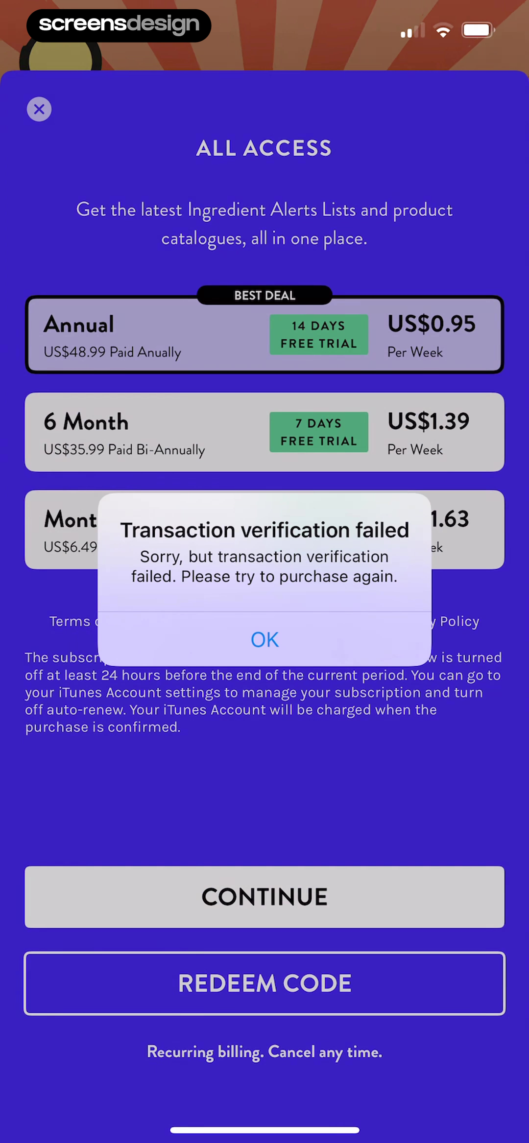
Faladdin: Horoscope, Astrology shows that a visible error banner sits above the Social+ offer, keeping the failed transaction tied to the selected product. Think Dirty - Shop Clean takes a different but compatible approach: the failed state preserves annual and six-month choices so the shopper can review the offer before trying again. Together, the examples reveal which details must stay visible at the decision point rather than being deferred to support or legal copy.
Use a modal when the current action cannot continue, a banner when the page remains useful, and inline guidance for a field or payment method that can be corrected in place.
Test the normal path, dismissal, back navigation, interruption, app relaunch, slow network, stale account data, and the state after completion. The primary label, confirmation, saved data, and next destination should describe the same outcome. Check large text, screen readers, keyboard focus, translated copy, and reduced motion so the decision remains understandable without relying on layout or color alone.
05. Later and restore
Offer honest fallback paths.
Some failures cannot be fixed in the current session.
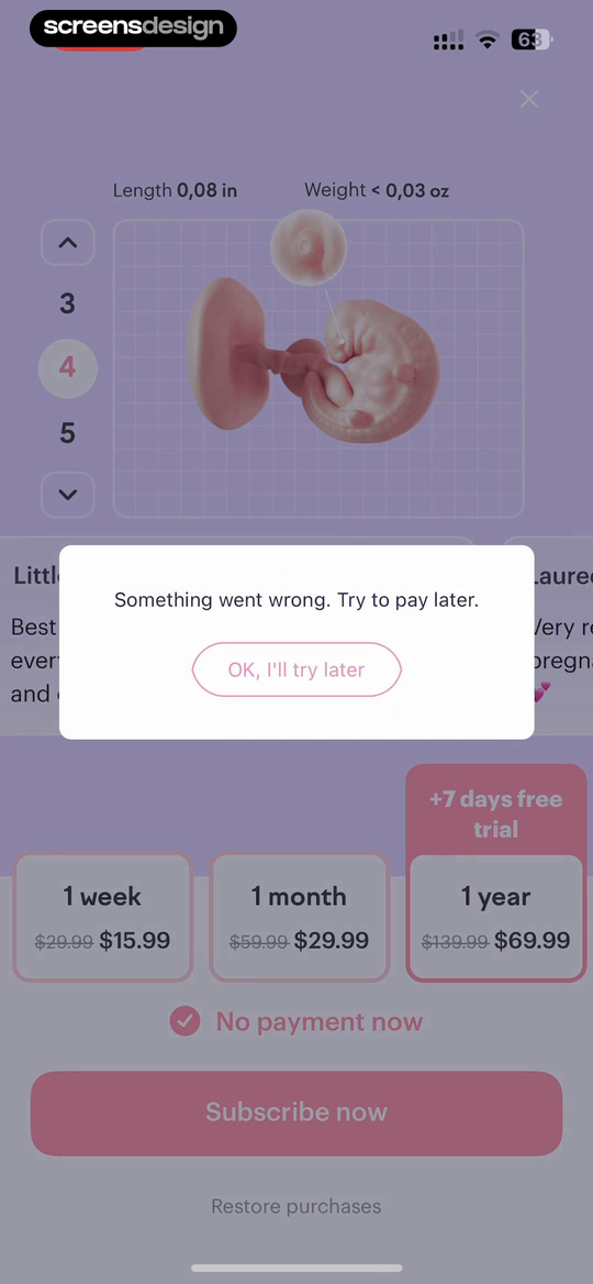
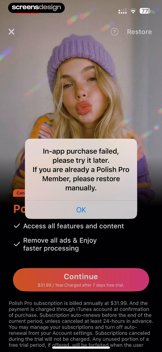
amma: Pregnancy & Baby Tracker shows that something went wrong explicitly recommends trying later and provides a calm acknowledgement path. Polish - AI Photo Editor takes a different but compatible approach: the message separates a failed new purchase from an existing member who should use Restore. Together, the examples reveal which details must stay visible at the decision point rather than being deferred to support or legal copy.
Let customers try later without losing the chosen plan. Existing members should be able to restore, update payment details, or reach support with transaction context already attached.
Test the normal path, dismissal, back navigation, interruption, app relaunch, slow network, stale account data, and the state after completion. The primary label, confirmation, saved data, and next destination should describe the same outcome. Check large text, screen readers, keyboard focus, translated copy, and reduced motion so the decision remains understandable without relying on layout or color alone.
Implementation
Build the state model before polishing the screen.
Interface quality depends on entitlement, account, billing, content, and analytics state agreeing.
Map store and processor outcomes into customer-safe categories: cancelled, retryable, payment-method action required, already purchased, pending, unavailable, and unknown. Keep raw codes for support, but show only verified language. Use idempotency and server-side entitlement checks before starting another charge.
Persist the product, offer, billing term, price, currency, trial, and originating feature. After failure, return to a state that can retry the same validated product. When payment details must change outside the app, explain where the customer will go and how to return. Existing subscribers need Restore or Refresh access rather than another purchase attempt.
Test airplane mode, store outage, cancelled authentication, insufficient funds, expired card, parental approval, pending purchase, duplicate tap, delayed success callback, restored purchase, family sharing, price change, and app relaunch. Reconcile the final entitlement with the store receipt before showing success.
- The message names the failed object without guessing the cause.
- The selected plan, price, and trial remain available.
- Retry is idempotent and cannot create a duplicate charge.
- Update payment, restore, later, and support routes appear when relevant.
- Pending and already-purchased states do not look like failures.
- Success is based on verified entitlement, not only a client callback.
Measurement
Measure the completed outcome, not only the first tap.
A visible control is useful only when the customer reaches the expected state and can continue.
Track recovery attempt, successful entitlement, duplicate charge prevention, restore success, and payment-support contact. Define the successful product state before launch and verify it from server or platform truth where possible. A button tap without the promised entitlement, schedule, reward, survey result, or recovered access should be counted as an error, not conversion.
Segment by entry point, customer state, current plan or program, platform, app version, locale, accessibility settings, prior failures, and whether the person returned after leaving the flow. Compare immediate completion with what happens during the next relevant session so a short-term click does not hide confusion or regret.
Review guardrails alongside the primary metric: repeated attempts, backtracking, support contact, refund, cancellation, incorrect access, disabled reminders, abandoned tasks, and manual corrections. Read open feedback and replay representative failures with sensitive information protected. The goal is a trustworthy customer outcome, not a higher number produced by obscuring alternatives.
Review checklist
Test the content, the control, and the resulting account state.
Create accounts for the new, active, returning, expired, interrupted, unsupported, and already-completed states. Verify copy, available actions, confirmation, account data, navigation, and the destination for each one.
Run the flow with slow and failed network calls, app relaunch, another device, large text, screen reader, localization, denied permissions where relevant, and a customer who changes their mind. Every path should preserve data and provide a clear way forward.
- The message names the failed object without guessing the cause.
- The selected plan, price, and trial remain available.
- Retry is idempotent and cannot create a duplicate charge.
- Update payment, restore, later, and support routes appear when relevant.
- Pending and already-purchased states do not look like failures.
- Success is based on verified entitlement, not only a client callback.
Questions and answers
Failed payment recovery questions
What should a failed payment screen say?
Name the subscription or purchase that failed, use only a cause the system knows, preserve the selected offer, and provide the safest next action.
Should the app automatically retry a failed payment?
Only when the billing platform and policy make that safe. User-initiated purchases should not loop or risk duplicate charges.
When should Restore Purchases appear?
Show it for an existing customer whose entitlement may not have synced. Restore is not the same as retrying a new payment.
How should unknown errors be handled?
Use neutral language, preserve context, allow a later retry, and attach technical details to support rather than exposing raw processor codes.
What is the main success metric for payment recovery?
Verified access after recovery is more meaningful than a Retry tap. Include duplicate charges, repeated failures, refunds, and support contacts as guardrails.
Apps referenced in this page
Open the products behind the examples.
 Bookmory - reading trackerTrack & Remember Your Books
 Me+ Lifestyle RoutineDaily Planner & Habit Tracker
 Lotus - AI Photo Face AnimatorCartoon Face Lip Synch Maker
 STNDRD Workout & Fitness PlansStrength Training Programs
 iCardio - Heart Rate TrackerPulse Monitor & Blood Pressure
 Blood Pressure: Healthy LifeHeart Rate Tracker,Blood Sugar
 Faladdin: Horoscope, AstrologyPsychic Reading & Tarot Cards
 Think Dirty - Shop CleanLearn Beauty Ingredients ^_^
 amma: Pregnancy & Baby TrackerMom-to-Be Countdown & Calendar
 Polish - AI Photo EditorEdit,Retouch,Enhance,Filters
2,715 apps in the top charts.Ask them anything.
Search real app flows, compare the screens around each decision, and turn stronger references into your own product.