Budget dashboard research
14 Budget App Dashboard Design Examples
A useful budget dashboard explains the period, available amount, plan, actual spending, and action that changes the outcome.
Personal finance dashboards can show income, expenses, balances, categories, budgets, goals, subscriptions, forecasts, and advice. Giving each metric equal weight forces the user to decide what the product is for. The dashboard should prioritize the current job: finish planning, understand remaining money, categorize activity, connect missing data, or act on a savings goal.
This review uses fourteen recorded screens from Budget app, EveryDollar, BuyBye, and SubPilot. They cover manual and connected data, zero-based budgeting, paycheck planning, category limits, calendar views, savings framing, account assignment, and empty transaction states. The examples are interface evidence only. They do not establish financial outcomes, forecast accuracy, savings, conversion, or revenue.
For general return-state hierarchy, read the mobile app home screen design article. For clear charts and interaction hierarchy, use the mobile app UI design guide.
01. Setup and intent
Collect the minimum information needed to show a real first dashboard.
A budget should become inspectable before onboarding asks for every financial detail.
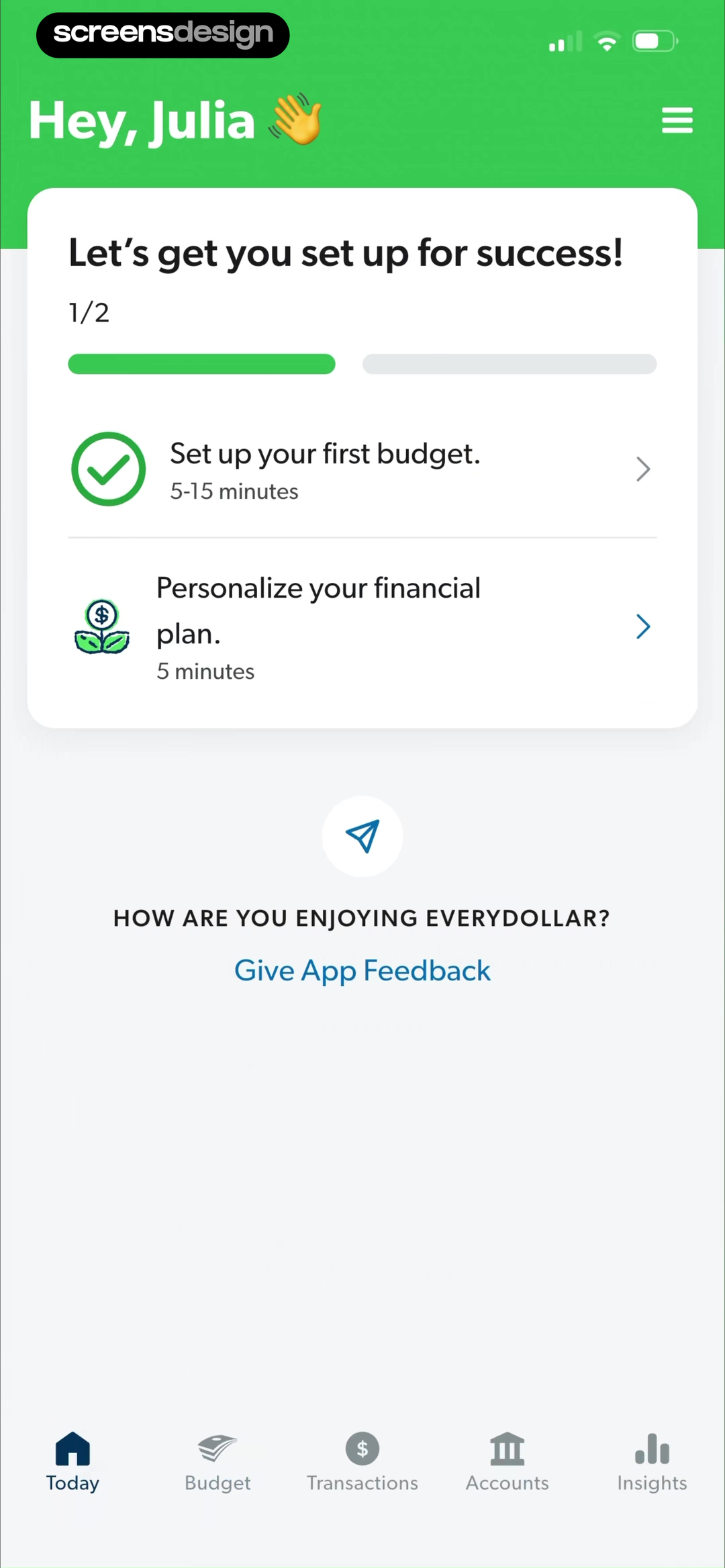
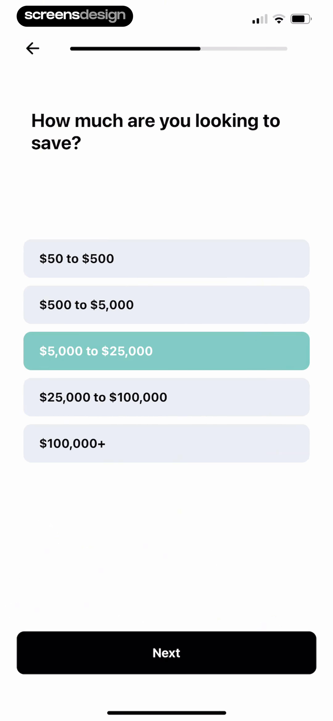
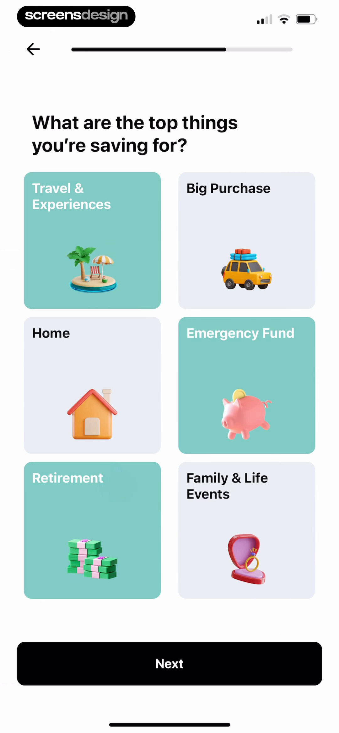
EveryDollar divides setup into a first budget and a personalized financial plan with expected time for each. BuyBye asks how much the person wants to save and what they are saving for. Budget app introduces useful statistics and spending tracking through a compact feature screen. These routes support different jobs, so the resulting home should not converge on the same generic balance card.
Start with period, currency, budgeting method, and one meaningful object such as income, category, account, or goal. Let users explore a manual path before requiring bank connection. If the product has a specific method, explain it with an example rather than assuming terms such as zero-based budget or sinking fund are understood.
Avoid collecting income, debts, employer, household, and goals only to display an unchanged demo dashboard. Return each answer as an editable part of the plan. Explain storage, account requirements, and whether estimates constitute guidance before asking for sensitive financial information.
02. Overview hierarchy
Put the period and remaining decision before secondary analytics.
A number is useful only when the user can tell whether it is balance, budget, spent, or remaining.
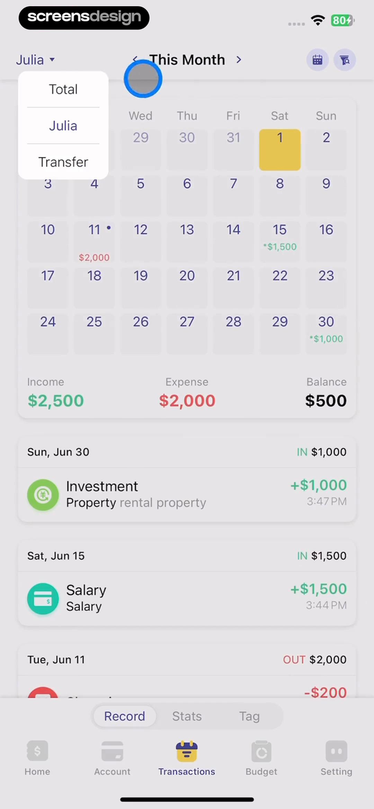
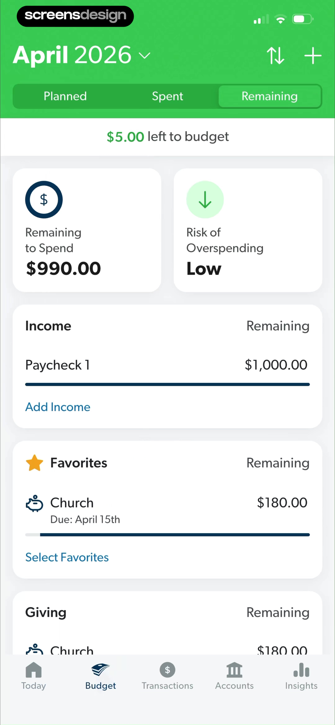
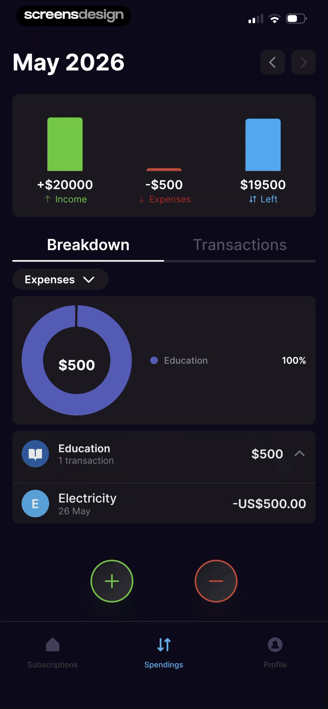
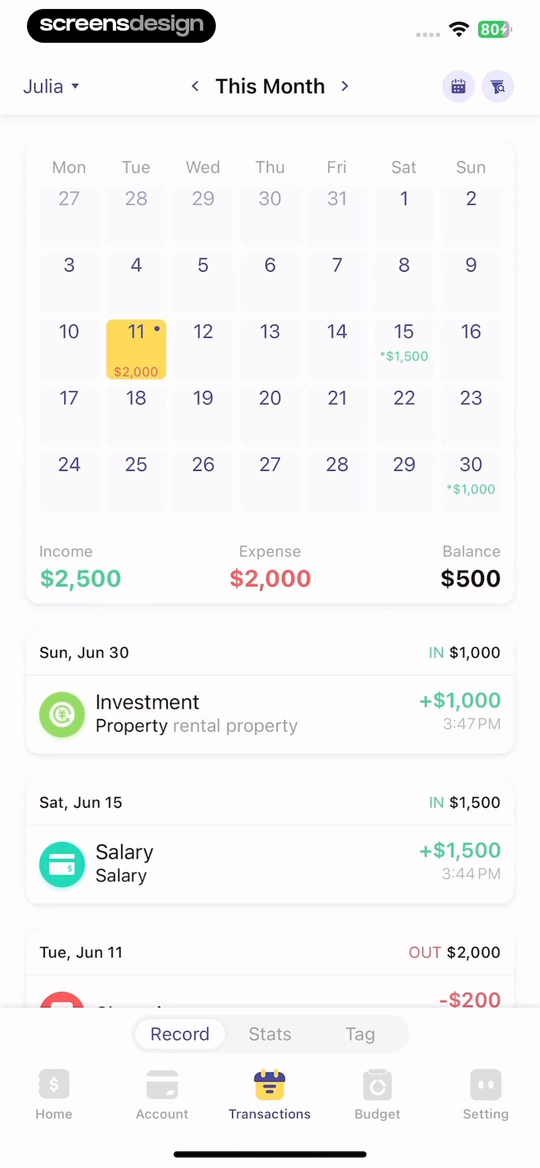
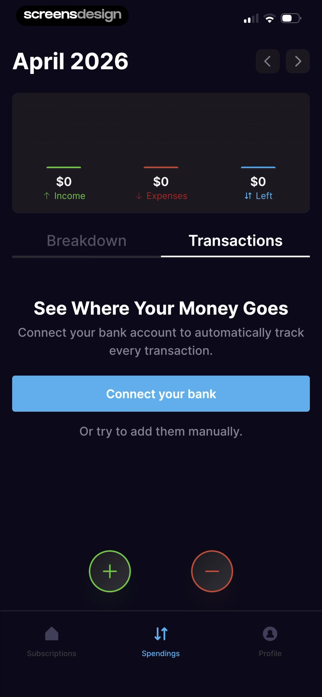
Budget app shows a monthly overview that separates transfer, income, expense, and balance. EveryDollar puts Planned, Spent, Remaining, amount left to budget, remaining to spend, and overspending risk in one view. SubPilot's dashboard uses income, expenses, left, breakdown, and transactions. Each hierarchy reflects a different method, but every metric is tied to a visible period.
Choose one headline decision. If money remains unassigned, Finish budget can lead. If spending is close to a category limit, Review category can lead. If no transactions exist, Connect or Add transaction can lead. Do not make a net-worth total the dominant element when the product is asking for a monthly budget action.
Distinguish posted, pending, forecast, and manually entered values. Show data freshness and account scope. Negative values, refunds, transfers, shared accounts, foreign currencies, and end-of-month rollover need deliberate states. Color can reinforce income and expense, but labels and signs must remain sufficient.
03. Categories and calendar
Let users move from a pattern to the transactions behind it.
Charts should be navigational summaries, not decorative proof that data exists.
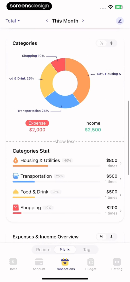
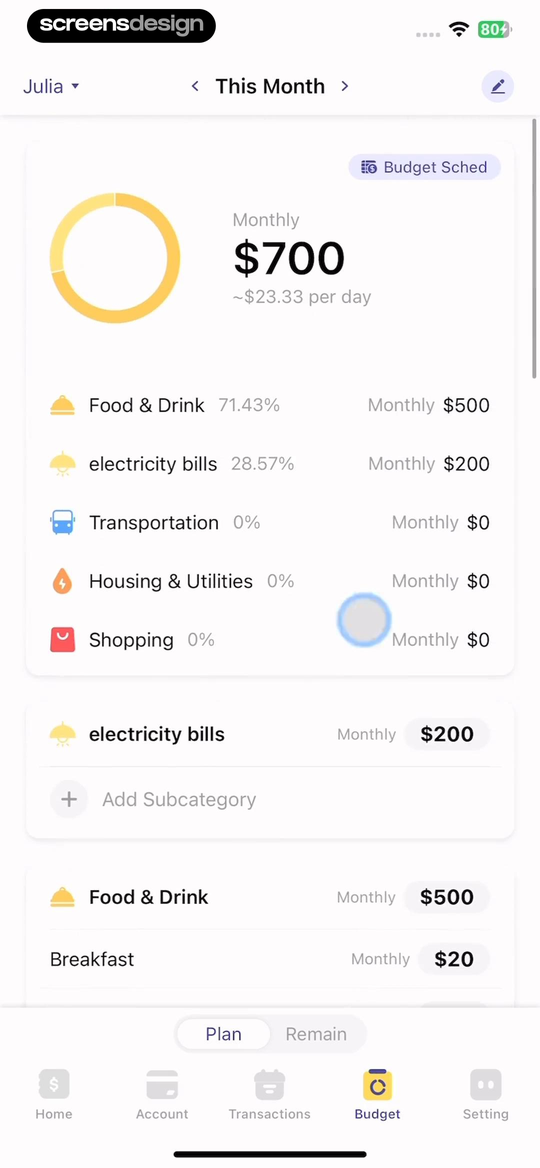
Budget app presents category shares beside expense and income totals, then uses a category budget card with monthly amount, daily equivalent, actual spending, and percentage. Its calendar view organizes activity by day. These are different ways of answering where money went and when it happened.
Every chart needs labels, period, unit, accessible values, and drill-down. Tapping Food and Drink should show the transactions included, uncategorized items, refunds, and rules. A daily equivalent can be helpful, but it must not imply that every category should be spent evenly across days.
Allow category correction without hiding the original account description. Show whether a transaction is manually categorized, rule-based, or suggested. When a category limit changes, explain whether historical comparisons update. Use empty and no-data states rather than filling charts with zeros that appear measured.
04. Cash flow and savings
Separate scheduled cash flow from long-term projections.
A paycheck schedule and an investment projection answer different questions and need different confidence language.
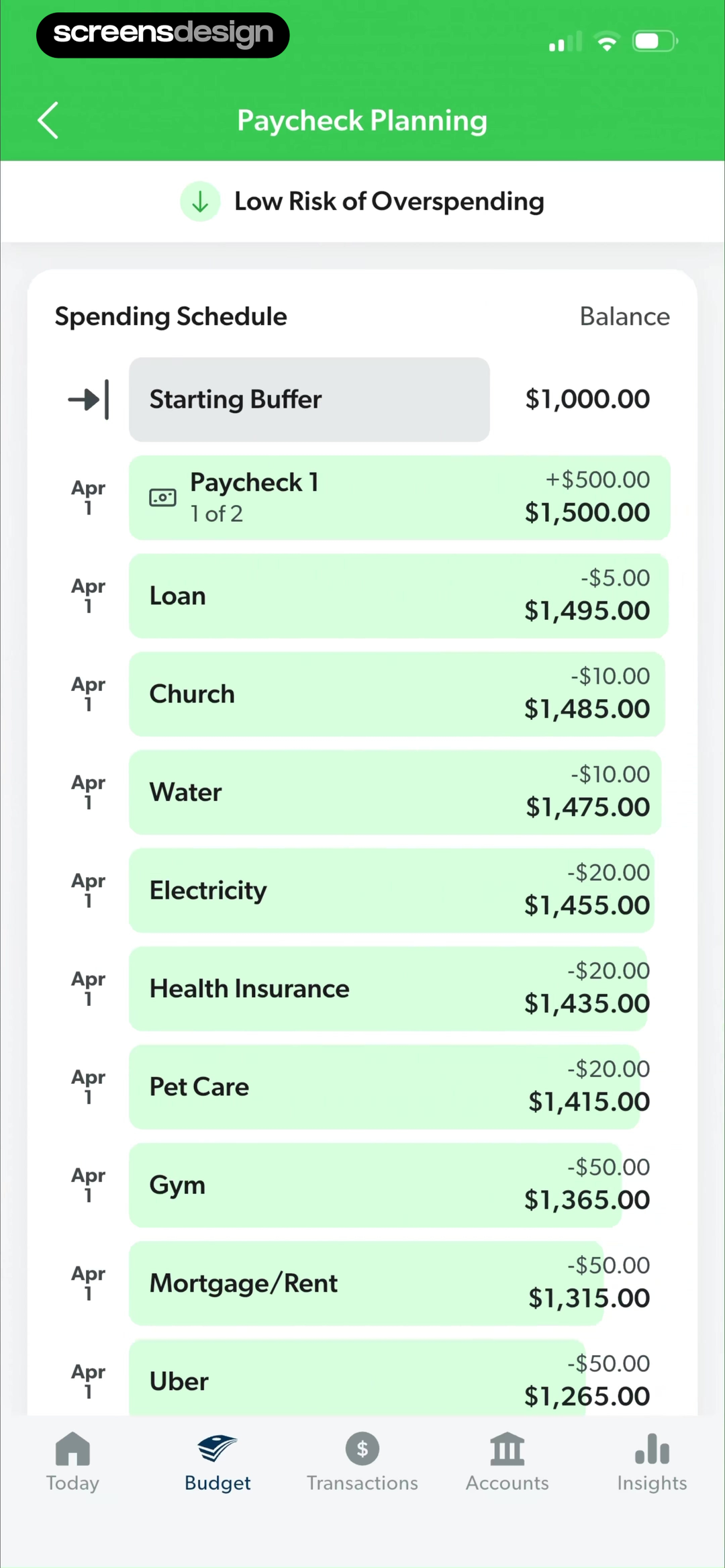
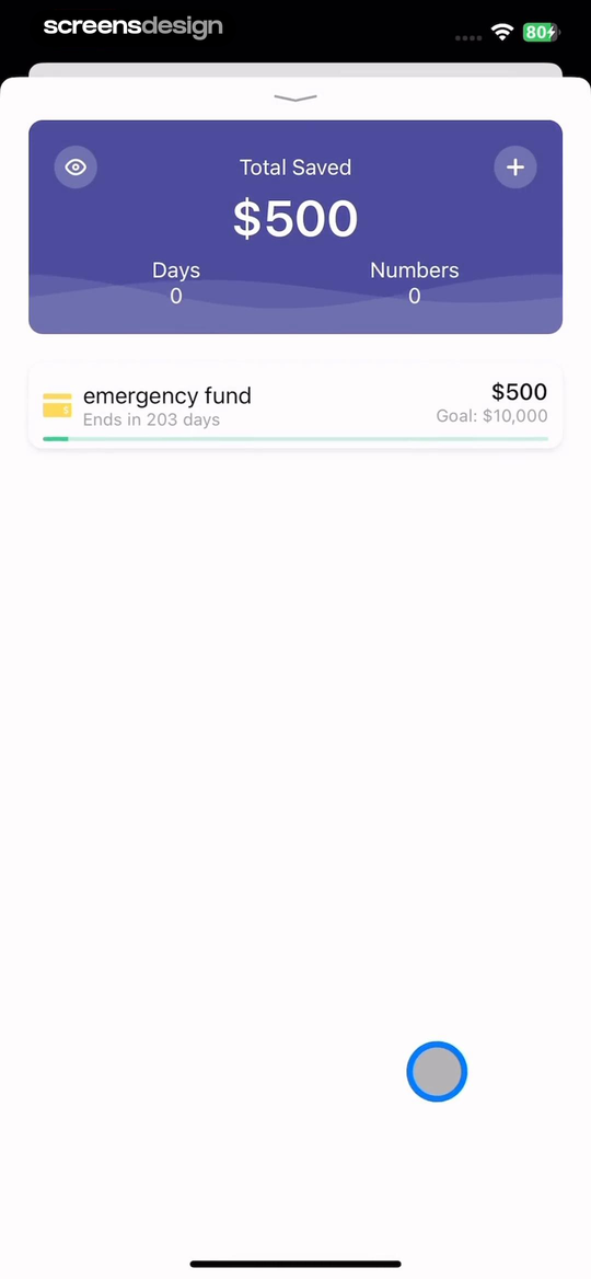
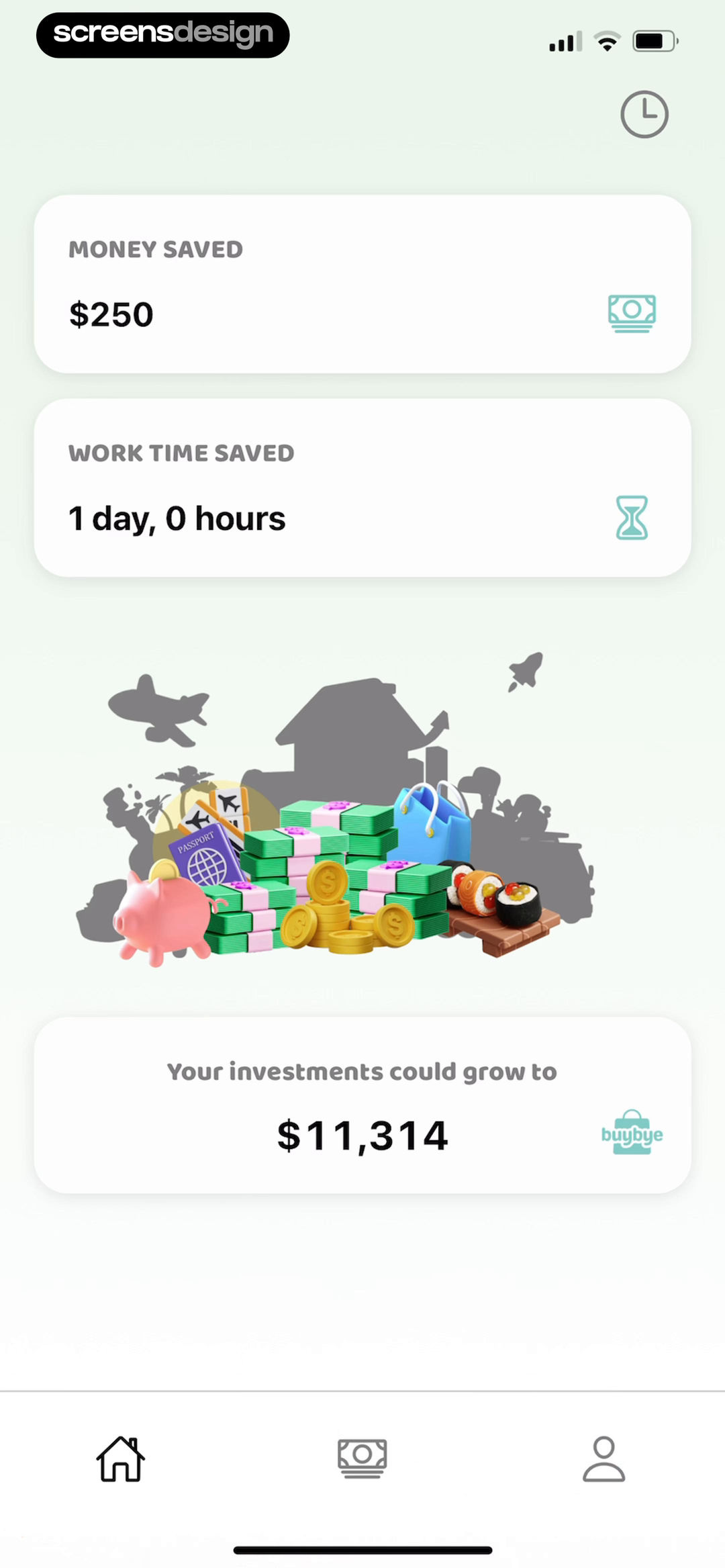
EveryDollar's Paycheck Planning shows a starting buffer, paychecks, spending schedule, and running balance. Budget app's savings goal shows amount saved, days, and target. BuyBye translates saved money into work time and an investment projection. These screens can motivate action, but they should not blur recorded savings with hypothetical growth.
A cash-flow timeline should label dates, pending items, available balance, and assumptions. Let users edit the starting buffer and move a bill. Warn when an account is missing instead of implying the forecast is complete. A savings goal should separate target amount, current contributions, expected date, and the action to add or adjust money.
Forecasts need an explanation of rate, time horizon, fees, and uncertainty. Avoid presenting future values as guaranteed. If the product provides financial guidance or investment recommendations, the product and content require appropriate regulatory and professional review beyond interface design.
05. Accounts, empty states, and Pro
Explain missing data instead of displaying a false zero.
A zero balance, no transactions, disconnected account, and incomplete assignment are different states.
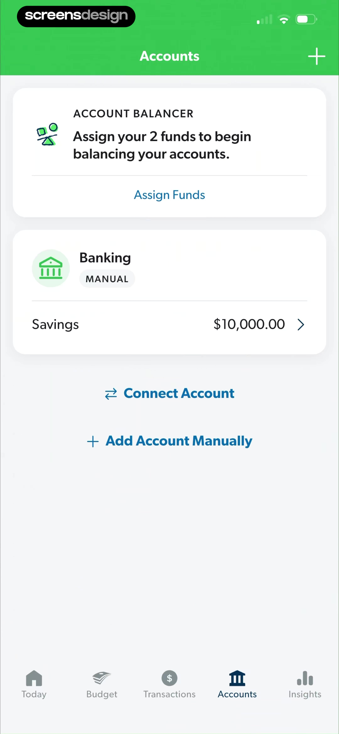
EveryDollar's Accounts view asks the user to assign funds and shows manual savings plus a Connect Account action. SubPilot's empty dashboard says there are no transactions and explains that connecting a bank will populate the view. These messages identify the missing input rather than suggesting the user has no money or activity.
Account connection should explain the provider, institutions, data categories, read and write behavior, refresh, revocation, and manual alternative. After connection, show sync state and last update. If an institution is unavailable, preserve the budget and offer manual import or entry instead of blocking the entire product.
Pro can reasonably support automatic import, more accounts, advanced insights, long history, household collaboration, or forecasting. Place the offer beside the relevant capability, explain renewal and data behavior after expiry, and keep manual access to existing records. ScreensDesign Pro helps teams compare these account and upgrade sequences across full recorded finance flows.
Review checklist
Test the dashboard across a complete month.
Review first setup, partial budget, unassigned money, manual account, connected account, pending transaction, refund, transfer, overspent category, missing institution, new month, changed currency, offline refresh, subscription expiry, and deleted connection. Confirm that every headline value has a period, source, and state.
Check financial language, projection assumptions, privacy, security, and regulatory boundaries with qualified experts. Test large amounts, negative values, zero, multiple currencies, localized number formats, shared accounts, and screen-reader order.
- The first dashboard reflects setup answers and supports a manual path.
- Headline values name the period, meaning, source scope, and freshness.
- Planned, actual, pending, forecast, and remaining money are visually distinct.
- Charts expose accessible values and drill down to included transactions.
- Categories can be corrected without hiding the original transaction data.
- Cash-flow and savings projections state assumptions and uncertainty.
- Empty, disconnected, stale, and true-zero states use different explanations.
- Pro expiry preserves understandable access to existing budgets and records.
Questions and answers
Budget app dashboard design questions
What should a budget app dashboard include?
Include the selected period, planned money, actual income and spending, remaining or unassigned amount, data freshness, and one primary action for the current state.
How should a budget app show spending categories?
Label the period and totals, expose accessible values, let each category open its transactions, and distinguish manually assigned, rule-based, and suggested categorization.
How should a finance app handle an empty dashboard?
Distinguish no transactions, disconnected account, incomplete sync, missing assignment, and true zero. Explain the missing input and offer manual or connection recovery.
How should a budget app display a forecast?
Separate forecast from actual data, state assumptions, dates, missing accounts, and uncertainty, and let users edit the inputs that drive the projection.
How can a budgeting app improve subscriber retention?
Make monthly planning reliable, account data transparent, categorization correctable, and progress useful. Use contextual paid value and easy cancellation rather than locking existing records.
What budget features can belong to Pro?
Automatic imports, more institutions, long history, household collaboration, advanced insights, and forecasting can be paid. Manual access and existing data should remain understandable after expiry.
Apps referenced in this page
Open the products behind the examples.




2,715 apps in the top charts.Ask them anything.
Search recorded budget, spending, goal, account, and finance-dashboard screens, inspect the complete monthly flow, and ask ScreensDesign Pro how leading apps handle the exact data or upgrade state you are improving.