Mobile app error state examples
10 Mobile App Error State Examples and Recovery Patterns
Good recovery copy says what failed, what remains safe, what the user can do, and whether trying again will help.
A mobile app error state is the visible result of a task that cannot continue as expected. It may come from local validation, missing permissions, connectivity, an unavailable service, conflicting data, an expired session, or a domain rule such as an unsupported file or exhausted limit.
The interface must distinguish an error from an empty state, loading delay, or successful zero result. Users need enough specificity to choose a next step, but technical internals, blame, and sensitive system details should stay out of the message.
Recovery works best when the app preserves valid input and context. A retry should repeat only the failed idempotent operation, editing should return to the relevant field, and support should receive a safe diagnostic reference rather than asking the person to reconstruct the entire failure.
The recorded examples below span creation, media, health, focus, fitness, chat, and email products. They show how real interfaces phrase failures and expose actions, but reliability and comprehension must be validated against your own failure modes.
01. Specific messages
Name the failed task in the user’s language.
A message such as “Could not save this design” is more useful than “Error 500.”
Menu Maker: Design Creator opens this decision with “QR Code Failed” and keeps “Retry” in the same state. Unsplash uses “Stats” with “Oops!” visible nearby. Looking at both recorded screens makes the tradeoff concrete: the strongest states connect a recognizable object or action to a concrete recovery option without exposing implementation details. These are interface observations, not a claim that either treatment performs better.
Write from the user’s goal outward. Say which item, upload, payment, message, or setting did not complete; whether existing work is safe; and what action is available. Avoid “Oops,” “something went wrong,” and blame unless the product truly has no safer diagnosis. Technical codes can appear as copyable support references, not as the headline.
Map typed backend outcomes to reviewed product copy. Do not render raw exception messages. Keep the diagnostic category, correlation ID, operation, and retryability in structured data so the UI and observability system agree.


02. Retry behavior
Offer Retry only when repeating the action is safe.
A visible button is not recovery if it duplicates a purchase or sends the same message twice.
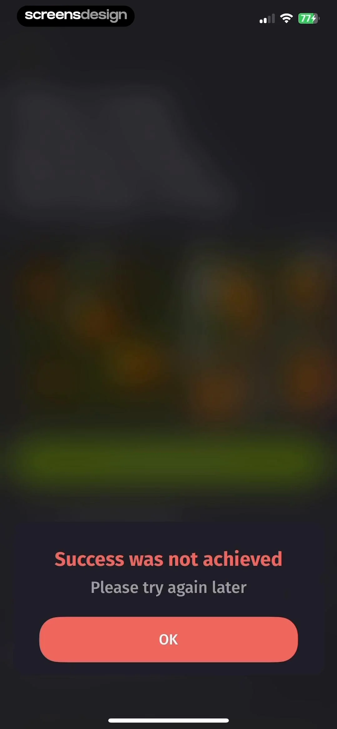
Plantion - Plant Identifier opens this decision with “Success was not achieved” and keeps “Please try again later” in the same state. Depuff AI - Debloat your face uses “Failed to upload image. Please check your connection and try again.” with “Try Again” visible nearby. Looking at both recorded screens makes the tradeoff concrete: retry treatments should reflect whether the failed operation is idempotent, still valid, and likely to succeed under changed conditions. These are interface observations, not a claim that either treatment performs better.
Use Retry for transient network or service failures with an idempotency key. Use Edit when input needs correction, Reconnect when authorization changed, and Try later when the dependency remains unavailable. Show progress after the tap and prevent repeated presses, while retaining an escape route.
Attach idempotency keys to mutations, reconcile ambiguous timeouts against server state, and separate retriable transport failures from business-rule rejections. The client should never guess whether a charge, upload, or account change happened.

03. Preserved context
Keep valid work visible and recoverable.
The cost of an error includes everything the interface unnecessarily discards.
Gymondo: Fitness Workout Plans opens this decision with “Oops!” and keeps “Something went wrong. Please try again.” in the same state. FocusFlight - Deepfocus Timer uses “Failed :(” with “Your focus data won't be saved.” visible nearby. Looking at both recorded screens makes the tradeoff concrete: recovery feels credible when users can still see the item, selection, query, or draft they were working on. These are interface observations, not a claim that either treatment performs better.
Preserve text, filters, attachments, scroll position, selected items, and navigation context unless security requires clearing them. Highlight only the invalid part. If the app must leave the screen for login or permission repair, save a bounded return state and resume exactly once after success.
Separate durable draft state from request state. Persist safely before a risky transition, version local changes, and handle conflicts explicitly. Never store secrets or payment credentials simply to make recovery convenient.


04. State distinction
Do not disguise failure as an empty result.
“No items” and “we could not load items” demand different decisions.
Xeela: Train, Fuel, Transform opens this decision with “Couldn't scan the menu” and keeps “Something went wrong while scanning. Please try again or enter food manually.” in the same state. Chat AI: Ask Agent Anything uses “Santa AI” with “History” visible nearby. Looking at both recorded screens makes the tradeoff concrete: users need to know whether changing a filter, adding content, waiting, or retrying is the rational next move. These are interface observations, not a claim that either treatment performs better.
Define loading, loaded-empty, filtered-empty, permission-denied, offline-cached, offline-empty, partial, stale, and failed states separately. Reuse layout and illustration styles if desired, but change the explanation and action. A cached result should be labeled with freshness when accuracy matters.
Have data layers expose status, source, freshness, pagination, and partial errors rather than returning an empty array for every failure. This prevents UI components from inventing the wrong message.


05. Accessible recovery
Move focus to the problem without trapping the user.
Errors must be perceivable, associated with the failed control, and operable with assistive technology.
Chatbot AI: AI Chat Assistant opens this decision with “GPT Chatbot” and keeps “Welcome back! What would you like to do today?” in the same state. HEY Email uses “Back” with “Error loading page” visible nearby. Looking at both recorded screens makes the tradeoff concrete: visual emphasis is only one channel; message order, focus, labels, and announcements determine whether recovery is actually available. These are interface observations, not a claim that either treatment performs better.
For form errors, connect messages to fields and provide a summary when several fail. For page-level failures, announce the change once and move focus only when it will not destroy the user’s place. Do not rely on red alone. Keep error text concise at the action point and provide details progressively.
Test VoiceOver announcements, Dynamic Type, hardware keyboard focus, switch control, reduced motion, contrast, and localization with long messages. Avoid repeating live-region updates during automatic retries or countdowns.


Implementation
Create an error taxonomy before writing error copy.
Reliable UI starts with typed outcomes shared across backend, client, analytics, and support.
Inventory operations and classify validation, authorization, permission, conflict, not found, limit, offline, timeout, dependency, partial, and unknown failures. For each class, define user-safe copy, retryability, preserved state, action, severity, diagnostic fields, and escalation route.
Use a reusable error presentation system, but keep messages specific to the task. Inline feedback, banners, full-page states, sheets, and alerts have different interruption costs. Choose the smallest surface that remains visible, accessible, and proportionate to the blocked work.
Model the page as explicit states rather than a single happy-path mockup. Include initial, loading, success, empty, partial, offline, permission-denied, validation, and server-error states where they apply. Preserve the user’s context across each transition, prevent duplicate submissions, and keep recovery close to the failed action.
Accessibility is part of the interaction contract. Test Dynamic Type, VoiceOver, keyboard focus, switch control, contrast, reduced motion, localization, right-to-left layouts, and touch targets. A visually compact pattern is not finished until the task remains understandable without color, animation, or perfect connectivity.
Name the failed task
Explain the problem in product language and keep internals private.
Choose the right action
Retry only idempotent work; otherwise edit, reconnect, wait, or seek help.
Preserve valid context
Keep drafts, filters, objects, and return destinations when safe.
Record structured evidence
Capture outcome category and correlation data without sensitive payloads.
Measurement
Measure recovery, recurrence, and user cost.
Error counts alone do not show whether people can get unstuck.
Track operation start, categorized failure, presentation surface, recovery action, retry result, edit result, support escalation, abandonment, and eventual task completion. Join client and server events through a safe correlation ID, not raw payloads or personally identifying content.
Monitor failure rate by app version, device, connection, endpoint, and operation; successful retry rate; repeated-failure loops; time to recovery; lost-draft reports; duplicate mutations; and support contacts. Establish alerts for unknown-error growth because it often means the taxonomy no longer matches the product.
Review qualitative evidence beside the event data. Watch moderated sessions, support conversations, replayed failures, accessibility testing, and open-ended feedback for confusion that a funnel cannot name. Define guardrails before release so an increase in one completion metric does not hide more accidental actions, privacy concerns, refunds, support work, or abandoned downstream tasks.
Review checklist
Review errors from the failed task to the recovered outcome.
Force every important dependency and rule to fail during QA.
Test local validation, denied permissions, offline use, timeouts, expired sessions, partial data, and ambiguous mutations.
- The screen names the user’s current task in plain language.
- One primary action is visually dominant and accurately labeled.
- Secondary actions remain available without competing with the main decision.
- Input, selection, loading, success, and failure states are designed before implementation.
- Back and close behavior preserve the context that brought the user here.
- Errors explain a recovery action and never erase valid work unnecessarily.
- Sensitive information is minimized in both the interface and analytics.
- Large text and screen readers preserve the intended reading and focus order.
- Slow, offline, interrupted, and duplicated actions have deliberate outcomes.
- Analytics measure completion of the user’s real task, not only button taps.
- The pattern is tested inside the full journey, not as an isolated screenshot.
- Recorded examples are used as references, then adapted to the product’s own constraints.
Questions and answers
Mobile app error state questions
What should a mobile app error message include?
Name the failed task, say what remains safe when relevant, and provide the next useful action. Keep technical internals out of the headline and use a separate diagnostic reference for support.
When should an app show a Retry button?
Show Retry when the operation is idempotent, the request is still valid, and a transient condition may have changed. Reconcile ambiguous mutations before repeating them.
How is an error state different from an empty state?
An empty state means the request succeeded with no content. An error state means the app could not determine or complete the result. They require different explanations and actions.
Should form errors appear inline or in an alert?
Put field-specific errors beside their controls and add an accessible summary when several fail. Reserve alerts for consequences or decisions that truly require interruption.
How can an app avoid losing work after an error?
Separate draft state from request state, persist safe input before risky transitions, preserve selection and navigation context, and clear only data that security requires.
What error analytics are safe to collect?
Collect typed outcome categories, operation names, version, timing, retry result, and a safe correlation ID. Exclude secrets, full form contents, tokens, payment data, and unnecessary personal information.
Apps referenced in this page
Open the products behind the examples.
 Menu Maker: Design CreatorRestaurant Menus & Price List
 UnsplashBeautiful photos and images
 Plantion - Plant IdentifierScan diagnose treat disease id
 Depuff AI - Debloat your faceDebloat and analyze your face
 Gymondo: Fitness Workout PlansGet Fit: Pilates, Yoga, HIIT
 FocusFlight - Deepfocus TimerTake off into deep focus
 Xeela: Train, Fuel, TransformLose Fat & Build Muscle
 Chat AI: Ask Agent AnythingChatbot & Search Assistant
 Chatbot AI: AI Chat AssistantAI Chat & Image Generator
 HEY EmailEmail at its best, by Basecamp
2,805 apps in the top charts.Ask them anything.
Compare recorded error states and use ScreensDesign Pro to inspect how real apps recover from the exact failure mode your product needs to handle.