Personalization inputs
10 Onboarding Goal Selection Screen Examples
A goal question earns its place when the answer visibly changes the plan, content, pace, or recommendations. The options should be understandable without product knowledge and broad enough to fit real motivations.
This is for teams building personalized fitness, learning, wellness, productivity, and creator experiences.
Collecting goals that only change marketing copy creates the appearance of personalization without changing the product. A strong onboarding goal selection decision should be reviewable as part of the complete flow: what caused the screen to appear, which state the product already knows, what the user can do next, and what happens when they decline, leave, or return.
The recorded examples below are useful because they show real product states, not isolated concept art. They do not prove that a pattern caused conversion, retention, revenue, or user satisfaction. Use them to inspect hierarchy, language, sequence, and implementation choices, then validate the decision with people using your product.
01. Ask in the user's language
Ask in the user's language.
A goal is not an internal taxonomy.
In Chair Yoga for Seniors at Home, the recorded screen is an onboarding screen for a senior-focused fitness app, asking the user to select their health goals. In RiseGuide: Self Improvement, the recorded screen is an onboarding screen for the RiseGuide app, designed to capture user goals. Placed side by side, they clarify why a goal is not an internal taxonomy. Focus on the entry state, not the visual genre.
The contrast between Chair Yoga for Seniors at Home and RiseGuide: Self Improvement is useful because the same design principle appears in two different product contexts. Options should describe outcomes people recognize rather than feature families or model labels. Now test the same decision with long copy, a small screen, prior state, and missing data.
Rewrite each choice as a sentence the user might say about their situation. Internal jargon makes people choose the closest wrong answer. Document the trigger, dismissal, saved state, and return path beside the design.


02. Control the size of the choice
Control the size of the choice.
Granularity determines confidence.
In MCI - Personal Training AI, the recorded screen is an onboarding screen for a fitness app, asking the user to select their primary fitness goals. In Unchaind: Overcome Lust, the recorded screen is an onboarding screen for a goal-setting flow. The useful difference is behavioral: granularity determines confidence. Compare what the interface reveals before and after the action.
MCI - Personal Training AI and Unchaind: Overcome Lust arrive at this decision from different products, which helps separate the underlying rule from the visual styling. Too few options erase meaningful differences, while too many make the screen feel like a survey. Check the pattern again for a returning user, a failed request, and a device using larger text.
Start with choices that produce different plans and defer lower-impact preferences. Decorative options add effort without improving the result. Connect the surface to source-of-truth state before polishing it.


03. Make selection rules visible
Make selection rules visible.
Single and multiple choice imply different product logic.
In MyFitnessPal: Calorie Counter, the recorded screen is an onboarding screen for a fitness and nutrition app, asking the user to select their personal goals from a list of options. In MyGrowth: Daily Micro Learning, the recorded screen is an onboarding screen for the MyGrowth app, titled 'About You' with a progress bar below it. Both examples turn one principle into a concrete choice: single and multiple choice imply different product logic. The transferable detail is the relationship between message, control, and next state.
These MyFitnessPal: Calorie Counter and MyGrowth: Daily Micro Learning screens show how much the surrounding task changes the right interface treatment. Checkboxes, radio controls, limits, and selected counts should match what the engine accepts. Review the boundary cases next: partial progress, stale data, interruption, and re-entry.
State limits before the user reaches them and keep Continue disabled only when an answer is truly required. Hidden limits turn exploration into an error. Treat loading, failure, cancellation, and recovery as part of the same design review.


04. Show the personalization payoff
Show the personalization payoff.
The answer should become visible quickly.
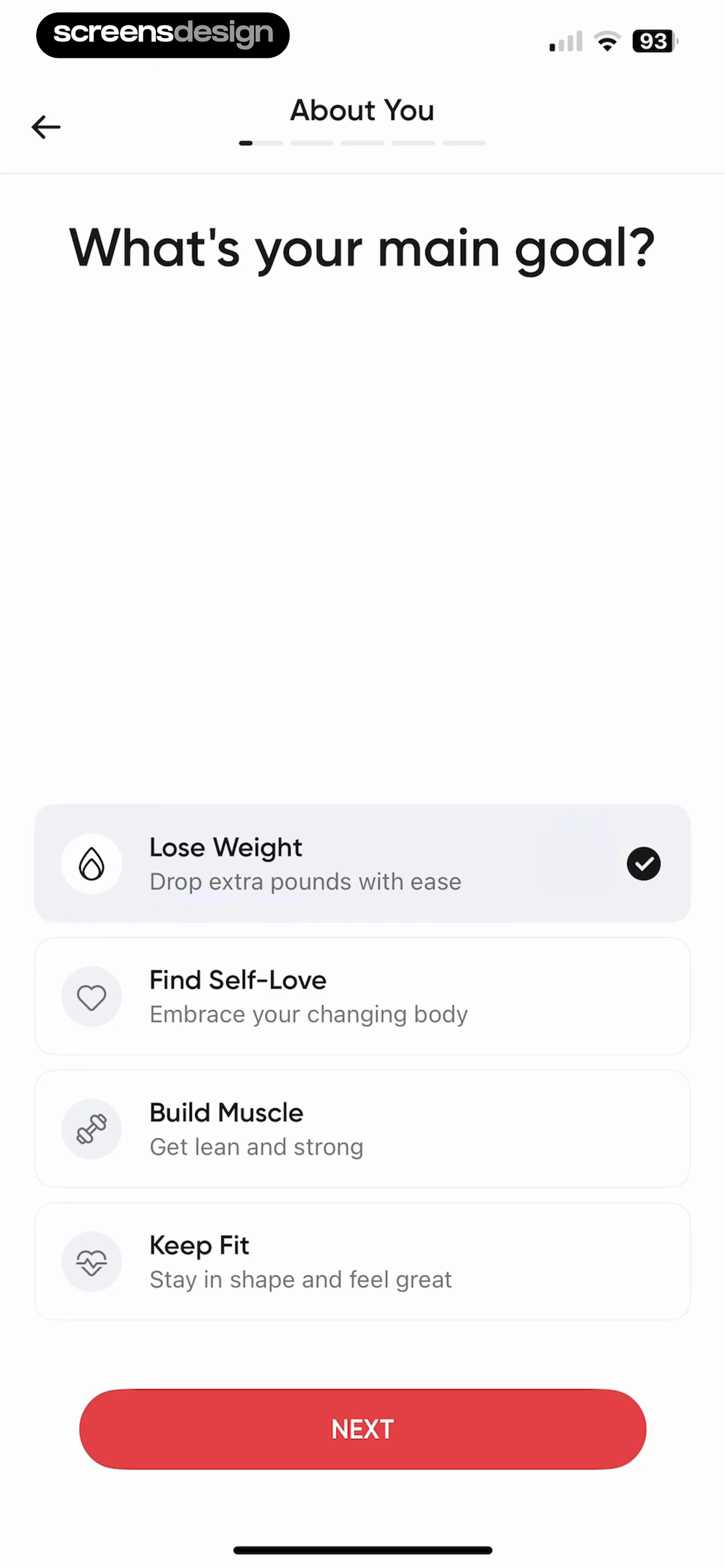
In BetterMe Well-Being Coach, the recorded screen is an onboarding screen for a health and fitness app, titled 'What's your main goal?'. In Remodel AI - Home Design, the recorded screen is an onboarding screen for the Remodel AI app, designed to capture user preferences. The pair is useful for one reason: the answer should become visible quickly. Inspect the surrounding replay before borrowing the pattern.
The contrast between BetterMe Well-Being Coach and Remodel AI - Home Design is useful because the same design principle appears in two different product contexts. A plan preview can connect the selected goal to sessions, recommendations, or milestones. The design is ready only when it still reads clearly with realistic content and imperfect state.
Reflect the user's wording in the next screen and explain any inferred schedule. Silent personalization is difficult to trust or correct. Name the event that opens the screen and the state change that proves the action worked.

05. Allow goals to evolve
Allow goals to evolve.
Onboarding answers should not become permanent identity.
In Activations: Daily Motivation, the recorded screen is an onboarding screen for a personal development app, featuring a multi-choice selection list. In Motivation - Daily quotes, the recorded screen is an onboarding screen for the 'Motivation' app, designed to personalize the user experience by identifying their primary goals. What carries across these products is simple: onboarding answers should not become permanent identity. The styling changes; the decision structure does not.
Activations: Daily Motivation and Motivation - Daily quotes arrive at this decision from different products, which helps separate the underlying rule from the visual styling. People change priorities after they understand the product or their circumstances change. Use the replay to inspect the lead-in and follow-through, then test the same path with accessibility settings enabled.
Provide an editable goal surface and define how changes affect history and future recommendations. Resetting progress after an edit discourages honest updates. Give engineering the entry rule, every outcome, and the expected state after the user returns.


Build the behavior
Implement onboarding goal selection as product state.
Store stable goal identifiers separately from localized labels, record multi-select order only when meaningful, and version recommendation rules.
Start by writing the state table before styling the surface. For each entry route, record what the product knows, what is still uncertain, which action is primary, which alternatives are valid, and where every outcome leads. Include new, returning, offline, loading, denied, failed, completed, and entitlement-changed states where they apply. This makes visual review more honest because the design is attached to executable behavior.
Keep business rules outside decorative components. Labels, eligibility, limits, dates, prices, permissions, and progress should come from the same domain state used by the action itself. When UI copy and backend truth are maintained separately, they eventually disagree. Add analytics identifiers to decisions and outcomes, not every tap, so the event model can explain whether the user completed the task or became stuck.
Accessibility belongs in the component contract. Test large text, screen-reader order, focus restoration, contrast, reduced motion, touch targets, and understandable error announcements. Localize with real strings rather than compressed placeholders. A robust implementation still works when the most important label wraps, an image is unavailable, or the network response arrives after the user has navigated away.
- Define every entry condition and destination.
- Keep a visible primary action and a valid alternative.
- Preserve user input across interruption and retry.
- Derive dynamic claims from current product state.
- Test large text, screen readers, and reduced motion.
- Log outcomes and recovery, not only button taps.
Validate the decision
Measure whether onboarding goal selection helps.
Measure answer completion, option distribution, plan acceptance, later goal edits, first-task success, and whether recommendations are understood.
Begin with a task-level baseline. Identify the people who legitimately reach this state, the decision they are trying to make, and the next meaningful outcome. Segment by entry route, account state, device conditions, and prior exposure where those factors change the experience. A single aggregate completion rate can hide a serious problem for first-time users, returning users, or people using accessibility settings.
A popular option is not proof that the taxonomy is good. Check whether people can explain what changed because they chose it. Pair behavioral events with short comprehension questions, usability sessions, support themes, refunds or reversals where relevant, and checks of the resulting product state. The goal is to learn whether people understood the choice and could continue confidently, not merely whether they moved forward.
When running an experiment, change one decision structure at a time and keep the underlying entitlement or task stable. Define guardrails before exposure, monitor failure and exit paths, and retain enough time to observe downstream behavior. Document what the evidence can and cannot establish so a local improvement is not mistakenly described as a universal best practice.
Completion
Did the user reach the intended outcome with the correct product state?
Comprehension
Could the user explain the choice, consequence, and next step?
Resilience
Could the user leave, decline, retry, and resume without losing context?
Guardrails
Did complaints, reversals, privacy concerns, or accessibility failures remain healthy?
Before release
Review onboarding goal selection in the complete flow.
Use the screen as an entry, decision, and exit state rather than a static composition.
Walk into the screen from every real trigger, complete each action, dismiss or decline it, interrupt it, and return later. Confirm that headings and button labels match the next state. Compare the interface with empty, partial, long, localized, and stale data. If the screen references price, progress, permission, safety, privacy, or access, verify the source of truth directly.
Then inspect what happens after success. The next screen should acknowledge the completed decision and make the new state visible. If nothing changes, the user has little evidence that the action worked. Finally, review the full sequence against the original purpose. Remove explanations, fields, and persuasion elements that do not help the task.
- The screen appears only when its decision is relevant.
- Visible copy matches the actual next state.
- Every alternative action has a coherent destination.
- Loading, denial, failure, and retry preserve context.
- Dynamic values come from current authoritative data.
- Success is visible after the action completes.
- Every recorded example links to its exact source screen.
Questions and answers
10 Onboarding Goal Selection Screen Examples questions
What makes onboarding goal selection effective?
It is effective when the user understands why the screen appears, what decision is required, what each action changes, and how to continue or recover. Visual polish matters after those behavioral relationships are clear.
How many screens should be compared?
Ten varied, relevant screens provide a practical starting set. Compare their surrounding sequences and product states instead of counting surface similarities. A smaller set of exact evidence is more useful than a large collection of loosely related images.
Can these examples prove conversion or retention?
No. The screens demonstrate interface choices used by real products. Revenue, downloads, ratings, and ranking are context, not causal evidence. Validate the pattern with your own users, product state, and controlled measurement.
What should be included in implementation?
Include eligibility, entry context, primary and alternative actions, saved state, data sources, accessibility behavior, analytics outcomes, and every loading, error, denial, dismissal, and return path that can occur.
How can ScreensDesign help with onboarding goal selection?
Use the exact links to inspect what happens before and after each screen. With Pro, you can search comparable recorded interfaces, study complete flows, and ask the app library about the decision you are designing.
Apps referenced in this page
Open the products behind the examples.
 Chair Yoga for Seniors at Home28-Day Wellness Challenge
 RiseGuide: Self ImprovementImprove Communication Skills
 MCI - Personal Training AIHybrid Workout | Smart Planner
 Unchaind: Overcome LustBreak free from temptation
 MyFitnessPal: Calorie CounterAI Coach & Nutrition Tracker
 MyGrowth: Daily Micro LearningGeneral knowledge growth
 BetterMe Well-Being CoachPilates, calisthenics, yoga
 Remodel AI - Home DesignAI Interior Design & Landscape
 Activations: Daily MotivationFeel Alive + Manifest
 Motivation - Daily quotesInspirational positive widgets
2,805 apps in the top charts.Ask them anything.
Search recorded onboarding goal selection screens, compare complete flows, and apply the useful decisions to your own app.