Journaling products
10 Journaling App Onboarding Examples
Journaling onboarding should make the first entry feel safe and achievable. It needs a prompt with a clear stopping point, visible privacy expectations, and a return pattern that supports reflection without turning it into pressure.
This is for teams designing diaries, mood trackers, gratitude products, guided reflection, and AI-assisted journals.
Asking many personal questions before the first entry can feel invasive because the product has not yet demonstrated how those answers help. A strong journaling app onboarding decision should be reviewable as part of the complete flow: what caused the screen to appear, which state the product already knows, what the user can do next, and what happens when they decline, leave, or return.
The recorded examples below are useful because they show real product states, not isolated concept art. They do not prove that a pattern caused conversion, retention, revenue, or user satisfaction. Use them to inspect hierarchy, language, sequence, and implementation choices, then validate the decision with people using your product.
01. Lower the cost of the first entry
Lower the cost of the first entry.
A blank page asks too much too soon.
In Lightly: Wellbeing Companion, the recorded screen is an onboarding screen for the Lightly app, designed to guide a new user through their first journal entry. In 365 Gratitude Journal & Diary, the recorded screen shows a chat-based onboarding or daily reflection interface for a gratitude journal app. Placed side by side, they clarify why a blank page asks too much too soon. Focus on the entry state, not the visual genre.
Lightly: Wellbeing Companion and 365 Gratitude Journal & Diary arrive at this decision from different products, which helps separate the underlying rule from the visual styling. A specific prompt, short check-in, or sentence starter gives the user a manageable first action. Now test the same decision with long copy, a small screen, prior state, and missing data.
Offer structure without requiring a long response and make Save available early. A mandatory essay creates false depth and easy abandonment. Document the trigger, dismissal, saved state, and return path beside the design.


02. Set privacy expectations early
Set privacy expectations early.
Reflection changes when people understand who can read it.
In Daylio Journal - Mood Tracker, the recorded screen is an onboarding screen for the Daylio Journal app, featuring a friendly, minimalist illustration of a person reading on a couch at the top. In Lightly: Wellbeing Companion, the recorded screen is an onboarding screen for a mental health journaling app. The useful difference is behavioral: reflection changes when people understand who can read it. Compare what the interface reveals before and after the action.
These Daylio Journal - Mood Tracker and Lightly: Wellbeing Companion screens show how much the surrounding task changes the right interface treatment. Locking, sync, AI processing, export, and deletion should be explained in plain product language. Check the pattern again for a returning user, a failed request, and a device using larger text.
Place the relevant control near the first sensitive input. A generic secure badge cannot explain data handling. Connect the surface to source-of-truth state before polishing it.


03. Use mood input with care
Use mood input with care.
A mood is a signal, not a diagnosis.
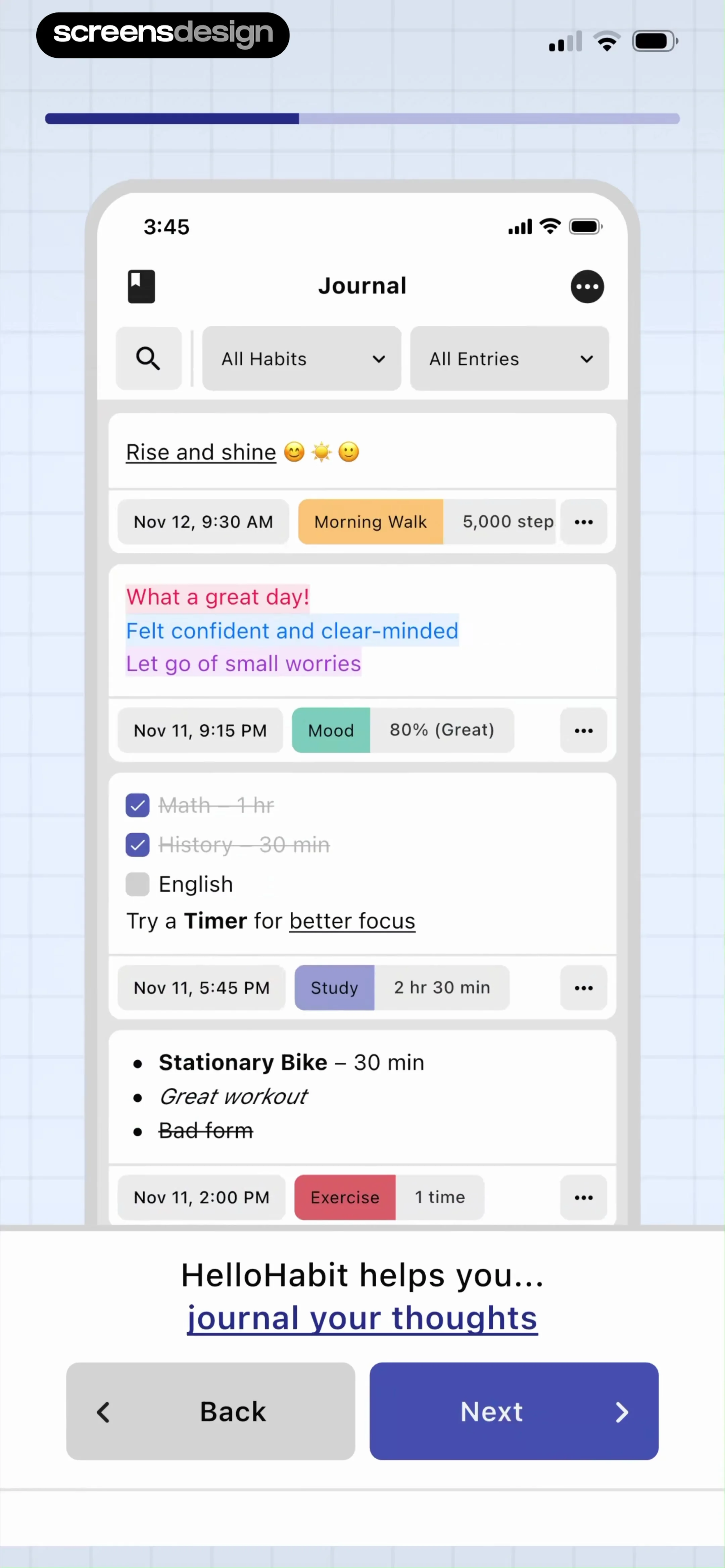
In Reflectly - Journal & AI Diary, the recorded screen is an onboarding or welcome screen for the Reflectly app, featuring a centered white modal card against a light gray background. In HelloHabit - Daily Planner, the recorded screen shows an onboarding or feature-highlighting view for the HelloHabit app, showcasing a 'Journal' interface within a device mockup. Both examples turn one principle into a concrete choice: a mood is a signal, not a diagnosis. The transferable detail is the relationship between message, control, and next state.
The contrast between Reflectly - Journal & AI Diary and HelloHabit - Daily Planner is useful because the same design principle appears in two different product contexts. Labels, scales, and optional context can help people interpret their history. Review the boundary cases next: partial progress, stale data, interruption, and re-entry.
Allow skip, uncertainty, and later correction while avoiding medical conclusions. Overconfident interpretation can turn a simple check-in into harmful advice. Treat loading, failure, cancellation, and recovery as part of the same design review.

04. Make prompts adaptive but legible
Make prompts adaptive but legible.
Personalization should still feel chosen.
In 5 Minute Journal・Daily Diary, the recorded screen is an onboarding screen for a journaling app, featuring a dark-themed interface with a botanical background pattern. In Reflectly - Journal & AI Diary, the recorded screen is the home screen of the Reflectly app, featuring a vibrant teal-to-white gradient background. The pair is useful for one reason: personalization should still feel chosen. Inspect the surrounding replay before borrowing the pattern.
5 Minute Journal・Daily Diary and Reflectly - Journal & AI Diary arrive at this decision from different products, which helps separate the underlying rule from the visual styling. Past themes, goals, and routines can shape prompts when the reason is understandable. The design is ready only when it still reads clearly with realistic content and imperfect state.
Show why a prompt appeared and let users change or mute a theme. Opaque personalization can make intimate content feel surveilled. Name the event that opens the screen and the state change that proves the action worked.


05. Design return without guilt
Design return without guilt.
A missed day should not close the door.
In Gratitude Plus - Journal, the recorded screen is an onboarding screen for a gratitude journaling app. In 5 Minute Journal・Daily Diary, the recorded screen shows an onboarding or welcome page for the 5 Minute Journal app. What carries across these products is simple: a missed day should not close the door. The styling changes; the decision structure does not.
These Gratitude Plus - Journal and 5 Minute Journal・Daily Diary screens show how much the surrounding task changes the right interface treatment. Resume prompts, recent entries, and gentle routines can reconnect the user to context. Use the replay to inspect the lead-in and follow-through, then test the same path with accessibility settings enabled.
Prefer flexible cadence and easy restart over punitive loss language. Aggressive streaks can conflict with the reflective purpose. Give engineering the entry rule, every outcome, and the expected state after the user returns.


Build the behavior
Implement journaling app onboarding as product state.
Separate entry content, mood tags, prompt provenance, privacy settings, sync state, and AI-processing consent in the data model.
Start by writing the state table before styling the surface. For each entry route, record what the product knows, what is still uncertain, which action is primary, which alternatives are valid, and where every outcome leads. Include new, returning, offline, loading, denied, failed, completed, and entitlement-changed states where they apply. This makes visual review more honest because the design is attached to executable behavior.
Keep business rules outside decorative components. Labels, eligibility, limits, dates, prices, permissions, and progress should come from the same domain state used by the action itself. When UI copy and backend truth are maintained separately, they eventually disagree. Add analytics identifiers to decisions and outcomes, not every tap, so the event model can explain whether the user completed the task or became stuck.
Accessibility belongs in the component contract. Test large text, screen-reader order, focus restoration, contrast, reduced motion, touch targets, and understandable error announcements. Localize with real strings rather than compressed placeholders. A robust implementation still works when the most important label wraps, an image is unavailable, or the network response arrives after the user has navigated away.
- Define every entry condition and destination.
- Keep a visible primary action and a valid alternative.
- Preserve user input across interruption and retry.
- Derive dynamic claims from current product state.
- Test large text, screen readers, and reduced motion.
- Log outcomes and recovery, not only button taps.
Validate the decision
Measure whether journaling app onboarding helps.
Measure first-entry completion, voluntary return, prompt changes, export and deletion success, perceived safety, and sustained useful entries.
Begin with a task-level baseline. Identify the people who legitimately reach this state, the decision they are trying to make, and the next meaningful outcome. Segment by entry route, account state, device conditions, and prior exposure where those factors change the experience. A single aggregate completion rate can hide a serious problem for first-time users, returning users, or people using accessibility settings.
More entries are not automatically better. Quality, control, and wellbeing signals matter alongside frequency. Pair behavioral events with short comprehension questions, usability sessions, support themes, refunds or reversals where relevant, and checks of the resulting product state. The goal is to learn whether people understood the choice and could continue confidently, not merely whether they moved forward.
When running an experiment, change one decision structure at a time and keep the underlying entitlement or task stable. Define guardrails before exposure, monitor failure and exit paths, and retain enough time to observe downstream behavior. Document what the evidence can and cannot establish so a local improvement is not mistakenly described as a universal best practice.
Completion
Did the user reach the intended outcome with the correct product state?
Comprehension
Could the user explain the choice, consequence, and next step?
Resilience
Could the user leave, decline, retry, and resume without losing context?
Guardrails
Did complaints, reversals, privacy concerns, or accessibility failures remain healthy?
Before release
Review journaling app onboarding in the complete flow.
Use the screen as an entry, decision, and exit state rather than a static composition.
Walk into the screen from every real trigger, complete each action, dismiss or decline it, interrupt it, and return later. Confirm that headings and button labels match the next state. Compare the interface with empty, partial, long, localized, and stale data. If the screen references price, progress, permission, safety, privacy, or access, verify the source of truth directly.
Then inspect what happens after success. The next screen should acknowledge the completed decision and make the new state visible. If nothing changes, the user has little evidence that the action worked. Finally, review the full sequence against the original purpose. Remove explanations, fields, and persuasion elements that do not help the task.
- The screen appears only when its decision is relevant.
- Visible copy matches the actual next state.
- Every alternative action has a coherent destination.
- Loading, denial, failure, and retry preserve context.
- Dynamic values come from current authoritative data.
- Success is visible after the action completes.
- Every recorded example links to its exact source screen.
Questions and answers
10 Journaling App Onboarding Examples questions
What makes journaling app onboarding effective?
It is effective when the user understands why the screen appears, what decision is required, what each action changes, and how to continue or recover. Visual polish matters after those behavioral relationships are clear.
How many screens should be compared?
Ten varied, relevant screens provide a practical starting set. Compare their surrounding sequences and product states instead of counting surface similarities. A smaller set of exact evidence is more useful than a large collection of loosely related images.
Can these examples prove conversion or retention?
No. The screens demonstrate interface choices used by real products. Revenue, downloads, ratings, and ranking are context, not causal evidence. Validate the pattern with your own users, product state, and controlled measurement.
What should be included in implementation?
Include eligibility, entry context, primary and alternative actions, saved state, data sources, accessibility behavior, analytics outcomes, and every loading, error, denial, dismissal, and return path that can occur.
How can ScreensDesign help with journaling app onboarding?
Use the exact links to inspect what happens before and after each screen. With Pro, you can search comparable recorded interfaces, study complete flows, and ask the app library about the decision you are designing.
Apps referenced in this page
Open the products behind the examples.
 Lightly: Wellbeing CompanionAI Mental Health Journaling
 365 Gratitude Journal & DiaryDaily Prompts & Affirmations
 Daylio Journal - Mood TrackerPrivate Diary, Health, Habits
 Reflectly - Journal & AI DiaryMood Tracker for Self-Care
 HelloHabit - Daily PlannerTasks, Routines, & Streaks
 5 Minute Journal・Daily DiaryGratitude・Mood Tracker・Prompts
 Gratitude Plus - JournalSocial gratitude journal
2,805 apps in the top charts.Ask them anything.
Search recorded journaling app onboarding screens, compare complete flows, and apply the useful decisions to your own app.